Statistics for Management: Activity 1-4 Analysis and Report
VerifiedAdded on 2020/10/22
|21
|3804
|232
Report
AI Summary
This report provides a detailed statistical analysis for management, covering various aspects of data analysis and hypothesis testing. It begins with an introduction to statistical tools and techniques, emphasizing their role in decision-making. The report then delves into Activity 1, which explores hypothesis testing related to gender pay gaps in both public and private sectors, including earnings-time charts and annual growth rate calculations. Activity 2 focuses on central measures of tendency and dispersion, utilizing ogives to calculate median and quartiles. Activity 3 applies statistical methods to determine economic order quantity, number of orders, and service levels. Finally, Activity 4 involves the creation of charts and ogives to analyze changes in economic indicators and staff earnings. The report concludes with a synthesis of the findings and references used throughout the analysis.
STATISTICS FOR
MANAGEMENT
MANAGEMENT
Paraphrase This Document
Need a fresh take? Get an instant paraphrase of this document with our AI Paraphraser
Table of Contents
INTRODUCTION...........................................................................................................................1
ACTIVITY 1....................................................................................................................................1
(a) Determining whether earnings of men are different from women in public sector...............1
(b) Determining whether earnings of men are different from women in private sector.............2
(c) Earnings-Time Chart Plot for each Sector:............................................................................3
(d) Annual Growth Rate and its computation:............................................................................5
ACTIVITY 2 ...................................................................................................................................8
(i) Calculating Median and Quartiles through Ogive..................................................................9
(ii) Ascertaining the measures of Central Tendency and Dispersion........................................11
(c) Comparing the statistical measures for two branches of Leisure Centre.............................12
ACTIVITY 3 .................................................................................................................................13
(a) Economic order Quantity ....................................................................................................13
(b) Number of Orders to be placed...........................................................................................14
(d) Current Service Level to Customers....................................................................................14
(e) Re-order levels that fulfil desired service levels..................................................................14
ACTIVITY 4 .................................................................................................................................15
(a) Line and/or Bar Charts for data indicating changes in CPI, CPIH and RPI from 2007 to
2017...........................................................................................................................................15
(b)Producing Ogive for Cumulative Percentage of Staff versus Hourly Earnings ..................17
CONCLUSION..............................................................................................................................17
REFERENCES..............................................................................................................................19
INTRODUCTION
Statistics help management in undertaking projects by making accurate decisions in terms
of production and quality based on the acquired knowledge about customer tastes and
preferences. This theoretical framework includes investigation, interpretation, protection and
demonstration of collected data (Cawthorn and Mariani, 2017). It helps in measuring the
performance of management as well as stimulate innovation by providing a foundation for
research and development activities in the organisation. This report entails a detailed evaluation
of statistical tools and techniques in relation to Hypothesis testing, central measures of tendency,
dispersion and variability. Furthermore, the report includes interpretation of data collected,
analysed and presented under each task.
ACTIVITY 1
The concept of hypothesis testing relates to the affirmation of assumptions in regards to a
certain set of data set derived from a population indicating whether such data hold true or not.
For this purpose, two opposing hypotheses are made viz. Null hypothesis (H0) and Alternative
Hypothesis (H1). The Null Hypothesis can be defined as an asserting statement which says that
there is no difference between sample statistic and population parameters. On the other hand,
Alternative Hypothesis one which opposes this assertion (General and Welfare, 2013). While
conducting a statistical test, null hypothesis is taken into account or is tested. If this hypothesis
does not hold true, it is rejected whereas alternative hypothesis is accepted and vice versa.
Hypothesis testing helps in deriving important conclusions or inferences through the
measurement of deviations in sample data from population parameters. Thus, it is one of the
most widely accepted forms of statistical methods undertaken by businesses so as to enable an
informed decision-making on their part.
In the context of scenario mentioned in the case study, following analysis of different
situations have been imparted using hypothesis testing:
Public Sector:
(a) Determining whether earnings of men are different from women in public sector
Under this scenario, the following hypothesis are taken under investigation:
H0: Earnings of men is not significantly different from that of women employed in Public Sector.
H1: Earnings of men is significantly different from that of women employed in Public Sector.
1
⊘ This is a preview!⊘
Do you want full access?
Subscribe today to unlock all pages.
Trusted by 1+ million students worldwide
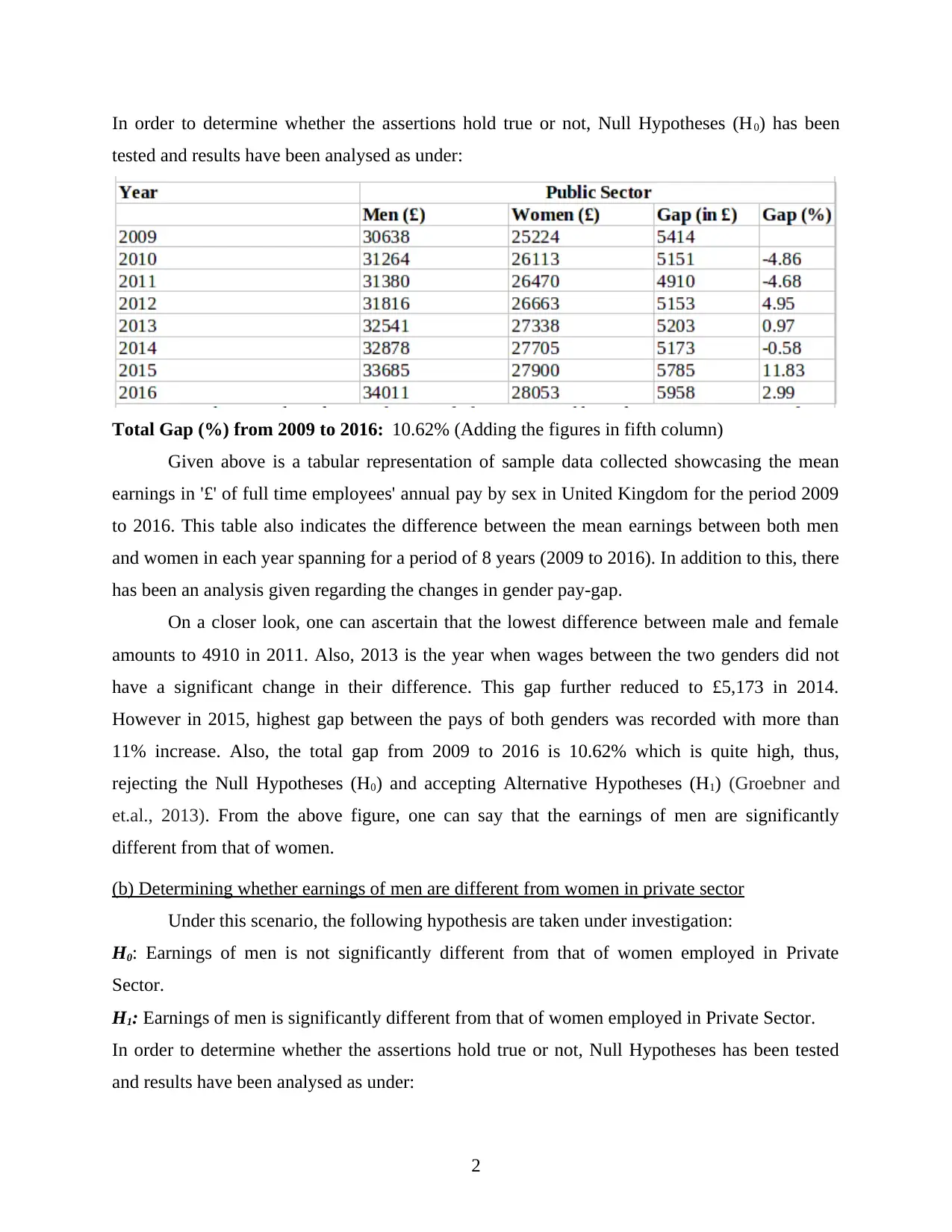
In order to determine whether the assertions hold true or not, Null Hypotheses (H0) has been
tested and results have been analysed as under:
Total Gap (%) from 2009 to 2016: 10.62% (Adding the figures in fifth column)
Given above is a tabular representation of sample data collected showcasing the mean
earnings in '£' of full time employees' annual pay by sex in United Kingdom for the period 2009
to 2016. This table also indicates the difference between the mean earnings between both men
and women in each year spanning for a period of 8 years (2009 to 2016). In addition to this, there
has been an analysis given regarding the changes in gender pay-gap.
On a closer look, one can ascertain that the lowest difference between male and female
amounts to 4910 in 2011. Also, 2013 is the year when wages between the two genders did not
have a significant change in their difference. This gap further reduced to £5,173 in 2014.
However in 2015, highest gap between the pays of both genders was recorded with more than
11% increase. Also, the total gap from 2009 to 2016 is 10.62% which is quite high, thus,
rejecting the Null Hypotheses (H0) and accepting Alternative Hypotheses (H1) (Groebner and
et.al., 2013). From the above figure, one can say that the earnings of men are significantly
different from that of women.
(b) Determining whether earnings of men are different from women in private sector
Under this scenario, the following hypothesis are taken under investigation:
H0: Earnings of men is not significantly different from that of women employed in Private
Sector.
H1: Earnings of men is significantly different from that of women employed in Private Sector.
In order to determine whether the assertions hold true or not, Null Hypotheses has been tested
and results have been analysed as under:
2
Paraphrase This Document
Need a fresh take? Get an instant paraphrase of this document with our AI Paraphraser
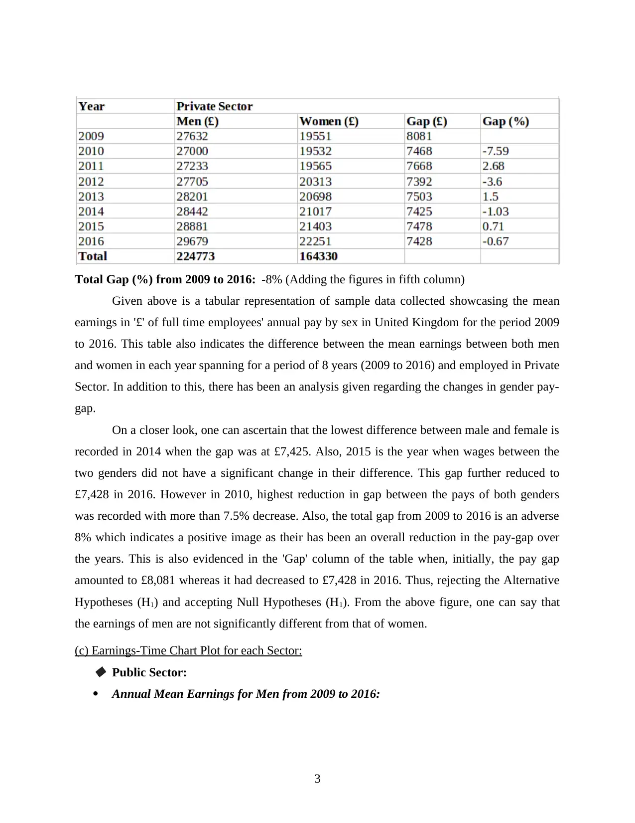
Total Gap (%) from 2009 to 2016: -8% (Adding the figures in fifth column)
Given above is a tabular representation of sample data collected showcasing the mean
earnings in '£' of full time employees' annual pay by sex in United Kingdom for the period 2009
to 2016. This table also indicates the difference between the mean earnings between both men
and women in each year spanning for a period of 8 years (2009 to 2016) and employed in Private
Sector. In addition to this, there has been an analysis given regarding the changes in gender pay-
gap.
On a closer look, one can ascertain that the lowest difference between male and female is
recorded in 2014 when the gap was at £7,425. Also, 2015 is the year when wages between the
two genders did not have a significant change in their difference. This gap further reduced to
£7,428 in 2016. However in 2010, highest reduction in gap between the pays of both genders
was recorded with more than 7.5% decrease. Also, the total gap from 2009 to 2016 is an adverse
8% which indicates a positive image as their has been an overall reduction in the pay-gap over
the years. This is also evidenced in the 'Gap' column of the table when, initially, the pay gap
amounted to £8,081 whereas it had decreased to £7,428 in 2016. Thus, rejecting the Alternative
Hypotheses (H1) and accepting Null Hypotheses (H1). From the above figure, one can say that
the earnings of men are not significantly different from that of women.
(c) Earnings-Time Chart Plot for each Sector: Public Sector:
Annual Mean Earnings for Men from 2009 to 2016:
3
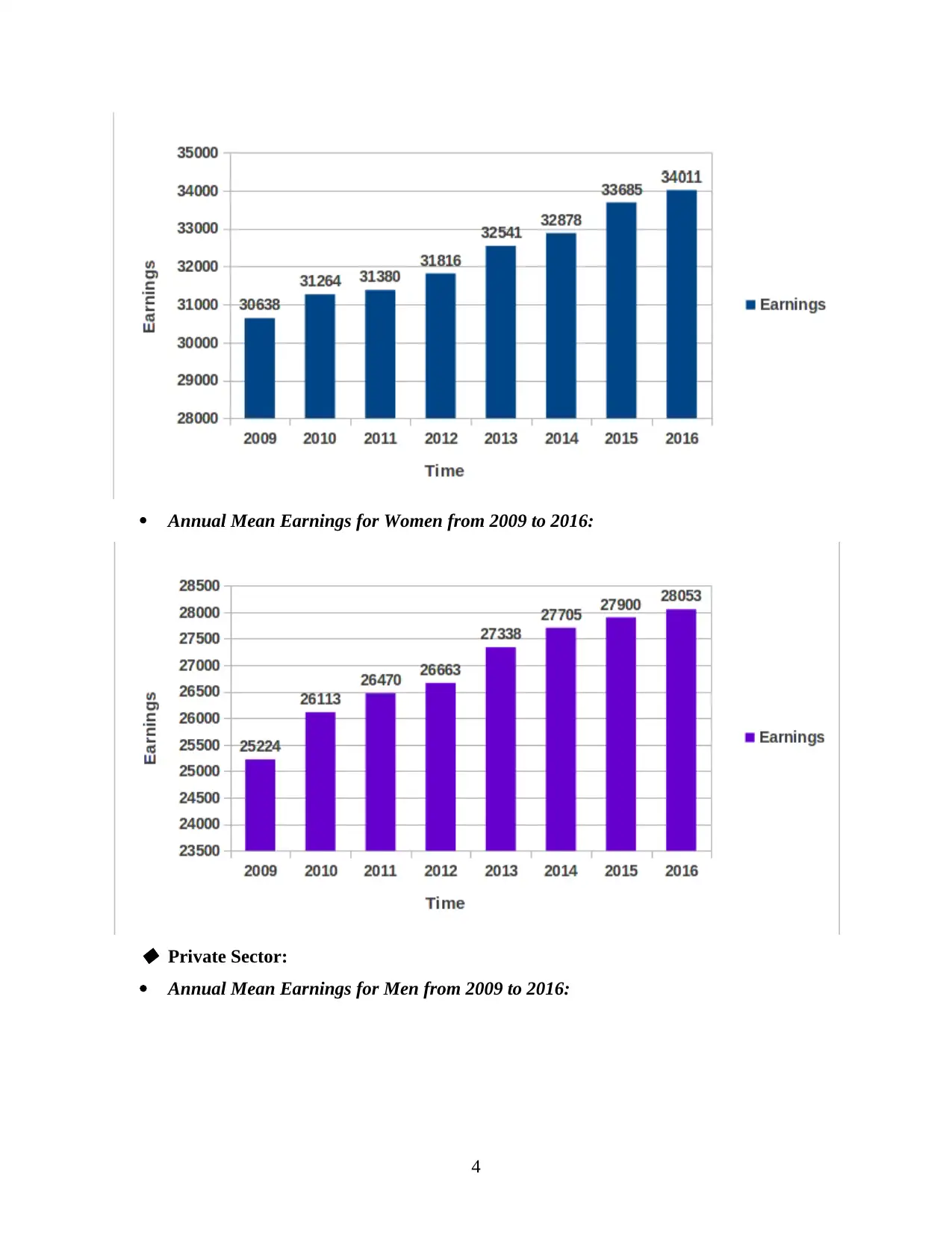
Annual Mean Earnings for Women from 2009 to 2016:
Private Sector:
Annual Mean Earnings for Men from 2009 to 2016:
4
Private Sector:
Annual Mean Earnings for Men from 2009 to 2016:
4
⊘ This is a preview!⊘
Do you want full access?
Subscribe today to unlock all pages.
Trusted by 1+ million students worldwide
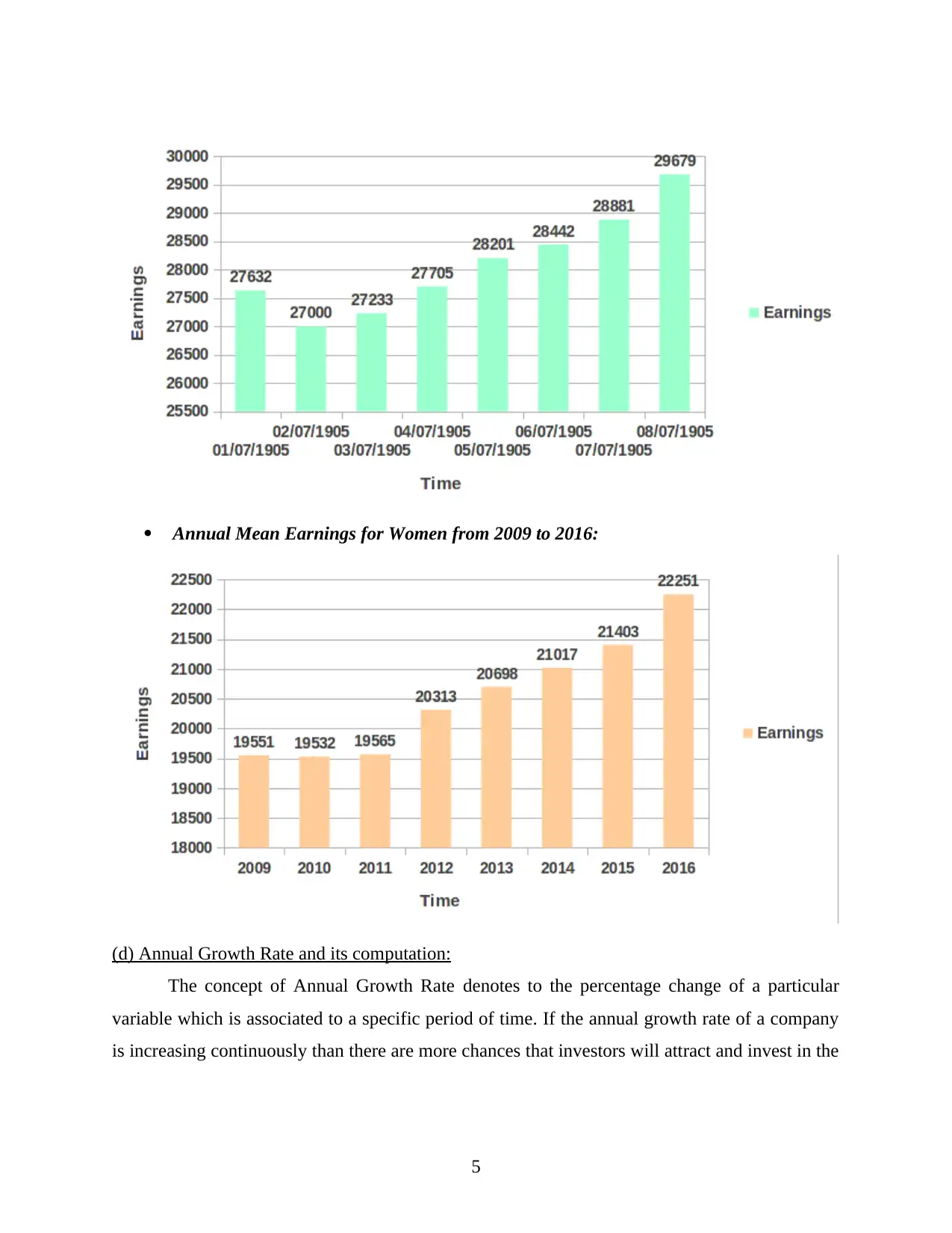
Annual Mean Earnings for Women from 2009 to 2016:
(d) Annual Growth Rate and its computation:
The concept of Annual Growth Rate denotes to the percentage change of a particular
variable which is associated to a specific period of time. If the annual growth rate of a company
is increasing continuously than there are more chances that investors will attract and invest in the
5
Paraphrase This Document
Need a fresh take? Get an instant paraphrase of this document with our AI Paraphraser
business of organisation. It can be terms of income or earnings and it shows that financial
position of corporation is strong and it is earning good profit.
Annual Growth Rate (%) = [(Value1- Value0)/(Value0)]*100 where,
Value1 = Measurement in Current Year
Value0 = Measurement in Previous Year
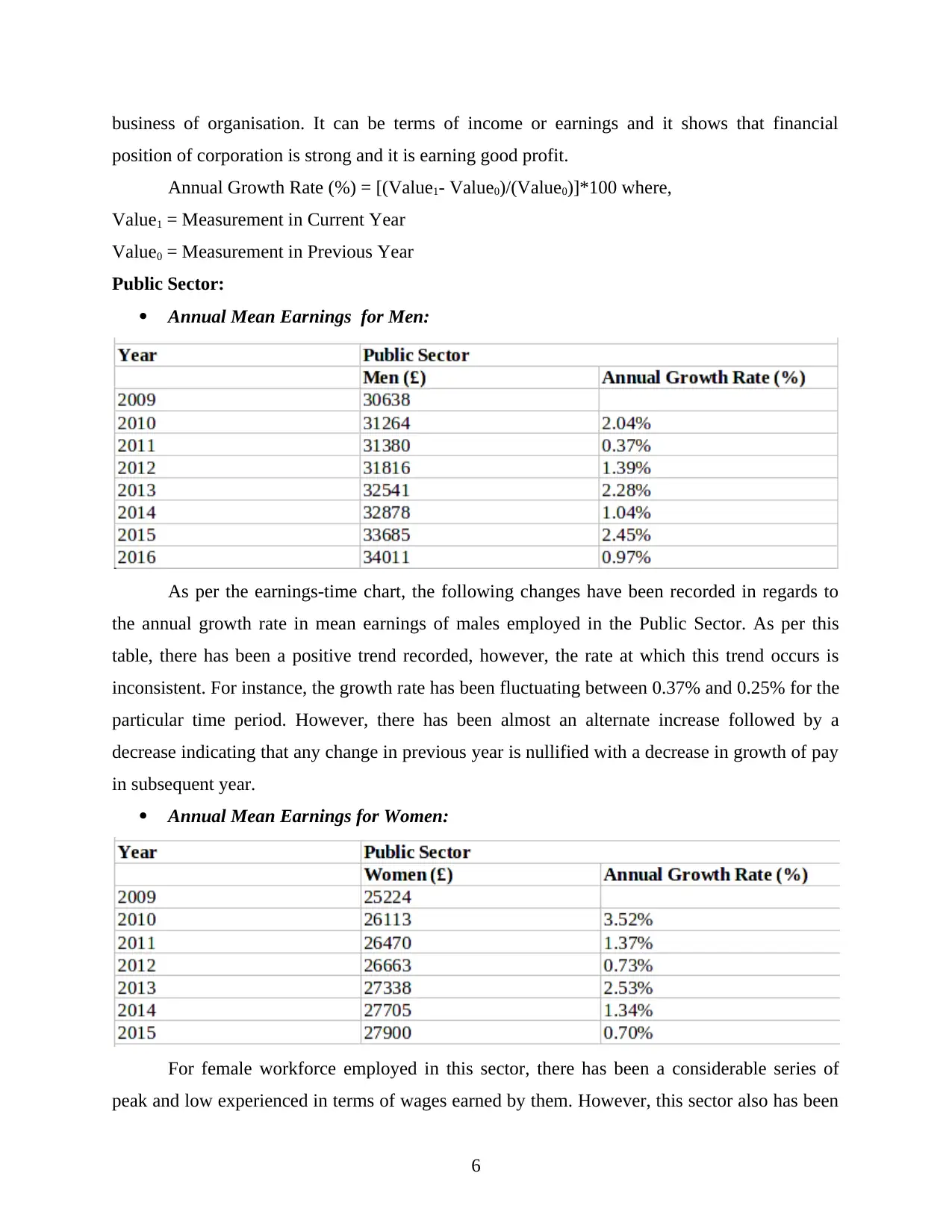
Public Sector:
Annual Mean Earnings for Men:
As per the earnings-time chart, the following changes have been recorded in regards to
the annual growth rate in mean earnings of males employed in the Public Sector. As per this
table, there has been a positive trend recorded, however, the rate at which this trend occurs is
inconsistent. For instance, the growth rate has been fluctuating between 0.37% and 0.25% for the
particular time period. However, there has been almost an alternate increase followed by a
decrease indicating that any change in previous year is nullified with a decrease in growth of pay
in subsequent year.
Annual Mean Earnings for Women:
For female workforce employed in this sector, there has been a considerable series of
peak and low experienced in terms of wages earned by them. However, this sector also has been
6
position of corporation is strong and it is earning good profit.
Annual Growth Rate (%) = [(Value1- Value0)/(Value0)]*100 where,
Value1 = Measurement in Current Year
Value0 = Measurement in Previous Year
Public Sector:
Annual Mean Earnings for Men:
As per the earnings-time chart, the following changes have been recorded in regards to
the annual growth rate in mean earnings of males employed in the Public Sector. As per this
table, there has been a positive trend recorded, however, the rate at which this trend occurs is
inconsistent. For instance, the growth rate has been fluctuating between 0.37% and 0.25% for the
particular time period. However, there has been almost an alternate increase followed by a
decrease indicating that any change in previous year is nullified with a decrease in growth of pay
in subsequent year.
Annual Mean Earnings for Women:
For female workforce employed in this sector, there has been a considerable series of
peak and low experienced in terms of wages earned by them. However, this sector also has been
6
experiencing a positive trend similar to that of its male counterparts. One can also see that every
third year there has been a growth close to the rate of 0.70%. Also, every second year between
2010 and 2016, the sector experienced a growth close to 1.34%. This indicates that the sector
tends to follow a certain pattern of rise and fall in a given time-period (Jennings, Nagel and
Mansfield, 2016).
Private Sector:
Annual Mean Earnings for Men:
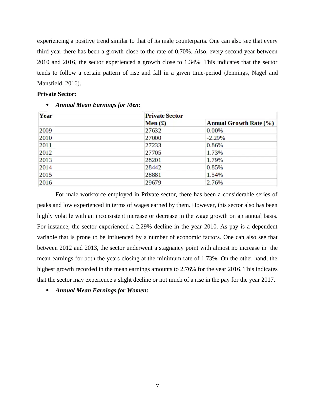
For male workforce employed in Private sector, there has been a considerable series of
peaks and low experienced in terms of wages earned by them. However, this sector also has been
highly volatile with an inconsistent increase or decrease in the wage growth on an annual basis.
For instance, the sector experienced a 2.29% decline in the year 2010. As pay is a dependent
variable that is prone to be influenced by a number of economic factors. One can also see that
between 2012 and 2013, the sector underwent a stagnancy point with almost no increase in the
mean earnings for both the years closing at the minimum rate of 1.73%. On the other hand, the
highest growth recorded in the mean earnings amounts to 2.76% for the year 2016. This indicates
that the sector may experience a slight decline or not much of a rise in the pay for the year 2017.
Annual Mean Earnings for Women:
7
third year there has been a growth close to the rate of 0.70%. Also, every second year between
2010 and 2016, the sector experienced a growth close to 1.34%. This indicates that the sector
tends to follow a certain pattern of rise and fall in a given time-period (Jennings, Nagel and
Mansfield, 2016).
Private Sector:
Annual Mean Earnings for Men:
For male workforce employed in Private sector, there has been a considerable series of
peaks and low experienced in terms of wages earned by them. However, this sector also has been
highly volatile with an inconsistent increase or decrease in the wage growth on an annual basis.
For instance, the sector experienced a 2.29% decline in the year 2010. As pay is a dependent
variable that is prone to be influenced by a number of economic factors. One can also see that
between 2012 and 2013, the sector underwent a stagnancy point with almost no increase in the
mean earnings for both the years closing at the minimum rate of 1.73%. On the other hand, the
highest growth recorded in the mean earnings amounts to 2.76% for the year 2016. This indicates
that the sector may experience a slight decline or not much of a rise in the pay for the year 2017.
Annual Mean Earnings for Women:
7
⊘ This is a preview!⊘
Do you want full access?
Subscribe today to unlock all pages.
Trusted by 1+ million students worldwide
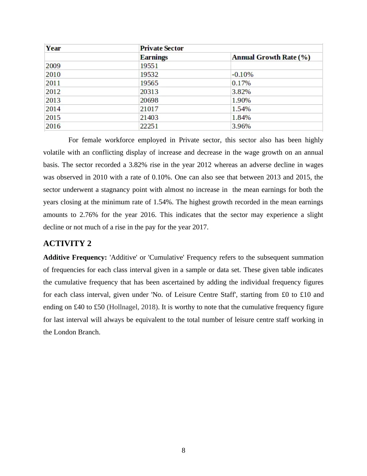
For female workforce employed in Private sector, this sector also has been highly
volatile with an conflicting display of increase and decrease in the wage growth on an annual
basis. The sector recorded a 3.82% rise in the year 2012 whereas an adverse decline in wages
was observed in 2010 with a rate of 0.10%. One can also see that between 2013 and 2015, the
sector underwent a stagnancy point with almost no increase in the mean earnings for both the
years closing at the minimum rate of 1.54%. The highest growth recorded in the mean earnings
amounts to 2.76% for the year 2016. This indicates that the sector may experience a slight
decline or not much of a rise in the pay for the year 2017.
ACTIVITY 2
Additive Frequency: 'Additive' or 'Cumulative' Frequency refers to the subsequent summation
of frequencies for each class interval given in a sample or data set. These given table indicates
the cumulative frequency that has been ascertained by adding the individual frequency figures
for each class interval, given under 'No. of Leisure Centre Staff', starting from £0 to £10 and
ending on £40 to £50 (Hollnagel, 2018). It is worthy to note that the cumulative frequency figure
for last interval will always be equivalent to the total number of leisure centre staff working in
the London Branch.
8
Paraphrase This Document
Need a fresh take? Get an instant paraphrase of this document with our AI Paraphraser
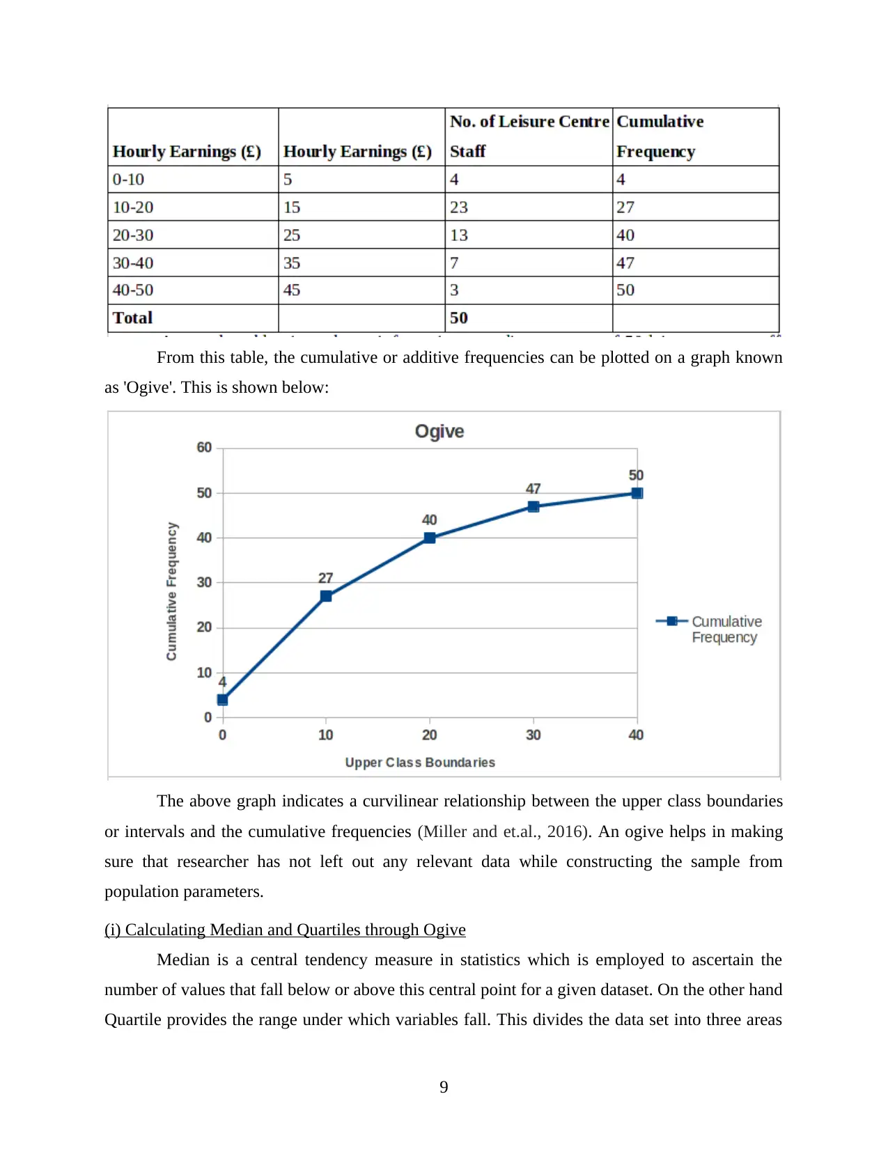
From this table, the cumulative or additive frequencies can be plotted on a graph known
as 'Ogive'. This is shown below:
The above graph indicates a curvilinear relationship between the upper class boundaries
or intervals and the cumulative frequencies (Miller and et.al., 2016). An ogive helps in making
sure that researcher has not left out any relevant data while constructing the sample from
population parameters.
(i) Calculating Median and Quartiles through Ogive
Median is a central tendency measure in statistics which is employed to ascertain the
number of values that fall below or above this central point for a given dataset. On the other hand
Quartile provides the range under which variables fall. This divides the data set into three areas
9
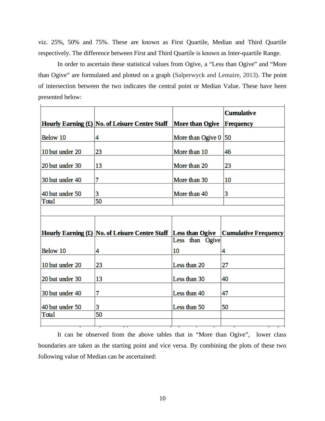
viz. 25%, 50% and 75%. These are known as First Quartile, Median and Third Quartile
respectively. The difference between First and Third Quartile is known as Inter-quartile Range.
In order to ascertain these statistical values from Ogive, a “Less than Ogive” and “More
than Ogive” are formulated and plotted on a graph (Salperwyck and Lemaire, 2013). The point
of intersection between the two indicates the central point or Median Value. These have been
presented below:
It can be observed from the above tables that in “More than Ogive”, lower class
boundaries are taken as the starting point and vice versa. By combining the plots of these two
following value of Median can be ascertained:
10
⊘ This is a preview!⊘
Do you want full access?
Subscribe today to unlock all pages.
Trusted by 1+ million students worldwide
1 out of 21
Related Documents


Your All-in-One AI-Powered Toolkit for Academic Success.
+13062052269
info@desklib.com
Available 24*7 on WhatsApp / Email
![[object Object]](/_next/static/media/star-bottom.7253800d.svg)
Unlock your academic potential
Copyright © 2020–2026 A2Z Services. All Rights Reserved. Developed and managed by ZUCOL.