Statistics for Management: Data Analysis and Interpretation Report
VerifiedAdded on 2020/06/05
|23
|5452
|33
Report
AI Summary
This report presents a comprehensive statistical analysis of various datasets. It begins with an examination of earnings differences between men and women in the public and private sectors in the UK, including the calculation of mean earnings, hypothesis testing, and the use of time charts to visualize income trends from 2009 to 2016. The report also determines annual growth rates in earnings. The second part of the report focuses on student performance data, presenting data visualizations and calculating averages and measures of dispersion. It also explores the relationship between age and weight using a line of best fit. The final section analyzes delivery data, calculating economic order quantity (EOQ) and comparing associated costs. The report utilizes statistical methods to interpret data and draw meaningful conclusions across various management-related scenarios.
Statistics for Management
Paraphrase This Document
Need a fresh take? Get an instant paraphrase of this document with our AI Paraphraser
TABLE OF CONTENTS
INTRODUCTION...........................................................................................................................1
TASK 1............................................................................................................................................1
(A) Difference of the earnings of men and women in public sector for UK..............................1
(B) Difference of the earnings of men and women in private sector for UK..............................3
(C) Earning time chart for each group for period of 2009-2016.................................................4
(D) Determining the annual growth rate in earning....................................................................5
TASK 2............................................................................................................................................7
Section A.....................................................................................................................................7
2.1 Presentation of the data.........................................................................................................7
2.2 (i) Average of the marks and performance of students and also the strengths and weakness
of mean........................................................................................................................................8
(ii) Measurement of dispersion using Statistical measure of dispersion...................................10
2.3 Interpretation and representation of the above. ..................................................................11
Section B...................................................................................................................................12
2.4 Producing line of best fit to show relationship between age and weight............................12
TASK 3..........................................................................................................................................14
(a) Number of deliveries which were made in current year......................................................14
(b) Number of bottle which are delivered in each deliveries....................................................14
(c) Economic order quantity (EOQ)..........................................................................................14
(d) Economic order quantity and cost comparison...................................................................15
TASK 4..........................................................................................................................................16
4.1 (I) Depicting the data on bar chart......................................................................................16
(II) Depicting the data on pie chart...........................................................................................16
4.2 Correlation of the number of bedrooms and their prices on various streets.......................18
CONCLUSION..............................................................................................................................19
REFERENCES..............................................................................................................................19
INTRODUCTION
Statistics is concerned with data collection and then interpretation of that collected data
so that relationship between the collected data could be taken out. These statistics have been
applied and followed in all parts of an organisation so that problems could be solved and
correlation or relationship among the data could be determined. The main aim of the study will
be taking out how data is been collected and how that one is interpreted so that meaningful
conclusions could be drawn from that. Mainly statistics will not be interpreting the given or
collected data into only yes or no term but rather they will be not then that and will b telling
probability of happening a particular event on certain interval of time. The following report is
based on taking out different types of data and correlation or relationship between them. Like,
the report will be covering random sampling of data of 1000 participants and thus taking out the
growth of male and female within both private and public sector of UK.
TASK 1
(A) Difference of the earnings of men and women in public sector for UK.
Hypothesis 0: There is no significance difference between the earnings of public sector of men
and women
Hypothesis a: There is significance difference between the earning of public sector of men and
women.
1
⊘ This is a preview!⊘
Do you want full access?
Subscribe today to unlock all pages.
Trusted by 1+ million students worldwide
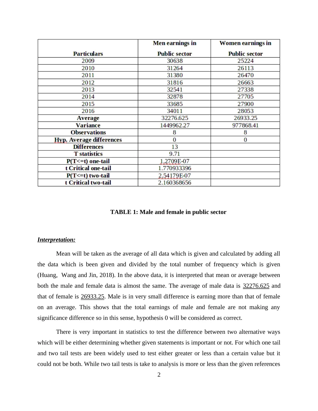
TABLE 1: Male and female in public sector
Interpretation:
Mean will be taken as the average of all data which is given and calculated by adding all
the data which is been given and divided by the total number of frequency which is given
(Huang, Wang and Jin, 2018). In the above data, it is interpreted that mean or average between
both the male and female data is almost the same. The average of male data is 32276.625 and
that of female is 26933.25. Male is in very small difference is earning more than that of female
on an average. This shows that the total earnings of male and female are not making any
significance difference so in this sense, hypothesis 0 will be considered as correct.
There is very important in statistics to test the difference between two alternative ways
which will be either determining whether given statements is important or not. For which one tail
and two tail tests are been widely used to test either greater or less than a certain value but it
could not be both. While two tail tests is take to analysis is more or less than the given references
2
Paraphrase This Document
Need a fresh take? Get an instant paraphrase of this document with our AI Paraphraser
value. If the population is been given then hypothesis testing is applied which will be telling
whether the claim is true or not. In order ot calculates the significance difference between the
earning of male and female in the above table we will be putting T test into the mean. So from
the above table it could be said that level of difference between the income is just 1.27>0.05
which tells that between male and female income there is not many variations. This also shows
that both male and female are receiving almost same level of income within the public sector of
UK. The government of UK who is giving the income are not promoting any kind of gender
inequality within company and giving same amount of income to both of them. This also tells
that income of male is slightly higher than that of female but not causing much difference.
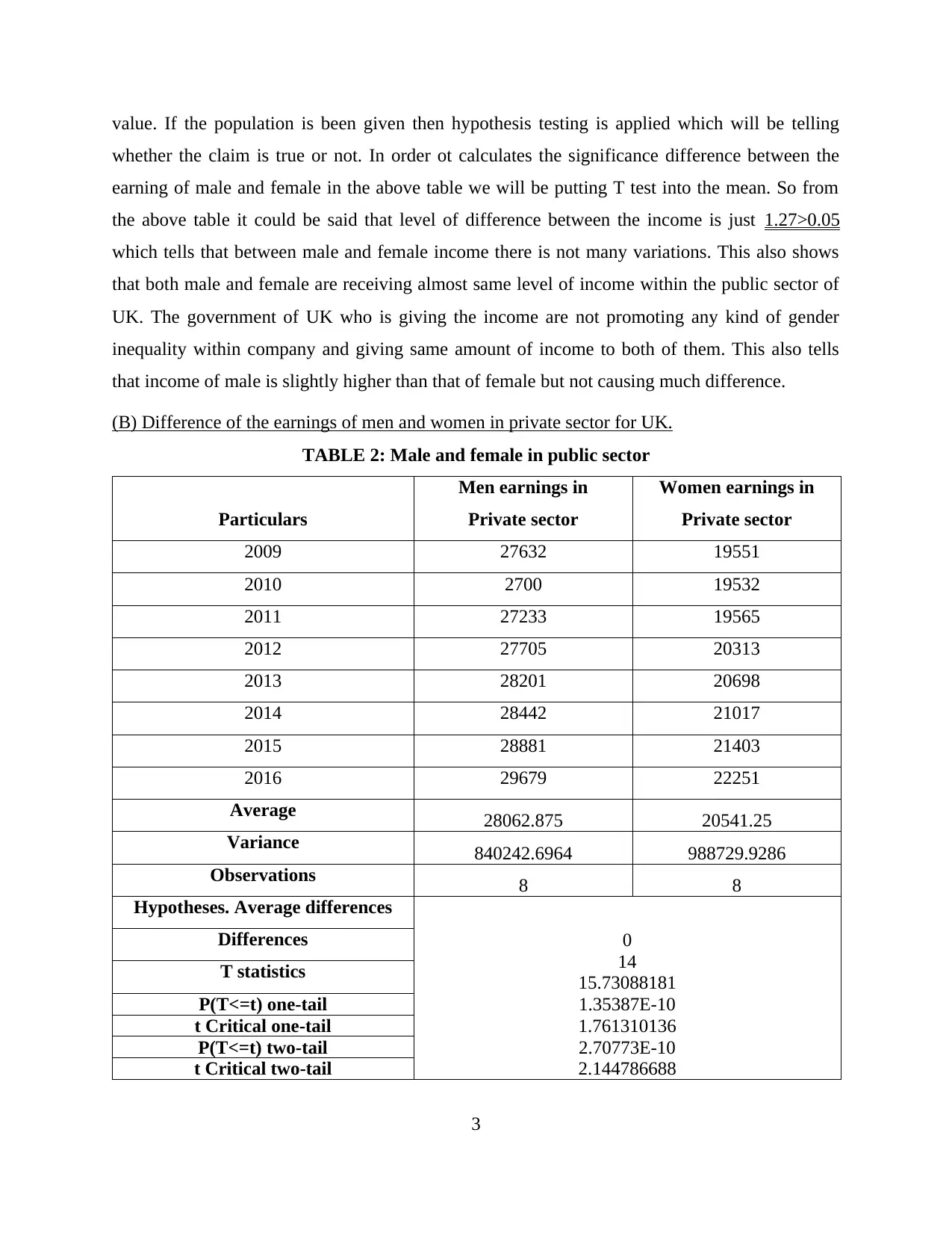
(B) Difference of the earnings of men and women in private sector for UK.
TABLE 2: Male and female in public sector
Particulars
Men earnings in
Private sector
Women earnings in
Private sector
2009 27632 19551
2010 2700 19532
2011 27233 19565
2012 27705 20313
2013 28201 20698
2014 28442 21017
2015 28881 21403
2016 29679 22251
Average 28062.875 20541.25
Variance 840242.6964 988729.9286
Observations 8 8
Hypotheses. Average differences
0
14
15.73088181
1.35387E-10
1.761310136
2.70773E-10
2.144786688
Differences
T statistics
P(T<=t) one-tail
t Critical one-tail
P(T<=t) two-tail
t Critical two-tail
3
whether the claim is true or not. In order ot calculates the significance difference between the
earning of male and female in the above table we will be putting T test into the mean. So from
the above table it could be said that level of difference between the income is just 1.27>0.05
which tells that between male and female income there is not many variations. This also shows
that both male and female are receiving almost same level of income within the public sector of
UK. The government of UK who is giving the income are not promoting any kind of gender
inequality within company and giving same amount of income to both of them. This also tells
that income of male is slightly higher than that of female but not causing much difference.
(B) Difference of the earnings of men and women in private sector for UK.
TABLE 2: Male and female in public sector
Particulars
Men earnings in
Private sector
Women earnings in
Private sector
2009 27632 19551
2010 2700 19532
2011 27233 19565
2012 27705 20313
2013 28201 20698
2014 28442 21017
2015 28881 21403
2016 29679 22251
Average 28062.875 20541.25
Variance 840242.6964 988729.9286
Observations 8 8
Hypotheses. Average differences
0
14
15.73088181
1.35387E-10
1.761310136
2.70773E-10
2.144786688
Differences
T statistics
P(T<=t) one-tail
t Critical one-tail
P(T<=t) two-tail
t Critical two-tail
3
Interpretation:
The same test which is done to calculate the difference within the income level of
male and female in public sector and the same will be done to calculate difference of income
level within private sector of UK. From the above table, it was interpreted that mean of male is
28062.875 and that of female is 20541.25 which shows that there is not much difference between
the earnings and income of both of them. This will also be telling that UK is highly promoting
gender equality within all the sectors of economy and giving same amount of income with a
minor difference. Variance is the spread between all the data which is set and thus measuring
that each number which is given within data how far that number is with mean of the whole
frequency. Thus, it can be clearly said that females are getting good pay in comparison with male
and that they are also showcasing their talent within public sector. The T test which is been don
in the above table also tells that 1.35>0.05 so there is also not much significance difference
between male and female within private sector of UK.
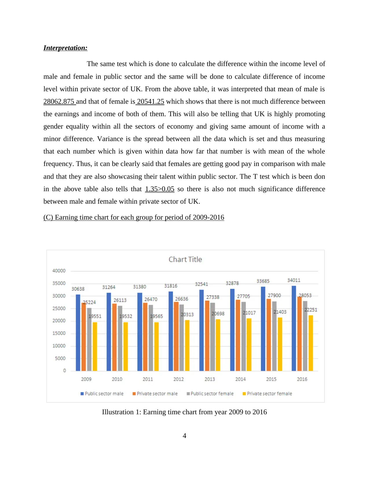
(C) Earning time chart for each group for period of 2009-2016
4
Illustration 1: Earning time chart from year 2009 to 2016
The same test which is done to calculate the difference within the income level of
male and female in public sector and the same will be done to calculate difference of income
level within private sector of UK. From the above table, it was interpreted that mean of male is
28062.875 and that of female is 20541.25 which shows that there is not much difference between
the earnings and income of both of them. This will also be telling that UK is highly promoting
gender equality within all the sectors of economy and giving same amount of income with a
minor difference. Variance is the spread between all the data which is set and thus measuring
that each number which is given within data how far that number is with mean of the whole
frequency. Thus, it can be clearly said that females are getting good pay in comparison with male
and that they are also showcasing their talent within public sector. The T test which is been don
in the above table also tells that 1.35>0.05 so there is also not much significance difference
between male and female within private sector of UK.
(C) Earning time chart for each group for period of 2009-2016
4
Illustration 1: Earning time chart from year 2009 to 2016
⊘ This is a preview!⊘
Do you want full access?
Subscribe today to unlock all pages.
Trusted by 1+ million students worldwide
Interpretation:
Time chart is the graph which will be showing the changes which are taking place within
the time period and time span (Wild, Utts and Horton, 2018). In the time chart, the time will be
shown on x-axis of chart and the other data whose time frequency which is to be taken out will
be shown on y-axis. The above time chart which will be telling that what is the difference in the
level of income of male and female income in both private and public sector from the time span
of 2009-2016. So, it is interpreted that although there is not much significance difference
between the income and earnings of male and female in private and public sector of UK, But
then also income of male in public sector is increasing with respect to that of others in data. The
income of males in public sector in 2009 was 30638 and it increased to 34011 till 2016 and this
was the same in the case of private sector in 2009 it was 27632 and in 2016 it was 29679.
Income of female in private and public sector also raised but not that much as compared to male
in these sectors. The income of female in private sector in 2009 and 2016 was 19551 and 22251
respectively. That of public sector earning of female was 25224 and 28053 in 2009 and 2016
respectively.
It is also seen that the income of both male and female is greater in public sector than that
of private sector which means that government is giving more salary to its employees as
compared to private sector employer.
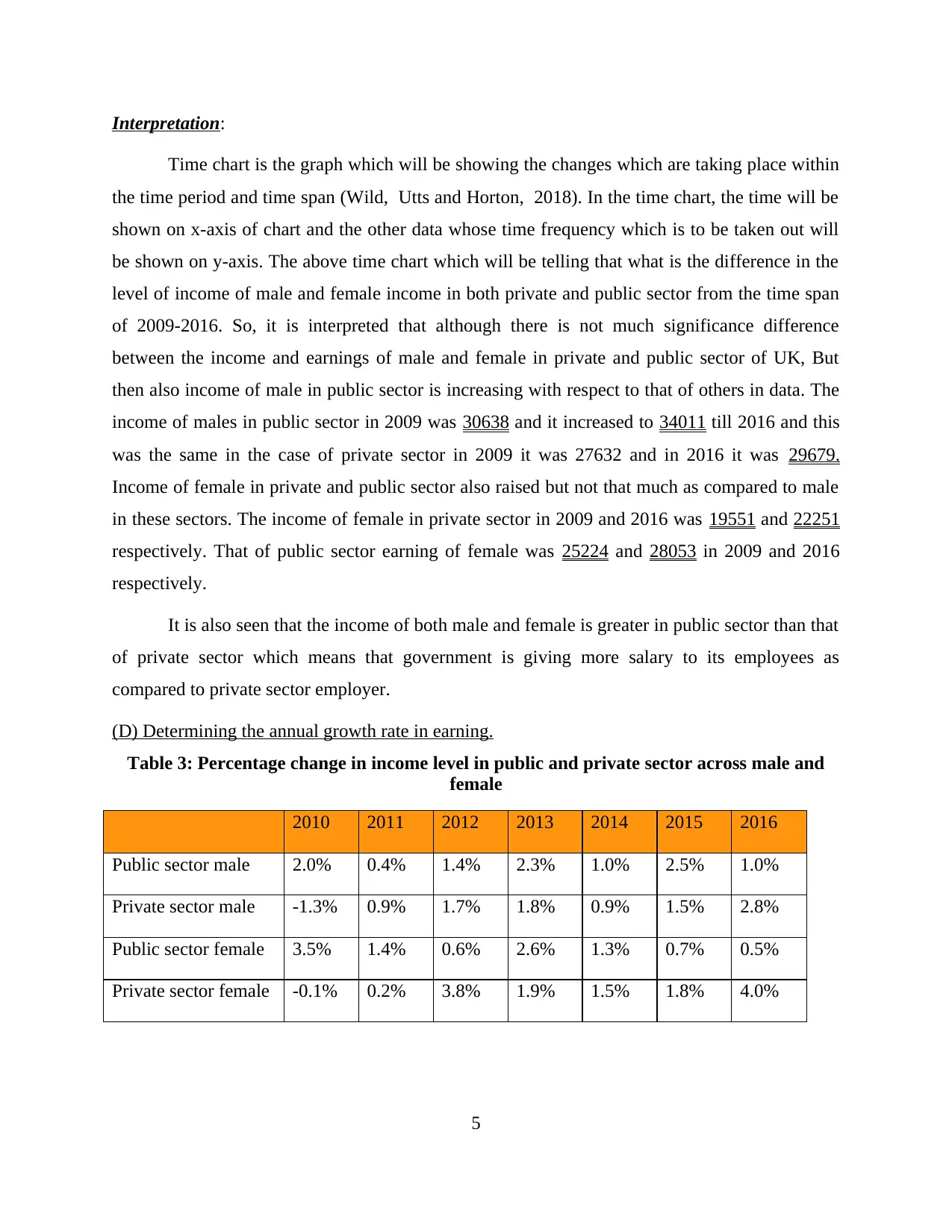
(D) Determining the annual growth rate in earning.
Table 3: Percentage change in income level in public and private sector across male and
female
2010 2011 2012 2013 2014 2015 2016
Public sector male 2.0% 0.4% 1.4% 2.3% 1.0% 2.5% 1.0%
Private sector male -1.3% 0.9% 1.7% 1.8% 0.9% 1.5% 2.8%
Public sector female 3.5% 1.4% 0.6% 2.6% 1.3% 0.7% 0.5%
Private sector female -0.1% 0.2% 3.8% 1.9% 1.5% 1.8% 4.0%
5
Time chart is the graph which will be showing the changes which are taking place within
the time period and time span (Wild, Utts and Horton, 2018). In the time chart, the time will be
shown on x-axis of chart and the other data whose time frequency which is to be taken out will
be shown on y-axis. The above time chart which will be telling that what is the difference in the
level of income of male and female income in both private and public sector from the time span
of 2009-2016. So, it is interpreted that although there is not much significance difference
between the income and earnings of male and female in private and public sector of UK, But
then also income of male in public sector is increasing with respect to that of others in data. The
income of males in public sector in 2009 was 30638 and it increased to 34011 till 2016 and this
was the same in the case of private sector in 2009 it was 27632 and in 2016 it was 29679.
Income of female in private and public sector also raised but not that much as compared to male
in these sectors. The income of female in private sector in 2009 and 2016 was 19551 and 22251
respectively. That of public sector earning of female was 25224 and 28053 in 2009 and 2016
respectively.
It is also seen that the income of both male and female is greater in public sector than that
of private sector which means that government is giving more salary to its employees as
compared to private sector employer.
(D) Determining the annual growth rate in earning.
Table 3: Percentage change in income level in public and private sector across male and
female
2010 2011 2012 2013 2014 2015 2016
Public sector male 2.0% 0.4% 1.4% 2.3% 1.0% 2.5% 1.0%
Private sector male -1.3% 0.9% 1.7% 1.8% 0.9% 1.5% 2.8%
Public sector female 3.5% 1.4% 0.6% 2.6% 1.3% 0.7% 0.5%
Private sector female -0.1% 0.2% 3.8% 1.9% 1.5% 1.8% 4.0%
5
Paraphrase This Document
Need a fresh take? Get an instant paraphrase of this document with our AI Paraphraser
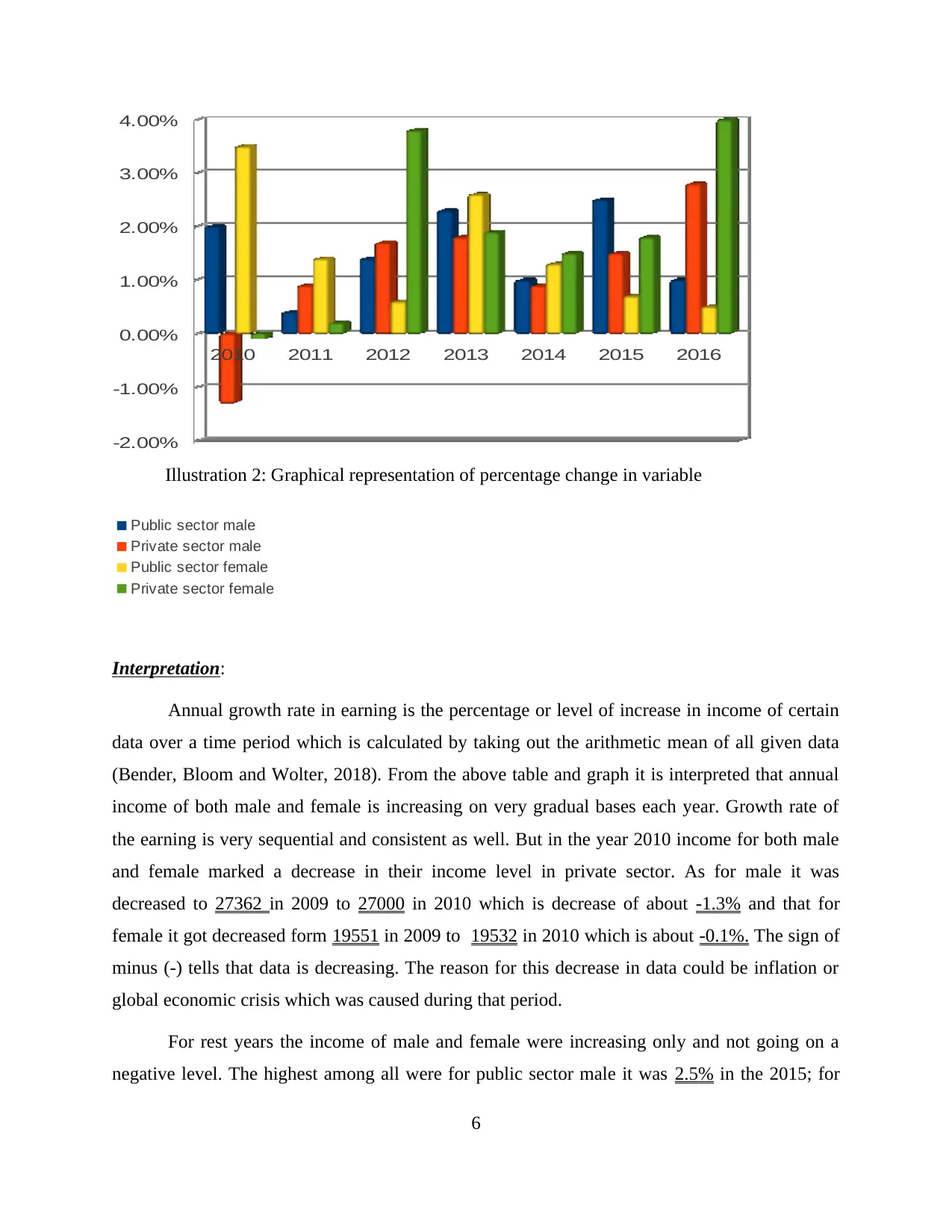
2010 2011 2012 2013 2014 2015 2016
-2.00%
-1.00%
0.00%
1.00%
2.00%
3.00%
4.00%
Illustration 2: Graphical representation of percentage change in variable
Public sector male
Private sector male
Public sector female
Private sector female
Interpretation:
Annual growth rate in earning is the percentage or level of increase in income of certain
data over a time period which is calculated by taking out the arithmetic mean of all given data
(Bender, Bloom and Wolter, 2018). From the above table and graph it is interpreted that annual
income of both male and female is increasing on very gradual bases each year. Growth rate of
the earning is very sequential and consistent as well. But in the year 2010 income for both male
and female marked a decrease in their income level in private sector. As for male it was
decreased to 27362 in 2009 to 27000 in 2010 which is decrease of about -1.3% and that for
female it got decreased form 19551 in 2009 to 19532 in 2010 which is about -0.1%. The sign of
minus (-) tells that data is decreasing. The reason for this decrease in data could be inflation or
global economic crisis which was caused during that period.
For rest years the income of male and female were increasing only and not going on a
negative level. The highest among all were for public sector male it was 2.5% in the 2015; for
6
public sector female it was 3.5% in 2010; for private sector male it was 2.8%; and that for private
sector female it was 4.0% in 2016. This increase of income of private sector female was also the
highest rise of income for all group.
TASK 2
Section A
2.1 Presentation of the data
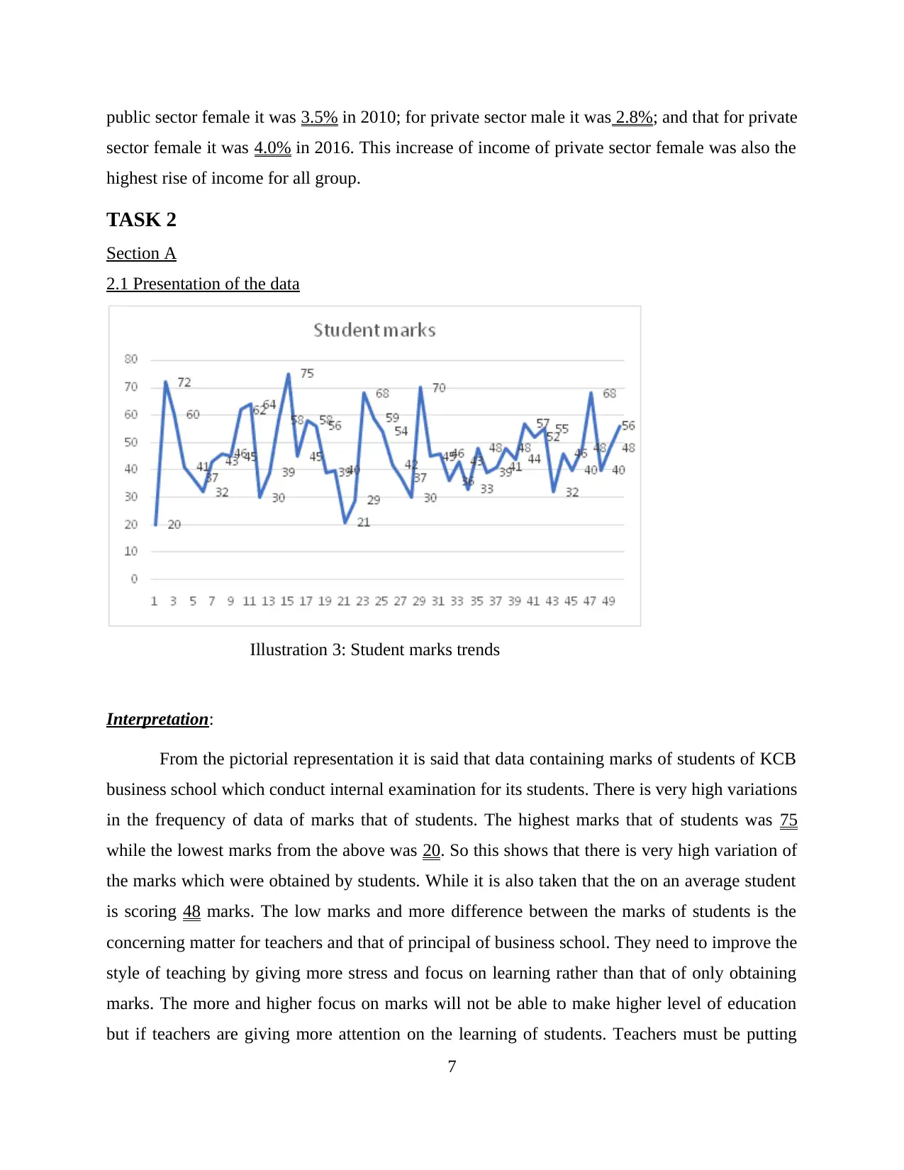
Illustration 3: Student marks trends
Interpretation:
From the pictorial representation it is said that data containing marks of students of KCB
business school which conduct internal examination for its students. There is very high variations
in the frequency of data of marks that of students. The highest marks that of students was 75
while the lowest marks from the above was 20. So this shows that there is very high variation of
the marks which were obtained by students. While it is also taken that the on an average student
is scoring 48 marks. The low marks and more difference between the marks of students is the
concerning matter for teachers and that of principal of business school. They need to improve the
style of teaching by giving more stress and focus on learning rather than that of only obtaining
marks. The more and higher focus on marks will not be able to make higher level of education
but if teachers are giving more attention on the learning of students. Teachers must be putting
7
sector female it was 4.0% in 2016. This increase of income of private sector female was also the
highest rise of income for all group.
TASK 2
Section A
2.1 Presentation of the data
Illustration 3: Student marks trends
Interpretation:
From the pictorial representation it is said that data containing marks of students of KCB
business school which conduct internal examination for its students. There is very high variations
in the frequency of data of marks that of students. The highest marks that of students was 75
while the lowest marks from the above was 20. So this shows that there is very high variation of
the marks which were obtained by students. While it is also taken that the on an average student
is scoring 48 marks. The low marks and more difference between the marks of students is the
concerning matter for teachers and that of principal of business school. They need to improve the
style of teaching by giving more stress and focus on learning rather than that of only obtaining
marks. The more and higher focus on marks will not be able to make higher level of education
but if teachers are giving more attention on the learning of students. Teachers must be putting
7
⊘ This is a preview!⊘
Do you want full access?
Subscribe today to unlock all pages.
Trusted by 1+ million students worldwide
their efforts in making students learn the things within classroom only so that they are not
required to learn the same thing again and again they can just revise the piece of work. Teachers
must also be trying to bring the total average marks of students to that of at least 60% so that
students can easily pass the said external examination.
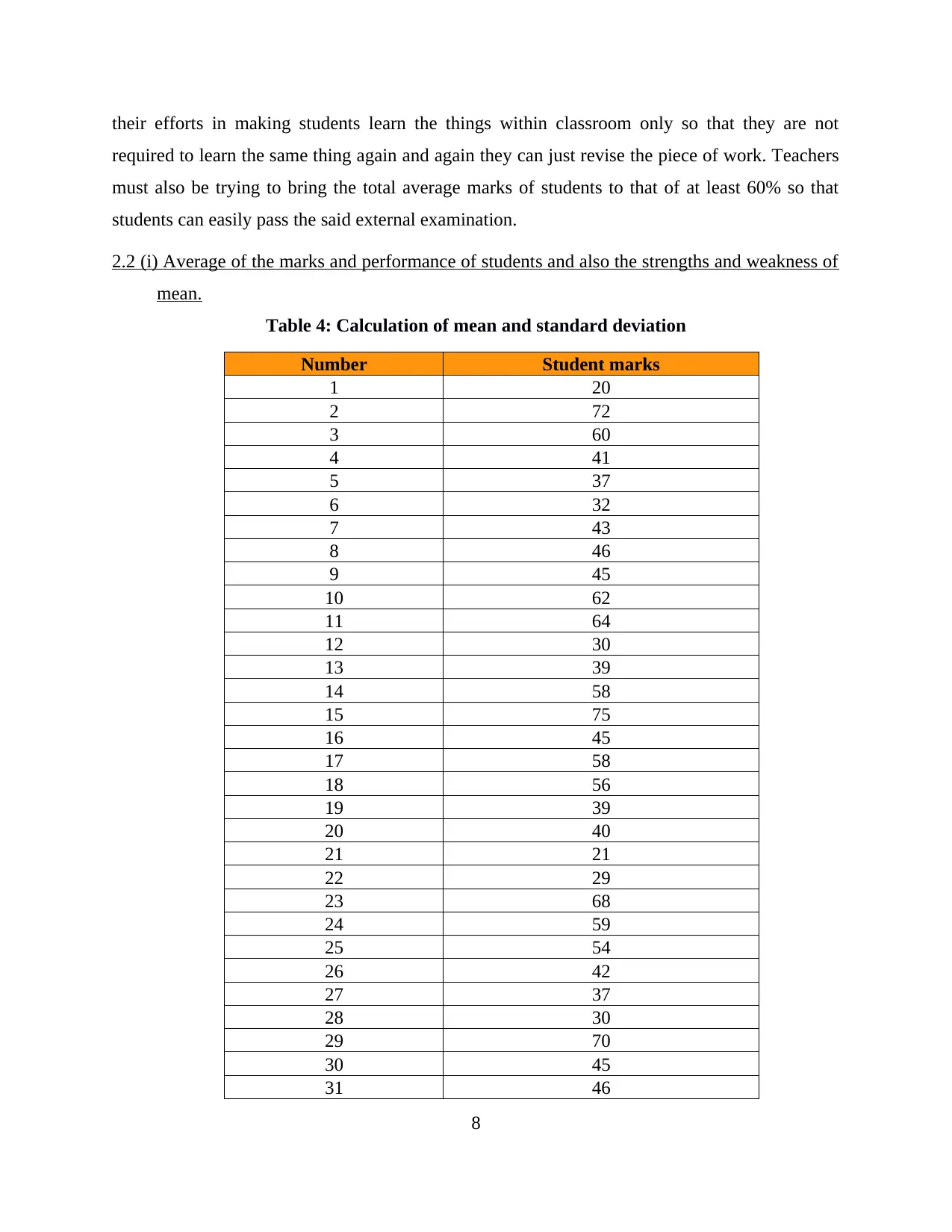
2.2 (i) Average of the marks and performance of students and also the strengths and weakness of
mean.
Table 4: Calculation of mean and standard deviation
Number Student marks
1 20
2 72
3 60
4 41
5 37
6 32
7 43
8 46
9 45
10 62
11 64
12 30
13 39
14 58
15 75
16 45
17 58
18 56
19 39
20 40
21 21
22 29
23 68
24 59
25 54
26 42
27 37
28 30
29 70
30 45
31 46
8
required to learn the same thing again and again they can just revise the piece of work. Teachers
must also be trying to bring the total average marks of students to that of at least 60% so that
students can easily pass the said external examination.
2.2 (i) Average of the marks and performance of students and also the strengths and weakness of
mean.
Table 4: Calculation of mean and standard deviation
Number Student marks
1 20
2 72
3 60
4 41
5 37
6 32
7 43
8 46
9 45
10 62
11 64
12 30
13 39
14 58
15 75
16 45
17 58
18 56
19 39
20 40
21 21
22 29
23 68
24 59
25 54
26 42
27 37
28 30
29 70
30 45
31 46
8
Paraphrase This Document
Need a fresh take? Get an instant paraphrase of this document with our AI Paraphraser
32 36
33 43
34 33
35 48
36 39
37 41
38 48
39 44
40 57
41 52
42 55
43 32
44 46
45 40
46 48
47 68
48 40
49 48
50 56
Mean 46.74
Mode 48
Standard Deviations 12.82187226
Interpretation:
From the above table it is clearly said that mean or average of all students of KCB
business school is about 46.74 while the middle or mode of the total part will be 48 and standard
deviations of the whole data is 12.82187226. The mean which is 46.74 this depict that about half
of the students of the class is failing in the subject and they must be working very hard so that
they could get good score in the subjects. The mode in the table is 48 which depicts that about
half of the students are scoring the average marks of 46.74 that means that they are getting the
passing marks only. So it is required for all the students to work hard in subjects which is been
taught to them and teachers must also be giving more attention to students so that they are able to
score good marks. The strengths and weaknesses of the above mentioned methods of calculating
statistical measurements are as follows:
9
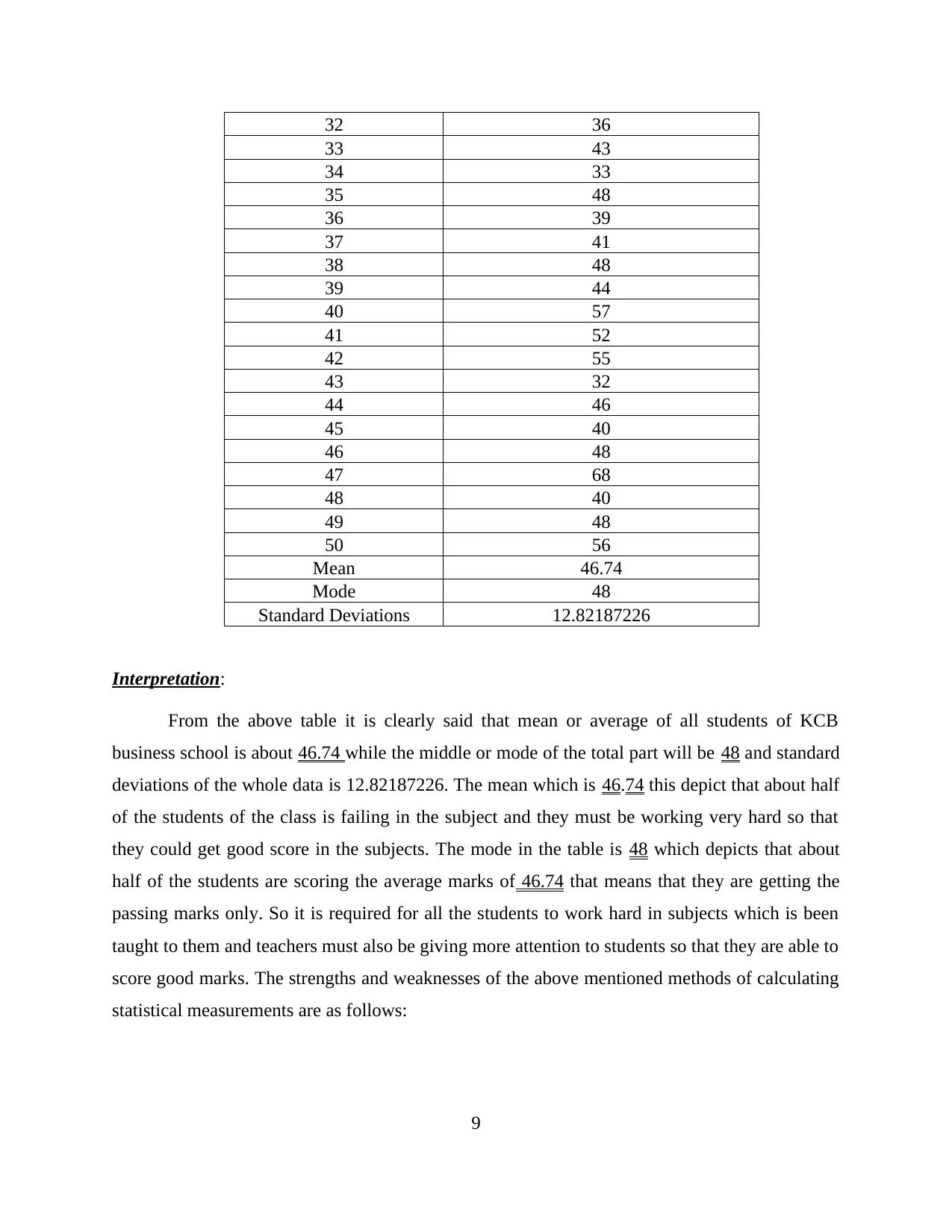
Mean:
Strength Weaknesses
1. The simplicity and easiness of the arithmetic
mean or average makes the first strength of it.
2. All the data which is made available within
the frequency will be including in the
calculation part (Merits and demerits of mean,
median and mode. 2018).
3. The data which is of no use will not be
included in.
4. Mean could be regarded to as representation
of the given data as it is based on all
observations.
1. In this form qualitative data is of no use as
mean will not be calculating intelligence or
honesty of the given population.
2. If the class interval are having the open ends
the mean could be calculated.
3. All the highest and lowest observation is
very many gets affected by mean so that
extreme observation is not taken into account.
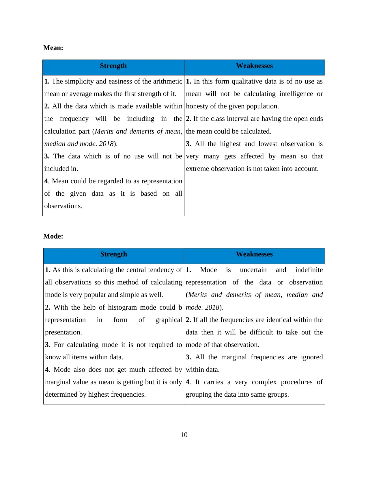
Mode:
Strength Weaknesses
1. As this is calculating the central tendency of
all observations so this method of calculating
mode is very popular and simple as well.
2. With the help of histogram mode could b
representation in form of graphical
presentation.
3. For calculating mode it is not required to
know all items within data.
4. Mode also does not get much affected by
marginal value as mean is getting but it is only
determined by highest frequencies.
1. Mode is uncertain and indefinite
representation of the data or observation
(Merits and demerits of mean, median and
mode. 2018).
2. If all the frequencies are identical within the
data then it will be difficult to take out the
mode of that observation.
3. All the marginal frequencies are ignored
within data.
4. It carries a very complex procedures of
grouping the data into same groups.
10
Strength Weaknesses
1. The simplicity and easiness of the arithmetic
mean or average makes the first strength of it.
2. All the data which is made available within
the frequency will be including in the
calculation part (Merits and demerits of mean,
median and mode. 2018).
3. The data which is of no use will not be
included in.
4. Mean could be regarded to as representation
of the given data as it is based on all
observations.
1. In this form qualitative data is of no use as
mean will not be calculating intelligence or
honesty of the given population.
2. If the class interval are having the open ends
the mean could be calculated.
3. All the highest and lowest observation is
very many gets affected by mean so that
extreme observation is not taken into account.
Mode:
Strength Weaknesses
1. As this is calculating the central tendency of
all observations so this method of calculating
mode is very popular and simple as well.
2. With the help of histogram mode could b
representation in form of graphical
presentation.
3. For calculating mode it is not required to
know all items within data.
4. Mode also does not get much affected by
marginal value as mean is getting but it is only
determined by highest frequencies.
1. Mode is uncertain and indefinite
representation of the data or observation
(Merits and demerits of mean, median and
mode. 2018).
2. If all the frequencies are identical within the
data then it will be difficult to take out the
mode of that observation.
3. All the marginal frequencies are ignored
within data.
4. It carries a very complex procedures of
grouping the data into same groups.
10
⊘ This is a preview!⊘
Do you want full access?
Subscribe today to unlock all pages.
Trusted by 1+ million students worldwide
1 out of 23
Related Documents


Your All-in-One AI-Powered Toolkit for Academic Success.
+13062052269
info@desklib.com
Available 24*7 on WhatsApp / Email
![[object Object]](/_next/static/media/star-bottom.7253800d.svg)
Unlock your academic potential
Copyright © 2020–2026 A2Z Services. All Rights Reserved. Developed and managed by ZUCOL.