Statistics for Management: Analysis of Earnings, Growth, and Inventory
VerifiedAdded on 2020/12/24
|18
|2936
|430
Report
AI Summary
This report provides a comprehensive statistical analysis for management, covering several key areas. It begins with hypothesis testing on earnings in the public and private sectors, comparing men's and women's salaries, and presents the findings through graphical representations and annual growth rate calculations. The report then utilizes ogive curves to estimate median hourly earnings and quartiles, followed by calculations of mean and standard deviation. Further analysis involves the application of economic order quantity (EOQ) to inventory management, determining reorder durations and inventory policy costs. The report concludes with graphical representations of price index changes and the creation of an ogive curve using provided data, demonstrating the practical application of statistical tools in business decision-making.

Statistics for
Management
Management
Paraphrase This Document
Need a fresh take? Get an instant paraphrase of this document with our AI Paraphraser
Table of Contents
INTRODUCTION...........................................................................................................................1
ACTIVITY 1....................................................................................................................................1
a) Testing Hypothesis for mean earning in public sector............................................................1
b) Testing hypothesis for mean earning in private sector...........................................................2
c) Graphical representation of earning time chart for each group...............................................3
d) Calculation of Annual Growth rate for each segment............................................................5
ACTIVITY 2....................................................................................................................................6
a) Use of ogive to estimate the median hourly earnings and the quartiles..................................6
b) Calculation of Mean and Standard Deviation of hourly earning............................................8
ACTIVITY 3..................................................................................................................................10
a) Calculation of Economic order quantity...............................................................................10
b) Calculation of re order duration of Tee Shirts......................................................................11
c) Calculation of Inventory Policy Cost....................................................................................12
d) Calculation of current level service to the customers...........................................................12
e) Calculation of Re order level................................................................................................12
ACTIVITY 4 .................................................................................................................................13
(a) Graphical representation to show changes in price index as per CPI, CPIH and RPI:........13
(b) Creating Ogive using table 1...............................................................................................14
CONCLUSION..............................................................................................................................15
REFERENCES..............................................................................................................................16
INTRODUCTION
Business statistics is considered as a very important tool for the company. It helps the
managers to find out the latest trends and develop their strategies according to that (Brozović and
Schlenker, 2011). It also helps the management to analyse the growth rate of the company as it
shows the past records in a graphical representation. This graphical representation helps the user
to understand it easily and formulate new strategies. In the preparation of this report statistical
tools such as ogive curve, central tendencies are used to determine the use of these tools in
business and how this helps in decision making process.
ACTIVITY 1
A hypothesis is a testable statement which is used to test the relation between two or
more variable (Embrechts and Hofert, 2014). It is also used to identify the validity of the
relationship between the variables. Hypothesis helps the mangers to take decisions for the
benefits of the organisation. It is used by the organisation to measure the validity of the
statement. Various methods such as measure of central tendency, dispersion, etc. are used to
measure the hypothesis. It is used to analyse the assumption which is made for a particular set of
data that whether the hypothesis is accepted or rejected. Two events as null hypothesis(H0) and
alternative hypothesis(H1) are made to validate the statement.
a) Testing Hypothesis for mean earning in public sector.
As per the case, a study is conducted on the earning of 1000 persons on the basis of
gender, for this purpose the sample is selected on a random basis. In this case the assumption is
made for the analysis of the average annual gross earning of men and women's salary. For the
analysis of the above given scenario following assumptions are made:
Null Hypothesis (H0): it is considered as the earning of men in public sector is not
significant to the earning of the women in public sector.
Alternative Hypothesis (H1): It is considered that the earning of men in public sector is
significant to the earning of women.
1
⊘ This is a preview!⊘
Do you want full access?
Subscribe today to unlock all pages.
Trusted by 1+ million students worldwide
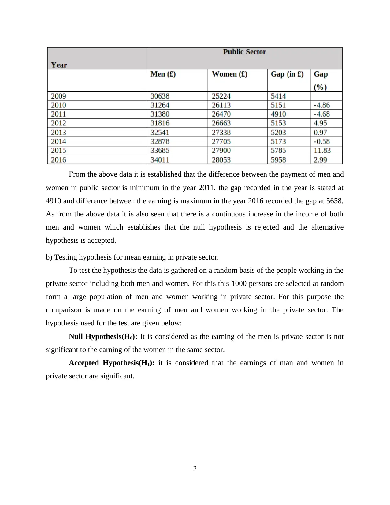
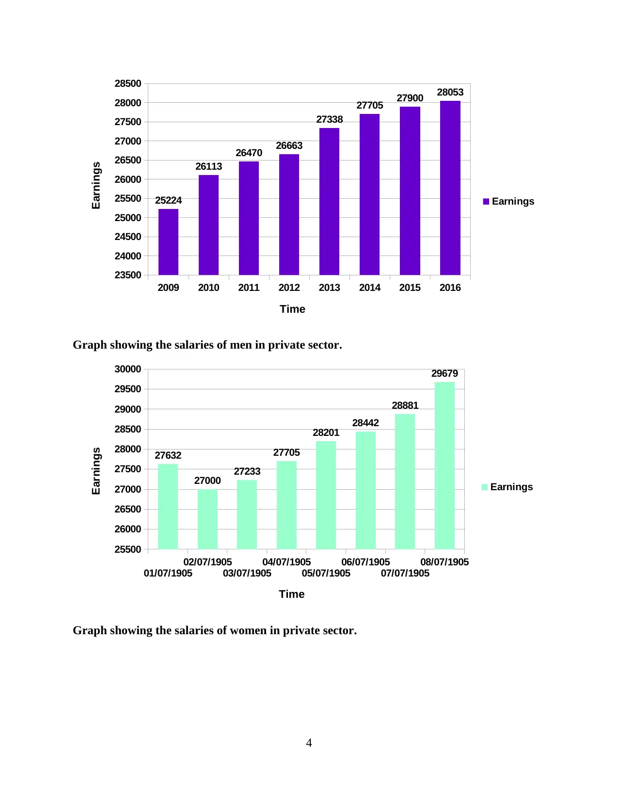
From the above data it is established that the difference between the payment of men and
women in public sector is minimum in the year 2011. the gap recorded in the year is stated at
4910 and difference between the earning is maximum in the year 2016 recorded the gap at 5658.
As from the above data it is also seen that there is a continuous increase in the income of both
men and women which establishes that the null hypothesis is rejected and the alternative
hypothesis is accepted.
b) Testing hypothesis for mean earning in private sector.
To test the hypothesis the data is gathered on a random basis of the people working in the
private sector including both men and women. For this this 1000 persons are selected at random
form a large population of men and women working in private sector. For this purpose the
comparison is made on the earning of men and women working in the private sector. The
hypothesis used for the test are given below:
Null Hypothesis(H0): It is considered as the earning of the men is private sector is not
significant to the earning of the women in the same sector.
Accepted Hypothesis(H1): it is considered that the earnings of man and women in
private sector are significant.
2
Paraphrase This Document
Need a fresh take? Get an instant paraphrase of this document with our AI Paraphraser
As per the above given data it has been analysed that the difference between earning of
men and women in the private sector is approximately equal to 7500 in the year 2010-2016
expect in the year 2009 it is recorded as 8081. This states that the null hypothesis is rejected and
the alternative hypothesis is accepted.
c) Graphical representation of earning time chart for each group.
Graph showing the salaries of men worker in public sector.
2009 2010 2011 2012 2013 2014 2015 2016
28000
29000
30000
31000
32000
33000
34000
35000
30638
31264 31380
31816
32541 32878
33685 34011
Earnings
Time
Earnings
Graph showing the salaries of women in public sector.
3
2009 2010 2011 2012 2013 2014 2015 2016
23500
24000
24500
25000
25500
26000
26500
27000
27500
28000
28500
25224
26113
26470 26663
27338
27705 27900 28053
Earnings
Time
Earnings
Graph showing the salaries of men in private sector.
01/07/1905
02/07/1905
03/07/1905
04/07/1905
05/07/1905
06/07/1905
07/07/1905
08/07/1905
25500
26000
26500
27000
27500
28000
28500
29000
29500
30000
27632
27000 27233
27705
28201 28442
28881
29679
Earnings
Time
Earnings
Graph showing the salaries of women in private sector.
4
⊘ This is a preview!⊘
Do you want full access?
Subscribe today to unlock all pages.
Trusted by 1+ million students worldwide
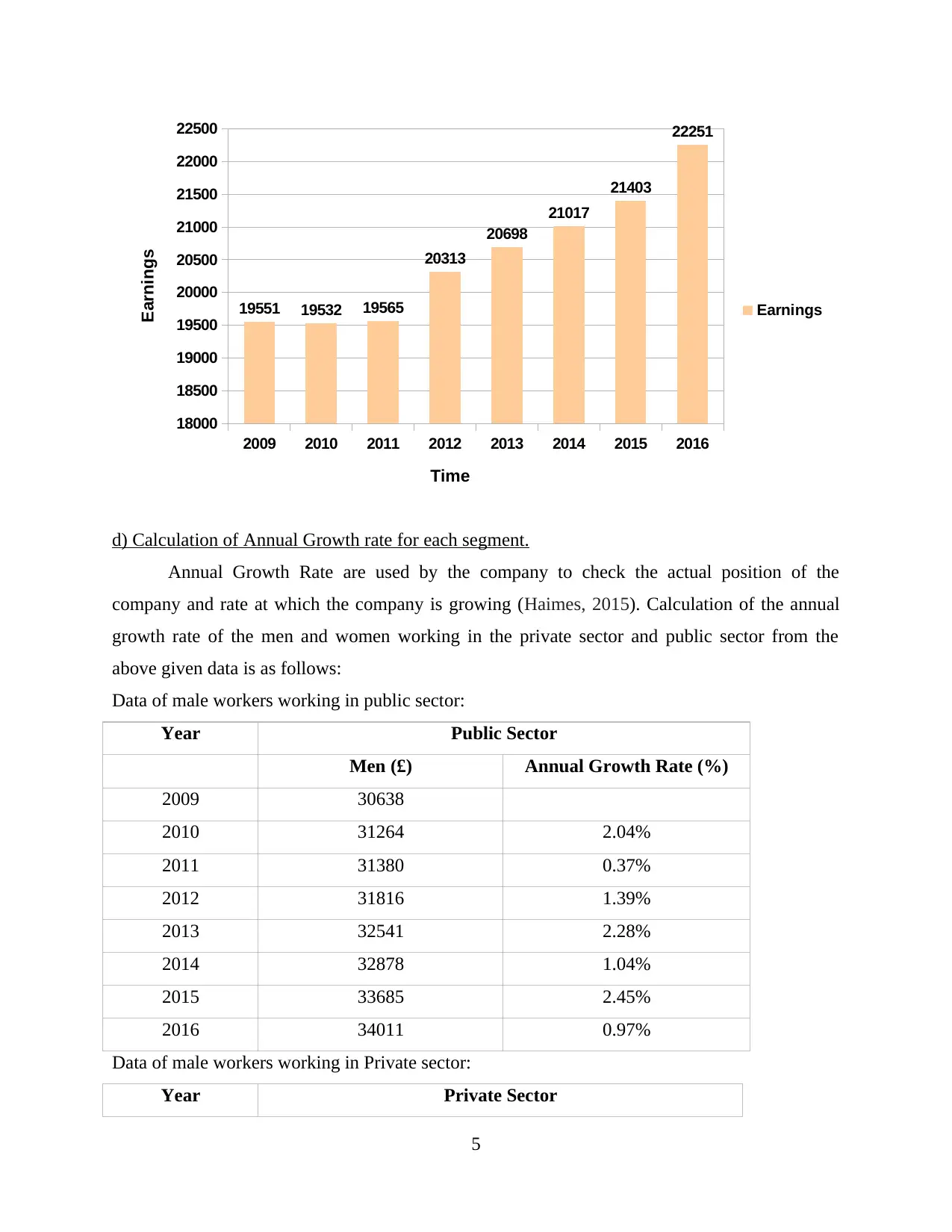
2009 2010 2011 2012 2013 2014 2015 2016
18000
18500
19000
19500
20000
20500
21000
21500
22000
22500
19551 19532 19565
20313
20698
21017
21403
22251
Earnings
Time
Earnings
d) Calculation of Annual Growth rate for each segment.
Annual Growth Rate are used by the company to check the actual position of the
company and rate at which the company is growing (Haimes, 2015). Calculation of the annual
growth rate of the men and women working in the private sector and public sector from the
above given data is as follows:
Data of male workers working in public sector:
Year Public Sector
Men (£) Annual Growth Rate (%)
2009 30638
2010 31264 2.04%
2011 31380 0.37%
2012 31816 1.39%
2013 32541 2.28%
2014 32878 1.04%
2015 33685 2.45%
2016 34011 0.97%
Data of male workers working in Private sector:
Year Private Sector
5
Paraphrase This Document
Need a fresh take? Get an instant paraphrase of this document with our AI Paraphraser
Men (£) Annual Growth Rate (%)
2009 27632 0.00%
2010 27000 -2.29%
2011 27233 0.86%
2012 27705 1.73%
2013 28201 1.79%
2014 28442 0.85%
2015 28881 1.54%
2016 29679 2.76%
Data of female workers working in Public sector:
Year Public Sector
Women (£) Annual Growth Rate (%)
2009 25224
2010 26113 3.52%
2011 26470 1.37%
2012 26663 0.73%
2013 27338 2.53%
2014 27705 1.34%
2015 27900 0.70%
Data of female workers working in Private sector:
Year Private Sector
Earnings Annual Growth Rate (%)
2009 19551
2010 19532 -0.10%
2011 19565 0.17%
2012 20313 3.82%
2013 20698 1.90%
2014 21017 1.54%
2015 21403 1.84%
2016 22251 3.96%
6
ACTIVITY 2
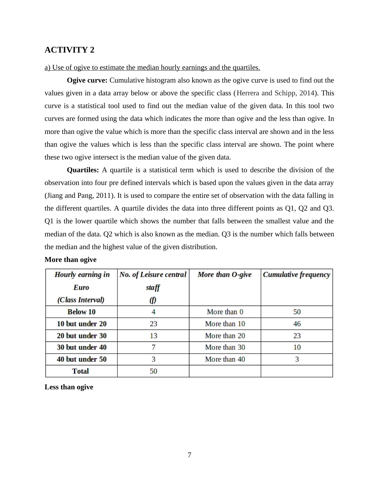
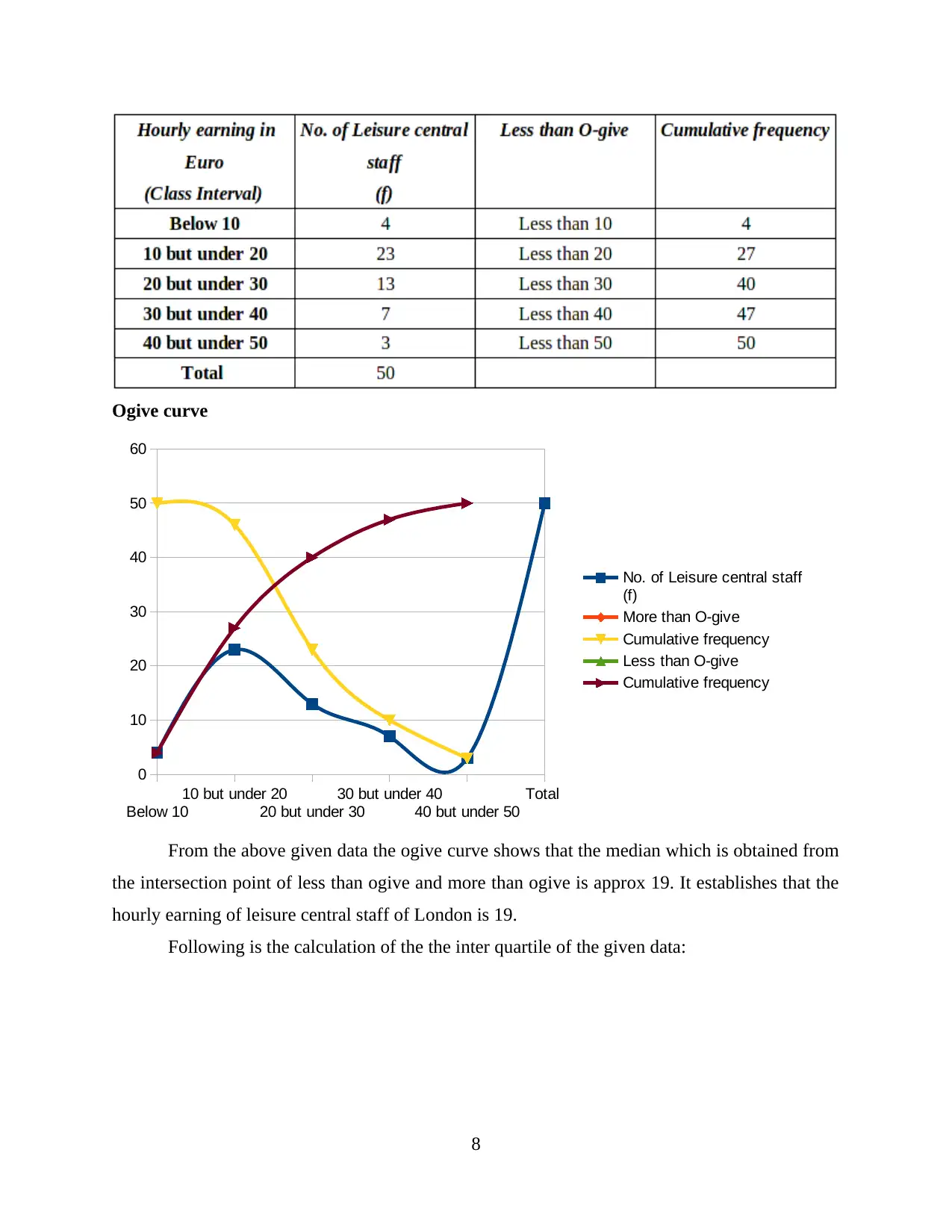
a) Use of ogive to estimate the median hourly earnings and the quartiles.
Ogive curve: Cumulative histogram also known as the ogive curve is used to find out the
values given in a data array below or above the specific class (Herrera and Schipp, 2014). This
curve is a statistical tool used to find out the median value of the given data. In this tool two
curves are formed using the data which indicates the more than ogive and the less than ogive. In
more than ogive the value which is more than the specific class interval are shown and in the less
than ogive the values which is less than the specific class interval are shown. The point where
these two ogive intersect is the median value of the given data.
Quartiles: A quartile is a statistical term which is used to describe the division of the
observation into four pre defined intervals which is based upon the values given in the data array
(Jiang and Pang, 2011). It is used to compare the entire set of observation with the data falling in
the different quartiles. A quartile divides the data into three different points as Q1, Q2 and Q3.
Q1 is the lower quartile which shows the number that falls between the smallest value and the
median of the data. Q2 which is also known as the median. Q3 is the number which falls between
the median and the highest value of the given distribution.
More than ogive
Less than ogive
7
⊘ This is a preview!⊘
Do you want full access?
Subscribe today to unlock all pages.
Trusted by 1+ million students worldwide
Ogive curve
Below 10
10 but under 20
20 but under 30
30 but under 40
40 but under 50
Total
0
10
20
30
40
50
60
No. of Leisure central staff
(f)
More than O-give
Cumulative frequency
Less than O-give
Cumulative frequency
From the above given data the ogive curve shows that the median which is obtained from
the intersection point of less than ogive and more than ogive is approx 19. It establishes that the
hourly earning of leisure central staff of London is 19.
Following is the calculation of the the inter quartile of the given data:
8
Paraphrase This Document
Need a fresh take? Get an instant paraphrase of this document with our AI Paraphraser
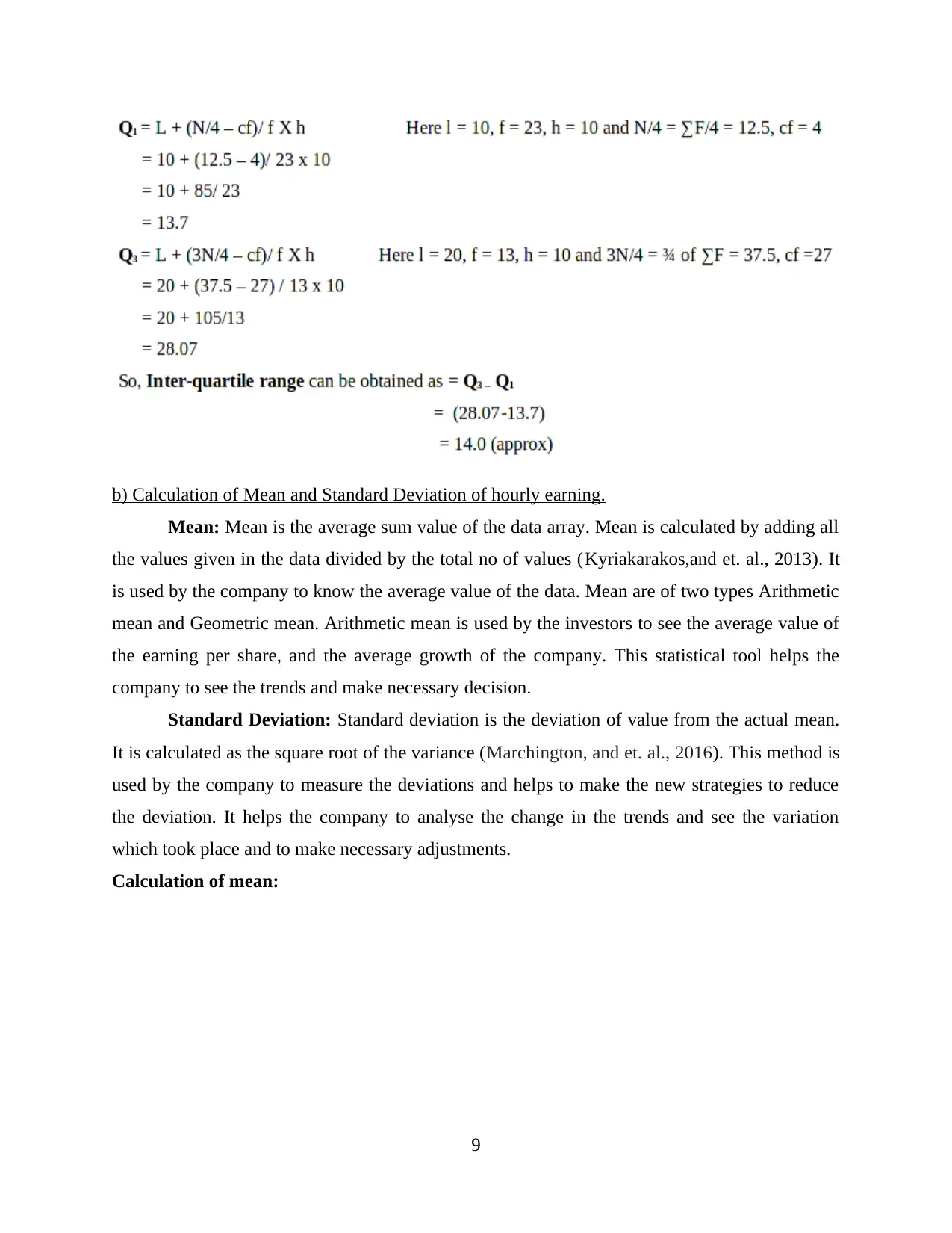
b) Calculation of Mean and Standard Deviation of hourly earning.
Mean: Mean is the average sum value of the data array. Mean is calculated by adding all
the values given in the data divided by the total no of values (Kyriakarakos,and et. al., 2013). It
is used by the company to know the average value of the data. Mean are of two types Arithmetic
mean and Geometric mean. Arithmetic mean is used by the investors to see the average value of
the earning per share, and the average growth of the company. This statistical tool helps the
company to see the trends and make necessary decision.
Standard Deviation: Standard deviation is the deviation of value from the actual mean.
It is calculated as the square root of the variance (Marchington, and et. al., 2016). This method is
used by the company to measure the deviations and helps to make the new strategies to reduce
the deviation. It helps the company to analyse the change in the trends and see the variation
which took place and to make necessary adjustments.
Calculation of mean:
9
working notes:
Comparison between the earning in two region:
10
Comparison between the earning in two region:
10
⊘ This is a preview!⊘
Do you want full access?
Subscribe today to unlock all pages.
Trusted by 1+ million students worldwide
1 out of 18
Related Documents


Your All-in-One AI-Powered Toolkit for Academic Success.
+13062052269
info@desklib.com
Available 24*7 on WhatsApp / Email
![[object Object]](/_next/static/media/star-bottom.7253800d.svg)
Unlock your academic potential
Copyright © 2020–2026 A2Z Services. All Rights Reserved. Developed and managed by ZUCOL.