Statistics of Management Report: Data Analysis and Findings

Verified

Added on  2020/06/06

|20
|3742
|165
Report
AI Summary
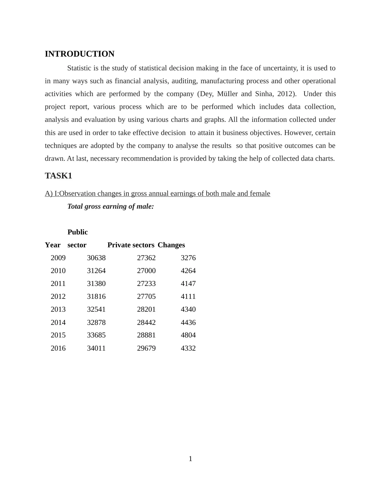
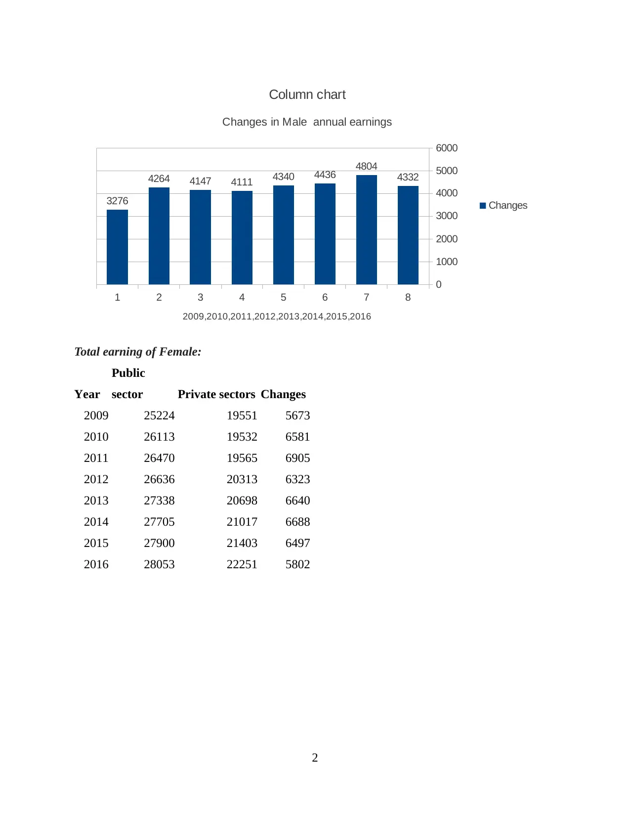
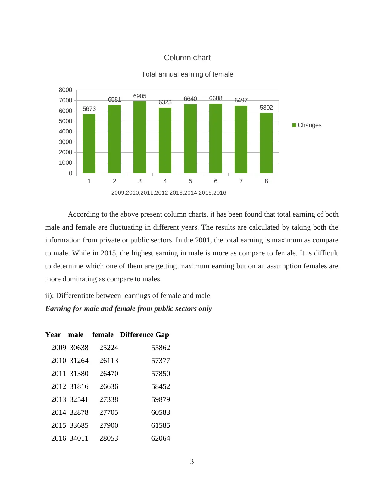
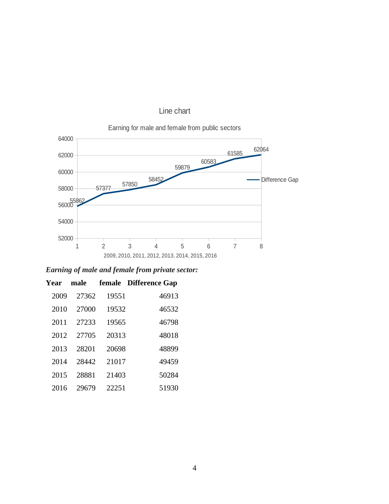
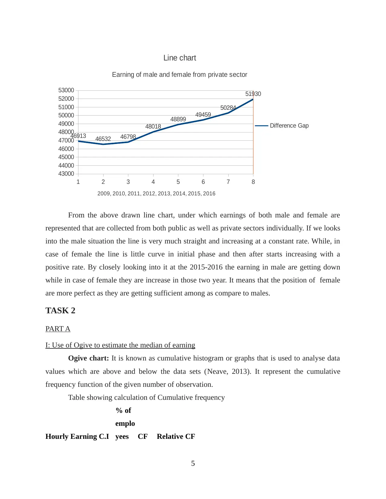
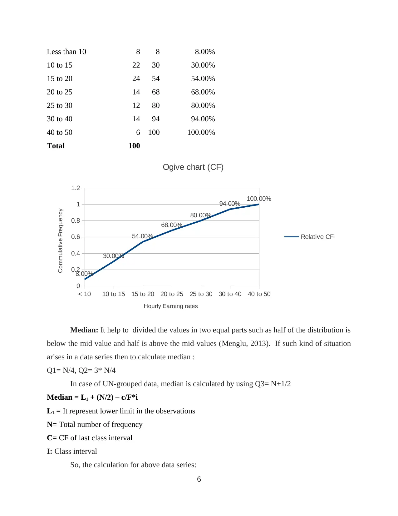
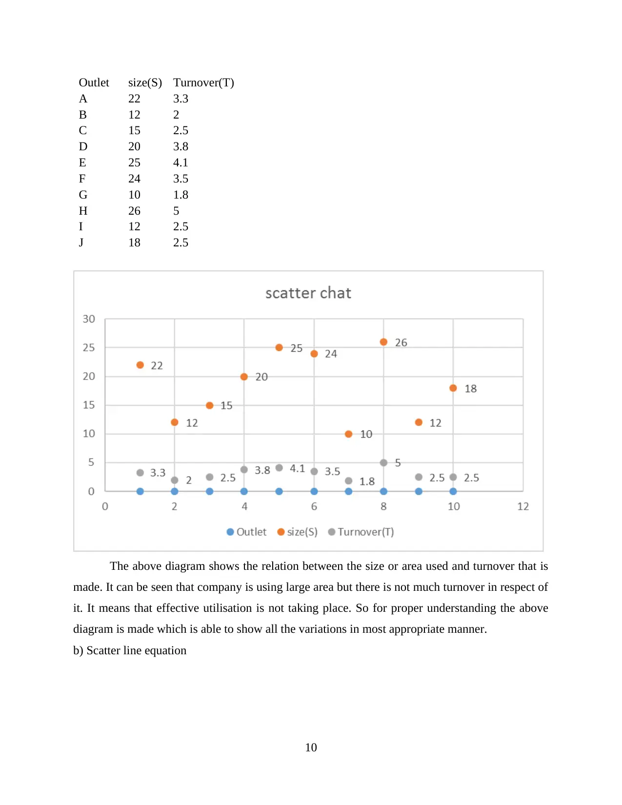
This report presents a statistical analysis of management data, encompassing various techniques and methodologies. It begins with an introduction to statistics and its applications in business, followed by a task-based approach to data analysis. Task 1 focuses on observing changes in gross annual earnings for both male and female employees, differentiating between their earnings, and presenting the data using column charts. Task 2 delves into the use of ogive charts to estimate the median of earnings, calculates mean and standard deviation, and compares data analysis between different regions. Part B of Task 2 investigates the relationship between outlet size and turnover using scatter diagrams, determining turnover, and calculating the correlation coefficient. Task 3 addresses the total number of deliveries, the number of bottles involved, and economic order quantity, offering suggestions for improvement. Task 4 communicates findings using line charts and ogives. The report concludes with a summary of findings and recommendations, along with a list of references. The report uses various statistical tools and techniques to analyze data, draw conclusions, and provide valuable insights for effective decision-making in a business context.
Document Page
Statistics of management
tabler-icon-diamond-filled.svg

Paraphrase This Document

Need a fresh take? Get an instant paraphrase of this document with our AI Paraphraser
Document Page
Table of Contents
INTRODUCTION...........................................................................................................................1
TASK1.............................................................................................................................................1
A) I:Observation changes in gross annual earnings of both male and female............................1
ii): Differentiate between earnings of female and male.............................................................3
TASK 2............................................................................................................................................5
PART A.......................................................................................................................................5
I: Use of Ogive to estimate the median of earning......................................................................5
ii): Calculation of mean and standard deviation.........................................................................7
b: .................................................................................................................................................9
PART B.......................................................................................................................................9
TASK 3..........................................................................................................................................12
a) Total number of deliveries in year........................................................................................13
b) Calculation of Number of bottles involved in each delivery................................................13
c) Economic order quantity.......................................................................................................13
d) Changes and suggestions......................................................................................................13
TASK 4..........................................................................................................................................14
a) Communication of findings with the use of line chart..........................................................14
b) Representation with the use of ogives..................................................................................15
CONCLUSION..............................................................................................................................16
REFERENCES..............................................................................................................................18
Document Page
INTRODUCTION
Statistic is the study of statistical decision making in the face of uncertainty, it is used to
in many ways such as financial analysis, auditing, manufacturing process and other operational
activities which are performed by the company (Dey, MüIler and Sinha, 2012). Under this
project report, various process which are to be performed which includes data collection,
analysis and evaluation by using various charts and graphs. All the information collected under
this are used in order to take effective decision to attain it business objectives. However, certain
techniques are adopted by the company to analyse the results so that positive outcomes can be
drawn. At last, necessary recommendation is provided by taking the help of collected data charts.
TASK1
A) I:Observation changes in gross annual earnings of both male and female
Total gross earning of male:
Year
Public
sector Private sectors Changes
2009 30638 27362 3276
2010 31264 27000 4264
2011 31380 27233 4147
2012 31816 27705 4111
2013 32541 28201 4340
2014 32878 28442 4436
2015 33685 28881 4804
2016 34011 29679 4332
1
Document Page
1 2 3 4 5 6 7 8
0
1000
2000
3000
4000
5000
6000
3276
4264 4147 4111 4340 4436 4804
4332
Column chart
Changes in Male annual earnings
Changes
2009,2010,2011,2012,2013,2014,2015,2016
Total earning of Female:
Year
Public
sector Private sectors Changes
2009 25224 19551 5673
2010 26113 19532 6581
2011 26470 19565 6905
2012 26636 20313 6323
2013 27338 20698 6640
2014 27705 21017 6688
2015 27900 21403 6497
2016 28053 22251 5802
2
tabler-icon-diamond-filled.svg

Paraphrase This Document

Need a fresh take? Get an instant paraphrase of this document with our AI Paraphraser
Document Page
1 2 3 4 5 6 7 8
0
1000
2000
3000
4000
5000
6000
7000
8000
5673
6581 6905 6323 6640 6688 6497
5802
Column chart
Total annual earning of female
Changes
2009,2010,2011,2012,2013,2014,2015,2016
According to the above present column charts, it has been found that total earning of both
male and female are fluctuating in different years. The results are calculated by taking both the
information from private or public sectors. In the 2001, the total earning is maximum as compare
to male. While in 2015, the highest earning in male is more as compare to female. It is difficult
to determine which one of them are getting maximum earning but on an assumption females are
more dominating as compare to males.
ii): Differentiate between earnings of female and male
Earning for male and female from public sectors only
Year male female Difference Gap
2009 30638 25224 55862
2010 31264 26113 57377
2011 31380 26470 57850
2012 31816 26636 58452
2013 32541 27338 59879
2014 32878 27705 60583
2015 33685 27900 61585
2016 34011 28053 62064
3
Document Page
1 2 3 4 5 6 7 8
52000
54000
56000
58000
60000
62000
64000
55862
57377 57850 58452
59879 60583
61585 62064
Line chart
Earning for male and female from public sectors
Difference Gap
2009, 2010, 2011, 2012, 2013, 2014, 2015, 2016
Earning of male and female from private sector:
Year male female Difference Gap
2009 27362 19551 46913
2010 27000 19532 46532
2011 27233 19565 46798
2012 27705 20313 48018
2013 28201 20698 48899
2014 28442 21017 49459
2015 28881 21403 50284
2016 29679 22251 51930
4
Document Page
1 2 3 4 5 6 7 8
43000
44000
45000
46000
47000
48000
49000
50000
51000
52000
53000
46913 46532 46798
48018
48899 49459
50284
51930
Line chart
Earning of male and female from private sector
Difference Gap
2009, 2010, 2011, 2012, 2013, 2014, 2015, 2016
From the above drawn line chart, under which earnings of both male and female are
represented that are collected from both public as well as private sectors individually. If we looks
into the male situation the line is very much straight and increasing at a constant rate. While, in
case of female the line is little curve in initial phase and then after starts increasing with a
positive rate. By closely looking into it at the 2015-2016 the earning in male are getting down
while in case of female they are increase in those two year. It means that the position of female
are more perfect as they are getting sufficient among as compare to males.
TASK 2
PART A
I: Use of Ogive to estimate the median of earning
Ogive chart: It is known as cumulative histogram or graphs that is used to analyse data
values which are above and below the data sets (Neave, 2013). It represent the cumulative
frequency function of the given number of observation.
Table showing calculation of Cumulative frequency
Hourly Earning C.I
% of
emplo
yees CF Relative CF
5
tabler-icon-diamond-filled.svg

Paraphrase This Document

Need a fresh take? Get an instant paraphrase of this document with our AI Paraphraser
Document Page
Less than 10 8 8 8.00%
10 to 15 22 30 30.00%
15 to 20 24 54 54.00%
20 to 25 14 68 68.00%
25 to 30 12 80 80.00%
30 to 40 14 94 94.00%
40 to 50 6 100 100.00%
Total 100
< 10 10 to 15 15 to 20 20 to 25 25 to 30 30 to 40 40 to 50
0
0.2
0.4
0.6
0.8
1
1.2
8.00%
30.00%
54.00%
68.00%
80.00%
94.00% 100.00%
Ogive chart (CF)
Relative CF
Hourly Earning rates
Commulative Frequency
Median: It help to divided the values in two equal parts such as half of the distribution is
below the mid value and half is above the mid-values (Menglu, 2013). If such kind of situation
arises in a data series then to calculate median :
Q1= N/4, Q2= 3* N/4
In case of UN-grouped data, median is calculated by using Q3= N+1/2
Median = L1 + (N/2) – c/F*i
L1 = It represent lower limit in the observations
N= Total number of frequency
C= CF of last class interval
I: Class interval
So, the calculation for above data series:
6
Document Page
M= N/2= 100/2
= 50. It lies in data range of 15 -20, whose cf is 54.
Median: 10 + [(50 – 8)/46*10]
: 10 + (42/46*10)
: 10+ 9.13 = £19.13
Quartile: It is known as one of the three set points that divide a range of data or
observation into four equal parts (Huber, 2011). The first quartile is fall under the 25th percent of
the below data. The second quartile divided the data into middle which have 50 percent of data
below it.
Quartile calculation:
Q1: N/4
: 100 /4 = 25. It lies in the data range of 10 -15 with the CF of 30.
Q1= 10 + (25- 8)/22*10
= 10+ 17 /22 *10
= 10+7.7 = £17.7
Q3 = 3(N+1)/4 = 3(110/4)= 75.7
The75.7 falls in class interval of 25 -30 with the CF of 80
Q3= 25 + (75 – 68)/12 *10
= 25 + (7/12*10)
= 25+ 5.8 = £ 30.8
According to the above computation, it has been observed that total hourly earning can be
determine by using values of median and quartile. Under this median value of £19.13 is incurred
from the available set of observations. It means that total wage earning is 19.13 per hours. It
means 50% of the employees are getting less than £19. If we talk about quartile values, 25th
percentile of the labour are getting wage rate of £17.7. While, 50 percentile is receiving at the
rate of £30 per hours. The overall analyse present a perfect image of the company's
performance. Only 6 people are getting less wage as compare to other those are related with 40-
50.
ii): Calculation of mean and standard deviation
Table for mean calculation
Hourly Frequency Mid value F * X
7
Document Page
Earning
Less than 10 8 5 40
10 but under
15 22 12.5 275
15 to 20 24 17.5 420
20 to 25 14 22.5 315
25 to 30 12 27.5 330
30 to 40 14 35 490
40 to 50 6 45 270
Total 2140
Mean 21.4
Mean: It is known as numerical values which is collected by taking total average from
the available observations (Linoff and Berry, 2011). It is linked with the values that are incur
after dividing by the total number of frequencies.
Formula:
Mean: = ∑F*x /∑F
= 2140 /10
= 21.40
Standard deviation: The total value of dispersion available in the observation are said to
be SD (Anderson and et. al., 2014). It that quantity which is express by the total number of
observation of a group are different from the mean value for that particular group. It mostly
measure the dispersion of a set of value out of its total mean.
Table: Calculation of standard deviation:
Hourly Earning Frequency Mid value F* M Dx = X-A Fdx Fdx2
Below 10 8 5 40 -17.5 -140 19600
10 but under 15 22 12.5 275 -10 -220 48400
15 to 20 24 17.5 420 -5 -120 14400
20 to 25 14 22.5 315 0 0 0
25 to 30 12 27.5 330 5 60 3600
30 to 40 14 35 490 12.5 175 30625
8
tabler-icon-diamond-filled.svg

Paraphrase This Document

Need a fresh take? Get an instant paraphrase of this document with our AI Paraphraser
Document Page
40to 50 6 45 270 22.5 135 18225
100 2140 -110 134850
Assume mean 22.5
Formula for SD:
: √ ∑Fdx2/N – (∑F d*x/N)2
= √ 134850 / 100 - (- 110/100)^2
= √ 1348.5- 12100 / 10000
= √ 1348.5-1.21 =√1347.29= 36.7
b:
Comparison of data analysis
Statistical measuring South East North East
Mean £21.4 £16.75
Median £19.13 £14.55
Standard deviation £36.7 £7.40
According to the above information, it has been found that the total average collected
from hourly earning from south east area is around £21.4. it is much higher as compare to that of
north east which is £16.75. While, median from data at south east is also more with £19.13 and
in north east it is only £14.55. If risk factors analysis the standard deviation is playing an
important role. Under this interpretation it has been seen that in south east the there is £36.7
deviation in value that indicated value are more closer to total mean. Likewise, in north east the
values are more spread from total mean. The risk factor in north east department is about £7.4.
PART B
a) Scatter Diagram: In any business there are several variables that are to be taken into
consideration and it is needed that proper relation shall be established between them (Venables
and Ripley, 2013). It is identified with the help of this chart which shows the modifications
which are occurring. So it is needed that the correlation which exist shall be determined and then
its representation shall be made on the graph by covering both axis.
9
Document Page
Outlet size(S) Turnover(T)
A 22 3.3
B 12 2
C 15 2.5
D 20 3.8
E 25 4.1
F 24 3.5
G 10 1.8
H 26 5
I 12 2.5
J 18 2.5
The above diagram shows the relation between the size or area used and turnover that is
made. It can be seen that company is using large area but there is not much turnover in respect of
it. It means that effective utilisation is not taking place. So for proper understanding the above
diagram is made which is able to show all the variations in most appropriate manner.
b) Scatter line equation
10
chevron_up_icon
1 out of 20
circle_padding
hide_on_mobile
zoom_out_icon
[object Object]