Statistics for Management: Statistical Analysis Report, 2023
VerifiedAdded on 2021/01/02
|15
|4800
|386
Report
AI Summary
This report provides a comprehensive statistical analysis for management, encompassing four distinct activities. Activity 1 examines changes in gross annual earnings across public and private sectors, analyzing gender pay gaps and comparing earnings between education and finance sectors, as well as health and administrative staff. Activity 2 focuses on evaluating hourly pay rates through the construction of an Ogive to determine median and quartiles. Activity 3 delves into economic order quantity calculations, including current delivery numbers, order size, and inventory policy costs. Finally, Activity 4 provides graphical representations of the data from Activities 1 and 2. The report utilizes statistical tools to derive meaningful information, aiding in decision-making processes across various organizational needs.
Statistics For Management
Paraphrase This Document
Need a fresh take? Get an instant paraphrase of this document with our AI Paraphraser
Table of Contents
INTRODUCTION...........................................................................................................................1
ACTIVITY 1....................................................................................................................................1
(i) Changes in Gross Annual Earnings in the Public and Private sector since 2010...................1
(ii) Analysing the gap between male and female gross annual earnings between 2010 and
2016.............................................................................................................................................3
(iii) Determination of gap between the education and finance gross annual earnings................4
(iv) Determining whether health and social care staff are better paid than administrative staff.5
ACTIVITY 2....................................................................................................................................5
Evaluation of Hourly Pay Rates..................................................................................................5
(a) Producing an Ogive for estimation of Median and Quartiles................................................5
ACTIVITY 3....................................................................................................................................7
Economic Order Quantity...........................................................................................................7
(a) Current Number of rice bag deliveries made annually by the supplier:................................8
(b) Calculation of number of rice bags with each delivery is calculated below:........................9
(c) Calculation of economic order quantity:...............................................................................9
(d) Calculation of Inventory Policy Cost and recommendations made thereof........................10
ACTIVITY 4..................................................................................................................................11
(a) Drawing Line Chart from Table 1 (Activity 1)...................................................................11
(b) Producing Scatter Diagram from Table 4 (Activity 2)........................................................11
CONCLUSION..............................................................................................................................12
REFERENCES..............................................................................................................................13
INTRODUCTION
Statistics for Management is an important tool used in the process of decision-making.
Statistical tools include measures of central tendency, dispersion as well as variability. For the
purpose of collection of meaningful information to cater to different organisational needs in
relation to marketing, finance as well as forecasting, this information is helpful in easy derivation
as well as simplification of complex data stored in the database of organisation (Al-Omari,
2016).
This report is divided into four distinct activities that help in developing understanding
regarding the different statistical techniques and tools used for serving different purposes. The
first activity analyses the annual gross earnings in regards to different sectors along with their
graphical representation. On the other hand, Activities 2 and 3 cater to the detail analysis of
Ogive, Median, Quartiles, Standard Deviation and Economic Order Quantity. Lastly, Activity 4
aims to provide graphical representation of previous activities 1 and 2 in order to produce
meaningful data in a creative manner.
ACTIVITY 1
(i) Changes in Gross Annual Earnings in the Public and Private sector since 2010.
In the context of given case scenario, the Gross Annual Earnings is the income earned by
an individual in exchange of services provided by them to their respective employers. The
following Table (1) shows bifurcation of Public and Private Sector employees working full-time
on the basis of gender for the period of 2010 to 2016. Apart from this, a graphical representation
of these figures has been provided below showcasing the changes in these earnings with the help
of trend-lines for the 7 periods.
Table 1: Public / Private sector full-time employees' pay by sex, United Kingdom, April 2009 –
2016 (Gross annual earnings (£))
Year Public Sector Private Sector
Male Female Male Female
2010 31264 26113 27000 19532
2011 31380 26470 27233 19565
2012 31816 26636 27705 20313
2013 32541 27338 28201 20698
1
⊘ This is a preview!⊘
Do you want full access?
Subscribe today to unlock all pages.
Trusted by 1+ million students worldwide
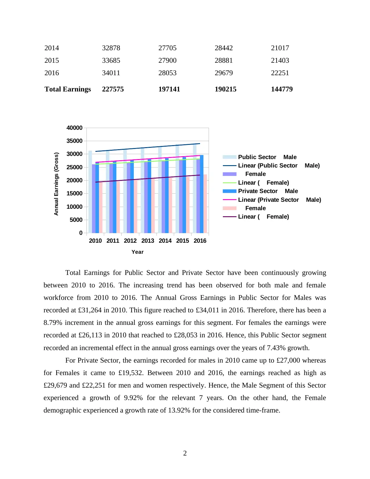
2014 32878 27705 28442 21017
2015 33685 27900 28881 21403
2016 34011 28053 29679 22251
Total Earnings 227575 197141 190215 144779
2010 2011 2012 2013 2014 2015 2016
0
5000
10000
15000
20000
25000
30000
35000
40000
Public Sector Male
Linear (Public Sector Male)
Female
Linear ( Female)
Private Sector Male
Linear (Private Sector Male)
Female
Linear ( Female)
Year
Annual Earnings (Gross)
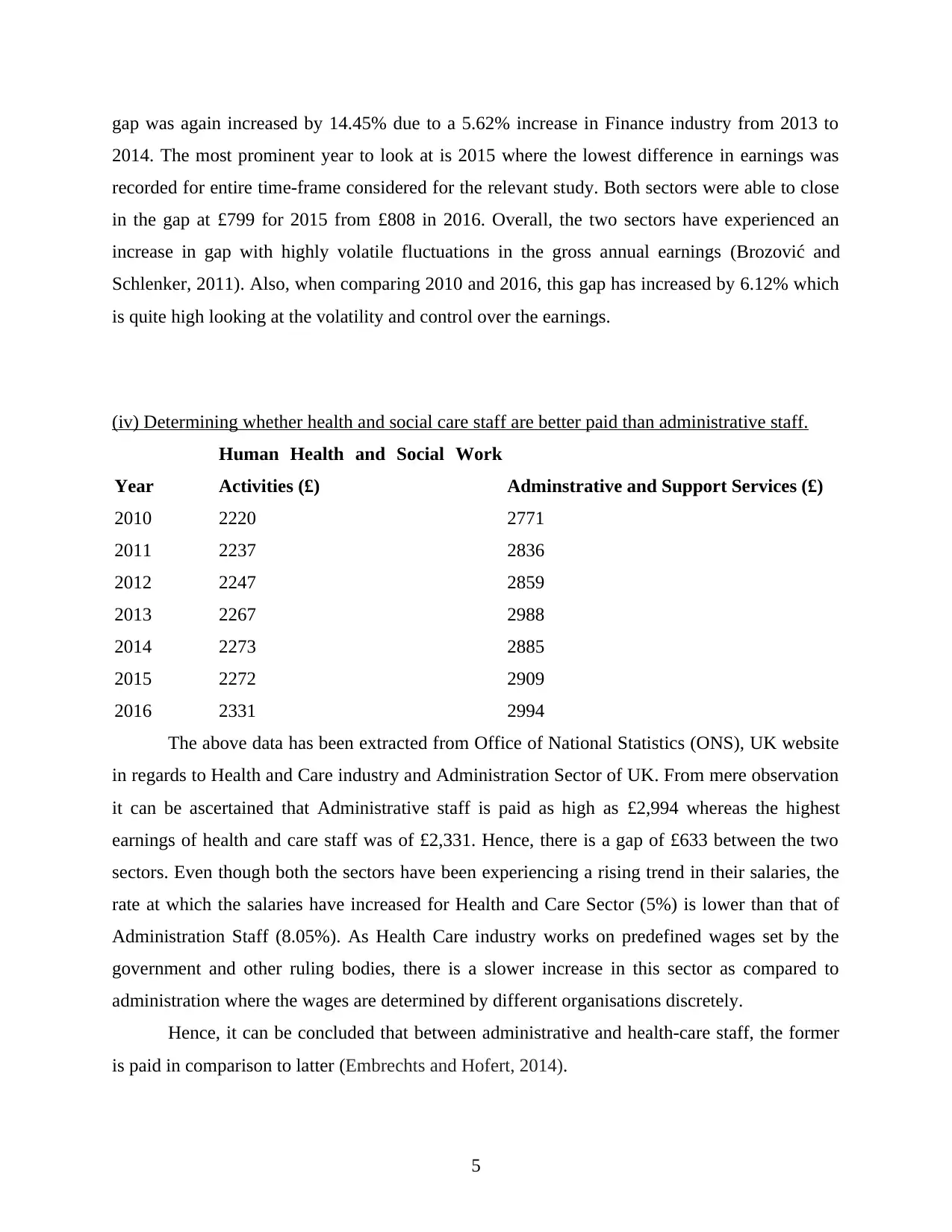
Total Earnings for Public Sector and Private Sector have been continuously growing
between 2010 to 2016. The increasing trend has been observed for both male and female
workforce from 2010 to 2016. The Annual Gross Earnings in Public Sector for Males was
recorded at £31,264 in 2010. This figure reached to £34,011 in 2016. Therefore, there has been a
8.79% increment in the annual gross earnings for this segment. For females the earnings were
recorded at £26,113 in 2010 that reached to £28,053 in 2016. Hence, this Public Sector segment
recorded an incremental effect in the annual gross earnings over the years of 7.43% growth.
For Private Sector, the earnings recorded for males in 2010 came up to £27,000 whereas
for Females it came to £19,532. Between 2010 and 2016, the earnings reached as high as
£29,679 and £22,251 for men and women respectively. Hence, the Male Segment of this Sector
experienced a growth of 9.92% for the relevant 7 years. On the other hand, the Female
demographic experienced a growth rate of 13.92% for the considered time-frame.
2
2015 33685 27900 28881 21403
2016 34011 28053 29679 22251
Total Earnings 227575 197141 190215 144779
2010 2011 2012 2013 2014 2015 2016
0
5000
10000
15000
20000
25000
30000
35000
40000
Public Sector Male
Linear (Public Sector Male)
Female
Linear ( Female)
Private Sector Male
Linear (Private Sector Male)
Female
Linear ( Female)
Year
Annual Earnings (Gross)
Total Earnings for Public Sector and Private Sector have been continuously growing
between 2010 to 2016. The increasing trend has been observed for both male and female
workforce from 2010 to 2016. The Annual Gross Earnings in Public Sector for Males was
recorded at £31,264 in 2010. This figure reached to £34,011 in 2016. Therefore, there has been a
8.79% increment in the annual gross earnings for this segment. For females the earnings were
recorded at £26,113 in 2010 that reached to £28,053 in 2016. Hence, this Public Sector segment
recorded an incremental effect in the annual gross earnings over the years of 7.43% growth.
For Private Sector, the earnings recorded for males in 2010 came up to £27,000 whereas
for Females it came to £19,532. Between 2010 and 2016, the earnings reached as high as
£29,679 and £22,251 for men and women respectively. Hence, the Male Segment of this Sector
experienced a growth of 9.92% for the relevant 7 years. On the other hand, the Female
demographic experienced a growth rate of 13.92% for the considered time-frame.
2
Paraphrase This Document
Need a fresh take? Get an instant paraphrase of this document with our AI Paraphraser
Through these findings one can say that the highest growth recorded between 2010 and
2016 is for the Women Segment of Private Sector whereas the lowest or minimum increase has
been recorded in Public Sector for Females. An Incremental change in annual gross earnings
indicates a positive sign in regards to working conditions, job satisfaction, increase in
productivity as well as complexity of job roles (Armstrong and Taylor, 2014). Also, favourable
conditions for women exist in both sectors, especially in Private Sector where there has been an
exponential growth in the annual earnings for this demographic.
(ii) Analysing the gap between male and female gross annual earnings between 2010 and 2016.
A remuneration gap occurring between men and women annual earnings is known as
'Gender Pay Gap.' Usually this gap exists in terms of female workforce being paid less than their
male counterparts for the same job role. The following table shows the total earnings made by
both males and females in Public as well as Private Sectors in UK from 2010 to 2016.
Table 1: Public / Private sector full-time employees' pay by sex, United Kingdom, April 2009 –
2016 (Gross annual earnings (£))
Year Public Sector Private Sector
Male Female Gap (£) Gap (%) Male Female Gap (£) Gap (%)
2010 31264 26113 5151 27000 19532 7468
2011 31380 26470 4910 -4.68 27233 19565 7668 2.68
2012 31816 26636 5180 5.5 27705 20313 7392 -3.6
2013 32541 27338 5203 0.45 28201 20698 7503 1.5
2014 32878 27705 5173 -0.58 28442 21017 7425 -1.04
2015 33685 27900 5785 11.83 28881 21403 7478 0.71
2016 34011 28053 5958 2.99 29679 22251 7428 -0.67
Total Earnings
(£) 227575 197141 190215 144779
From the above dataset, it can be seen that the total annual gross earnings has been higher
for Males in comparison to Females in both Public Sector as well as in Private Sector. In Public
Sector, the gap for males and females was recorded at £5,151 whereas in private sector it was
observed at £7,468. However, the year on year gap (in percent) was detected to be lowest in 2011
where the difference between the earnings reduced by 4.68%. Conversely, public sector
experienced highest difference in pay gaps in 2015 where the difference rose by 11.83% from
3
previous year. From 2010 to 2016, this gap has increased drastically by 15.67% with a
simultaneous increase in incomes for both males and females.
For Private Sector, this gap is recorded at a higher level in comparison to Public Sector.
Here, the highest gap was recorded in 2011 at £7,668. However, the year-on-year gap exhibited
by this sector has been less volatile in comparison to that observed in Public Sector. 2011 was
also the same year where the highest year-on-year gap has been recorded for annual gross
earnings. On the other hand, this sector was able to reduce this gap in 2012 by a net of 0.92%
(=3.6%-2.68%). However, this difference has been minimized to as low as 0.67% in 2016 since
2010. Overall, the private sector has been successful in reducing or maintaining its gap by 0.54%
as compared to public sector where there is high volatility in pay gaps regarding male and female
gross earnings (Boehm and Thomas, 2013).
(iii) Determination of gap between the education and finance gross annual earnings.
The following data has been extracted from Office of National Statistics (ONS), for the
period of 2010 to 2016.
Year Education (£)
Financial, insurance and real estate
activities (£) Gap (£) Gap (%)
2010 2350 3053 703
2011 2383 3040 657 -6.54
2012 2245 3064 819 24.66
2013 2443 3149 706 -13.8
2014 2518 3326 808 14.45
2015 2516 3315 799 -1.11
2016 2559 3305 746 -6.63
The above data set shows the gap between the two sectors viz. Financial and Education.
As it can be observed, the financial sector has a higher gross annual earnings in comparison to
Education Industry. The highest gap recorded among the two sectors was in 2012 at £819 in
addition to a drastic increase in the year-on-year gap (in percent) of 24.66%. This can be due to
the further decrease in annual gross earnings by 5.79% in educational sector for that year with
almost no or little rise in the earnings of Finance industry (by 0.79%).
The two sectors were able to reduce this gap by recording an increase for both variables
in 2013. This resulted in a decrease in gross earnings difference by 13.8%, however, in 2014, this
4
⊘ This is a preview!⊘
Do you want full access?
Subscribe today to unlock all pages.
Trusted by 1+ million students worldwide
gap was again increased by 14.45% due to a 5.62% increase in Finance industry from 2013 to
2014. The most prominent year to look at is 2015 where the lowest difference in earnings was
recorded for entire time-frame considered for the relevant study. Both sectors were able to close
in the gap at £799 for 2015 from £808 in 2016. Overall, the two sectors have experienced an
increase in gap with highly volatile fluctuations in the gross annual earnings (Brozović and
Schlenker, 2011). Also, when comparing 2010 and 2016, this gap has increased by 6.12% which
is quite high looking at the volatility and control over the earnings.
(iv) Determining whether health and social care staff are better paid than administrative staff.
Year
Human Health and Social Work
Activities (£) Adminstrative and Support Services (£)
2010 2220 2771
2011 2237 2836
2012 2247 2859
2013 2267 2988
2014 2273 2885
2015 2272 2909
2016 2331 2994
The above data has been extracted from Office of National Statistics (ONS), UK website
in regards to Health and Care industry and Administration Sector of UK. From mere observation
it can be ascertained that Administrative staff is paid as high as £2,994 whereas the highest
earnings of health and care staff was of £2,331. Hence, there is a gap of £633 between the two
sectors. Even though both the sectors have been experiencing a rising trend in their salaries, the
rate at which the salaries have increased for Health and Care Sector (5%) is lower than that of
Administration Staff (8.05%). As Health Care industry works on predefined wages set by the
government and other ruling bodies, there is a slower increase in this sector as compared to
administration where the wages are determined by different organisations discretely.
Hence, it can be concluded that between administrative and health-care staff, the former
is paid in comparison to latter (Embrechts and Hofert, 2014).
5
Paraphrase This Document
Need a fresh take? Get an instant paraphrase of this document with our AI Paraphraser
ACTIVITY 2
Evaluation of Hourly Pay Rates
(a) Producing an Ogive for estimation of Median and Quartiles
Many statistical tools and techniques facilitate the management to plan, forecast, organize
as well as control variables important to the achievement of strategic objectives. An Ogive is one
such tool used by researchers to understand the data and draw inferences in more meaningful
manner. In case of measuring central tendency, the Ogive helps in ascertaining Median and
Quartiles. The following table represents results from a survey conducted in the South-West for a
sample of 100 sales personnel in relation to their hourly earnings (Table 2):
Hourly Earnings Hourly Earnings No. of Employees
Cumulative
Frequency
Less than 10 5 8 8
Less than 20 15 46 54
Less than 30 25 26 80
Less than 40 35 14 94
Less than 50 45 6 100
Total 100
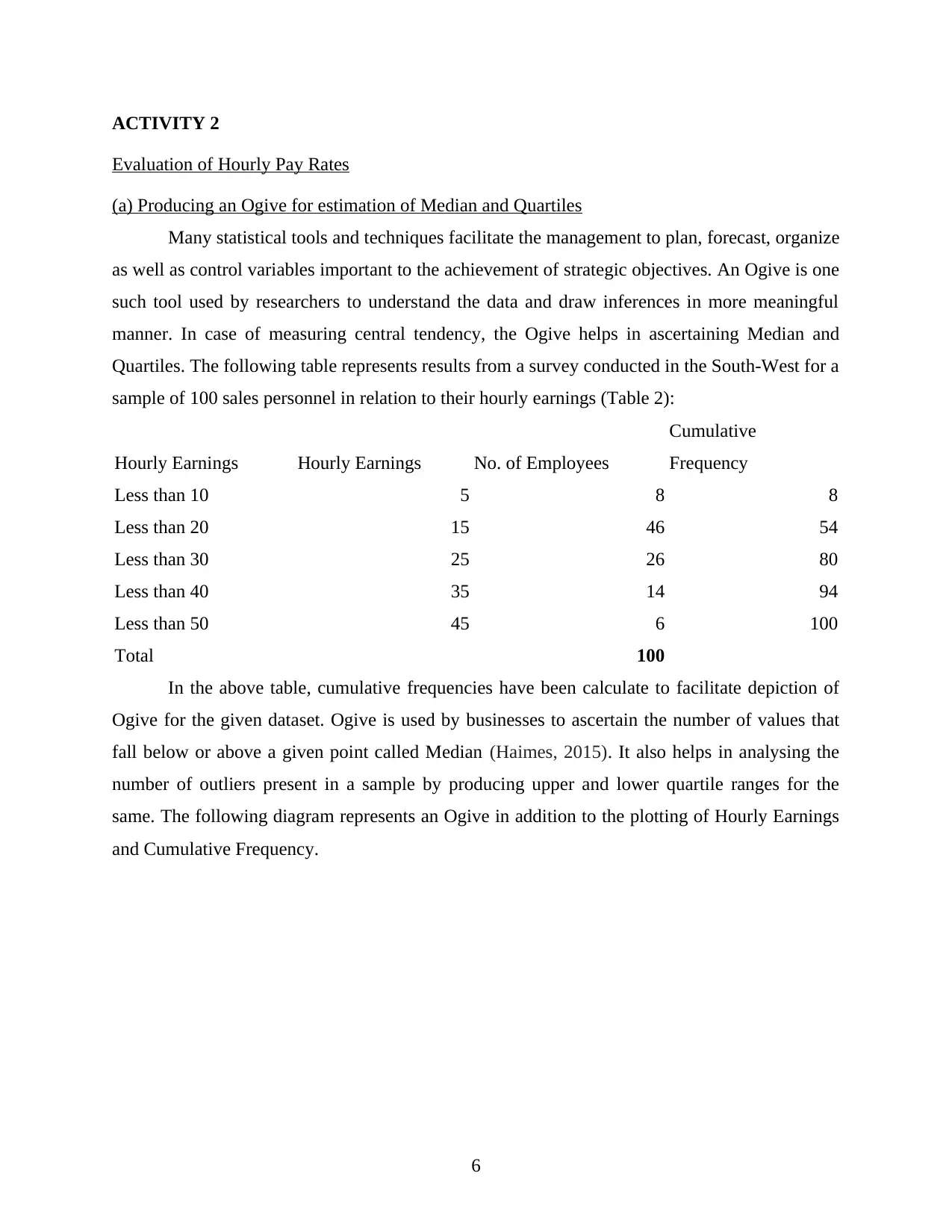
In the above table, cumulative frequencies have been calculate to facilitate depiction of
Ogive for the given dataset. Ogive is used by businesses to ascertain the number of values that
fall below or above a given point called Median (Haimes, 2015). It also helps in analysing the
number of outliers present in a sample by producing upper and lower quartile ranges for the
same. The following diagram represents an Ogive in addition to the plotting of Hourly Earnings
and Cumulative Frequency.
6
Evaluation of Hourly Pay Rates
(a) Producing an Ogive for estimation of Median and Quartiles
Many statistical tools and techniques facilitate the management to plan, forecast, organize
as well as control variables important to the achievement of strategic objectives. An Ogive is one
such tool used by researchers to understand the data and draw inferences in more meaningful
manner. In case of measuring central tendency, the Ogive helps in ascertaining Median and
Quartiles. The following table represents results from a survey conducted in the South-West for a
sample of 100 sales personnel in relation to their hourly earnings (Table 2):
Hourly Earnings Hourly Earnings No. of Employees
Cumulative
Frequency
Less than 10 5 8 8
Less than 20 15 46 54
Less than 30 25 26 80
Less than 40 35 14 94
Less than 50 45 6 100
Total 100
In the above table, cumulative frequencies have been calculate to facilitate depiction of
Ogive for the given dataset. Ogive is used by businesses to ascertain the number of values that
fall below or above a given point called Median (Haimes, 2015). It also helps in analysing the
number of outliers present in a sample by producing upper and lower quartile ranges for the
same. The following diagram represents an Ogive in addition to the plotting of Hourly Earnings
and Cumulative Frequency.
6
0 10 20 30 40
0
20
40
60
80
100
120
5
15
25
35
45
8
46
26
14
6
8
54
80
94
100
Hourly Earnings
No. of Employees
Cumulative Frequency
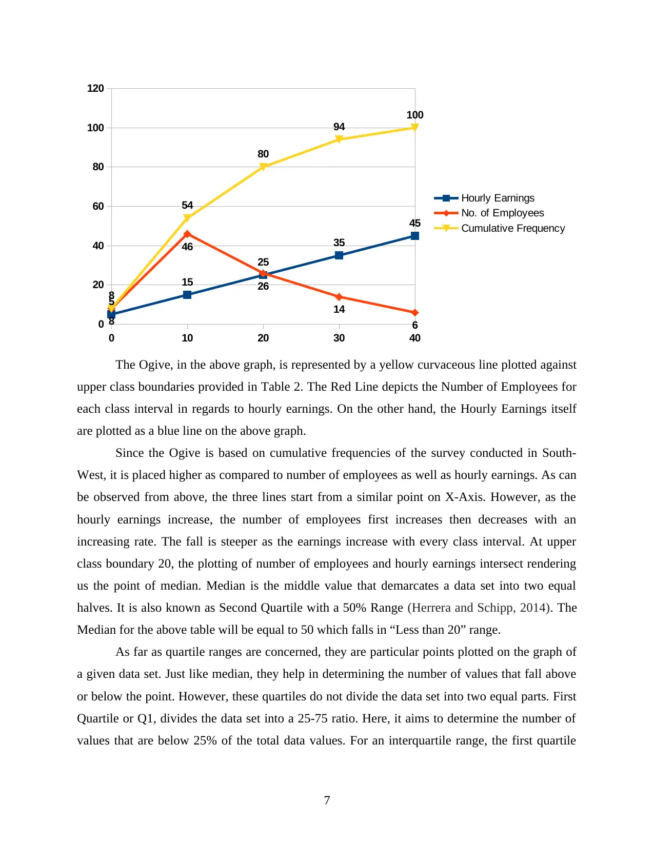
The Ogive, in the above graph, is represented by a yellow curvaceous line plotted against
upper class boundaries provided in Table 2. The Red Line depicts the Number of Employees for
each class interval in regards to hourly earnings. On the other hand, the Hourly Earnings itself
are plotted as a blue line on the above graph.
Since the Ogive is based on cumulative frequencies of the survey conducted in South-
West, it is placed higher as compared to number of employees as well as hourly earnings. As can
be observed from above, the three lines start from a similar point on X-Axis. However, as the
hourly earnings increase, the number of employees first increases then decreases with an
increasing rate. The fall is steeper as the earnings increase with every class interval. At upper
class boundary 20, the plotting of number of employees and hourly earnings intersect rendering
us the point of median. Median is the middle value that demarcates a data set into two equal
halves. It is also known as Second Quartile with a 50% Range (Herrera and Schipp, 2014). The
Median for the above table will be equal to 50 which falls in “Less than 20” range.
As far as quartile ranges are concerned, they are particular points plotted on the graph of
a given data set. Just like median, they help in determining the number of values that fall above
or below the point. However, these quartiles do not divide the data set into two equal parts. First
Quartile or Q1, divides the data set into a 25-75 ratio. Here, it aims to determine the number of
values that are below 25% of the total data values. For an interquartile range, the first quartile
7
0
20
40
60
80
100
120
5
15
25
35
45
8
46
26
14
6
8
54
80
94
100
Hourly Earnings
No. of Employees
Cumulative Frequency
The Ogive, in the above graph, is represented by a yellow curvaceous line plotted against
upper class boundaries provided in Table 2. The Red Line depicts the Number of Employees for
each class interval in regards to hourly earnings. On the other hand, the Hourly Earnings itself
are plotted as a blue line on the above graph.
Since the Ogive is based on cumulative frequencies of the survey conducted in South-
West, it is placed higher as compared to number of employees as well as hourly earnings. As can
be observed from above, the three lines start from a similar point on X-Axis. However, as the
hourly earnings increase, the number of employees first increases then decreases with an
increasing rate. The fall is steeper as the earnings increase with every class interval. At upper
class boundary 20, the plotting of number of employees and hourly earnings intersect rendering
us the point of median. Median is the middle value that demarcates a data set into two equal
halves. It is also known as Second Quartile with a 50% Range (Herrera and Schipp, 2014). The
Median for the above table will be equal to 50 which falls in “Less than 20” range.
As far as quartile ranges are concerned, they are particular points plotted on the graph of
a given data set. Just like median, they help in determining the number of values that fall above
or below the point. However, these quartiles do not divide the data set into two equal parts. First
Quartile or Q1, divides the data set into a 25-75 ratio. Here, it aims to determine the number of
values that are below 25% of the total data values. For an interquartile range, the first quartile
7
⊘ This is a preview!⊘
Do you want full access?
Subscribe today to unlock all pages.
Trusted by 1+ million students worldwide
provides the minimum range value for a data set. On the other hand, the third quartile or Q3 aims
to determine the highest or maximum value for a data set by dividing the sample into a 75-25
ratio. This means that under third quartile, how many values fall below 75% of the total data
values. The interquartile range can be found out by calculating the difference between first and
third quartile.
For the above figure, the quartiles can be calculated as follows:
Q1 = (1*(n+1))/4 = 0.25*101 = 25.25
Q3 = (3*(n+1))/4 = 0.75* 101 = 75.75
Therefore, one can ascertain the inter-quartile range which comes to 50 (= 75.75-25.25).
This means that the spread of the data values in the selected sample is between 25.25 and 75.75
with a middle value of 50 (median).
ACTIVITY 3
Economic Order Quantity
Economic Order Quantity or EOQ is the inventory management model that aims to help
organisations of various sizes in terms of reducing wastage and enhancing efficiency, economies
of scale as well as revenue or turnover. It is one of the most popular inventory control method
adopted by various businesses (Jiang and Pang, 2011). As a company includes various internal
organisational frameworks, one such mechanism relates to the purchase of raw material for the
purpose of producing final goods or services that are directly consumed by the organisation's
customers or are used as a component in producing consumer goods by other organizations. As it
is important to know how much costs, direct as well as indirect, were incurred in terms of
demand met for a given time period, this concept plays an important role in controlling any
losses that could be avoided if proper measures were taken.
Economic Quantity Model helps in analysing two types of costs viz. Storage or Carrying
cost as well as Delivery or Order Cost. The Delivery Cost is the cost incurred in bringing the raw
material from supplier's warehouse to the organisation's premises. It essentially includes
transportation costs in the form of octroi, carriage inward and freight. On the other hand,
Carrying cost is the cost incurred for storing the raw material purchased in the warehouse located
at or outside the organisational premises (Kyriakarakos and et. al., 2013).
One of the important behaviour to be noted here is that both the costs have an inverse
relationship with the size or volume of the inventory purchased and stored. As far as Ordering
8
Paraphrase This Document
Need a fresh take? Get an instant paraphrase of this document with our AI Paraphraser
Cost is concerned, this expenditure tends to decline as the volume of inventory or raw material
increases. Conversely, the carrying cost tends to increase as the volume of raw material
purchased increases. This is due to the fact that as the business buys more of a raw material, it
would need to have a larger place in the warehouse to store the same in order to avoid
deterioration of quality of such material. Therefore, a business needs to come up with an
inventory policy that not only reduces such costs but also gives them economies of scale with
larger volume purchases made with their respective suppliers (Marchington and et. al., 2016).
For this purpose Economic Order Quantity Model is employed by the businesses to
ascertain that level of quantity where the ordering costs and carrying costs are minimalist and the
volume of quantity purchased is the highest or adequate enough to meet the requirements of the
business. The following calculations are in relation to the given case scenario where a supplier
makes deliveries of rice to a local supermarket:
(a) Current Number of rice bag deliveries made annually by the supplier:
The supplier has been provisioning 45,000 rice bags in a year to the local supermarket.
Here, a year includes 360 days as five days the market is said to be closed. The supplier goes for
a delivery every 12 days. For this purpose, the following calculations have been rendered:
Number of deliveries of rice bag in a particular year: 360 days/ 12= 30.
So number of deliveries made by the rice supplier in a particular years is 30.
(b) Calculation of number of rice bags with each delivery is calculated below:
Since the number of deliveries made by supplier currently comes to 30 with a total of
45,000 rice bags delivered in all this commute. The number of rice bags delivered by the supplier
in each commute is calculated as follows:
Total number of days in year = 365 days
Number of days in which supermarket remain closed = 5 days
So the total days on which supermarket opens =360 days
In addition, supplier delivers rice in each 12 days, so total number of days is 360/12 = 30 days
Hence, number of rice bags with each delivery is = 45000 bags/30 deliveries = 1500 bags per
delivery.
9
(c) Calculation of economic order quantity:
In order to minimize ordering and storage cost while meeting the annual consumption
demand of rice supplier's customers at the same time, economic order quantity is calculated. This
will help the supplier in knowing the optimal level of quantity which he/she needs to sell in order
to break-even regarding holding and ordering costs. For this purpose, Economic order quantity is
calculated by following formula:
√ 2* demand * ordering cost
holding cost
Herein, demand refers to quantity of a particular product demanded by the customers on
an annual basis. Ordering cost is the cost which occurs in placing the order of a particular
product and holding cost is also known by the carrying cost, it occurs due to storing goods or
product in warehouses.
In the given question a supplier delivers rice every twelve day to the supermarket. In
addition following informations are given below:
Demand for rice bags 45000
Cost of delivery (Ordering cost) 20
Storage cost (2*25%) 0.5
From above data, Economic order quantity is calculated as follows:
√2*45000*20/0.5 = 1897.3 units
Thus, in order to minimize the ordering as well as carrying costs the supplier needs to
have an economic order quantity of 1897.3 units for demanding rice bag.
(d) Calculation of Inventory Policy Cost and recommendations made thereof
In the context of given case scenario, the supplier incurs an ordering cost of £20. This
cost is incurred by the supplier in the form of deliveries made of rice bags every 12 days by
commuting to the local market. The annual consumption of rice bags is ascertained at 45,000. In
addition to this, the supplier also incurs a carrying cost which is 25% of the cost price. The cost
price per rice bag is £2. Thus, the total inventory cost of the supplier in regards to the same is
calculated as follows:
Total Inventory Cost = Annual Carrying Cost+ Purchase Cost + Annual Ordering Cost
= 45000* £0.50+45000* £2+45000* £20
= £22500 + £90000 + £900000
10
⊘ This is a preview!⊘
Do you want full access?
Subscribe today to unlock all pages.
Trusted by 1+ million students worldwide
1 out of 15
Related Documents


Your All-in-One AI-Powered Toolkit for Academic Success.
+13062052269
info@desklib.com
Available 24*7 on WhatsApp / Email
![[object Object]](/_next/static/media/star-bottom.7253800d.svg)
Unlock your academic potential
Copyright © 2020–2026 A2Z Services. All Rights Reserved. Developed and managed by ZUCOL.