Statistics for Management: Data Analysis and Findings

Verified

Added on  2020/11/12

|18
|3053
|141
Report
AI Summary
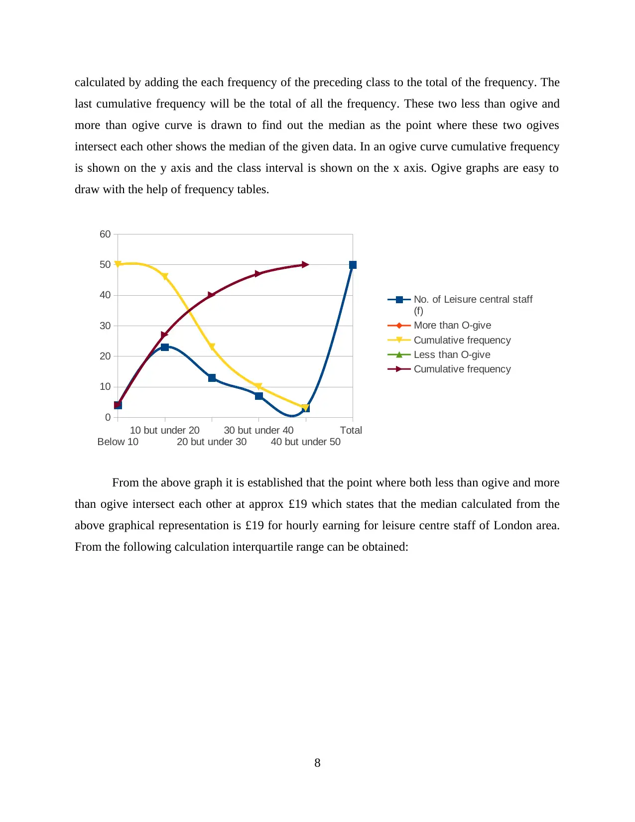
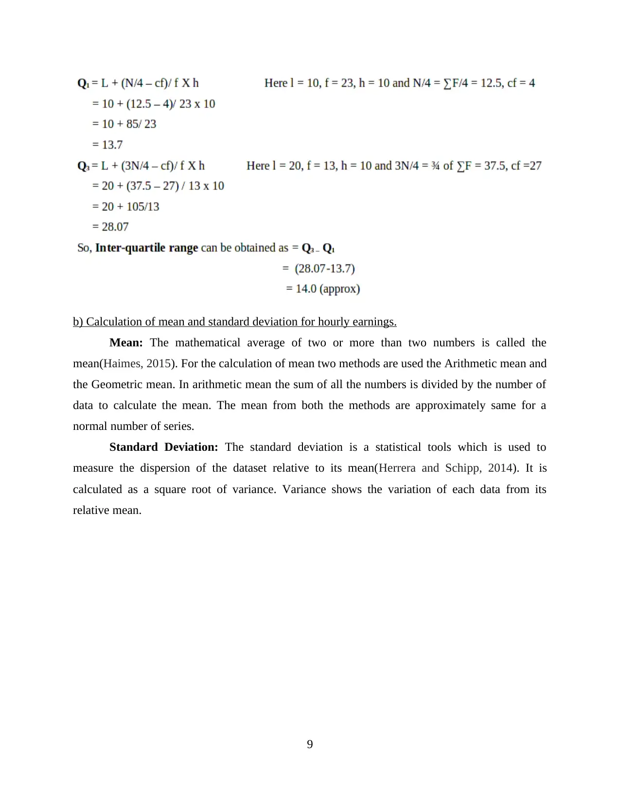
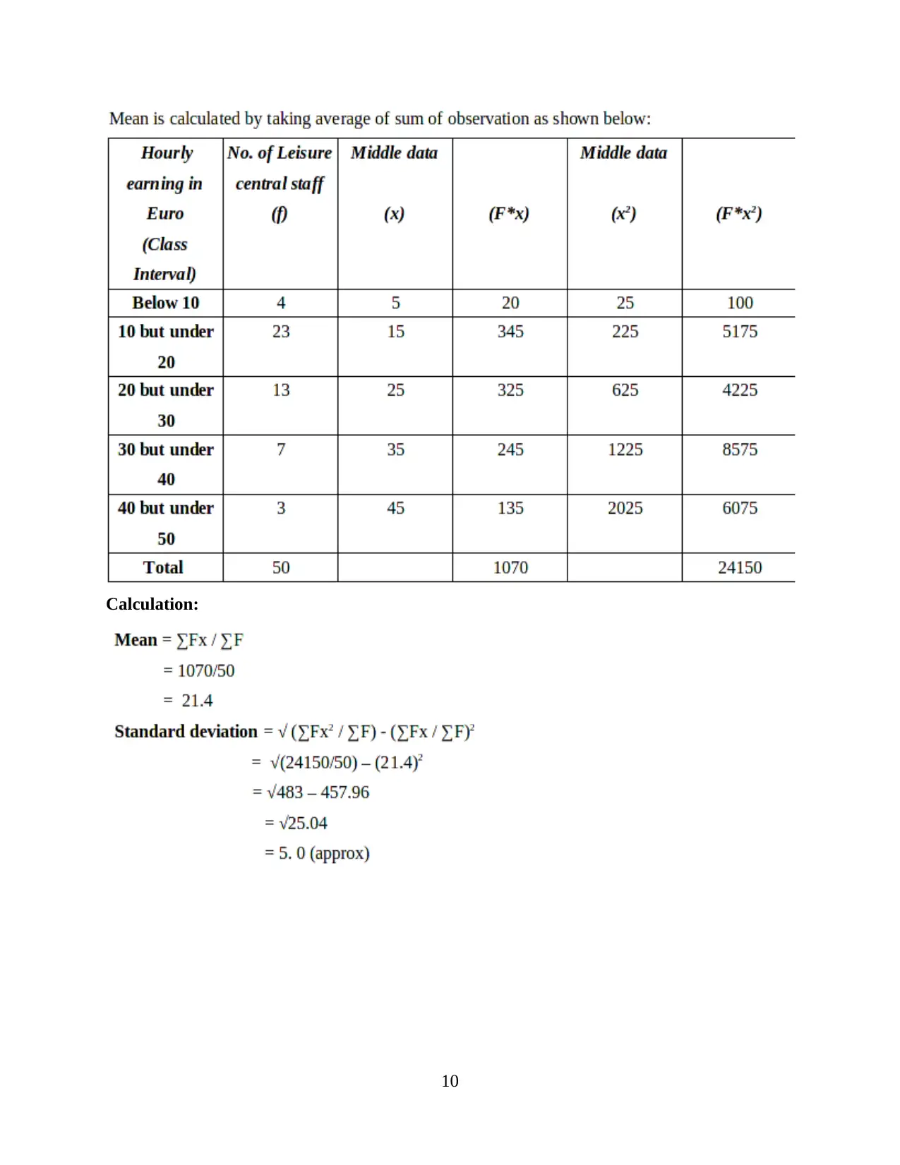
This report provides a comprehensive analysis of statistical concepts relevant to management. It begins with an introduction to business statistics and its applications, followed by an examination of hypothesis testing for mean earnings in both public and private sectors, using data to compare male and female salaries and determine annual growth rates. The report also includes graphical representations of earnings over time. Furthermore, the report explores the use of ogive curves to estimate median hourly earnings and quartiles, along with the calculation of mean and standard deviation. It compares earnings across different regions. The analysis extends to inventory management, calculating the economic order quantity (EOQ), reorder quantity, and inventory policy costs. The report also assesses the current service levels to customers and determines reorder levels. Finally, it addresses price index changes using CPI, CPIH, and RPI, and constructs an ogive curve. The report concludes with a summary of findings and a list of references.
tabler-icon-diamond-filled.svg

Contribute Materials

Your contribution can guide someone’s learning journey. Share your documents today.
Document Page
STATISTICS FOR
MANAGEMENT
tabler-icon-diamond-filled.svg

Secure Best Marks with AI Grader

Need help grading? Try our AI Grader for instant feedback on your assignments.
Document Page
Table of Contents
INTRODUCTION...........................................................................................................................1
TASK 1............................................................................................................................................1
(a) Testing Hypothesis for mean earnings in public sector....................................................1
(b) Testing Hypothesis for mean earnings in private sector...................................................2
(c) Producing Earnings-Time Chart for each group...............................................................3
(d) Determination of Annual Growth Rate for each segment................................................5
TASK 2............................................................................................................................................6
a) Using an ogive to estimate the median hourly earnings and the quartiles.........................6
b) Calculation of mean and standard deviation for hourly earnings......................................8
c) Comparison between the earning in the two regions:......................................................10
TASK 3..........................................................................................................................................10
a) Calculation of economic order quantity...........................................................................11
b) Calculation of reorder quantity of Tee shirts...................................................................11
c) Calculation of the inventory policy cost...........................................................................12
d) Calculation of current level service to the customers......................................................12
e) Calculation of Re order level............................................................................................12
TASK 4 .........................................................................................................................................13
(a) Graphical representation to show changes in price index as per CPI, CPIH and RPI:...13
(b) Creating Ogive using table 1..........................................................................................14
CONCLUSION..............................................................................................................................15
REFERENCES..............................................................................................................................16
Document Page
INTRODUCTION
Business statistics can be defined as procedure to make appropriate decisions in the case
of uncertainty. It is used in various aspects of business like econometrics, financial analysis,
production, auditing and more, including marketing research and service improvement (Al-
Omari, 2016). The present report covers an in-depth knowledge related to data collection, central
tendency, ogive curve, dispersion and variability, for analysing a business situation. Here,
different types of data are shown in graphical manner to identify the spotting trends as well as
different patterns related to different variables. Furthermore, recommendations also provide as
per findings within each section.
TASK 1
A hypothesis can be defined as a proposed statement for analysing a particular business
situation (Armstrong and Taylor, 2014). Having a good hypothesis aid decision-makers in
finding new ways for achievement of business objectives. In statistics, hypothesis is made to
measure variability of a proposed statement. For this purpose, various methods can be used like
dispersion, measures of central tendency, variability and more. While, hypothesis testing is used
to analyse whether an assumption made for a particular data is either rejected or accepted. For
this purpose, two events are made as null hypothesis (H0) and alternative hypothesis (H1).
(a) Testing Hypothesis for mean earnings in public sector
As per given case scenario, a study is undertaken where earning of 1000 persons are
described according to gender basis, who are chosen on random basis from a large population.
Here, assumptions are made for analysing whether average annual gross earnings of given data
of men and women’s salary followed a normal distribution or not. For this purpose, a comparison
is made on data on the basis of men and women in following manner:
Null Hypothesis (H0): Earnings of men in public sector is not considered as significant
as of women.
Alternative Hypothesis (H1): Earnings of men in public sector is considered as
significant as of women.
1
Document Page
Year
Public Sector
Men (£) Women (£) Gap (in £) Gap
(%)
2009 30638 25224 5414
2010 31264 26113 5151 -4.86
2011 31380 26470 4910 -4.68
2012 31816 26663 5153 4.95
2013 32541 27338 5203 0.97
2014 32878 27705 5173 -0.58
2015 33685 27900 5785 11.83
2016 34011 28053 5958 2.99
From the above data, it has interpreted that there is £4,910 minimum pay gap in 2011
between earnings of men and women. While, maximum pay gap is recorded as £5,958 in the
year 2016. Therefore, it shows that in payment pattern of public sector because there is a
continuous increase in salaries of men and women. Therefore, hypothesis is rejected under this
case and alternate one is accepted.
(b) Testing Hypothesis for mean earnings in private sector
In order to test hypothesis for mean earning in private sectors, a data is gathered by
primary survey method. For this purpose, 1000 respondents chosen on random basis which
includes both men and women, from a large population. In this regard, comparison of data on the
basis of men and women’s earning within private sector is done, by considering below
hypothesis:
Null Hypothesis (H0): Earnings of men in private sector is not considered as significant
as of women.
Alternative Hypothesis (H1): Earnings of men in private sector is considered as
significant as of women.
Year Private Sector
2
tabler-icon-diamond-filled.svg

Secure Best Marks with AI Grader

Need help grading? Try our AI Grader for instant feedback on your assignments.
Document Page
Men (£) Women (£) Gap (£) Gap (%)
2009 27632 19551 8081
2010 27000 19532 7468 -7.59
2011 27233 19565 7668 2.68
2012 27705 20313 7392 -3.6
2013 28201 20698 7503 1.5
2014 28442 21017 7425 -1.03
2015 28881 21403 7478 0.71
2016 29679 22251 7428 -0.67
Total 224773 164330
As per above table, annual earning gap between female and male workers of private
sector, is calculated by subtracting monthly wages of both. Through this process, it has analysed
that significant gap is recorded as £7428, which is near about 33.38%. Therefore, alternative
hypothesis is considered as acceptance region in this case.
(c) Producing Earnings-Time Chart for each group
Graphical representation of male workers’ salaries within public sector
2009 2010 2011 2012 2013 2014 2015 2016
28000
29000
30000
31000
32000
33000
34000
35000
30638
31264 31380
31816
32541 32878
33685 34011
Earnings
Time
Earnings
Graphical representation of female workers’ salaries within public sector
3
Document Page
2009 2010 2011 2012 2013 2014 2015 2016
23500
24000
24500
25000
25500
26000
26500
27000
27500
28000
28500
25224
26113
26470 26663
27338
27705 27900 28053
Earnings
Time
Earnings
Graphical representation of male workers’ salaries within private sector
01/07/1905
02/07/1905
03/07/1905
04/07/1905
05/07/1905
06/07/1905
07/07/1905
08/07/1905
25500
26000
26500
27000
27500
28000
28500
29000
29500
30000
27632
27000 27233
27705
28201 28442
28881
29679
Earnings
Time
Earnings
Graphical representation of female workers’ salaries within public sector
4
Document Page
2009 2010 2011 2012 2013 2014 2015 2016
18000
18500
19000
19500
20000
20500
21000
21500
22000
22500
19551 19532 19565
20313
20698
21017
21403
22251
Earnings
Time
Earnings
(d) Determination of Annual Growth Rate for each segment
Annual Growth Rate defines progress of a company within an accounting period (Boehm
and Thomas, 2013). In this regard, annual growth rate for data given as per salaries of male and
female workers within Public and Private Sector, can be calculated in following manner:
Annual Growth Rate = [(Current year – Previous Year) / (Previous Year)] X 100
Data of male workers within public sector:
Year Public Sector
Men (£) Annual Growth Rate (%)
2009 30638
2010 31264 2.04%
2011 31380 0.37%
2012 31816 1.39%
2013 32541 2.28%
2014 32878 1.04%
2015 33685 2.45%
2016 34011 0.97%
5
tabler-icon-diamond-filled.svg

Paraphrase This Document

Need a fresh take? Get an instant paraphrase of this document with our AI Paraphraser
Document Page
Data for Male workers within Private Sector:
Year Private Sector
Men (£) Annual Growth Rate (%)
2009 27632 0.00%
2010 27000 -2.29%
2011 27233 0.86%
2012 27705 1.73%
2013 28201 1.79%
2014 28442 0.85%
2015 28881 1.54%
2016 29679 2.76%
Data of Female workers within public sector:
Year Public Sector
Women (£) Annual Growth Rate (%)
2009 25224
2010 26113 3.52%
2011 26470 1.37%
2012 26663 0.73%
2013 27338 2.53%
2014 27705 1.34%
2015 27900 0.70%
Data for female workers within private sector:
Year Private Sector
Earnings Annual Growth Rate (%)
2009 19551
2010 19532 -0.10%
2011 19565 0.17%
2012 20313 3.82%
6
Document Page
2013 20698 1.90%
2014 21017 1.54%
2015 21403 1.84%
2016 22251 3.96%
TASK 2
a) Using an ogive to estimate the median hourly earnings and the quartiles.
More than ogive
Less than ogive
Ogive curve: Ogive curve also known as the cumulative histograms, are the graphs which is
used in statistics to find out the value that lie below or above the particular value in data
array(Embrechts and Hofert, 2014). To draw ogive curve cumulative frequency is required. It is
7
Document Page
calculated by adding the each frequency of the preceding class to the total of the frequency. The
last cumulative frequency will be the total of all the frequency. These two less than ogive and
more than ogive curve is drawn to find out the median as the point where these two ogives
intersect each other shows the median of the given data. In an ogive curve cumulative frequency
is shown on the y axis and the class interval is shown on the x axis. Ogive graphs are easy to
draw with the help of frequency tables.
Below 10
10 but under 20
20 but under 30
30 but under 40
40 but under 50
Total
0
10
20
30
40
50
60
No. of Leisure central staff
(f)
More than O-give
Cumulative frequency
Less than O-give
Cumulative frequency
From the above graph it is established that the point where both less than ogive and more
than ogive intersect each other at approx £19 which states that the median calculated from the
above graphical representation is £19 for hourly earning for leisure centre staff of London area.
From the following calculation interquartile range can be obtained:
8
tabler-icon-diamond-filled.svg

Secure Best Marks with AI Grader

Need help grading? Try our AI Grader for instant feedback on your assignments.
Document Page
b) Calculation of mean and standard deviation for hourly earnings.
Mean: The mathematical average of two or more than two numbers is called the
mean(Haimes, 2015). For the calculation of mean two methods are used the Arithmetic mean and
the Geometric mean. In arithmetic mean the sum of all the numbers is divided by the number of
data to calculate the mean. The mean from both the methods are approximately same for a
normal number of series.
Standard Deviation: The standard deviation is a statistical tools which is used to
measure the dispersion of the dataset relative to its mean(Herrera and Schipp, 2014). It is
calculated as a square root of variance. Variance shows the variation of each data from its
relative mean.
9
Document Page
Calculation:
10
Document Page
c) Comparison between the earning in the two regions:
TASK 3
Economic Order Quantity (EOQ): Economic order quantity is the tool used in the field
of Supply Management, Logistics and operations (Jiang and Pang, 2011). It is a tool used by the
company to minimize the cost of order and maintain the inventory so that the production does
not stops. It helps the company to find out the amount of inventories to be order in a way that
cost of holding the inventory and cost of order of the inventory is minimized. The inventory
holding cost includes the cost of ordering, shortage cost and storage cost.
Following is the formula used to calculate EOQ:
11
tabler-icon-diamond-filled.svg

Paraphrase This Document

Need a fresh take? Get an instant paraphrase of this document with our AI Paraphraser
Document Page
a) Calculation of economic order quantity.
To meet the customer requirement Jenny Jones like to use the inventory control policy.
At present the shop meets the requirement of 95% of the customers with a standard deviation of
15 tee shirts. These tee shirts are purchase by the company from a manufacturing company
located in China which take the average lead time of 28 days with the holding period 20%.
Delivery charges paid by the shop is £5. On the basis of above information the EOQ is calculated
as under:
EOQ= 2x2000x5
2
= 100 units
b) Calculation of reorder quantity of Tee shirts.
Re order quantity is the quantity of the inventory which is to be ordered by the company
to maintain the stock (Kyriakarakos and et. al., 2013). It is important for the company to
maintain the inventory so the production or the sale of the company does not stops. It is
calculated by using the following formula:
At this point the company should re order the stock so the sale of Tee shirts does not stop.
How often Jenny should re order the Tee shirts is calculated by using the following formula:
Frequency of Re order = annual consumption/ ROQ
=2000/206
12
Document Page
=9.7 or 10 days.
c) Calculation of the inventory policy cost.
Inventory Policy Cost: Inventory policy cost is the cost of inventory which is calculated
to know the total cost of inventory (Marchington and et. al., 2016). It is considered as an
important part of the inventory management as it indicates the variable cost related to the reorder
of the stock, it is also essential to estimate the lead time and stock out costs. This policy is used
by the company to estimate the total cost incurred to procure the stock. It is calculated by using
the following formula:
from the above calculation it is estimated that the inventory policy cost Jenny Jones shop
is 17 after considering all the related cost.
d) Calculation of current level service to the customers.
As per the given case at present Jenny Jones are able to complete only 95% fo the
demand by the customers for the Tee shirts. It is mentioned in the above case that from the past
ten weeks the demand for the tee shirts are increased to 40 tee shirts per week. The current level
of service given by the Jenny Jones to their customers are as under:
e) Calculation of Re order level.
TASK 4
(a) Graphical representation to show changes in price index as per CPI, CPIH and RPI:
Consumer Price Index (CPI) (Consumer Price Index. 2019)
13
Document Page
Year CPI Change in CPI (year-on-
year)
2007 1256.4
2008 1301.8 3.61%
2009 1330 2.17%
2010 1373.7 3.29%
2011 1435.3 4.48%
2012 1484.9 3.46%
2013 1513.5 1.93%
2014 1535.6 1.46%
2015 1536.3 0.05%
2016 1546.5 0.66%
Retail Price Index: (Retail Price Index. 2019)
Year RPI Change in RPI (year-on-
year)
2007 2478.6
2008 2577.9 4.0062938756
2009 2564.2 -0.5314403196
2010 2682.7 4.6213243897
14
tabler-icon-diamond-filled.svg

Secure Best Marks with AI Grader

Need help grading? Try our AI Grader for instant feedback on your assignments.
Document Page
2011 2822.2 5.1999850896
2012 2912.7 3.2067181631
2013 2999.5 2.9800528719
2014 3072.4 2.4304050675
2015 3102.5 0.9796901445
2016 3156.6 1.7437550363
2017 3269.7 3.5829690173
(b) Creating Ogive using table 1
Hourly Earnings (£) No. of Leisure Centre Staff Cumulative Frequency
Less than 10 4 4
Less than 20 23 27
Less than 30 13 40
Less than 40 7 47
Less than 50 3 50
15
Document Page
Total 50
0 10 20 30 40
0
10
20
30
40
50
60
4
27
40
47 50
Ogive
Cumulative
Frequency
Upper Class Boundaries
Cumulative Frequency
CONCLUSION
From the above case it is analysed that the uses of statistics in management is essential as
it shows the actual position and the need for the inventory management. With the help of various
graphs it is established that with the statistical tools company can see the trends and develop their
strategies according to the current trends. With the helps of the scatter diagram it is easy for the
user to understand and interpret the data. Graphical representation of data helps the user to easily
understand the trends in the market and manage its resources.
16
chevron_up_icon
1 out of 18
circle_padding
hide_on_mobile
zoom_out_icon
logo.png

Your All-in-One AI-Powered Toolkit for Academic Success.

Available 24*7 on WhatsApp / Email

[object Object]