Statistics for Management Report: Earnings and Inventory
VerifiedAdded on 2020/12/24
|17
|3567
|150
Report
AI Summary
This statistics report provides a comprehensive analysis of earnings and inventory management using various statistical methods. The report begins with hypothesis testing to compare men's and women's earnings in both public and private sectors, followed by a time chart illustrating earnings trends from 2010 to 2016 and annual growth rate calculations. Descriptive statistics are applied to analyze hourly earnings of leisure staff in London and Manchester. The report also delves into inventory management, calculating economic order quantity, re-order levels, and inventory costs for a shop. Finally, the report includes graphical representations, such as ogive charts, to visualize cumulative frequencies and earnings distributions, providing a well-rounded statistical overview.

STATISTICS FOR
MANAGEMENT
MANAGEMENT
Paraphrase This Document
Need a fresh take? Get an instant paraphrase of this document with our AI Paraphraser
TABLE OF CONTENTS
INTRODUCTION...........................................................................................................................1
ACTIVITY 1....................................................................................................................................1
1.a Identifying men and women’s earning of public sector on basis of hypothesis testing........1
1.b Identifying men and women’s earning of private sector on basis of hypothesis testing.......2
1.c Design earnings time chart of every group with use of spread sheet (2010- 2016)..............2
1.d determine annual growth rate of earning of every group......................................................4
ACTIVITY 2....................................................................................................................................7
2.A.a Applying ogive chart to estimate median of hourly earnings with reference to quartile.. 7
2.A.b Calculating mean and standard deviation of hourly earnings of leisure staff...................9
2.B Comparing hourly earnings of leisure staff employees in London and Manchester region
...................................................................................................................................................10
ACTIVITY 3..................................................................................................................................11
a. Calculating economic order quantity ...................................................................................11
b. How often order and cost......................................................................................................11
c. Calculating Inventory policy cost..........................................................................................11
d. Specify current service level.................................................................................................12
e. Finding re-order level............................................................................................................12
ACTIVITY 4 .................................................................................................................................12
4.B Drafting Ogive chart of cumulative % of leisure staff employees vs earning on hourly
perspective................................................................................................................................14
CONCLUSION..............................................................................................................................14
REFERENCES..............................................................................................................................15
INTRODUCTION
Statistics is known as form of mathematical analysis which directly applies quantified
models, synopses and representations for a specified set of experimental data or with real life
studies. Generally, statistics studied methodologies for collecting, reviewing, drawing and
analysing conclusions through data. The present report would provide discussion about men and
women earnings of male and female who are employed in public and private sector with context
to hypothesis testing. In the same series, it would articulate about hourly earnings of leisure staff
of London and Manchester earnings with context to descriptive statistics. Moreover, this report
will reflect economic order quantity, inventory policy cost and re-order level of Jenny Jones’
shop. Lastly, it will show graphical presentation of indexes as Consumer Price Index, CPIH and
Retail price Index.
ACTIVITY 1
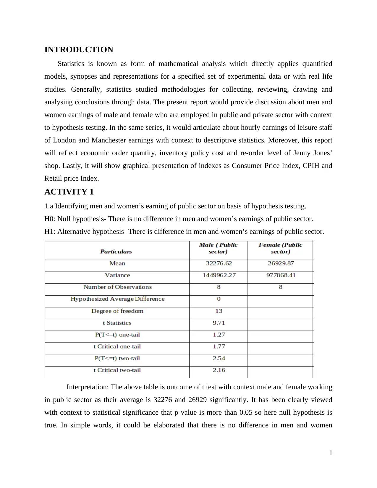
1.a Identifying men and women’s earning of public sector on basis of hypothesis testing.
H0: Null hypothesis- There is no difference in men and women’s earnings of public sector.
H1: Alternative hypothesis- There is difference in men and women’s earnings of public sector.
Interpretation: The above table is outcome of t test with context male and female working
in public sector as their average is 32276 and 26929 significantly. It has been clearly viewed
with context to statistical significance that p value is more than 0.05 so here null hypothesis is
true. In simple words, it could be elaborated that there is no difference in men and women
1
Statistics is known as form of mathematical analysis which directly applies quantified
models, synopses and representations for a specified set of experimental data or with real life
studies. Generally, statistics studied methodologies for collecting, reviewing, drawing and
analysing conclusions through data. The present report would provide discussion about men and
women earnings of male and female who are employed in public and private sector with context
to hypothesis testing. In the same series, it would articulate about hourly earnings of leisure staff
of London and Manchester earnings with context to descriptive statistics. Moreover, this report
will reflect economic order quantity, inventory policy cost and re-order level of Jenny Jones’
shop. Lastly, it will show graphical presentation of indexes as Consumer Price Index, CPIH and
Retail price Index.
ACTIVITY 1
1.a Identifying men and women’s earning of public sector on basis of hypothesis testing.
H0: Null hypothesis- There is no difference in men and women’s earnings of public sector.
H1: Alternative hypothesis- There is difference in men and women’s earnings of public sector.
Interpretation: The above table is outcome of t test with context male and female working
in public sector as their average is 32276 and 26929 significantly. It has been clearly viewed
with context to statistical significance that p value is more than 0.05 so here null hypothesis is
true. In simple words, it could be elaborated that there is no difference in men and women
1
⊘ This is a preview!⊘
Do you want full access?
Subscribe today to unlock all pages.
Trusted by 1+ million students worldwide
earnings working in public sector (Rudolf and et.al, 2018). Simultaneously, it has been extracted
with 13 as degree of freedom and variance as 1449960 and 977868 men and women respectively.
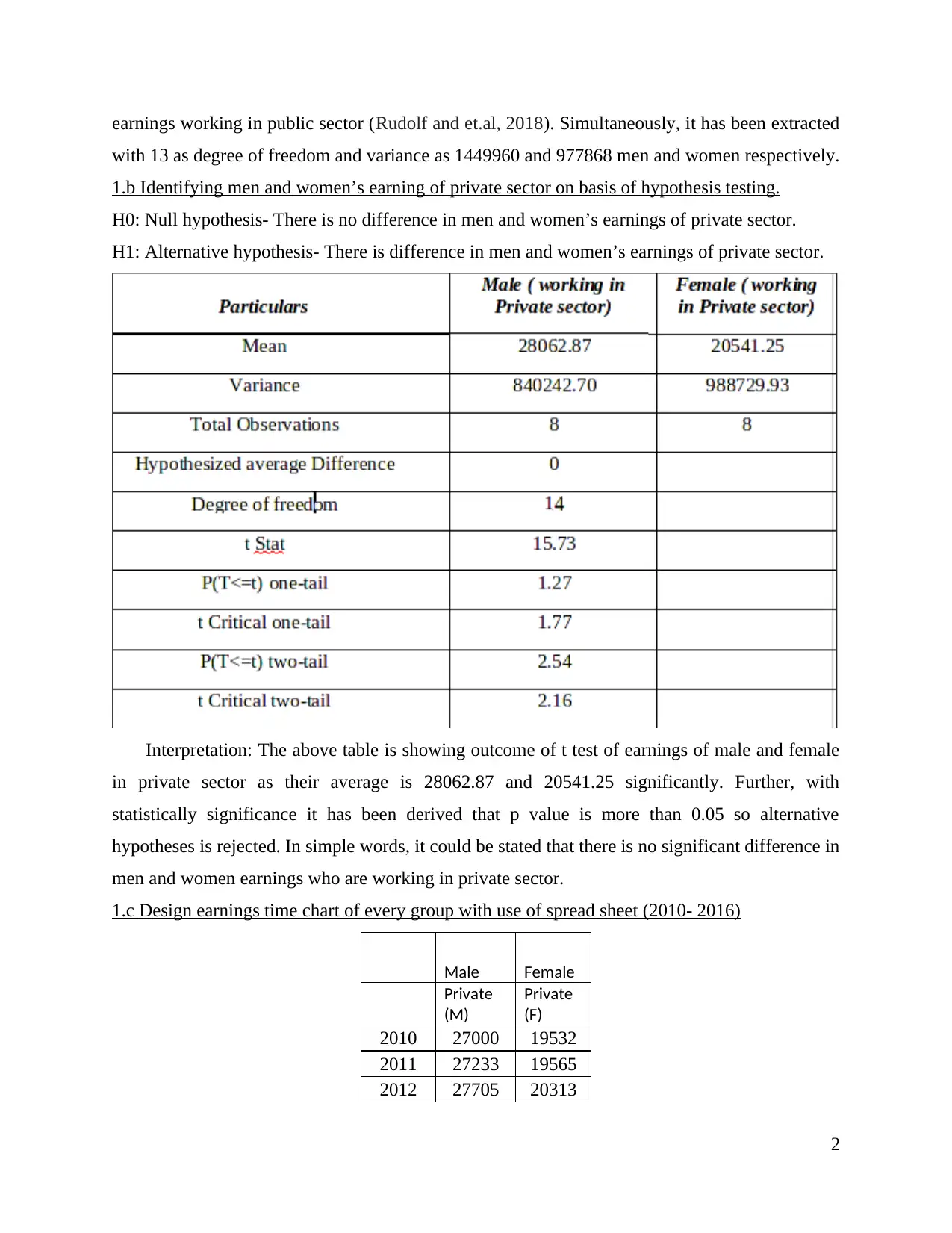
1.b Identifying men and women’s earning of private sector on basis of hypothesis testing.
H0: Null hypothesis- There is no difference in men and women’s earnings of private sector.
H1: Alternative hypothesis- There is difference in men and women’s earnings of private sector.
Interpretation: The above table is showing outcome of t test of earnings of male and female
in private sector as their average is 28062.87 and 20541.25 significantly. Further, with
statistically significance it has been derived that p value is more than 0.05 so alternative
hypotheses is rejected. In simple words, it could be stated that there is no significant difference in
men and women earnings who are working in private sector.
1.c Design earnings time chart of every group with use of spread sheet (2010- 2016)
Male Female
Private
(M)
Private
(F)
2010 27000 19532
2011 27233 19565
2012 27705 20313
2
with 13 as degree of freedom and variance as 1449960 and 977868 men and women respectively.
1.b Identifying men and women’s earning of private sector on basis of hypothesis testing.
H0: Null hypothesis- There is no difference in men and women’s earnings of private sector.
H1: Alternative hypothesis- There is difference in men and women’s earnings of private sector.
Interpretation: The above table is showing outcome of t test of earnings of male and female
in private sector as their average is 28062.87 and 20541.25 significantly. Further, with
statistically significance it has been derived that p value is more than 0.05 so alternative
hypotheses is rejected. In simple words, it could be stated that there is no significant difference in
men and women earnings who are working in private sector.
1.c Design earnings time chart of every group with use of spread sheet (2010- 2016)
Male Female
Private
(M)
Private
(F)
2010 27000 19532
2011 27233 19565
2012 27705 20313
2
Paraphrase This Document
Need a fresh take? Get an instant paraphrase of this document with our AI Paraphraser
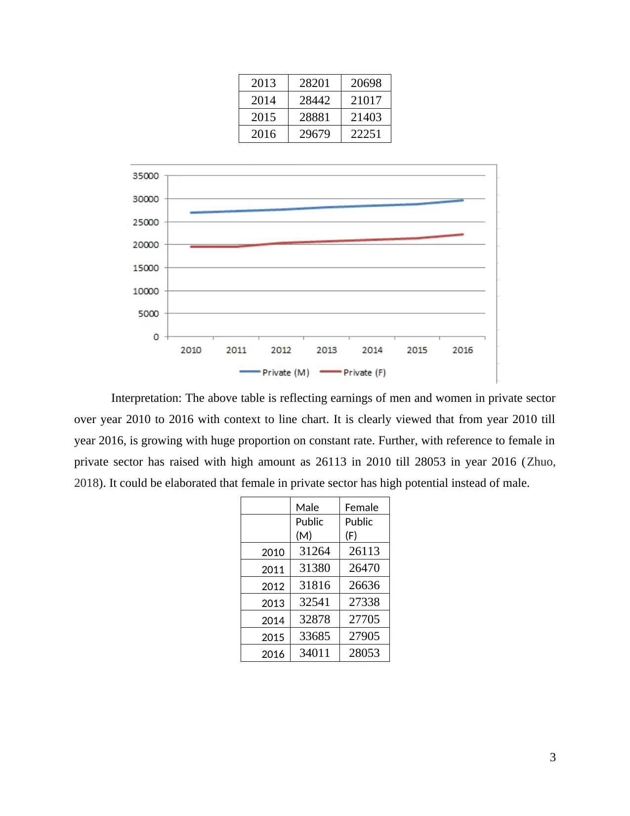
2013 28201 20698
2014 28442 21017
2015 28881 21403
2016 29679 22251
Interpretation: The above table is reflecting earnings of men and women in private sector
over year 2010 to 2016 with context to line chart. It is clearly viewed that from year 2010 till
year 2016, is growing with huge proportion on constant rate. Further, with reference to female in
private sector has raised with high amount as 26113 in 2010 till 28053 in year 2016 (Zhuo,
2018). It could be elaborated that female in private sector has high potential instead of male.
Male Female
Public
(M)
Public
(F)
2010 31264 26113
2011 31380 26470
2012 31816 26636
2013 32541 27338
2014 32878 27705
2015 33685 27905
2016 34011 28053
3
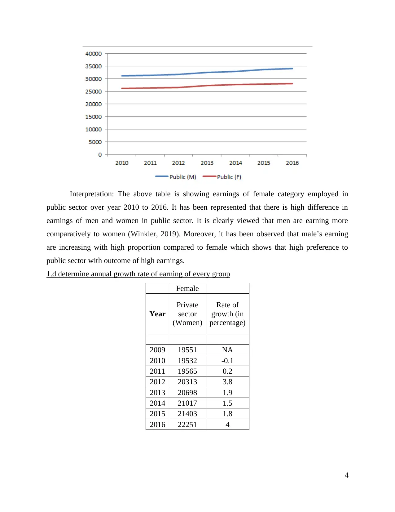
Interpretation: The above table is showing earnings of female category employed in
public sector over year 2010 to 2016. It has been represented that there is high difference in
earnings of men and women in public sector. It is clearly viewed that men are earning more
comparatively to women (Winkler, 2019). Moreover, it has been observed that male’s earning
are increasing with high proportion compared to female which shows that high preference to
public sector with outcome of high earnings.
1.d determine annual growth rate of earning of every group
Female
Year
Private
sector
(Women)
Rate of
growth (in
percentage)
2009 19551 NA
2010 19532 -0.1
2011 19565 0.2
2012 20313 3.8
2013 20698 1.9
2014 21017 1.5
2015 21403 1.8
2016 22251 4
4
⊘ This is a preview!⊘
Do you want full access?
Subscribe today to unlock all pages.
Trusted by 1+ million students worldwide
Gross annual rate of female in private sector: The above scenario is depicting growth rate
of earnings of women employed in private sector. It has been clearly viewed that from year 2011
till 2016 it is rising but in 2010, this decreased by -0.1% (Najmi, Raza and Qazi, 2018). On the
contrary, growth rate was highest in 2016 by 4% which might be due high influential and
potential as well.
Female
Year
Public
sector
(Women)
Rate of
growth (in
percentage)
2009 25224 NA
2010 26113 3.5
2011 26470 1.4
2012 26636 0.6
2013 27338 2.6
2014 27705 1.3
2015 27900 0.7
2016 28053 0.5
Gross annual rate of female in public sector: The above table is observing growth rate of
women who are employed in public sector over year 2010 to 2016 (Amrhein, Trafimow and
Greenland, 2018). This is providing clear picture of increasing aspect in each year as in year
2010, this got increment by highest amount as 3.5 and at last, this rose with least proportion as
0.5% comparatively to other years.
Male
Year
Private
sector
Rate of
growth (in
percentage)
(Men)
2009 27362 NA
2010 27000 -1.3
2011 27233 0.9
2012 27705 1.7
2013 28201 1.8
5
Paraphrase This Document
Need a fresh take? Get an instant paraphrase of this document with our AI Paraphraser
2014 28442 0.9
2015 28881 1.5
2016 29679 2.8
Gross annual rate of Male in private sector: The above table is depicting growth rate of
earnings of private sector of men category over year 2010 to 2016. It has been observed that
from 2011 to 2016, it is increasing in each year but in 2011 it decreases by -1.3%. Moreover, it
has been traced that n year 2016, it increased with highest percentage as 2.8 and least with 2014
and 2011 by 0.9%.
Male
Year
Public
sector
Rate of
growth (in
percentage)
(Men)
2009 30638 NA
2010 31264 2
2011 31380 0.4
2012 31816 1.4
2013 32541 2.3
2014 32878 1
2015 33685 2.5
2016 34011 1
Gross annual rate of female in public sector: In the above scenario, the growth rate of
women in public sector is increasing in each year. It has been clearly depicted that in 2011, it
rose with least percentage as 0.4 and in year 2015, it was highest with 2.5 followed by year 2013.
In nutshell, it has been observed by growth rate of each category that in private sector it
decreased in 2010 and in 2016, it increased with highest amount. With reference to public sector,
it has faced fluctuations on each category male and female. This shows that mostly people are
giving high reference to private sector.
6
ACTIVITY 2
2.A.a Applying ogive chart to estimate median of hourly earnings with reference to quartile.
Ogive is referred as polygon of cumulative frequency which is aggregate plotted on graph
from left to right. This is elaborated as frequencies as vital function directly implied to plot
statistics in terms of cumulative frequencies. Generally, it allows one to attaining quick estimate
of number of observation which is less than or equal to one. It reflects distribution of cumulative
frequency in grouped data is known as ogive. Moreover, to determine understandings of graph
with tools, this method shows cumulative frequency (Lindner and et.al., 2019). This is unique
through frequency polygon due to cumulative values instead of plotting value themselves.
Median is known as value which classifies higher half and lower half of sample data as
value likely to fall upper or below it. In the same series, this is known as middle value in
numerical list as measure of central tendency as to extract about observations arranged in
ascending order and then formula is implied. It is not influenced by outliers.
Class interval
of hourly
range
Number of
Leisure Staff R frequency
Cumulative
frequency
Cumulative *
R Frequency
0 - 10 4 4 4 4
10 - 20 23 23 27 27
20 - 30 13 13 40 40
30 - 40 7 7 47 47
40 - 50 3 3 50 50
Median: L+ Cf-n/ f* I
= 10+(20-10)/ 23 * (25 - 4)
= 10+ 9.13
= 19.13
7
⊘ This is a preview!⊘
Do you want full access?
Subscribe today to unlock all pages.
Trusted by 1+ million students worldwide
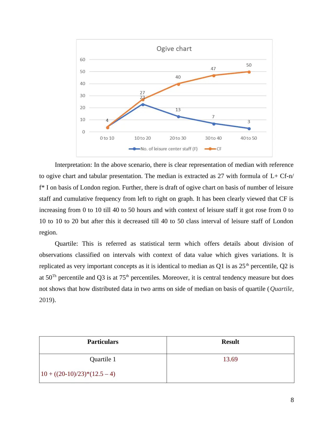
Interpretation: In the above scenario, there is clear representation of median with reference
to ogive chart and tabular presentation. The median is extracted as 27 with formula of L+ Cf-n/
f* I on basis of London region. Further, there is draft of ogive chart on basis of number of leisure
staff and cumulative frequency from left to right on graph. It has been clearly viewed that CF is
increasing from 0 to 10 till 40 to 50 hours and with context of leisure staff it got rose from 0 to
10 to 10 to 20 but after this it decreased till 40 to 50 class interval of leisure staff of London
region.
Quartile: This is referred as statistical term which offers details about division of
observations classified on intervals with context of data value which gives variations. It is
replicated as very important concepts as it is identical to median as Q1 is as 25th percentile, Q2 is
at 50Th percentile and Q3 is at 75th percentiles. Moreover, it is central tendency measure but does
not shows that how distributed data in two arms on side of median on basis of quartile ( Quartile,
2019).
Particulars Result
Quartile 1
10 + ((20-10)/23)*(12.5 – 4)
13.69
8
Paraphrase This Document
Need a fresh take? Get an instant paraphrase of this document with our AI Paraphraser
= 10 + (10/23) * 8.5
= 10+ 3.70
= 13.70
Quartile 2 (median) 19.13
Quartile 3
20 + ((30-20)/23)*(37.5 – 23)
= 20 + 11.15
31.15
Interpretation: The above result is of quartile of number of leisure employees of their
frequency as Q1 is 4 which shows that 25% data is smaller than 4 and rest 75% is higher.
Simultaneously, Quartile 2 is 7 which distributes data as 50% higher and smaller whereas
quartile 3 is 13.
2.A.b Calculating mean and standard deviation of hourly earnings of leisure staff
Mean: it is also known as average which is implied with objective to derive central
tendency of data This is determined as aggregate of data in population and then divided by sum
of number of particular points of frequency (Walker, Michailoy. and Trukhanov, 2019). It might
be not stated as appropriate presentation because it gets direct influence from outliers because it
is common measure of centre but prone for distribution by presence of extreme values not
required for particular distortion.
Interval of
hourly
Earnings
Leisure Staff
(F)
Middle
number (X)
Leisure staff *
Middle
number (FX)
0 to 10 4 5 20
10 to 20 23 15 345
20 to 30 13 25 325
30 to 40 7 35 245
40 to 50 3 45 135
9
Total 50 1070
Steps for mean= Total frequencies/ Total of FX
= 1070/ 50
= 21.4
Interpretation: The above table is stating average of leisure staff of London region as 21.4
where is total of FX is 50 and leisure staff with middle number sum is 1070 which gave outcome
as statistical mean.
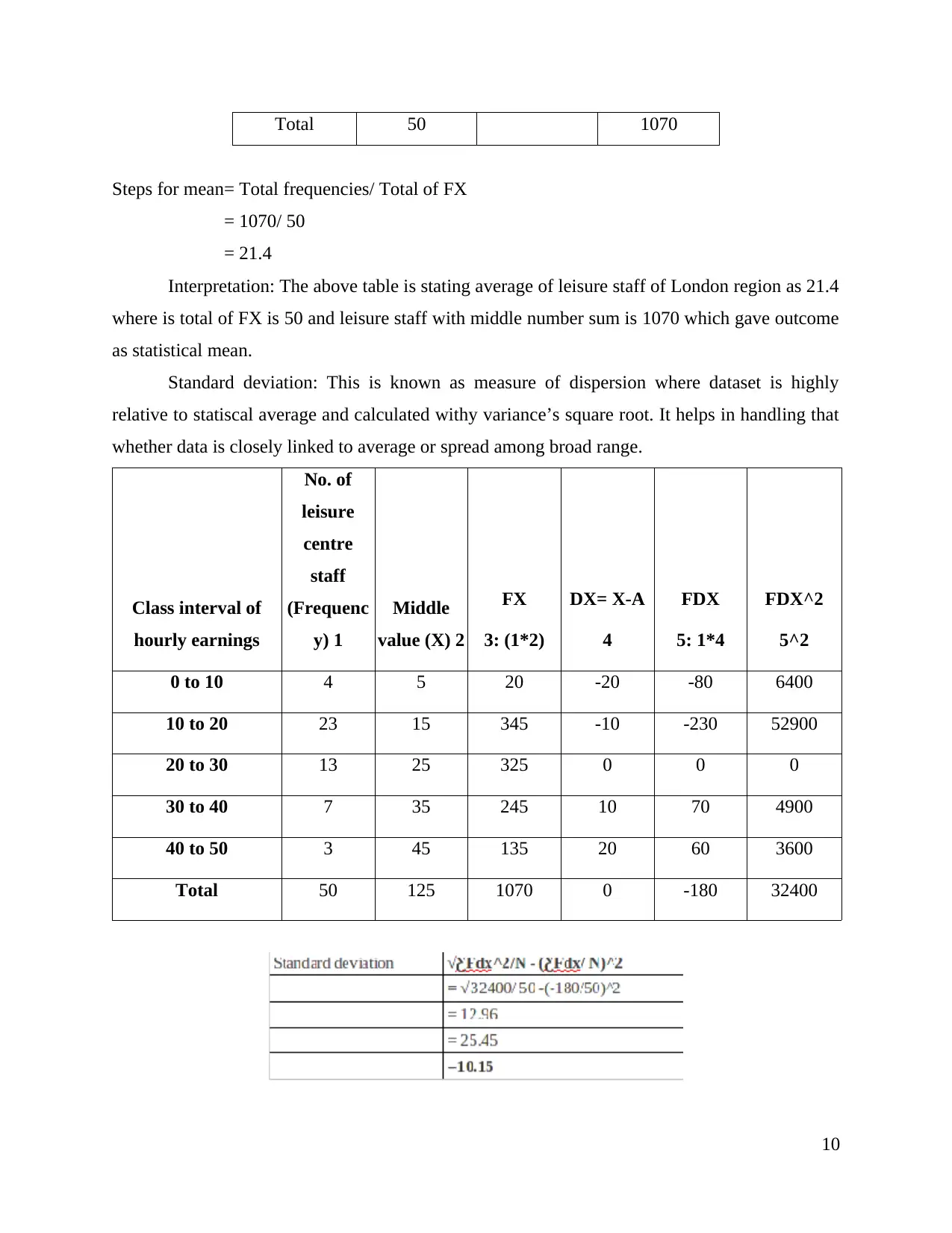
Standard deviation: This is known as measure of dispersion where dataset is highly
relative to statiscal average and calculated withy variance’s square root. It helps in handling that
whether data is closely linked to average or spread among broad range.
Class interval of
hourly earnings
No. of
leisure
centre
staff
(Frequenc
y) 1
Middle
value (X) 2
FX
3: (1*2)
DX= X-A
4
FDX
5: 1*4
FDX^2
5^2
0 to 10 4 5 20 -20 -80 6400
10 to 20 23 15 345 -10 -230 52900
20 to 30 13 25 325 0 0 0
30 to 40 7 35 245 10 70 4900
40 to 50 3 45 135 20 60 3600
Total 50 125 1070 0 -180 32400
10
Steps for mean= Total frequencies/ Total of FX
= 1070/ 50
= 21.4
Interpretation: The above table is stating average of leisure staff of London region as 21.4
where is total of FX is 50 and leisure staff with middle number sum is 1070 which gave outcome
as statistical mean.
Standard deviation: This is known as measure of dispersion where dataset is highly
relative to statiscal average and calculated withy variance’s square root. It helps in handling that
whether data is closely linked to average or spread among broad range.
Class interval of
hourly earnings
No. of
leisure
centre
staff
(Frequenc
y) 1
Middle
value (X) 2
FX
3: (1*2)
DX= X-A
4
FDX
5: 1*4
FDX^2
5^2
0 to 10 4 5 20 -20 -80 6400
10 to 20 23 15 345 -10 -230 52900
20 to 30 13 25 325 0 0 0
30 to 40 7 35 245 10 70 4900
40 to 50 3 45 135 20 60 3600
Total 50 125 1070 0 -180 32400
10
⊘ This is a preview!⊘
Do you want full access?
Subscribe today to unlock all pages.
Trusted by 1+ million students worldwide
1 out of 17
Related Documents


Your All-in-One AI-Powered Toolkit for Academic Success.
+13062052269
info@desklib.com
Available 24*7 on WhatsApp / Email
![[object Object]](/_next/static/media/star-bottom.7253800d.svg)
Unlock your academic potential
Copyright © 2020–2026 A2Z Services. All Rights Reserved. Developed and managed by ZUCOL.