Statistics for Management: Data Analysis and Growth Rate Calculation
VerifiedAdded on 2021/01/01
|20
|5143
|29
Report
AI Summary
This report provides a comprehensive analysis of statistical methods relevant to management, encompassing hypothesis testing, data analysis, and inventory management techniques. The report begins with hypothesis testing on mean earnings in public and private sectors, comparing male and female workforces, and calculating annual growth rates. It then delves into analyzing raw business data using statistical methods such as Ogive, calculating mean and standard deviation, and comparing earnings between regions. Furthermore, the report covers economic order quantity calculations and inventory policy cost determination. Finally, the report includes the creation of line/bar charts showcasing changes in CPI, CPIH, and RPI, along with the creation of Ogive using provided data, offering a complete overview of statistical applications in a business context.
STATISTICS FOR
MANAGEMENT
MANAGEMENT
Paraphrase This Document
Need a fresh take? Get an instant paraphrase of this document with our AI Paraphraser
Table of Contents
INTRODUCTION...........................................................................................................................1
TASK 1............................................................................................................................................1
(a) Testing Hypothesis for mean earnings in public sector.........................................................1
(b) Testing Hypothesis for mean earnings in private sector.......................................................3
(c) Producing Earnings-Time Chart for each group....................................................................4
In case of Male Workforce of Public Sector:..............................................................................4
In case of Female Workforce of Public Sector:..........................................................................4
In case of Male Workforce of Private Sector:.............................................................................5
In case of Female Workforce of Private Sector:.........................................................................5
(d) Determination of Annual Growth Rate for each segment.....................................................6
TASK 2............................................................................................................................................7
(a) Analysing raw business data using a number of statistical methods:....................................7
(i) Using Ogive to estimate Median and Quartiles for Leisure Centre Staff, London ...............8
(ii) Calculation of Mean and Standard Deviation for hourly earnings......................................10
(b) Comparison of earnings between two regions.....................................................................10
TASK 3..........................................................................................................................................11
(a) Calculating Economic Order Quantity................................................................................11
(b) Calculating Frequency of Orders.........................................................................................12
(c) Ascertaining Inventory Policy Cost.....................................................................................13
TASK 4 .........................................................................................................................................14
(a) Producing Line/Bar Charts for showcasing changes in CPI, CPIH and RPI:.....................14
(b) Creating Ogive using table 1...............................................................................................15
REFERENCES..............................................................................................................................17
APPENDICES...............................................................................................................................18
INTRODUCTION
Statistics is an important part of decision-making done by management. It helps in
creation of various policies and plans that are helpful in achieving the goals and objectives of the
business. Various methods of analysis are formulated on the basis of statistical techniques used
to convert raw data into cooked or meaningful information (Al-Omari, 2016). This report aims to
provide an in-depth knowledge in regards to data collection, ogive, central tendency, dispersion
and variability. Also, it shows how graphical representation of the data is helpful in spotting
trends and patterns in regards to different variables. In addition to this, recommendations
regarding findings are also provided along with each section.
TASK 1
A hypothesis is a proposed statement for a particular phenomenon. Generally, this
statement or explanation is created on the basis of data collected previously and conclusions
drawn thereof. In statistics, this type of method is used in order to check or verify the substance
of a proposed statement. This means that using statistical tools and techniques such as measures
of central tendency, variability and dispersion, the researcher is able to justify whether their
proposed statement held true in regards to a phenomenon or not. This process is known as
'Hypothesis Testing'.
Under this scenario, two events are created by the researcher. One that holds true is called
H0 or H 'naught'. On the other hand, the event considered as 'false' is called 'H1'. It is important to
note that the statements proposed by the researcher must be 'testable' acknowledging the current
situation. Also, these must be 'achievable' and 'verifiable' through the employment of statistical
and analytical tools and methods (Anderson and et.al., 2012).
(a) Testing Hypothesis for mean earnings in public sector
In the given case scenario, a study was conducted that included random sampling of 1000
participants for both women and men. The assumptions used to conduct the statistical techniques
over this study included that the mean annual gross earnings followed a normal distribution. The
study aimed to compare the earnings of men and women. From the given case scenario, the
following hypothesis can be derived:
Statement: Earnings of men is not substantially significant to that of women in Public
Sector.
1
⊘ This is a preview!⊘
Do you want full access?
Subscribe today to unlock all pages.
Trusted by 1+ million students worldwide
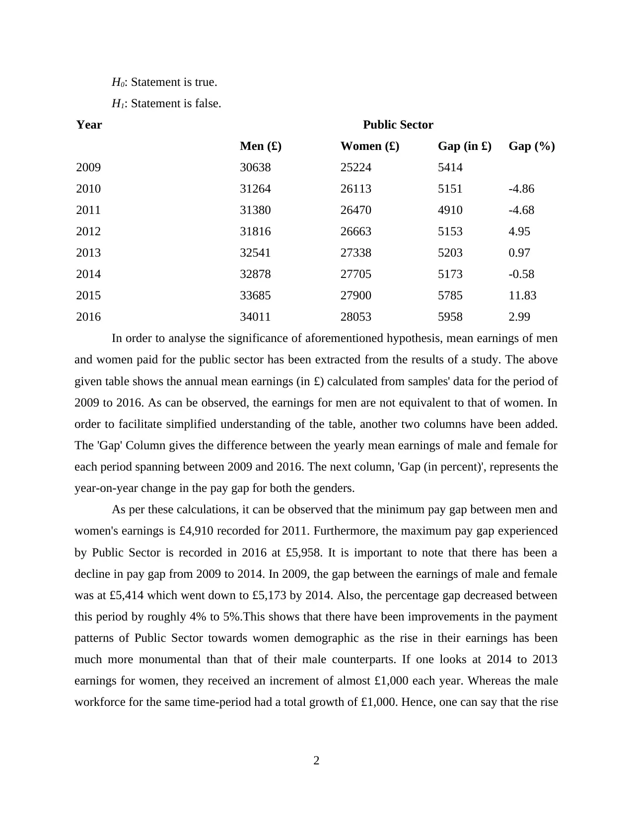
H0: Statement is true.
H1: Statement is false.
Year Public Sector
Men (£) Women (£) Gap (in £) Gap (%)
2009 30638 25224 5414
2010 31264 26113 5151 -4.86
2011 31380 26470 4910 -4.68
2012 31816 26663 5153 4.95
2013 32541 27338 5203 0.97
2014 32878 27705 5173 -0.58
2015 33685 27900 5785 11.83
2016 34011 28053 5958 2.99
In order to analyse the significance of aforementioned hypothesis, mean earnings of men
and women paid for the public sector has been extracted from the results of a study. The above
given table shows the annual mean earnings (in £) calculated from samples' data for the period of
2009 to 2016. As can be observed, the earnings for men are not equivalent to that of women. In
order to facilitate simplified understanding of the table, another two columns have been added.
The 'Gap' Column gives the difference between the yearly mean earnings of male and female for
each period spanning between 2009 and 2016. The next column, 'Gap (in percent)', represents the
year-on-year change in the pay gap for both the genders.
As per these calculations, it can be observed that the minimum pay gap between men and
women's earnings is £4,910 recorded for 2011. Furthermore, the maximum pay gap experienced
by Public Sector is recorded in 2016 at £5,958. It is important to note that there has been a
decline in pay gap from 2009 to 2014. In 2009, the gap between the earnings of male and female
was at £5,414 which went down to £5,173 by 2014. Also, the percentage gap decreased between
this period by roughly 4% to 5%.This shows that there have been improvements in the payment
patterns of Public Sector towards women demographic as the rise in their earnings has been
much more monumental than that of their male counterparts. If one looks at 2014 to 2013
earnings for women, they received an increment of almost £1,000 each year. Whereas the male
workforce for the same time-period had a total growth of £1,000. Hence, one can say that the rise
2
Paraphrase This Document
Need a fresh take? Get an instant paraphrase of this document with our AI Paraphraser
in income of women has been the sole or direct factor driving the gender pay gap on the
downside.
From above observations and calculations, it can inferred that the overall gender pay gap
in the Public Sector has been on the rising side in the recent years. Therefore, our hypothesis
does not hold true. It can be observed from the most recent pay made to men is almost £6,000 or
21.23% higher than that paid to women resulting in acceptance of H1 and rejection of H0.
(b) Testing Hypothesis for mean earnings in private sector
In the given case scenario, a study was conducted that included random sampling of 1000
participants for both women and men. The assumptions used to conduct the statistical techniques
over this study included that the mean annual gross earnings followed a normal distribution. The
study aimed to compare the earnings of men and women of Private Sector. Following this
scenario from above, the hypothesis derived is given as under:
Statement: Earnings of men is not substantially significant to that of women in Private
Sector.
H0: Statement is true.
H1: Statement is false.
Year Private Sector
Men (£) Women (£) Gap (£) Gap (%)
2009 27632 19551 8081
2010 27000 19532 7468 -7.59
2011 27233 19565 7668 2.68
2012 27705 20313 7392 -3.6
2013 28201 20698 7503 1.5
2014 28442 21017 7425 -1.03
2015 28881 21403 7478 0.71
2016 29679 22251 7428 -0.67
Total 224773 164330
In the above table, the annual gap between male and female workforce has been
calculated by subtracting the wages paid to women from that of men. Similarly, the year-on-year
gap percentage has been calculated to account the changes in pay gap from 2010 to 2016. There
has been a considerable decrease in the gap from 2009 to 2016. This sector experienced the
3
lowest pay gap in 2012 recorded at £7,392. It is noteworthy that both Men and Women have
experienced an almost same increase in their annual gross earnings from one year to another. The
highest change in pay-gap occurred between 2010 and 2011 where the gap reduced by 7.59%. In
addition to this, the sector also experienced a recent decline of mere 0.67%. However, there has
been an increase in the gap of 2016 earnings of men and women. Taking this into account, it can
be inferred that hypothesis ( H1) holds true, that is, there is a significant earning gap (£7428 or
33.38%) between male and female workforce employed in the private sector.
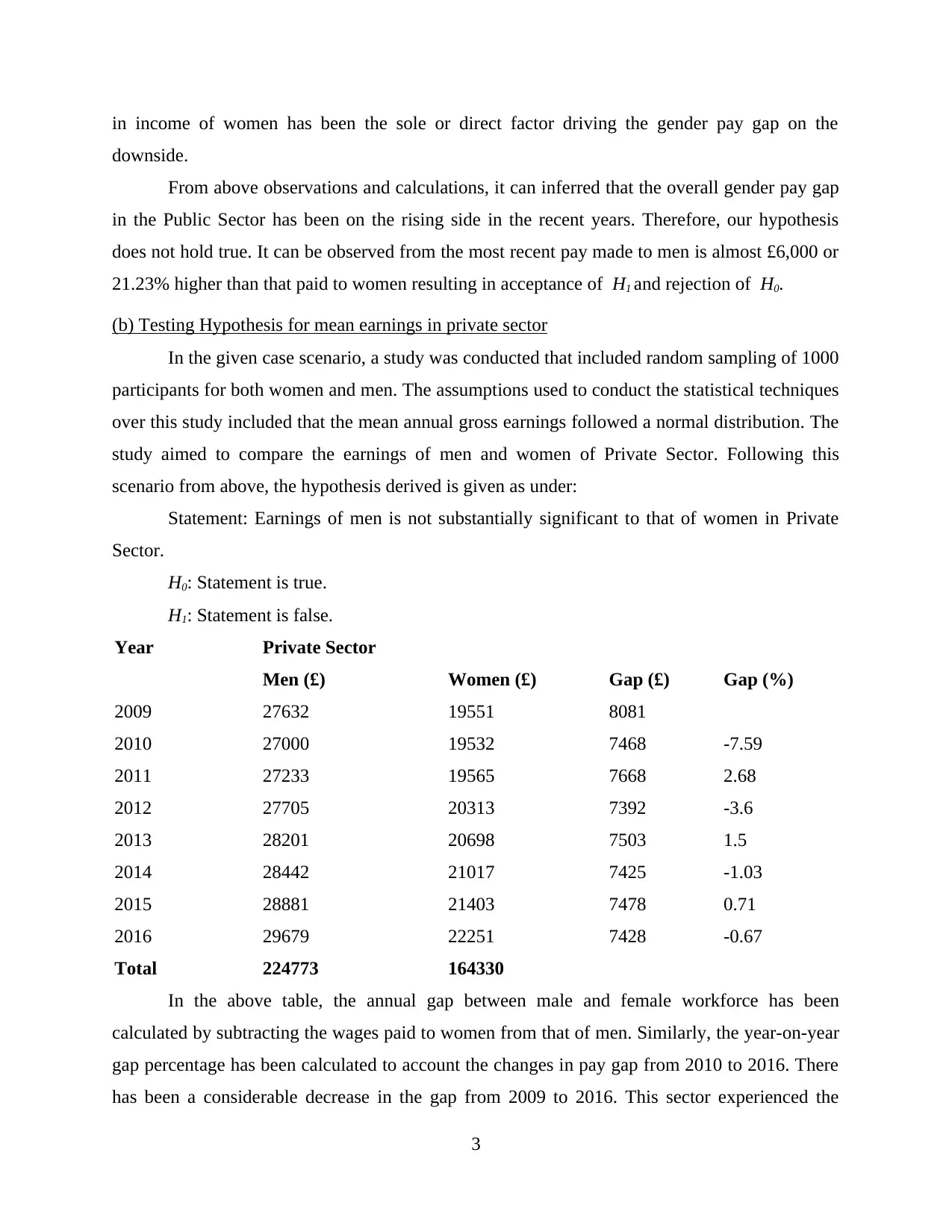
(c) Producing Earnings-Time Chart for each group
In case of Male Workforce of Public Sector:
2009 2010 2011 2012 2013 2014 2015 2016
28000
29000
30000
31000
32000
33000
34000
35000
30638
31264 31380
31816
32541 32878
33685 34011
Earnings
Time
Earnings
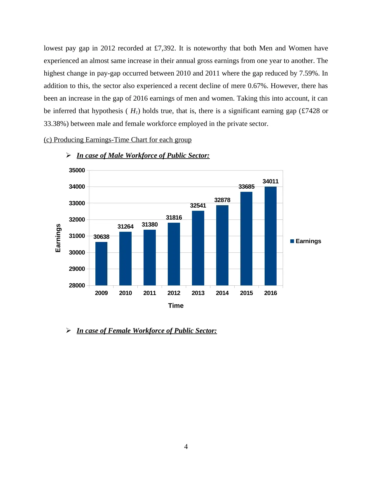
In case of Female Workforce of Public Sector:
4
experienced an almost same increase in their annual gross earnings from one year to another. The
highest change in pay-gap occurred between 2010 and 2011 where the gap reduced by 7.59%. In
addition to this, the sector also experienced a recent decline of mere 0.67%. However, there has
been an increase in the gap of 2016 earnings of men and women. Taking this into account, it can
be inferred that hypothesis ( H1) holds true, that is, there is a significant earning gap (£7428 or
33.38%) between male and female workforce employed in the private sector.
(c) Producing Earnings-Time Chart for each group
In case of Male Workforce of Public Sector:
2009 2010 2011 2012 2013 2014 2015 2016
28000
29000
30000
31000
32000
33000
34000
35000
30638
31264 31380
31816
32541 32878
33685 34011
Earnings
Time
Earnings
In case of Female Workforce of Public Sector:
4
⊘ This is a preview!⊘
Do you want full access?
Subscribe today to unlock all pages.
Trusted by 1+ million students worldwide
2009 2010 2011 2012 2013 2014 2015 2016
23500
24000
24500
25000
25500
26000
26500
27000
27500
28000
28500
25224
26113
26470 26663
27338
27705 27900 28053
Earnings
Time
Earnings
In case of Male Workforce of Private Sector:
01/07/1905
02/07/1905
03/07/1905
04/07/1905
05/07/1905
06/07/1905
07/07/1905
08/07/1905
25500
26000
26500
27000
27500
28000
28500
29000
29500
30000
27632
27000 27233
27705
28201 28442
28881
29679
Earnings
Time
Earnings
In case of Female Workforce of Private Sector:
5
23500
24000
24500
25000
25500
26000
26500
27000
27500
28000
28500
25224
26113
26470 26663
27338
27705 27900 28053
Earnings
Time
Earnings
In case of Male Workforce of Private Sector:
01/07/1905
02/07/1905
03/07/1905
04/07/1905
05/07/1905
06/07/1905
07/07/1905
08/07/1905
25500
26000
26500
27000
27500
28000
28500
29000
29500
30000
27632
27000 27233
27705
28201 28442
28881
29679
Earnings
Time
Earnings
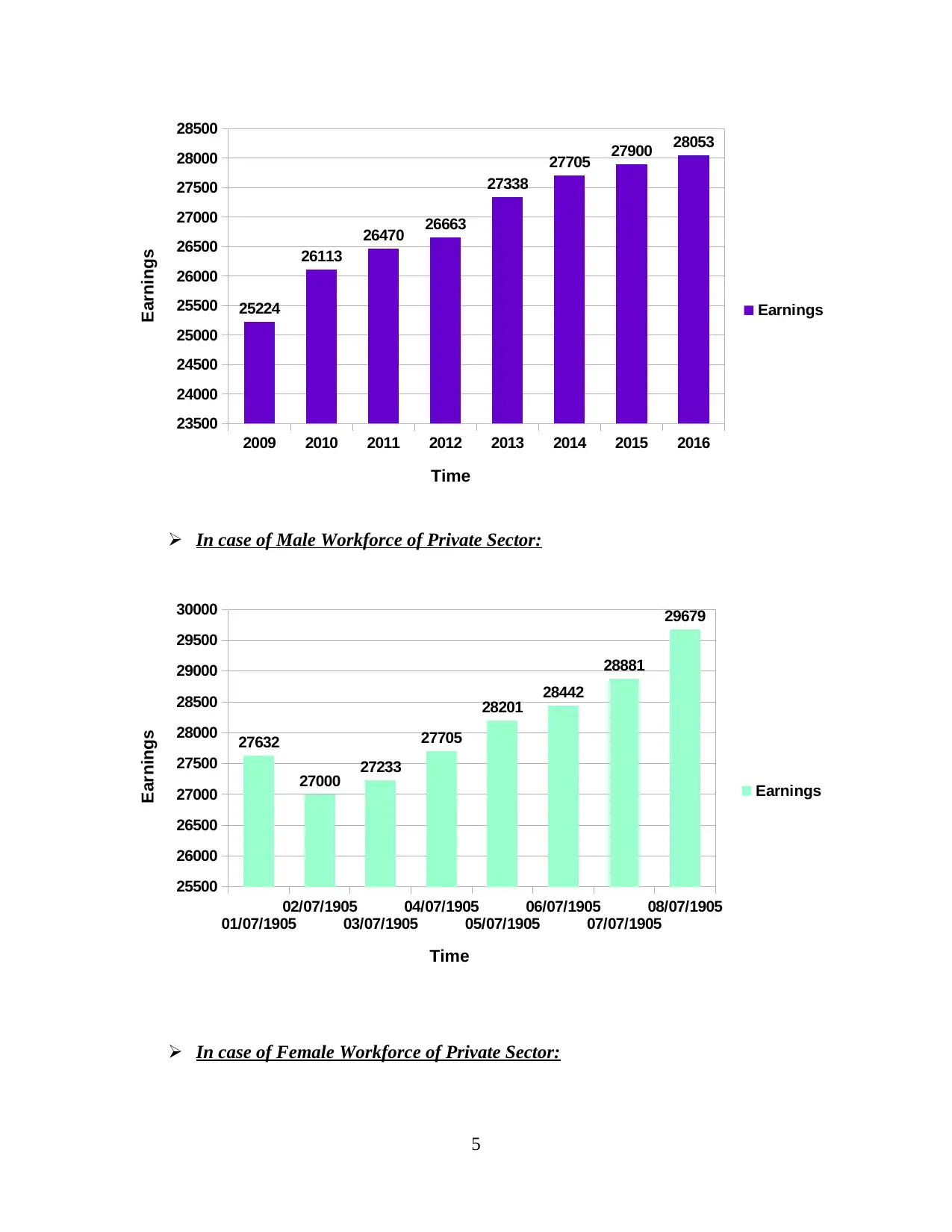
In case of Female Workforce of Private Sector:
5
Paraphrase This Document
Need a fresh take? Get an instant paraphrase of this document with our AI Paraphraser
2009 2010 2011 2012 2013 2014 2015 2016
18000
18500
19000
19500
20000
20500
21000
21500
22000
22500
19551 19532 19565
20313
20698
21017
21403
22251
Earnings
Time
Earnings
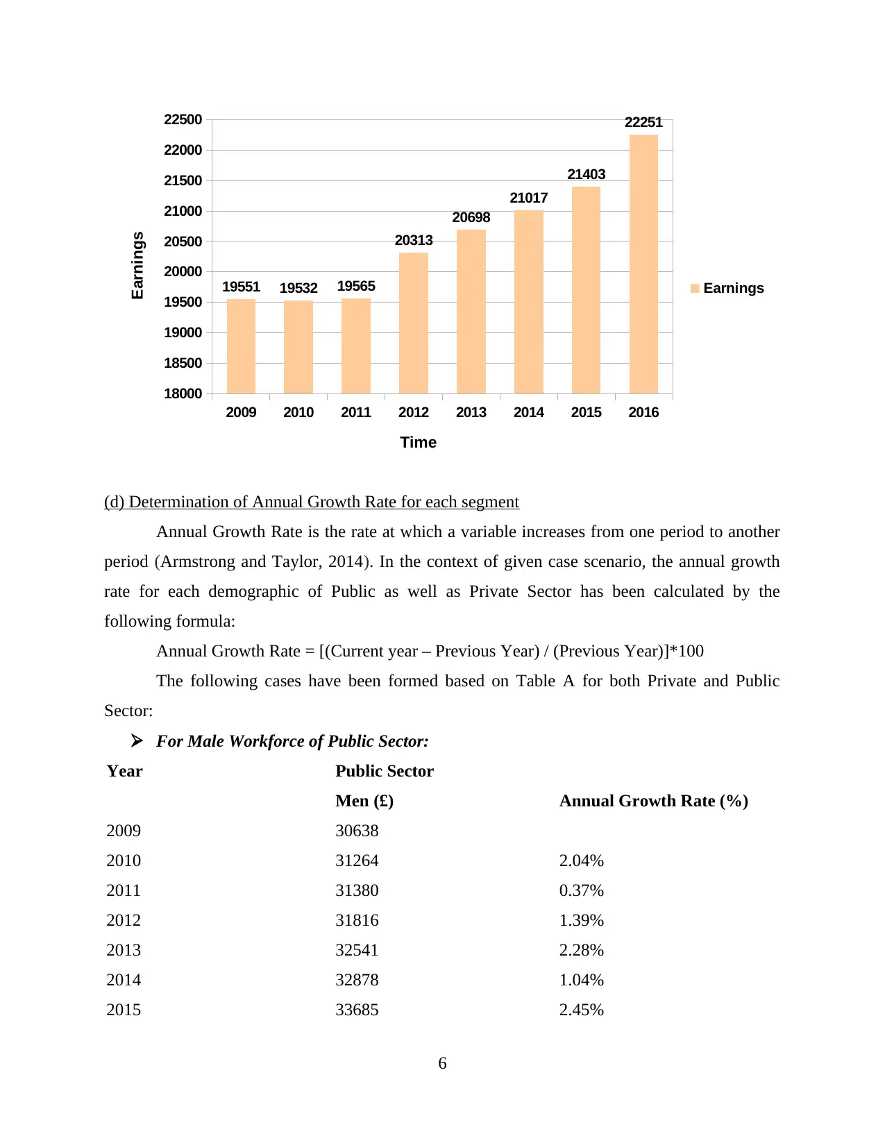
(d) Determination of Annual Growth Rate for each segment
Annual Growth Rate is the rate at which a variable increases from one period to another
period (Armstrong and Taylor, 2014). In the context of given case scenario, the annual growth
rate for each demographic of Public as well as Private Sector has been calculated by the
following formula:
Annual Growth Rate = [(Current year – Previous Year) / (Previous Year)]*100
The following cases have been formed based on Table A for both Private and Public
Sector:
For Male Workforce of Public Sector:
Year Public Sector
Men (£) Annual Growth Rate (%)
2009 30638
2010 31264 2.04%
2011 31380 0.37%
2012 31816 1.39%
2013 32541 2.28%
2014 32878 1.04%
2015 33685 2.45%
6
18000
18500
19000
19500
20000
20500
21000
21500
22000
22500
19551 19532 19565
20313
20698
21017
21403
22251
Earnings
Time
Earnings
(d) Determination of Annual Growth Rate for each segment
Annual Growth Rate is the rate at which a variable increases from one period to another
period (Armstrong and Taylor, 2014). In the context of given case scenario, the annual growth
rate for each demographic of Public as well as Private Sector has been calculated by the
following formula:
Annual Growth Rate = [(Current year – Previous Year) / (Previous Year)]*100
The following cases have been formed based on Table A for both Private and Public
Sector:
For Male Workforce of Public Sector:
Year Public Sector
Men (£) Annual Growth Rate (%)
2009 30638
2010 31264 2.04%
2011 31380 0.37%
2012 31816 1.39%
2013 32541 2.28%
2014 32878 1.04%
2015 33685 2.45%
6
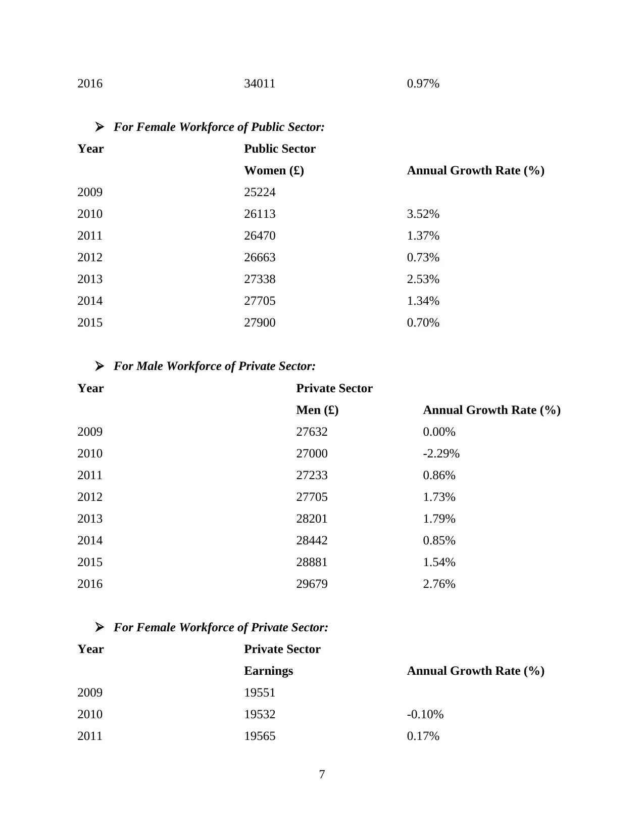
2016 34011 0.97%
For Female Workforce of Public Sector:
Year Public Sector
Women (£) Annual Growth Rate (%)
2009 25224
2010 26113 3.52%
2011 26470 1.37%
2012 26663 0.73%
2013 27338 2.53%
2014 27705 1.34%
2015 27900 0.70%
For Male Workforce of Private Sector:
Year Private Sector
Men (£) Annual Growth Rate (%)
2009 27632 0.00%
2010 27000 -2.29%
2011 27233 0.86%
2012 27705 1.73%
2013 28201 1.79%
2014 28442 0.85%
2015 28881 1.54%
2016 29679 2.76%
For Female Workforce of Private Sector:
Year Private Sector
Earnings Annual Growth Rate (%)
2009 19551
2010 19532 -0.10%
2011 19565 0.17%
7
⊘ This is a preview!⊘
Do you want full access?
Subscribe today to unlock all pages.
Trusted by 1+ million students worldwide
2012 20313 3.82%
2013 20698 1.90%
2014 21017 1.54%
2015 21403 1.84%
2016 22251 3.96%
TASK 2
(a) Analysing raw business data using a number of statistical methods:
In Statistics, raw data includes those figures or information that has not beet processed
yet or converted into something more meaningful. This business data may be segregated into
divisions based on the objectives it aims to achieve and utilized as information for many research
and development purpose including population and sample. Population is referred to as a vast
pool of data from which a sample is drawn . It may include group of people, objects or units of
measure. On the other hand, a sample is a smaller group of data reflecting all the characteristics
of population it is drawn from. To achieve this, many researchers take help of data analysis or
statistical methods to convert mass data into an insight.
Under Data Analysis, a research may conduct either a quantitative analysis or a
qualitative analysis. Even though both aim to serve the same purpose, Quantitative Analysis
targets quantification of data whereas qualitative analysis targets the underlying reasons such as
motivation factors and psychology of the consumer to gain an in-depth understanding from the
collected data (Bedeian, 2014). In the context of Leisure Centre Staff of London, a quantitative
analysis has been carried out to derive meaningful inferences from the data collected.
(i) Using Ogive to estimate Median and Quartiles for Leisure Centre Staff, London
An Ogive or Cumulative histogram, is a graphical representation of Cumulative
Frequencies used to ascertain number of data points which lie below or above a certain value
present in the data set. The Cumulative Frequency, here, is the addition of each frequency with
that of next class interval (Boehm and Thomas, 2013). It is important to note that the Cumulative
Frequency for the last interval would always be equal to the sum of all data values present in the
data set. The following table shows the calculations regarding cumulative frequency for the
purpose of generating Ogive:
8
Paraphrase This Document
Need a fresh take? Get an instant paraphrase of this document with our AI Paraphraser
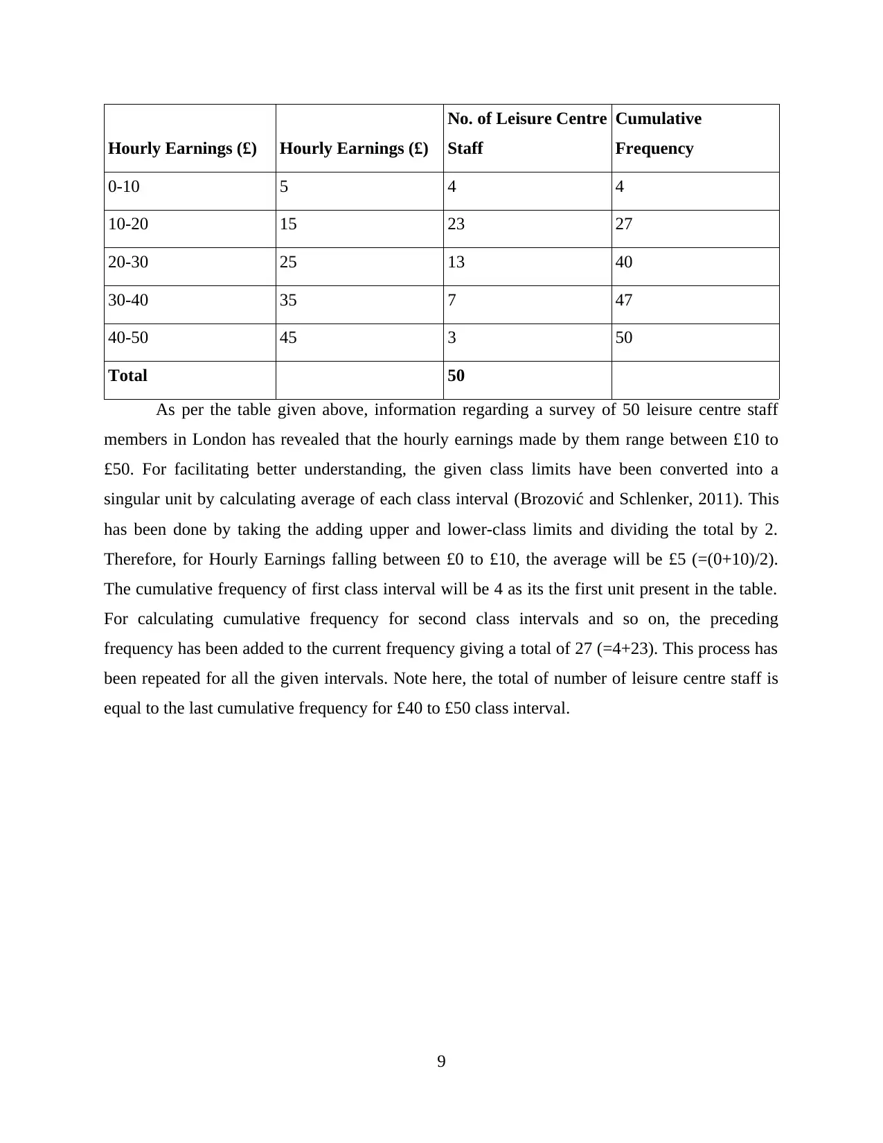
Hourly Earnings (£) Hourly Earnings (£)
No. of Leisure Centre
Staff
Cumulative
Frequency
0-10 5 4 4
10-20 15 23 27
20-30 25 13 40
30-40 35 7 47
40-50 45 3 50
Total 50
As per the table given above, information regarding a survey of 50 leisure centre staff
members in London has revealed that the hourly earnings made by them range between £10 to
£50. For facilitating better understanding, the given class limits have been converted into a
singular unit by calculating average of each class interval (Brozović and Schlenker, 2011). This
has been done by taking the adding upper and lower-class limits and dividing the total by 2.
Therefore, for Hourly Earnings falling between £0 to £10, the average will be £5 (=(0+10)/2).
The cumulative frequency of first class interval will be 4 as its the first unit present in the table.
For calculating cumulative frequency for second class intervals and so on, the preceding
frequency has been added to the current frequency giving a total of 27 (=4+23). This process has
been repeated for all the given intervals. Note here, the total of number of leisure centre staff is
equal to the last cumulative frequency for £40 to £50 class interval.
9
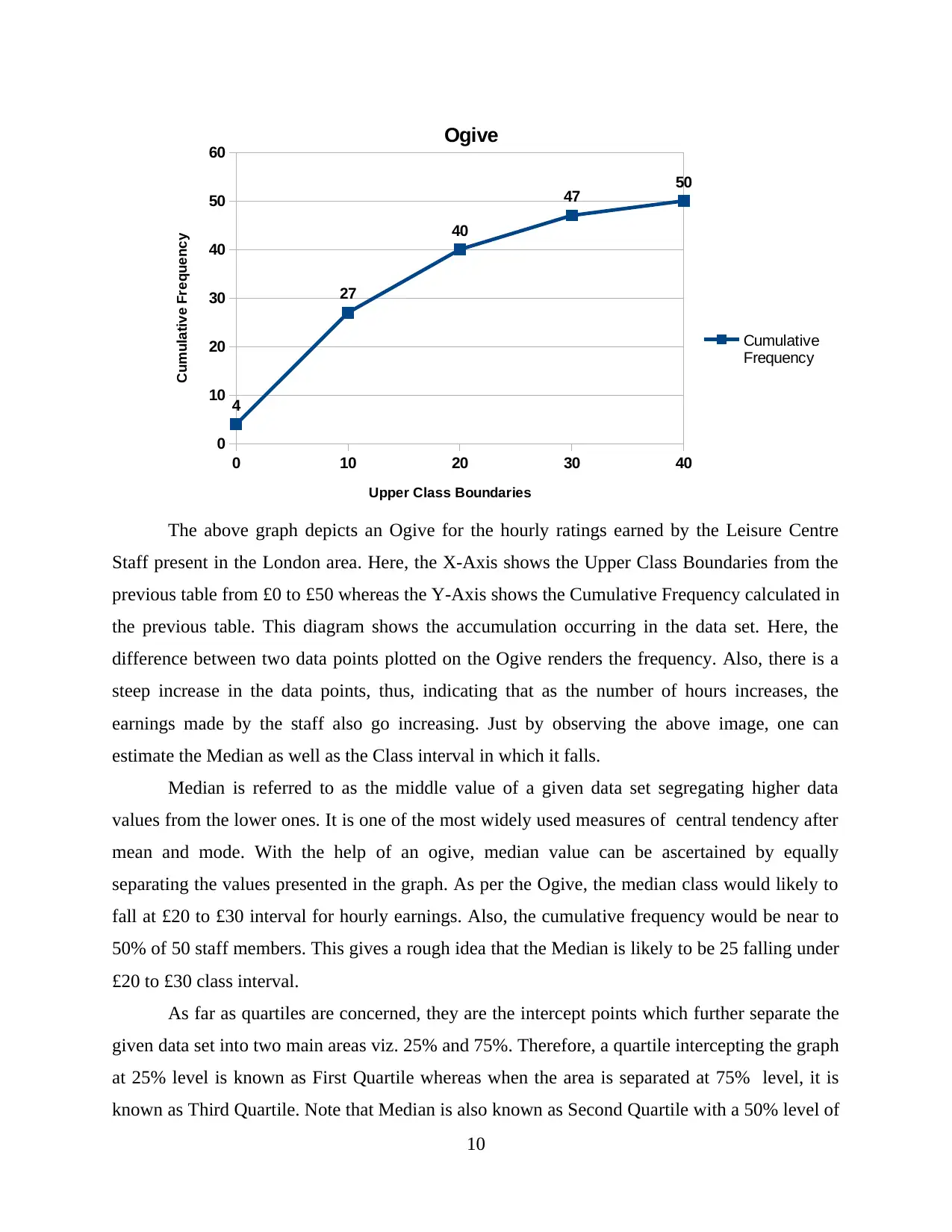
0 10 20 30 40
0
10
20
30
40
50
60
4
27
40
47 50
Ogive
Cumulative
Frequency
Upper Class Boundaries
Cumulative Frequency
The above graph depicts an Ogive for the hourly ratings earned by the Leisure Centre
Staff present in the London area. Here, the X-Axis shows the Upper Class Boundaries from the
previous table from £0 to £50 whereas the Y-Axis shows the Cumulative Frequency calculated in
the previous table. This diagram shows the accumulation occurring in the data set. Here, the
difference between two data points plotted on the Ogive renders the frequency. Also, there is a
steep increase in the data points, thus, indicating that as the number of hours increases, the
earnings made by the staff also go increasing. Just by observing the above image, one can
estimate the Median as well as the Class interval in which it falls.
Median is referred to as the middle value of a given data set segregating higher data
values from the lower ones. It is one of the most widely used measures of central tendency after
mean and mode. With the help of an ogive, median value can be ascertained by equally
separating the values presented in the graph. As per the Ogive, the median class would likely to
fall at £20 to £30 interval for hourly earnings. Also, the cumulative frequency would be near to
50% of 50 staff members. This gives a rough idea that the Median is likely to be 25 falling under
£20 to £30 class interval.
As far as quartiles are concerned, they are the intercept points which further separate the
given data set into two main areas viz. 25% and 75%. Therefore, a quartile intercepting the graph
at 25% level is known as First Quartile whereas when the area is separated at 75% level, it is
known as Third Quartile. Note that Median is also known as Second Quartile with a 50% level of
10
⊘ This is a preview!⊘
Do you want full access?
Subscribe today to unlock all pages.
Trusted by 1+ million students worldwide
1 out of 20
Related Documents


Your All-in-One AI-Powered Toolkit for Academic Success.
+13062052269
info@desklib.com
Available 24*7 on WhatsApp / Email
![[object Object]](/_next/static/media/star-bottom.7253800d.svg)
Unlock your academic potential
Copyright © 2020–2026 A2Z Services. All Rights Reserved. Developed and managed by ZUCOL.