Report on Statistics and Research Methods for Business Decision Making
VerifiedAdded on 2023/01/13
|19
|3126
|37
Report
AI Summary
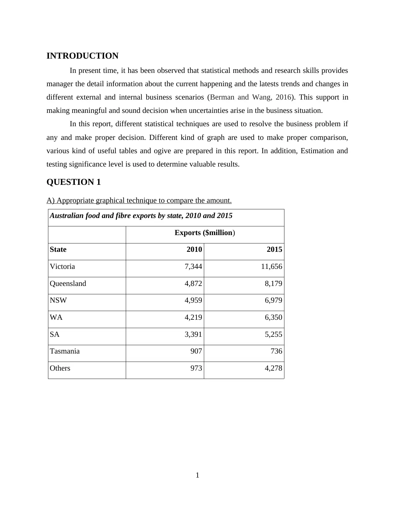
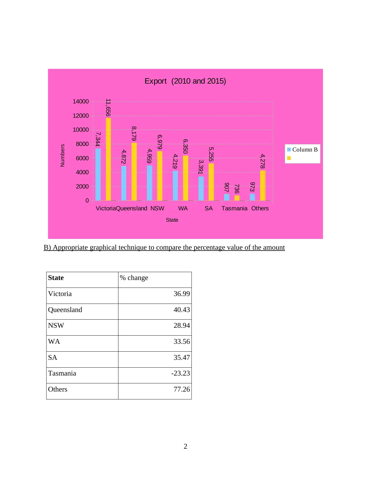
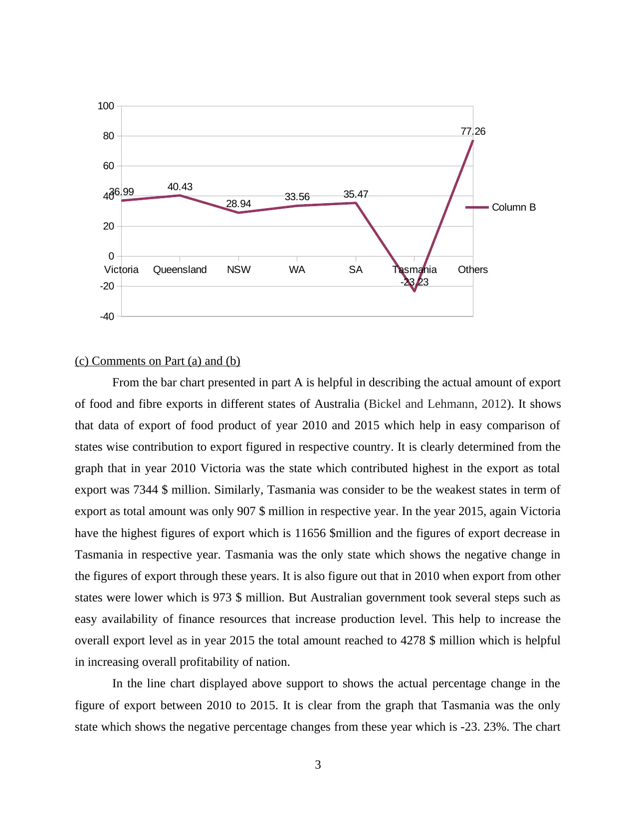
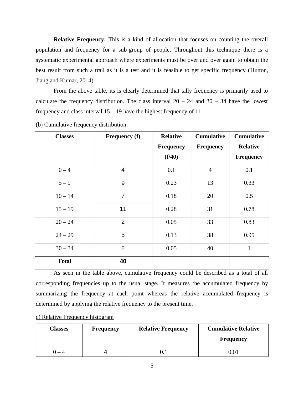
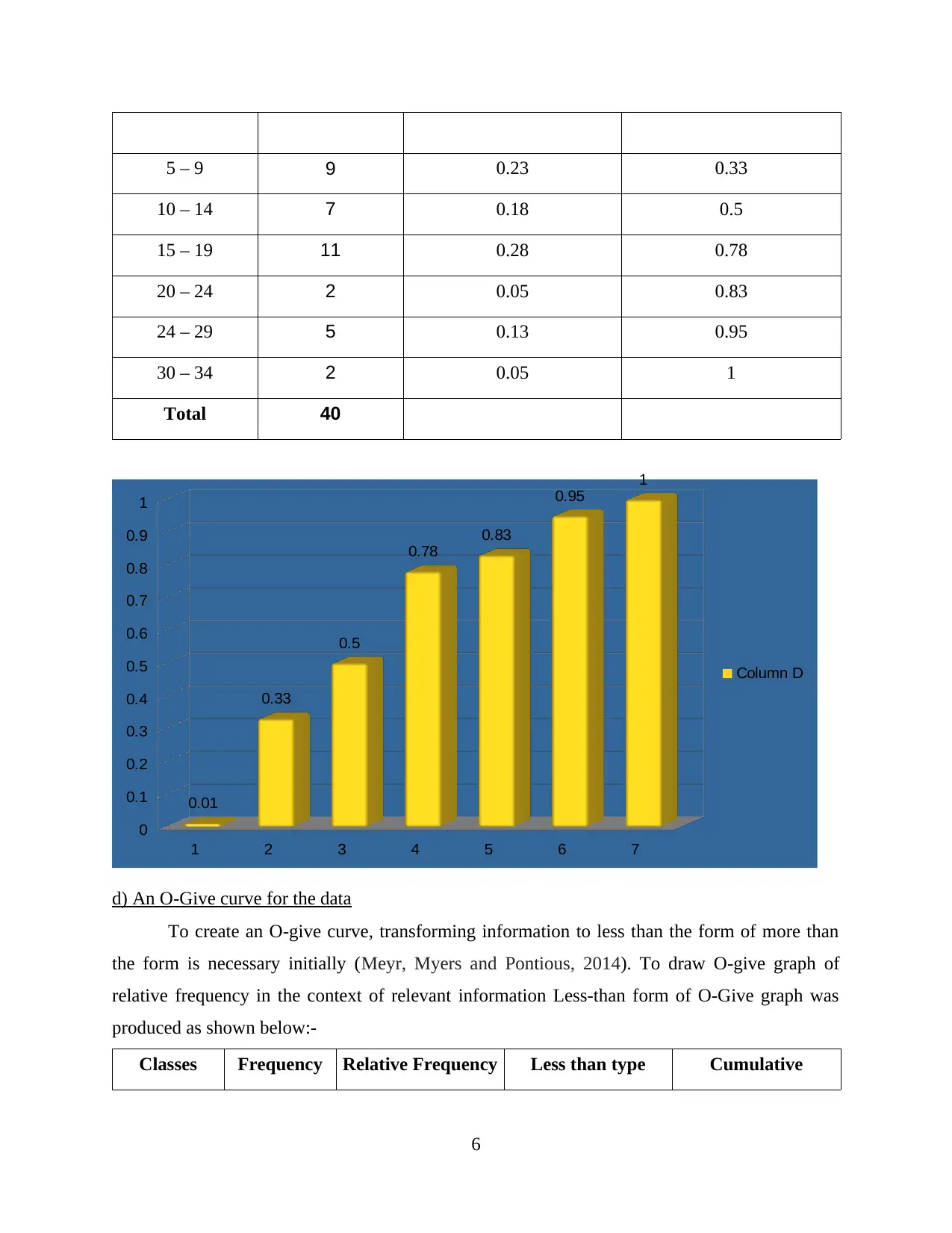
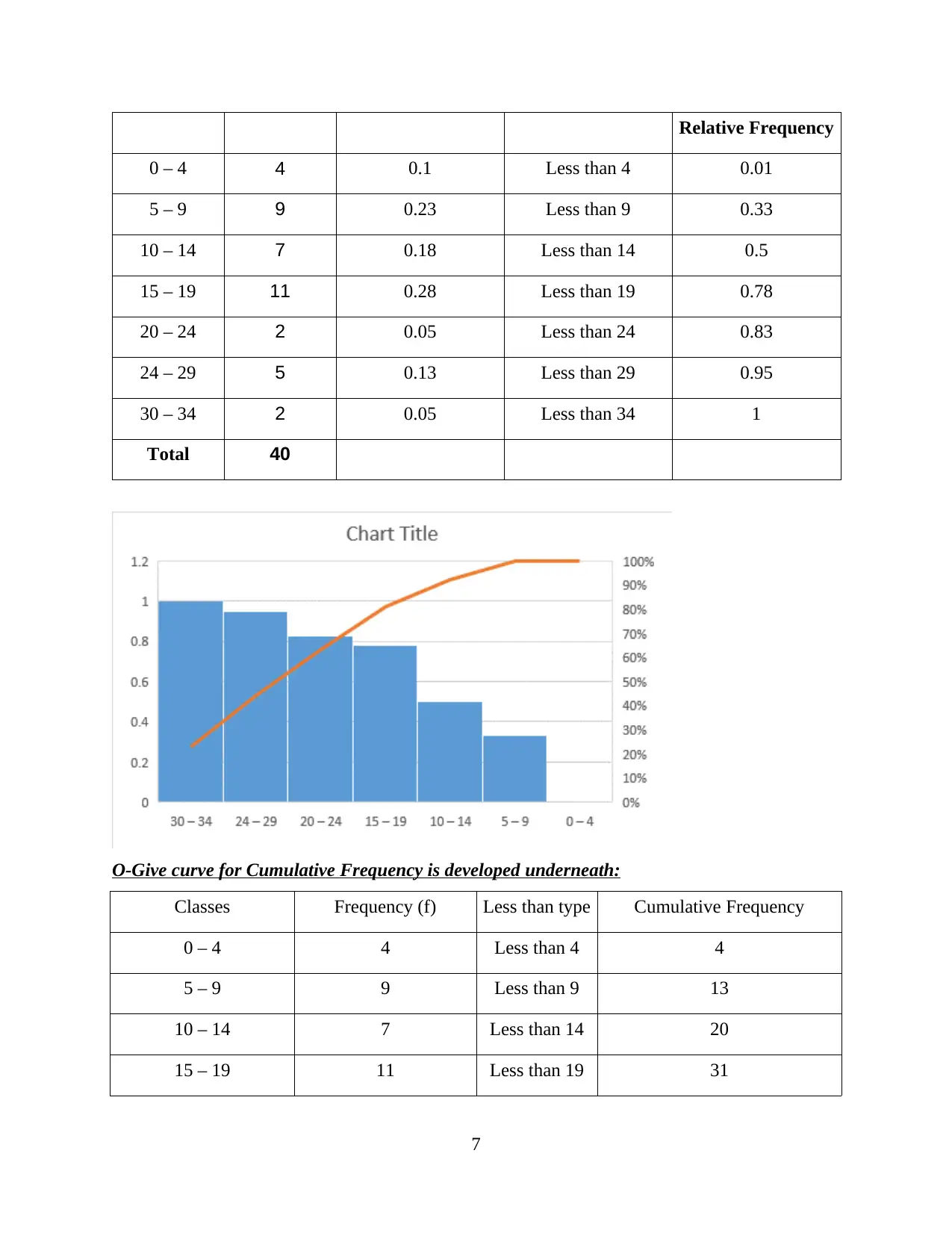
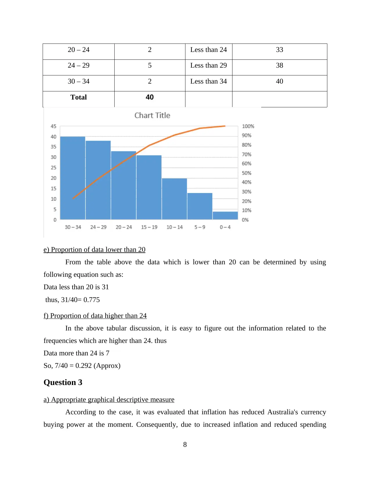
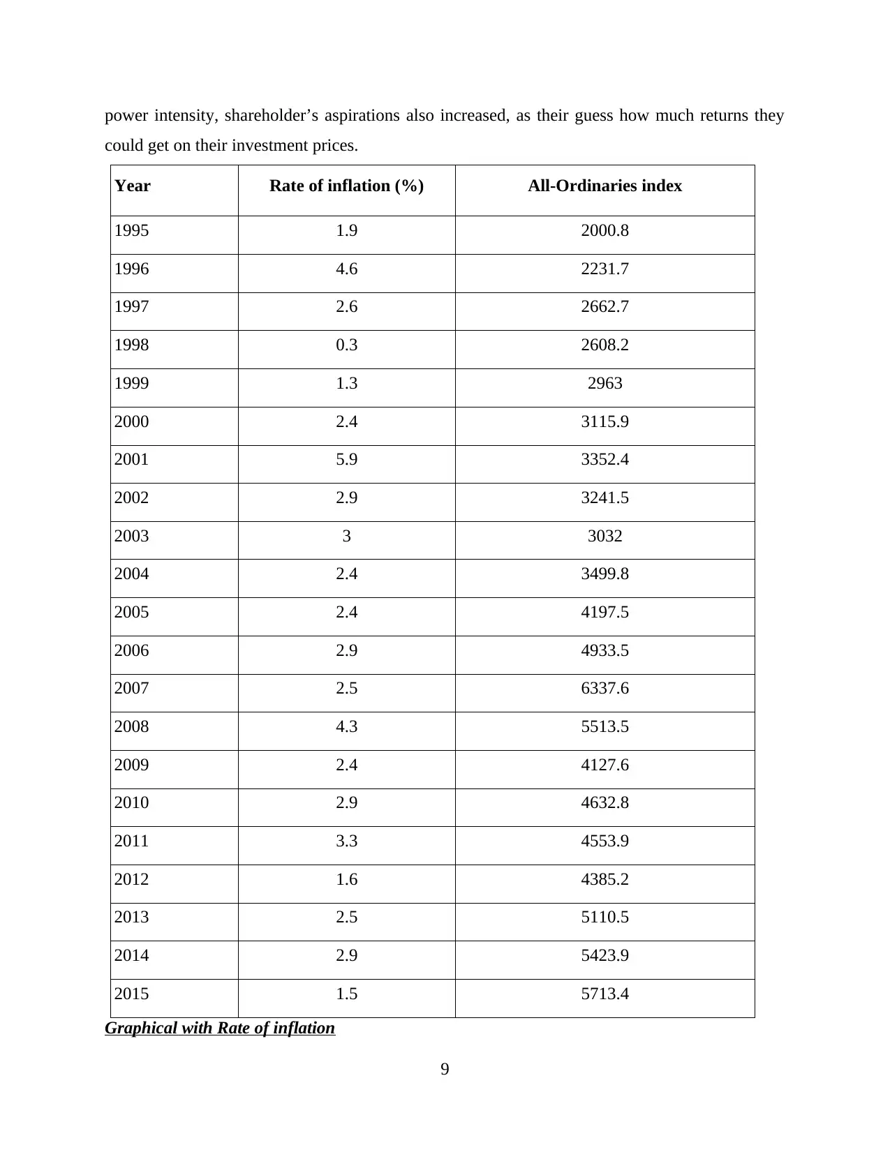
This report delves into the application of statistical methods and research techniques to aid in business decision-making. It begins with an introduction highlighting the importance of statistical analysis in understanding business trends and uncertainties. The report then addresses specific questions, starting with the comparison of Australian food and fibre exports using appropriate graphical techniques like bar charts and percentage change graphs, offering insights into state-wise contributions and export trends. The analysis continues with a detailed examination of weekly sales call data, including the creation of frequency and relative frequency distributions, cumulative frequency distributions, histograms, and O-give curves to analyze the data. Furthermore, the report investigates the relationship between inflation rates and the All-Ordinaries index, employing graphical descriptive measures, scatter plots, and numerical summaries to explore the correlation and regression between the variables, including calculations for correlation coefficients, regression lines, and significance testing. The report concludes by summarizing the findings and emphasizing the practical implications of statistical analysis in business contexts.

Statistics and Research
Methods for Business
Decision Making
Methods for Business
Decision Making
Paraphrase This Document
Need a fresh take? Get an instant paraphrase of this document with our AI Paraphraser

Table of Contents
INTRODUCTION...........................................................................................................................1
QUESTION 1...................................................................................................................................1
A) Appropriate graphical technique to compare the amount.................................................1
B) Appropriate graphical technique to compare the percentage value of the amount...........2
(c) Comments on Part (a) and (b)...........................................................................................3
QUESTION 2...................................................................................................................................4
a) Frequency distribution and a relative frequency distribution.............................................4
(b) Cumulative frequency distribution:..................................................................................5
c) Relative Frequency histogram............................................................................................5
d) An O-Give curve for the data.............................................................................................6
e) Proportion of data lower than 20........................................................................................7
f) Proportion of data higher than 24.......................................................................................8
Question 3........................................................................................................................................8
a) Appropriate graphical descriptive measure........................................................................8
b) Scatter Plot.......................................................................................................................10
c) Numerical Summary Plot.................................................................................................10
d) Correlation coefficient...................................................................................................13
e) Estimating Regression Line..............................................................................................14
f) Estimating Coefficient of Determination..........................................................................14
g) Testing Significance of the relationship...........................................................................14
h) Value of the standard error...............................................................................................14
CONCLUSION..............................................................................................................................15
REFERENCES..............................................................................................................................16

⊘ This is a preview!⊘
Do you want full access?
Subscribe today to unlock all pages.

Trusted by 1+ million students worldwide

INTRODUCTION
In present time, it has been observed that statistical methods and research skills provides
manager the detail information about the current happening and the latests trends and changes in
different external and internal business scenarios (Berman and Wang, 2016). This support in
making meaningful and sound decision when uncertainties arise in the business situation.
In this report, different statistical techniques are used to resolve the business problem if
any and make proper decision. Different kind of graph are used to make proper comparison,
various kind of useful tables and ogive are prepared in this report. In addition, Estimation and
testing significance level is used to determine valuable results.
QUESTION 1
A) Appropriate graphical technique to compare the amount.
Australian food and fibre exports by state, 2010 and 2015
Exports ($million)
State 2010 2015
Victoria 7,344 11,656
Queensland 4,872 8,179
NSW 4,959 6,979
WA 4,219 6,350
SA 3,391 5,255
Tasmania 907 736
Others 973 4,278
1
Paraphrase This Document
Need a fresh take? Get an instant paraphrase of this document with our AI Paraphraser

B) Appropriate graphical technique to compare the percentage value of the amount
State % change
Victoria 36.99
Queensland 40.43
NSW 28.94
WA 33.56
SA 35.47
Tasmania -23.23
Others 77.26
2
VictoriaQueensland NSW WA SA Tasmania Others
0
2000
4000
6000
8000
10000
12000
14000
7,344
4,872
4,959
4,219
3,391
907
973
11,656
8,179
6,979
6,350
5,255
736
4,278
Export (2010 and 2015)
Column B
State
Numbers

Victoria Queensland NSW WA SA Tasmania Others
-40
-20
0
20
40
60
80
100
36.99 40.43
28.94 33.56 35.47
-23.23
77.26
Column B
(c) Comments on Part (a) and (b)
From the bar chart presented in part A is helpful in describing the actual amount of export
of food and fibre exports in different states of Australia (Bickel and Lehmann, 2012). It shows
that data of export of food product of year 2010 and 2015 which help in easy comparison of
states wise contribution to export figured in respective country. It is clearly determined from the
graph that in year 2010 Victoria was the state which contributed highest in the export as total
export was 7344 $ million. Similarly, Tasmania was consider to be the weakest states in term of
export as total amount was only 907 $ million in respective year. In the year 2015, again Victoria
have the highest figures of export which is 11656 $million and the figures of export decrease in
Tasmania in respective year. Tasmania was the only state which shows the negative change in
the figures of export through these years. It is also figure out that in 2010 when export from other
states were lower which is 973 $ million. But Australian government took several steps such as
easy availability of finance resources that increase production level. This help to increase the
overall export level as in year 2015 the total amount reached to 4278 $ million which is helpful
in increasing overall profitability of nation.
In the line chart displayed above support to shows the actual percentage change in the
figure of export between 2010 to 2015. It is clear from the graph that Tasmania was the only
state which shows the negative percentage changes from these year which is -23. 23%. The chart
3
⊘ This is a preview!⊘
Do you want full access?
Subscribe today to unlock all pages.

Trusted by 1+ million students worldwide

also shows that the highest percentage alteration in other state of Australia which share the more
amount of export in year 2015. The main reasons for increase in export is because of fall in
inflation rate as in year 2010 its was 2.9% and in year 2015 it remain at 1.5. this help to raise he
Australian international compet8itiveness and will likely improve and raise the export level in
respective year.
QUESTION 2
Numbers of weekly sales calls by a sample of 40 telemarketers are recorded and
presented in below table:
14 8 6 12 21 4 9 0 25 17
9 5 8 18 16 3 17 19 10 15
5 20 17 14 19 7 10 15 10 8
28 31 27 30 2 17 26 11 29 19
a) Frequency distribution and a relative frequency distribution.
Classes Tally Frequency Frequency (f) Relative Frequency
(f/40)
0 – 4 IIII 4 0.1
5 – 9 IIIII IIII 9 0.23
10 – 14 IIIII II 7 0.18
15 – 19 IIIII IIIII I 11 0.28
20 – 24 II 2 0.05
24 – 29 IIIII 5 0.13
30 – 34 II 2 0.05
Total 40 40
Frequency Distribution: This is a description that allows to display either in tabular or
tabular format the amount of findings inside a given period (Dittmar and Duchin, 2015). It is
used primarily in a mathematical sense related to normal distribution forecasting.
4
Paraphrase This Document
Need a fresh take? Get an instant paraphrase of this document with our AI Paraphraser

Relative Frequency: This is a kind of allocation that focuses on counting the overall
population and frequency for a sub-group of people. Throughout this technique there is a
systematic experimental approach where experiments must be over and over again to obtain the
best result from such a trail as it is a test and it is feasible to get specific frequency (Hutton,
Jiang and Kumar, 2014).
From the above table, its is clearly determined that tally frequency is primarily used to
calculate the frequency distribution. The class interval 20 – 24 and 30 – 34 have the lowest
frequency and class interval 15 – 19 have the highest frequency of 11.
(b) Cumulative frequency distribution:
Classes Frequency (f) Relative
Frequency
(f/40)
Cumulative
Frequency
Cumulative
Relative
Frequency
0 – 4 4 0.1 4 0.1
5 – 9 9 0.23 13 0.33
10 – 14 7 0.18 20 0.5
15 – 19 11 0.28 31 0.78
20 – 24 2 0.05 33 0.83
24 – 29 5 0.13 38 0.95
30 – 34 2 0.05 40 1
Total 40
As seen in the table above, cumulative frequency could be described as a total of all
corresponding frequencies up to the usual stage. It measures the accumulated frequency by
summarizing the frequency at each point whereas the relative accumulated frequency is
determined by applying the relative frequency to the present time.
c) Relative Frequency histogram
Classes Frequency Relative Frequency Cumulative Relative
Frequency
0 – 4 4 0.1 0.01
5

5 – 9 9 0.23 0.33
10 – 14 7 0.18 0.5
15 – 19 11 0.28 0.78
20 – 24 2 0.05 0.83
24 – 29 5 0.13 0.95
30 – 34 2 0.05 1
Total 40
1 2 3 4 5 6 7
0
0.1
0.2
0.3
0.4
0.5
0.6
0.7
0.8
0.9
1
0.01
0.33
0.5
0.78
0.83
0.95
1
Column D
d) An O-Give curve for the data
To create an O-give curve, transforming information to less than the form of more than
the form is necessary initially (Meyr, Myers and Pontious, 2014). To draw O-give graph of
relative frequency in the context of relevant information Less-than form of O-Give graph was
produced as shown below:-
Classes Frequency Relative Frequency Less than type Cumulative
6
⊘ This is a preview!⊘
Do you want full access?
Subscribe today to unlock all pages.

Trusted by 1+ million students worldwide

Relative Frequency
0 – 4 4 0.1 Less than 4 0.01
5 – 9 9 0.23 Less than 9 0.33
10 – 14 7 0.18 Less than 14 0.5
15 – 19 11 0.28 Less than 19 0.78
20 – 24 2 0.05 Less than 24 0.83
24 – 29 5 0.13 Less than 29 0.95
30 – 34 2 0.05 Less than 34 1
Total 40
O-Give curve for Cumulative Frequency is developed underneath:
Classes Frequency (f) Less than type Cumulative Frequency
0 – 4 4 Less than 4 4
5 – 9 9 Less than 9 13
10 – 14 7 Less than 14 20
15 – 19 11 Less than 19 31
7
Paraphrase This Document
Need a fresh take? Get an instant paraphrase of this document with our AI Paraphraser

20 – 24 2 Less than 24 33
24 – 29 5 Less than 29 38
30 – 34 2 Less than 34 40
Total 40
e) Proportion of data lower than 20
From the table above the data which is lower than 20 can be determined by using
following equation such as:
Data less than 20 is 31
thus, 31/40= 0.775
f) Proportion of data higher than 24
In the above tabular discussion, it is easy to figure out the information related to the
frequencies which are higher than 24. thus
Data more than 24 is 7
So, 7/40 = 0.292 (Approx)
Question 3
a) Appropriate graphical descriptive measure
According to the case, it was evaluated that inflation has reduced Australia's currency
buying power at the moment. Consequently, due to increased inflation and reduced spending
8

power intensity, shareholder’s aspirations also increased, as their guess how much returns they
could get on their investment prices.
Year Rate of inflation (%) All-Ordinaries index
1995 1.9 2000.8
1996 4.6 2231.7
1997 2.6 2662.7
1998 0.3 2608.2
1999 1.3 2963
2000 2.4 3115.9
2001 5.9 3352.4
2002 2.9 3241.5
2003 3 3032
2004 2.4 3499.8
2005 2.4 4197.5
2006 2.9 4933.5
2007 2.5 6337.6
2008 4.3 5513.5
2009 2.4 4127.6
2010 2.9 4632.8
2011 3.3 4553.9
2012 1.6 4385.2
2013 2.5 5110.5
2014 2.9 5423.9
2015 1.5 5713.4
Graphical with Rate of inflation
9
⊘ This is a preview!⊘
Do you want full access?
Subscribe today to unlock all pages.

Trusted by 1+ million students worldwide
1 out of 19
Related Documents

Your All-in-One AI-Powered Toolkit for Academic Success.
+13062052269
info@desklib.com
Available 24*7 on WhatsApp / Email
Unlock your academic potential
Copyright © 2020–2025 A2Z Services. All Rights Reserved. Developed and managed by ZUCOL.