Statistics and Research Methods for Business Decisions - Analysis
VerifiedAdded on 2021/02/19
|21
|3174
|56
Homework Assignment
AI Summary
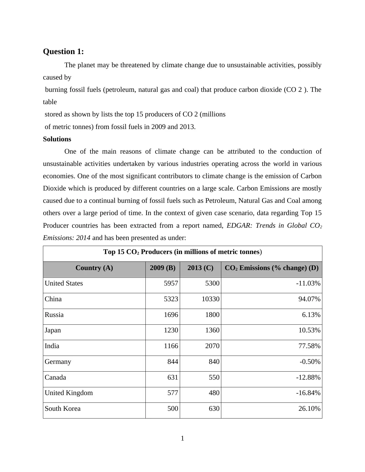
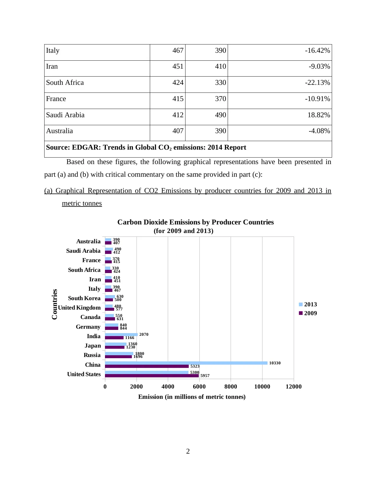
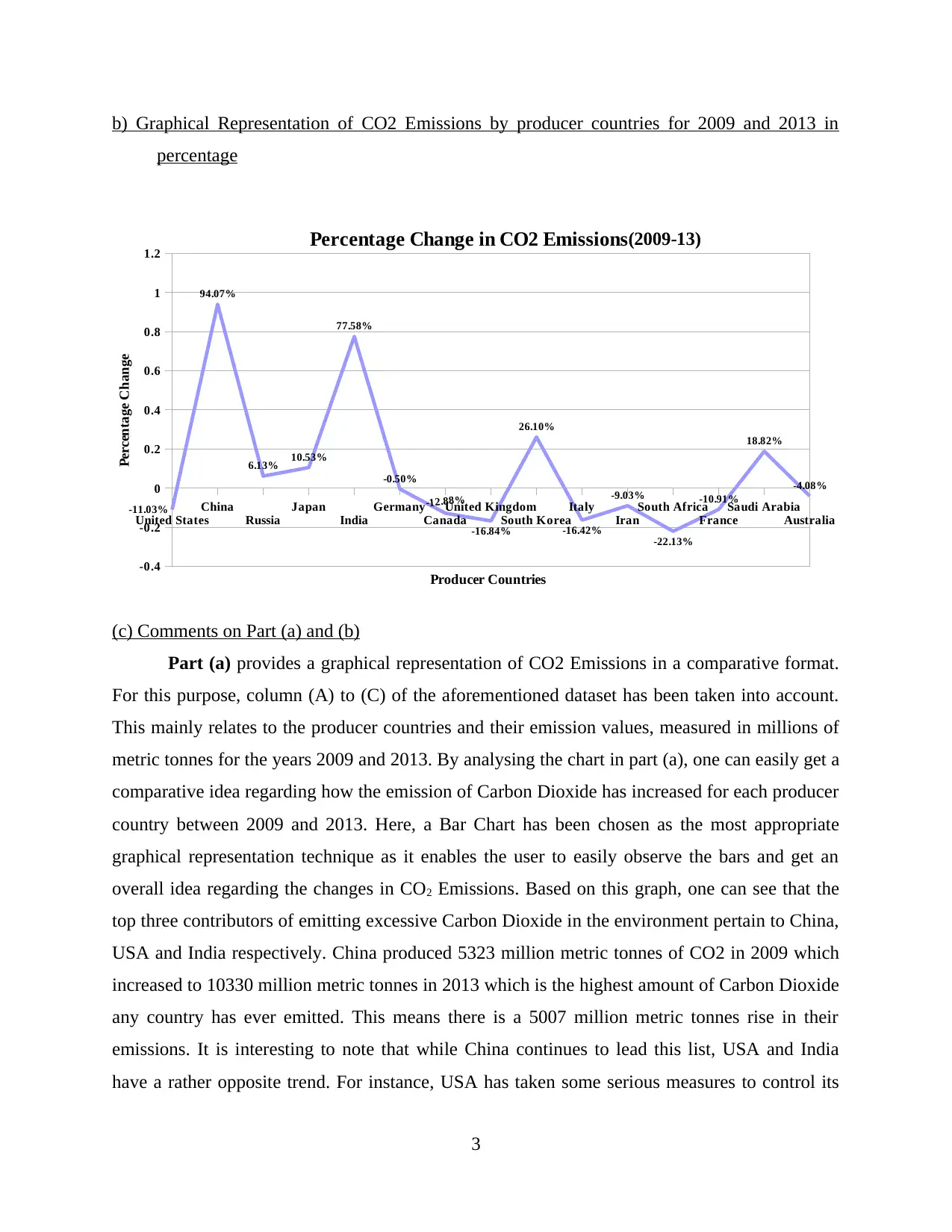
This document presents a comprehensive solution to a statistics assignment focused on business decision-making. The assignment addresses three key questions. Question 1 involves the graphical representation and analysis of CO2 emissions by producer countries, comparing data from 2009 and 2013, using both metric tonnes and percentage changes. Question 2 delves into frequency distributions, including frequency, relative frequency, cumulative frequency, and histogram construction, along with O-give curves and proportion calculations. Question 3 examines the relationship between inflation and investment returns, utilizing graphical descriptive measures of two variables, scatter plots, and correlation coefficients, referencing Australian inflation and the All-Ordinaries Index from 1995 to 2015. The solution provides detailed calculations, graphical representations, and insightful commentary, demonstrating a strong understanding of statistical concepts and their application in a business context.

Statistics and Research Methods
for Business Decision Making
Paraphrase This Document
Need a fresh take? Get an instant paraphrase of this document with our AI Paraphraser

Table of Contents
Question 1: ......................................................................................................................................1
(a) Graphical Representation of CO2 Emissions by producer countries for 2009 and 2013 in
metric tonnes..........................................................................................................................2
b) Graphical Representation of CO2 Emissions by producer countries for 2009 and 2013 in
percentage...............................................................................................................................2
(c) Comments on Part (a) and (b)...........................................................................................3
Question 2........................................................................................................................................5
a) Frequency and Relative frequency.....................................................................................5
b) Cumulative Frequency and Cumulative Relative Frequency.............................................6
c) Relative Frequency histogram............................................................................................7
d) An O-Give curve for the data.............................................................................................8
e) Proportion of data which is less than 65.............................................................................9
f) Proportion of data which is more than 75.........................................................................10
Question 3......................................................................................................................................11
a) Graphical Descriptive Measure of two variables.............................................................11
b) Scatter Plot.......................................................................................................................13
c) Numerical Summary Plot.................................................................................................14
d) Correlation coefficient.....................................................................................................16

⊘ This is a preview!⊘
Do you want full access?
Subscribe today to unlock all pages.

Trusted by 1+ million students worldwide

Question 1:
The planet may be threatened by climate change due to unsustainable activities, possibly
caused by
burning fossil fuels (petroleum, natural gas and coal) that produce carbon dioxide (CO 2 ). The
table
stored as shown by lists the top 15 producers of CO 2 (millions
of metric tonnes) from fossil fuels in 2009 and 2013.
Solutions
One of the main reasons of climate change can be attributed to the conduction of
unsustainable activities undertaken by various industries operating across the world in various
economies. One of the most significant contributors to climate change is the emission of Carbon
Dioxide which is produced by different countries on a large scale. Carbon Emissions are mostly
caused due to a continual burning of fossil fuels such as Petroleum, Natural Gas and Coal among
others over a large period of time. In the context of given case scenario, data regarding Top 15
Producer countries has been extracted from a report named, EDGAR: Trends in Global CO2
Emissions: 2014 and has been presented as under:
Top 15 CO2 Producers (in millions of metric tonnes)
Country (A) 2009 (B) 2013 (C) CO2 Emissions (% change) (D)
United States 5957 5300 -11.03%
China 5323 10330 94.07%
Russia 1696 1800 6.13%
Japan 1230 1360 10.53%
India 1166 2070 77.58%
Germany 844 840 -0.50%
Canada 631 550 -12.88%
United Kingdom 577 480 -16.84%
South Korea 500 630 26.10%
1
Paraphrase This Document
Need a fresh take? Get an instant paraphrase of this document with our AI Paraphraser

Italy 467 390 -16.42%
Iran 451 410 -9.03%
South Africa 424 330 -22.13%
France 415 370 -10.91%
Saudi Arabia 412 490 18.82%
Australia 407 390 -4.08%
Source: EDGAR: Trends in Global CO2 emissions: 2014 Report
Based on these figures, the following graphical representations have been presented in
part (a) and (b) with critical commentary on the same provided in part (c):
(a) Graphical Representation of CO2 Emissions by producer countries for 2009 and 2013 in
metric tonnes
United States
China
Russia
Japan
India
Germany
Canada
United Kingdom
South Korea
Italy
Iran
South Africa
France
Saudi Arabia
Australia
0 2000 4000 6000 8000 10000 12000
5957
5323
1696
1230
1166
844
631
577
500
467
451
424
415
412
407
5300
10330
1800
1360
2070
840
550
480
630
390
410
330
370
490
390
Carbon Dioxide Emissions by Producer Countries
(for 2009 and 2013)
2013
2009
Emission (in millions of metric tonnes)
Countries
2

b) Graphical Representation of CO2 Emissions by producer countries for 2009 and 2013 in
percentage
United States
China
Russia
Japan
India
Germany
Canada
United Kingdom
South Korea
Italy
Iran
South Africa
France
Saudi Arabia
Australia
-0.4
-0.2
0
0.2
0.4
0.6
0.8
1
1.2
-11.03%
94.07%
6.13% 10.53%
77.58%
-0.50%
-12.88%
-16.84%
26.10%
-16.42%
-9.03%
-22.13%
-10.91%
18.82%
-4.08%
Percentage Change in CO2 Emissions (2009-13)
Producer Countries
Percentage Change
(c) Comments on Part (a) and (b)
Part (a) provides a graphical representation of CO2 Emissions in a comparative format.
For this purpose, column (A) to (C) of the aforementioned dataset has been taken into account.
This mainly relates to the producer countries and their emission values, measured in millions of
metric tonnes for the years 2009 and 2013. By analysing the chart in part (a), one can easily get a
comparative idea regarding how the emission of Carbon Dioxide has increased for each producer
country between 2009 and 2013. Here, a Bar Chart has been chosen as the most appropriate
graphical representation technique as it enables the user to easily observe the bars and get an
overall idea regarding the changes in CO2 Emissions. Based on this graph, one can see that the
top three contributors of emitting excessive Carbon Dioxide in the environment pertain to China,
USA and India respectively. China produced 5323 million metric tonnes of CO2 in 2009 which
increased to 10330 million metric tonnes in 2013 which is the highest amount of Carbon Dioxide
any country has ever emitted. This means there is a 5007 million metric tonnes rise in their
emissions. It is interesting to note that while China continues to lead this list, USA and India
have a rather opposite trend. For instance, USA has taken some serious measures to control its
3
⊘ This is a preview!⊘
Do you want full access?
Subscribe today to unlock all pages.

Trusted by 1+ million students worldwide

overall CO2 emissions over the years, even though it manages to rank second among all the other
producer countries of this list. Conversely, India has significantly increased its overall emissions
of Carbon Dioxide between 2009 and 2013. Thus, indicating that there are hardly any significant
control measures taken in this regard. Additionally, it is also important to take note of the fact
that there is a possibility of non-compliance with environmental standards or implementation of
control measures which are largely ineffective in nature as this can also lead to rise in overall
Carbon Emissions as can be seen in the graph presented in the part (a) of this question. On the
other hand, South Africa seems to be the lowest contributor of such gases with a decline of 94
(=424-330) million metric tonnes between 2009 and 2013. Also, many other countries such as
Canada, Australia, France, Italy, Germany and Iran among others have attempted to control CO2
emissions between this period.
Part (b) provides a graphical representation of CO2 Emissions in a manner which
facilitates the depiction of percentage change in carbon dioxide emanation for top 15 producer
countries of the world. For this purpose, column (A) and (D) of the aforementioned dataset has
been taken into account. By analysing the chart in part (b), one can easily get a clear idea
regarding in what percentage has emission of Carbon Dioxide increased for each producer
country between 2009 and 2013. Here, a Line Graph has been chosen as the most appropriate
graphical representation technique as it enables the user to easily observe the highs and lows for
each country within the stipulated time period. Here, again, China has experienced a sharp hike
of 94.07%, followed by India at 77.58% rise in CO2 Emissions between 2013 and 2009. The
maximum decrease in such activity is recorded for United Kingdom which has recorded a low of
22.13% over the years followed by United Kingdom at 16.84%. The least amount of change in
emissions has been recorded for Germany which was only able to control its overall carbon
emissions by a mere 0.50% followed by Australia at 4.08% between 2009 and 2013. Thus,
indicating that China remains rather ignorant of the fact that whether or not its carbon footprint
within an international context remains massive as it has nearly doubled its emission by 2013
while countries such as Germany, South Africa, Germany and United Kingdom are trying their
best to control carbon emission in the ecosystem so as to prevent Climate Change on a large
scale.
4
Paraphrase This Document
Need a fresh take? Get an instant paraphrase of this document with our AI Paraphraser

Question 2
The amount of time (in seconds) needed for assembly-line workers to complete a weld at
a car assembly plant in Adelaide was recorded for 40 workers.
59 60 81 74 68 66 49 76 63 67
69 35 65 61 43 72 83 65 69 70
54 61 38 92 72 74 55 63 69 73
75 47 60 62 68 51 71 73 68 99
Solutions:
a) Frequency and Relative frequency
In order to calculate total frequency distribution, tally frequency is generally used as
shown in given table. From this process, it has been analysed that the plant has analysed the
capacity of its workers that are 40, in Adelaide, has found that the frequency of workers under
class group 35 to 44 is 3. While 45 to 54 group, it consists 5 workers and 10 workers take around
55-65 seconds, 17 workers takes 65-75 sec, 3 comes under 75 to 85 seconds, 1 worker take 85 to
95 and last 1 take 95-105 seconds for welding a car in assembly line. While to calculate relative
frequency, frequency assigned for each class group is calculated by dividing them with total
frequency i.e. 40. Relative Frequency can be defined as number of times an event is occurred
during experimental trials, which is divided by total number of trials, as summarised below -
Classes Tally Frequency Frequency (f) Relative Frequency
(f/40)
35 – 44 III 3 0.075
45 – 54 IIIII 5 0.125
55 – 64 IIIII IIIII 10 0.250
65 – 74 IIIII IIIII IIIII IIIII II 17 0.425
75 – 84 III 3 0.075
5

85 – 94 I 1 0.025
95 – 104 I 1 0.025
Total 40 40 1
b) Cumulative Frequency and Cumulative Relative Frequency
Cumulative frequency can be defined as sum of all previous frequencies up to current
point as shown below. Hereby, cumulative frequency is calculated by summing up the frequency
at each point, while relative cumulative frequency is calculated by adding up the relative
frequency to current point.
Classes Frequency Relative
Frequency
Cumulative
Frequency
Cumulative
Relative
Frequency
35 – 44 3 0.075 3 0.075
45 – 54 5 0.125 8 0.200
55 – 64 10 0.250 18 0.450
65 – 74 17 0.425 35 0.875
75 – 84 3 0.075 38 0.950
85 – 94 1 0.025 39 0.975
95 – 104 1 0.025 40 1.000
Total 40
6
⊘ This is a preview!⊘
Do you want full access?
Subscribe today to unlock all pages.

Trusted by 1+ million students worldwide

c) Relative Frequency histogram
Classes Frequency Relative Frequency Cumulative Relative
Frequency
35 – 44 3 0.075 0.075
45 – 54 5 0.125 0.200
55 – 64 10 0.250 0.450
65 – 74 17 0.425 0.875
75 – 84 3 0.075 0.950
85 – 94 1 0.025 0.975
95 – 104 1 0.025 1.000
Total 40
7
Classes Frequency Relative Frequency Cumulative Relative
Frequency
35 – 44 3 0.075 0.075
45 – 54 5 0.125 0.200
55 – 64 10 0.250 0.450
65 – 74 17 0.425 0.875
75 – 84 3 0.075 0.950
85 – 94 1 0.025 0.975
95 – 104 1 0.025 1.000
Total 40
7
Paraphrase This Document
Need a fresh take? Get an instant paraphrase of this document with our AI Paraphraser

d) An O-Give curve for the data
To draw an O-give curve, it is essential first to convert data either in less than type of
more than type. In this regard, to draw O-give curve of relative frequency, Less-than type of O-
Give curve has been drawn as shown below:-
Classes Frequency Relative
Frequency
Less than type Cumulative
Relative
Frequency
35 – 44 3 0.075 Less than 44 0.075
45 – 54 5 0.125 Less than 54 0.200
55 – 64 10 0.250 Less than 64 0.450
65 – 74 17 0.425 Less than 74 0.875
8

75 – 84 3 0.075 Less than 84 0.950
85 – 94 1 0.025 Less than 94 0.975
95 – 104 1 0.025 Less than 104 1.000
Total 40
Similarly, O-Give curve for Cumulative Frequency is constructed as -
Classes Frequency Less than type Cumulative
Frequency
35 – 44 3 Less than 44 3
45 – 54 5 Less than 54 8
55 – 64 10 Less than 64 18
65 – 74 17 Less than 74 35
75 – 84 3 Less than 84 38
85 – 94 1 Less than 94 39
9
⊘ This is a preview!⊘
Do you want full access?
Subscribe today to unlock all pages.

Trusted by 1+ million students worldwide
1 out of 21
Related Documents
Your All-in-One AI-Powered Toolkit for Academic Success.
+13062052269
info@desklib.com
Available 24*7 on WhatsApp / Email
Unlock your academic potential
Copyright © 2020–2025 A2Z Services. All Rights Reserved. Developed and managed by ZUCOL.


