A Comprehensive Report: Statistics and Research Methods for Business
VerifiedAdded on 2021/02/22
|16
|3552
|101
Report
AI Summary
This report delves into the application of statistical and research methods for effective business decision-making. It begins with a comparison of CO2 emissions across various countries between 2009 and 2013, utilizing both numerical and percentage-based analyses. The report then explores frequency distributions, cumulative frequencies, and histogram construction, using data related to assembly line worker times. Furthermore, the report includes the development of ogives, and calculation of proportions of data within specified ranges. Lastly, the report incorporates descriptive statistical analysis, including graphical representation, correlation analysis, regression modeling, and significance testing using data on inflation rates and all-ordinaries index, to provide a comprehensive understanding of the dataset and its implications for business insights and decision-making. The report concludes with key findings and recommendations based on the statistical analyses conducted.
Statistics and Research Methods for
Business Decision Making
Business Decision Making
Paraphrase This Document
Need a fresh take? Get an instant paraphrase of this document with our AI Paraphraser
TABLE OF CONTENTS
INTRODUCTION...........................................................................................................................1
MAIN BODY...................................................................................................................................1
Question 1........................................................................................................................................1
a. Comparison of amount of Co 2 emissions in 2009 and 2013.................................................1
b. Comparison of percentage value of amount of Co 2 emissions in 2009 and 2013.................2
c. Comment about observation in part a and b............................................................................3
Question 2........................................................................................................................................4
a. Constructing frequency distribution and relative frequency distribution...............................4
b. Constructing cumulative and relative cumulative frequency distribution..............................4
c. Plotting relative frequency histogram.....................................................................................5
1 d. Constructing ogive with the help of given data set...............................................................6
2 e. Proportion of data which is less than 65...............................................................................7
f. Proportion of data that is more than 75...................................................................................7
Question 3........................................................................................................................................8
1 a. Graphical descriptive analysis of the given data set.............................................................8
b. Relationship in between both the independent and dependent variable...............................10
c. Summary report of data.........................................................................................................10
d. Coefficient of correlation......................................................................................................11
e. Regression model..................................................................................................................12
f. Determining the R Square.....................................................................................................12
1 g. Testing significance relationship.......................................................................................12
h. Standard error value..............................................................................................................13
CONCLUSION..............................................................................................................................13
REFERENCES..............................................................................................................................14
INTRODUCTION
Statistics is related with the process of collecting, measuring, evaluating and interpretation of all
the numerical as well as quantitative data for gaining deep insight about a particular
phenomenon. Making correct and proper interpretation of data with the help of statistical as well
as mathematical tools can help in better understanding and thus can assist in making crucial
business decisions as well. The present report is based on statistical and research methods which
are helpful in decision making process of the business. It will define about comparison as made
about Co 2 emissions from the fossil fuels in the year 2009 and 2013 with the help of graphical
methods. Furthermore, with the help of frequency distribution, ogive and related statistical tools
explanation about time required by assembly line workers will be made. At last, with the help of
descriptive statistical analysis data will be arranged and interpreted in proper and effective
manner.
MAIN BODY
Question 1
a. Comparison of amount of Co 2 emissions in 2009 and 2013.
Country 2009 2013
Change in Co 2
emissions
United States 5957 5300 -657
China 5323 10330 5007
Russia 1696 1800 104
Japan 1230 1360 130
India 1166 2070 904
Germany 844 840 -4
Canada 631 550 -81
United Kingdom 577 480 -97
South Korea 500 630 130
Italy 467 390 -77
Iran 451 410 -41
South Africa 424 330 -94
France 415 370 -45
Saudi Arabia 412 490 78
Australia 407 390 -17
1
⊘ This is a preview!⊘
Do you want full access?
Subscribe today to unlock all pages.
Trusted by 1+ million students worldwide
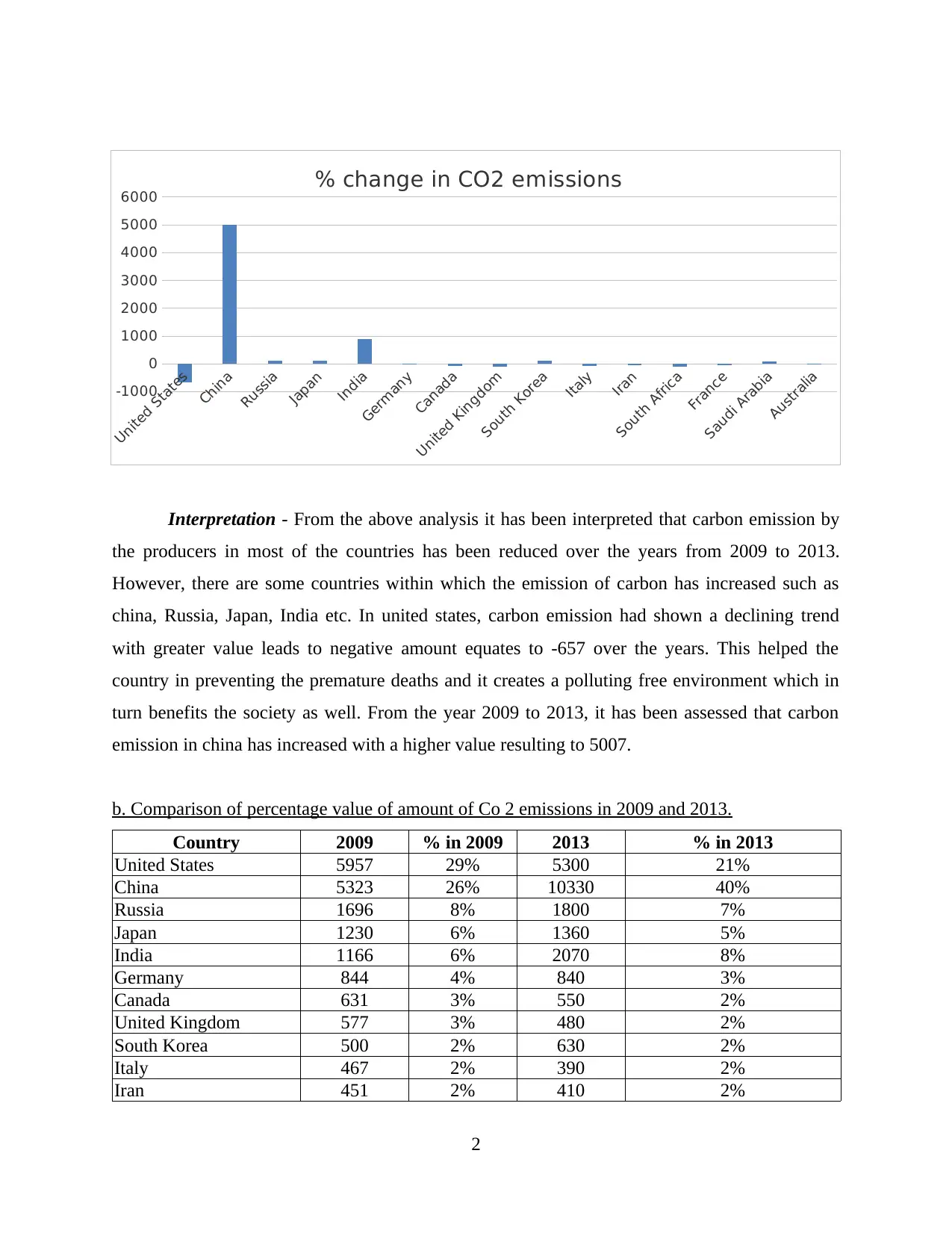
Interpretation - From the above analysis it has been interpreted that carbon emission by
the producers in most of the countries has been reduced over the years from 2009 to 2013.
However, there are some countries within which the emission of carbon has increased such as
china, Russia, Japan, India etc. In united states, carbon emission had shown a declining trend
with greater value leads to negative amount equates to -657 over the years. This helped the
country in preventing the premature deaths and it creates a polluting free environment which in
turn benefits the society as well. From the year 2009 to 2013, it has been assessed that carbon
emission in china has increased with a higher value resulting to 5007.
b. Comparison of percentage value of amount of Co 2 emissions in 2009 and 2013.
Country 2009 % in 2009 2013 % in 2013
United States 5957 29% 5300 21%
China 5323 26% 10330 40%
Russia 1696 8% 1800 7%
Japan 1230 6% 1360 5%
India 1166 6% 2070 8%
Germany 844 4% 840 3%
Canada 631 3% 550 2%
United Kingdom 577 3% 480 2%
South Korea 500 2% 630 2%
Italy 467 2% 390 2%
Iran 451 2% 410 2%
2
United States
China
Russia
Japan
India
Germany
Canada
United Kingdom
South Korea
Italy
Iran
South Africa
France
Saudi Arabia
Australia
-1000
0
1000
2000
3000
4000
5000
6000
% change in CO2 emissions
Paraphrase This Document
Need a fresh take? Get an instant paraphrase of this document with our AI Paraphraser
South Africa 424 2% 330 1%
France 415 2% 370 1%
Saudi Arabia 412 2% 490 2%
Australia 407 2% 390 2%
20500 25740
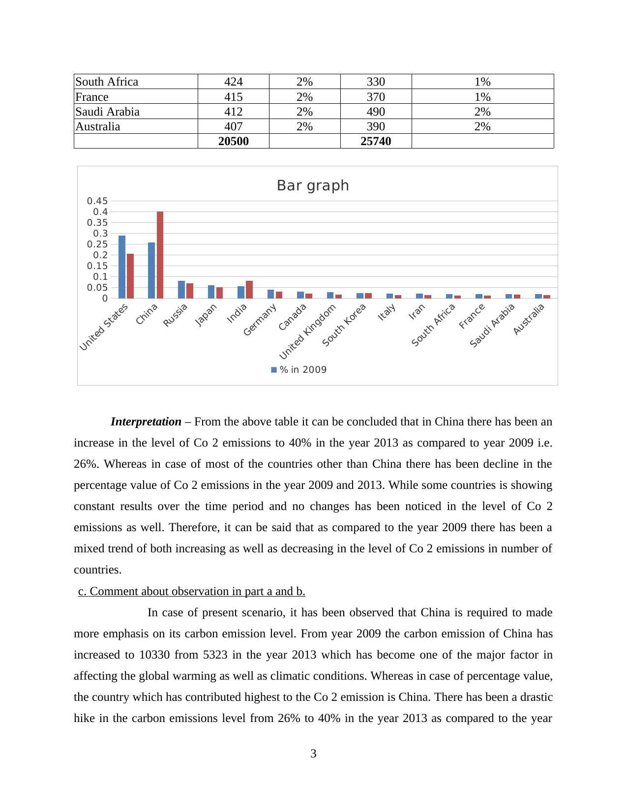
Interpretation – From the above table it can be concluded that in China there has been an
increase in the level of Co 2 emissions to 40% in the year 2013 as compared to year 2009 i.e.
26%. Whereas in case of most of the countries other than China there has been decline in the
percentage value of Co 2 emissions in the year 2009 and 2013. While some countries is showing
constant results over the time period and no changes has been noticed in the level of Co 2
emissions as well. Therefore, it can be said that as compared to the year 2009 there has been a
mixed trend of both increasing as well as decreasing in the level of Co 2 emissions in number of
countries.
c. Comment about observation in part a and b.
In case of present scenario, it has been observed that China is required to made
more emphasis on its carbon emission level. From year 2009 the carbon emission of China has
increased to 10330 from 5323 in the year 2013 which has become one of the major factor in
affecting the global warming as well as climatic conditions. Whereas in case of percentage value,
the country which has contributed highest to the Co 2 emission is China. There has been a drastic
hike in the carbon emissions level from 26% to 40% in the year 2013 as compared to the year
3
United States
China
Russia
Japan
India
Germany
Canada
United Kingdom
South Korea
Italy
Iran
South Africa
France
Saudi Arabia
Australia
0
0.05
0.1
0.15
0.2
0.25
0.3
0.35
0.4
0.45
Bar graph
% in 2009
France 415 2% 370 1%
Saudi Arabia 412 2% 490 2%
Australia 407 2% 390 2%
20500 25740
Interpretation – From the above table it can be concluded that in China there has been an
increase in the level of Co 2 emissions to 40% in the year 2013 as compared to year 2009 i.e.
26%. Whereas in case of most of the countries other than China there has been decline in the
percentage value of Co 2 emissions in the year 2009 and 2013. While some countries is showing
constant results over the time period and no changes has been noticed in the level of Co 2
emissions as well. Therefore, it can be said that as compared to the year 2009 there has been a
mixed trend of both increasing as well as decreasing in the level of Co 2 emissions in number of
countries.
c. Comment about observation in part a and b.
In case of present scenario, it has been observed that China is required to made
more emphasis on its carbon emission level. From year 2009 the carbon emission of China has
increased to 10330 from 5323 in the year 2013 which has become one of the major factor in
affecting the global warming as well as climatic conditions. Whereas in case of percentage value,
the country which has contributed highest to the Co 2 emission is China. There has been a drastic
hike in the carbon emissions level from 26% to 40% in the year 2013 as compared to the year
3
United States
China
Russia
Japan
India
Germany
Canada
United Kingdom
South Korea
Italy
Iran
South Africa
France
Saudi Arabia
Australia
0
0.05
0.1
0.15
0.2
0.25
0.3
0.35
0.4
0.45
Bar graph
% in 2009
2009. On the other hand, there are number of countries which has neither decrease nor increase
their carbon emission level when it is compared from the year 2009 to year 2013. Such countries
include name South Korea, Italy, Iran which has maintained their level by adoption of better
improved techniques. Improvements can be made related to decline in the level of Carbon
emission by formulating strong as well as effective plans, strategies and adoption of set defined
business standards as well.
Question 2
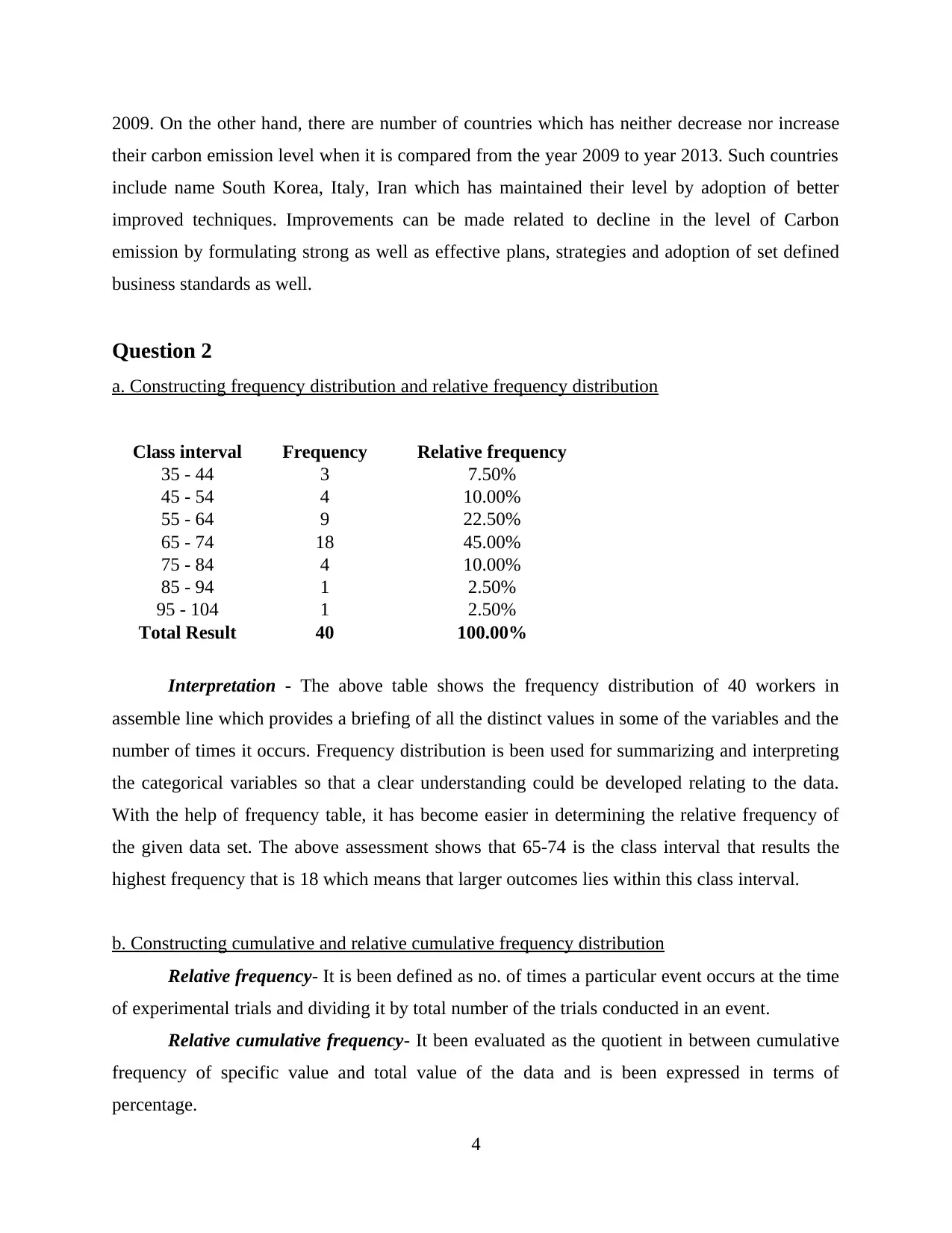
a. Constructing frequency distribution and relative frequency distribution
Class interval Frequency Relative frequency
35 - 44 3 7.50%
45 - 54 4 10.00%
55 - 64 9 22.50%
65 - 74 18 45.00%
75 - 84 4 10.00%
85 - 94 1 2.50%
95 - 104 1 2.50%
Total Result 40 100.00%
Interpretation - The above table shows the frequency distribution of 40 workers in
assemble line which provides a briefing of all the distinct values in some of the variables and the
number of times it occurs. Frequency distribution is been used for summarizing and interpreting
the categorical variables so that a clear understanding could be developed relating to the data.
With the help of frequency table, it has become easier in determining the relative frequency of
the given data set. The above assessment shows that 65-74 is the class interval that results the
highest frequency that is 18 which means that larger outcomes lies within this class interval.
b. Constructing cumulative and relative cumulative frequency distribution
Relative frequency- It is been defined as no. of times a particular event occurs at the time
of experimental trials and dividing it by total number of the trials conducted in an event.
Relative cumulative frequency- It been evaluated as the quotient in between cumulative
frequency of specific value and total value of the data and is been expressed in terms of
percentage.
4
their carbon emission level when it is compared from the year 2009 to year 2013. Such countries
include name South Korea, Italy, Iran which has maintained their level by adoption of better
improved techniques. Improvements can be made related to decline in the level of Carbon
emission by formulating strong as well as effective plans, strategies and adoption of set defined
business standards as well.
Question 2
a. Constructing frequency distribution and relative frequency distribution
Class interval Frequency Relative frequency
35 - 44 3 7.50%
45 - 54 4 10.00%
55 - 64 9 22.50%
65 - 74 18 45.00%
75 - 84 4 10.00%
85 - 94 1 2.50%
95 - 104 1 2.50%
Total Result 40 100.00%
Interpretation - The above table shows the frequency distribution of 40 workers in
assemble line which provides a briefing of all the distinct values in some of the variables and the
number of times it occurs. Frequency distribution is been used for summarizing and interpreting
the categorical variables so that a clear understanding could be developed relating to the data.
With the help of frequency table, it has become easier in determining the relative frequency of
the given data set. The above assessment shows that 65-74 is the class interval that results the
highest frequency that is 18 which means that larger outcomes lies within this class interval.
b. Constructing cumulative and relative cumulative frequency distribution
Relative frequency- It is been defined as no. of times a particular event occurs at the time
of experimental trials and dividing it by total number of the trials conducted in an event.
Relative cumulative frequency- It been evaluated as the quotient in between cumulative
frequency of specific value and total value of the data and is been expressed in terms of
percentage.
4
⊘ This is a preview!⊘
Do you want full access?
Subscribe today to unlock all pages.
Trusted by 1+ million students worldwide
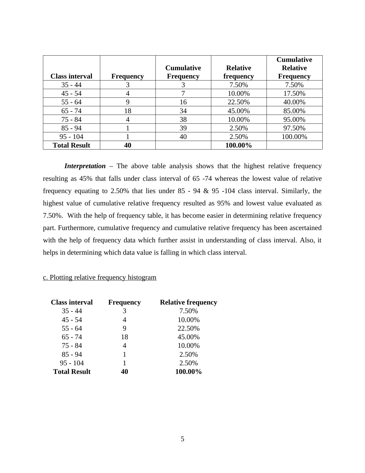
Class interval Frequency
Cumulative
Frequency
Relative
frequency
Cumulative
Relative
Frequency
35 - 44 3 3 7.50% 7.50%
45 - 54 4 7 10.00% 17.50%
55 - 64 9 16 22.50% 40.00%
65 - 74 18 34 45.00% 85.00%
75 - 84 4 38 10.00% 95.00%
85 - 94 1 39 2.50% 97.50%
95 - 104 1 40 2.50% 100.00%
Total Result 40 100.00%
Interpretation – The above table analysis shows that the highest relative frequency
resulting as 45% that falls under class interval of 65 -74 whereas the lowest value of relative
frequency equating to 2.50% that lies under 85 - 94 & 95 -104 class interval. Similarly, the
highest value of cumulative relative frequency resulted as 95% and lowest value evaluated as
7.50%. With the help of frequency table, it has become easier in determining relative frequency
part. Furthermore, cumulative frequency and cumulative relative frequency has been ascertained
with the help of frequency data which further assist in understanding of class interval. Also, it
helps in determining which data value is falling in which class interval.
c. Plotting relative frequency histogram
Class interval Frequency Relative frequency
35 - 44 3 7.50%
45 - 54 4 10.00%
55 - 64 9 22.50%
65 - 74 18 45.00%
75 - 84 4 10.00%
85 - 94 1 2.50%
95 - 104 1 2.50%
Total Result 40 100.00%
5
Cumulative
Frequency
Relative
frequency
Cumulative
Relative
Frequency
35 - 44 3 3 7.50% 7.50%
45 - 54 4 7 10.00% 17.50%
55 - 64 9 16 22.50% 40.00%
65 - 74 18 34 45.00% 85.00%
75 - 84 4 38 10.00% 95.00%
85 - 94 1 39 2.50% 97.50%
95 - 104 1 40 2.50% 100.00%
Total Result 40 100.00%
Interpretation – The above table analysis shows that the highest relative frequency
resulting as 45% that falls under class interval of 65 -74 whereas the lowest value of relative
frequency equating to 2.50% that lies under 85 - 94 & 95 -104 class interval. Similarly, the
highest value of cumulative relative frequency resulted as 95% and lowest value evaluated as
7.50%. With the help of frequency table, it has become easier in determining relative frequency
part. Furthermore, cumulative frequency and cumulative relative frequency has been ascertained
with the help of frequency data which further assist in understanding of class interval. Also, it
helps in determining which data value is falling in which class interval.
c. Plotting relative frequency histogram
Class interval Frequency Relative frequency
35 - 44 3 7.50%
45 - 54 4 10.00%
55 - 64 9 22.50%
65 - 74 18 45.00%
75 - 84 4 10.00%
85 - 94 1 2.50%
95 - 104 1 2.50%
Total Result 40 100.00%
5
Paraphrase This Document
Need a fresh take? Get an instant paraphrase of this document with our AI Paraphraser
Interpretation – With the help of above table it can be evaluated that class interval of 65
– 74 is containing the highest value of frequency. Also, when it can come to determining the
value of relative frequency, frequency data has been taken into consideration. The highest
relative frequency distribution data is 45% which is falling under the class interval of 65 – 74
with frequency value of 18 in it.
d. Constructing ogive with the help of given data set.
6
35-44 45-54 55-64 65-74 75-84 85-94 95-104
0
0.05
0.1
0.15
0.2
0.25
0.3
0.35
0.4
0.45
0.5
Relative frequency
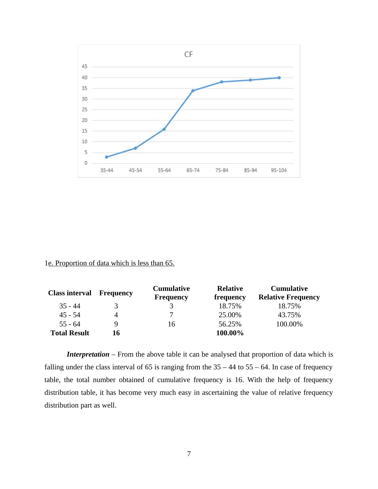
1e. Proportion of data which is less than 65.
Class interval Frequency Cumulative
Frequency
Relative
frequency
Cumulative
Relative Frequency
35 - 44 3 3 18.75% 18.75%
45 - 54 4 7 25.00% 43.75%
55 - 64 9 16 56.25% 100.00%
Total Result 16 100.00%
Interpretation – From the above table it can be analysed that proportion of data which is
falling under the class interval of 65 is ranging from the 35 – 44 to 55 – 64. In case of frequency
table, the total number obtained of cumulative frequency is 16. With the help of frequency
distribution table, it has become very much easy in ascertaining the value of relative frequency
distribution part as well.
7
⊘ This is a preview!⊘
Do you want full access?
Subscribe today to unlock all pages.
Trusted by 1+ million students worldwide
f. Proportion of data that is more than 75.
Class
interval Frequency Cumulative
Frequency
Relative
frequency
Cumulative
Relative
Frequency
75 - 84 4 4 66.67% 66.67%
85 - 94 1 5 16.67% 83.33%
95 - 104 1 6 16.67% 100.00%
Total Result 6 100.00%
Interpretation – In case of above table, explanation has been made related to the data
outside the purview of 75. The number of proportion which is falling outside 75 ranges from
class interval of 75 – 84 to 95 – 104. Total number of data value in case of frequency obtained is
6 which is cross checked with the help of calculation of cumulative frequency part. After
ascertaining the value of cumulative frequency, it has assisted in ensuring that calculation are
going correct. The Relative frequency has been determined with the help of frequency data part
after which cumulative has been obtained out of it.
Question 3
1a. Graphical descriptive analysis of the given data set.
Year Rate of inflation (%) All - Ordinaries index
1995 1.9 2000.8
1996 4.6 2231.7
1997 2.6 2662.7
1998 0.3 2608.2
1999 1.3 2963.0
2000 2.4 3115.9
2001 5.9 3352.4
2002 2.9 3241.5
2003 3.0 3032.0
2004 2.4 3499.8
2005 2.4 4197.5
2006 2.9 4933.5
2007 2.5 6337.6
2008 4.3 5513.5
8
Paraphrase This Document
Need a fresh take? Get an instant paraphrase of this document with our AI Paraphraser
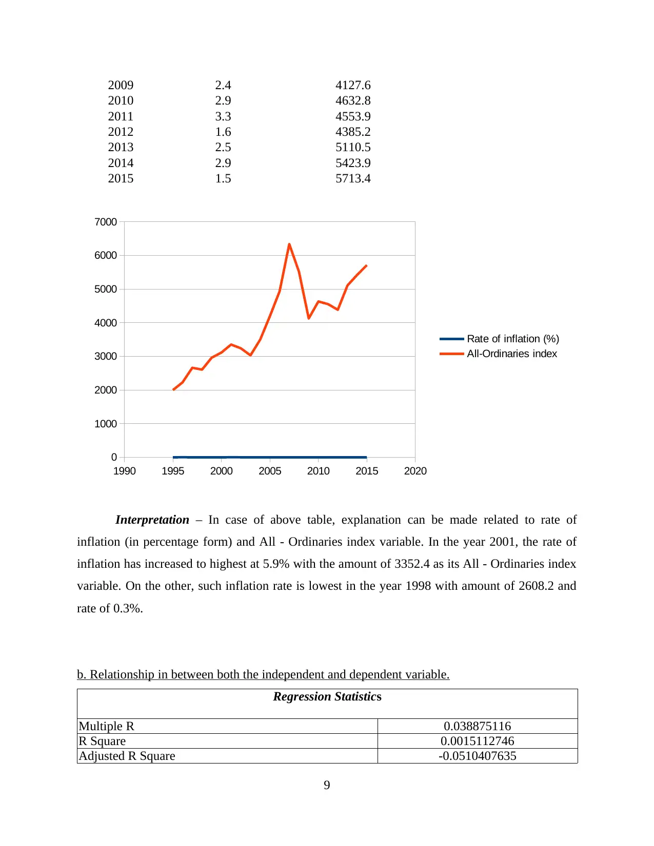
2009 2.4 4127.6
2010 2.9 4632.8
2011 3.3 4553.9
2012 1.6 4385.2
2013 2.5 5110.5
2014 2.9 5423.9
2015 1.5 5713.4
Interpretation – In case of above table, explanation can be made related to rate of
inflation (in percentage form) and All - Ordinaries index variable. In the year 2001, the rate of
inflation has increased to highest at 5.9% with the amount of 3352.4 as its All - Ordinaries index
variable. On the other, such inflation rate is lowest in the year 1998 with amount of 2608.2 and
rate of 0.3%.
b. Relationship in between both the independent and dependent variable.
Regression Statistics
Multiple R 0.038875116
R Square 0.0015112746
Adjusted R Square -0.0510407635
9
1990 1995 2000 2005 2010 2015 2020
0
1000
2000
3000
4000
5000
6000
7000
Rate of inflation (%)
All-Ordinaries index
Standard Error 1.2233486617
Observations 21
Interpretation - Above evaluation shows that the relationship in between inflation rate
and all ordinaries index where rate of inflation is denoted as Y and all ordinaries index expressed
as X. the analysis shows that there exist a positive but low relationship between both the
variables as the value of R resulted to 0.038 which shows the correlation between inflation rate
and its independent variable.
c. Summary report of data.
Mean- It referred as the simple average of the range values or the quantities which is
been computed by dividing sum of all the values with that of the no of values.
Median- It is the represented as the middle value resulted in the data group. Median
facilitates useful measure in relation to centre of the dataset.
Range- this statistical measure defined as the difference resulted in between lowest and
the largest values in the data and facilitates indication of the statistical dispersion (Goos and
Meintrup, 2015).
Variance- It reflects the area for which the data is been spread which involved the
average of squared differences from mean. It is been computed by the calculating the difference
in between every number in set and mean with squaring differences and then dividing the total of
squares with that of the no. of values within the dataset.
Standard deviation- It is the statistic which measures dispersion of dataset relating to
mean and is computed as square root of variance. It measures absolute variability of distribution
and higher the value of SD, greater variance is the variance which in turn shows the larger range
between price.
Rate of inflation (%) All-Ordinaries index
Mean 2.6904761905 Mean 3982.7333333333
Standard Error 0.2603939106 Standard Error 269.989701773
Median 2.5 Median 4127.6
Mode 2.4 Mode #N/A
Standard Deviation 1.1932748057 Standard Deviation 1237.2482452335
Sample Variance 1.4239047619 Sample Variance 1530783.22033333
10
⊘ This is a preview!⊘
Do you want full access?
Subscribe today to unlock all pages.
Trusted by 1+ million students worldwide
1 out of 16
Related Documents


Your All-in-One AI-Powered Toolkit for Academic Success.
+13062052269
info@desklib.com
Available 24*7 on WhatsApp / Email
![[object Object]](/_next/static/media/star-bottom.7253800d.svg)
Unlock your academic potential
Copyright © 2020–2026 A2Z Services. All Rights Reserved. Developed and managed by ZUCOL.