Statistics Resit Assignment for Introduction to Accounting & Finance

Verified

Added on  2023/01/12

|6
|1050
|88
Homework Assignment
AI Summary
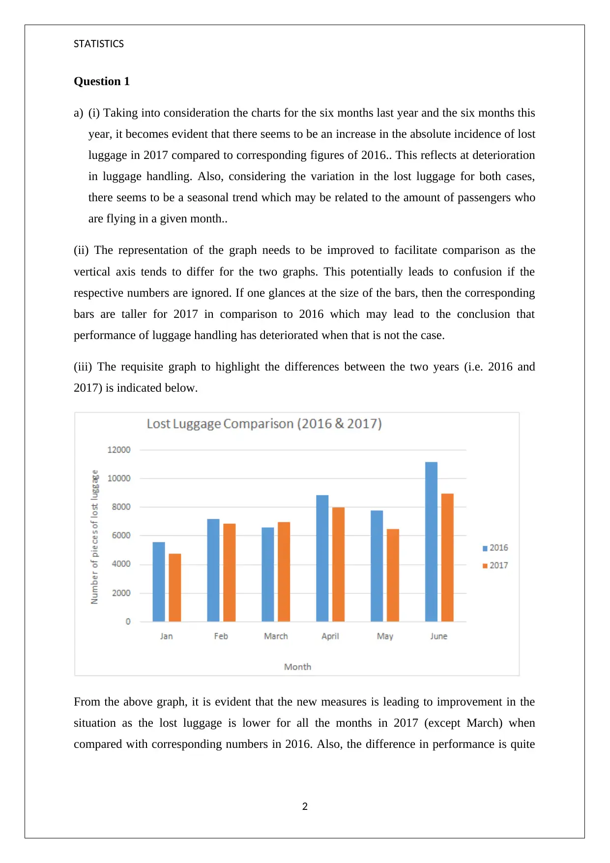
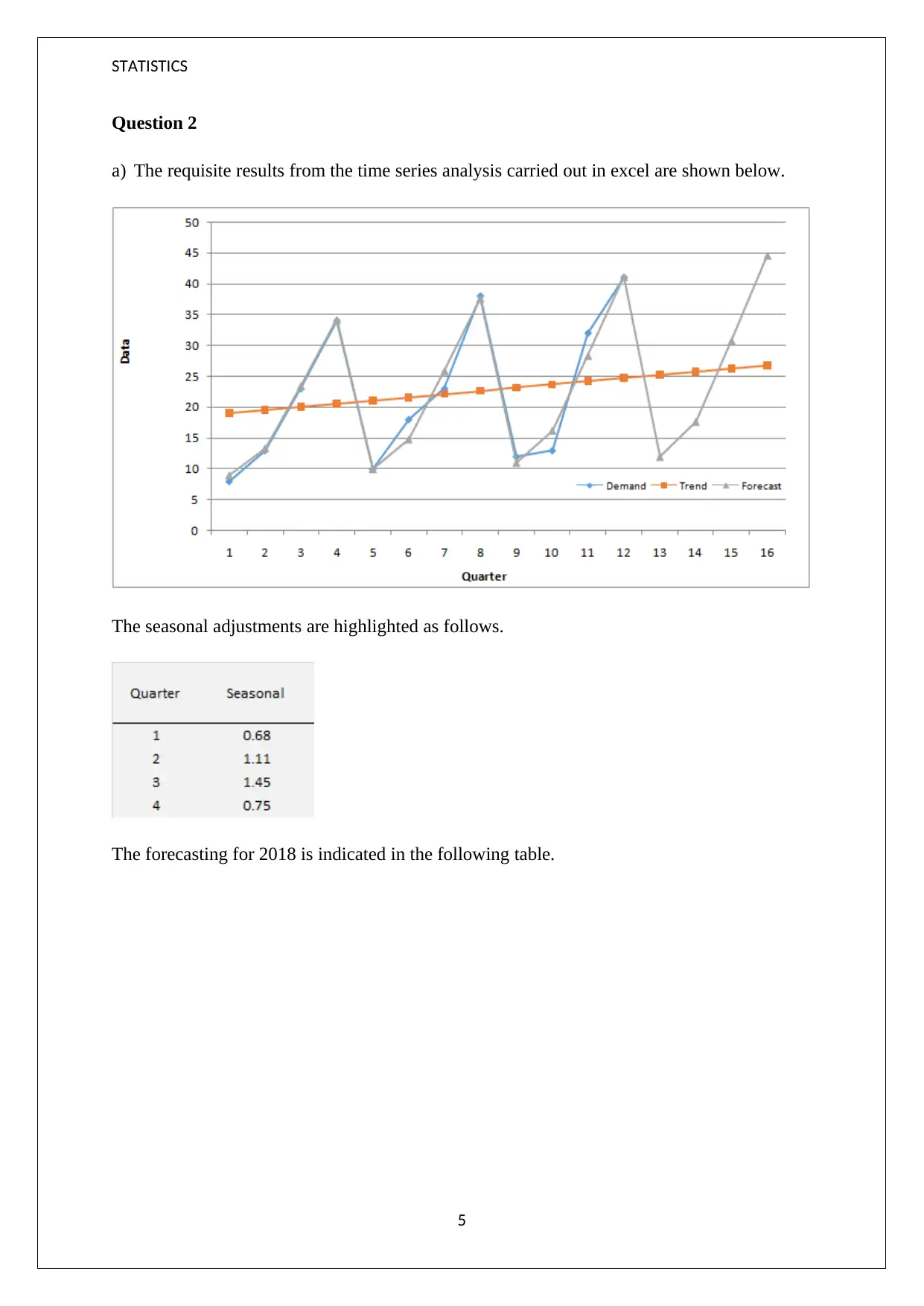
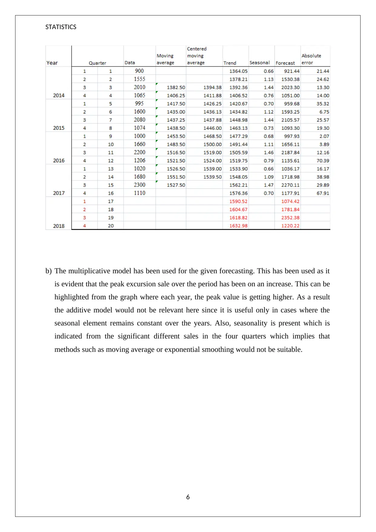
This statistics resit assignment presents a comprehensive analysis of data, focusing on time series analysis and forecasting techniques. The assignment begins with an examination of luggage handling data, comparing lost luggage incidents over two years and discussing the need for improved graph representations to facilitate comparison. It then delves into the concepts of mean and median, illustrating their application with examples and explaining the impact of skewed data. The assignment also evaluates a histogram, identifying issues with its presentation and interpreting its skewness. Furthermore, it explores the suitability of different chart types for data representation. Finally, the assignment presents a time series analysis with seasonal adjustments and forecasting using a multiplicative model. The rationale behind the chosen model is explained in the context of increasing sales trends and the presence of seasonality.
tabler-icon-diamond-filled.svg

Contribute Materials

Your contribution can guide someone’s learning journey. Share your documents today.
Document Page
STATISTICS
RESIT ASSIGNMENT
STUDENT ID:
[Pick the date]
tabler-icon-diamond-filled.svg

Secure Best Marks with AI Grader

Need help grading? Try our AI Grader for instant feedback on your assignments.
Document Page
STATISTICS
Question 1
a) (i) Taking into consideration the charts for the six months last year and the six months this
year, it becomes evident that there seems to be an increase in the absolute incidence of lost
luggage in 2017 compared to corresponding figures of 2016.. This reflects at deterioration
in luggage handling. Also, considering the variation in the lost luggage for both cases,
there seems to be a seasonal trend which may be related to the amount of passengers who
are flying in a given month..
(ii) The representation of the graph needs to be improved to facilitate comparison as the
vertical axis tends to differ for the two graphs. This potentially leads to confusion if the
respective numbers are ignored. If one glances at the size of the bars, then the corresponding
bars are taller for 2017 in comparison to 2016 which may lead to the conclusion that
performance of luggage handling has deteriorated when that is not the case.
(iii) The requisite graph to highlight the differences between the two years (i.e. 2016 and
2017) is indicated below.
From the above graph, it is evident that the new measures is leading to improvement in the
situation as the lost luggage is lower for all the months in 2017 (except March) when
compared with corresponding numbers in 2016. Also, the difference in performance is quite
2
Document Page
STATISTICS
significant in June when the number of lost luggage is the highest amongst the given six
months.
(b) (i) Mean tends to denote the average value of the given data. Median on the other hand
tends to highlight the value for which 50% of the data values would be either lower or equal
to. Mean is a useful measure of central tendency of a data when it is not skewed. This implies
that mean should be used when the given data does not have extreme value either on the
higher end or lower end. The presence of these extreme values (also called outliers) tends to
distort the mean value. As a result, in case of skewed data, median is the appropriate choice
for computation of the central tendency of data. This is because median is not impacted by
the presence of extreme values and hence is more representative of the data average.
The above understanding can be supported using the following example.
1) Consider the following raw data
1, 5,11, 17, 10, 9, 12, 16, 110
Mean = (Sum of observations/Number of observations) = (1+5+11+17+10+9+12+16+110)/9
= 191/9 = 21.22
Median = [(9+1)/2]th observation = 5th observation when data is arranged in ascending or
descending order = 11
In the above case, it is evident that median is the more representative average value than
mean owing to the presence of extreme value of 110 which results in data being skewed.
2) Now consider the following raw data
5,11, 17, 10, 9, 12, 16
Mean = (Sum of observations/Number of observations) = (5+11+17+10+9+12+16)/7 = 80/7
= 11.4
Median = [(7+1)/2]th observation = 4th observation when data is arranged in ascending or
descending order = 11
3
Document Page
STATISTICS
In the above case, the mean value is the more representative average value than median
owing to the data being free from extreme values and hence is not skewed.
(ii) For the histogram drawn, the following issues can be noticed.
Neither of the axes have been labelled owing to which it is difficult to interpret the
histogram in terms of what is represents.
No title has been given for the histogram. Title highlights the variable that has been
represented using the histogram.
The border lines for the bar are not solid owing to which the bars cannot be
segregated. Adding a border line would allow better understanding of the histogram.
(iii) Based on the shape of the histogram, it is evident that positive skew is present. This is
because there is presence of abnormally high values. Also, the tail to the right of the mean is
greater than the corresponding tail to the left of the mean. This would imply that the mean
would be greater than the median. This is because mean is influenced by extreme values,
which is not the case for median.
(iv) 3d chart is not suitable for inclusion in the report as these are difficult to interpret and
may end of distorting what it meant to be represented. For instance in the given case the
objective is to compare the baggage lost in 2016 and 2017 which is better represented using
2D chart as has also been shown with the using of bar graph in part a (iii).
4
tabler-icon-diamond-filled.svg

Secure Best Marks with AI Grader

Need help grading? Try our AI Grader for instant feedback on your assignments.
Document Page
STATISTICS
Question 2
a) The requisite results from the time series analysis carried out in excel are shown below.
The seasonal adjustments are highlighted as follows.
The forecasting for 2018 is indicated in the following table.
5
Document Page
STATISTICS
b) The multiplicative model has been used for the given forecasting. This has been used as it
is evident that the peak excursion sale over the period has been on an increase. This can be
highlighted from the graph where each year, the peak value is getting higher. As a result
the additive model would not be relevant here since it is useful only in cases where the
seasonal element remains constant over the years. Also, seasonality is present which is
indicated from the significant different sales in the four quarters which implies that
methods such as moving average or exponential smoothing would not be suitable.
6
chevron_up_icon
1 out of 6
circle_padding
hide_on_mobile
zoom_out_icon
logo.png

Your All-in-One AI-Powered Toolkit for Academic Success.

Available 24*7 on WhatsApp / Email

[object Object]