STATS 201/8 Assignment 1: Analyzing Economic and Health Data
VerifiedAdded on 2022/10/02
|14
|2093
|36
Homework Assignment
AI Summary
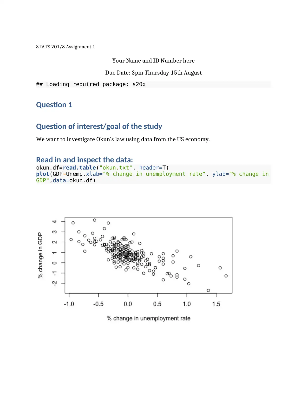
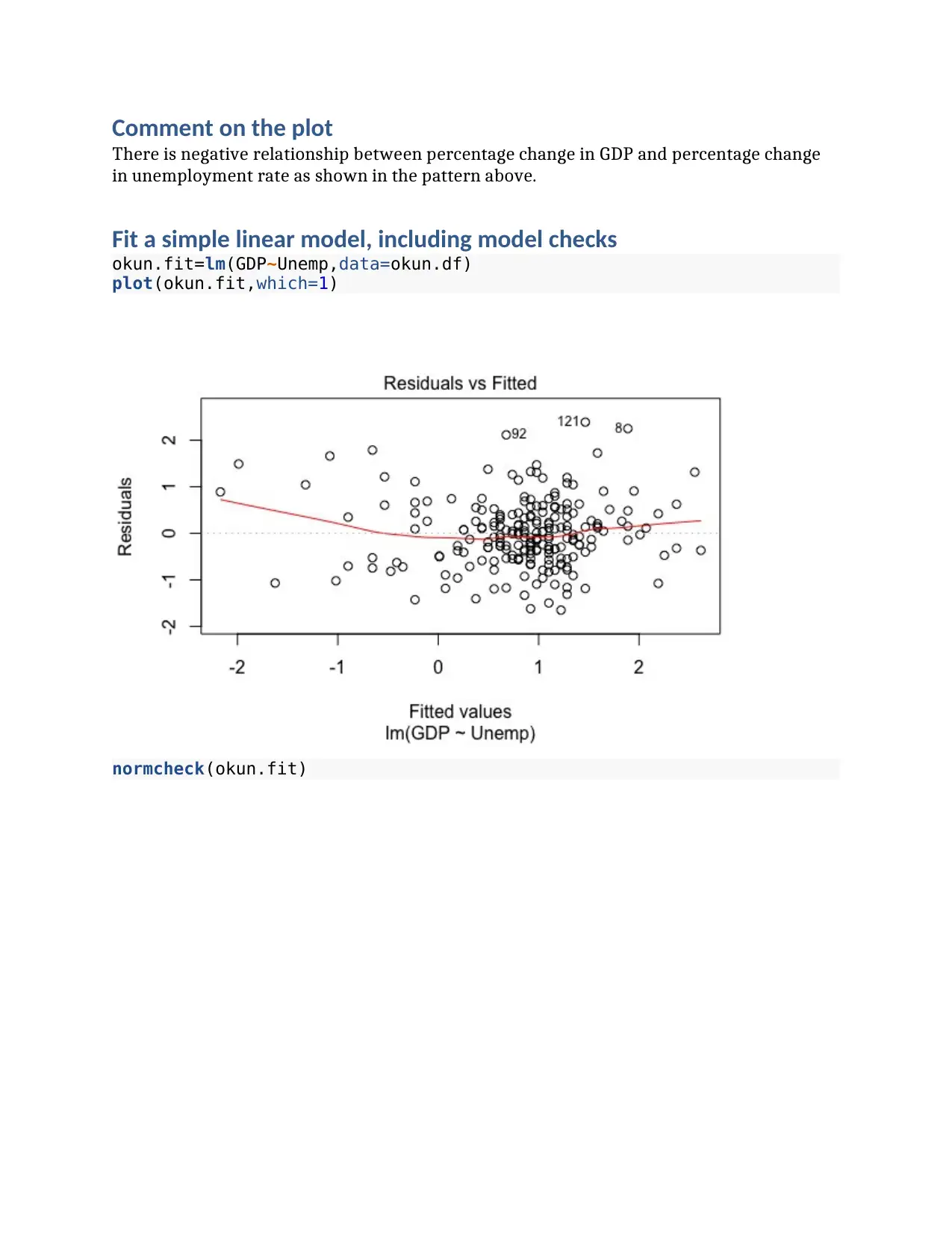
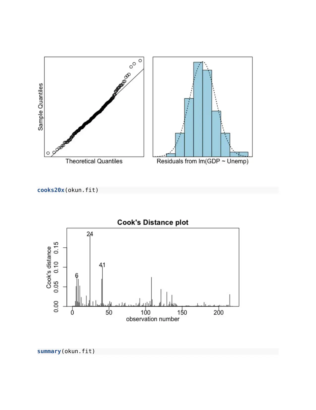
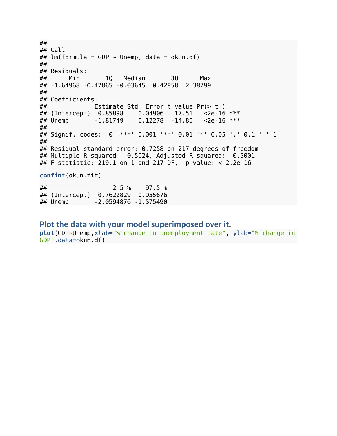
This assignment focuses on applying statistical methods to analyze real-world datasets. The first part investigates Okun's Law, examining the relationship between the percentage change in GDP and the percentage change in the unemployment rate using linear regression. The second part analyzes...

STATS 201/8 Assignment 1
Your Name and ID Number here
Due Date: 3pm Thursday 15th August
## Loading required package: s20x
Question 1
Question of interest/goal of the study
We want to investigate Okun’s law using data from the US economy.
Read in and inspect the data:
okun.df=read.table("okun.txt", header=T)
plot(GDP~Unemp,xlab="% change in unemployment rate", ylab="% change in
GDP",data=okun.df)
Secure Best Marks with AI Grader
Need help grading? Try our AI Grader for instant feedback on your assignments.

Comment on the plot
There is negative relationship between percentage change in GDP and percentage change
in unemployment rate as shown in the pattern above.
Fit a simple linear model, including model checks
okun.fit=lm(GDP~Unemp,data=okun.df)
plot(okun.fit,which=1)
normcheck(okun.fit)
There is negative relationship between percentage change in GDP and percentage change
in unemployment rate as shown in the pattern above.
Fit a simple linear model, including model checks
okun.fit=lm(GDP~Unemp,data=okun.df)
plot(okun.fit,which=1)
normcheck(okun.fit)

cooks20x(okun.fit)
summary(okun.fit)
summary(okun.fit)

##
## Call:
## lm(formula = GDP ~ Unemp, data = okun.df)
##
## Residuals:
## Min 1Q Median 3Q Max
## -1.64968 -0.47865 -0.03645 0.42858 2.38799
##
## Coefficients:
## Estimate Std. Error t value Pr(>|t|)
## (Intercept) 0.85898 0.04906 17.51 <2e-16 ***
## Unemp -1.81749 0.12278 -14.80 <2e-16 ***
## ---
## Signif. codes: 0 '***' 0.001 '**' 0.01 '*' 0.05 '.' 0.1 ' ' 1
##
## Residual standard error: 0.7258 on 217 degrees of freedom
## Multiple R-squared: 0.5024, Adjusted R-squared: 0.5001
## F-statistic: 219.1 on 1 and 217 DF, p-value: < 2.2e-16
confint(okun.fit)
## 2.5 % 97.5 %
## (Intercept) 0.7622829 0.955676
## Unemp -2.0594876 -1.575490
Plot the data with your model superimposed over it.
plot(GDP~Unemp,xlab="% change in unemployment rate", ylab="% change in
GDP",data=okun.df)
Secure Best Marks with AI Grader
Need help grading? Try our AI Grader for instant feedback on your assignments.

Predict % change in GDP given the % change in unemployment for the
final quarter of 2015
# Hint: % change = 100*(after-before)/(before);
Interpret the prediction interval. Comment whether or not the actual
% change in GDP was consistent with that predicted. Briefly justify
your answer.
Method and Assumption Checks
The data follows a linear relationship, so we have fitted a simple linear regression model.
There was some concerns with a hint of curvature in the residuals, but this was mostly at
the extremes where there were quite sparse data so likely to have been the influenced by
just a few points. (Fitting a curve is unlikely to be helpful for this data - any small gain in
explanatory power will be heavily offset by the complication in the model.) Note - we are
treating these observation as independent which is not correct as this is historical data
which is related by time. (Any problems with time dependence can actually be checked for -
see Time Series later in the course.) All other assumptions seem valid.
Our model is: GD Pi= β0 + β1 ×Unem pi+ϵ i where ϵi ∼iid N (0 , σ 2)

Our model only explains about 50% of the variation in the data (so any predictions won’t
be very precise).
Executive Summary
Data visualization was first performed using scatterplots which revealed existence of
negative linear association between the GDP and the rate of unemployment of US. We went
ahead and fit a linear model with GDP as dependent variable and rate of unemployment as
the independent variable, the results show that rate of unemployment was significant in
influencing the GDP of US. However, the model checks showed that the model fitted was
not good for prediction.
Question 2
Question of interest/goal of the study
We are interested in seeing if there is a change in the systolic blood pressure (SBP)
(preferably a decrease) after the therapy has been administered. As we have a paired
design, we want to see if the average difference in SBP is different from 0.
Read in and inspect the data:
sbp.df=read.table("sbp.txt", header=T)
sbp.differences=sbp.df$before-sbp.df$after
stripchart(sbp.differences,method="stack",pch=1)

summaryStats(sbp.differences)
## Minimum value: -9
## Maximum value: 8
## Mean value: -1.83
## Median: -2
## Upper quartile: 0
## Lower quartile: -7.25
## Variance: 33.97
## Standard deviation: 5.83
## Midspread (IQR): 7.25
## Skewness: 0.44
## Number of data values: 12
Comment on the plot and summary statistics:
The chart above showed that most of the differences were negative while a few of them
were positive, which implied the outcome of systolic blood pressure differences were in
line with the expectations of the experiment that SBP decrease after the therapy has been
administered. The average change in the SBP was found to be -1.83. Additionally, the
highest SBP difference was 8 while the smallest was -9.
Paraphrase This Document
Need a fresh take? Get an instant paraphrase of this document with our AI Paraphraser

Manually calculate the t-statistic for testing if the underlying mean is
0, and the 95% confidence interval for the mean.
Formulas: T = y−μ0
se ( y) and 95% confidence interval y ±tdf , 0.975 × se( y )
NOTES: The R code mean(y) calculates y. The standard error is se( y)= s
√n where s is the
standard deviation of y and is calculated by sd(y), and n is the number of data-points
calculated by length(y). The degrees of freedom is df =n−1. The tdf ,0.975 multiplier is given
by the R code qt(0.975, df).
qt(0.975,11)
[1] 2.200985
y ±tdf , 0.975 × se ( y ) =−1.83 ±2.200985 ×1.682976=(−5.53421, 1.874205)
T = y−μ0
se ( y) =−1.83−0
5.83
√12
=−1.087
# t-statistic for H0: mu=0:
# 95% confidence interval for the mean:
Repeat the same calculation using the t.test function (done for you):
t.test(sbp.differences,var.equal=TRUE)
##
## One Sample t-test
##
## data: sbp.differences
## t = -1.0896, df = 11, p-value = 0.2992
## alternative hypothesis: true mean is not equal to 0
## 95 percent confidence interval:
## -5.536492 1.869825
## sample estimates:
## mean of x
## -1.833333
Note: You should get exactly the same results from the manual calculations and using the
t . test function. Doing this was to give you practice using some R code. The t . test function
also delivers the p-value that we did not calculate above.
The results above showed that the difference in systolic blood pressure before and after
therapy was not different from zero. Therefore, the information from the 12 patients was

not sufficient enough to established that administration of therapy reduce systolic blood
pressure.
Fit and check the null model, providing relevant output to compare to
above:
> summary(fit1)
Call:
lm(formula = sbpdiff ~ Ud)
Residuals:
Min 1Q Median 3Q Max
-6.447 -4.832 -1.040 1.850 11.332
Coefficients:
Estimate Std. Error t value Pr(>|t|)
(Intercept) -27.4469 40.7914 -0.673 0.516
Ud 0.1977 0.3145 0.628 0.544
Residual standard error: 5.996 on 10 degrees of freedom
Multiple R-squared: 0.038, Adjusted R-squared: -0.0582
F-statistic: 0.395 on 1 and 10 DF, p-value: 0.5438
Did the linear model give the same results as the t-test? Are these
doing the same thing?
The results from the linear regression model fitted showed the same results as that of t test
earlier performed. Thus, there was no sufficient evidence to support the claim that the
therapy reduce the systolic blood pressure.
Method and Assumption Checks
As the data has two measurements (systolic blood pressure before and after the therapy)
on each person, we have applied a paired sample t-test to test if there is a change after the
therapy.
We have a random sample of 12 men, so the results of the differences in blood pressure
should be independent of each other. Checking the normality of the differences reveals no
problems once you realise that we only have 12 observations. There were no unduly
influential points.
Our model is: sbpDif f i=μd +ϵ i where ϵi ∼iid N (0 , σ 2)

Executive Summary
First summary statistics were computed which revealed that the average systolic blood
pressure difference was -1.83. T test was also used to test whether the SBP difference was
different from zero, the result show that the SBP differences was not different from zero.
Linear regression model fitted also showed similar results like that of t test. It was
therefore, established that the there was no sufficient evidence to support the claim that
the therapy reduce the systolic blood pressure.
Question 3
Question of interest/goal of the study
We are interested in investigating how the power consumption of an electric bike increases
with the bikes speed.
Read in and inspect the data:
Ebike.df=read.table("CyclePower.txt", header=T)
plot(watts~kph,data=Ebike.df)
Secure Best Marks with AI Grader
Need help grading? Try our AI Grader for instant feedback on your assignments.

Comment on the plots
The scatterplot above show that there was strong positive association between the power
consumption of an electric bike with the bike speed.
Fit an appropriate linear model, including model checks.
summary(fit)
Call:
lm(formula = watts ~ kph)
Residuals:
Min 1Q Median 3Q Max
-41.744 -9.365 0.080 9.919 31.595
Coefficients:
Estimate Std. Error t value Pr(>|t|)
(Intercept) -77.7181 4.3908 -17.70 <2e-16 ***
kph 18.2442 0.2079 87.74 <2e-16 ***
---
Signif. codes: 0 ‘***’ 0.001 ‘**’ 0.01 ‘*’ 0.05 ‘.’ 0.1 ‘ ’ 1
Residual standard error: 13.26 on 103 degrees of freedom
Multiple R-squared: 0.9868, Adjusted R-squared: 0.9867
F-statistic: 7698 on 1 and 103 DF, p-value: < 2.2e-16
plot(fit, which=1)
plot(fit, which=2)

Plot the data with your appropriate model superimposed over it.
plot(watts~kph,data=Ebike.df)

Prediction of power consumption at 20 kph
watt=−77.7181+20 ( 18.2442 ) =287.1659
Interpret the prediction interval. How useful do you think this model
will be for prediction? Give two reasons justifying your answer.
The model is very useful for predicting the power consumption given any value of kph
since 98.67% of variation in the power consumption is explained by variation in kph.
Additionally, the curvature of residuals displayed a random pattern showing that most the
values influence the linear regression model fitted.
Method and Assumption Checks
The data follows a linear relationship, so we have fitted a simple linear regression model.
There were no much concerns with a hint of curvature in the residuals, which means that
this was mostly at the all the values influence the variation and fitting of the model. (Fitting
a curve is likely to be helpful for this data - any small gain in explanatory power will be is
not affected by the complication in the model.). The model meets both normality
assumption since the QQ plot show a known normality pattern. The fitted-residual plot also
displayed a random pattern, indicating that the model met constant variance assumption.
Therefore, based on these features the model was established to be good for prediction.
Paraphrase This Document
Need a fresh take? Get an instant paraphrase of this document with our AI Paraphraser

Our model is: wattsi =β0+ β1 ×kphi+ ϵi where ϵi ∼ iid N (0 , σ 2)
Executive Summary
Scatterplot was first plotted to show the kind of relationship that existed between power
consumption (watts) and kbh. The pattern displayed by the plot showed that there is
strong positive association between the power consumption of an electric bike with the
bike speed. A linear model was also fitted, which show that 98.67% variation in power
consumption is explained by variation in kbh. The model also met the model assumption
and thus, it was a good model to be used for prediction.
1 out of 14
Related Documents

Your All-in-One AI-Powered Toolkit for Academic Success.
+13062052269
info@desklib.com
Available 24*7 on WhatsApp / Email
Unlock your academic potential
© 2024 | Zucol Services PVT LTD | All rights reserved.