Comprehensive Analysis and Visualization of Superstore Data - Report
VerifiedAdded on 2023/06/05
|25
|3983
|222
Report
AI Summary
This report provides a comprehensive analysis and visualization of Superstore data. It begins with data pre-processing, detailing the use of filter options, SUMIFS function, and pivot tables in Excel to analyze sales and profit trends from 2009 to 2012. The analysis reveals sales and profit declines, regional performance, and product-based sales and profit contributions. The report also includes data visualization techniques using pie charts and bar diagrams to represent sales and profit data, including a pivot table analysis by product and region. The report further explores statistical analysis of student ice cream preferences, and discusses data mining techniques. Finally, it examines advantages and disadvantages of Excel and SPSS.
Analysis & Visualisation
Paraphrase This Document
Need a fresh take? Get an instant paraphrase of this document with our AI Paraphraser
Table of Contents
Part 1................................................................................................................................................3
Data Pre-Processing, Analysing & Visualisation........................................................................3
PART 2..........................................................................................................................................11
2.1 Students which like vanilla flavoured ice-cream.................................................................11
2.2 Students that are male and female.......................................................................................12
2.3 Mean and Median of participants who like chocolate and strawberry flavour ice cream.. .13
2.4 Cluster analysis example- K means clustering....................................................................15
2.5 Text mining and data mining methods that are used in businesses.....................................22
2.6 Advantages and disadvantages of using Excel and SPSS...................................................23
REFERENCES................................................................................................................................1
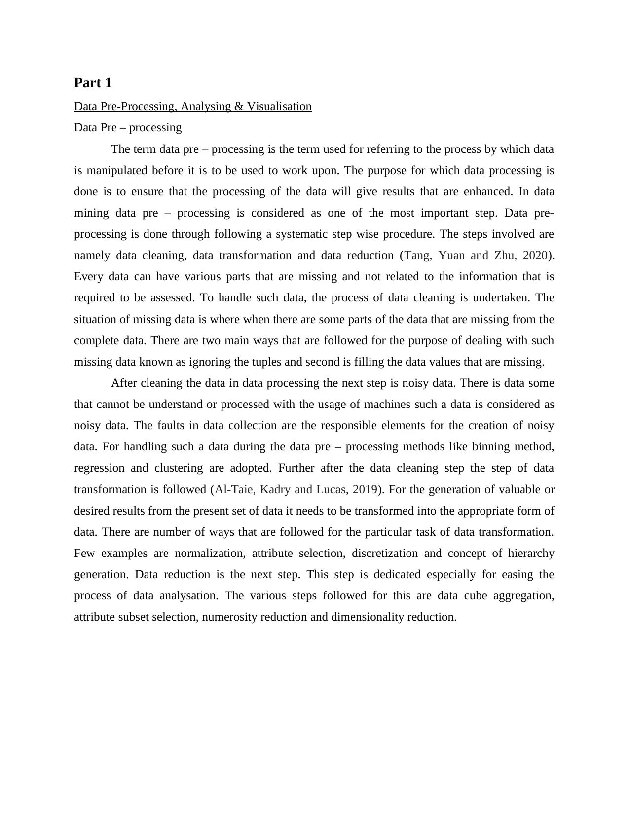
Part 1
Data Pre-Processing, Analysing & Visualisation
Data Pre – processing
The term data pre – processing is the term used for referring to the process by which data
is manipulated before it is to be used to work upon. The purpose for which data processing is
done is to ensure that the processing of the data will give results that are enhanced. In data
mining data pre – processing is considered as one of the most important step. Data pre-
processing is done through following a systematic step wise procedure. The steps involved are
namely data cleaning, data transformation and data reduction (Tang, Yuan and Zhu, 2020).
Every data can have various parts that are missing and not related to the information that is
required to be assessed. To handle such data, the process of data cleaning is undertaken. The
situation of missing data is where when there are some parts of the data that are missing from the
complete data. There are two main ways that are followed for the purpose of dealing with such
missing data known as ignoring the tuples and second is filling the data values that are missing.
After cleaning the data in data processing the next step is noisy data. There is data some
that cannot be understand or processed with the usage of machines such a data is considered as
noisy data. The faults in data collection are the responsible elements for the creation of noisy
data. For handling such a data during the data pre – processing methods like binning method,
regression and clustering are adopted. Further after the data cleaning step the step of data
transformation is followed (Al-Taie, Kadry and Lucas, 2019). For the generation of valuable or
desired results from the present set of data it needs to be transformed into the appropriate form of
data. There are number of ways that are followed for the particular task of data transformation.
Few examples are normalization, attribute selection, discretization and concept of hierarchy
generation. Data reduction is the next step. This step is dedicated especially for easing the
process of data analysation. The various steps followed for this are data cube aggregation,
attribute subset selection, numerosity reduction and dimensionality reduction.
⊘ This is a preview!⊘
Do you want full access?
Subscribe today to unlock all pages.
Trusted by 1+ million students worldwide
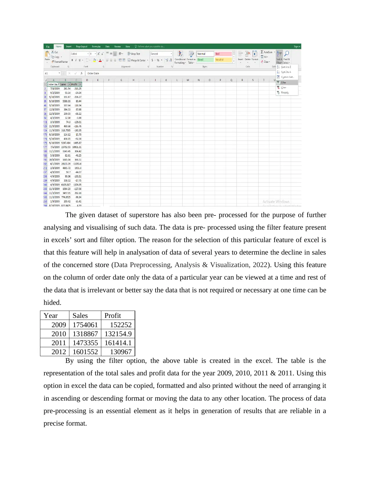
The given dataset of superstore has also been pre- processed for the purpose of further
analysing and visualising of such data. The data is pre- processed using the filter feature present
in excels’ sort and filter option. The reason for the selection of this particular feature of excel is
that this feature will help in analysation of data of several years to determine the decline in sales
of the concerned store (Data Preprocessing, Analysis & Visualization, 2022). Using this feature
on the column of order date only the data of a particular year can be viewed at a time and rest of
the data that is irrelevant or better say the data that is not required or necessary at one time can be
hided.
Year Sales Profit
2009 1754061 152252
2010 1318867 132154.9
2011 1473355 161414.1
2012 1601552 130967
By using the filter option, the above table is created in the excel. The table is the
representation of the total sales and profit data for the year 2009, 2010, 2011 & 2011. Using this
option in excel the data can be copied, formatted and also printed without the need of arranging it
in ascending or descending format or moving the data to any other location. The process of data
pre-processing is an essential element as it helps in generation of results that are reliable in a
precise format.
Paraphrase This Document
Need a fresh take? Get an instant paraphrase of this document with our AI Paraphraser
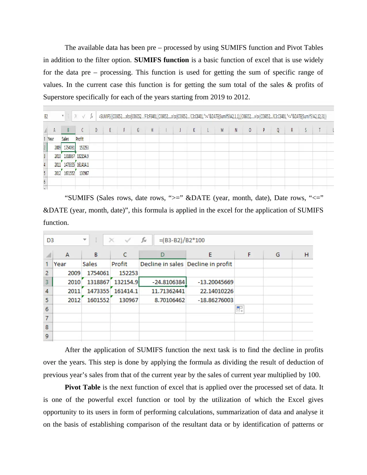
The available data has been pre – processed by using SUMIFS function and Pivot Tables
in addition to the filter option. SUMIFS function is a basic function of excel that is use widely
for the data pre – processing. This function is used for getting the sum of specific range of
values. In the current case this function is for getting the sum total of the sales & profits of
Superstore specifically for each of the years starting from 2019 to 2012.
“SUMIFS (Sales rows, date rows, “>=” &DATE (year, month, date), Date rows, “<=”
&DATE (year, month, date)”, this formula is applied in the excel for the application of SUMIFS
function.
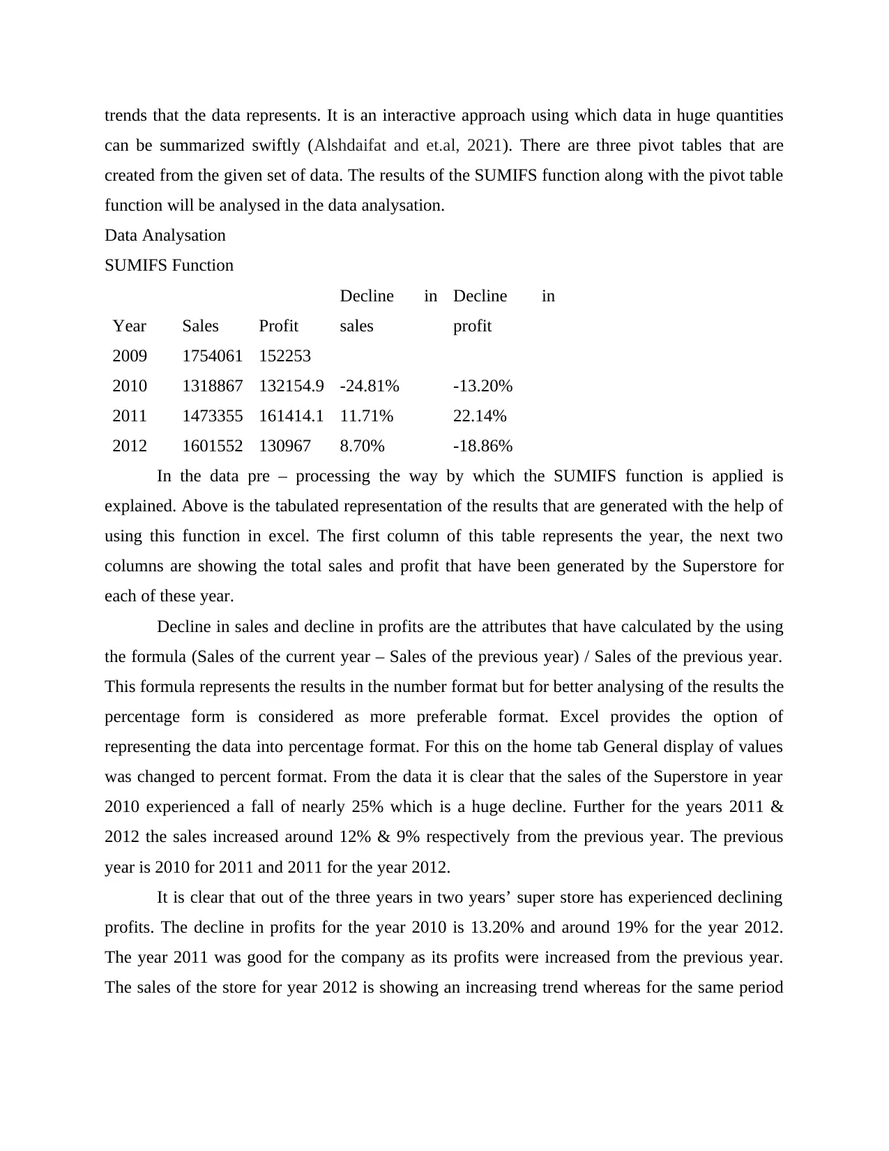
After the application of SUMIFS function the next task is to find the decline in profits
over the years. This step is done by applying the formula as dividing the result of deduction of
previous year’s sales from that of the current year by the sales of current year multiplied by 100.
Pivot Table is the next function of excel that is applied over the processed set of data. It
is one of the powerful excel function or tool by the utilization of which the Excel gives
opportunity to its users in form of performing calculations, summarization of data and analyse it
on the basis of establishing comparison of the resultant data or by identification of patterns or
in addition to the filter option. SUMIFS function is a basic function of excel that is use widely
for the data pre – processing. This function is used for getting the sum of specific range of
values. In the current case this function is for getting the sum total of the sales & profits of
Superstore specifically for each of the years starting from 2019 to 2012.
“SUMIFS (Sales rows, date rows, “>=” &DATE (year, month, date), Date rows, “<=”
&DATE (year, month, date)”, this formula is applied in the excel for the application of SUMIFS
function.
After the application of SUMIFS function the next task is to find the decline in profits
over the years. This step is done by applying the formula as dividing the result of deduction of
previous year’s sales from that of the current year by the sales of current year multiplied by 100.
Pivot Table is the next function of excel that is applied over the processed set of data. It
is one of the powerful excel function or tool by the utilization of which the Excel gives
opportunity to its users in form of performing calculations, summarization of data and analyse it
on the basis of establishing comparison of the resultant data or by identification of patterns or
trends that the data represents. It is an interactive approach using which data in huge quantities
can be summarized swiftly (Alshdaifat and et.al, 2021). There are three pivot tables that are
created from the given set of data. The results of the SUMIFS function along with the pivot table
function will be analysed in the data analysation.
Data Analysation
SUMIFS Function
Year Sales Profit
Decline in
sales
Decline in
profit
2009 1754061 152253
2010 1318867 132154.9 -24.81% -13.20%
2011 1473355 161414.1 11.71% 22.14%
2012 1601552 130967 8.70% -18.86%
In the data pre – processing the way by which the SUMIFS function is applied is
explained. Above is the tabulated representation of the results that are generated with the help of
using this function in excel. The first column of this table represents the year, the next two
columns are showing the total sales and profit that have been generated by the Superstore for
each of these year.
Decline in sales and decline in profits are the attributes that have calculated by the using
the formula (Sales of the current year – Sales of the previous year) / Sales of the previous year.
This formula represents the results in the number format but for better analysing of the results the
percentage form is considered as more preferable format. Excel provides the option of
representing the data into percentage format. For this on the home tab General display of values
was changed to percent format. From the data it is clear that the sales of the Superstore in year
2010 experienced a fall of nearly 25% which is a huge decline. Further for the years 2011 &
2012 the sales increased around 12% & 9% respectively from the previous year. The previous
year is 2010 for 2011 and 2011 for the year 2012.
It is clear that out of the three years in two years’ super store has experienced declining
profits. The decline in profits for the year 2010 is 13.20% and around 19% for the year 2012.
The year 2011 was good for the company as its profits were increased from the previous year.
The sales of the store for year 2012 is showing an increasing trend whereas for the same period
⊘ This is a preview!⊘
Do you want full access?
Subscribe today to unlock all pages.
Trusted by 1+ million students worldwide
the profits are showing declining pattern it means that the store expenses need to controlled for
the better performance.
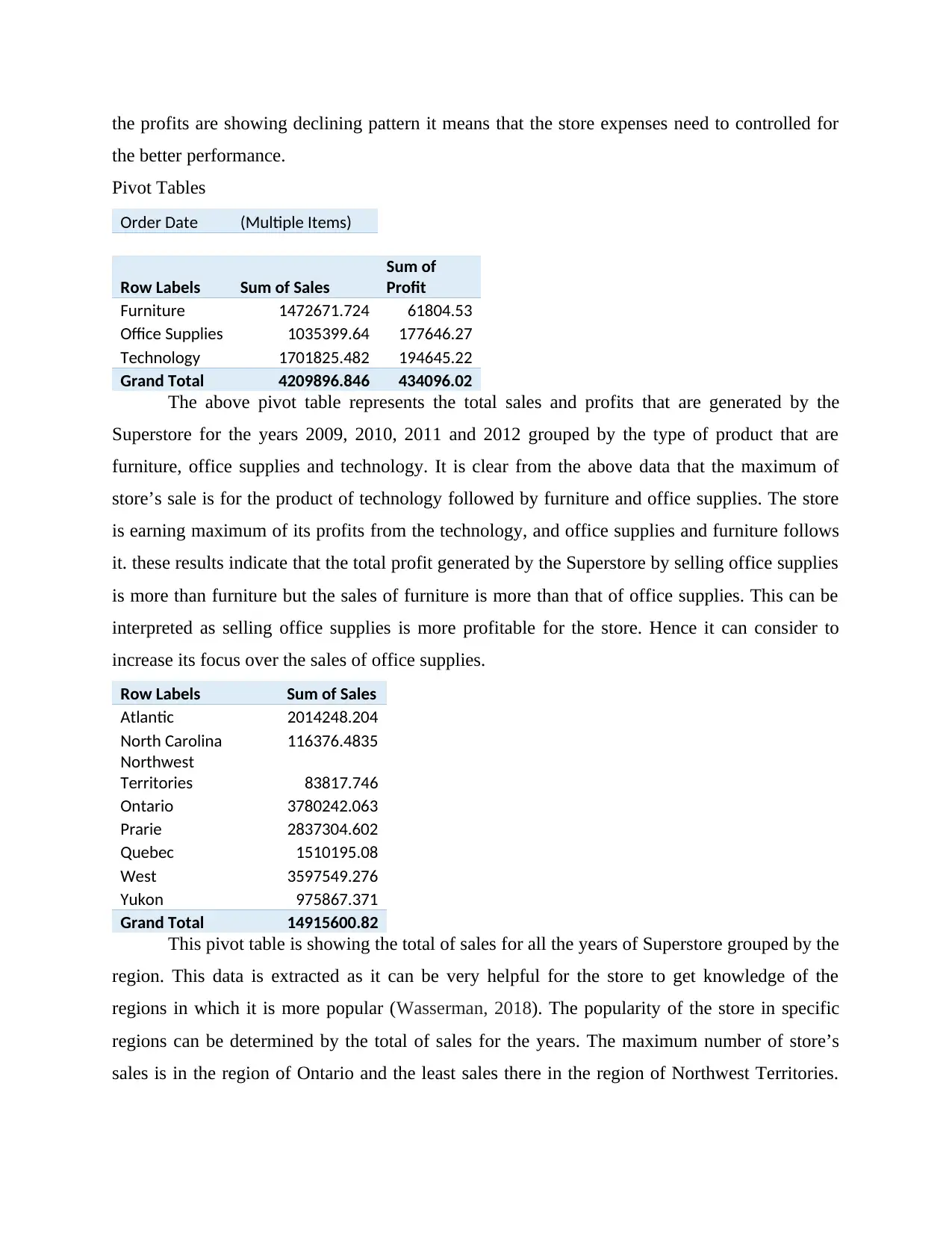
Pivot Tables
Order Date (Multiple Items)
Row Labels Sum of Sales
Sum of
Profit
Furniture 1472671.724 61804.53
Office Supplies 1035399.64 177646.27
Technology 1701825.482 194645.22
Grand Total 4209896.846 434096.02
The above pivot table represents the total sales and profits that are generated by the
Superstore for the years 2009, 2010, 2011 and 2012 grouped by the type of product that are
furniture, office supplies and technology. It is clear from the above data that the maximum of
store’s sale is for the product of technology followed by furniture and office supplies. The store
is earning maximum of its profits from the technology, and office supplies and furniture follows
it. these results indicate that the total profit generated by the Superstore by selling office supplies
is more than furniture but the sales of furniture is more than that of office supplies. This can be
interpreted as selling office supplies is more profitable for the store. Hence it can consider to
increase its focus over the sales of office supplies.
Row Labels Sum of Sales
Atlantic 2014248.204
North Carolina 116376.4835
Northwest
Territories 83817.746
Ontario 3780242.063
Prarie 2837304.602
Quebec 1510195.08
West 3597549.276
Yukon 975867.371
Grand Total 14915600.82
This pivot table is showing the total of sales for all the years of Superstore grouped by the
region. This data is extracted as it can be very helpful for the store to get knowledge of the
regions in which it is more popular (Wasserman, 2018). The popularity of the store in specific
regions can be determined by the total of sales for the years. The maximum number of store’s
sales is in the region of Ontario and the least sales there in the region of Northwest Territories.
the better performance.
Pivot Tables
Order Date (Multiple Items)
Row Labels Sum of Sales
Sum of
Profit
Furniture 1472671.724 61804.53
Office Supplies 1035399.64 177646.27
Technology 1701825.482 194645.22
Grand Total 4209896.846 434096.02
The above pivot table represents the total sales and profits that are generated by the
Superstore for the years 2009, 2010, 2011 and 2012 grouped by the type of product that are
furniture, office supplies and technology. It is clear from the above data that the maximum of
store’s sale is for the product of technology followed by furniture and office supplies. The store
is earning maximum of its profits from the technology, and office supplies and furniture follows
it. these results indicate that the total profit generated by the Superstore by selling office supplies
is more than furniture but the sales of furniture is more than that of office supplies. This can be
interpreted as selling office supplies is more profitable for the store. Hence it can consider to
increase its focus over the sales of office supplies.
Row Labels Sum of Sales
Atlantic 2014248.204
North Carolina 116376.4835
Northwest
Territories 83817.746
Ontario 3780242.063
Prarie 2837304.602
Quebec 1510195.08
West 3597549.276
Yukon 975867.371
Grand Total 14915600.82
This pivot table is showing the total of sales for all the years of Superstore grouped by the
region. This data is extracted as it can be very helpful for the store to get knowledge of the
regions in which it is more popular (Wasserman, 2018). The popularity of the store in specific
regions can be determined by the total of sales for the years. The maximum number of store’s
sales is in the region of Ontario and the least sales there in the region of Northwest Territories.
Paraphrase This Document
Need a fresh take? Get an instant paraphrase of this document with our AI Paraphraser
the second most popular region context of store’s sales is West followed by Prarie, Atlantic,
Quebec, Yukon, North Carolina.
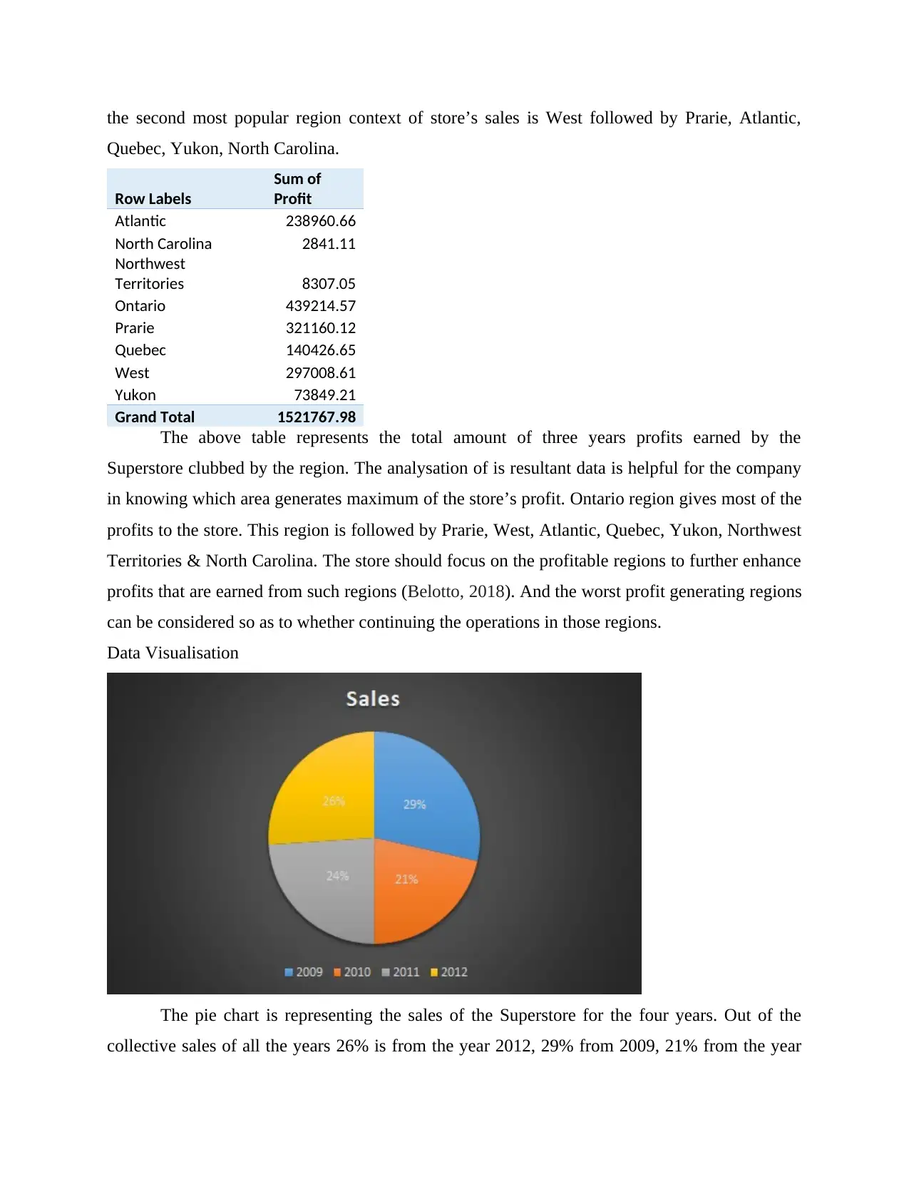
Row Labels
Sum of
Profit
Atlantic 238960.66
North Carolina 2841.11
Northwest
Territories 8307.05
Ontario 439214.57
Prarie 321160.12
Quebec 140426.65
West 297008.61
Yukon 73849.21
Grand Total 1521767.98
The above table represents the total amount of three years profits earned by the
Superstore clubbed by the region. The analysation of is resultant data is helpful for the company
in knowing which area generates maximum of the store’s profit. Ontario region gives most of the
profits to the store. This region is followed by Prarie, West, Atlantic, Quebec, Yukon, Northwest
Territories & North Carolina. The store should focus on the profitable regions to further enhance
profits that are earned from such regions (Belotto, 2018). And the worst profit generating regions
can be considered so as to whether continuing the operations in those regions.
Data Visualisation
The pie chart is representing the sales of the Superstore for the four years. Out of the
collective sales of all the years 26% is from the year 2012, 29% from 2009, 21% from the year
Quebec, Yukon, North Carolina.
Row Labels
Sum of
Profit
Atlantic 238960.66
North Carolina 2841.11
Northwest
Territories 8307.05
Ontario 439214.57
Prarie 321160.12
Quebec 140426.65
West 297008.61
Yukon 73849.21
Grand Total 1521767.98
The above table represents the total amount of three years profits earned by the
Superstore clubbed by the region. The analysation of is resultant data is helpful for the company
in knowing which area generates maximum of the store’s profit. Ontario region gives most of the
profits to the store. This region is followed by Prarie, West, Atlantic, Quebec, Yukon, Northwest
Territories & North Carolina. The store should focus on the profitable regions to further enhance
profits that are earned from such regions (Belotto, 2018). And the worst profit generating regions
can be considered so as to whether continuing the operations in those regions.
Data Visualisation
The pie chart is representing the sales of the Superstore for the four years. Out of the
collective sales of all the years 26% is from the year 2012, 29% from 2009, 21% from the year
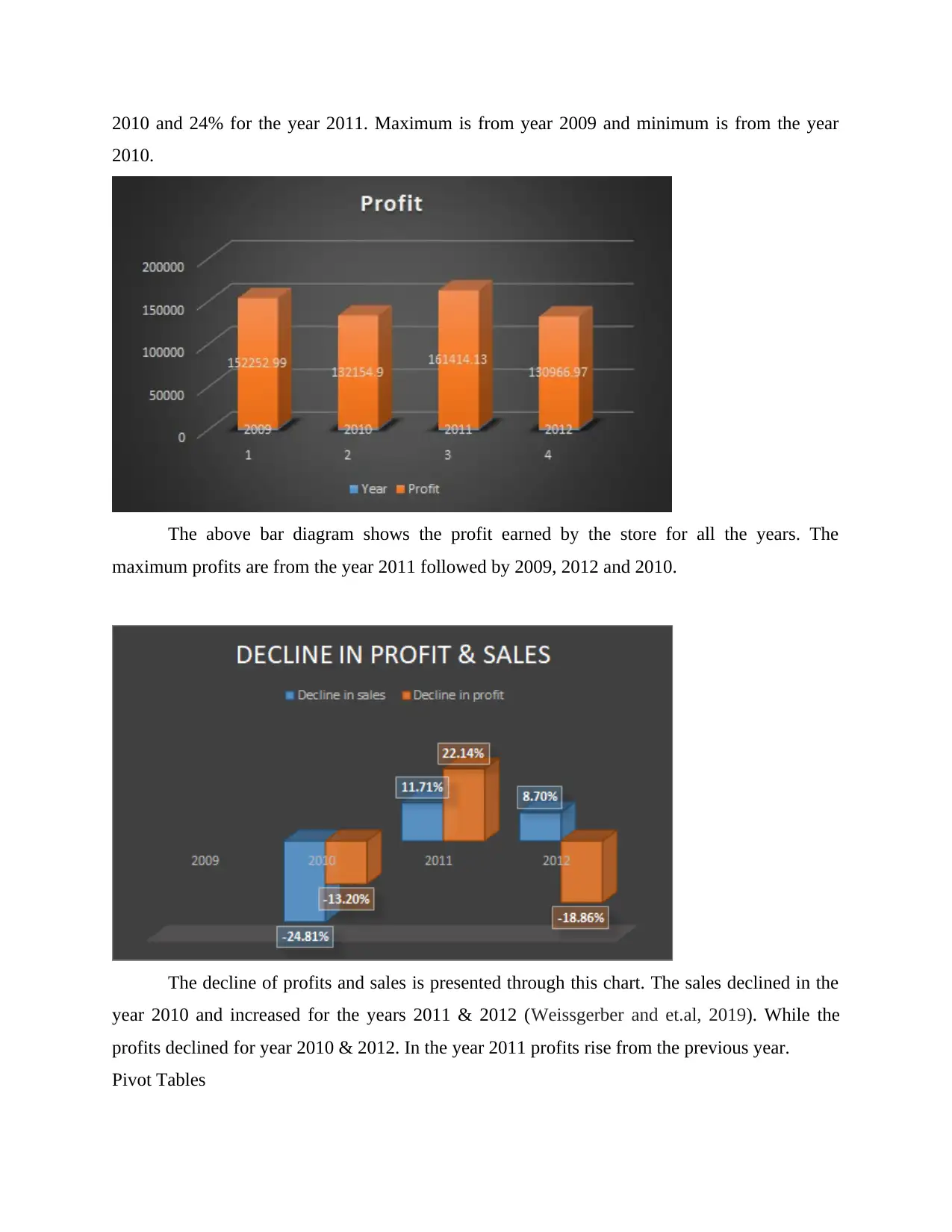
2010 and 24% for the year 2011. Maximum is from year 2009 and minimum is from the year
2010.
The above bar diagram shows the profit earned by the store for all the years. The
maximum profits are from the year 2011 followed by 2009, 2012 and 2010.
The decline of profits and sales is presented through this chart. The sales declined in the
year 2010 and increased for the years 2011 & 2012 (Weissgerber and et.al, 2019). While the
profits declined for year 2010 & 2012. In the year 2011 profits rise from the previous year.
Pivot Tables
⊘ This is a preview!⊘
Do you want full access?
Subscribe today to unlock all pages.
Trusted by 1+ million students worldwide
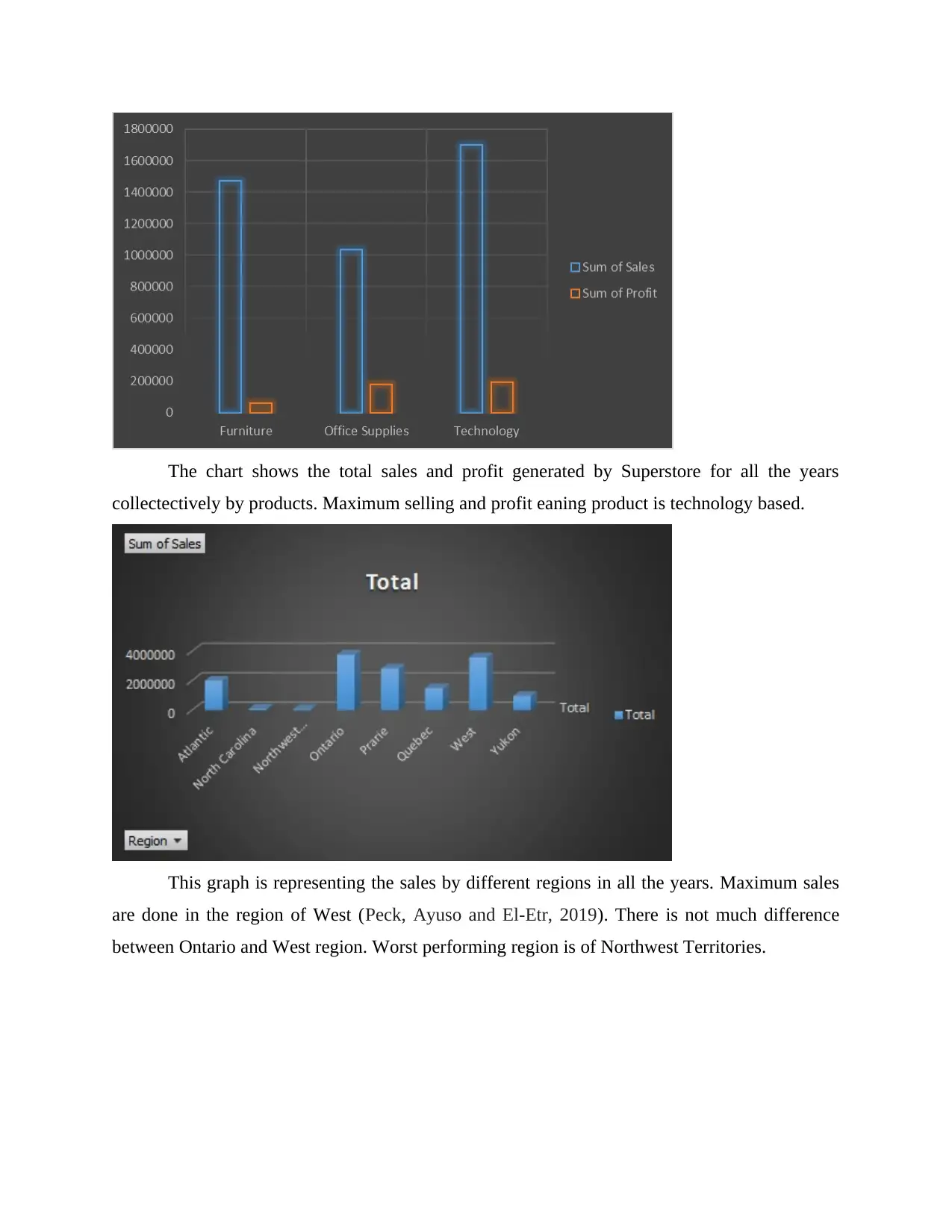
The chart shows the total sales and profit generated by Superstore for all the years
collectectively by products. Maximum selling and profit eaning product is technology based.
This graph is representing the sales by different regions in all the years. Maximum sales
are done in the region of West (Peck, Ayuso and El-Etr, 2019). There is not much difference
between Ontario and West region. Worst performing region is of Northwest Territories.
Paraphrase This Document
Need a fresh take? Get an instant paraphrase of this document with our AI Paraphraser
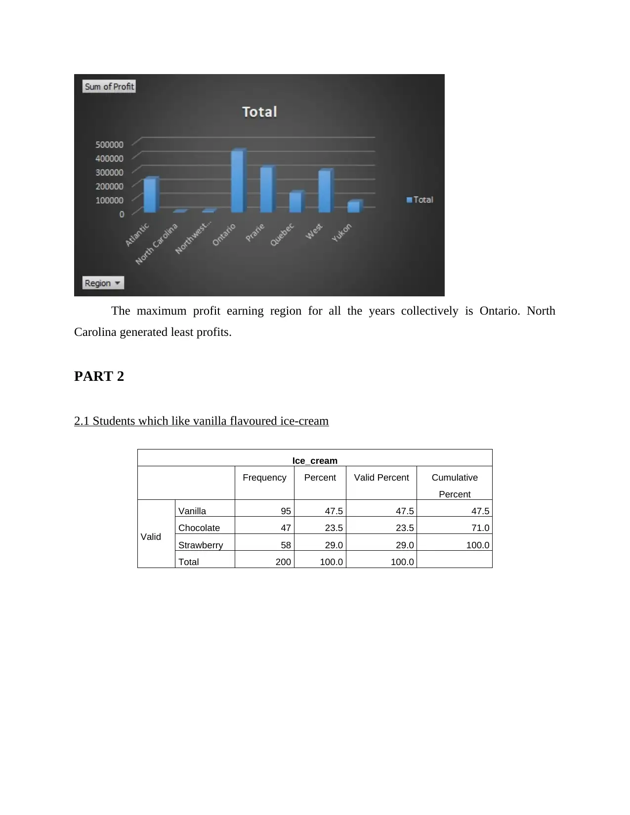
The maximum profit earning region for all the years collectively is Ontario. North
Carolina generated least profits.
PART 2
2.1 Students which like vanilla flavoured ice-cream
Ice_cream
Frequency Percent Valid Percent Cumulative
Percent
Valid
Vanilla 95 47.5 47.5 47.5
Chocolate 47 23.5 23.5 71.0
Strawberry 58 29.0 29.0 100.0
Total 200 100.0 100.0
Carolina generated least profits.
PART 2
2.1 Students which like vanilla flavoured ice-cream
Ice_cream
Frequency Percent Valid Percent Cumulative
Percent
Valid
Vanilla 95 47.5 47.5 47.5
Chocolate 47 23.5 23.5 71.0
Strawberry 58 29.0 29.0 100.0
Total 200 100.0 100.0
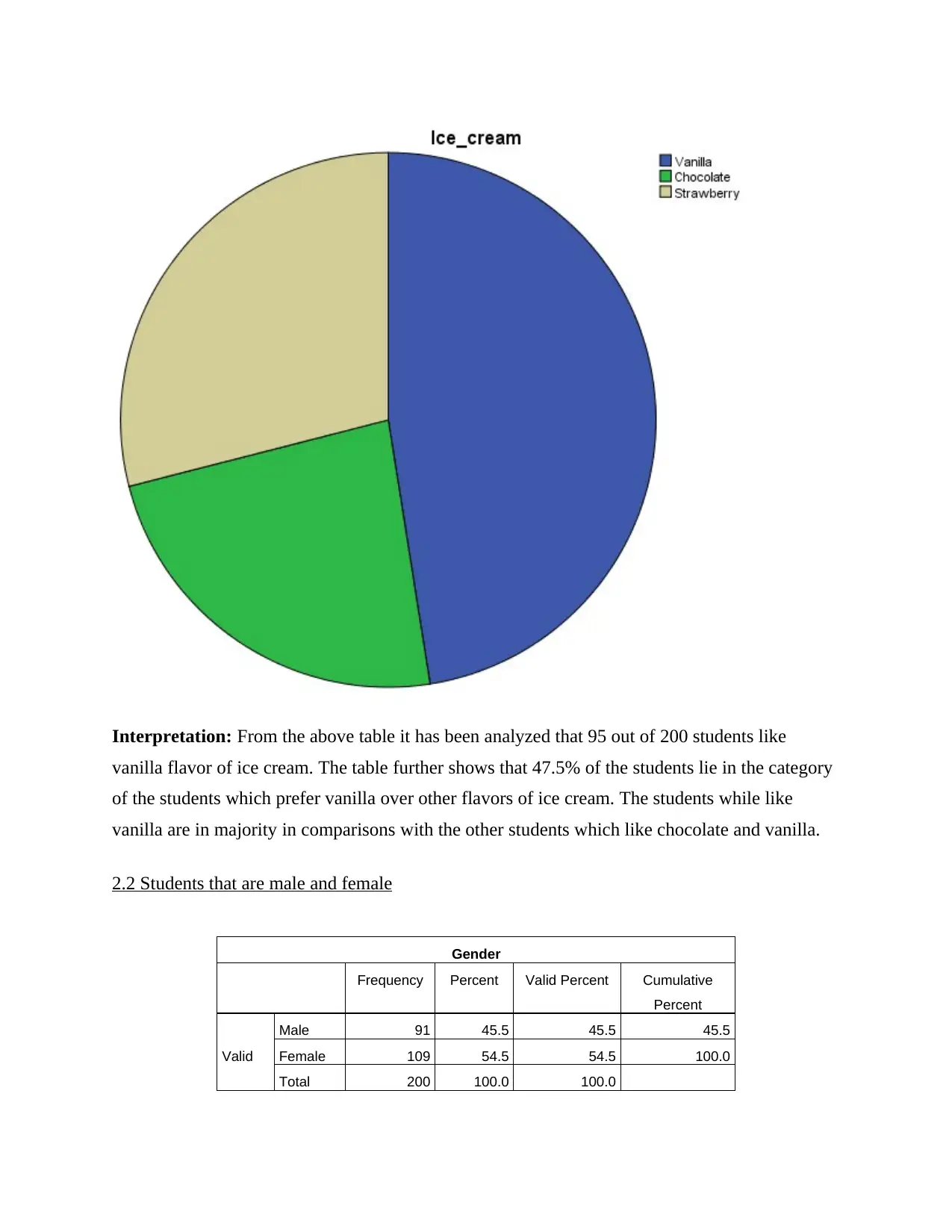
Interpretation: From the above table it has been analyzed that 95 out of 200 students like
vanilla flavor of ice cream. The table further shows that 47.5% of the students lie in the category
of the students which prefer vanilla over other flavors of ice cream. The students while like
vanilla are in majority in comparisons with the other students which like chocolate and vanilla.
2.2 Students that are male and female
Gender
Frequency Percent Valid Percent Cumulative
Percent
Valid
Male 91 45.5 45.5 45.5
Female 109 54.5 54.5 100.0
Total 200 100.0 100.0
⊘ This is a preview!⊘
Do you want full access?
Subscribe today to unlock all pages.
Trusted by 1+ million students worldwide
1 out of 25
Related Documents


Your All-in-One AI-Powered Toolkit for Academic Success.
+13062052269
info@desklib.com
Available 24*7 on WhatsApp / Email
![[object Object]](/_next/static/media/star-bottom.7253800d.svg)
Unlock your academic potential
Copyright © 2020–2026 A2Z Services. All Rights Reserved. Developed and managed by ZUCOL.