Human Computer Interaction: Designing Sydney Toll Roads Website

Verified

Added on  2023/06/15

|14
|1805
|77
Report
AI Summary
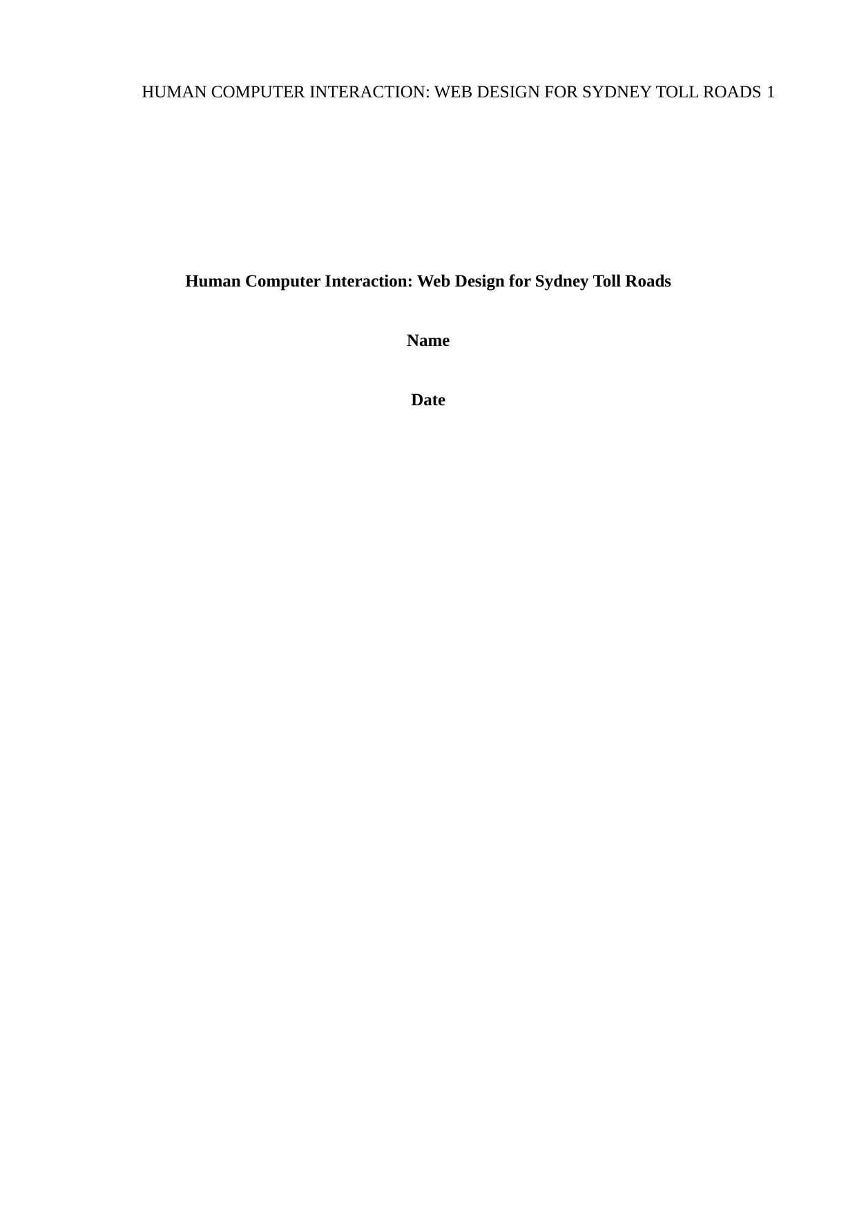
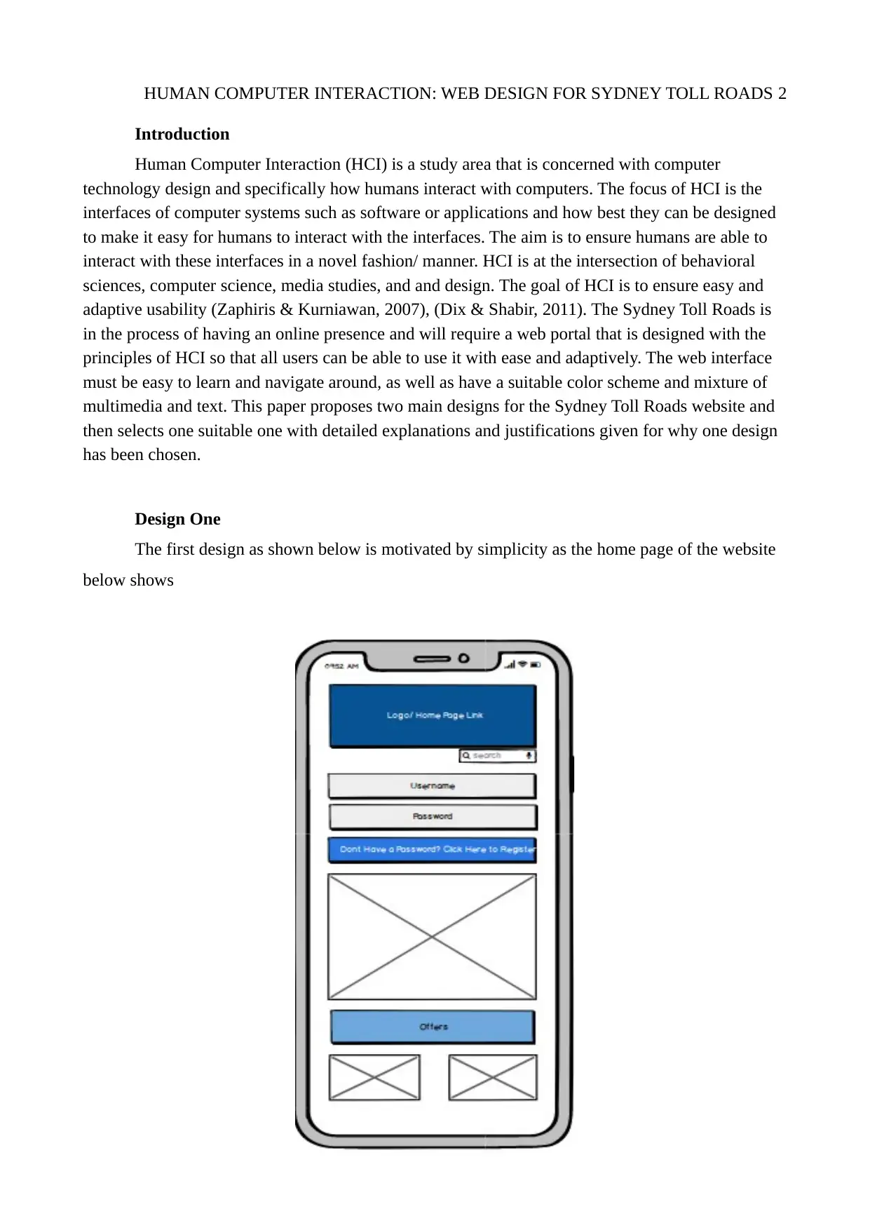
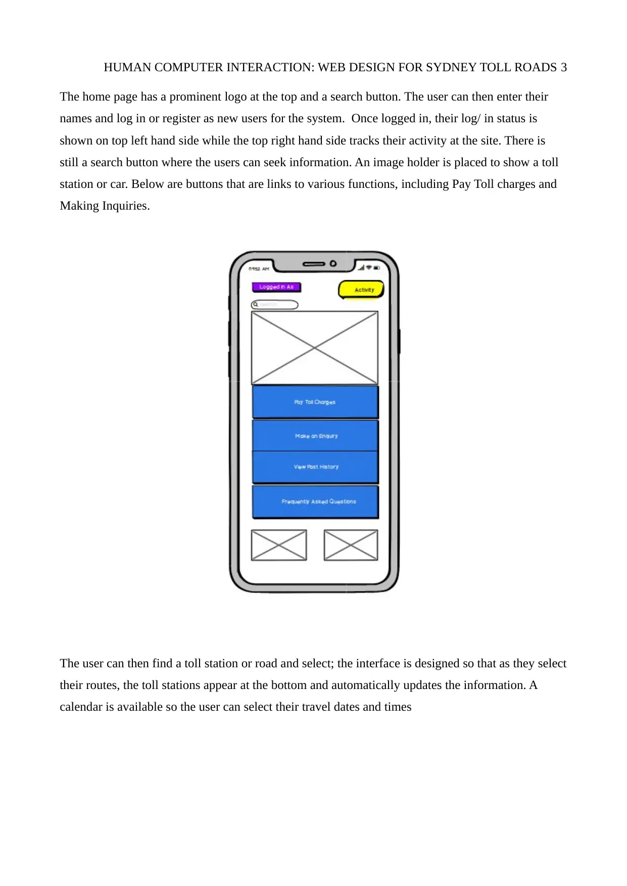
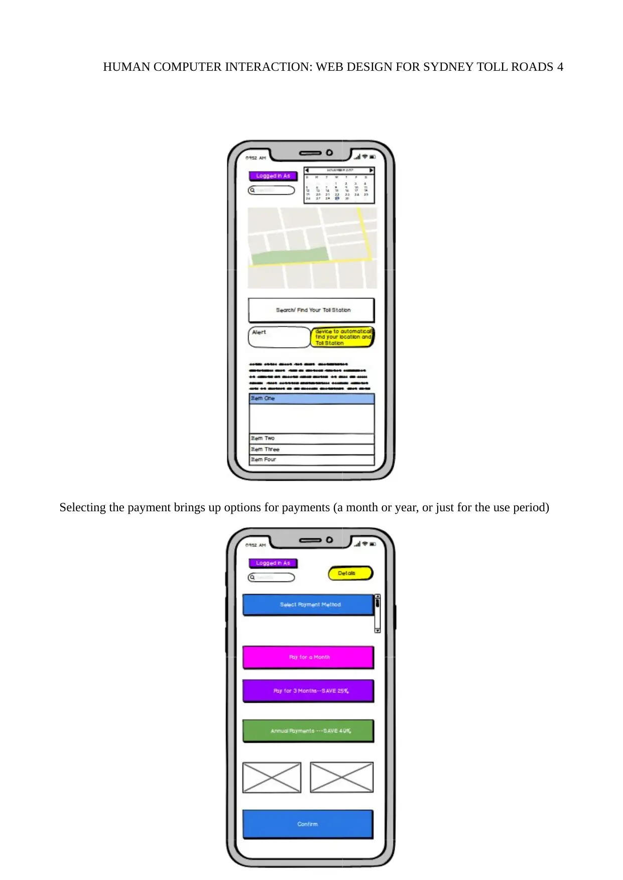
This report presents two web design proposals for Sydney Toll Roads, focusing on Human Computer Interaction (HCI) principles to ensure user-friendly interfaces. The first design emphasizes simplicity with a prominent logo, search functionality, user login/registration, and buttons for key functions like toll payment and inquiries. The second design adopts a high-contrast approach with image placeholders, icon-based navigation, and direct access to payment, vehicle management, and route planning features. Ultimately, the second design is favored due to its adherence to HCI principles such as learnability, consistency, ergonomics, robustness, and task transferability. It incorporates features like a help button, web forms for charge calculation, and a user-friendly interface with high contrast and large text. The report concludes that the second design offers a more elegant and intuitive experience compared to the first, making it easier for users of all ages to navigate and access information efficiently. Desklib provides this and many other solved assignments for students.
Document Page
HUMAN COMPUTER INTERACTION: WEB DESIGN FOR SYDNEY TOLL ROADS 1
Human Computer Interaction: Web Design for Sydney Toll Roads
Name
Date
tabler-icon-diamond-filled.svg

Paraphrase This Document

Need a fresh take? Get an instant paraphrase of this document with our AI Paraphraser
Document Page
HUMAN COMPUTER INTERACTION: WEB DESIGN FOR SYDNEY TOLL ROADS 2
Introduction
Human Computer Interaction (HCI) is a study area that is concerned with computer
technology design and specifically how humans interact with computers. The focus of HCI is the
interfaces of computer systems such as software or applications and how best they can be designed
to make it easy for humans to interact with the interfaces. The aim is to ensure humans are able to
interact with these interfaces in a novel fashion/ manner. HCI is at the intersection of behavioral
sciences, computer science, media studies, and and design. The goal of HCI is to ensure easy and
adaptive usability (Zaphiris & Kurniawan, 2007), (Dix & Shabir, 2011). The Sydney Toll Roads is
in the process of having an online presence and will require a web portal that is designed with the
principles of HCI so that all users can be able to use it with ease and adaptively. The web interface
must be easy to learn and navigate around, as well as have a suitable color scheme and mixture of
multimedia and text. This paper proposes two main designs for the Sydney Toll Roads website and
then selects one suitable one with detailed explanations and justifications given for why one design
has been chosen.
Design One
The first design as shown below is motivated by simplicity as the home page of the website
below shows
Document Page
HUMAN COMPUTER INTERACTION: WEB DESIGN FOR SYDNEY TOLL ROADS 3
The home page has a prominent logo at the top and a search button. The user can then enter their
names and log in or register as new users for the system. Once logged in, their log/ in status is
shown on top left hand side while the top right hand side tracks their activity at the site. There is
still a search button where the users can seek information. An image holder is placed to show a toll
station or car. Below are buttons that are links to various functions, including Pay Toll charges and
Making Inquiries.
The user can then find a toll station or road and select; the interface is designed so that as they select
their routes, the toll stations appear at the bottom and automatically updates the information. A
calendar is available so the user can select their travel dates and times
Document Page
HUMAN COMPUTER INTERACTION: WEB DESIGN FOR SYDNEY TOLL ROADS 4
Selecting the payment brings up options for payments (a month or year, or just for the use period)
tabler-icon-diamond-filled.svg

Paraphrase This Document

Need a fresh take? Get an instant paraphrase of this document with our AI Paraphraser
Document Page
HUMAN COMPUTER INTERACTION: WEB DESIGN FOR SYDNEY TOLL ROADS 5
After selecting payment period, the user then selects their vehicle details (make and model)
as well as give insurance information. They can make the payment, with a call out button available
to tell them to make some changes while giving their payment details as shown below
Document Page
HUMAN COMPUTER INTERACTION: WEB DESIGN FOR SYDNEY TOLL ROADS 6
The tolll payment details will be shown, along with their travel route and a confirmation SMS sent
to them, along with other text information.
Document Page
HUMAN COMPUTER INTERACTION: WEB DESIGN FOR SYDNEY TOLL ROADS 7
Design Two for the Sydney Toll Roads
The home page is shown below;
This uses a simplistic high contrast design as shown above. It has the logo and an image either of
users’ car or a toll station in the image place holder. The home page has a log in/ register button and
uses icons with images that link to other pages for the basic/ main tasks of payment, vehicles, or
accessing the map. One can seek more information by clicking more button or obtain direct help by
selecting the ‘HELP’ button.
tabler-icon-diamond-filled.svg

Paraphrase This Document

Need a fresh take? Get an instant paraphrase of this document with our AI Paraphraser
Document Page
HUMAN COMPUTER INTERACTION: WEB DESIGN FOR SYDNEY TOLL ROADS 8
Clicking on ‘Payment’ opens a window where the user will enter their details (if unregistered),
otherwise registered users go directly to the payment page.
Document Page
HUMAN COMPUTER INTERACTION: WEB DESIGN FOR SYDNEY TOLL ROADS 9
On the payment page, a user will add cards for payment and put details and confirm by clicking
‘ADD CARD’
The payment details can then be updated by recharging their account; selecting ‘MAKE A
PAYMENT’ will show details of their balance and easy buttons are added for increasing or
reducing the amount, without having to type. The page gives feedback, such as default recharge
amounts and the user can then confirm payment after selecting the amount; the ZIP code is shown
by default based on their detail data.
KKKKK
Document Page
HUMAN COMPUTER INTERACTION: WEB DESIGN FOR SYDNEY TOLL ROADS 10
After recharging, the user can then add vehicles and confirm as the screen below shows
tabler-icon-diamond-filled.svg

Paraphrase This Document

Need a fresh take? Get an instant paraphrase of this document with our AI Paraphraser
Document Page
HUMAN COMPUTER INTERACTION: WEB DESIGN FOR SYDNEY TOLL ROADS 11
Fig A Fig B
Another important feature in the app is the route planner shown in Fig B above where the user can
select where they are going and the application automatically computes the toll charges based on the
toll stations, while showing the route to use as well as information such as distance and time plus
total charges
Document Page
HUMAN COMPUTER INTERACTION: WEB DESIGN FOR SYDNEY TOLL ROADS 12
The Preferred Design
Based on the two designs proposed and depicted in wire-frames above, design two would
best suit the needs of Sydney Toll Roads. The rationale for choosing the second design is that it
factors in most of the HCI design principles and elements one of which is familiarity/ learn-ability
(Kurosu, 2014). The website has been designed in such a way that the main buttons and the
information they contain remain the same (uniform and standard) for all the pages in the site. This is
so that the user remains familiar with their navigation, for instance, navigating to another page is
made easy. Consistency and standards is another principle adhered to in the design such that the
color schemes for the different web pages in the website remain the same (McKay, 2008). This
further makes it easy to navigate around; there are no pages that are starkly different from the
others; this helps make it easy to navigate and move around the website. Another principle that
makes the second design the chosen/ preferred one is that it adheres to the principles of ergonomics
(Falzon, Gaines, & Monk, 2013); The home page has image place holders that can be clicked to
perform various functions, such as making payments. Another HCI design principle for the website
is robustness where the user can get direct feedback (Stephanidis, 2009). This is done with the use
of a help button that gives feedback based on user actions by monitoring activity. Further, feedback
is achieved by having a help/ chat button where someone can click on and get instant help from a
help assistant at the back end of the website. In addition, there is a web form where an individual
can enter the details of their cars and calculate their charges for the toll stations, depending on their
location.
The use of the image place holders enhances the flexibility of using the website as it is based
on the principle of task transferability (Lowgren, n.d). the overall design is made in such a way that
tasks flow smoothly through a rich interface that is simple and elegant. The interface is easy to use
due to high contrast to enhance visibility even when used under the sun. The image holder
navigation system makes it very easy to learn and use the application. Large text is used in bold,
also with a high contrast for ease of reading even for those with eyesight problems. In general, the
second design incorporates many principles of HCI; the design is simplistic with text and images
placed with a highly contrasting background to make it easy for users to seek information. Anyone
at any age will quickly learn to use the system as the task flows are logical and easy to learn. At first
visit, the user will get to gather a lot of information, making the website very easy to use and
navigate around. This is in contrast to the first design in which there is no uniformity and the look
chevron_up_icon
1 out of 14
circle_padding
hide_on_mobile
zoom_out_icon
[object Object]