Syngenta: Business Decision Making, Graphical Analysis & Gantt Chart
VerifiedAdded on 2023/04/21
|11
|563
|167
Report
AI Summary
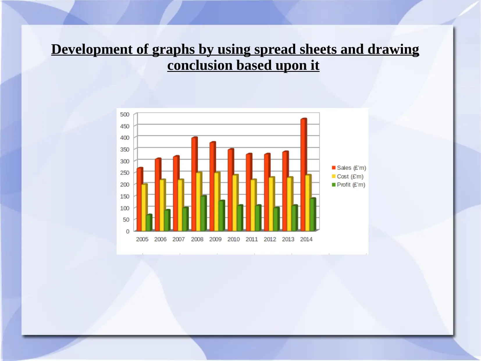
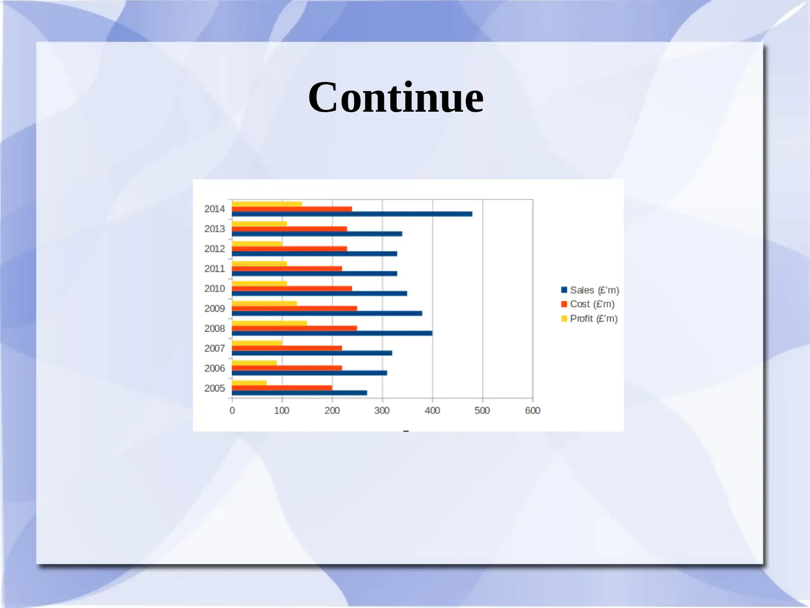
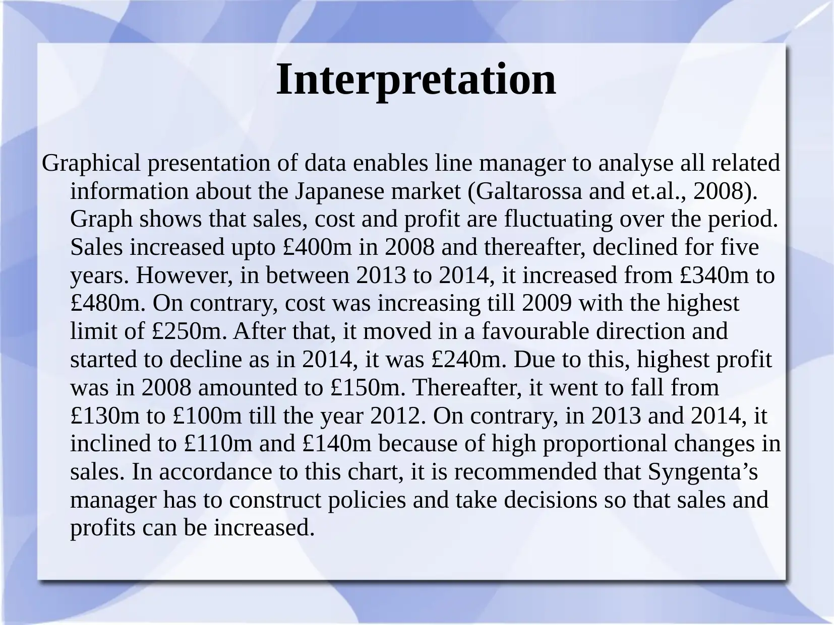
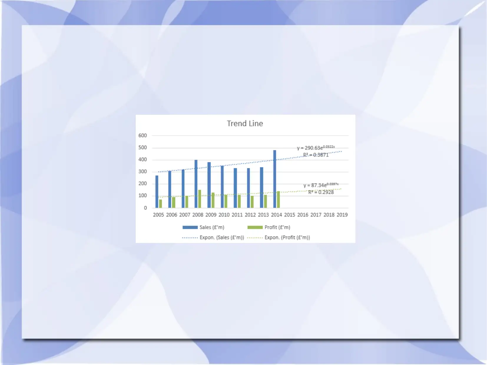
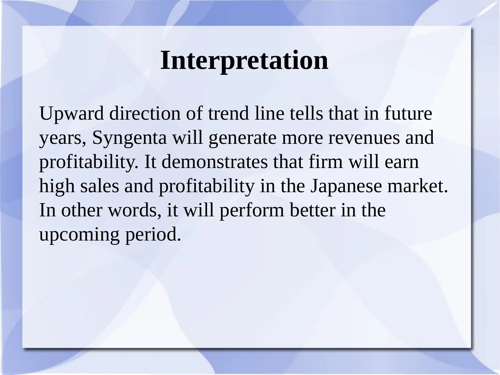
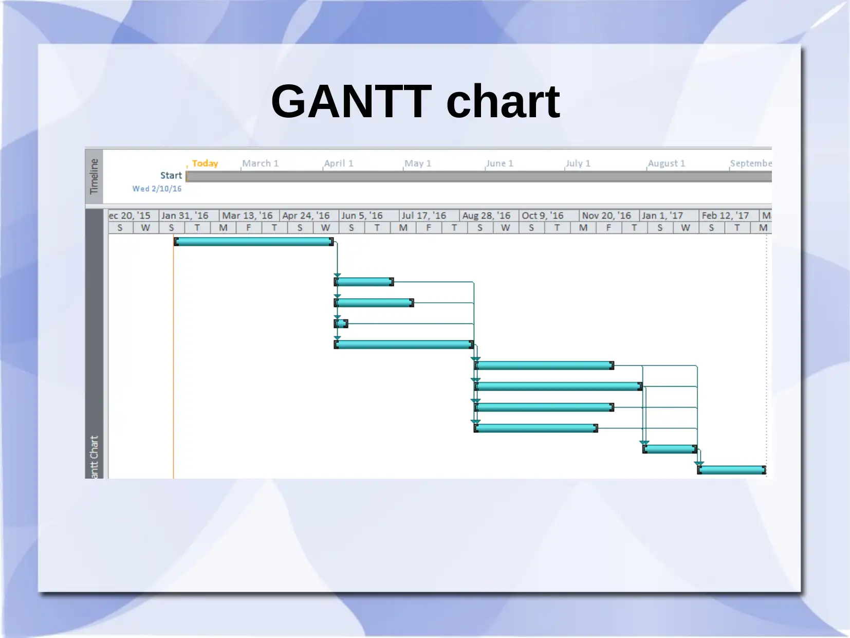
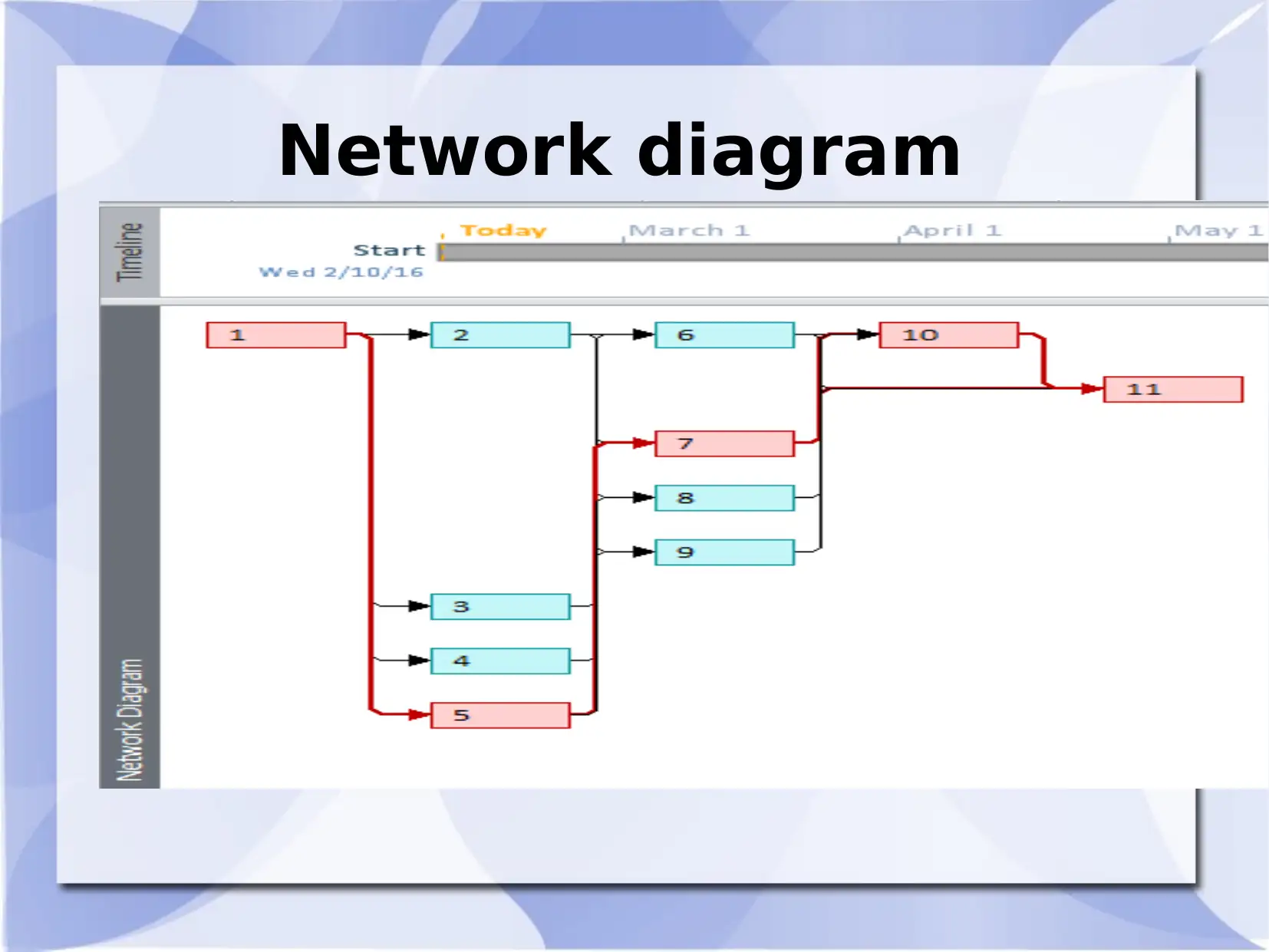
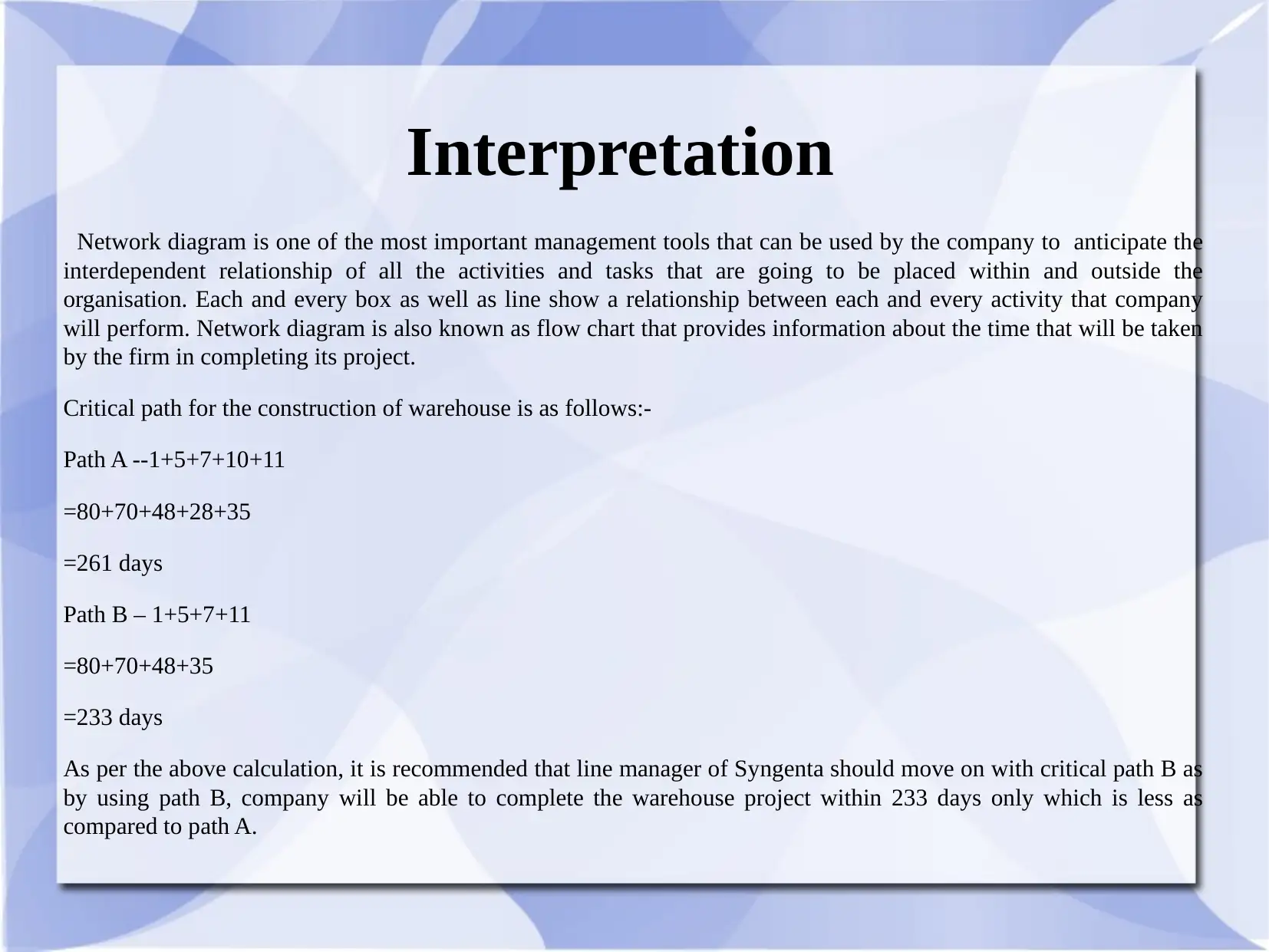
This report provides a business decision-making analysis using graphical presentations and project planning tools. It interprets sales, cost, and profit fluctuations in the Japanese market using graphs, recommending policies to increase sales and profits for Syngenta. The report also includes a Gantt chart and a network diagram for warehouse construction, determining the critical path to complete the project efficiently. Path B is recommended for its shorter completion time of 233 days compared to Path A's 261 days. Desklib is your go-to for more solved assignments and study resources.

BUSINESS DECISION MAKING
Paraphrase This Document
Need a fresh take? Get an instant paraphrase of this document with our AI Paraphraser

Development of graphs by using spread sheets and drawing
conclusion based upon it

Continue
⊘ This is a preview!⊘
Do you want full access?
Subscribe today to unlock all pages.

Trusted by 1+ million students worldwide

Interpretation
Graphical presentation of data enables line manager to analyse all related
information about the Japanese market (Galtarossa and et.al., 2008).
Graph shows that sales, cost and profit are fluctuating over the period.
Sales increased upto £400m in 2008 and thereafter, declined for five
years. However, in between 2013 to 2014, it increased from £340m to
£480m. On contrary, cost was increasing till 2009 with the highest
limit of £250m. After that, it moved in a favourable direction and
started to decline as in 2014, it was £240m. Due to this, highest profit
was in 2008 amounted to £150m. Thereafter, it went to fall from
£130m to £100m till the year 2012. On contrary, in 2013 and 2014, it
inclined to £110m and £140m because of high proportional changes in
sales. In accordance to this chart, it is recommended that Syngenta’s
manager has to construct policies and take decisions so that sales and
profits can be increased.
Paraphrase This Document
Need a fresh take? Get an instant paraphrase of this document with our AI Paraphraser


Interpretation
Upward direction of trend line tells that in future
years, Syngenta will generate more revenues and
profitability. It demonstrates that firm will earn
high sales and profitability in the Japanese market.
In other words, it will perform better in the
upcoming period.
Upward direction of trend line tells that in future
years, Syngenta will generate more revenues and
profitability. It demonstrates that firm will earn
high sales and profitability in the Japanese market.
In other words, it will perform better in the
upcoming period.
⊘ This is a preview!⊘
Do you want full access?
Subscribe today to unlock all pages.

Trusted by 1+ million students worldwide

GANTT chart
Paraphrase This Document
Need a fresh take? Get an instant paraphrase of this document with our AI Paraphraser

Network diagram

Interpretation
Network diagram is one of the most important management tools that can be used by the company to anticipate the
interdependent relationship of all the activities and tasks that are going to be placed within and outside the
organisation. Each and every box as well as line show a relationship between each and every activity that company
will perform. Network diagram is also known as flow chart that provides information about the time that will be taken
by the firm in completing its project.
Critical path for the construction of warehouse is as follows:-
Path A --1+5+7+10+11
=80+70+48+28+35
=261 days
Path B – 1+5+7+11
=80+70+48+35
=233 days
As per the above calculation, it is recommended that line manager of Syngenta should move on with critical path B as
by using path B, company will be able to complete the warehouse project within 233 days only which is less as
compared to path A.
⊘ This is a preview!⊘
Do you want full access?
Subscribe today to unlock all pages.

Trusted by 1+ million students worldwide

References
Li, J. and et.al., 2012. Sideband spectroscopy and dispersion measurement in microcavities. Optics
express. 20(24). pp.26337-26344.
Robertson, G. and et.al., 2008. Effectiveness of animation in trend visualization. Visualization and
Computer Graphics, IEEE Transactions on. 14(6). pp.1325-1332.
Brandt, M. W. and et.al., 2010. The idiosyncratic volatility puzzle: Time trend or speculative
episodes?. Review of Financial Studies. 23(2). pp.863-899.
Götze, U., Northcott, D. and Schuster, P., 2008. Investment appraisal. Methods and Models, Berlin,
Heidelberg 2008.
Online
PERT and Gantt chart, n.d. [Pdf]. Available through:
<http://ualr.edu/jdberleant/courses/ifsc7310/pertgantt.pdf>. [Accessed on 8th March, 2016].
Paraphrase This Document
Need a fresh take? Get an instant paraphrase of this document with our AI Paraphraser

Thank you
1 out of 11
Related Documents

Your All-in-One AI-Powered Toolkit for Academic Success.
+13062052269
info@desklib.com
Available 24*7 on WhatsApp / Email
Unlock your academic potential
Copyright © 2020–2025 A2Z Services. All Rights Reserved. Developed and managed by ZUCOL.