Tableau-Based Business Intelligence Tool: Olympic Games Data Analysis
VerifiedAdded on 2021/04/07
|13
|1930
|137
Project
AI Summary
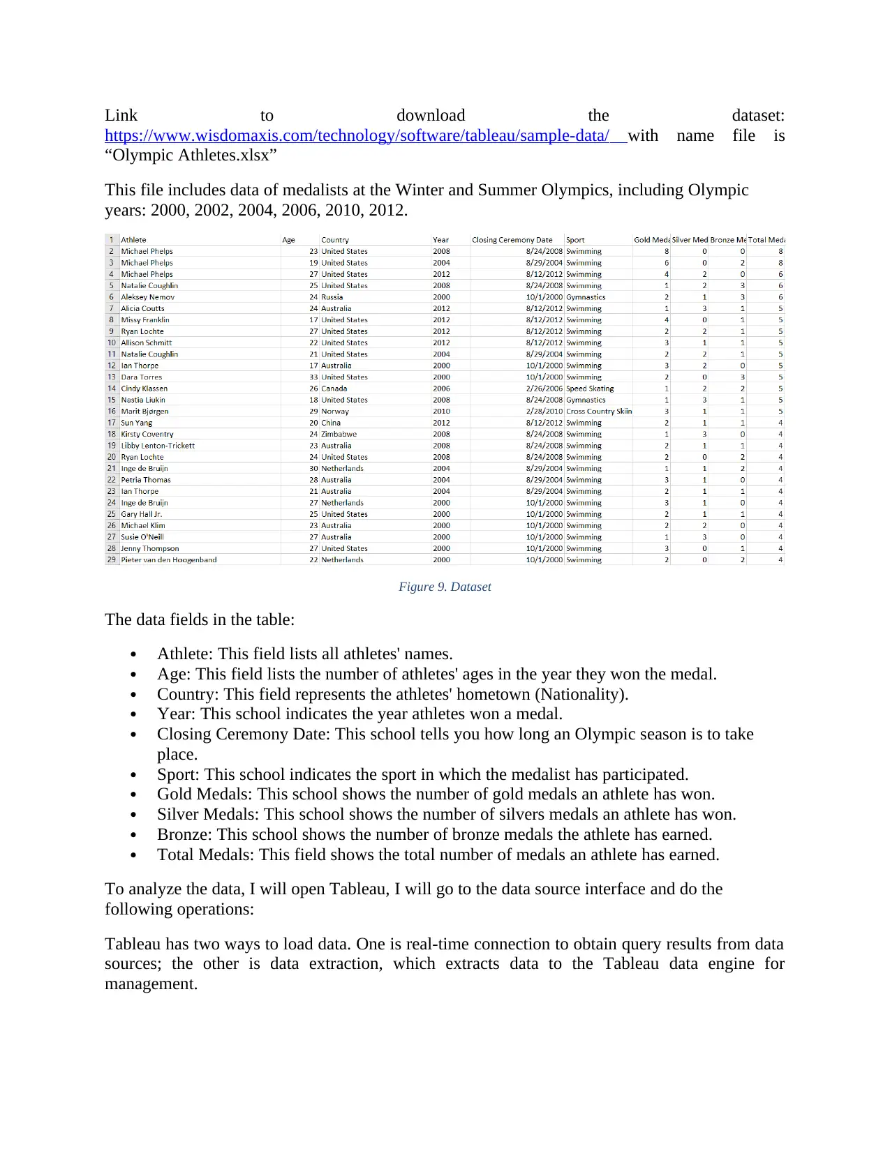
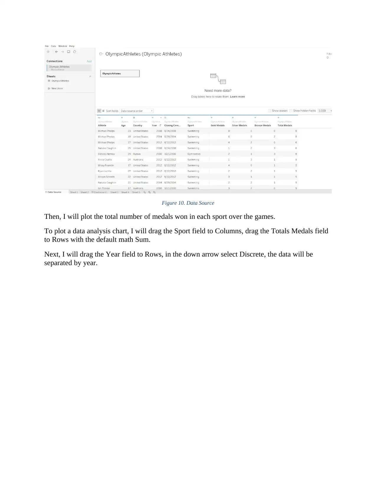
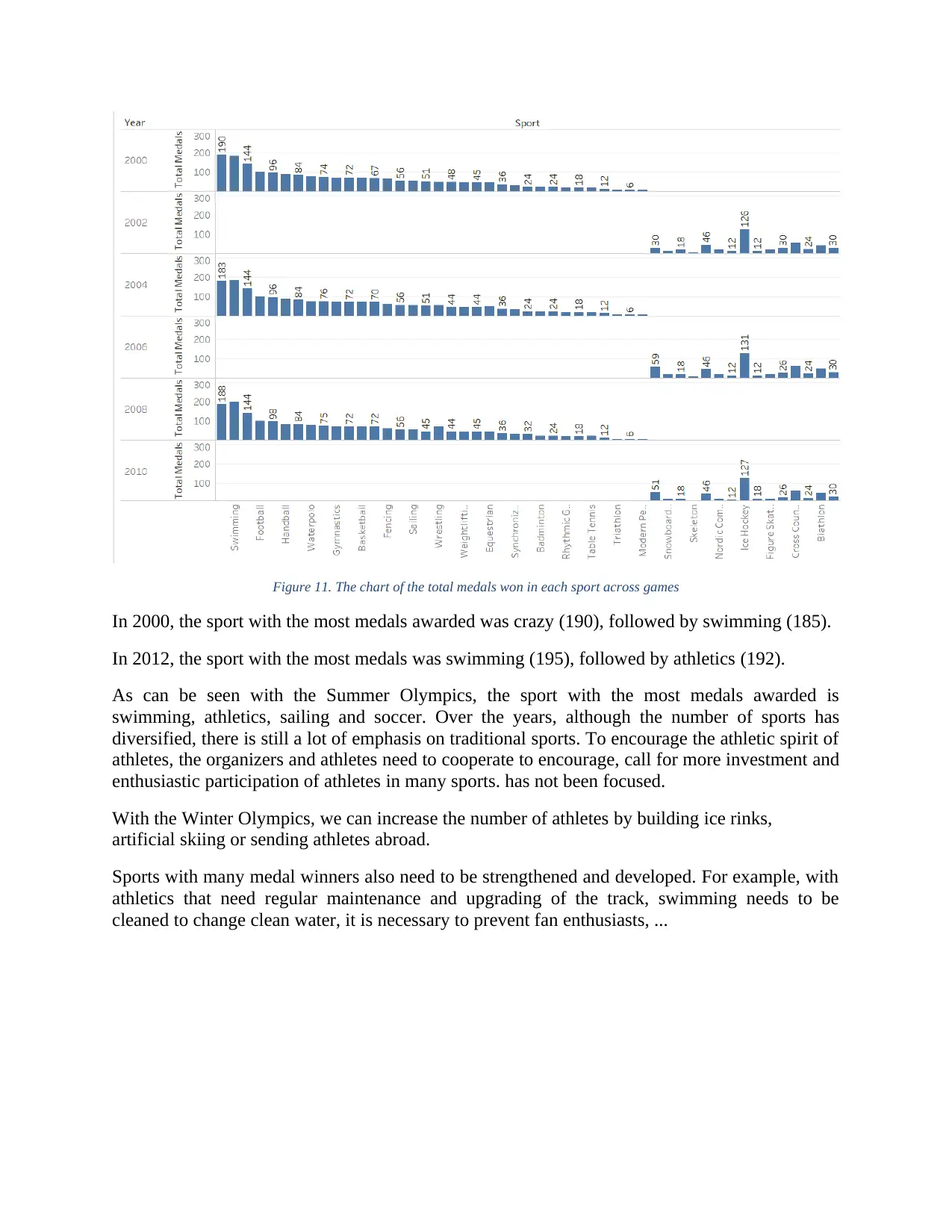
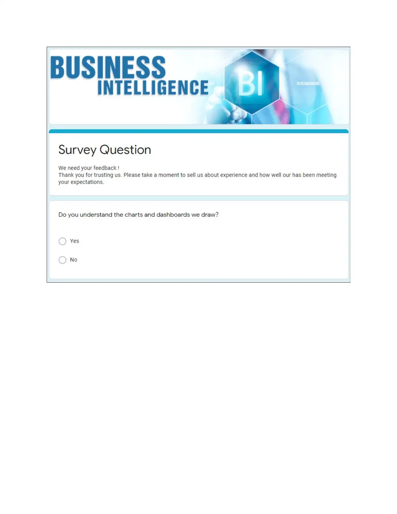
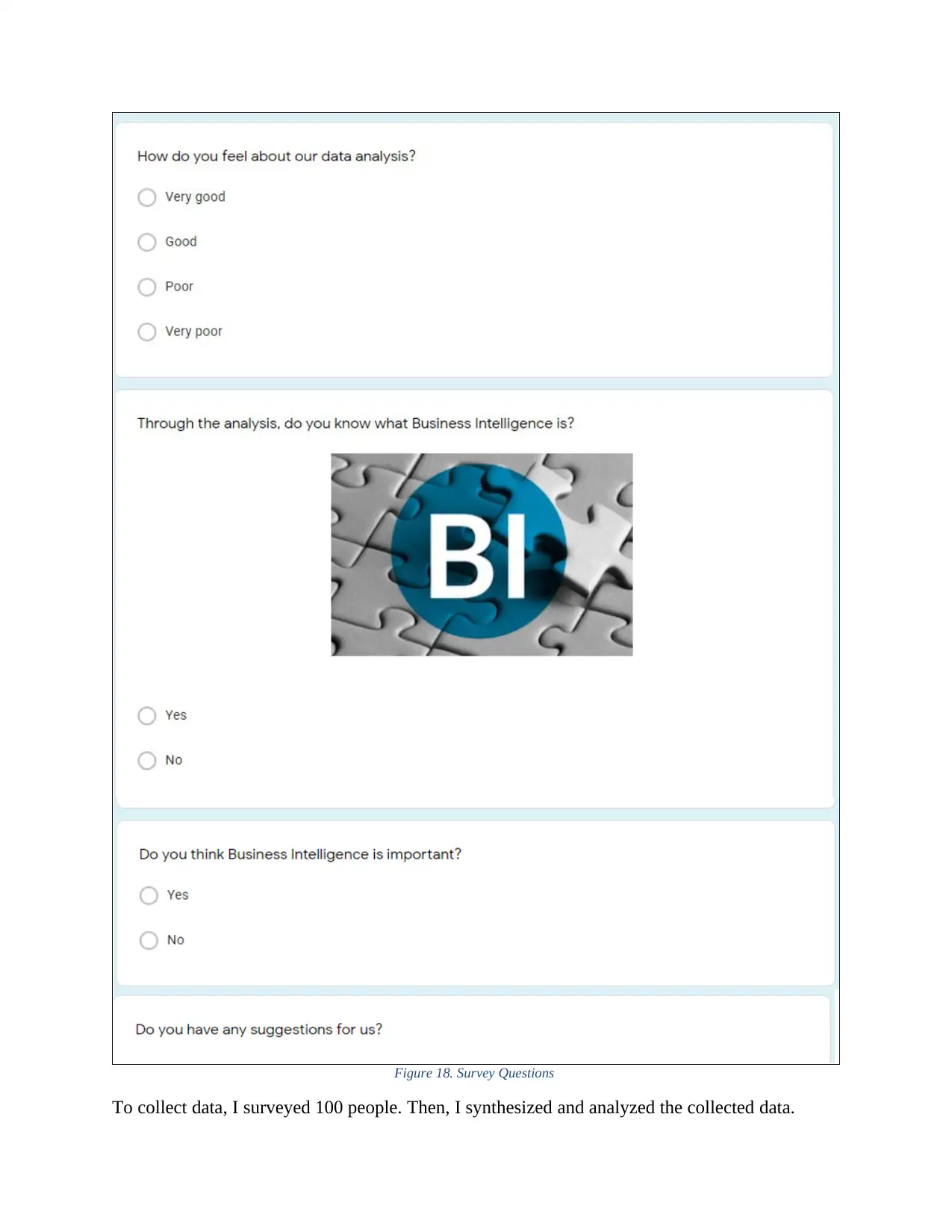
This assignment presents a Tableau-based business intelligence tool designed to analyze Olympic Games data from 2000 to 2012. The project begins with an introduction to Tableau and its capabilities, highlighting its speed, ease of use, and interactive dashboard creation. The dataset, sourced from the Olympics, includes information on athletes, age, country, year, sport, and medal counts. The analysis involves creating various charts, including the total number of medals won in each sport over the years and the number of medals won by each country. A dashboard is then developed, integrating several visualizations such as a medal count by country, a bar chart showing medal types for each country, and a chart of the top 10 countries with the highest total medals. The project also includes user feedback collected through a survey, assessing the clarity and effectiveness of the dashboards. The analysis reveals trends in sports popularity, country performance, and the overall understanding of business intelligence. The project concludes with a discussion of the strengths and limitations of the dashboard, and future improvements.

I. Design a business intelligence tool,
application or interface that can perform
a specific task to support problem-solving
or decision-making at an advance level
In this section, I will use Tableau to conduct data analysis. Tableau is a powerful and fastest
growing data visualization tool used in the Business Intelligence Industry. It helps to simplify
raw data in a format that is easy to understand. Tableau helps create data that can be understood
by professionals at any level in the organization. It also allows non-technical users to create
custom dashboards.
The Dashboard created in this section was conducted with Tableau Public. Tableau Public,
created by a software company in Seattle, enables interactive data visualization and focuses on
business intelligence. The product connects to relational databases, cubes and cloud databases.
Tableau Public allows the creation of many types of graphs that can be combined in dashboards
and distributed on the internet. Currently used in all areas, Tableau Public has imposed by the
easy access not requiring programming skills. Among the advantages of using Tableau Public we
can mention:
Speed – is the most important strength of Tableau Public. It is able to analyses millions
of rows and provide an answer in few seconds, enabling decision making in real time.
Ease of use – based on the drag and drop option. Most of times, the graphics are created
by importing an Excel file. Engaging and interactive Dashboards – enables creation of
smart charts and graphs.
Direct connection to databases (Google Analytics, MySQL, Microsoft PowerPivot,
Oracle, SAP, Windows Azure Marketplace Data Market, Excel, etc.)
Easy sharing – can be easily distributed on internet and mobile devices.
Popular Tool of Business Intelligence
Before I go into data analysis, what is the dataset?
According to Wikipedia, “A dataset (or data set) is a collection of data, usually presented in
tabular form. Each column represents a particular variable. Each row corresponds to a given
member of the dataset in question. It lists values for each of the variables, such as height and
weight of an object. Each value is known as a datum. The dataset may comprise data for one or
more members, corresponding to the number of rows. Nontabular datasets can take the form of
marked up strings of characters, such as an XML file.”
Content of dataset: The Olympic Games have been expanding every year which can be seen by
the records of the nation’s participating. This international sporting event where thousands of
athletes from various countries compete in various sports every four years, has experienced
enough growth in which we can begin to ask questions on the evolution of the Olympics based
on gender participation or their performance and results based on basic biological information.
Paraphrase This Document
Need a fresh take? Get an instant paraphrase of this document with our AI Paraphraser

Link to download the dataset:
https://www.wisdomaxis.com/technology/software/tableau/sample-data/ with name file is
“Olympic Athletes.xlsx”
This file includes data of medalists at the Winter and Summer Olympics, including Olympic
years: 2000, 2002, 2004, 2006, 2010, 2012.
Figure 9. Dataset
The data fields in the table:
Athlete: This field lists all athletes' names.
Age: This field lists the number of athletes' ages in the year they won the medal.
Country: This field represents the athletes' hometown (Nationality).
Year: This school indicates the year athletes won a medal.
Closing Ceremony Date: This school tells you how long an Olympic season is to take
place.
Sport: This school indicates the sport in which the medalist has participated.
Gold Medals: This school shows the number of gold medals an athlete has won.
Silver Medals: This school shows the number of silvers medals an athlete has won.
Bronze: This school shows the number of bronze medals the athlete has earned.
Total Medals: This field shows the total number of medals an athlete has earned.
To analyze the data, I will open Tableau, I will go to the data source interface and do the
following operations:
Tableau has two ways to load data. One is real-time connection to obtain query results from data
sources; the other is data extraction, which extracts data to the Tableau data engine for
management.

Figure 10. Data Source
Then, I will plot the total number of medals won in each sport over the games.
To plot a data analysis chart, I will drag the Sport field to Columns, drag the Totals Medals field
to Rows with the default math Sum.
Next, I will drag the Year field to Rows, in the down arrow select Discrete, the data will be
separated by year.
⊘ This is a preview!⊘
Do you want full access?
Subscribe today to unlock all pages.

Trusted by 1+ million students worldwide

Figure 11. The chart of the total medals won in each sport across games
In 2000, the sport with the most medals awarded was crazy (190), followed by swimming (185).
In 2012, the sport with the most medals was swimming (195), followed by athletics (192).
As can be seen with the Summer Olympics, the sport with the most medals awarded is
swimming, athletics, sailing and soccer. Over the years, although the number of sports has
diversified, there is still a lot of emphasis on traditional sports. To encourage the athletic spirit of
athletes, the organizers and athletes need to cooperate to encourage, call for more investment and
enthusiastic participation of athletes in many sports. has not been focused.
With the Winter Olympics, we can increase the number of athletes by building ice rinks,
artificial skiing or sending athletes abroad.
Sports with many medal winners also need to be strengthened and developed. For example, with
athletics that need regular maintenance and upgrading of the track, swimming needs to be
cleaned to change clean water, it is necessary to prevent fan enthusiasts, ...
Paraphrase This Document
Need a fresh take? Get an instant paraphrase of this document with our AI Paraphraser

Figure 12. The chart shows the number of medals of the countries in the Olympics. (2000-2012)
Figure 13. Top 10 countries with the highest total medals (2000, 2012)
In the 2 charts above we see: in 2000, after clicking on the icon sorted in descending order of the
total number of medals (ascending), we see that the US has the largest total number of medals
achieved (243) chapter.
During the 2012 Olympics, the United States was still the country with the largest total number
of medals (254).
Dashboard
A dashboard is a visual display of the most important information needed to achieve one or more
objectives that fits entirely on a single computer screen, so that it can be viewed, monitored and
managed at a glance.

Dashboard is a user interface that organizes and presents information in a way that is easy to
read.
When you add a view to the dashboard, it automatically connects to the corresponding
worksheet. When you modify the worksheet, the dashboard is updated automatically and vice-
versa.
My dashboard consists of 3 charts:
First, I will create a single pseudo chart showing the total number of medals from 2000 to 2012.
Figure 14. Medal Count by County
Once the map was ready it was time to start with the medals, so I created a simple bar chart
showing the bronze, silver and gold medals for each country and a reference line showing the
average medals won by country. I also edited the colors to make it easier and faster to identify
the type of medal, added a parameter so the user can sort the chart by the total number of medals
or by each type, and finally grouped some countries that changed their name during the
dashboard’s time period (Russia and Soviet Union, Germany and West / East Germany, etc.).
⊘ This is a preview!⊘
Do you want full access?
Subscribe today to unlock all pages.

Trusted by 1+ million students worldwide

Figure 15. Bar chart showing the bronze, silver and gold medals for each country
Finally, I will create a bar chart showing the top 10 countries with the highest total medals from
2000-2012.
Figure 16. Top 10 countries with the highest total medals
Finally, I will create a bar chart showing the top 10 countries with the highest total medals from
2000-2012.
Figure 16. Top 10 countries with the highest total medals
Paraphrase This Document
Need a fresh take? Get an instant paraphrase of this document with our AI Paraphraser

With all my sheets ready it was dashboard building time. I selected a Times New Roman font,
added the Olympics logo, added all the sheets, edited the filters to highlight them a little bit, and
define all the actions. This is the final result.
Figure 17. Olympic Dashboard
Give feedback / comments
During the demonstration about BI, I collected feedback and comments from users to review
how well my dashboards design meet user or business requirement and what customization
needed for future use.
Below is a sample survey question I have created to conduct a survey and collect customer
feedback.

⊘ This is a preview!⊘
Do you want full access?
Subscribe today to unlock all pages.

Trusted by 1+ million students worldwide

Figure 18. Survey Questions
To collect data, I surveyed 100 people. Then, I synthesized and analyzed the collected data.
Paraphrase This Document
Need a fresh take? Get an instant paraphrase of this document with our AI Paraphraser

Question 1:
Question
Answer
Do you understand the charts and dashboards we draw?
Yes 75
No 25
Figure 19. Question 1 survey results
Of the 100 people surveyed, after looking through dashboards, there were 75 people who
answered yes and 25 answered no. Most people find the dashboard easy to understand, which is a
good result for the company.
Question 2:
Question
Answer
How do you feel about our data analysis?
Very Good 25
Good 63
Poor 10
Very poor 2
Question
Answer
Do you understand the charts and dashboards we draw?
Yes 75
No 25
Figure 19. Question 1 survey results
Of the 100 people surveyed, after looking through dashboards, there were 75 people who
answered yes and 25 answered no. Most people find the dashboard easy to understand, which is a
good result for the company.
Question 2:
Question
Answer
How do you feel about our data analysis?
Very Good 25
Good 63
Poor 10
Very poor 2

Figure 20. Question 2 survey results
From the chart, we see that most people think that our data analysis is quite good (25 people
think the data analysis process is Very Good, 63 people say Good, 10 people say Poor, and 2
people say Very Poor.
Question 3:
Question
Answer
Through the dashboard, do you know what Business Intelligence is?
Yes 80
No 20
Figure 21. Question 3 survey results
⊘ This is a preview!⊘
Do you want full access?
Subscribe today to unlock all pages.

Trusted by 1+ million students worldwide
1 out of 13
Related Documents
Your All-in-One AI-Powered Toolkit for Academic Success.
+13062052269
info@desklib.com
Available 24*7 on WhatsApp / Email
Unlock your academic potential
Copyright © 2020–2025 A2Z Services. All Rights Reserved. Developed and managed by ZUCOL.


