CS5603: Data Visualization Project Report - Analysis
VerifiedAdded on 2023/06/10
|20
|3697
|86
Report
AI Summary
This report details a data visualization project utilizing Tableau software to analyze the Sample-Superstore.xls dataset. The project's introduction outlines the dataset's attributes, research questions focused on product sales, profit, and regional comparisons, and the objectives. The design section emphasizes Tableau's interactive capabilities and design considerations. The implementation phase describes the data source connection, dimension and measure selection, and application of visualization techniques, including bar charts and regional sales comparisons. The evaluation section assesses the project, and the conclusion summarizes the findings. The report covers the entire process from data import to the interpretation of visualizations, addressing key business intelligence questions regarding product performance, regional sales trends, and the impact of discounts on profitability, thereby providing insights through interactive data exploration.

Paraphrase This Document
Need a fresh take? Get an instant paraphrase of this document with our AI Paraphraser
Data Visualization
1
1
Contents
1. Introduction.......................................................................................................................................2
1.1 Dataset Description....................................................................................................................2
1.2 Research Questions....................................................................................................................2
2. Design.................................................................................................................................................3
3. Implementation..................................................................................................................................5
3.1 Data source Connection.............................................................................................................6
3.2 Measurement and Dimension Selection...................................................................................9
3.3 Apply Data Visualization technique.......................................................................................11
4. Evaluation........................................................................................................................................15
5. Conclusion........................................................................................................................................17
References................................................................................................................................................17
2
⊘ This is a preview!⊘
Do you want full access?
Subscribe today to unlock all pages.
Trusted by 1+ million students worldwide
1. Introduction
The main objective of this project is to develop an interactive data visualisation, using a
tool like Tableau, in order to gain demonstrably useful insight into a complex dataset. For this
project sample Superstore dataset is taken to do analysis. To do the dataset analysis, we will use
‘Tableau Software’. The objectives of this project is listed below.
1) To describe the dataset taken in this project and to determine the user type and to plan
the questions
2) In design section, we will discuss that how our solution evolved from initial ideas
proposed at the presentation to your final paper prototype design and
implementations.
3) In Implementation, we will discuss about how we implemented our design by using
our chosen data visualisation tools.
4) The obtained screenshots and data visualization process steps what we carried out
will be discussed in detail.
5) In Evaluation section, we will evaluate critically the project as a whole including
reflections on your personal learning (to date and looking forward) and the relative
merits of the data visualisation tools used.
1.1 Dataset Description
The dataset taken for this BI analysis project is ‘Sample-Superstore.xls’ data set. In this
dataset, there are three sheets provided. In the Order table, Row ID, Order ID, Order Date, Ship
Date, Ship Mode, Customer ID, Customer Name, Segment, Country, City, State, Postal Code,
Region, Product ID, Category, Sub-Category, Product Name, Sales, Quantity, Discount and
Profit are the attributes. In the Returned Table, onely two attributes are stored and they are
Returned and Order ID. In third table, Person and region attributes are stored. This data set is
obtained from the website https://community.tableau.com/docs/DOC-1236.
1.2 Research Questions
1) What are the products are bought mostly by people from which region?
2) What are the products has more profit even though it has sold with high discount rate?
3) Compare the discount, profit and sale of each categorized products.
3
Paraphrase This Document
Need a fresh take? Get an instant paraphrase of this document with our AI Paraphraser
4) Using Global Superstore, identify the Sub-Categories where Top 20 Customers that have
Sales more than the other Sub-Categories in the same Region.
5) 3)Using Global Superstore, identify the Regions where Top 20 Customers that have
overall Profit Ratio (Profit as % of Sales) which is double the Profit Ratio of other
Customers in the Region.
2. Design
Tableau is unique with regards to setting up featuring activities crosswise over
worksheets, so exploit these in our maps and dashboards. Tableau enables individuals to change
information into noteworthy bits of knowledge (MERCIER, 2017). Investigate with boundless
visual examination. Assemble dashboards and perform prompt examinations in only a couple of
snaps. Offer our work with anybody and have an effect on our business. From worldwide
undertakings to beginning period new companies and private companies, individuals wherever
utilize Tableau to see and comprehend their information. With various worksheets on a
dashboard, make sure to exploit the plan apparatuses in Tableau to all the more likely incorporate
the guide into our outline. We'll additionally need to ensure that the types for information on the
individual dashboards coordinate (Moore and Berk, 2013).
By setting up a feature activity in view of the area number, the user can investigate one
region at any given moment. Something else, it's excessively overpowering, making it
impossible to see the examples of progress with the confused fringes on each guide.
It's anything but difficult to set this up on a dashboard. We'll have to utilize a different
worksheet to fill in as our legend permission and to set up activities connecting our 'legend' to
alternate worksheets on our dashboard. Likewise, for our information, ensure that the types that
we utilize have similar qualities over the majority of the permits on the dashboard. Conflictingly
repeating types will make it almost inconceivable for most users to accurately decipher the
information (Moore and Drecki, 2013).
Consider a case where we think about the quantity of business and private building
licenses issued around the Las Vegas, Nevada zone. In the event that we utilize the default
shading encoding for the two maps we have an enormous contrast in the significance of the green
shades on the grounds that there such a significant number of fewer business development
licenses.
4
In some cases the best information maps tell harmless untruths—and that is alright! In
this dashboard by Josh Tapley and Jake Riley, which indicates reasons for mortality around the
U.S., the creator moved Alaska and Hawaii to new areas with the goal that the perspective of the
U.S. fits in a littler impression.
In Tableau, utilizing "inset" maps enables a client to communicate straightforwardly with
the information in a solitary worksheet, rather than using separate worksheets for the mainland.
As a matter of course, a worksheet is a rectangular shape on a dashboard—yet our guide
doesn't need to be that constrained. Since geographic highlights are once in a while a decent
square shape fit as a fiddle, have a go at trying different things with an alternate hope to flavor up
our lower. At times a static realistic is all that we have to recount the entire information story.
For something straightforward, where the guide is only a reference and doesn't should be
intelligent, consider utilizing only a realistic rather than a worksheet.
In the event that we are utilizing a guide information representation where it isn't basic
for a user to zoom in and take a gander at point by point areas, we can secure panning and
zooming.
This keeps the client from coincidentally changing the show, which is especially helpful
for those investigating information on a cell phone or little screen. Locking the degree of the
guide is anything but difficult to do, simply select Map > Map Options, and after that uncheck
the "Permit Pan and Zoom" alternative (Evans, 2002).
To consistently fit our guide into our dashboard, utilize the shading picker. Match types
with the goal that the guide supplements our dashboard's general plan. This works for changing
types for the imprints on the guide and in addition for coordinating foundations on the base guide
(and for the content boxes or different worksheets on a dashboard) (Condorcet, 2016).
Tableau software provides numerous unique advantages to its clients, and as indicated by
fulfilled organizations, helps to examine the data in a way which drivers choices a productive
way. Here are the most noticeable Tableau benefits you should think about:
Association with Different Information Sources
To begin with, Tableau's efficiency suite enables you to interface it to various
information sources you're as of now utilizing, import and envision information in a matter of
minutes. Because of the modernized innovation and speed of task, the organization cases to have
5
⊘ This is a preview!⊘
Do you want full access?
Subscribe today to unlock all pages.
Trusted by 1+ million students worldwide
built up a 1o to 100 times quicker information investigation instrument than the one its rivals can
offer.
Natural and Simple Interface
For such an innovative framework, Tableau is intelligibly simple to utilize, and makes it
feasible to carry information for investigation with couple of basic simplified moves. This
implies the item is natural notwithstanding for all kinds of clients, and doesn't require some
investment, programming information, or costly preparing for groups to get a handle on it.
Driven Assistance
Cooperation highlights are additionally included to encourage gather investigation, and
guarantee that all colleagues are in agreement. The greater part of Tableau's usefulness is
grouped on an open dashboard, where clients can access and process information with just
couple of snaps. The best part about it is the dedicated portable application for various gadgets
which guarantees exercises can be finished paying little mind to the operator's area. At that point,
specialists can utilize a similar application to share their accomplishments and welcome
associates to team up.
A few strategies for data investigation
Tableau examines information in a wide range of routes, beginning with substantial,
conventional dashboards, and winding up with complex cloud-based source investigations.
Rather than directing examinations with a solitary technique, the client can consolidate
methodologies and information perspectives to make bits of knowledge more extravagant.
Toward the end, all conclusions are displayed in thorough information representations, made so
straightforward that you can undoubtedly impart them to customers and accomplices from
various businesses.
Adaptable Valuing and Arrangement
Tableau gives clients the likelihood to pick whether they need to send it in cloud or on
their nearby servers, and provides yearly memberships and single-installment licenses to meet
the limit of various organizations. It is on account of this adaptable approach that Tableau is
made open to organizations from all scales and enterprises.
Compact help
6
Paraphrase This Document
Need a fresh take? Get an instant paraphrase of this document with our AI Paraphraser
Tableau gives clients access to a dependable technical support group, and robotizes
information updates to enable organizations to get new data without squandering their
opportunity.
3. Implementation
There are three essential advances associated with making any Tableau information
investigation report. These three stages are explained in detail.
1) Associate with an information source − It includes finding the information and
utilizing a suitable kind of association with read the information.
2) Pick measurements and measures − this includes choosing the required sections from
the source information for examination.
3) Apply representation strategy − This includes applying required perception strategies,
for example, a particular diagram or chart compose to the information being
investigated.
For our convenience, how about we utilize the example informational index that
accompanies Tableau establishment named test – superstore.xls. Find the establishment envelope
of Tableau and go to My Tableau Repository. Under it, we will locate the above record at
Datasources\9.2\en_US-US.
3.1 Data source Connection
On opening Tableau, we will get the begin page demonstrating different information
sources. Under the header "Interface", we have choices to pick a record or server or spared
information source. Under Files, pick exceed expectations. At that point explore to the record
"Test – Superstore.xls" as specified previously. The exceed expectations document has three
sheets named Orders, People and Returns. Pick "Orders"
7
The above screenshot shows that the start page of the Tableau software.
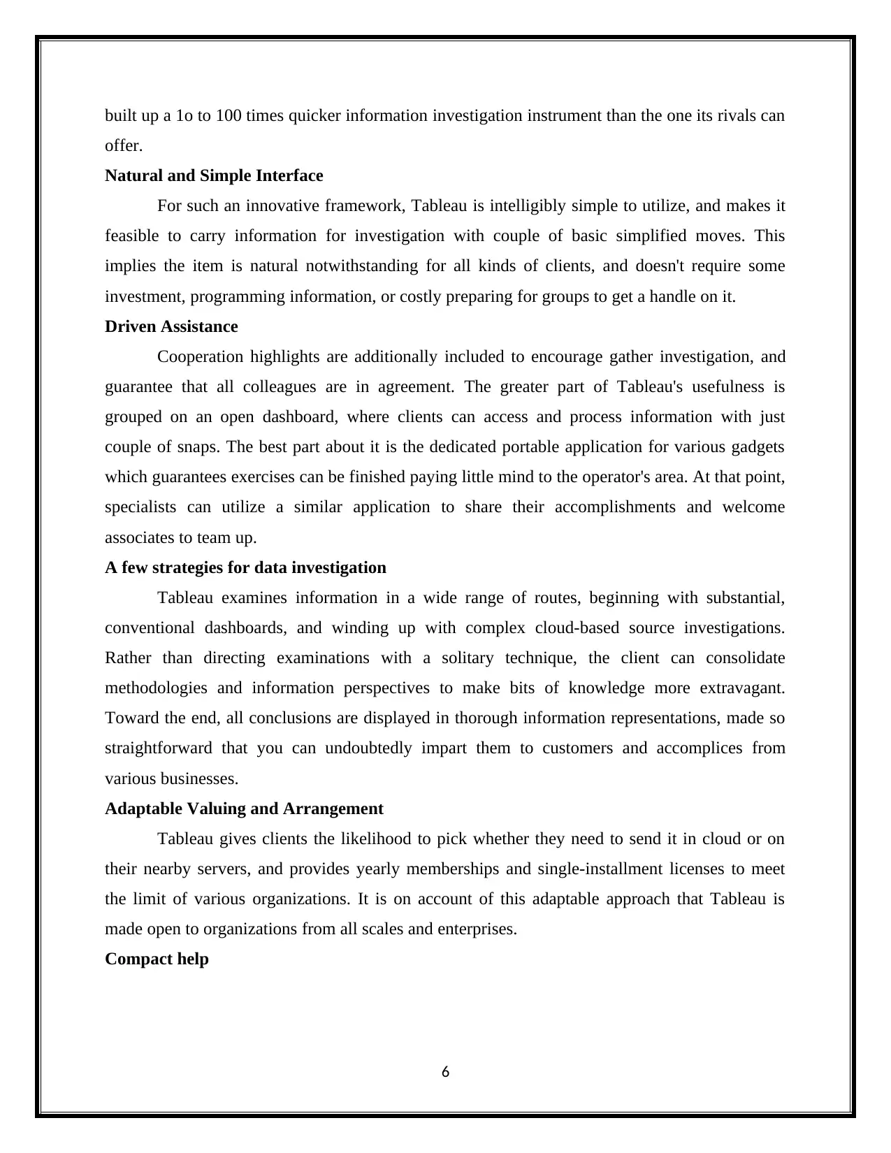
To connect the dataset into this tool, we choose ‘Microsoft Excel’ option.
8
To connect the dataset into this tool, we choose ‘Microsoft Excel’ option.
8
⊘ This is a preview!⊘
Do you want full access?
Subscribe today to unlock all pages.
Trusted by 1+ million students worldwide
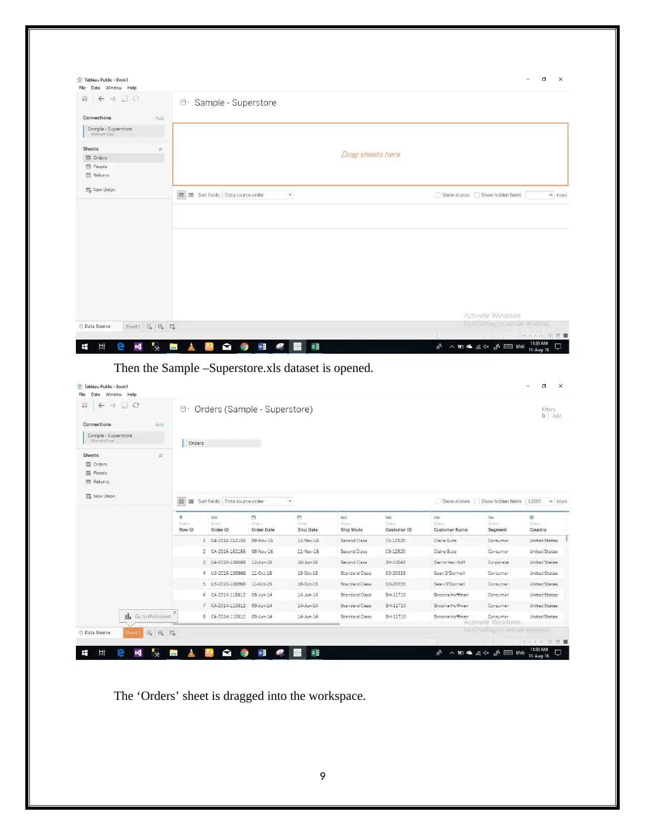
Then the Sample –Superstore.xls dataset is opened.
The ‘Orders’ sheet is dragged into the workspace.
9
The ‘Orders’ sheet is dragged into the workspace.
9
Paraphrase This Document
Need a fresh take? Get an instant paraphrase of this document with our AI Paraphraser
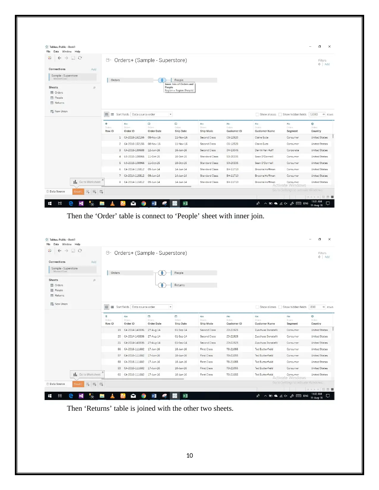
Then the ‘Order’ table is connect to ‘People’ sheet with inner join.
Then ‘Returns’ table is joined with the other two sheets.
10
Then ‘Returns’ table is joined with the other two sheets.
10
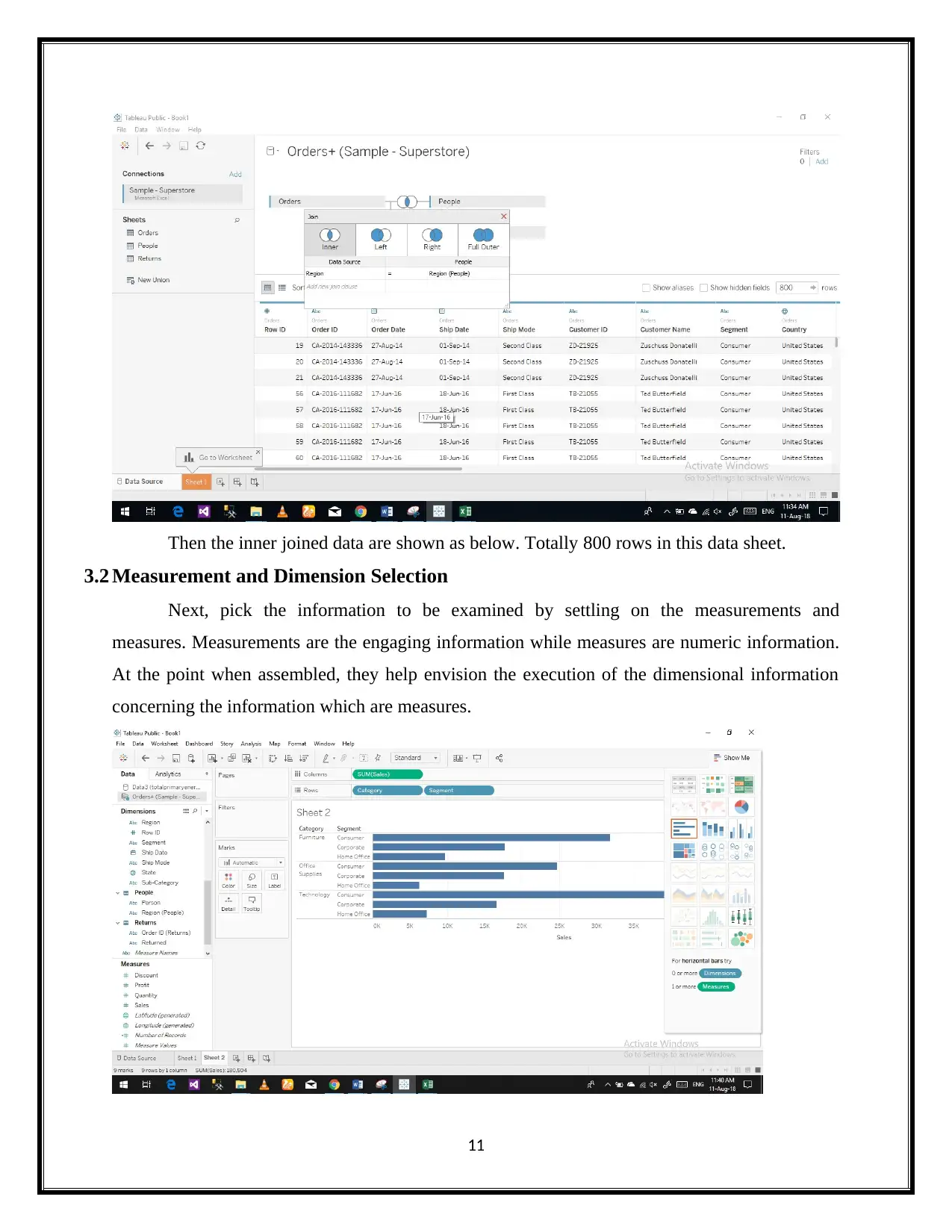
Then the inner joined data are shown as below. Totally 800 rows in this data sheet.
3.2 Measurement and Dimension Selection
Next, pick the information to be examined by settling on the measurements and
measures. Measurements are the engaging information while measures are numeric information.
At the point when assembled, they help envision the execution of the dimensional information
concerning the information which are measures.
11
⊘ This is a preview!⊘
Do you want full access?
Subscribe today to unlock all pages.
Trusted by 1+ million students worldwide
1 out of 20
Related Documents


Your All-in-One AI-Powered Toolkit for Academic Success.
+13062052269
info@desklib.com
Available 24*7 on WhatsApp / Email
![[object Object]](/_next/static/media/star-bottom.7253800d.svg)
Unlock your academic potential
Copyright © 2020–2026 A2Z Services. All Rights Reserved. Developed and managed by ZUCOL.