Web Development: Design Documentation for Unique Wears Website

Verified

Added on  2022/11/17

|10
|586
|337
Project
AI Summary
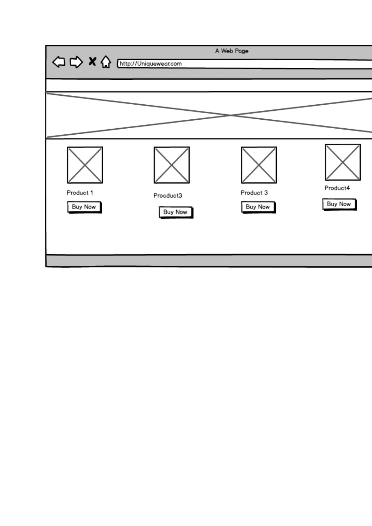
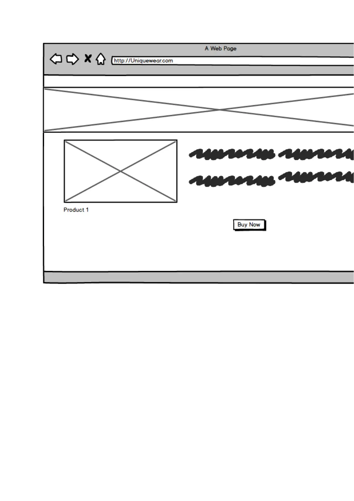
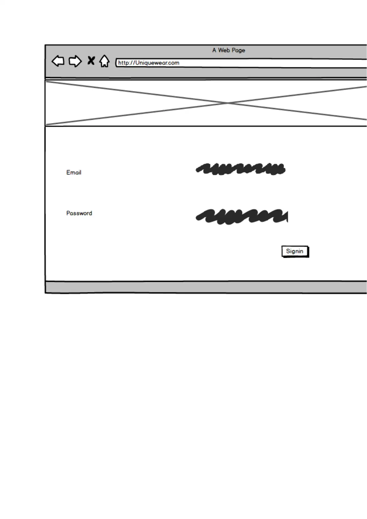
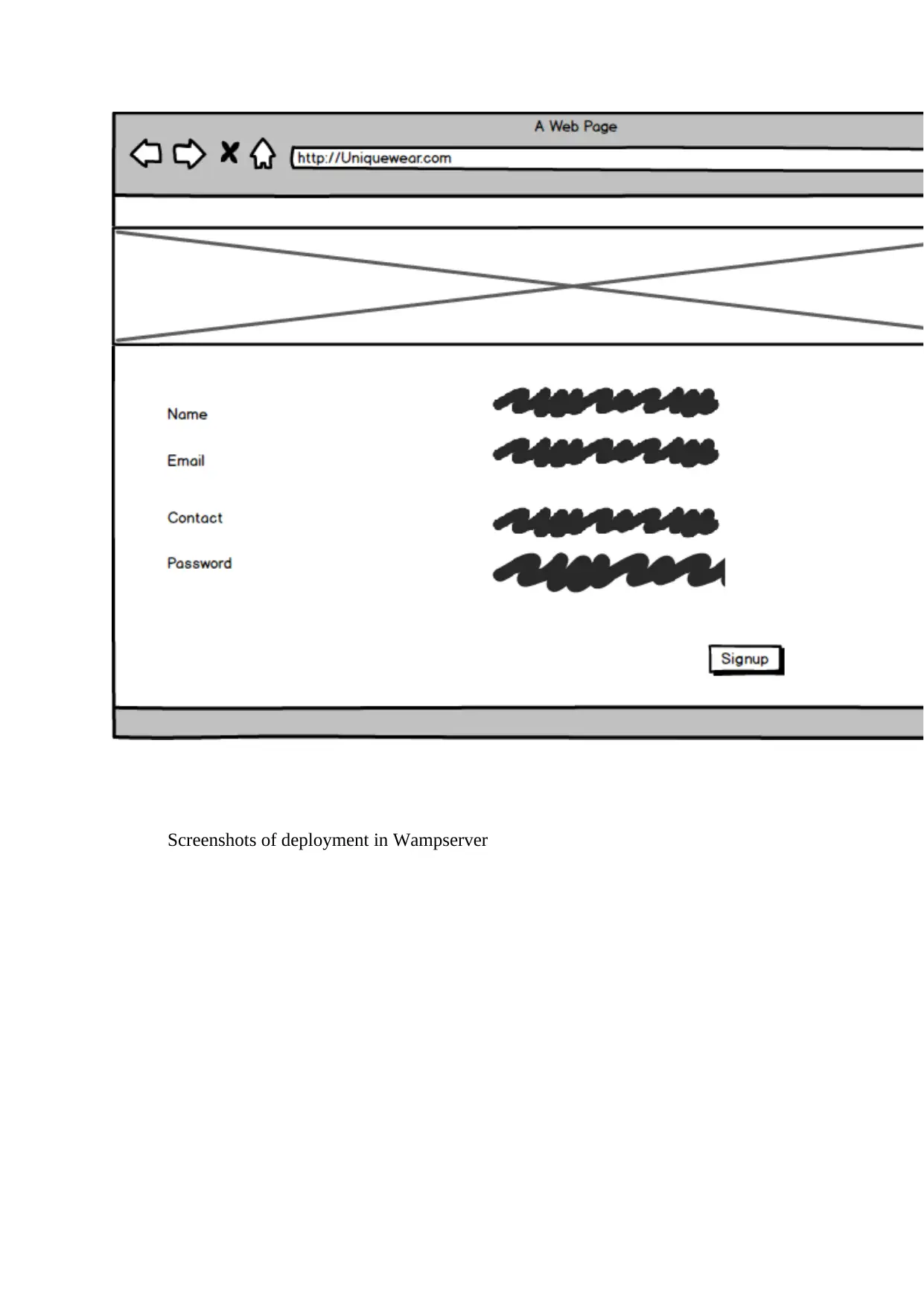
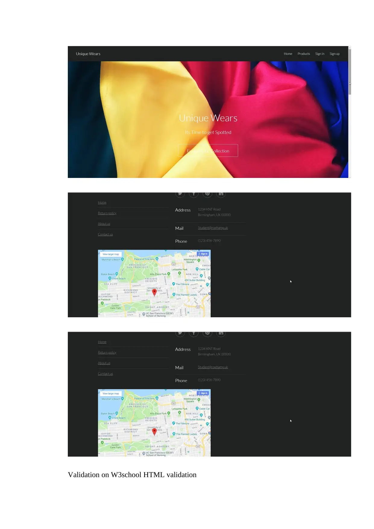
This document presents the design documentation for the Unique Wears website, an e-commerce project developed as part of a Web Development module (QAC020C153S) in Spring 2018/19, Semester 1, Year 1. The documentation emphasizes matching the website's design with the products sold, highlighting consistency as crucial for an impactful e-commerce presence. It details considerations for user experience, easy navigation, and mobile responsiveness to cater to the increasing number of mobile users. The project involved creating mockups using HTML, CSS, and JavaScript. The design incorporates concepts like content flow on smaller screens and the use of container elements for organized content display. Static pixel units are used for elements like buttons and logos, while breakpoints are implemented for layout adjustments across different devices. The assignment also includes screenshots of deployment on Wampserver and HTML validation results. This document provides a comprehensive overview of the design and development process for the Unique Wears website.
tabler-icon-diamond-filled.svg

Contribute Materials

Your contribution can guide someone’s learning journey. Share your documents today.
Document Page
Design Documentation for the Website of Unique Wears
Name of the Student
Name of the University
Authors note
tabler-icon-diamond-filled.svg

Secure Best Marks with AI Grader

Need help grading? Try our AI Grader for instant feedback on your assignments.
Document Page
While developing and designing the website for the E-commerce site of Unique Wear
one of the most important things was to match the design with the Products that will be sold
on the site. Consistency is one of the important key in order to make an e-Commerce website
impactful on the targeted audience. Keeping the design coherent with product or nature of the
business can help in completing the overall feel as well as look of the site.
While designing the site it is made sure that every element from colour schemes to
images are coherent with the business. The User experience is also considered as another
important factors that was considered through the easy and consistent among the different
pages of site. With the top navigation and other functional links on the pages it is ensured
that the developed website offers the ease of navigation. This helps the users to navigate from
a any page of the site any section or page of the site.
From different analysis it is found that, more than half of the internet traffic comes
from the mobile device users as it enables the users to get the information on the go. This
number is getting high day by day which means that more users are using their devices in
order to search, collect information and purchase products/services while connected to the
internet on the go. Therefore for “UniqueWear” it is important that they need to have
mobile-friendly and responsive site in order to reach the maximum number of targeted users.
Therefore in order to avoid the risk of losing significant number of the targeted audience due
to lack of sites readability and adaptability to the mobile devices.
Following are the Mockups that are designed before the development of the site using
the HTML, CSS and JS. As the screen size of the devices are become smaller therefore the
website content on the pages usually covers up vertical space on the mobile devices and the
remaining content of the page is pushed down which is referred as flow in designing a
website. This concepts are helpful in designing the site while using both pixels and points.
Document Page
In the project, the elements or the objects are managed as the nested objects. As the
pages of the e-commerce website contains lot of objects/elements which depends on each
other and is displayed are very difficult to control while making the content available in the
similar manner on multiple devices. Thus using the container in order to wrap elements
keeps the display of the content understandable, tidy as well as clean. In this scenario the
static units for displaying the elements the pixels are most helpful. The Pixel values are very
useful in order to display the contents that does not require scaling according to the device
screen size such as the buttons/logos etc. In addition to that, the Breakpoints are also used for
the layout of the user interface. Such as for the web pages on the desktop may contain more
than two columns where as in case of the screens of the mobile devices the same page will
show only a single column.
Document Page
Mockup designs
tabler-icon-diamond-filled.svg

Secure Best Marks with AI Grader

Need help grading? Try our AI Grader for instant feedback on your assignments.
Document Page
Document Page
Document Page
tabler-icon-diamond-filled.svg

Paraphrase This Document

Need a fresh take? Get an instant paraphrase of this document with our AI Paraphraser
Document Page
Screenshots of deployment in Wampserver
Document Page
Validation on W3school HTML validation
Document Page
chevron_up_icon
1 out of 10
circle_padding
hide_on_mobile
zoom_out_icon
logo.png

Your All-in-One AI-Powered Toolkit for Academic Success.

Available 24*7 on WhatsApp / Email

[object Object]