University Marketing Data Analysis Dashboard Report

Verified

Added on  2023/01/13

|6
|782
|20
Report
AI Summary
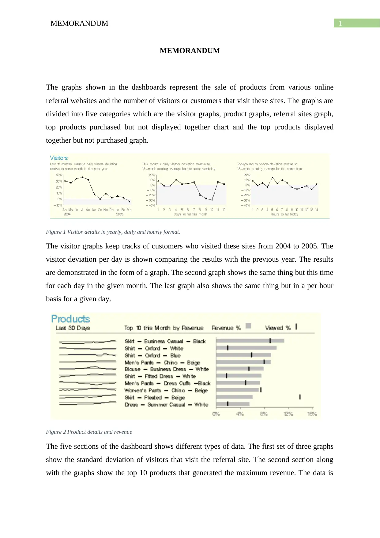
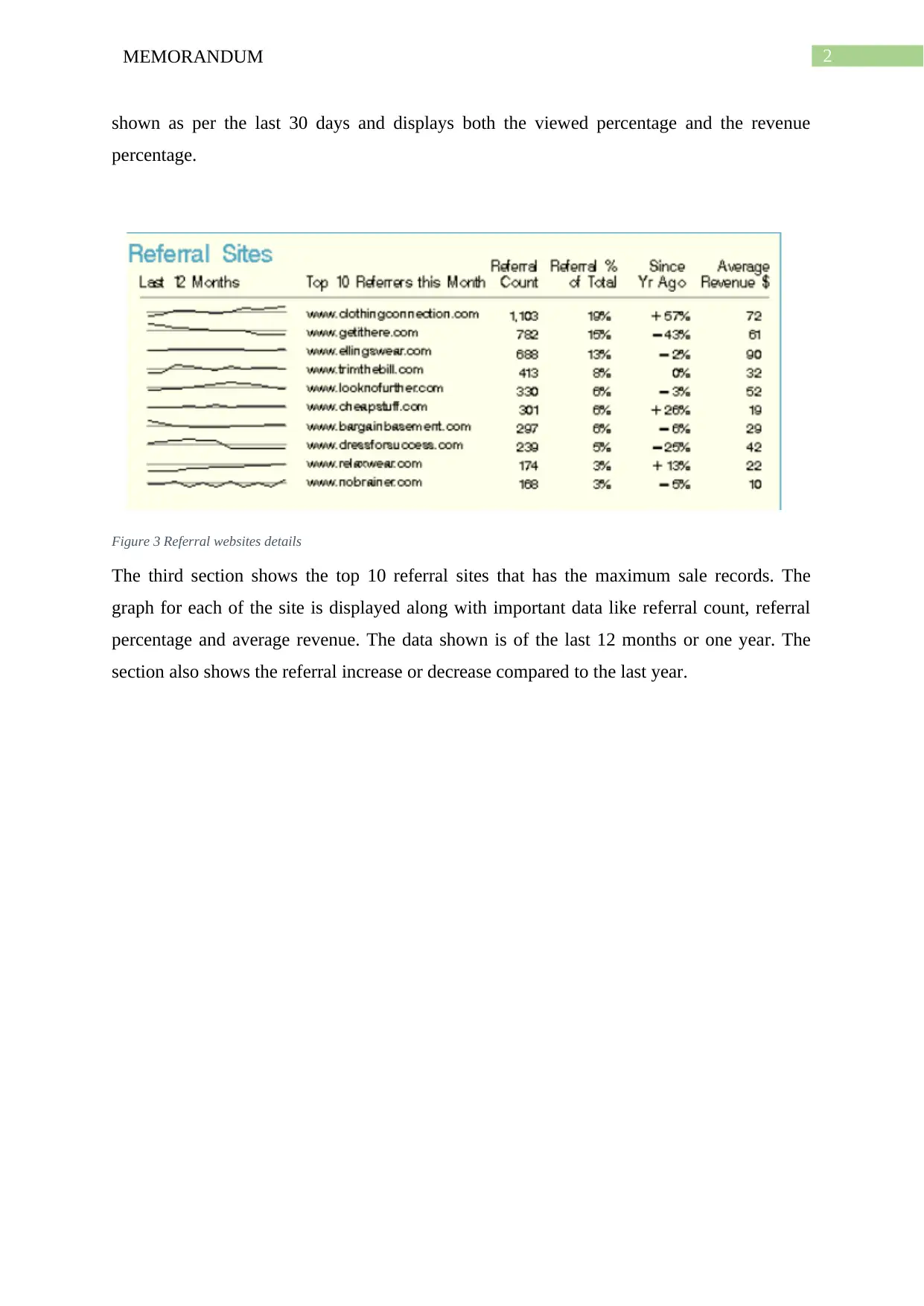
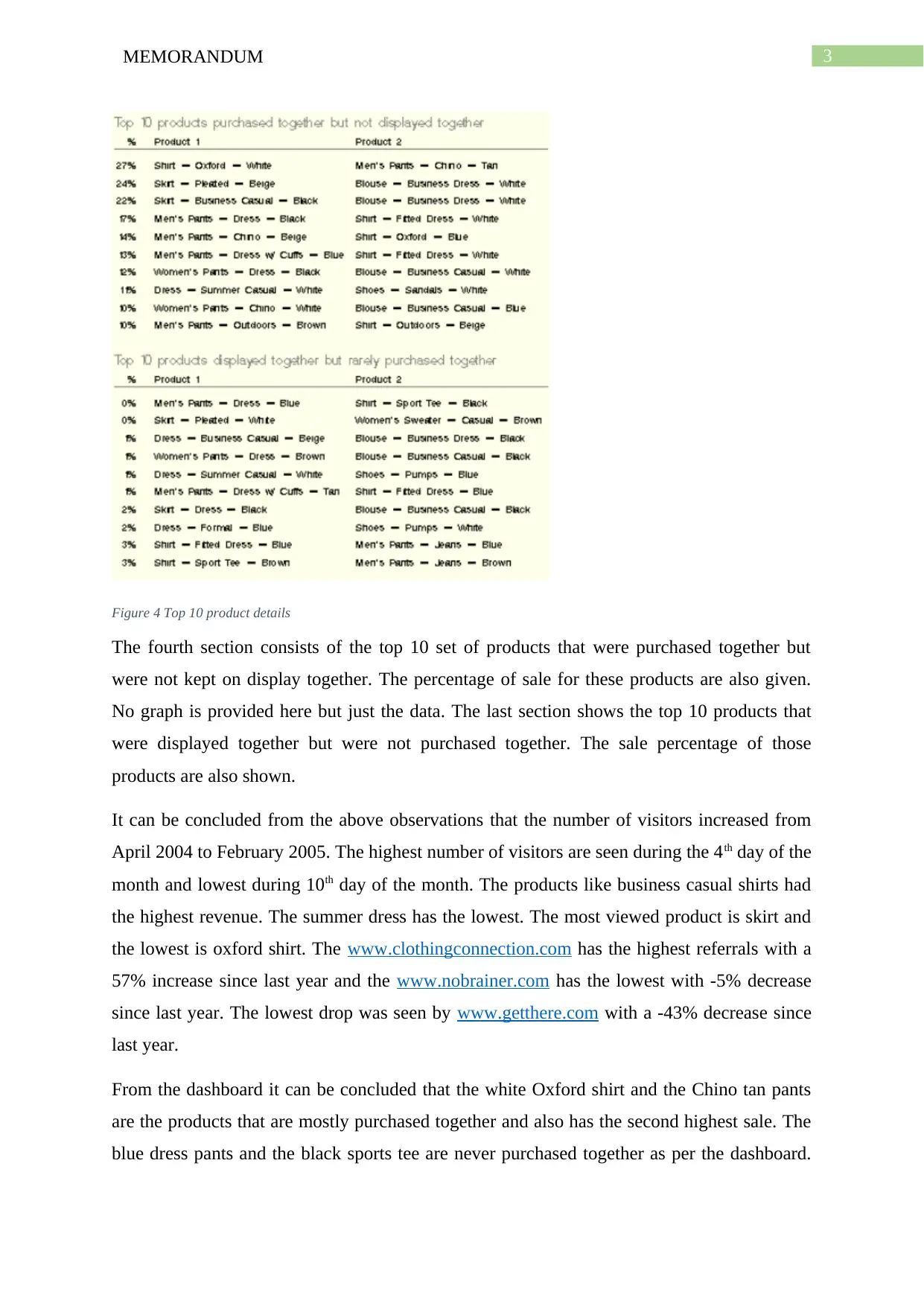
This report analyzes a marketing dashboard, focusing on website visitor data, product sales, and referral website performance. The dashboard presents data in various formats, including yearly, daily, and hourly visitor graphs, top-selling product details, and referral website statistics. The analysis reveals trends in visitor numbers, product revenue, and the effectiveness of referral sites. Key findings include the increase in visitors from April 2004 to February 2005, identification of top-performing products like business casual shirts, and the most successful referral websites. The report also highlights product combinations frequently purchased together. The conclusion summarizes the most popular products based on the data. The report also includes a bibliography of relevant sources.
Document Page
Running head: MEMORANDUM
MEMORANDUM
Name of the Student:
Name of the University:
Author Note:
tabler-icon-diamond-filled.svg

Paraphrase This Document

Need a fresh take? Get an instant paraphrase of this document with our AI Paraphraser
Document Page
1MEMORANDUM
MEMORANDUM
The graphs shown in the dashboards represent the sale of products from various online
referral websites and the number of visitors or customers that visit these sites. The graphs are
divided into five categories which are the visitor graphs, product graphs, referral sites graph,
top products purchased but not displayed together chart and the top products displayed
together but not purchased graph.
Figure 1 Visitor details in yearly, daily and hourly format.
The visitor graphs keep tracks of customers who visited these sites from 2004 to 2005. The
visitor deviation per day is shown comparing the results with the previous year. The results
are demonstrated in the form of a graph. The second graph shows the same thing but this time
for each day in the given month. The last graph also shows the same thing but in a per hour
basis for a given day.
Figure 2 Product details and revenue
The five sections of the dashboard shows different types of data. The first set of three graphs
show the standard deviation of visitors that visit the referral site. The second section along
with the graphs show the top 10 products that generated the maximum revenue. The data is
Document Page
2MEMORANDUM
shown as per the last 30 days and displays both the viewed percentage and the revenue
percentage.
Figure 3 Referral websites details
The third section shows the top 10 referral sites that has the maximum sale records. The
graph for each of the site is displayed along with important data like referral count, referral
percentage and average revenue. The data shown is of the last 12 months or one year. The
section also shows the referral increase or decrease compared to the last year.
Document Page
3MEMORANDUM
Figure 4 Top 10 product details
The fourth section consists of the top 10 set of products that were purchased together but
were not kept on display together. The percentage of sale for these products are also given.
No graph is provided here but just the data. The last section shows the top 10 products that
were displayed together but were not purchased together. The sale percentage of those
products are also shown.
It can be concluded from the above observations that the number of visitors increased from
April 2004 to February 2005. The highest number of visitors are seen during the 4th day of the
month and lowest during 10th day of the month. The products like business casual shirts had
the highest revenue. The summer dress has the lowest. The most viewed product is skirt and
the lowest is oxford shirt. The www.clothingconnection.com has the highest referrals with a
57% increase since last year and the www.nobrainer.com has the lowest with -5% decrease
since last year. The lowest drop was seen by www.getthere.com with a -43% decrease since
last year.
From the dashboard it can be concluded that the white Oxford shirt and the Chino tan pants
are the products that are mostly purchased together and also has the second highest sale. The
blue dress pants and the black sports tee are never purchased together as per the dashboard.
tabler-icon-diamond-filled.svg

Paraphrase This Document

Need a fresh take? Get an instant paraphrase of this document with our AI Paraphraser
Document Page
4MEMORANDUM
To conclude, business casual black skirts, oxford white shirt, oxford blue shirt and men’s
pant chino beige are the most purchased products from the websites.
Document Page
5MEMORANDUM
Bibliography
26133 - Create a sample marketing analysis dashboard for use in a portlet. (2019). Retrieved
from http://support.sas.com/kb/26/133.html
Obermaier, J. F., Stam, K., & Lizardi, R. (2018). Employing User-Centered Design to
Accelerate the Construction of a Business Intelligence Dashboard (Doctoral
dissertation).
Gounder, M. S., Iyer, V. V., & Al Mazyad, A. (2016, March). A survey on business
intelligence tools for university dashboard development. In 2016 3rd MEC
International Conference on Big Data and Smart City (ICBDSC) (pp. 1-7). IEEE.
Mahajan, S., Parekh, M., Patel, H., & Patil, S. (2017, March). BRB dashboard: A web-based
statistical dashboard. In 2017 International Conference on Innovations in
Information, Embedded and Communication Systems (ICIIECS) (pp. 1-6). IEEE.
chevron_up_icon
1 out of 6
circle_padding
hide_on_mobile
zoom_out_icon
[object Object]