Analysis of Website Design and Responsive Web Design Tools
VerifiedAdded on 2019/11/25
|14
|2768
|317
Report
AI Summary
This report provides a detailed analysis of responsive web design and its importance in modern web development. It begins with an introduction to responsive design principles, emphasizing the need for websites to adapt to various screen sizes and devices. The report then examines a case study of the Makezine website, evaluating its responsiveness across different display sizes and features. It delves into the positive and negative aspects of the website's design, user-friendliness, and compatibility. Furthermore, the report explores the advantages and disadvantages of using the Chrome responsive web design tester, along with a discussion of other responsive testing tools. The conclusion summarizes the key findings and offers recommendations for effective responsive web design practices.
WEBSITE DESIGN AND RESPONSIVE WEB DESIGN TESTER TOOLS 1
WEBSITE DESIGN AND RESPONSIVE WEB DESIGN TESTER TOOLS.
by (Name)
[Course name]
[Proffessor Name]
[University name]
[City name]
[Date]
WEBSITE DESIGN AND RESPONSIVE WEB DESIGN TESTER TOOLS.
by (Name)
[Course name]
[Proffessor Name]
[University name]
[City name]
[Date]
Paraphrase This Document
Need a fresh take? Get an instant paraphrase of this document with our AI Paraphraser
WEBSITE DESIGN AND RESPONSIVE WEB DESIGN TESTER TOOLS 2
Table of Contents
Introduction................................................................................................................................4
Makezine Nominated Website Responsiveness..........................................................................5
Maker Media Website Displays...................................................................................................5
i. large Display....................................................................................................................................5
Desktop Computer.....................................................................................................................6
ii.Medium Display..............................................................................................................................7
Android Nexus 10-landscape......................................................................................................7
Android Nexus 10-Portrait.........................................................................................................7
iii. Tiny display...................................................................................................................................8
Android HTC One X-Landsape..................................................................................................8
Android HTc One X-Portrait......................................................................................................9
Maker Website Features............................................................................................................10
Header..............................................................................................................................................11
ii. Website logo:...........................................................................................................................11
iii. The Tag’s lines:.........................................................................................................................11
iv. The horizontal navigation bar:..................................................................................................11
v. Sign in form:.............................................................................................................................11
vi. Sign up form:...........................................................................................................................11
Body.................................................................................................................................................11
i. Images gallery:..........................................................................................................................11
ii. Image links:...............................................................................................................................11
Footer...............................................................................................................................................11
i. Contacts forms:........................................................................................................................11
ii. Newsletter signing up form:.....................................................................................................11
iii. Social media’s buttons:.............................................................................................................11
iv. Vertical menu bar:....................................................................................................................11
Positive And Negative Aspects Of The Website..........................................................................11
Website Review By Two Other Persons......................................................................................12
Advantages And Disadvantages Of Chrome Responsive Web Design Tester...............................13
Advantages.................................................................................................................................13
Disadvantages.............................................................................................................................13
Other responsive tester tool.........................................................................................................13
Conclusion.................................................................................................................................15
Recommendations.....................................................................................................................15
References................................................................................................................................16
WEBSITE DESIGN AND RESPONSIVE WEB DESIGN TESTER TOOLS 3
Introduction
The responsive website designing is a good designing technique that enable the
development of website to enable the adaptation of the various group of people who uses
different devices to access internet where those devices do vary in terms of the screen sizes,
platforms used , and the orientations.
In responsive web designing there is use of variety of layouts ,images and the grids,
however all this is achieved by use of the CSS styles and HTML languages too.
The responsive websites makes it easy for the for the users to keep on switching
among various devices where the websites resolutions, images sizes and quality is
maintained.
The responsiveness in website is as a result of technology growth where it easily
responds to the needs of the users and thus there will be single design to be accessed by all
devices used .
However in order to call a design responsive the designer is required to have used CSS
and HTML IN ORDER to do resizing ,hiding shrinking and enlarging of the webpage
together with the movement of its content this is to ensure that there is flexibility in webpage
and the WebPages will fit any screen of device without scrolling and to resize it.
Below are few reasons of using the responsive websites design as the current
technology.
i. High use of mobile devices:
The current trend over 50% of the people has Smartphone’s and the website traffic from the
mobile phones is almost 61% therefore the websites developed require to be responsive to
avoid the clients going to the competitors websites.
ii. The growth in online mobile shopping:
The online shopping has become very easy where it spares much time instead of going to
shop physically ,however a big number of about 81% of the mobile users do shop online
hence there is chance of rise in responsive designing.
iii. Raise in number of visitors in the Social Medias.
More than 54% of social media visitors uses the mobile devices therefore for any website to
have many followers it need to share its links which are responsive.
iv. Improving rank in the search engine optimization.
The responsive design is recommendable for any mobile device ,therefore it also increases the
ranks in the and thus websites made should be friendly to the mobile devices users since this
is recommendable by search engines like the Google.
⊘ This is a preview!⊘
Do you want full access?
Subscribe today to unlock all pages.
Trusted by 1+ million students worldwide
WEBSITE DESIGN AND RESPONSIVE WEB DESIGN TESTER TOOLS 4
Makezine Nominated Website Responsiveness.
This is a report about responsive in website design ,where to make website responsive
makes it more appealing while it is displayed in any device like the laptop, computer ,tablet or
even mobile phones.
However the website responsiveness is achieved by use of the CSS and HTML
languages that are used to do resizing, hiding, shrinking ,enlarging and maving of the content
to ensure that webpage looks very good in any of the devices regardless the size.
The makermedia is a website that is owned by a movement called the maker
movements that its main objective is promoting of the innovations, creativeness and learning
in order to boost the communities and ensure the betterment of their future.
However this maker group entails the group of the parents, tinkerer, educators and
those in their professions.
The maker movement also is made of variety of people of different age the elderly and
the youths, who mainly are engaged in the process of talents development and finding of
means of interest resolutions where this is achieved through working on some projects as a
team.
In making the people are able to express themselves and thus enable them to be
creative, communal development and encouragement in terms of innovativeness.
Paraphrase This Document
Need a fresh take? Get an instant paraphrase of this document with our AI Paraphraser
WEBSITE DESIGN AND RESPONSIVE WEB DESIGN TESTER TOOLS 5
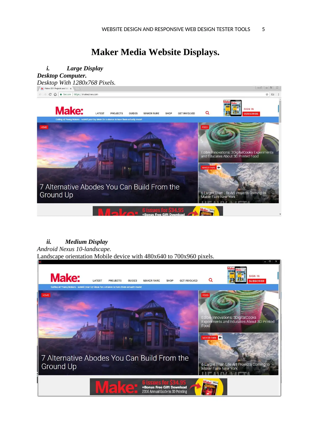
Maker Media Website Displays.
i. Large Display
Desktop Computer.
Desktop With 1280x768 Pixels.
ii. Medium Display
Android Nexus 10-landscape.
Landscape orientation Mobile device with 480x640 to 700x960 pixels.
Maker Media Website Displays.
i. Large Display
Desktop Computer.
Desktop With 1280x768 Pixels.
ii. Medium Display
Android Nexus 10-landscape.
Landscape orientation Mobile device with 480x640 to 700x960 pixels.
WEBSITE DESIGN AND RESPONSIVE WEB DESIGN TESTER TOOLS 6
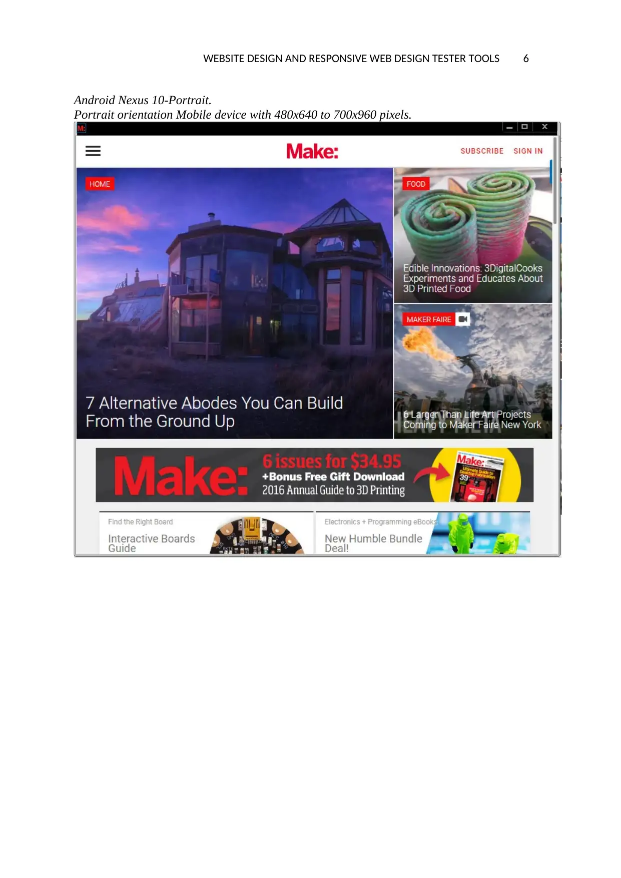
Android Nexus 10-Portrait.
Portrait orientation Mobile device with 480x640 to 700x960 pixels.
Android Nexus 10-Portrait.
Portrait orientation Mobile device with 480x640 to 700x960 pixels.
⊘ This is a preview!⊘
Do you want full access?
Subscribe today to unlock all pages.
Trusted by 1+ million students worldwide
WEBSITE DESIGN AND RESPONSIVE WEB DESIGN TESTER TOOLS 7
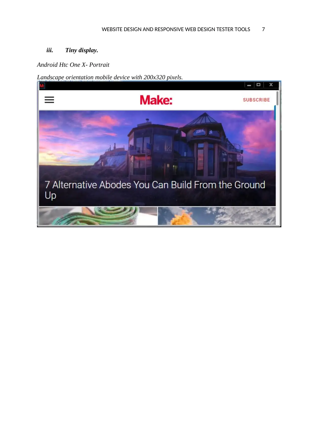
iii. Tiny display.
Android Htc One X- Portrait
Landscape orientation mobile device with 200x320 pixels.
iii. Tiny display.
Android Htc One X- Portrait
Landscape orientation mobile device with 200x320 pixels.
Paraphrase This Document
Need a fresh take? Get an instant paraphrase of this document with our AI Paraphraser
WEBSITE DESIGN AND RESPONSIVE WEB DESIGN TESTER TOOLS 8
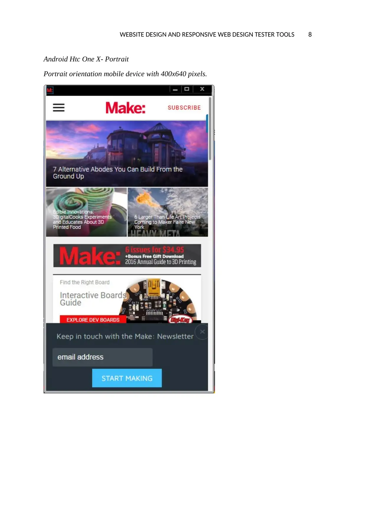
Android Htc One X- Portrait
Portrait orientation mobile device with 400x640 pixels.
Android Htc One X- Portrait
Portrait orientation mobile device with 400x640 pixels.
WEBSITE DESIGN AND RESPONSIVE WEB DESIGN TESTER TOOLS 9
Maker Website Features
The maker website is made of various features, these features are located in different
positions of the websites and they are used to perform a specific function (Jeremy, 2015, p.
135).The website has various WebPages and each webpage is split into three parts which are:
i. Header
ii. Body
iii. Footer
However the above parts has various features as discussed below;
Header
i. The domains name: this is the link of the web address used to access this website
which is www.makezine.com
ii. Website logo:This is the image on the top left part of website named as the MAKE
this is used to denote the name of the organization.
iii. The Tag’s lines:This is the line that is placed slightly below the logo and it is used
to describe the function of the organizations for this case is called “call for young
makers”.
iv. The horizontal navigation bar:This is a feature that is placed at the top part of the
website and it is made of various menus and links to other pages.
v. Sign in form: This is a feature that is used to allow the members to login the
website and post some projects.
vi. Sign up form:This is a form that is used by the users to register to be members and
enable them to sign in the websites accounts later.
vii. News aggregator form: This is feature that allows the users to sign up in order to
be receiving the newsletters into their email addresses.
Body
i. Images gallery: This is the feature where a group of images are placed in the
website that displays some of the projects done in the organization.
ii. Image links: These are the links that directs users to some WebPages and they are
linked using the images in the gallery but not the texts.
iii. Video and Video links: These are the videos that are attached to the website to
display a series of the events that takes place in the website.
iv. Internal links :These are the links which are used to direct users to other WebPages
,some supplements the images links.
Footer
i. Contacts forms: This is feature that provides the users with a form to send some of
their enquiries to the management.
ii. Newsletter signing up form: This is the part where the users enters their email
addresses to subscribe for the news letter.
iii. Social media’s buttons: This is the links used to link the users to the social medias
like the twitter, facebook , pintrest and the instagram.
iv. Vertical menu bar: This is the menu that will be used to link the users to the other
WebPages of this website.
⊘ This is a preview!⊘
Do you want full access?
Subscribe today to unlock all pages.
Trusted by 1+ million students worldwide
WEBSITE DESIGN AND RESPONSIVE WEB DESIGN TESTER TOOLS 10
Positive And Negative Aspects Of The Website
The makezine website is a website that is developed well to ensure that It is fully
repeonsive ,below are the major advantages and disadvantages of this website.
Positive.
i. User friendliness: This website is user friendly since there are all necessary
features and the links re all easy to access.
ii. Compatibility: The website is able to be accessed by any of the devices either large
or tiny and it fits the respective screen sizes.
iii. Adjusting Screen Resolution: The website is able to adjust to any screen of the
devices and the functions ,colors are maintained regardless of screen size or the
orientation (Erin, 2014, p. 156) .
iv. Media Displaying Issues: This website is able to do resizing of the WebPages
pictures and videos to fit any of the media devices used to access it.
v. The website Search Engine is Optimized: The website is easily displayed on the
browser since it is already optimized.
Negative.
i. Hiding WebPages Content :The website while it is accessed by some devices there
are features like the menus and vides which are not displayed.
ii. Usage of videos: The website is using the videos which lead to slowing down the
loading speed of the website since they are too heavy to load.
iii. There is too much scrolling: Most of the WebPages are very lengthy and the users
are forced to scroll down the page wasting much time.
iv. Slow in loading speed: The WebPages are too heavy due to too many images and
videos in the home page therefore they end up loading very slowly.
Website Review By Two Other Persons.
The website responsiveness was however reviewed by some other people who are friends
from another college as the following details.
1. Friend
Age: 24 years old.
Gender: Male
Profession : IT specialist.
2. Friend
Age: 24 years old.
Gender: Male
Profession : IT specialist.
Reviews:
The two reviewers were able to give their reviews about the system where some were
positive and others were negative as follows:
Paraphrase This Document
Need a fresh take? Get an instant paraphrase of this document with our AI Paraphraser
WEBSITE DESIGN AND RESPONSIVE WEB DESIGN TESTER TOOLS 11
i. The website was slow in loading speed .
ii. The website web pages were very lengthy to scroll down.
iii. The website was compatible to all the devices large and tiny ones.
iv. The website was having so many images making the homepage look crowded.
However the reviewer’s opinions were not different from my opinion since the website
was slow to load and there were much of images and videos that made the website very slow.
Advantages And Disadvantages Of Chrome Responsive
Web Design Tester
Advantages
i. More Mobile Traffic: This tool is able to improve the level of the website traffics
since many user of various devices are able to access the websites and hence the traffic
is high (Ethan, 2014,p. 56) .
ii. Faster Mobile Development at Lower Costs: The ability of the mobile devices to
access the website has lead to many mobile devices to be developed and thus users
increase the traffic level too.
iii. Low Maintenance Need: This tool is used to test that the website can be accessed by
any device and thus one website is developed to be accessed by any of the devices
regardless the sizes.
iv. Faster WebPages: This tool is used to test responsiveness of website and thus it
ensures that the website developed is fast to access.
v. Improved Search engine optimization: This tool is used to ensure that the website is
highly responsive and is optimized for easy searching using the browsers.
Disadvantages.
i. Load Speed: The website loading speed cannot be improved by the tool since it only
tests the responsiveness of the website.
ii. The respect of usages: The tool is quite tricky to use if the people using it has no
experience on how to use it.
iii. Web browsers Compatibility: The tool however does not support the compatibility
issues since there are many new devices that are invented daily.
Other responsive tester tool.
Below are the examples of the responsive website tools:
i. Resizer tool.
This is a tool used in the chrome browser and is used to to optimization of the websites
and it is easy to use by any one:
WEBSITE DESIGN AND RESPONSIVE WEB DESIGN TESTER TOOLS 12
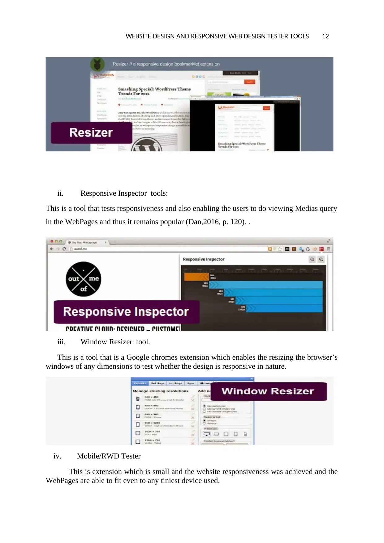
ii. Responsive Inspector tools:
This is a tool that tests responsiveness and also enabling the users to do viewing Medias query
in the WebPages and thus it remains popular (Dan,2016, p. 120). .
iii. Window Resizer tool.
This is a tool that is a Google chromes extension which enables the resizing the browser’s
windows of any dimensions to test whether the design is responsive in nature.
iv. Mobile/RWD Tester
This is extension which is small and the website responsiveness was achieved and the
WebPages are able to fit even to any tiniest device used.
⊘ This is a preview!⊘
Do you want full access?
Subscribe today to unlock all pages.
Trusted by 1+ million students worldwide
1 out of 14
Related Documents


Your All-in-One AI-Powered Toolkit for Academic Success.
+13062052269
info@desklib.com
Available 24*7 on WhatsApp / Email
![[object Object]](/_next/static/media/star-bottom.7253800d.svg)
Unlock your academic potential
Copyright © 2020–2026 A2Z Services. All Rights Reserved. Developed and managed by ZUCOL.