DGTL11005 Web Design, 2020 Term 1: Web Page Mockup Report

Verified

Added on  2022/08/22

|6
|814
|26
Report
AI Summary
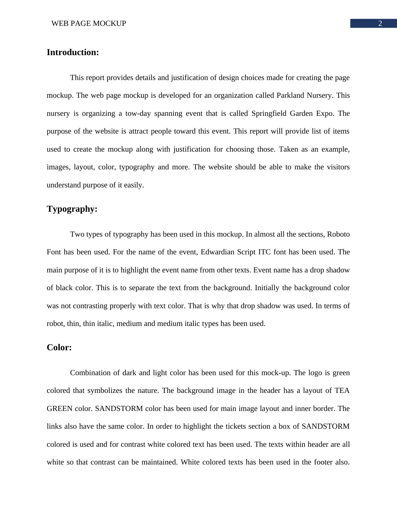
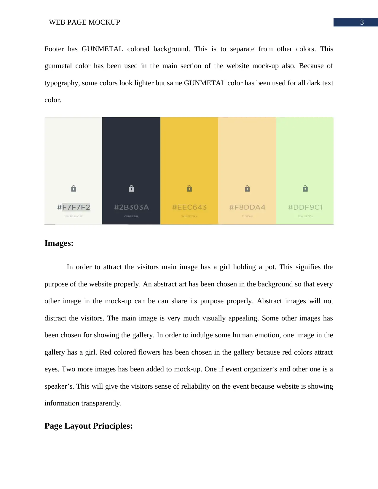
This report details the design choices for a web page mockup promoting the Springfield Garden Expo, a fictitious two-day event organized by Parkland Nursery. The mockup, created using Adobe Photoshop, focuses on attracting visitors to the event. The report provides a comprehensive overview of the design elements, including typography, such as the use of Roboto and Edwardian Script ITC fonts, and color schemes utilizing combinations of dark and light colors to enhance visual appeal. It also explains the selection of images, including a main image of a girl holding a pot and abstract backgrounds, and discusses the application of page layout principles, like balance and the use of both vertical and horizontal space. The report concludes that the mockup effectively follows interaction design principles, with each element serving a specific purpose and contributing to an overall good website appearance. The report also includes a bibliography of sources used during the design process.
Document Page
Running head: WEB PAGE MOCKUP
Web Page Mockup
Name of the Student
Name of the University
Author’s note
tabler-icon-diamond-filled.svg

Secure Best Marks with AI Grader

Need help grading? Try our AI Grader for instant feedback on your assignments.
Document Page
1WEB PAGE MOCKUP
Table of Contents
Introduction:....................................................................................................................................2
Typography:.....................................................................................................................................2
Color:...............................................................................................................................................2
Images:.............................................................................................................................................3
Page Layout Principles:...................................................................................................................3
Conclusion:......................................................................................................................................4
Bibliography:...................................................................................................................................5
Document Page
2WEB PAGE MOCKUP
Introduction:
This report provides details and justification of design choices made for creating the page
mockup. The web page mockup is developed for an organization called Parkland Nursery. This
nursery is organizing a tow-day spanning event that is called Springfield Garden Expo. The
purpose of the website is attract people toward this event. This report will provide list of items
used to create the mockup along with justification for choosing those. Taken as an example,
images, layout, color, typography and more. The website should be able to make the visitors
understand purpose of it easily.
Typography:
Two types of typography has been used in this mockup. In almost all the sections, Roboto
Font has been used. For the name of the event, Edwardian Script ITC font has been used. The
main purpose of it is to highlight the event name from other texts. Event name has a drop shadow
of black color. This is to separate the text from the background. Initially the background color
was not contrasting properly with text color. That is why that drop shadow was used. In terms of
robot, thin, thin italic, medium and medium italic types has been used.
Color:
Combination of dark and light color has been used for this mock-up. The logo is green
colored that symbolizes the nature. The background image in the header has a layout of TEA
GREEN color. SANDSTORM color has been used for main image layout and inner border. The
links also have the same color. In order to highlight the tickets section a box of SANDSTORM
colored is used and for contrast white colored text has been used. The texts within header are all
white so that contrast can be maintained. White colored texts has been used in the footer also.
Document Page
3WEB PAGE MOCKUP
Footer has GUNMETAL colored background. This is to separate from other colors. This
gunmetal color has been used in the main section of the website mock-up also. Because of
typography, some colors look lighter but same GUNMETAL color has been used for all dark text
color.
Images:
In order to attract the visitors main image has a girl holding a pot. This signifies the
purpose of the website properly. An abstract art has been chosen in the background so that every
other image in the mock-up can be can share its purpose properly. Abstract images will not
distract the visitors. The main image is very much visually appealing. Some other images has
been chosen for showing the gallery. In order to indulge some human emotion, one image in the
gallery has a girl. Red colored flowers has been chosen in the gallery because red colors attract
eyes. Two more images has been added to mock-up. One if event organizer’s and other one is a
speaker’s. This will give the visitors sense of reliability on the event because website is showing
information transparently.
Page Layout Principles:
tabler-icon-diamond-filled.svg

Secure Best Marks with AI Grader

Need help grading? Try our AI Grader for instant feedback on your assignments.
Document Page
4WEB PAGE MOCKUP
Balance between symmetrical and asymmetrical has been maintained and implemented in
the mockup properly. Placement of every element is symmetrical in terms of its container.
However, various elements has been placed asymmetrically in terms of whole window. Mock-up
make use of both the vertical and horizontal space. Elements that needs white space around it to
be highlighted properly has got it. Header and footer make use of horizontal layout perfectly.
Conclusion:
From the above study, it is concluded that proposed mock-up follows the fundamental
rules of interaction. The color combinations are also very good. Each element added to the
mock-up have its own purpose. Any unnecessary element has been added to the mockup. The
use of modal for tickets and attend sections is a good approach to make use of little space.
Overall look of the website is very good. The important information are highlighted properly.
Visitors can easily distinguish the different information.
Document Page
5WEB PAGE MOCKUP
Bibliography:
Photoshop, A., 2017. Adobe Photoshop. Red, 2(189), p.168.
Ronquillo, C.E., Currie, L., Rowsell, D. and Phillips, J.C., 2016. Using rapid prototyping to
design a smoking cessation website with end-users.
chevron_up_icon
1 out of 6
circle_padding
hide_on_mobile
zoom_out_icon
logo.png

Your All-in-One AI-Powered Toolkit for Academic Success.

Available 24*7 on WhatsApp / Email

[object Object]