Website Development: Comparative Analysis of Tesco and M&S Websites
VerifiedAdded on 2023/06/09
|17
|3777
|126
Report
AI Summary
This report provides a comparative evaluation of Tesco's and Marks & Spencer's (M&S) websites, focusing on their adherence to website design principles and suitability for their intended audiences. The analysis covers aspects such as white space utilization, accessibility, navigation, alignment, clarity, accuracy, consistency, content quality, and simplicity. The Tesco website is noted for its effective use of white space and well-organized content, while M&S excels in media integration but faces challenges with content overcrowding and navigation speed. The report also discusses the usability pros and cons of both websites, emphasizing the importance of clarity, consistency, and user-friendly design for high-performance websites. The study concludes that while both websites have strengths, Tesco's website demonstrates superior navigation and overall design effectiveness, making it more attractive and interactive for users. Desklib provides students with access to this assignment and many other solved assignments and study tools.
UNIT 6 WEBSITE
DEVELOPMENT
1
DEVELOPMENT
1
Paraphrase This Document
Need a fresh take? Get an instant paraphrase of this document with our AI Paraphraser
TABLE OF CONTENTS
INTRODUCTION...........................................................................................................................3
MAIN BODY...................................................................................................................................3
Comparison of website designing principles for these two websites along with their suitability
to the intended audiences.............................................................................................................3
Website 1: Tesco Website............................................................................................................3
Website 2: M&S website.............................................................................................................8
Comparison between two websites............................................................................................11
Evaluation of the web design principles for generating creative and high performance websites
...................................................................................................................................................14
CONCLUSION..............................................................................................................................15
REFERENCES..............................................................................................................................16
INTRODUCTION
Website is the set of different associated web pages which shares the distinct domain name,
every web page in it gives the explicit links, it provides the clickable aspect of the text which
enables the user to easily navigate the one page (Narayan, Herrington and Cochrane, 2019).
Websites are being used by the businesses with the purpose of brand awareness of their product
and services to their prospective consumers. It helps in providing the all information to their
potential consumer so that they will proceed to make purchase of an item also helps in
constructing the business apart from business rivalries (Morley and et.al 2021). For the better
and effective website, it is important to involve all the website principles which marks its
success. There are some website principles which is required for the website for better
performance. Thus by the follow up of website principles firm can easily provide their customer
an online visibility as well as they can develop or promote brand recognition. Following report
will cover the website evaluation of two websites where one is Tesco’s ecommerce website and
mark and spencer’s website. It will also highlight how website designing principles have been
utilised in these two websites and also highlight the different comparison parameters over which
these two websites are compared.
MAIN BODY
Comparison of website designing principles for these two websites along with their suitability to
the intended audiences
It is important that an efficient must concerns with its designing principles that assists in
conveying the message to engage the visitor with it. For this report two websites are selected for
evaluation that are Tesco’s ecommerce website and other M&S’s website. Both websites have
the millions of visitors who traverse the website and make purchase it.
Website 1: Tesco Website
First website is Tesco’s ecommerce website where it is an electronic commerce website which
offers the range of products and services that includes the E products, books, clothes etc. main
purpose of the site is to sell the goods and services all around the world, company also have their
physical stores and their online business is quite famous. Where the intended audience of Tesco
are customers from the middle income with young children, as company is able to provide the
3
⊘ This is a preview!⊘
Do you want full access?
Subscribe today to unlock all pages.

Trusted by 1+ million students worldwide
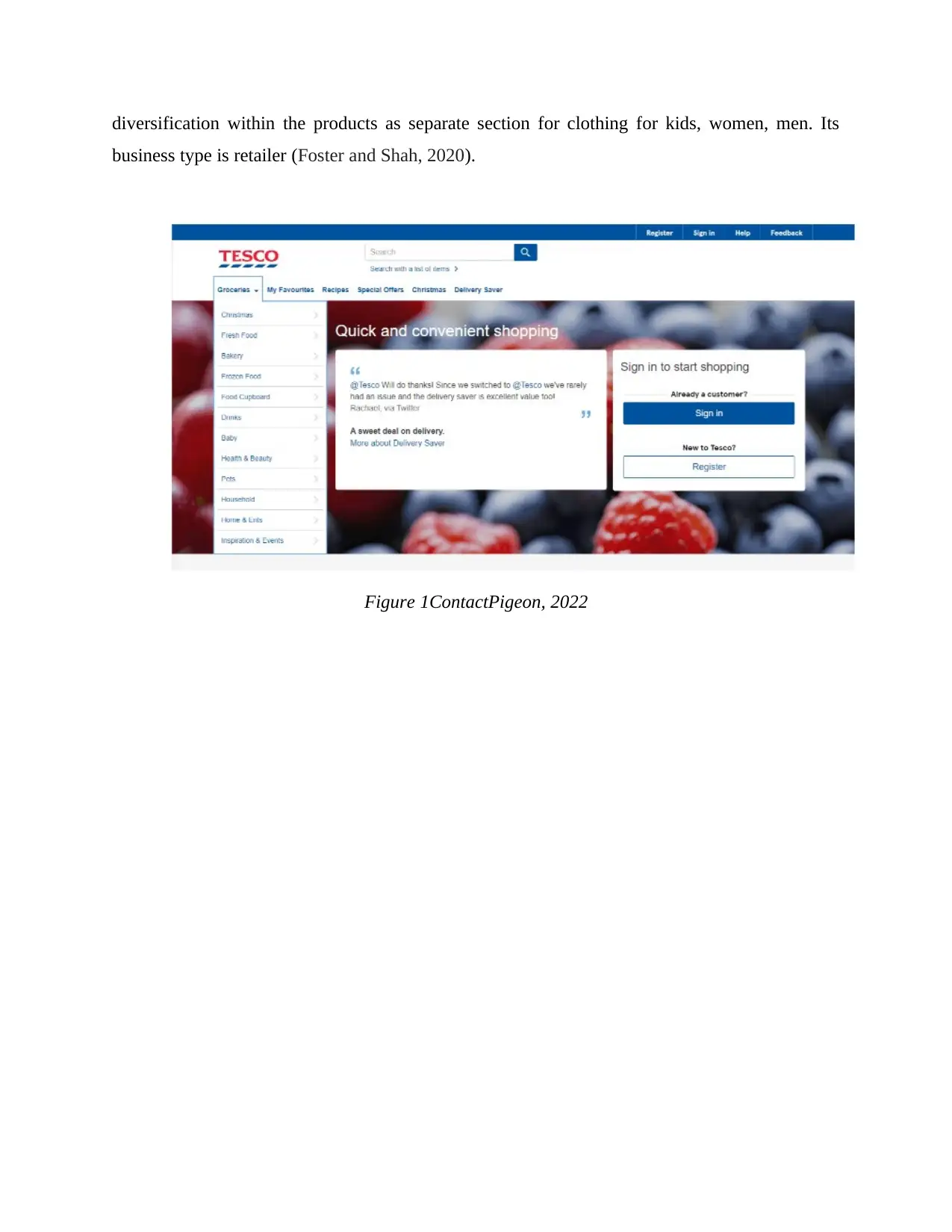
diversification within the products as separate section for clothing for kids, women, men. Its
business type is retailer (Foster and Shah, 2020).
Figure 1ContactPigeon, 2022
business type is retailer (Foster and Shah, 2020).
Figure 1ContactPigeon, 2022
Paraphrase This Document
Need a fresh take? Get an instant paraphrase of this document with our AI Paraphraser
White space:
White space in website designing refer as empty space around the information present on
web page, it is used for balancing the web design and to arrange the content and elements in
order. It also used for enhancing the visual experience of the visitor. For this website it is clearly
seen that there is a use of white space in average manner.
Accessibility:
It is about every people can easily access the website whether they are disable or normal
people. It is about to make the people efficient in perceiving, understanding and interacting with
web pages. Tesco company’s website is accessible and can be viewed over range of distinct
screen sizes and there is also advantage for the people in size as they can select the text size
which suits them.
Navigation:
It is the most important which makes the website successful and well developed. For
instance, Tesco company’s navigation ranges as mediocre where it has the bad UX and poor on
site searching tab.
Alignment:
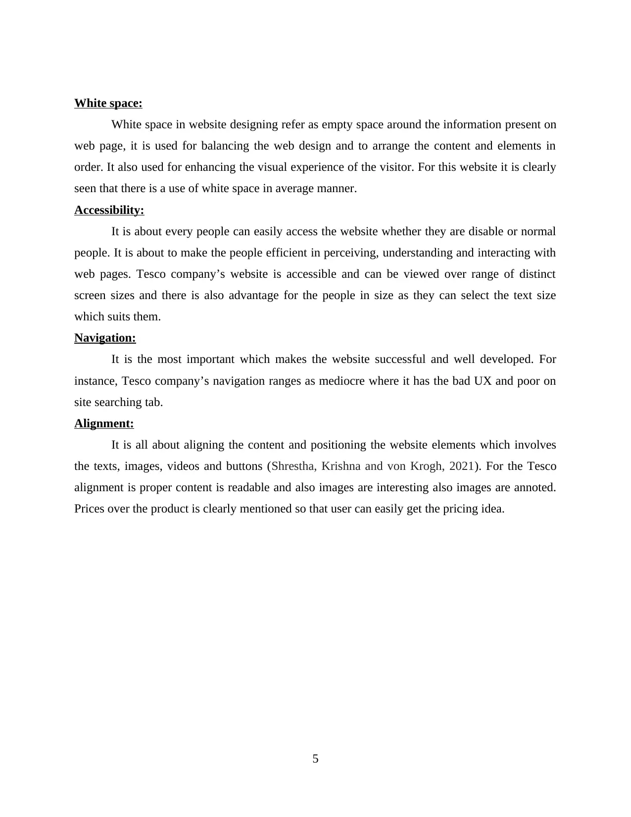
It is all about aligning the content and positioning the website elements which involves
the texts, images, videos and buttons (Shrestha, Krishna and von Krogh, 2021). For the Tesco
alignment is proper content is readable and also images are interesting also images are annoted.
Prices over the product is clearly mentioned so that user can easily get the pricing idea.
5
Clarity:
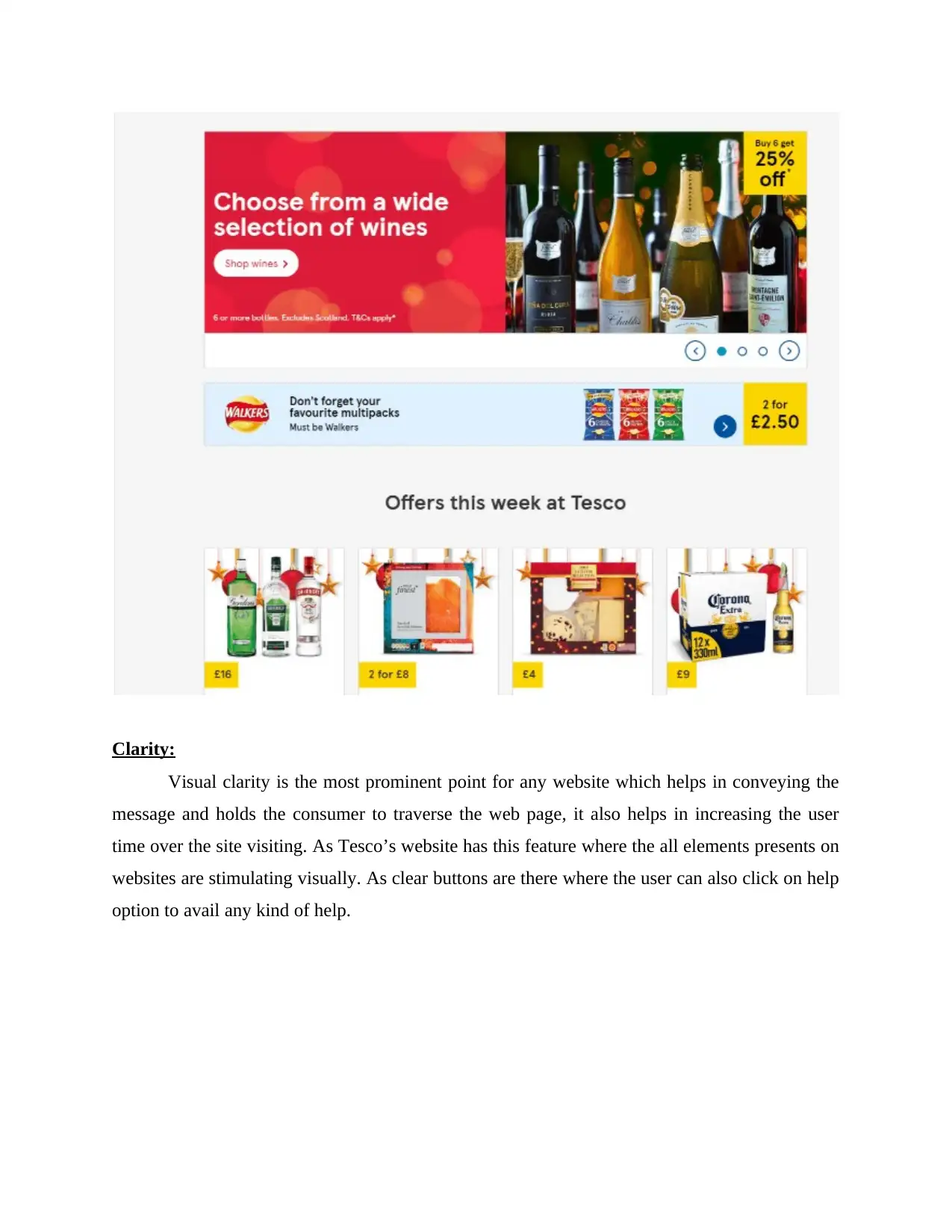
Visual clarity is the most prominent point for any website which helps in conveying the
message and holds the consumer to traverse the web page, it also helps in increasing the user
time over the site visiting. As Tesco’s website has this feature where the all elements presents on
websites are stimulating visually. As clear buttons are there where the user can also click on help
option to avail any kind of help.
⊘ This is a preview!⊘
Do you want full access?
Subscribe today to unlock all pages.

Trusted by 1+ million students worldwide
Accuracy:
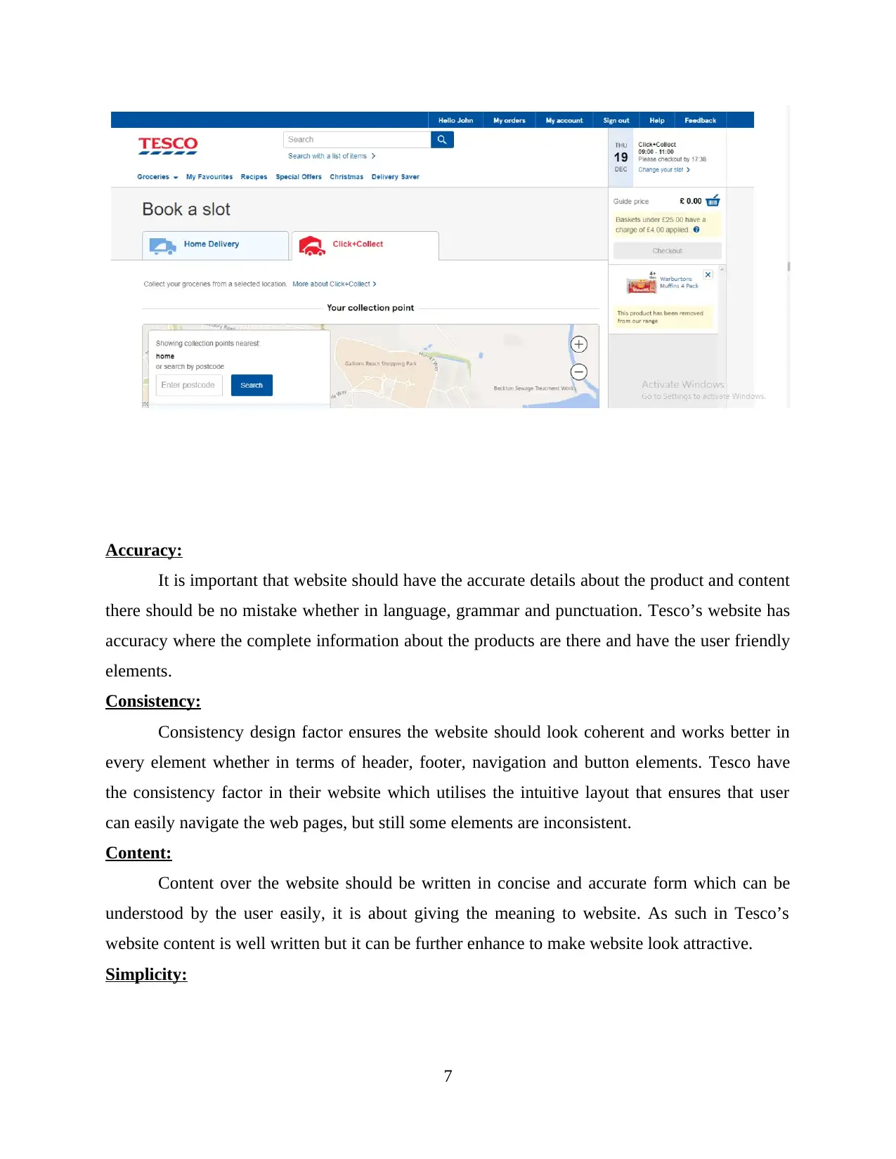
It is important that website should have the accurate details about the product and content
there should be no mistake whether in language, grammar and punctuation. Tesco’s website has
accuracy where the complete information about the products are there and have the user friendly
elements.
Consistency:
Consistency design factor ensures the website should look coherent and works better in
every element whether in terms of header, footer, navigation and button elements. Tesco have
the consistency factor in their website which utilises the intuitive layout that ensures that user
can easily navigate the web pages, but still some elements are inconsistent.
Content:
Content over the website should be written in concise and accurate form which can be
understood by the user easily, it is about giving the meaning to website. As such in Tesco’s
website content is well written but it can be further enhance to make website look attractive.
Simplicity:
7
Paraphrase This Document
Need a fresh take? Get an instant paraphrase of this document with our AI Paraphraser
Simplicity within the web design is all about eliminating the not required elements from
the website. It specifically defines as to sleek and clear the layout and utilise the uniform colours
for consistency.
Website 2: M&S website
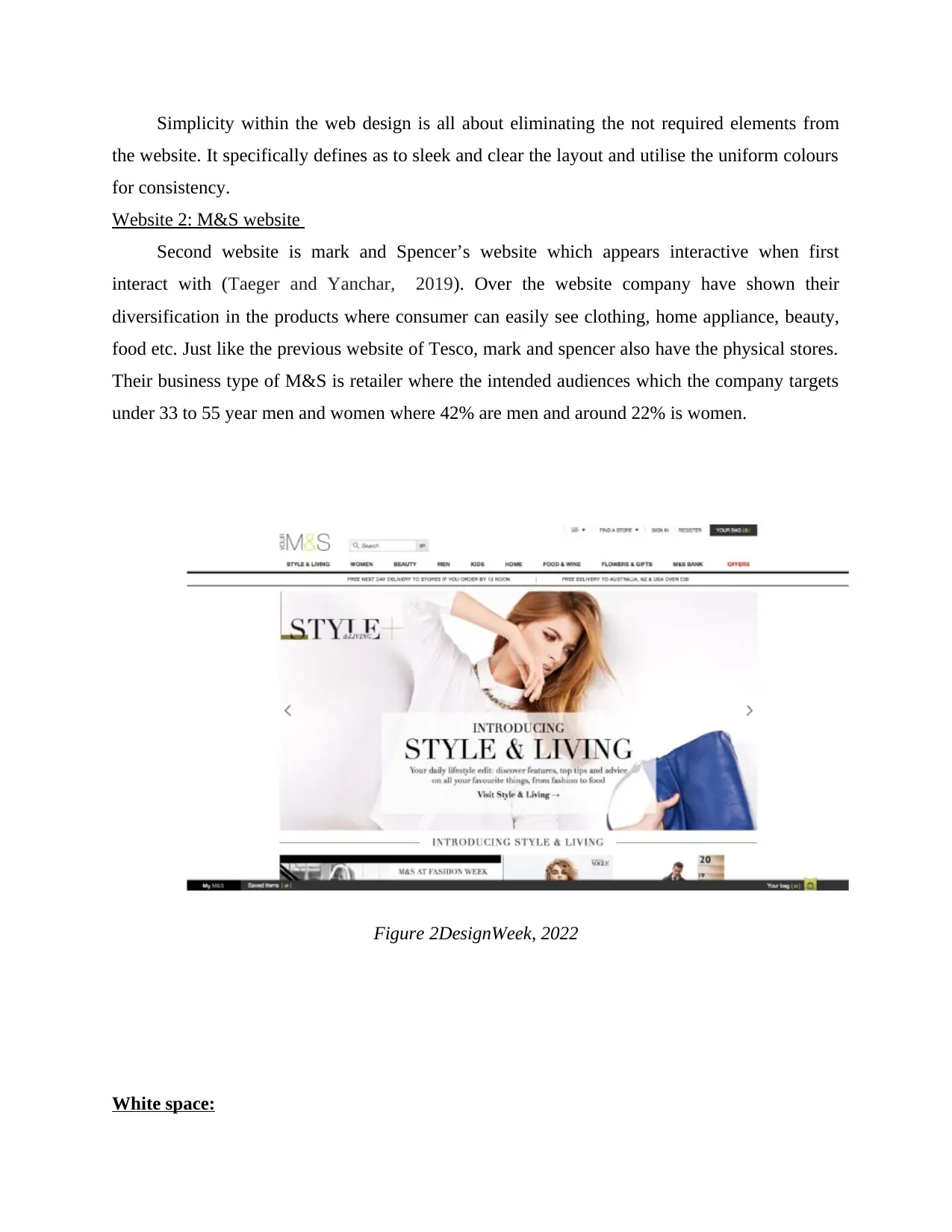
Second website is mark and Spencer’s website which appears interactive when first
interact with (Taeger and Yanchar, 2019). Over the website company have shown their
diversification in the products where consumer can easily see clothing, home appliance, beauty,
food etc. Just like the previous website of Tesco, mark and spencer also have the physical stores.
Their business type of M&S is retailer where the intended audiences which the company targets
under 33 to 55 year men and women where 42% are men and around 22% is women.
Figure 2DesignWeek, 2022
White space:
As M&S is recognised brand all over the world so it is obvious that they have the better
interface over their website which connects the large audience with their products and services.
For their website there is a quite balancing in white space which is good. Most of its content are
written in middle where the slides are left vacant and white.
Accessibility:
This website has the greater accessibility which means anyone can access it and run it on
their browser it supports any screen size which makes it compatible to visit the website.
Navigation:
Navigation is one of the main website designing functions which increase the user
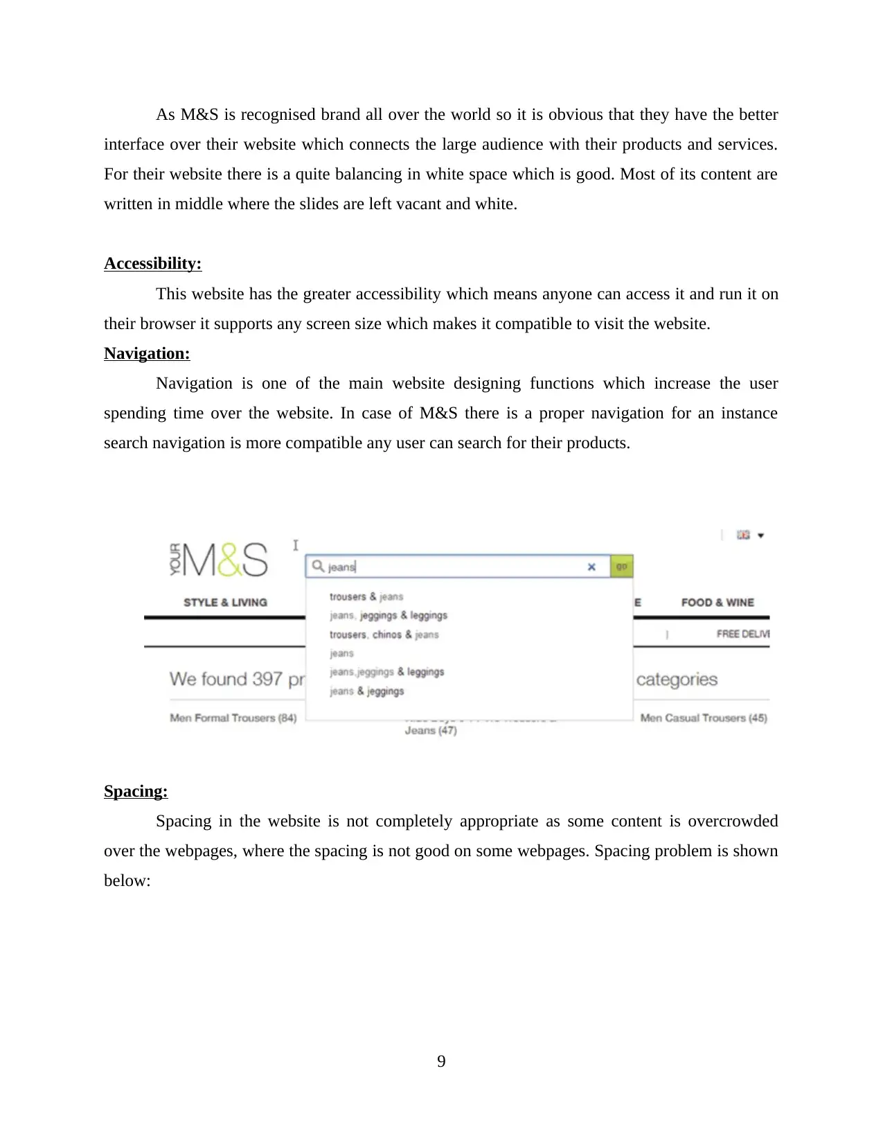
spending time over the website. In case of M&S there is a proper navigation for an instance
search navigation is more compatible any user can search for their products.
Spacing:
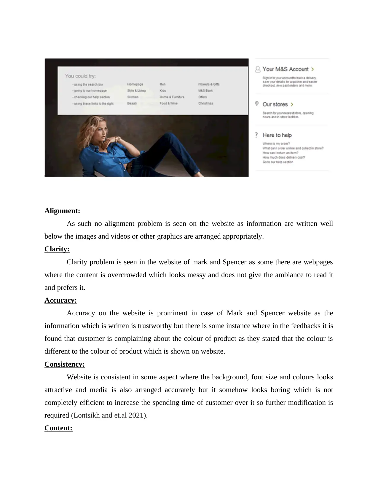
Spacing in the website is not completely appropriate as some content is overcrowded
over the webpages, where the spacing is not good on some webpages. Spacing problem is shown
below:
9
⊘ This is a preview!⊘
Do you want full access?
Subscribe today to unlock all pages.

Trusted by 1+ million students worldwide
Alignment:
As such no alignment problem is seen on the website as information are written well
below the images and videos or other graphics are arranged appropriately.
Clarity:
Clarity problem is seen in the website of mark and Spencer as some there are webpages
where the content is overcrowded which looks messy and does not give the ambiance to read it
and prefers it.
Accuracy:
Accuracy on the website is prominent in case of Mark and Spencer website as the
information which is written is trustworthy but there is some instance where in the feedbacks it is
found that customer is complaining about the colour of product as they stated that the colour is
different to the colour of product which is shown on website.
Consistency:
Website is consistent in some aspect where the background, font size and colours looks
attractive and media is also arranged accurately but it somehow looks boring which is not
completely efficient to increase the spending time of customer over it so further modification is
required (Lontsikh and et.al 2021).
Content:
Paraphrase This Document
Need a fresh take? Get an instant paraphrase of this document with our AI Paraphraser
As this website have the target consumer which is adults so most of the products are for
adult, thus if there are any underage or kids uses the website they should be in a parental control,
while some of content are inappropriate for the users.
`
Simplicity:
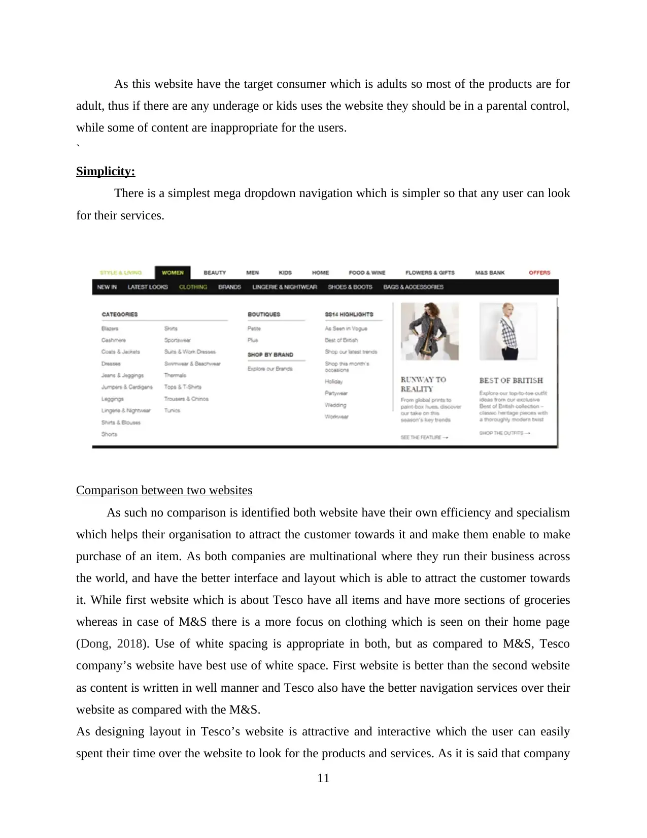
There is a simplest mega dropdown navigation which is simpler so that any user can look
for their services.
Comparison between two websites
As such no comparison is identified both website have their own efficiency and specialism
which helps their organisation to attract the customer towards it and make them enable to make
purchase of an item. As both companies are multinational where they run their business across
the world, and have the better interface and layout which is able to attract the customer towards
it. While first website which is about Tesco have all items and have more sections of groceries
whereas in case of M&S there is a more focus on clothing which is seen on their home page
(Dong, 2018). Use of white spacing is appropriate in both, but as compared to M&S, Tesco
company’s website have best use of white space. First website is better than the second website
as content is written in well manner and Tesco also have the better navigation services over their
website as compared with the M&S.
As designing layout in Tesco’s website is attractive and interactive which the user can easily
spent their time over the website to look for the products and services. As it is said that company
11
is committed to provide the better and efficient services to their consumer therefore they have
introduced better features over their website which attracts the consumer, and user can easily
navigate the web pages and avail the services without wasting any time which generally takes in
redirecting to the next page (Bartikowski and et.al 2022). Thus in Mark and Spencer’s website
search bar and other navigation tools are effective but it still takes more time for load to reach to
the next web page. Thus on the basis of navigation designing factor Tesco is far better than M&S
(Boaz and et.al 2018). About media factor M&S have the uses the better medias which is eye
catching and written prices below the images are also appropriate and centred but there is a
problem as some content and media overcrowded which might hide the main idea, As compare
with Tesco they also have the media where the image are set appropriately and content is proper
written and not overcrowded.
Analysing the principle of website design used for generating creative, high performance
websites
For this section it will involves the pros and cons of both websites in terms of website
design factors:
Usability:
Both websites are good in the usability factor as they have the simpler interface which
makes it simplest to use and navigate it. thus both supports the redirecting of web pages without
any complexities (Cheek, Sale and Wolverton, 2018). But it is also seen that both websites are
committing that they are screen friendly and any user can use it but in reality there is no special
navigation for the disable user.
White space:
It is must for the website to have the white space but too much white space makes the
website looks strange. There should be balance in it however one of the website have not
balancing in their white space which makes it look strange.
Clarity and consistency:
Clarity and consistency are more important which helps in enhancing the spending time
of the user, when the information are written in clear language and punctuation and images are
set appropriate helps in engaging the consumer with it (Artyom and et.al 2021). both of the
⊘ This is a preview!⊘
Do you want full access?
Subscribe today to unlock all pages.

Trusted by 1+ million students worldwide
1 out of 17
Related Documents
Your All-in-One AI-Powered Toolkit for Academic Success.
+13062052269
info@desklib.com
Available 24*7 on WhatsApp / Email
![[object Object]](/_next/static/media/star-bottom.7253800d.svg)
Unlock your academic potential
Copyright © 2020–2026 A2Z Services. All Rights Reserved. Developed and managed by ZUCOL.


