Creative Genius: David Johnson CMST 290 Usability Review Project

Verified

Added on  2022/09/26

|10
|1078
|24
Project
AI Summary
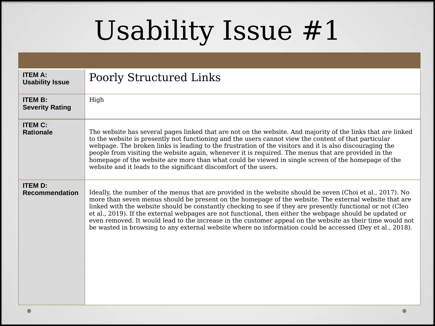
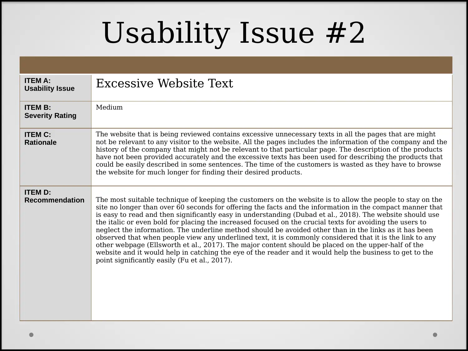
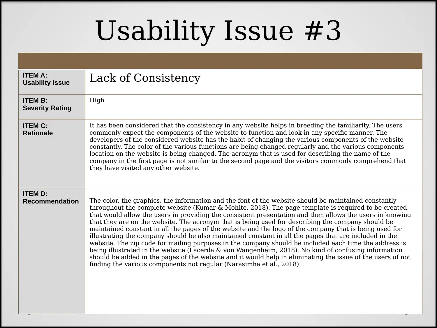
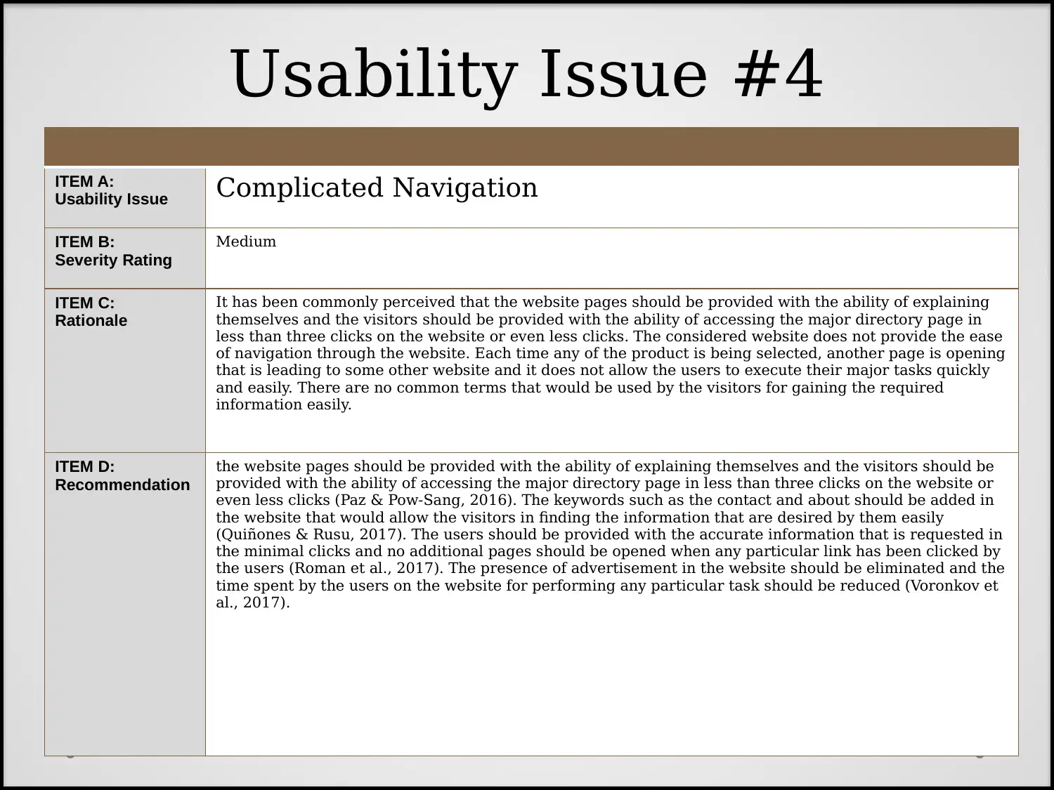
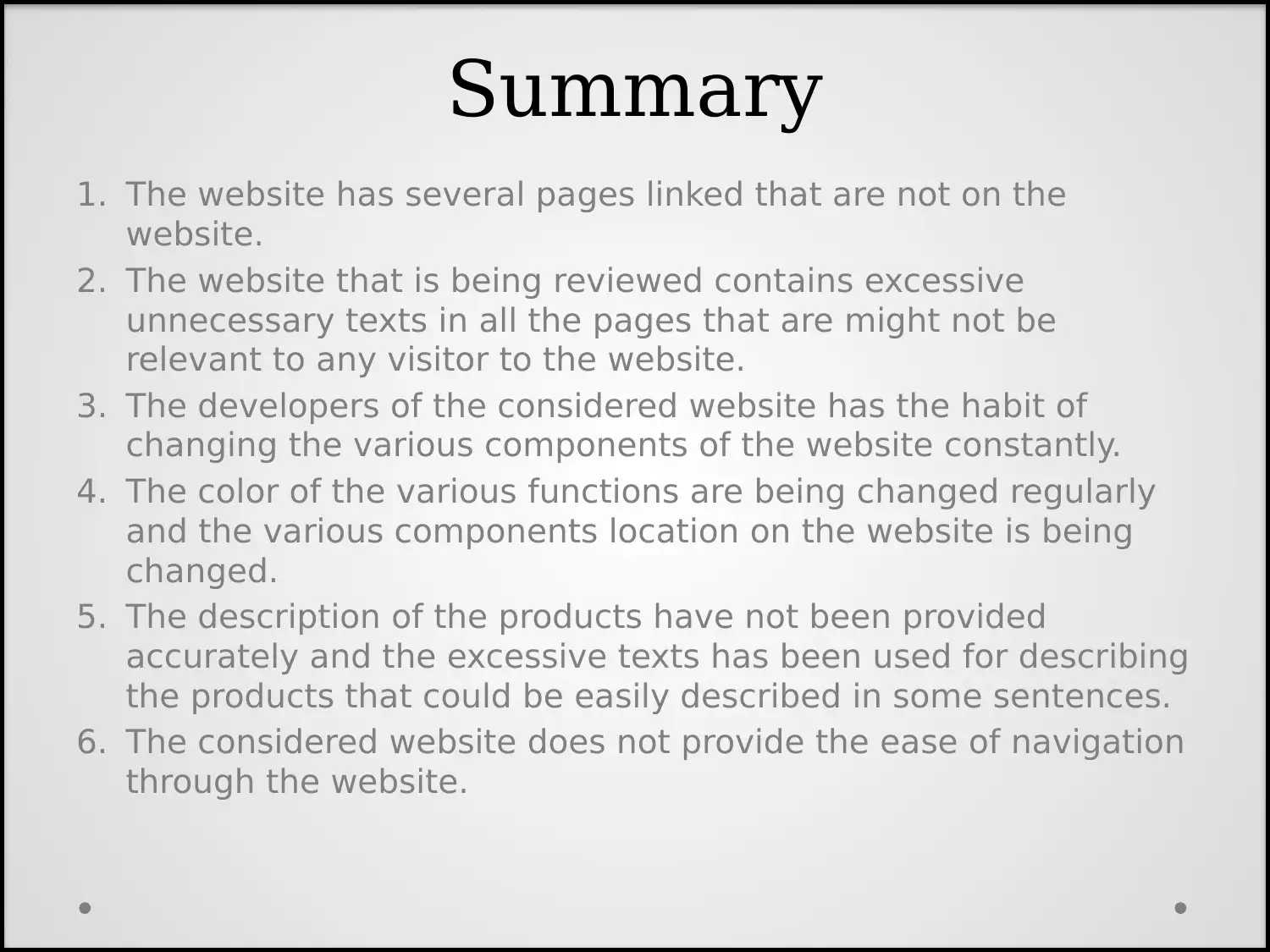
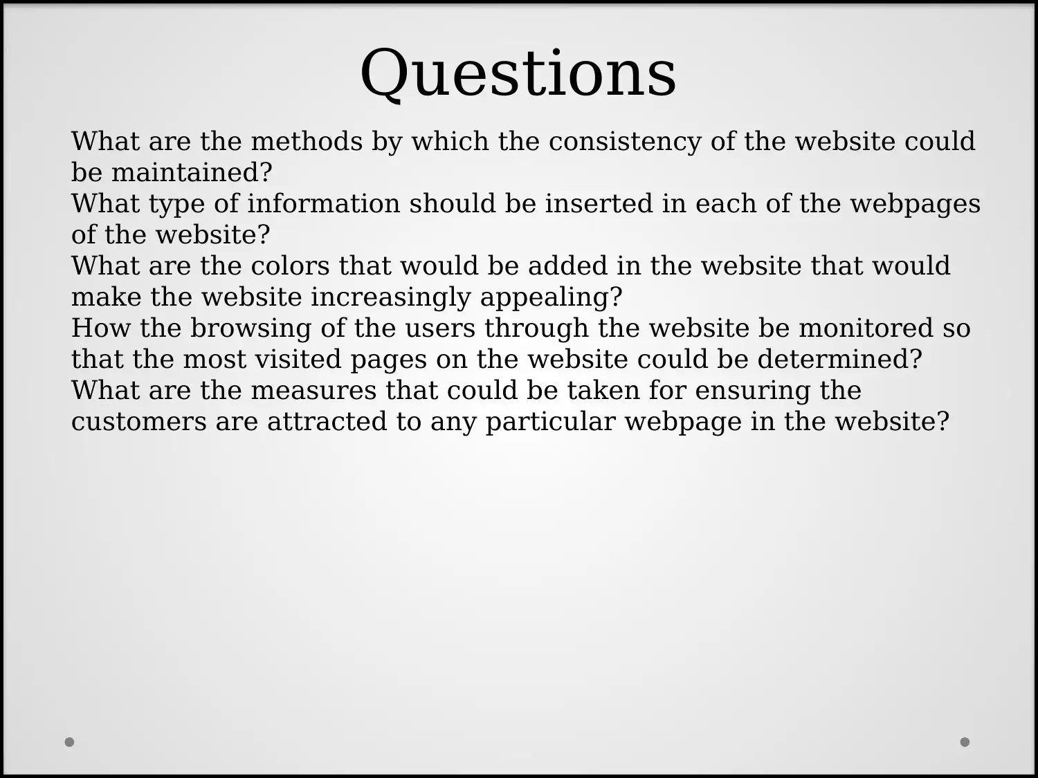
This project, completed by a student, is a usability review of the website lingscars.com, as part of the CMST 290: Introduction to Interactive Design course in Fall 2016. The project's critical goal is to determine what makes a website usable and visually appealing, identifying major drawbacks and appealing points to attract more customers. The review highlights several usability issues, including broken links, excessive and irrelevant text, inconsistent design elements, inaccurate product descriptions, and poor navigation. The project includes questions about maintaining website consistency, appropriate information for webpages, color schemes, user browsing monitoring, and customer attraction strategies. References to relevant research papers on usability and a project reflection discussing challenges are also provided. The student's reflection focuses on identifying the most critical usability issues impacting website visitor retention and suggests recommendations for improvements.
Document Page
Creative Genius
David Johnson
CMST 290: Introduction to Interactive Design
Project 3 – Fall 2016
Usability Review of
https://www.lingscars.com/
tabler-icon-diamond-filled.svg

Secure Best Marks with AI Grader

Need help grading? Try our AI Grader for instant feedback on your assignments.
Document Page
Critical Goal
The critical goal of usability review of the website is
to determine what makes any website particularly
usable and visually appealing. With the help of the
usability review of the website, it would be
determined what the major drawbacks of the
website and what the major appealing points of the
website that would help in attracting the increased
number of customers to the website.
Document Page
ITEM A:
Usability Issue Poorly Structured Links
ITEM B:
Severity Rating
High
ITEM C:
Rationale The website has several pages linked that are not on the website. And majority of the links that are linked
to the website is presently not functioning and the users cannot view the content of that particular
webpage. The broken links is leading to the frustration of the visitors and it is also discouraging the
people from visiting the website again, whenever it is required. The menus that are provided in the
homepage of the website are more than what could be viewed in single screen of the homepage of the
website and it leads to the significant discomfort of the users.
ITEM D:
Recommendation Ideally, the number of the menus that are provided in the website should be seven (Choi et al., 2017). No
more than seven menus should be present on the homepage of the website. The external website that are
linked with the website should be constantly checking to see if they are presently functional or not (Cleo
et al., 2019). If the external webpages are not functional, then either the webpage should be updated or
even removed. It would lead to the increase in the customer appeal on the website as their time would not
be wasted in browsing to any external website where no information could be accessed (Dey et al., 2018).
Usability Issue #1
Document Page
ITEM A:
Usability Issue Excessive Website Text
ITEM B:
Severity Rating
Medium
ITEM C:
Rationale
The website that is being reviewed contains excessive unnecessary texts in all the pages that are might
not be relevant to any visitor to the website. All the pages includes the information of the company and the
history of the company that might not be relevant to that particular page. The description of the products
have not been provided accurately and the excessive texts has been used for describing the products that
could be easily described in some sentences. The time of the customers is wasted as they have to browse
the website for much longer for finding their desired products.
ITEM D:
Recommendation The most suitable technique of keeping the customers on the website is to allow the people to stay on the
site no longer than over 60 seconds for offering the facts and the information in the compact manner that
is easy to read and then significantly easy in understanding (Dubad et al., 2018). The website should use
the italic or even bold for placing the increased focused on the crucial texts for avoiding the users to
neglect the information. The underline method should be avoided other than in the links as it has been
observed that when people view any underlined text, it is commonly considered that it is the link to any
other webpage (Ellsworth et al., 2017). The major content should be placed on the upper-half of the
website and it would help in catching the eye of the reader and it would help the business to get to the
point significantly easily (Fu et al., 2017).
Usability Issue #2
tabler-icon-diamond-filled.svg

Secure Best Marks with AI Grader

Need help grading? Try our AI Grader for instant feedback on your assignments.
Document Page
ITEM A:
Usability Issue Lack of Consistency
ITEM B:
Severity Rating
High
ITEM C:
Rationale
It has been considered that the consistency in any website helps in breeding the familiarity. The users
commonly expect the components of the website to function and look in any specific manner. The
developers of the considered website has the habit of changing the various components of the website
constantly. The color of the various functions are being changed regularly and the various components
location on the website is being changed. The acronym that is used for describing the name of the
company in the first page is not similar to the second page and the visitors commonly comprehend that
they have visited any other website.
ITEM D:
Recommendation The color, the graphics, the information and the font of the website should be maintained constantly
throughout the complete website (Kumar & Mohite, 2018). The page template is required to be created
that would allow the users in providing the consistent presentation and then allows the users in knowing
that they are on the website. The acronym that is being used for describing the company should be
maintained constant in all the pages of the website and the logo of the company that is being used for
illustrating the company should be also maintained constant in all the pages that are included in the
website. The zip code for mailing purposes in the company should be included each time the address is
being illustrated in the website (Lacerda & von Wangenheim, 2018). No kind of confusing information
should be added in the pages of the website and it would help in eliminating the issue of the users of not
finding the various components not regular (Narasimha et al., 2018).
Usability Issue #3
Document Page
ITEM A:
Usability Issue Complicated Navigation
ITEM B:
Severity Rating
Medium
ITEM C:
Rationale
It has been commonly perceived that the website pages should be provided with the ability of explaining
themselves and the visitors should be provided with the ability of accessing the major directory page in
less than three clicks on the website or even less clicks. The considered website does not provide the ease
of navigation through the website. Each time any of the product is being selected, another page is opening
that is leading to some other website and it does not allow the users to execute their major tasks quickly
and easily. There are no common terms that would be used by the visitors for gaining the required
information easily.
ITEM D:
Recommendation
the website pages should be provided with the ability of explaining themselves and the visitors should be
provided with the ability of accessing the major directory page in less than three clicks on the website or
even less clicks (Paz & Pow-Sang, 2016). The keywords such as the contact and about should be added in
the website that would allow the visitors in finding the information that are desired by them easily
(Quiñones & Rusu, 2017). The users should be provided with the accurate information that is requested in
the minimal clicks and no additional pages should be opened when any particular link has been clicked by
the users (Roman et al., 2017). The presence of advertisement in the website should be eliminated and the
time spent by the users on the website for performing any particular task should be reduced (Voronkov et
al., 2017).
Usability Issue #4
Document Page
Summary
1. The website has several pages linked that are not on the
website.
2. The website that is being reviewed contains excessive
unnecessary texts in all the pages that are might not be
relevant to any visitor to the website.
3. The developers of the considered website has the habit of
changing the various components of the website constantly.
4. The color of the various functions are being changed regularly
and the various components location on the website is being
changed.
5. The description of the products have not been provided
accurately and the excessive texts has been used for describing
the products that could be easily described in some sentences.
6. The considered website does not provide the ease of navigation
through the website.
tabler-icon-diamond-filled.svg

Paraphrase This Document

Need a fresh take? Get an instant paraphrase of this document with our AI Paraphraser
Document Page
Questions
What are the methods by which the consistency of the website could
be maintained?
What type of information should be inserted in each of the webpages
of the website?
What are the colors that would be added in the website that would
make the website increasingly appealing?
How the browsing of the users through the website be monitored so
that the most visited pages on the website could be determined?
What are the measures that could be taken for ensuring the
customers are attracted to any particular webpage in the website?
Document Page
References
Choi, I., Rhiu, I., Lee, Y., Yun, M. H., & Nam, C. S. (2017). A systematic review of hybrid brain-computer interfaces:
Taxonomy and usability perspectives. PloS one, 12(4), e0176674.
Cleo, G., Scott, A. M., Islam, F., Julien, B., & Beller, E. (2019). Usability and acceptability of four systematic review
automation software packages: a mixed method design. Systematic reviews, 8(1), 145.
Dey, A., Billinghurst, M., Lindeman, R. W., & Swan, J. (2018). A systematic review of 10 years of augmented reality
usability studies: 2005 to 2014. Frontiers in Robotics and AI, 5, 37.
Dubad, M., Winsper, C., Meyer, C., Livanou, M., & Marwaha, S. (2018). A systematic review of the psychometric properties,
usability and clinical impacts of mobile mood-monitoring applications in young people. Psychological medicine, 48(2), 208-
228.
Ellsworth, M. A., Dziadzko, M., O'Horo, J. C., Farrell, A. M., Zhang, J., & Herasevich, V. (2017). An appraisal of published
usability evaluations of electronic health records via systematic review. Journal of the American Medical Informatics
Association, 24(1), 218-226.
Fu, H., McMahon, S. K., Gross, C. R., Adam, T. J., & Wyman, J. F. (2017). Usability and clinical efficacy of diabetes mobile
applications for adults with type 2 diabetes: a systematic review. Diabetes research and clinical practice, 131, 70-81.
Kumar, B. A., & Mohite, P. (2018). Usability of mobile learning applications: a systematic literature review. Journal of
Computers in Education, 5(1), 1-17.
Lacerda, T. C., & von Wangenheim, C. G. (2018). Systematic literature review of usability capability/maturity models.
Computer Standards & Interfaces, 55, 95-105.
Narasimha, S., Madathil, K. C., Agnisarman, S., Rogers, H., Welch, B., Ashok, A., ... & McElligott, J. (2017). Designing
telemedicine systems for geriatric patients: a review of the usability studies. Telemedicine and e-Health, 23(6), 459-472.
Paz, F., & Pow-Sang, J. A. (2016). A systematic mapping review of usability evaluation methods for software development
process. International Journal of Software Engineering and Its Applications, 10(1), 165-178.
Quiñones, D., & Rusu, C. (2017). How to develop usability heuristics: A systematic literature review. Computer Standards
& Interfaces, 53, 89-122.
Roman, L. C., Ancker, J. S., Johnson, S. B., & Senathirajah, Y. (2017). Navigation in the electronic health record: a review of
the safety and usability literature. Journal of biomedical informatics, 67, 69-79.
Voronkov, A., Iwaya, L. H., Martucci, L. A., & Lindskog, S. (2017). Systematic literature review on usability of firewall
configuration. ACM Computing Surveys (CSUR), 50(6), 1-35.
Document Page
Project Reflection
The only challenge I faced while completing this project
is to determine the most crucial usability issues that
are leading to the reduction of the number of the
visitors on the website. I have analysed that the
website is presently facing several issues and the
number of the users who are visiting the website are
leaving the website just by visiting one or two pages of
the website as the information provided in majority of
the other pages of the website is not accurate and it
wastes the time of the users on the website. I wanted
to determine the most urgent issues that could be
recommended to the developers for eliminating and
allowing the increased number of visitors on the
website.
chevron_up_icon
1 out of 10
circle_padding
hide_on_mobile
zoom_out_icon
logo.png

Your All-in-One AI-Powered Toolkit for Academic Success.

Available 24*7 on WhatsApp / Email

[object Object]