Xchart Analysis: Measuring Quality Indicator of Calls Resolved
VerifiedAdded on 2022/08/12
|14
|3942
|26
Report
AI Summary
This report presents an analysis of an XmR chart, a type of process behavior chart, to evaluate the quality indicator of telephone advice calls. The analysis examines data related to the number of calls resolved by telephone advice, utilizing both individual and moving range charts. The study identifies the components of process behavior charts, including central lines, upper and lower limits, and data plotted over time. It explores statistical stability, common and special causes of variation, and the assumptions underlying XmR charts. The report presents the findings, including an explanation of the data's behavior, identifying changes and patterns, and the impact of a new call management protocol. The analysis also includes a reflection on the chosen chart and alternative methods, highlighting the suitability of the XmR chart for the data provided.

Xchart 1
ANALYSIS AND MEASURE OF QUALITY INDICATOR
by Your Full Name
Course
Professor
University
Date of Submission
ANALYSIS AND MEASURE OF QUALITY INDICATOR
by Your Full Name
Course
Professor
University
Date of Submission
Paraphrase This Document
Need a fresh take? Get an instant paraphrase of this document with our AI Paraphraser
Xchart 2
The Number of Calls Resolved by Telephone Advice
Part A: Identification of Chart Used
A process behavior chart is used to evaluate the variation of a process over a certain
period of time, and to keep track of quality. They are used in shaping the character of interest
by providing visuals that can be interpreted effectively. Graphical charts are usually used to
provide a context for interpreting provided data (Wanichthanarak et al., 2017). A process
behavior graph has three main components. The process behavior chart has a Central Line for
the average, an upper line for the upper natural process limit, a lower line for the lower
natural process limit, and all data is plotted based on a time order (Black, 2017). Process
behavior charts are more useful when portraying historical account of a procedure,
monitoring processes for their stability, detecting changes in the variation of previously stable
data, checking signals which may be necessary for making adjustments, and detecting special
cause variations. There are two kinds of causes that produce the variation as seen in a run
chart. First is the common cause. Common causes are usually slight and are caused by
random factors that make up the process. The second type of cause is the common causes,
and are usually systematic changes in the pattern of the process for which the real cause is
often found when a control chart signals their presence. Process behavior charts are used best
when predicting an expected range of results, to evaluate patterns, and to finding and solving
problems (Black, 2015). The chart is also suitable for detecting significant variations in a
process mean or variance.
Characteristics of Chart Chosen
For the analysis of the data that was provided, the process behavior chart that I used is
the XmR chart. X in an XmR chart represents the performance measure while the mR stands
for the moving range. An XmR chart has some assumptions (Ali, Pievatolo and Gob, 2016).
The first assumption is that there is one observation per period. Secondly, is that it has
Xchart 3
consistent values; that is, the vales will to be measured are of the same type, and the method
used is the same (Ali, Pievatolo and Gob, 2016). Lastly, the data also should be logically
comparable (Khaliq and Riaz, 2015). The data we have suited the conditions of an XmR
chart. The data has one observation per period; the data to be measured is of the same type,
and the data is also logically comparable. XmR charts are usually created using five or more
points of data and how data does have more than 5 points (Khaliq and Riaz, 2015). This
makes the chart even more suitable for the analysis of the data (Ali, Pievatolo and Gob,
2016). That is why I chose the XmR chart for the scrutiny of the information given on
telephone calls.
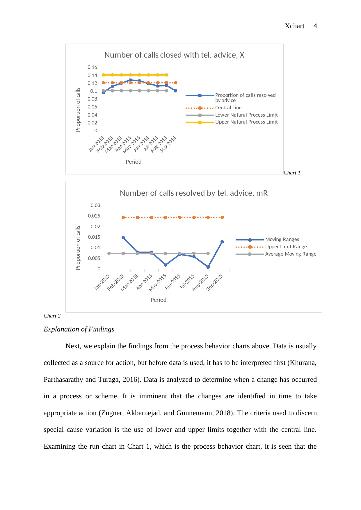
Process Behavior Charts
The charts below are the XmR charts for the data. Visualization of behavior happens
to be an important aspect. It gives a clear indication of limits and degree of variation among
the characteristics of interest (Wludarczyk-Sielika and Stateczy, 2016). Chart 1 below is the
first process behavior chart while Chart 2 is the second process behavior chart. They are
labeled Chart 1 and Chart 2 to minimize the caption written beside the chart. The first process
behavior chart contains three lines, the central line, upper and lower limits and finally, the
proportion of calls line (Wludarczyk-Sielika and Stateczy, 2016). In this manner, the
proportions are easy to interpret. The proportion of calls line shows the spread of the data in a
graph (Wludarczyk-Sielika and Stateczy, 2016). Therefore, the data is represented in the
graphs are analyzed in a process behavior chart that gives clear visuals. The first being an
individual chart and the second a moving range chart ( Wludarczyk-Sielika and Stateczy,
2016). The values used in the creation of the process behavior are calculated differently. For
the upper natural process limit to be obtained, the average moving range is multiplied by a
scaling factor of 3.27, which is a constant. The scaling factor produces an appropriate range
for the upper natural process limit. The analysis done is as shown below.
consistent values; that is, the vales will to be measured are of the same type, and the method
used is the same (Ali, Pievatolo and Gob, 2016). Lastly, the data also should be logically
comparable (Khaliq and Riaz, 2015). The data we have suited the conditions of an XmR
chart. The data has one observation per period; the data to be measured is of the same type,
and the data is also logically comparable. XmR charts are usually created using five or more
points of data and how data does have more than 5 points (Khaliq and Riaz, 2015). This
makes the chart even more suitable for the analysis of the data (Ali, Pievatolo and Gob,
2016). That is why I chose the XmR chart for the scrutiny of the information given on
telephone calls.
Process Behavior Charts
The charts below are the XmR charts for the data. Visualization of behavior happens
to be an important aspect. It gives a clear indication of limits and degree of variation among
the characteristics of interest (Wludarczyk-Sielika and Stateczy, 2016). Chart 1 below is the
first process behavior chart while Chart 2 is the second process behavior chart. They are
labeled Chart 1 and Chart 2 to minimize the caption written beside the chart. The first process
behavior chart contains three lines, the central line, upper and lower limits and finally, the
proportion of calls line (Wludarczyk-Sielika and Stateczy, 2016). In this manner, the
proportions are easy to interpret. The proportion of calls line shows the spread of the data in a
graph (Wludarczyk-Sielika and Stateczy, 2016). Therefore, the data is represented in the
graphs are analyzed in a process behavior chart that gives clear visuals. The first being an
individual chart and the second a moving range chart ( Wludarczyk-Sielika and Stateczy,
2016). The values used in the creation of the process behavior are calculated differently. For
the upper natural process limit to be obtained, the average moving range is multiplied by a
scaling factor of 3.27, which is a constant. The scaling factor produces an appropriate range
for the upper natural process limit. The analysis done is as shown below.
⊘ This is a preview!⊘
Do you want full access?
Subscribe today to unlock all pages.
Trusted by 1+ million students worldwide
Xchart 4
Jan-2015
Feb-2015
Mar-2015
Apr-2015
May-2015
Jun-2015
Jul-2015
Aug-2015
Sep-2015
0
0.02
0.04
0.06
0.08
0.1
0.12
0.14
0.16
Number of calls closed with tel. advice, X
Proportion of calls resolved
by advice
Central Line
Lower Natural Process Limit
Upper Natural Process Limit
Period
Proportion of calls
Chart 1
Jan-2015
Feb-2015
Mar-2015
Apr-2015
May-2015
Jun-2015
Jul-2015
Aug-2015
Sep-2015
0
0.005
0.01
0.015
0.02
0.025
0.03
Number of calls resolved by tel. advice, mR
Moving Ranges
Upper Limit Range
Average Moving Range
Period
Proportion of calls
Chart 2
Explanation of Findings
Next, we explain the findings from the process behavior charts above. Data is usually
collected as a source for action, but before data is used, it has to be interpreted first (Khurana,
Parthasarathy and Turaga, 2016). Data is analyzed to determine when a change has occurred
in a process or scheme. It is imminent that the changes are identified in time to take
appropriate action (Zügner, Akbarnejad, and Günnemann, 2018). The criteria used to discern
special cause variation is the use of lower and upper limits together with the central line.
Examining the run chart in Chart 1, which is the process behavior chart, it is seen that the
Jan-2015
Feb-2015
Mar-2015
Apr-2015
May-2015
Jun-2015
Jul-2015
Aug-2015
Sep-2015
0
0.02
0.04
0.06
0.08
0.1
0.12
0.14
0.16
Number of calls closed with tel. advice, X
Proportion of calls resolved
by advice
Central Line
Lower Natural Process Limit
Upper Natural Process Limit
Period
Proportion of calls
Chart 1
Jan-2015
Feb-2015
Mar-2015
Apr-2015
May-2015
Jun-2015
Jul-2015
Aug-2015
Sep-2015
0
0.005
0.01
0.015
0.02
0.025
0.03
Number of calls resolved by tel. advice, mR
Moving Ranges
Upper Limit Range
Average Moving Range
Period
Proportion of calls
Chart 2
Explanation of Findings
Next, we explain the findings from the process behavior charts above. Data is usually
collected as a source for action, but before data is used, it has to be interpreted first (Khurana,
Parthasarathy and Turaga, 2016). Data is analyzed to determine when a change has occurred
in a process or scheme. It is imminent that the changes are identified in time to take
appropriate action (Zügner, Akbarnejad, and Günnemann, 2018). The criteria used to discern
special cause variation is the use of lower and upper limits together with the central line.
Examining the run chart in Chart 1, which is the process behavior chart, it is seen that the
Paraphrase This Document
Need a fresh take? Get an instant paraphrase of this document with our AI Paraphraser
Xchart 5
quantity of calls resolved by telephone advice is above the Central Line from March 2015 to
August 2015. Since the data in the chart falls within the range, It is considered to be
statistically stable. On an XmR chart, a statistically stable process circulates randomly. If the
process were non-random, then it would not have been statistically stable. The Central Line
in the chart shows the average of data over a specified period. The central line is also used to
identify trends or shifts in the chart. For the telephone calls resolved to be above the Central
Line indicates that there was no substantial cause in variation change. In the analysis of data,
the numbers may change even though the process does not change. The natural process limits
usually define what the process will produce as long it is predictable (Larcos et al., 2015). For
the process to be predictable, it would mean that it is operating consistently. There are no
points outside the Natural Process Limits in Chart 1 as well, and this shows that there is no
particular cause that affects the percentage of calls shut by telephone advice. The upper and
lower control limits are calculated from the data and then placed symmetrically on sides of
the central line.
Looking at the second process behavior chart, mR chart, we try to determine whether
there are points that pass over the Upper Limit Range. A moving range, mR, is a progression
of calculations whereby the difference between successive values in a set of data is measured
(Ríos-Rincón et al., 2015). The moving range is used as a measure of distribution rather than
the standard deviation to compute the upper and lower limits. The four main tests that shall
be used to determine whether the process is in control are if 1 or more points lie outside the
control limits. If 8 points in a row are overhead or below the central line if 6 points in a row
increase or decrease gradually. And if more than 13 points in a row alternate from up to
down. Points that are outside the Upper Limit Range usually indicate that there is a
considerable variation in the data that need an explanation (Pimentel and Barrueto, 2015).
But for our case, Chart 2 does not have any point that is above the Upper Limit Range,
Xchart 6
therefore no substantial variation in the percentage of calls shut by telephone advice. Another
significant observation in the mR chart is the runs near the limits. Runs are successive values
or near-constant values in a graph (Anderson Hagiwara, Anderson Gara and Elg, 2016).
Should there be three or more consecutive values within the upper region and as well as
within the limit, then this would indicate that there is an unusual cause of variation that has a
reasonable but controlled effect (St-Maurice, Burns and Wolting, 2018). Chart 2 does not
have successive, but Chart 1 does. There was an unusual but moderate cause of variation
from June 2015 to August 2016 in the proportion of calls shut by telephone advice.
Part B
Run Chart 1
Jan-2015
Feb-2015
Mar-2015
Apr-2015
May-2015
Jun-2015
Jul-2015
Aug-2015
Sep-2015
0
0.02
0.04
0.06
0.08
0.1
0.12
0.14
0.16
Number of calls closed with tel. advice, X
Proportion of calls resolved by
advice
Central Line
Lower Natural Process Limit
Upper Natural Process Limit
Period
Proportion of calls
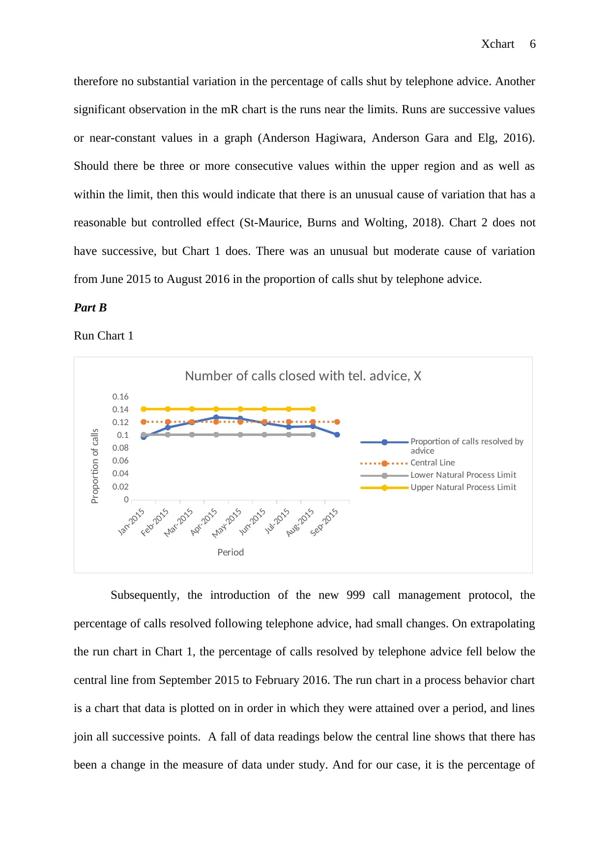
Subsequently, the introduction of the new 999 call management protocol, the
percentage of calls resolved following telephone advice, had small changes. On extrapolating
the run chart in Chart 1, the percentage of calls resolved by telephone advice fell below the
central line from September 2015 to February 2016. The run chart in a process behavior chart
is a chart that data is plotted on in order in which they were attained over a period, and lines
join all successive points. A fall of data readings below the central line shows that there has
been a change in the measure of data under study. And for our case, it is the percentage of
therefore no substantial variation in the percentage of calls shut by telephone advice. Another
significant observation in the mR chart is the runs near the limits. Runs are successive values
or near-constant values in a graph (Anderson Hagiwara, Anderson Gara and Elg, 2016).
Should there be three or more consecutive values within the upper region and as well as
within the limit, then this would indicate that there is an unusual cause of variation that has a
reasonable but controlled effect (St-Maurice, Burns and Wolting, 2018). Chart 2 does not
have successive, but Chart 1 does. There was an unusual but moderate cause of variation
from June 2015 to August 2016 in the proportion of calls shut by telephone advice.
Part B
Run Chart 1
Jan-2015
Feb-2015
Mar-2015
Apr-2015
May-2015
Jun-2015
Jul-2015
Aug-2015
Sep-2015
0
0.02
0.04
0.06
0.08
0.1
0.12
0.14
0.16
Number of calls closed with tel. advice, X
Proportion of calls resolved by
advice
Central Line
Lower Natural Process Limit
Upper Natural Process Limit
Period
Proportion of calls
Subsequently, the introduction of the new 999 call management protocol, the
percentage of calls resolved following telephone advice, had small changes. On extrapolating
the run chart in Chart 1, the percentage of calls resolved by telephone advice fell below the
central line from September 2015 to February 2016. The run chart in a process behavior chart
is a chart that data is plotted on in order in which they were attained over a period, and lines
join all successive points. A fall of data readings below the central line shows that there has
been a change in the measure of data under study. And for our case, it is the percentage of
⊘ This is a preview!⊘
Do you want full access?
Subscribe today to unlock all pages.
Trusted by 1+ million students worldwide
Xchart 7
calls resolved by telephone advice. The change is indicated by all the points that are below
the central line. The change occurred after the innovative protocol was presented.
Despite the change in the percentage of telephone calls shut with mobile advice,
points still were within the initial Upper and Lower Natural Process Limits. If there have
been any outliers in the chart after the new protocol, then new values for the control limits
would be calculated. Outliers are those points in the chart that are outside the upper and lower
natural process limits (Black and Leslie, 2018). Outliers, also known as exceptional variation,
usually show that there are variations that affect a process, and those variations are not
controlled effectively (Mohd Saudi et al., 2015). But since there are no outliers in the
extrapolated Chart 1, then we would not need to construct a new process behavior chart.
Part C
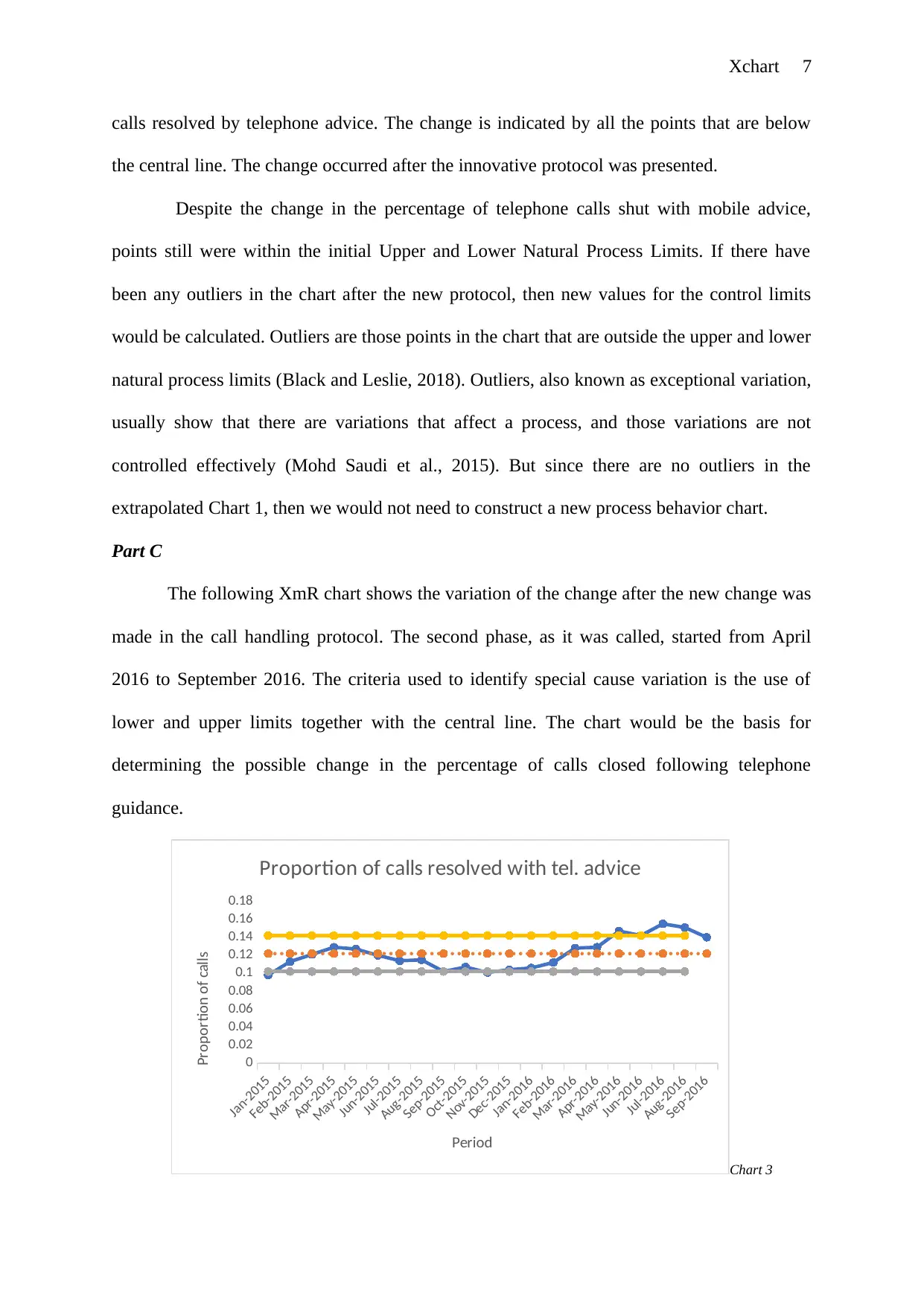
The following XmR chart shows the variation of the change after the new change was
made in the call handling protocol. The second phase, as it was called, started from April
2016 to September 2016. The criteria used to identify special cause variation is the use of
lower and upper limits together with the central line. The chart would be the basis for
determining the possible change in the percentage of calls closed following telephone
guidance.
Jan-2015
Feb-2015
Mar-2015
Apr-2015
May-2015
Jun-2015
Jul-2015
Aug-2015
Sep-2015
Oct-2015
Nov-2015
Dec-2015
Jan-2016
Feb-2016
Mar-2016
Apr-2016
May-2016
Jun-2016
Jul-2016
Aug-2016
Sep-2016
0
0.02
0.04
0.06
0.08
0.1
0.12
0.14
0.16
0.18
Proportion of calls resolved with tel. advice
Period
Proportion of calls
Chart 3
calls resolved by telephone advice. The change is indicated by all the points that are below
the central line. The change occurred after the innovative protocol was presented.
Despite the change in the percentage of telephone calls shut with mobile advice,
points still were within the initial Upper and Lower Natural Process Limits. If there have
been any outliers in the chart after the new protocol, then new values for the control limits
would be calculated. Outliers are those points in the chart that are outside the upper and lower
natural process limits (Black and Leslie, 2018). Outliers, also known as exceptional variation,
usually show that there are variations that affect a process, and those variations are not
controlled effectively (Mohd Saudi et al., 2015). But since there are no outliers in the
extrapolated Chart 1, then we would not need to construct a new process behavior chart.
Part C
The following XmR chart shows the variation of the change after the new change was
made in the call handling protocol. The second phase, as it was called, started from April
2016 to September 2016. The criteria used to identify special cause variation is the use of
lower and upper limits together with the central line. The chart would be the basis for
determining the possible change in the percentage of calls closed following telephone
guidance.
Jan-2015
Feb-2015
Mar-2015
Apr-2015
May-2015
Jun-2015
Jul-2015
Aug-2015
Sep-2015
Oct-2015
Nov-2015
Dec-2015
Jan-2016
Feb-2016
Mar-2016
Apr-2016
May-2016
Jun-2016
Jul-2016
Aug-2016
Sep-2016
0
0.02
0.04
0.06
0.08
0.1
0.12
0.14
0.16
0.18
Proportion of calls resolved with tel. advice
Period
Proportion of calls
Chart 3
Paraphrase This Document
Need a fresh take? Get an instant paraphrase of this document with our AI Paraphraser
Xchart 8
Some patterns can be obtained from looking at the process behavior chart. In the chart
above, we see a cycle pattern in the distribution of the data. A cycle pattern indicates that
there a special cause disparity as they are not random. From our process behavior chart, the
cyclical variation is due to the changes made in the protocols used to handle calls. From the
process behavior chart above, it would be undeniable to say that there stood a change in the
percentage of calls shut following telephone advice. The change is attributed to the fact that
the value of the proportion rose from below the central line. Not only did the proportion go
above the Central Line, but it also went ahead and surpassed the Upper Natural Process Limit
of the data. This resulted in exceptional variation in the data, also known as outliers. The
outliers would indicate that there a significant change in the variation of the data (Woodall,
2017). In our case, the presence of outliers would mean that Phase 2.1 of the call handling
procedure resulted in a higher percentage of calls shut by telephone advice.
Reflection on Chart Used and Alternative Choices
The XmR chart has been suitable for the data that was analyzed. This is because the
variation or change in the percentage of telephone calls resolved by telephone advice is
demonstrated in the chart. The data used was also suitable for the XmR chart as it followed
the assumptions associated with the chart. There are other types of charts that could have
been used to analyze the data. One of the charts is a histogram, also known as a tally plot. A
histogram displays variations using bars of different heights, and with each bar representing a
range of values (Ren and Ramanan, 2013). It is often useful when computing numerical
summaries of data (Barbeira et al., 2018). A taller bar in a histogram indicates that more data
are within that range, while a shorter bar means that there is a small amount of data in that
range (Qardaji, Yang and Li, 2013). A histogram would have been suitable for the analysis of
the data if we were looking to see the number of phone calls that are in a certain period and
Xchart 9
therefore was not ideal for our situation (Josephs et al., 2018). A histogram compresses data
given over the period.
It is important to reduce the common-cause variations, but process behavior charts are
not suitable for this type of assignment. A diverse way of thinking and application of
necessary tools is required (Wlodarczyk–Sielicka and Stateczny, 2016). For instance, it may
be probable and of importance to control the variation in some involvements to the procedure
or to the aspects of the working setting. In order to accomplish this, however, it is imminent
to determine the types of variability in the involvements and working setting (Barbeira et al.,
2018). This is because these factors are the most important causes of changeability of the
final results. Modification of some interior portions of the procedure may be possible. If
changes are made without evaluating the possible effects, they are likely to have in the final
result institutes altering, with all its hostile effects. In order to implement appropriate
changes, a planned investigation is required. The methods to be used would include
observation of the effects of experimental interventions, and also performing observational
analysis that relate variables to characteristics of the product (Black, 2017). Regression
methods of analysis are often used for this, but process behavior charts are the best.
Conclusion
Process behavior charts give clear and steady means of assessing the performance and
behavior of a certain process. Good decisions based on the analysis about the processes, will
help distinguish stable processes from the ones that need attention and enhancement. The
process behavior charts are also used as basis for predicting future results as well as
determining whether improvements made are effective. From the analysis carried out on the
data, we can see that, from January 2015 to September 2015, the percentage of phone calls
resolved using the telephone was significantly above average. With the start of the new-
⊘ This is a preview!⊘
Do you want full access?
Subscribe today to unlock all pages.
Trusted by 1+ million students worldwide
Xchart 10
fangled 999 call handling procedure in October 2015, it was noted that there was a drop in the
ratio of calls shut by telephone advice from November 2015 until March 2016. The protocol
that was implemented made a negative change, and then there was the implementation of the
Phase 2.1 call handling procedure on the 1st of April 2016. After the protocol was
implemented, there was a significant and notable change in the percentage of phone calls
resolved by mobile advice. The changes shot up beyond the upper natural process limits
resulting in outliers. This showed that the phase introduced was able to illustrate the presence
of variation higher than the one previously implemented. Therefore, I would recommend that
the phase 2.1 protocol of handling calls be kept as it is useful.
Reference List
A Black, S. (2017). Systems Behaviour Charts for Longitudinal Data Inform Marine
Conservation Management. Journal of Aquaculture & Marine Biology, 6(5). [online]
Available at:
https://www.researchgate.net/profile/Simon_Black3/publication/322820559_Systems_Behavi
our_Charts_for_Longitudinal_Data_Inform_Marine_Conservation_Management/links/
5a71802daca272e425edac6e/Systems-Behaviour-Charts-for-Longitudinal-Data-Inform-
Marine-Conservation-Management.pdf [Accessed 18 Feb. 2020].
Ali, S., Pievatolo, A. and Göb, R. (2016). An Overview of Control Charts for High-quality
Processes. Quality and Reliability Engineering International, 32(7), pp.2171-2189. Anon,
(2020). [online] Available at:
Paraphrase This Document
Need a fresh take? Get an instant paraphrase of this document with our AI Paraphraser
Xchart 11
https://www.researchgate.net/publication/294138693_An_Overview_of_Control_Charts_for_
High-quality_Processes [Accessed 18 Feb. 2020].
Andersson Hagiwara, M., Andersson Gäre, B. and Elg, M., (2016). Interrupted time series
versus statistical process control in quality improvement projects. Journal of nursing care
quality, 31(1), pp. E1-E8. [online] Available at: https://scholar.google.com/citations?
user=ZvFj5PUAAAAJ&hl=en [Accessed 18 Feb. 2020].
Barbeira, A.N., Dickinson, S.P., Bonazzola, R., Zheng, J., Wheeler, H.E., Torres, J.M.,
Torstenson, E.S., Shah, K.P., Garcia, T., Edwards, T.L. and Stahl, E.A., 2018. Exploring the
phenotypic consequences of tissue specific gene expression variation inferred from GWAS
summary statistics. Nature communications, 9(1), pp.1-20. [online] Available at:
https://ecommons.luc.edu/cgi/viewcontent.cgi?article=1101&context=biology_facpubs
[Accessed 18 Feb. 2020].
Black, S.A. and Leslie, S.C., 2018. Understanding impacts of mitigation in waterway control
systems on manatee deaths in Florida. Int J Avian & Wildlife Biol, 3(5), pp.386-390. [online]
Available at: https://blogs.kent.ac.uk/theconservationleader/ [Accessed 18 Feb. 2020].
Black, S.A., (2015). System behavior charts inform an understanding of biodiversity
recovery. International Journal of Ecology, 2015. [online] Available at:
https://blogs.kent.ac.uk/theconservationleader/ [Accessed 18 Feb. 2020].
Josephs, S., et al. (2018). IHI ID 16 Moving from parallel to serial preoperative process flow
utilizing multidisciplinary bedside handoffs improves preoperative task completion. [online]
Xchart 12
Available at: https://bmjopenquality.bmj.com/content/bmjqir/7/Suppl_1/A18.2.full.pdf
[Accessed 18 Feb. 2020].
Khaliq, Q. and Riaz, M. (2015). Robust Tukey-CUSUM Control Chart for Process
Monitoring. Quality and Reliability Engineering International, 32(3), pp.933-948. [online]
Available at: https://onlinelibrary.wiley.com/doi/full/10.1002/qre.1804 [Accessed 18 Feb
2020]
Khurana, U., Parthasarathy, S. and Turaga, D., 2016. Graph-based exploration of non-graph
datasets. Proceedings of the VLDB Endowment, 9(13), pp.1557-1560. [online] Available at:
http://www.vldb.org/pvldb/vol9/p1557-khurana.pdf [Accessed 18 Feb. 2020].
Larcos, G., Collins, L., Georgiou, A. and Westbrook, J. (2015). Nuclear medicine incident
reporting in Australia: control charts and notification rates inform quality
improvement. Internal Medicine Journal, 45(6), pp.609-617. [online] Available at:
https://www.researchgate.net/publication/274402628_Nuclear_medicine_incident_reporting_
in_Australia_Control_charts_and_notification_rates_inform_quality_improvement [Accessed
18 Feb. 2020].
Mohd Saudi, A., Azid, A., Juahir, H., Toriman, M., Amran, M., Mustafa, A., Azaman, F.,
Kamarudin, M. and Mohd Saudi, M. (2015). Flood Risk Pattern Recognition Using
Integrated Chemometric Method and Artificial Neural Network: A Case Study in the Johor
River Basin. Jurnal Teknologi, 74(1). [online] Available at:
https://www.researchgate.net/publication/281951832_Flood_Risk_Pattern_Recognition_Usin
⊘ This is a preview!⊘
Do you want full access?
Subscribe today to unlock all pages.
Trusted by 1+ million students worldwide
1 out of 14

Your All-in-One AI-Powered Toolkit for Academic Success.
+13062052269
info@desklib.com
Available 24*7 on WhatsApp / Email
![[object Object]](/_next/static/media/star-bottom.7253800d.svg)
Unlock your academic potential
Copyright © 2020–2026 A2Z Services. All Rights Reserved. Developed and managed by ZUCOL.