iTunes Usability Testing Report
VerifiedAdded on 2019/09/16
|14
|4206
|523
Report
AI Summary
This report details a usability study conducted on iTunes, focusing on user interactions with key functionalities such as playing music, importing files, creating playlists, syncing with iOS devices, and device management. The study involved five participants with varying levels of iTunes experience. The findings revealed several usability issues, including difficulties in importing music, creating playlists, managing iOS devices, and syncing content. The report also highlights problems with the interface's legibility, lack of system feedback, and the inaccessibility of advanced features for new users. Based on these findings, the report provides specific recommendations for improving iTunes' usability, such as reorganizing menus, enhancing feedback mechanisms, and simplifying device management processes. The evaluation discussion emphasizes the importance of addressing these usability issues to enhance user satisfaction and engagement.
Contents
Introduction...........................................................................................................................................2
Aim........................................................................................................................................................2
About the report.....................................................................................................................................2
Set of Limitations..............................................................................................................................2
Experimental Design.............................................................................................................................3
Set of Participants..................................................................................................................................3
Considerations...................................................................................................................................3
Selection............................................................................................................................................3
Test Process...........................................................................................................................................3
Tasks.....................................................................................................................................................4
Usability Metrics...................................................................................................................................4
Prioritization of Issues...........................................................................................................................4
Summary of overall findings.................................................................................................................5
Performance Data..................................................................................................................................5
Usability Issues......................................................................................................................................6
Recommendations...............................................................................................................................10
Evaluation Discussion.........................................................................................................................10
References...........................................................................................................................................12
1
Paraphrase This Document
Need a fresh take? Get an instant paraphrase of this document with our AI Paraphraser
Introduction
ITunes is among the most popular music players, media management and digital content e-
tailing platform in the world today. It has been on a steady rise since its inception nearly a
decade ago. The rise in popularity was mainly attributed to the fact that it was a simple and
intuitive player offering features and benefits that surpassed its competitors. However, over
the years it has grown into a mature platform offering many different features and solutions
which it may not have been originally designed or thought for. As a result, it has become
bundled with several functionalities and performs several additional tasks than it used to do
earlier. While the interface has grown revamps and overhauls several times since its
inception, many people find iTunes today a lot more difficult to handle than they used to. The
paper will present a usability testing of iTunes with a pre-defined set of users and would also
present a summary and analysis thereafter.
Aim
The main aim of this usability testing is to assess the usability of iTunes from the perspective
of general users performing typical tasks. At the end of this test, a conclusion can be drawn to
the degree of usability of iTunes and what are the recommended solutions for the overall
usability problems reported.
About the report
Set of Limitations
The nature of this study is qualitative and exploratory and therefore, the primary goal is not to
focus upon the results that are generalized. Also, the objective is not to compare and rate the
systems on the basis of the information collected. The main objective is to come up with
advanced insights in the mechanisms that users adopt to evaluate their experience. It is also
expected that a framework will be obtained for evaluation of user experience and the same
may be applied in the evaluation studies (Kim, 2015)carried out in the future. The
participants involved in the research were the students from the field of Information Studies.
It might appear that the results obtained at the end of the research may be biased for the savvy
users on the basis of their area of expertise. However, a number of trends and patterns that are
revealed from the interviews highlight that user satisfaction and heuristics have a higher
correlation with the persona type as compared to system expertise.
2
Experimental Design
A random method of allocation was chosen for the number of participants to understand and
validate the different experimental situations. The method was adopted to estimate the
usability as the interface interaction issues could be easily understood. Heuristic evaluation
was not carried out since the full proof evidence of the usability issues was required.
Set of Participants
Considerations
The age group preferred for the study will be young adults and the ones in late twenties. The
actual audience may differ from the preferred group; however, this age group was preferred
as it was assumed that they will provide (Lee and Price, 2017)enhanced contribution in the
usage of the improved delivery mechanisms. The gender of the user and the visually impaired
users were not the factors that were involved.
Selection
The selection of audience was done through the Facebook groups in a random manner with a
complete count as five. An even gender distribution was carried out and the participants were
also required to gain certain knowledge regarding the iTunes environment. The participants
had an experience on the iTunes environment and a majority of them did not have an
advanced technical knowledge. There were two participants that had a strong technical
background and the others did not have a sound knowledge of the technical gadgets. The
average age of the participants was observed as 30 with the youngest participant as 24 years
old and the oldest as 32 years old. In a span of seven days, five people took part in the user
tests. Two users out of five were new to iTunes with less than songs in their library while two
were advanced users having over 1,000 songs in the library. One of the users was
intermediate user that had more than 1,000 songs. Windows was the primary operating
system for four of these participants. The range of time spent in the usage of iTunes also
varied with one user having less than five months of experience while the other had over 24
months of experience.
Test Process
The test process would be carried out using audio-visual means over the internet. A live
TeamViewer session would be used to observe the user’s interaction with the system. The
estimated and actual duration of the tests would be noted. It would be made sure that the
users have latest version of the application. The tests would be carried out during weekends
3
⊘ This is a preview!⊘
Do you want full access?
Subscribe today to unlock all pages.
Trusted by 1+ million students worldwide
and based on user’s obligations. Notes would be taken during the test and appropriate
feedback from the users would be noted.
The primary task of the observer was to capture the notes regarding the experience and
reaction of the test user along with the (Chapter 14: Usability testing and field studies, 2009)
first impression of the software. The notes were taken with the aid of pen and paper and there
were no audio/video recordings taken. Such a practice was taken so that the users were
comfortable.
The users were also asked to fill out a questionnaire regarding their experience along with an
informal discussion regarding the experience with the software.
Tasks
Using iTunes to play music
Loading music files to iTunes
Create a Playlist
Sync a Playlist with an iOS Device
Manage an iOS device using iTunes
Usability Metrics
Success Rate
In a given scenario, was the user able to complete the assigned task?
Error Rate
Which errors tripped up users most? These can be divided into two types: critical and
noncritical. Critical errors will prevent a user from (Isaac, 1995) completing a task, while
noncritical errors will simply lower the efficiency with which they complete it.
Time to Completion
How much time did it take the user to complete the task? This can be particularly useful
when determining how your product compares with your competitors (if you’re testing both).
Prioritization of Issues
0 Superficial usability problem: may be easily overcome by user or occurs extremely
infrequently. Does not need to be fixed for next release unless extra time is available.
4
Paraphrase This Document
Need a fresh take? Get an instant paraphrase of this document with our AI Paraphraser
1 Minor usability problem: may occur more frequently or be more difficult to overcome.
Fixing this should be given low priority for next release.
2 Major usability problem: occurs frequently and persistently or users may be unable or
unaware of how to fix the problem. Important to fix, so should be given high priority.
3 Usability catastrophe: Seriously impairs use of product and cannot be overcome by users.
Imperative to fix this before product can be released.
Summary of overall findings
While Apple’s iTunes digital music application is usually commented on having a simple
interface and considered easy to use, a series of user tests covering the functionalities of
importing music, creating play lists, and burning CDs revealed a number of specific usability
problems. The user test tasks were based on the findings from the previous heuristic
evaluation and user survey. Problem areas identified by (Survey of designing user interface
for mobile applications, 2017) applying heuristics were then further tested with real users.
These specific usability problems were clustered into nine general problem areas and ranked
according to severity and the ease with which they could be fixed. They are addressed in
detail in this report, providing information about the general problem, some specific
examples, and a high-level recommendation for solving the problem.
The problem areas are:
Confusion/Surprise during the burn disc interaction
The inclusion of highlighting is not consistent as per the standards of the external
operating systems
Enhanced blending of the critical buttons in the interface and the adequate meaning of
the symbols could not be provided
No feedback for multiple functions in the software or could not be cognitively
processed
Advanced features less accessible to novice users
System does not provide feedback adequately
Unable to understand the device icon when device is connected
Advanced features are less accessible to novice users
Performance Data
Tasks Evaluation Table
5
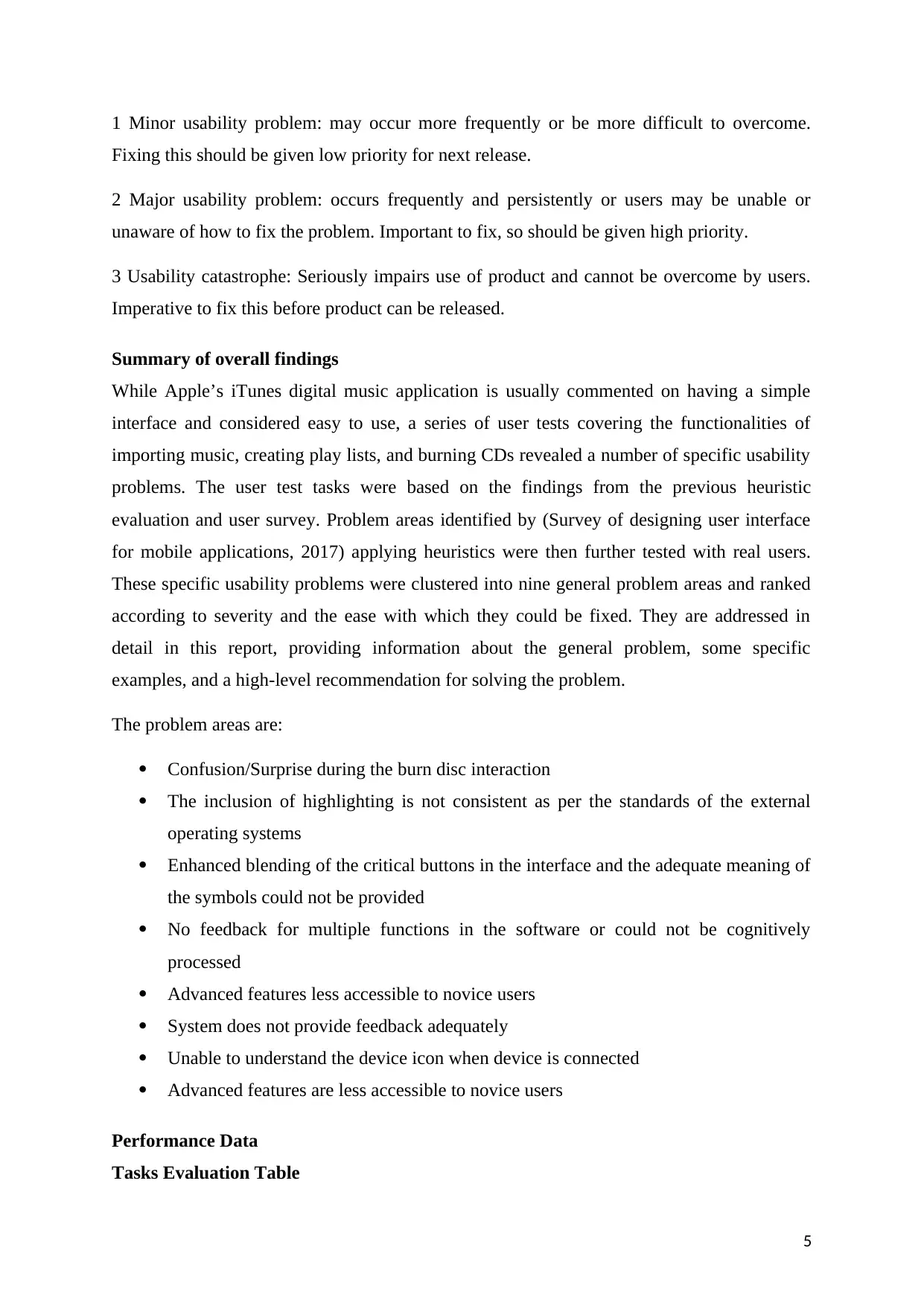
Sr.
No
Tasks Success
Rate
Error
Rate
Time to
Completion
(Average)
1 Using iTunes to play music 60% 50% 12 Minutes
2 Loading music files to iTunes 60% 50% 11 Minutes
3 Create a Playlist 40% 45% 7 Minutes
4 Sync a Playlist with an iOS Device 20% 80% 14 Minutes
5 Manage an iOS device using iTunes 40% 60% 12 Minutes
Usability Evaluation Table
Sr. No Usability Issue Impact
1 Inconsistency in importing audio/video files into playlists Low
2 Inconsistency in creating playlist Low
3 Critical Buttons/Menus blend into the interface and does not provide
tooltip
Medium
4 System does not provide feedback adequately Medium
5 Unable to understand the device icon when device is connected Medium
6 Advanced features are less accessible to novice users Low
Usability Issues
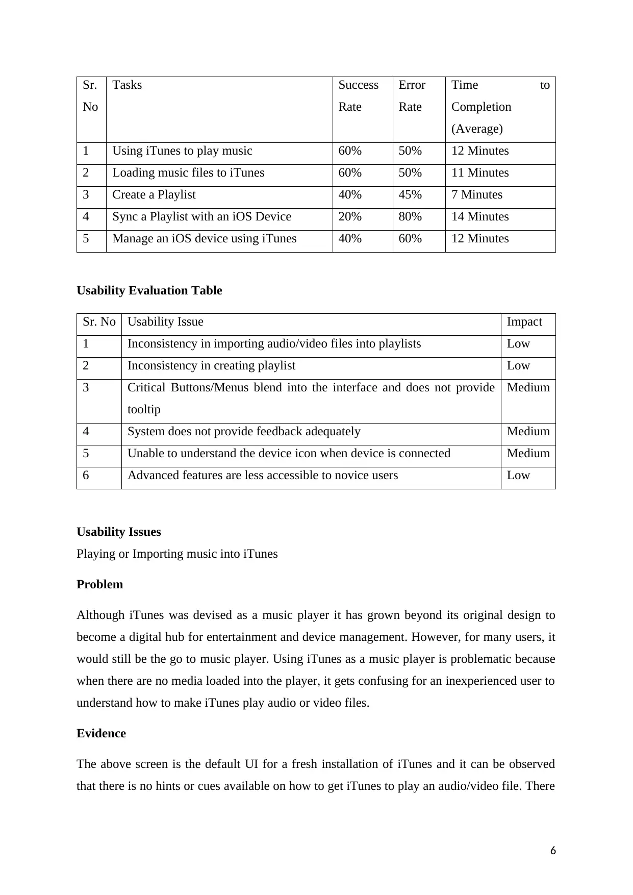
Playing or Importing music into iTunes
Problem
Although iTunes was devised as a music player it has grown beyond its original design to
become a digital hub for entertainment and device management. However, for many users, it
would still be the go to music player. Using iTunes as a music player is problematic because
when there are no media loaded into the player, it gets confusing for an inexperienced user to
understand how to make iTunes play audio or video files.
Evidence
The above screen is the default UI for a fresh installation of iTunes and it can be observed
that there is no hints or cues available on how to get iTunes to play an audio/video file. There
6
No
Tasks Success
Rate
Error
Rate
Time to
Completion
(Average)
1 Using iTunes to play music 60% 50% 12 Minutes
2 Loading music files to iTunes 60% 50% 11 Minutes
3 Create a Playlist 40% 45% 7 Minutes
4 Sync a Playlist with an iOS Device 20% 80% 14 Minutes
5 Manage an iOS device using iTunes 40% 60% 12 Minutes
Usability Evaluation Table
Sr. No Usability Issue Impact
1 Inconsistency in importing audio/video files into playlists Low
2 Inconsistency in creating playlist Low
3 Critical Buttons/Menus blend into the interface and does not provide
tooltip
Medium
4 System does not provide feedback adequately Medium
5 Unable to understand the device icon when device is connected Medium
6 Advanced features are less accessible to novice users Low
Usability Issues
Playing or Importing music into iTunes
Problem
Although iTunes was devised as a music player it has grown beyond its original design to
become a digital hub for entertainment and device management. However, for many users, it
would still be the go to music player. Using iTunes as a music player is problematic because
when there are no media loaded into the player, it gets confusing for an inexperienced user to
understand how to make iTunes play audio or video files.
Evidence
The above screen is the default UI for a fresh installation of iTunes and it can be observed
that there is no hints or cues available on how to get iTunes to play an audio/video file. There
6
⊘ This is a preview!⊘
Do you want full access?
Subscribe today to unlock all pages.
Trusted by 1+ million students worldwide
is no clear cut indication of importing such files, or opening them or dragging and dropping
them onto the main screen. 2 out of 5 users faced difficulties with this part.
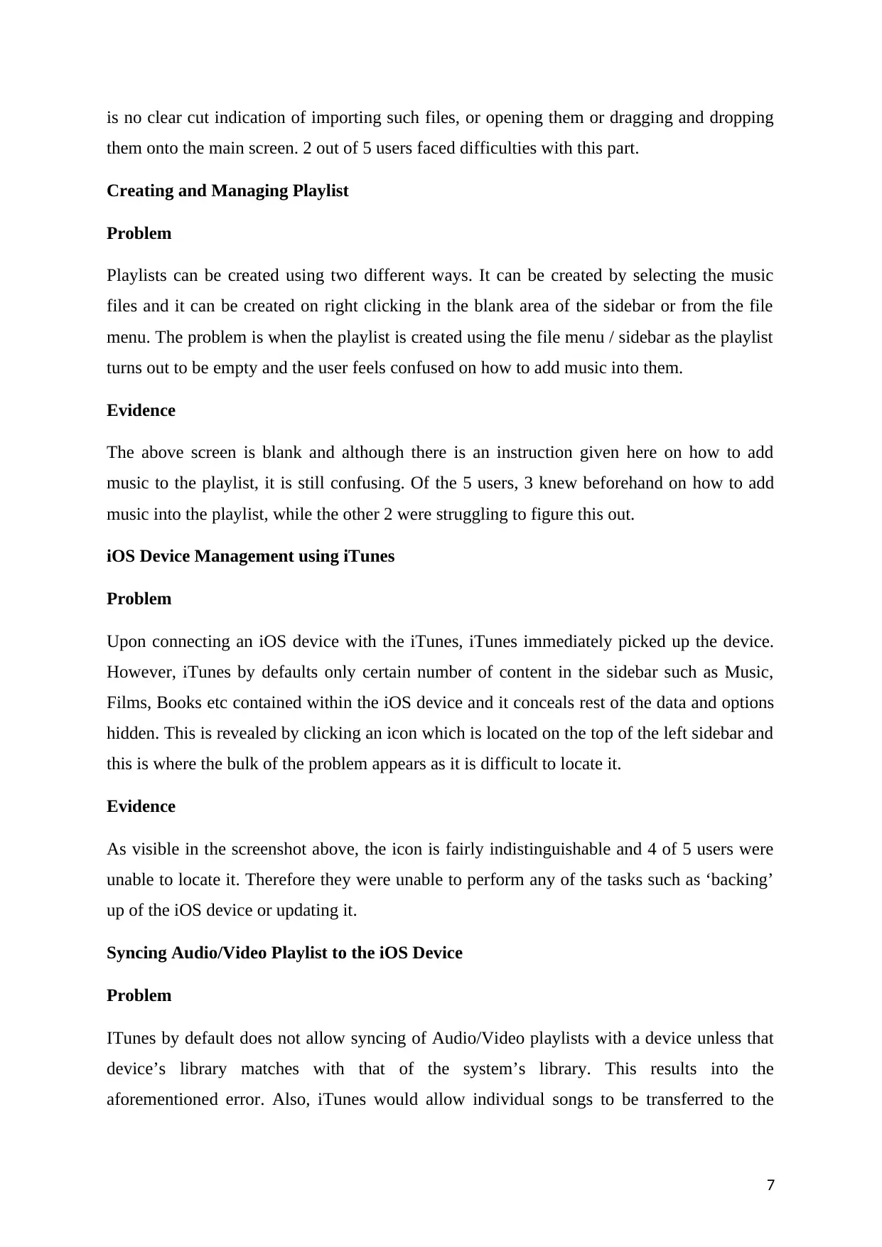
Creating and Managing Playlist
Problem
Playlists can be created using two different ways. It can be created by selecting the music
files and it can be created on right clicking in the blank area of the sidebar or from the file
menu. The problem is when the playlist is created using the file menu / sidebar as the playlist
turns out to be empty and the user feels confused on how to add music into them.
Evidence
The above screen is blank and although there is an instruction given here on how to add
music to the playlist, it is still confusing. Of the 5 users, 3 knew beforehand on how to add
music into the playlist, while the other 2 were struggling to figure this out.
iOS Device Management using iTunes
Problem
Upon connecting an iOS device with the iTunes, iTunes immediately picked up the device.
However, iTunes by defaults only certain number of content in the sidebar such as Music,
Films, Books etc contained within the iOS device and it conceals rest of the data and options
hidden. This is revealed by clicking an icon which is located on the top of the left sidebar and
this is where the bulk of the problem appears as it is difficult to locate it.
Evidence
As visible in the screenshot above, the icon is fairly indistinguishable and 4 of 5 users were
unable to locate it. Therefore they were unable to perform any of the tasks such as ‘backing’
up of the iOS device or updating it.
Syncing Audio/Video Playlist to the iOS Device
Problem
ITunes by default does not allow syncing of Audio/Video playlists with a device unless that
device’s library matches with that of the system’s library. This results into the
aforementioned error. Also, iTunes would allow individual songs to be transferred to the
7
them onto the main screen. 2 out of 5 users faced difficulties with this part.
Creating and Managing Playlist
Problem
Playlists can be created using two different ways. It can be created by selecting the music
files and it can be created on right clicking in the blank area of the sidebar or from the file
menu. The problem is when the playlist is created using the file menu / sidebar as the playlist
turns out to be empty and the user feels confused on how to add music into them.
Evidence
The above screen is blank and although there is an instruction given here on how to add
music to the playlist, it is still confusing. Of the 5 users, 3 knew beforehand on how to add
music into the playlist, while the other 2 were struggling to figure this out.
iOS Device Management using iTunes
Problem
Upon connecting an iOS device with the iTunes, iTunes immediately picked up the device.
However, iTunes by defaults only certain number of content in the sidebar such as Music,
Films, Books etc contained within the iOS device and it conceals rest of the data and options
hidden. This is revealed by clicking an icon which is located on the top of the left sidebar and
this is where the bulk of the problem appears as it is difficult to locate it.
Evidence
As visible in the screenshot above, the icon is fairly indistinguishable and 4 of 5 users were
unable to locate it. Therefore they were unable to perform any of the tasks such as ‘backing’
up of the iOS device or updating it.
Syncing Audio/Video Playlist to the iOS Device
Problem
ITunes by default does not allow syncing of Audio/Video playlists with a device unless that
device’s library matches with that of the system’s library. This results into the
aforementioned error. Also, iTunes would allow individual songs to be transferred to the
7
Paraphrase This Document
Need a fresh take? Get an instant paraphrase of this document with our AI Paraphraser
device but not if a playlist is selected. At the same time, transferring songs from the device
into the iTunes library is not a straightforward process either.
Evidence
3 out of 5 users encountered this error and since rest of the 2 users had already synced their
devices before didn’t encounter this error. However, all users stumbled into the problem
where they were unable to figure out how to proceed further.
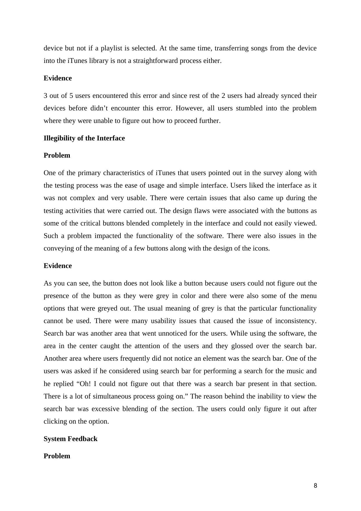
Illegibility of the Interface
Problem
One of the primary characteristics of iTunes that users pointed out in the survey along with
the testing process was the ease of usage and simple interface. Users liked the interface as it
was not complex and very usable. There were certain issues that also came up during the
testing activities that were carried out. The design flaws were associated with the buttons as
some of the critical buttons blended completely in the interface and could not easily viewed.
Such a problem impacted the functionality of the software. There were also issues in the
conveying of the meaning of a few buttons along with the design of the icons.
Evidence
As you can see, the button does not look like a button because users could not figure out the
presence of the button as they were grey in color and there were also some of the menu
options that were greyed out. The usual meaning of grey is that the particular functionality
cannot be used. There were many usability issues that caused the issue of inconsistency.
Search bar was another area that went unnoticed for the users. While using the software, the
area in the center caught the attention of the users and they glossed over the search bar.
Another area where users frequently did not notice an element was the search bar. One of the
users was asked if he considered using search bar for performing a search for the music and
he replied “Oh! I could not figure out that there was a search bar present in that section.
There is a lot of simultaneous process going on.” The reason behind the inability to view the
search bar was excessive blending of the section. The users could only figure it out after
clicking on the option.
System Feedback
Problem
8
into the iTunes library is not a straightforward process either.
Evidence
3 out of 5 users encountered this error and since rest of the 2 users had already synced their
devices before didn’t encounter this error. However, all users stumbled into the problem
where they were unable to figure out how to proceed further.
Illegibility of the Interface
Problem
One of the primary characteristics of iTunes that users pointed out in the survey along with
the testing process was the ease of usage and simple interface. Users liked the interface as it
was not complex and very usable. There were certain issues that also came up during the
testing activities that were carried out. The design flaws were associated with the buttons as
some of the critical buttons blended completely in the interface and could not easily viewed.
Such a problem impacted the functionality of the software. There were also issues in the
conveying of the meaning of a few buttons along with the design of the icons.
Evidence
As you can see, the button does not look like a button because users could not figure out the
presence of the button as they were grey in color and there were also some of the menu
options that were greyed out. The usual meaning of grey is that the particular functionality
cannot be used. There were many usability issues that caused the issue of inconsistency.
Search bar was another area that went unnoticed for the users. While using the software, the
area in the center caught the attention of the users and they glossed over the search bar.
Another area where users frequently did not notice an element was the search bar. One of the
users was asked if he considered using search bar for performing a search for the music and
he replied “Oh! I could not figure out that there was a search bar present in that section.
There is a lot of simultaneous process going on.” The reason behind the inability to view the
search bar was excessive blending of the section. The users could only figure it out after
clicking on the option.
System Feedback
Problem
8
The feedback that is given by the software is usually subtle and is not adapted by the user
easily. In the other scenarios, there is no feedback given. The functionalities in which such a
situation appears are the importing of the music, addition of the songs to the playlist and disc
burning scenarios. During the importing of the songs, it is not easy to detect the list of songs
being imported. The indicator is extremely small in size. There is also absence of feedback to
inform the users about the successful transfer of the songs. The only way to validate the same
is to check for the new songs in the playlist. The same issue is witnessed in the burning of the
disc as the feedback may go unnoticed after completion of the process.
Evidence
The users provided a lot of comments during the testing activities regarding the absence of
feedback. One of the users mentioned that he could not understand the importing of the songs
and also could not understand the indicators that came up against the songs in the playlist.
The user also could not understand the instance at which the import was stopped and the steps
to perform the same. The user kept on clicking the buttons as there was no action taking place
that could be seen by the user. Many users commented on the absence and lack of the
feedback. One of the users stated that she had to open the playlist to verify that the new songs
were added to the list.
Advanced Features are not readily accessible to new users
Problem
The software lacks in the accessibility of the advanced features for the new users as they do
not use such features frequently. For instance, it is necessary to open Preferences to make
changes in encoding during the music import. The option is not provided in the dialog box.
The default values are set in advance for the new users which eliminate the need to explore
such options.
Evidence
There were only two advanced users that were aware of the steps to be followed for making
changes in the encoding during music import. The other three users only guessed the
presence of the option on the basis of their assumptions. Many of the users believed that they
could right click and import the songs in their library. Some felt that there would be another
column present for the accomplishment of the task.
9
⊘ This is a preview!⊘
Do you want full access?
Subscribe today to unlock all pages.
Trusted by 1+ million students worldwide
Recommendations
The following recommendations are based on the results of the research process that is
carried out.
(1) The buttons and menus shall be reorganized to not only improve the aesthetics but also for
the improvement of the positioning, grouping, labelling, color and size.
(2) The details of the computer file and the device shall be included and displayed in the
software.
(3) The option to drag and drop the files to the device shall be made visible.
(4) The unnecessary steps to carry out an action shall be removed; for instance the
synchronization option before every download.
(5) The user feedback shall be improved with the aid of color or location.
(6) The time left for the completion of an activity, such as synchronization shall be visible.
(7) In case of an error, the user must be provided with the comments to resolve the error.
(8) The check boxes present for the playlist and sync options shall be enhanced.
(9) The assistance shall be provided in the native language of the user so that the same may
be understood by the user.
(10) The users shall be allowed to make changes in the device properties.
(11) The difference between synchronize and apply shall be adequately highlighted. The
priority of the suggestions shall be determined so that the future prototypes are built
accordingly.
Evaluation Discussion
In the usability analysis, it was determined that there were certain critical issues in the
software that brought it at an unacceptable stage for usage. The nature of the issues did not
include any major flaws in the design but included a lot of minor design and usability issues.
With the violation of the usability principle, the users are left confused and it becomes
difficult for them to determine the next step of action. This will bring down the engagement
percentage of the customers.
10
Paraphrase This Document
Need a fresh take? Get an instant paraphrase of this document with our AI Paraphraser
There were additional and unnecessary steps that the user had to perform to accomplish
certain activities. This led to decreased rate of customer satisfaction and also left them lost
and confused. The primary reason behind the same was the inability to perform actions on the
Apple program that set its mark with the innovative ideas. The set of concepts included in
iTunes are based on Apple. In spite of the unnecessary steps and increased confusions, it
could not be ruled out that the brand enhanced the denial of the activities, such as transfer to
the users. The research process made sure that the mapping of the issues regarding the
labelling and menu organization, lack of feedback and difficulty to resolve the errors was
done properly.
There are many non-functional requirements and system qualities that are present in the
software. Usability is one of the essential system qualities and is closely related with the
context of the user. The user satisfaction in this case is not associated with the success of
every step or the time required for the accomplishment of an activity in the middle. The
satisfaction was intermediary at the end of a specific process. Once the action is fully
completed, the effectiveness and the satisfaction of the user were enhanced. There are a few
limitations present in this study. At first, the context was limited to a specific geographical
area. Secondly, iTunes is mainly considered as a service and in such interaction, context
plays an influential factor in the customer actions and emotions. There should been an in-
depth analysis carried out. The reflection released at the end of the research included the
alternative steps to be followed in the synchronization of the activities along with the rate of
customer satisfaction to be achieved. In the time of increased market competition, the
decreasing number of users and financial factors demand the re-analysis of the software.
11
References
Chapter 14: Usability testing and field studies. (2009). [ebook] Available at:
http://teaching.csse.uwa.edu.au/units/CITS3201/LecturesPDF/Chapter_14_ID2e_slides.pdf
[Accessed 20 Dec. 2017].
Isaac, C. (1995). User Interface Design & User Interface Evaluation. The Computer Journal,
38(3), pp.265-265.
Kim, T. (2015). Heuristic Usability Evaluation iTunes. [ebook] Available at:
http://www.cs.utah.edu/~taek/assets/PSYC273.pdf [Accessed 20 Dec. 2017].
Lee, J. and Price, R. (2017). USER EXPERIENCE WITH COMMERCIAL MUSIC
SERVICES: AN EMPIRICAL EXPLORATION. [online] https://digital.lib.washington.edu.
Available at: https://digital.lib.washington.edu/researchworks/bitstream/handle/1773/27626/
JASIST_MusicServices_Preprint_LeePrice.pdf?sequence=1 [Accessed 20 Dec. 2017].
Survey of designing user interface for mobile applications. (2017). Journal of Advances in
Technology and Engineering Research, 3(2).
12
⊘ This is a preview!⊘
Do you want full access?
Subscribe today to unlock all pages.
Trusted by 1+ million students worldwide
1 out of 14
Related Documents


Your All-in-One AI-Powered Toolkit for Academic Success.
+13062052269
info@desklib.com
Available 24*7 on WhatsApp / Email
![[object Object]](/_next/static/media/star-bottom.7253800d.svg)
Unlock your academic potential
Copyright © 2020–2025 A2Z Services. All Rights Reserved. Developed and managed by ZUCOL.