User Experience Design: Interface Prototype for a Youth Club
VerifiedAdded on 2023/06/10
|26
|6223
|276
Report
AI Summary
This report provides an analysis of user interface design principles applied to three websites, culminating in the development of a mid-fidelity prototype for a youth club in East Greenwich. It leverages Shneiderman’s Eight Golden Rules to identify best practices and unique features. The prototype emphasizes user-friendliness through a search bar, clear navigation, comprehensive club details, and relevant imagery. User personas and scenarios are employed to align the design with user requirements, addressing legal, social, and ethical considerations such as content moderation, privacy, and copyright. The report also evaluates existing frameworks like London Youth and Young Hackney, comparing their designs and functionalities to inform the prototype's creation, ensuring a responsive and engaging user experience.
Running head: USER EXPERIENCE DESIGN
User Experience Design
Name of the Student
Name of the University
Author’s Note
User Experience Design
Name of the Student
Name of the University
Author’s Note
Paraphrase This Document
Need a fresh take? Get an instant paraphrase of this document with our AI Paraphraser
1
USER EXPERIENCE DESIGN
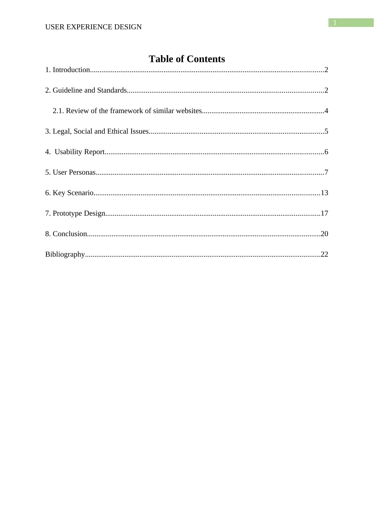
Table of Contents
1. Introduction............................................................................................................................2
2. Guideline and Standards........................................................................................................2
2.1. Review of the framework of similar websites.................................................................4
3. Legal, Social and Ethical Issues.............................................................................................5
4. Usability Report....................................................................................................................6
5. User Personas.........................................................................................................................7
6. Key Scenario........................................................................................................................13
7. Prototype Design..................................................................................................................17
8. Conclusion............................................................................................................................20
Bibliography.............................................................................................................................22
2
USER EXPERIENCE DESIGN
1. Introduction
The report is prepared for the analysis of the interface design of the three websites and
find the design principle followed for the development of the new design of the interface for a
small sized youth club in East Greenwich area. A mid field prototype is designed following
the good practices and critically analysing the web interface. Shneiderman’s Eight Golden
Rule is used for finding the best practice used by the websites and finding the features that
distinguishes the website from the other available websites (Shneiderman et al. 2016). The
main focus for the development of the mid fidelity prototype design is to find the feature that
makes the website attractive and creates a good connection with the user using the website
interface. A practical approach is used for the web site and different functionality are used for
making the website attractive and simple. Search bar is used for searching the contents of the
website and maintain a good navigation scheme. The details of the club should be included in
the website for enabling the user to contact with the club for if they face any problem this
helps in increasing the level of satisfaction of the customer. Relevant images are used for
designing the website such that the user can understand the content of the website at a glance
and spend less time in each of the pages of the website. The personas and the user scenario
are created for the identification of the requirement of the user and an in-depth analysis is
made for designing the user interface aligning the requirement of the user.
2. Guideline and Standards
Before start working on a prototype, there are certain guidelines to follow in order to
make it compatible with the user and organizational objectives. Generally, prototypes starts
as an extremely quick, rough and low-budget experiment to verify the proposed approach or
develop any complicated product in early stages. Firstly, the fidelity of a prototype must be
measures and selected depend on the stages of process (Patterson and Hennessy 2017). There
⊘ This is a preview!⊘
Do you want full access?
Subscribe today to unlock all pages.

Trusted by 1+ million students worldwide
3
USER EXPERIENCE DESIGN
are mainly three types of fidelity as low, medium and high fidelity. The failure rate is also
increase as the fidelity progress. To avoid the failure rate, higher fidelity must receive more
focus and time. It is recommended to build a prototype with high visual fidelity but with low
functional fidelity.
Most of the prototypes are created to evaluate any certain ideas from any team
member. However, prototypes can also be used to develop empathy. There are also certain
factors to consider before start making this type of prototypes. Firstly, the environment must
be analysed in order to understand the user requirement and usability. For instance, for
finding the mind-set toward readings, user must draw how they think about reading (Page
2014). After they have finished, developer could ask them about what they have drawn and
from there understand how they think. So it is highly recommended to create an empathy
prototype for own and teammates to help yourself step into your users’ shoes.
There are mainly three guidelines must be followed when integrating prototype. This
steps are followed:
Working in manageable modules: it allows user to interact with its key features but
can be built separately from other system. It has many advantage over typical process (Mi et
al. 2014). If the prototype does not produce the desired result, there is no needs to change the
whole system.
Building the prototype rapidly: Speed is always been an important factor of an
information system.
Analysts can use prototyping to shorten this gap by using traditional information-
gathering techniques to pinpoint salient information requirements.
Paraphrase This Document
Need a fresh take? Get an instant paraphrase of this document with our AI Paraphraser
4
USER EXPERIENCE DESIGN
Modifying the prototype: Another important guideline for developing prototype is
that the construction must support modifications. Prototypes needs several modifications the
meet the desired results.so each modification necessitates another evaluation by users.
2.1. Review of the framework of similar websites
The website is analysed based on the W3C standards for the identification of the
potential of the development team and building a rich interactive framework of the interface
for the youth club. The web design and the architecture of the web platform is analysed for
the evaluation of the interface and preparing the interface for the youth club (Macys. 2017).
The websites that have been used for comparison in this report are the website of the London
Youth Organization and the Young Hackney website. Both the websites are used for the
enhancement of the youths in the society. Both the websites have been developed with the
same intension but with a different idea. The main idea of the London Youth is to run a
charity for the improvement of the youths in London and challenge them to become better
person ion the society on the longer run (Londonyouth.org. 2018). The network of the
organization is spread across to more than 320 organizations who support the development of
the youths in London. On the other hand, the young hackney website provides the youngster
with the opportunities to earn the money from the website that would help them in
development of the careers and sustain their life. They also provide different type of learning
opportunities for the youngsters which would help them in the future in their life. In addition
to this, the website workshops for the students so that they can get in touch with the practical
works about what they are studying theoretically.
Although both the websites have focused on similar type of areas for the content of
the website, the designs of the websites are very distinct. There is a search option in the
header of the London Youth, but there is no such feature in the header of the Young Hackney
5
USER EXPERIENCE DESIGN
website. The search option has been designed in the body of the homepage of the website.
However, if the comparison id made on attractiveness the Young hackney org website would
be cited as the better one as the design of the website is better than that of the London Youth
Org. The categorization in the Young Hackney website is also very efficient and the story
details are included in the footer part of the website but the categorization is unavailable in
the London youth website and features which are included in the website are provided on the
starting page of the website and the users can use the more option to look for the additional
details about the information they are looking for (Young Hackney. 2018). There is also a
slideshow in the header region of the Young Hackney page but is absent in the London
Young webpage. In addition to all these the feature in both the websites are similar and they
provide their feature designs in the similar ways. It should also be noted that both the designs
are responsive and also provide the users with a great view when the windows are minimized
and effectively the content does not get distraught so that the user can get a perfect view of
the website.
3. Legal, Social and Ethical Issues
There are several issues associated with the management of the website interface and
the risks should be eliminated for the development of the prototype of the user interface
design. The limitation for the management of the offensive control and controlling the
comments on the website. The harassment of the other user should be restricted for limiting
the inappropriate posts because it can cause social issues for another user (Lee et al. 2013).
The moderation of the community such as reporting the inappropriate post and management
of the policy for monitoring and reviewing the information posted on the website is an
important factor for reducing the risk of social issues.
⊘ This is a preview!⊘
Do you want full access?
Subscribe today to unlock all pages.

Trusted by 1+ million students worldwide
6
USER EXPERIENCE DESIGN
W3C standards are followed for the development of the design and web architecture
and the main focus is given on the technology and principles containing the HTTP and the
URLs which is required for development of the technology stack and supporting the web
data. XML technology is used and other XML related standards are used for the management
of the web service and aligning with the universality. The author should be able to publish
without the software and the interaction modes. The implementation of the standards helps in
blending with the international web standards. It also helps in improvement of the website
platform and blending with the other standards.
4. Usability Report
The implementation of the age restriction to join the club can create room for the
young user because it can create topic such as restriction of the young user from participating
into different programs organized by the youth club. There are different crime done on the
internet and thus the website interface should be created meeting all the legal constraints such
that the rights of the interface and the contents should be available to the youth club. The
website should meet the copyright and the piracy criteria and creative common licensing
should be used for the management of the content of the website (Zahabi, Kaber and
Swangnetr 2015). The images and the contents used for designing the website should not be
copied from any sources because it can lead to the violation of the copyright.
The data used for the management of the members and should be protected for the
management of the privacy of the information. The user should be informed about the risk of
phishing and scam such that they does not share their private information and email to the
scammers. For the collection of the data the accuracy and the authorization of the data should
be analysed and a privacy policy page should be created and linked with the footer such that
it can be used for awaking the user regarding the usage of the website.
Paraphrase This Document
Need a fresh take? Get an instant paraphrase of this document with our AI Paraphraser
7
USER EXPERIENCE DESIGN
There are different ethical issue that are associated with designing the interface for the
youth club such as management of the identity and assumption of the different human activity
of the development team. The selection of the technology is important for the mitigation of
the design problems and different functionality should be included such that an effective
decision is taken for the development of the user interface for the youth club (Robinson et al.
2014). The emerging areas and the communication of the team member for the development
of the prototype is important for the success of the website. The communication gaps
between the team members should be eliminated and an electronic records should be kept for
sharing the information and identify the new technology that are essential for the
participation of the team members and the management of the roles and responsibility of the
user involved in the development of the user interface design (Wasson 2015). The design
principles and the traditions should be followed for designing the interface and use of the
human centred design but the emergence of the computer supported cooperative work needs
specific techniques and field studies for the management of the ongoing design process.
5. User Personas
The user persona should be developed for the evaluation of the targeted group of user
and develop the user interface according to the needs of the user. The personas are developed
for three different types of users such as librarian, student and teacher. The involvement of
the three different group would help them to involve in different social activity and gain
competitive advantage from the other application available in the market. The groups is
divided into five number of friendly user for the identification of their needs and create the
interface design according to their requirement.
Persona 1
Job Title: Librarian
8
USER EXPERIENCE DESIGN
Work: Library
Goals:
To use different technology and tools for increasing the efficiency of the workplace
and serve more number of users.
To use recent technology and apply it in the daily work.
Interest:
Management of the digital content
Management of the privacy
Management of coding
Interaction with Youth Club:
I want to join different events organized by the youth club since I have not attended
events from the past 2 years.
I only attend the library and technical conference where the recent technology is
discussed because I want to learn the recent trends and have interest in network and
emerging technologies
I follow the youth club in the social media websites like twitter, Facebook for getting
the recent updates about the events organized by the club
Desires:
I have a querry to know how to become a member of the youth club
I want to be get informed about the new events such as conference, webinars that are
organized by the club
The professional issues should be updated about the recent library technology
I hope that the youth club would provide more opportunity of network
⊘ This is a preview!⊘
Do you want full access?
Subscribe today to unlock all pages.

Trusted by 1+ million students worldwide
9
USER EXPERIENCE DESIGN
Membership Values:
The membership value ranges from low to high and it would depend on the
participation and involvement of the user
Motivations:
Have technical knowledge and keen to learn new technologies
Continuation in education
Professional improvement
Justification
The persona 1 is created for a librarian who have interest in participation of technical
seminal and keen to gain knowledge and have professional improvement. The persona is
created for the development of the interface according to the needs to the user and remove the
constraint that can cause a barrier for the development of the website interface.
Persona 2
Job Title: Student
Work: School
Goals:
To make use of the different type of innovation and updated technologies in the
market in current moment of type.
To make use and learn newer technologies which have been invented and the
upgrades daily.
Interest:
Management of education content
Paraphrase This Document
Need a fresh take? Get an instant paraphrase of this document with our AI Paraphraser
10
USER EXPERIENCE DESIGN
Management of their own career
Management of the ethical culture for the students.
Interaction with Youth Club:
I want to attend the different type workshops and seminars so that I can enhance the
skill and abilities in the different fields.
I would like to join the different type of events which are organized by the
associations.
I attend different type or events and competitions held by the different organization. I
also win awards in those which helps me in stabilization of my lifestyle and also make
efficient choices in the life ahead.
I follow the different type of platforms of social where I can reach out to the different
creative organizations of the youth club.
Desires:
I want to know the possible steps that I need to take for becoming the member of the
youth club. Additionally, the
I want to be get informed about the new events such as conference, webinars that are
organized by the club
The professional issues should be updated about the recent library technology
I hope that the youth club would provide more opportunity of network
Membership Values:
The membership value ranges from low to high and it would depend on the
participation and involvement of the user
Motivations:
11
USER EXPERIENCE DESIGN
Have technical knowledge and keen to learn new technologies
Gaining knowledge in the different sectors of educational in all departments.
Academicals developments.
Justification
The persona 2 is created for the students who would like to enhance their educational
skills in different sectors and also they would like to develop themselves as professionals and
gain the skills in their life so that they can have a good career.
Persona 3
Job Title: Teachers
Work: Academic Institutions
Goals:
To make use of the Innovative techniques to make the students understand their
lessons very easily.
To make use of the different type of inventions and the update the students on the
current technologies regularly.
To make the students accustomed to the newer technologies.
Interest:
Management of education content
Management of the careers of the students.
Management of the ethics and the culture for the students of the organizations.
Interaction with Youth Club:
⊘ This is a preview!⊘
Do you want full access?
Subscribe today to unlock all pages.

Trusted by 1+ million students worldwide
1 out of 26
Related Documents
Your All-in-One AI-Powered Toolkit for Academic Success.
+13062052269
info@desklib.com
Available 24*7 on WhatsApp / Email
![[object Object]](/_next/static/media/star-bottom.7253800d.svg)
Unlock your academic potential
Copyright © 2020–2026 A2Z Services. All Rights Reserved. Developed and managed by ZUCOL.


