Analyzing Data Visualization in Annual Reports: MIS770 Report
VerifiedAdded on 2023/01/16
|18
|3340
|22
Report
AI Summary
This report analyzes the data visualization techniques employed in an annual report, focusing on the effective presentation of information through statistical tables, charts, and graphs. Part A of the report establishes the criteria for analyzing these visualizations, detailing the characteristics and limitations of tabular and graphical representations, including horizontal bar charts, stacked bar charts, line charts, and pie charts. Part B applies these criteria to the Tourism & Transport Forum Australia's annual report, examining the use of tabular presentations for comparisons with other industries and international comparisons. The report further evaluates graphical presentations, such as line charts for tourism consumption, horizontal bar charts for tourism-related employment, pie charts for employment proportions, and bar charts for industry employment and investment growth, providing a comprehensive assessment of how data visualization enhances the understanding of complex information and supporting decision-making.
Running head: FOUNDATION SKILLS IN DATA SKILLS
Foundation Skills in Data Skills
Name of the Student:
Name of the University:
Author Note:
Foundation Skills in Data Skills
Name of the Student:
Name of the University:
Author Note:
Paraphrase This Document
Need a fresh take? Get an instant paraphrase of this document with our AI Paraphraser
1FOUNDATION SKILLS IN DATA SKILLS
Table of Contents
Introduction:...............................................................................................................................2
Part-A.........................................................................................................................................2
Part B:.........................................................................................................................................5
Tabular Presentation...............................................................................................................5
Graphical presentation...........................................................................................................7
Conclusion................................................................................................................................12
2FOUNDATION SKILLS IN DATA SKILLS
Introduction:
An annual report is contained with brief information about operations and financial
conditions. The report is published by the organisation itself in a particular time of the year.
The organisations usually publish it once or twice in a year. The information is given in the
form of data and statistics, which uses proper table, charts and graphs for visualisation. The
table and charts are intelligible and very easy to understand and easy to transform the data
into visualisation. There are various types of charts or graphs with specific characteristics,
which are used according to the type and nature of information.
The report is divided into Part- A and Part-B. Part-A contains the visualization criteria
which is a crucial part in analysing data. Part-B contains the report of Australia’s Tourism
and Transport Forum named Tourism: Supercharging Australia’s Future. The paper has used
the data visualisation through the graphs, charts and tables to present the outcomes to the
people (Tourism: Supercharging Australia’s Future, 2018). Tourism in Australia is major part
of the Australian economy. The contribution of tourism in Australia’s GDP was 3.0% in the
financial year 2014/15 and contributed AUS$47.5 billion to the economy.
Part-A
Data visualisation helps to communicate information efficiently through the use of
statistical tables, graphs and plots. This encoded the data using dot, bar and line for effective
visualization and helps the user of the report to understand and analyse the data and evidence.
For presentation of any graphs or plots or table, specific criteria needs to be followed in order
to analyse properly (Duquia et al. 2014). Raw data is represented in an organised manner in
the tables. Usually, tables usually contain the statistics of variables to interpret the quality and
robustness of the data (Hudson, 2015). This presents a huge amount of information, which
can also help to interpret the small parts. Graphical representation visualises the data by using
⊘ This is a preview!⊘
Do you want full access?
Subscribe today to unlock all pages.

Trusted by 1+ million students worldwide
3FOUNDATION SKILLS IN DATA SKILLS
the charts and graphs or plots. There are a number of common as well as complicated charts
and plots that are in regular use in the graphical representation according to the nature of the
data. However, every graphs and plots have their own specific feature. A horizontal bar chart
presents categorical data with specific lengths of bar. Length of these bars present the value
of the variable and it is proportional to the values of that variable. Stacked bar charts presents
bars for comparison between categorical data with segments. The segments show the
different parts of the bar (Heiberger and Robbins 2014). Line Chart presents the information
as a series of points. The points are known as markers that are connected by straight line.
Some important and major criterions of the above mentioned table and graphs are discussed
below:
Tabular Charts:
1. For comparison variables are placed in the column for effective analysis.
2. Rows of a table contain the categorical variables for analysis.
3. Units should be mentioned, which is used in measurement.
4. Table does not contain explanation for the information.
5. In comparative analysis, tabular presentation is very useful.
Graphical Presentation:
6. Vertical axis presents dependent variable and the horizontal axis presents the
independent variable.
7. Intervals are equal for all two consecutive labels.
8. Value of a variable begins from zero.
These are the common features for every graph and chart. Besides, there are specific
criterions for every chart.
Horizontal Bar Chart:
Paraphrase This Document
Need a fresh take? Get an instant paraphrase of this document with our AI Paraphraser
4FOUNDATION SKILLS IN DATA SKILLS
9. Independent variable should be placed on horizontal axis from bottom to top.
10. Lengths of the bar shows the value of dependent variable at different level of
independent variable (Milne 2014).
11. Use of different colours in bar for each and every subcategory is useful for easy
identification.
Stacked Bar Chart:
12. Sub-segments are placed in bars horizontally.
13. The bar compares the sub-segments.
14. It compares total value of independent categorical variable.
15. It compares the changes in the proportions of sub-segments
Line Chart:
16. The line presents the dependent variable at each level of independent variable (Dorrell
2014).
17. It presents the trends of data.
18. It is more appropriate when dependent variable is continuously changing (Fujii et al.
2014).
Pie Chart:
19. Pie chart presents a circle and the total area of circle is always accounted for 100%.
20. Pie chart has segments for each group. The segments describes the percentage or
proportion of total amount of the variable.
It is easy to present the analysis and evidences of any report through the charts and
diagrams. Though it has a great use in analysis and it is very useful, it has some limitations
which should be considered before using. Tables should exclude the irrelevant data which
5FOUNDATION SKILLS IN DATA SKILLS
may lead to wrong interpretation of the data. The proper labelling is needed in both the axis
for correct explanation. Results are neat and clean when the number of dependent variable is
less. So using less dependent variable is reliable and gives robust result (Cucina, Berger and
Busciglio 2017). The line chart should not be interpreted in the terms of intermediate values
between two markers.
Part B:
In the Australian tourism, transport and aviation sectors, the peak industry group is
Tourism & Transport Forum Australia. It is a national and member-funded CEO forum. It
promotes leading institutions’ public policy interests in the tourism sector. It was founded in
1989 as a not-for-profit company. Originally it was known as Tourism Task Force. The first
CEO of TTF was Susan Hunt. Over the year, TTF built its success and secured the leading
position as an advocacy group for tourism, transport and investment sectors. It publishes its
annual report each year.
The report contains the statistics and evidences of its growth, contribution of partners
and forecasts the investment and growth of the tourism and transport sector. It presents the
statistics with the help of data visualisation technique using charts tables and graphs. Some of
the tables and graphs are presented below and discussed how it presents the data:
Tabular Presentation
1. Comparison with Other Industries
⊘ This is a preview!⊘
Do you want full access?
Subscribe today to unlock all pages.

Trusted by 1+ million students worldwide
6FOUNDATION SKILLS IN DATA SKILLS
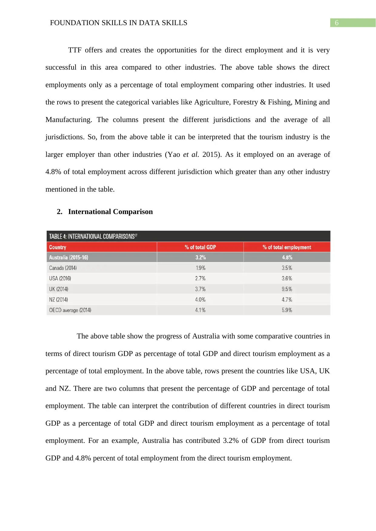
TTF offers and creates the opportunities for the direct employment and it is very
successful in this area compared to other industries. The above table shows the direct
employments only as a percentage of total employment comparing other industries. It used
the rows to present the categorical variables like Agriculture, Forestry & Fishing, Mining and
Manufacturing. The columns present the different jurisdictions and the average of all
jurisdictions. So, from the above table it can be interpreted that the tourism industry is the
larger employer than other industries (Yao et al. 2015). As it employed on an average of
4.8% of total employment across different jurisdiction which greater than any other industry
mentioned in the table.
2. International Comparison
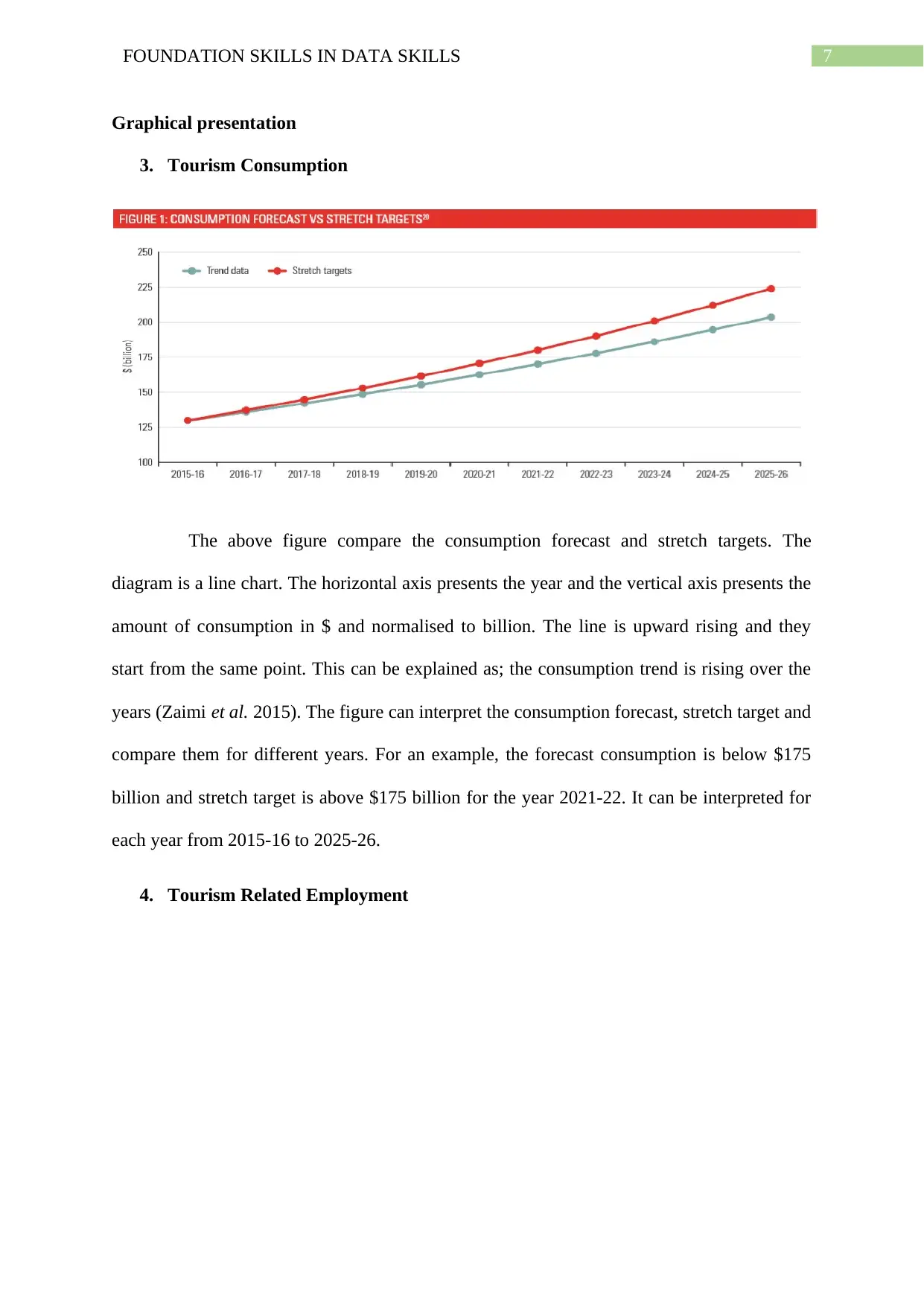
The above table show the progress of Australia with some comparative countries in
terms of direct tourism GDP as percentage of total GDP and direct tourism employment as a
percentage of total employment. In the above table, rows present the countries like USA, UK
and NZ. There are two columns that present the percentage of GDP and percentage of total
employment. The table can interpret the contribution of different countries in direct tourism
GDP as a percentage of total GDP and direct tourism employment as a percentage of total
employment. For an example, Australia has contributed 3.2% of GDP from direct tourism
GDP and 4.8% percent of total employment from the direct tourism employment.
Paraphrase This Document
Need a fresh take? Get an instant paraphrase of this document with our AI Paraphraser
7FOUNDATION SKILLS IN DATA SKILLS
Graphical presentation
3. Tourism Consumption
The above figure compare the consumption forecast and stretch targets. The
diagram is a line chart. The horizontal axis presents the year and the vertical axis presents the
amount of consumption in $ and normalised to billion. The line is upward rising and they
start from the same point. This can be explained as; the consumption trend is rising over the
years (Zaimi et al. 2015). The figure can interpret the consumption forecast, stretch target and
compare them for different years. For an example, the forecast consumption is below $175
billion and stretch target is above $175 billion for the year 2021-22. It can be interpreted for
each year from 2015-16 to 2025-26.
4. Tourism Related Employment
8FOUNDATION SKILLS IN DATA SKILLS
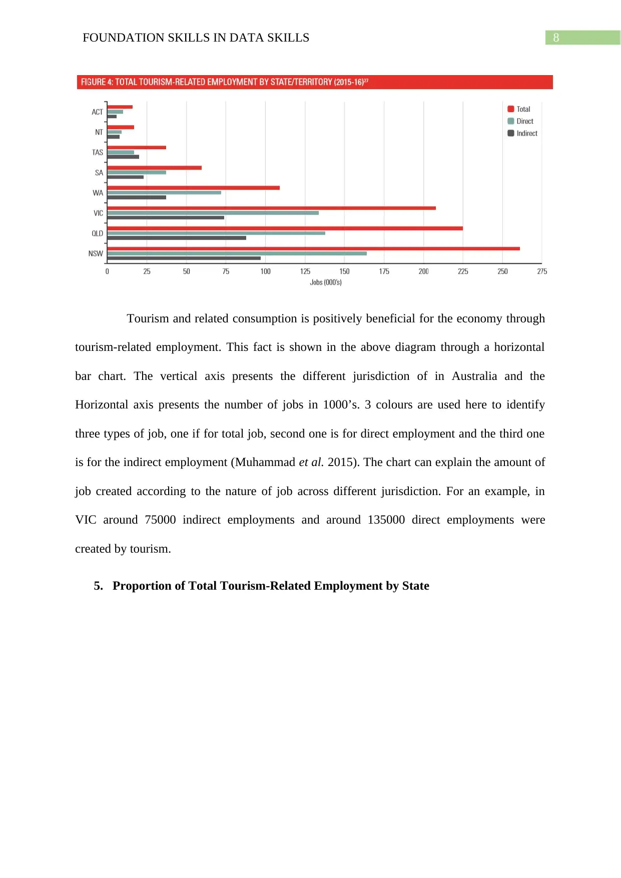
Tourism and related consumption is positively beneficial for the economy through
tourism-related employment. This fact is shown in the above diagram through a horizontal
bar chart. The vertical axis presents the different jurisdiction of in Australia and the
Horizontal axis presents the number of jobs in 1000’s. 3 colours are used here to identify
three types of job, one if for total job, second one is for direct employment and the third one
is for the indirect employment (Muhammad et al. 2015). The chart can explain the amount of
job created according to the nature of job across different jurisdiction. For an example, in
VIC around 75000 indirect employments and around 135000 direct employments were
created by tourism.
5. Proportion of Total Tourism-Related Employment by State
⊘ This is a preview!⊘
Do you want full access?
Subscribe today to unlock all pages.

Trusted by 1+ million students worldwide
9FOUNDATION SKILLS IN DATA SKILLS
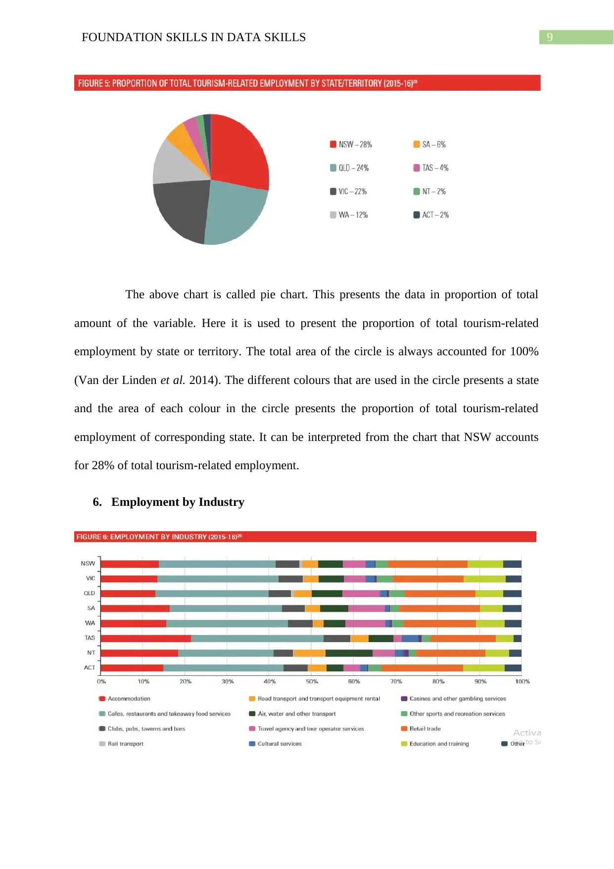
The above chart is called pie chart. This presents the data in proportion of total
amount of the variable. Here it is used to present the proportion of total tourism-related
employment by state or territory. The total area of the circle is always accounted for 100%
(Van der Linden et al. 2014). The different colours that are used in the circle presents a state
and the area of each colour in the circle presents the proportion of total tourism-related
employment of corresponding state. It can be interpreted from the chart that NSW accounts
for 28% of total tourism-related employment.
6. Employment by Industry
Paraphrase This Document
Need a fresh take? Get an instant paraphrase of this document with our AI Paraphraser
10FOUNDATION SKILLS IN DATA SKILLS
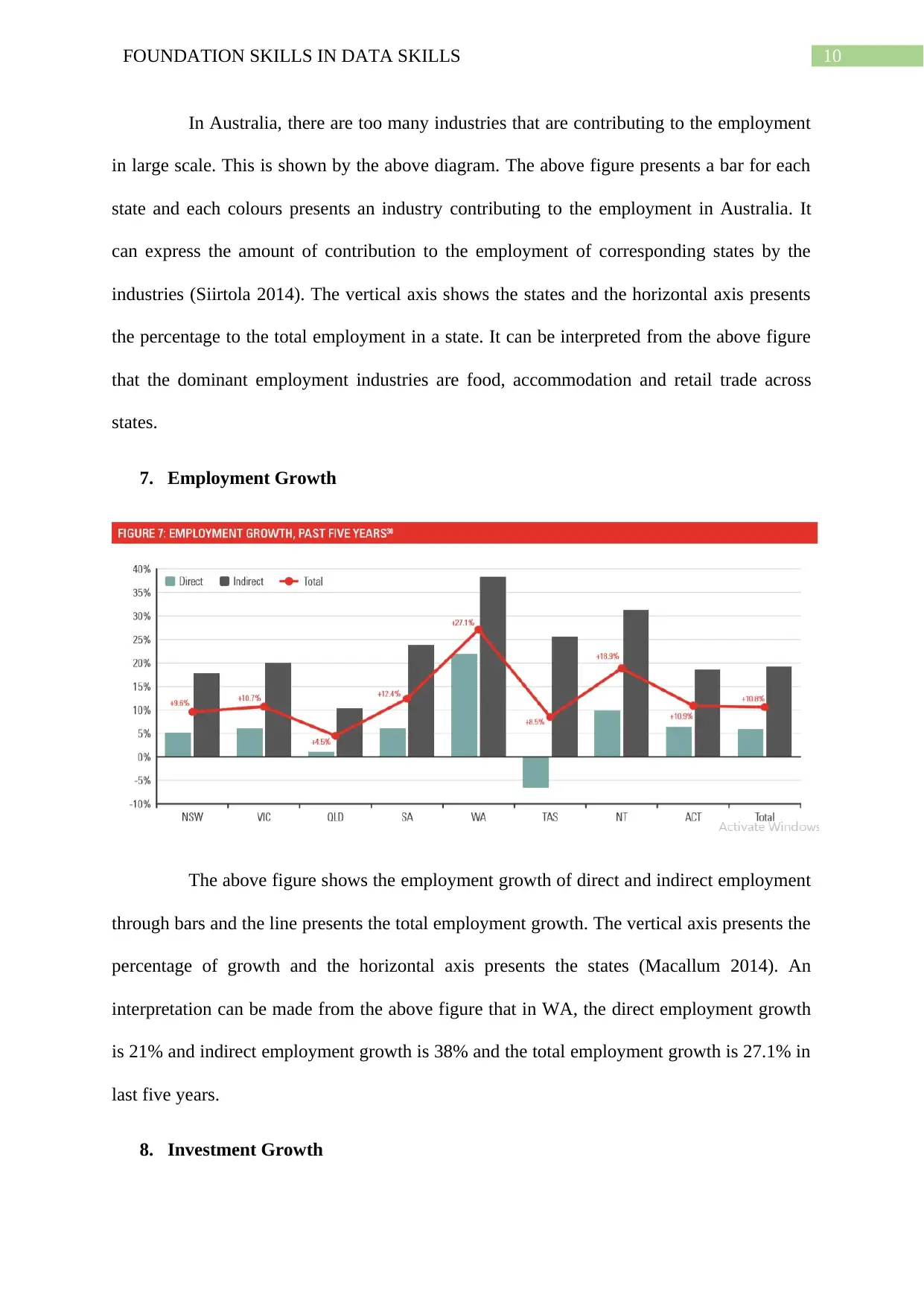
In Australia, there are too many industries that are contributing to the employment
in large scale. This is shown by the above diagram. The above figure presents a bar for each
state and each colours presents an industry contributing to the employment in Australia. It
can express the amount of contribution to the employment of corresponding states by the
industries (Siirtola 2014). The vertical axis shows the states and the horizontal axis presents
the percentage to the total employment in a state. It can be interpreted from the above figure
that the dominant employment industries are food, accommodation and retail trade across
states.
7. Employment Growth
The above figure shows the employment growth of direct and indirect employment
through bars and the line presents the total employment growth. The vertical axis presents the
percentage of growth and the horizontal axis presents the states (Macallum 2014). An
interpretation can be made from the above figure that in WA, the direct employment growth
is 21% and indirect employment growth is 38% and the total employment growth is 27.1% in
last five years.
8. Investment Growth
11FOUNDATION SKILLS IN DATA SKILLS
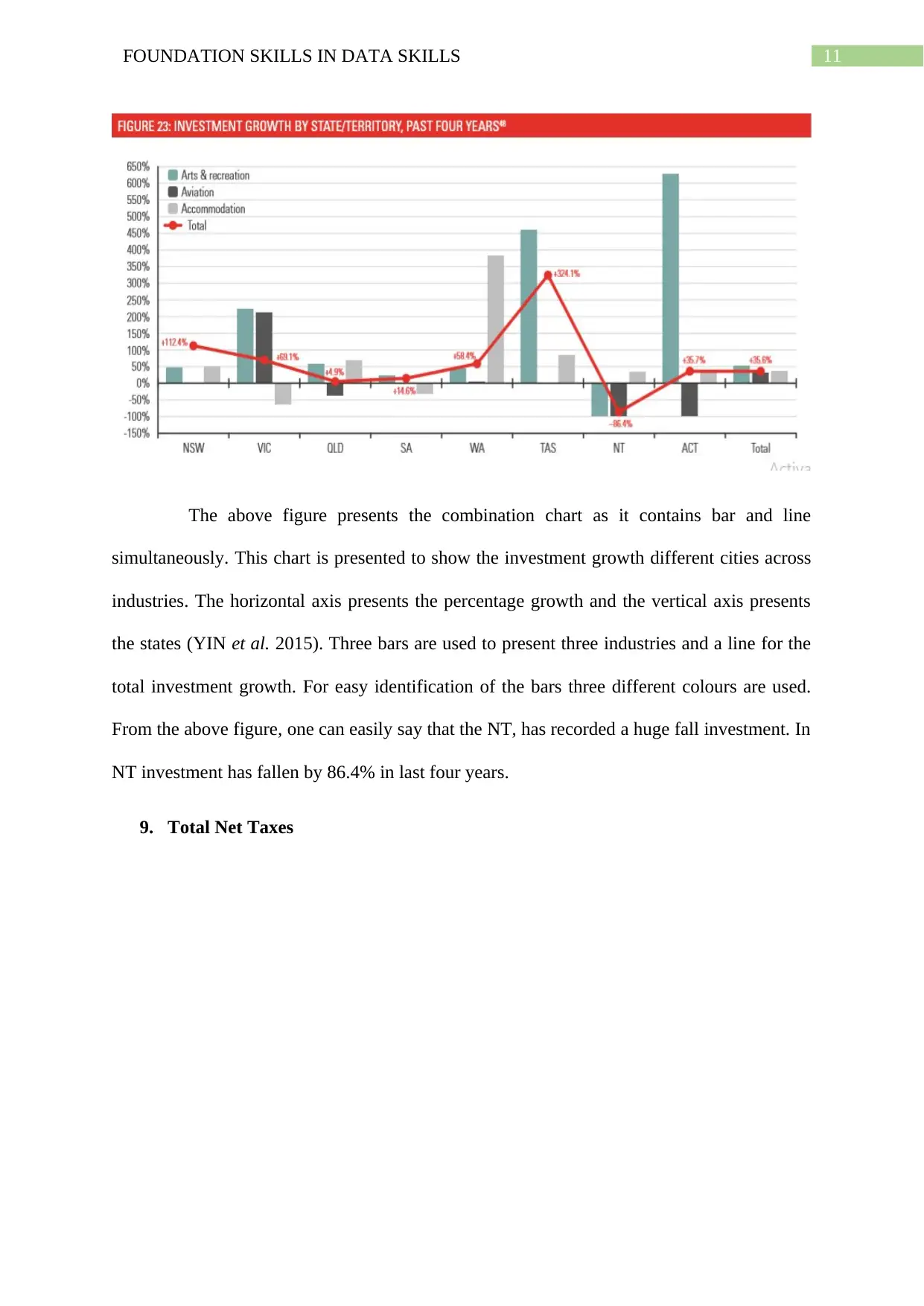
The above figure presents the combination chart as it contains bar and line
simultaneously. This chart is presented to show the investment growth different cities across
industries. The horizontal axis presents the percentage growth and the vertical axis presents
the states (YIN et al. 2015). Three bars are used to present three industries and a line for the
total investment growth. For easy identification of the bars three different colours are used.
From the above figure, one can easily say that the NT, has recorded a huge fall investment. In
NT investment has fallen by 86.4% in last four years.
9. Total Net Taxes
⊘ This is a preview!⊘
Do you want full access?
Subscribe today to unlock all pages.

Trusted by 1+ million students worldwide
1 out of 18
Related Documents
Your All-in-One AI-Powered Toolkit for Academic Success.
+13062052269
info@desklib.com
Available 24*7 on WhatsApp / Email
![[object Object]](/_next/static/media/star-bottom.7253800d.svg)
Unlock your academic potential
Copyright © 2020–2025 A2Z Services. All Rights Reserved. Developed and managed by ZUCOL.


