ABISD1801 HCI Design Brief: ePortfolio - User Testing and Design
VerifiedAdded on 2022/11/25
|15
|3306
|58
Report
AI Summary
This report details an HCI design brief for an ePortfolio, focusing on the development of a mobile application, FLYBRISSE, aimed at enhancing the user experience within the Brisbane Airport (BNE). The assignment includes a comprehensive analysis of user involvement, emphasizing the importance of a user-centered design approach based on the Kino Model. It delves into the application's features, targeting various user groups such as economy fliers, BNE staff, and students. The report outlines the testing methodology, including exploratory, assessment, and validation phases, with detailed test plans, participant characteristics, and data collection methods. It also provides a thorough discussion of visual design elements, prototype development, accessibility considerations, and emerging technologies, culminating in findings, recommendations, and an appendix containing relevant consent forms. The primary goal of the project is to improve the user experience and reduce reliance on human assistance at the airport, making it a valuable resource for students studying HCI and related fields.

HCI Design Brief - ePortfolio
Paraphrase This Document
Need a fresh take? Get an instant paraphrase of this document with our AI Paraphraser
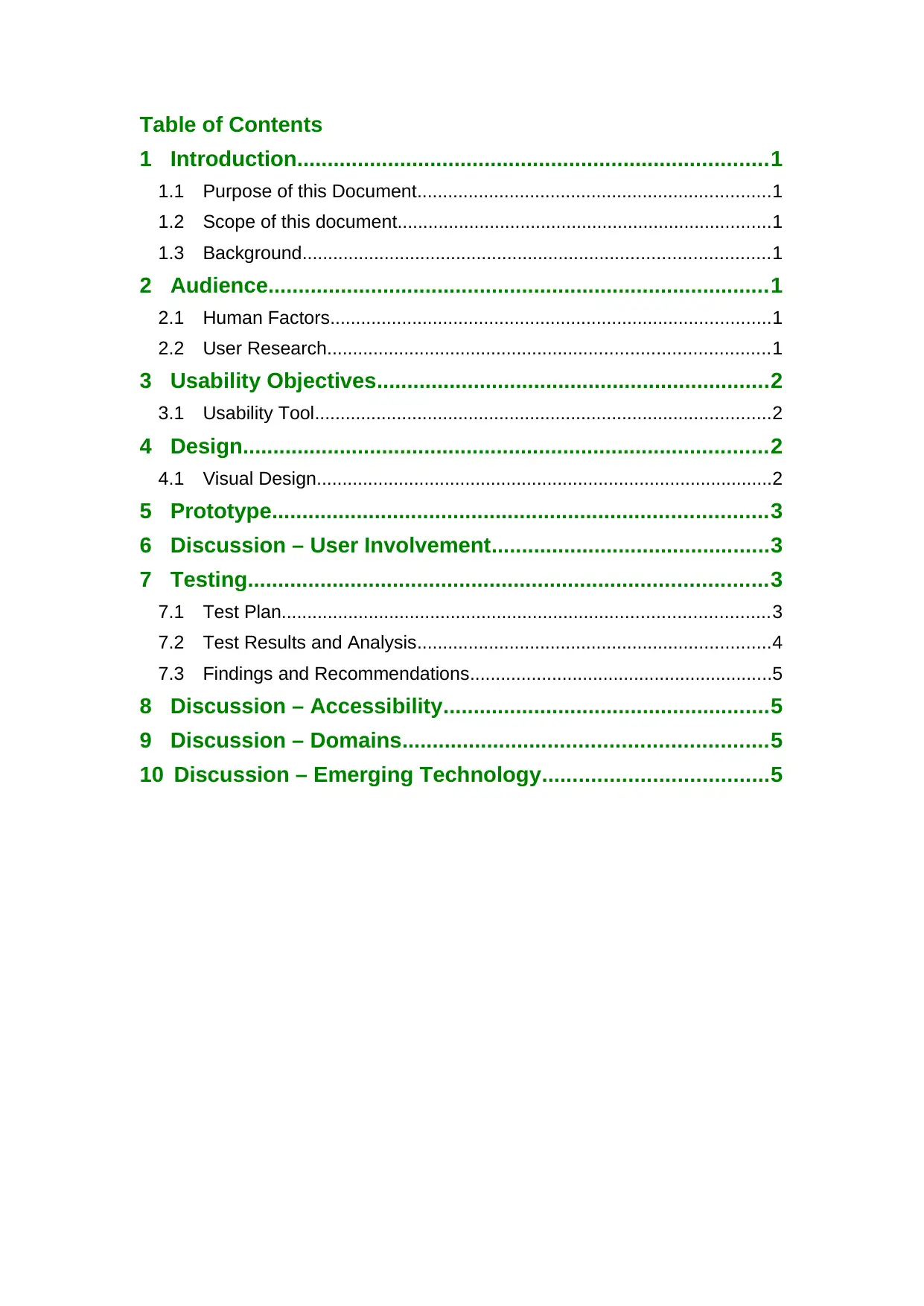
Table of Contents
1 Introduction..............................................................................1
1.1 Purpose of this Document.....................................................................1
1.2 Scope of this document.........................................................................1
1.3 Background...........................................................................................1
2 Audience...................................................................................1
2.1 Human Factors......................................................................................1
2.2 User Research......................................................................................1
3 Usability Objectives.................................................................2
3.1 Usability Tool.........................................................................................2
4 Design.......................................................................................2
4.1 Visual Design.........................................................................................2
5 Prototype..................................................................................3
6 Discussion – User Involvement..............................................3
7 Testing......................................................................................3
7.1 Test Plan...............................................................................................3
7.2 Test Results and Analysis.....................................................................4
7.3 Findings and Recommendations...........................................................5
8 Discussion – Accessibility......................................................5
9 Discussion – Domains............................................................5
10 Discussion – Emerging Technology.....................................5
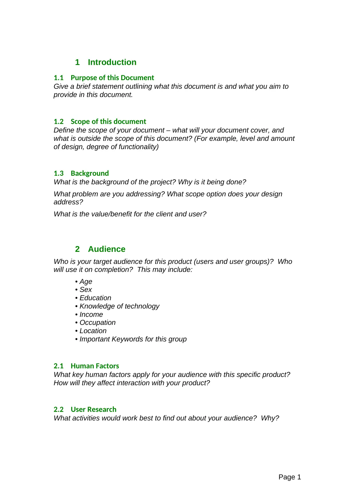
1 Introduction
1.1 Purpose of this Document
Give a brief statement outlining what this document is and what you aim to
provide in this document.
1.2 Scope of this document
Define the scope of your document – what will your document cover, and
what is outside the scope of this document? (For example, level and amount
of design, degree of functionality)
1.3 Background
What is the background of the project? Why is it being done?
What problem are you addressing? What scope option does your design
address?
What is the value/benefit for the client and user?
2 Audience
Who is your target audience for this product (users and user groups)? Who
will use it on completion? This may include:
• Age
• Sex
• Education
• Knowledge of technology
• Income
• Occupation
• Location
• Important Keywords for this group
2.1 Human Factors
What key human factors apply for your audience with this specific product?
How will they affect interaction with your product?
2.2 User Research
What activities would work best to find out about your audience? Why?
Page 1
⊘ This is a preview!⊘
Do you want full access?
Subscribe today to unlock all pages.

Trusted by 1+ million students worldwide
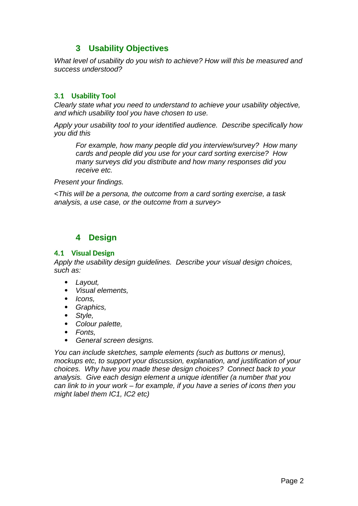
3 Usability Objectives
What level of usability do you wish to achieve? How will this be measured and
success understood?
3.1 Usability Tool
Clearly state what you need to understand to achieve your usability objective,
and which usability tool you have chosen to use.
Apply your usability tool to your identified audience. Describe specifically how
you did this
For example, how many people did you interview/survey? How many
cards and people did you use for your card sorting exercise? How
many surveys did you distribute and how many responses did you
receive etc.
Present your findings.
<This will be a persona, the outcome from a card sorting exercise, a task
analysis, a use case, or the outcome from a survey>
4 Design
4.1 Visual Design
Apply the usability design guidelines. Describe your visual design choices,
such as:
Layout,
Visual elements,
Icons,
Graphics,
Style,
Colour palette,
Fonts,
General screen designs.
You can include sketches, sample elements (such as buttons or menus),
mockups etc, to support your discussion, explanation, and justification of your
choices. Why have you made these design choices? Connect back to your
analysis. Give each design element a unique identifier (a number that you
can link to in your work – for example, if you have a series of icons then you
might label them IC1, IC2 etc)
Page 2
Paraphrase This Document
Need a fresh take? Get an instant paraphrase of this document with our AI Paraphraser
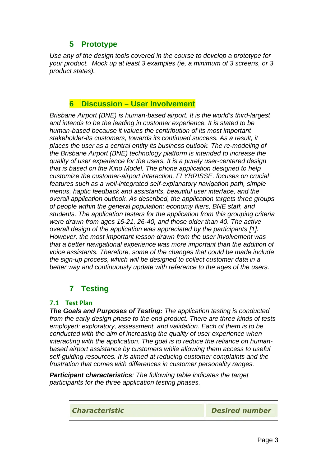
5 Prototype
Use any of the design tools covered in the course to develop a prototype for
your product. Mock up at least 3 examples (ie, a minimum of 3 screens, or 3
product states).
6 Discussion – User Involvement
Brisbane Airport (BNE) is human-based airport. It is the world’s third-largest
and intends to be the leading in customer experience. It is stated to be
human-based because it values the contribution of its most important
stakeholder-its customers, towards its continued success. As a result, it
places the user as a central entity its business outlook. The re-modeling of
the Brisbane Airport (BNE) technology platform is intended to increase the
quality of user experience for the users. It is a purely user-centered design
that is based on the Kino Model. The phone application designed to help
customize the customer-airport interaction, FLYBRISSE, focuses on crucial
features such as a well-integrated self-explanatory navigation path, simple
menus, haptic feedback and assistants, beautiful user interface, and the
overall application outlook. As described, the application targets three groups
of people within the general population: economy fliers, BNE staff, and
students. The application testers for the application from this grouping criteria
were drawn from ages 16-21, 26-40, and those older than 40. The active
overall design of the application was appreciated by the participants [1].
However, the most important lesson drawn from the user involvement was
that a better navigational experience was more important than the addition of
voice assistants. Therefore, some of the changes that could be made include
the sign-up process, which will be designed to collect customer data in a
better way and continuously update with reference to the ages of the users.
7 Testing
7.1 Test Plan
The Goals and Purposes of Testing: The application testing is conducted
from the early design phase to the end product. There are three kinds of tests
employed: exploratory, assessment, and validation. Each of them is to be
conducted with the aim of increasing the quality of user experience when
interacting with the application. The goal is to reduce the reliance on human-
based airport assistance by customers while allowing them access to useful
self-guiding resources. It is aimed at reducing customer complaints and the
frustration that comes with differences in customer personality ranges.
Participant characteristics: The following table indicates the target
participants for the three application testing phases.
Characteristic Desired number
Page 3
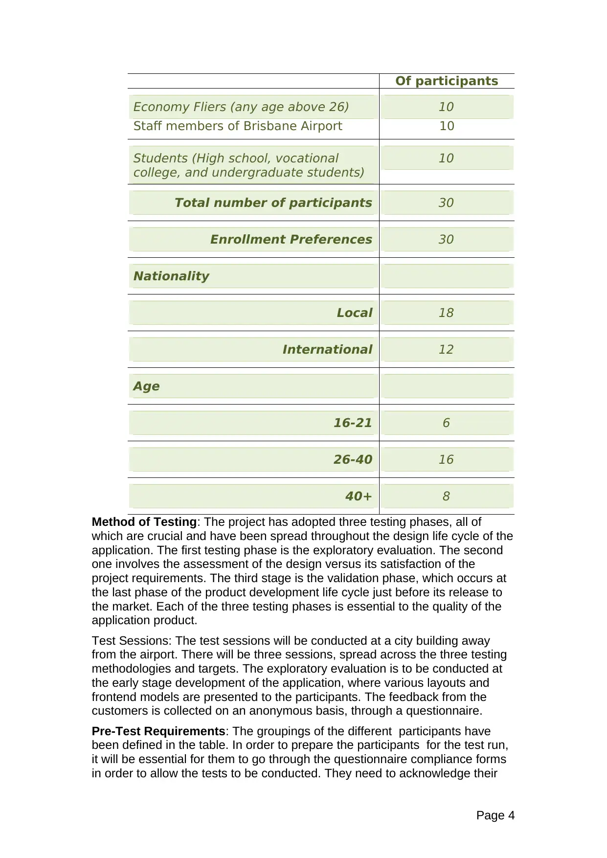
Of participants
Economy Fliers (any age above 26)
Staff members of Brisbane Airport
10
10
Students (High school, vocational
college, and undergraduate students)
10
Total number of participants 30
Enrollment Preferences 30
Nationality
Local 18
International 12
Age
16-21 6
26-40 16
40+ 8
Method of Testing: The project has adopted three testing phases, all of
which are crucial and have been spread throughout the design life cycle of the
application. The first testing phase is the exploratory evaluation. The second
one involves the assessment of the design versus its satisfaction of the
project requirements. The third stage is the validation phase, which occurs at
the last phase of the product development life cycle just before its release to
the market. Each of the three testing phases is essential to the quality of the
application product.
Test Sessions: The test sessions will be conducted at a city building away
from the airport. There will be three sessions, spread across the three testing
methodologies and targets. The exploratory evaluation is to be conducted at
the early stage development of the application, where various layouts and
frontend models are presented to the participants. The feedback from the
customers is collected on an anonymous basis, through a questionnaire.
Pre-Test Requirements: The groupings of the different participants have
been defined in the table. In order to prepare the participants for the test run,
it will be essential for them to go through the questionnaire compliance forms
in order to allow the tests to be conducted. They need to acknowledge their
Page 4
⊘ This is a preview!⊘
Do you want full access?
Subscribe today to unlock all pages.

Trusted by 1+ million students worldwide
participation with full consciousness. Also, they will be required to go through
any rules that may be existent for each of the test settings.
Each session will be designed to last a maximum of thirty minutes with a
possible extension of an hour to allow for the possibility of debriefing.
Interviews may also take place for the individuals who will be willing to
volunteer for face-to-face interaction with the test conduction team.
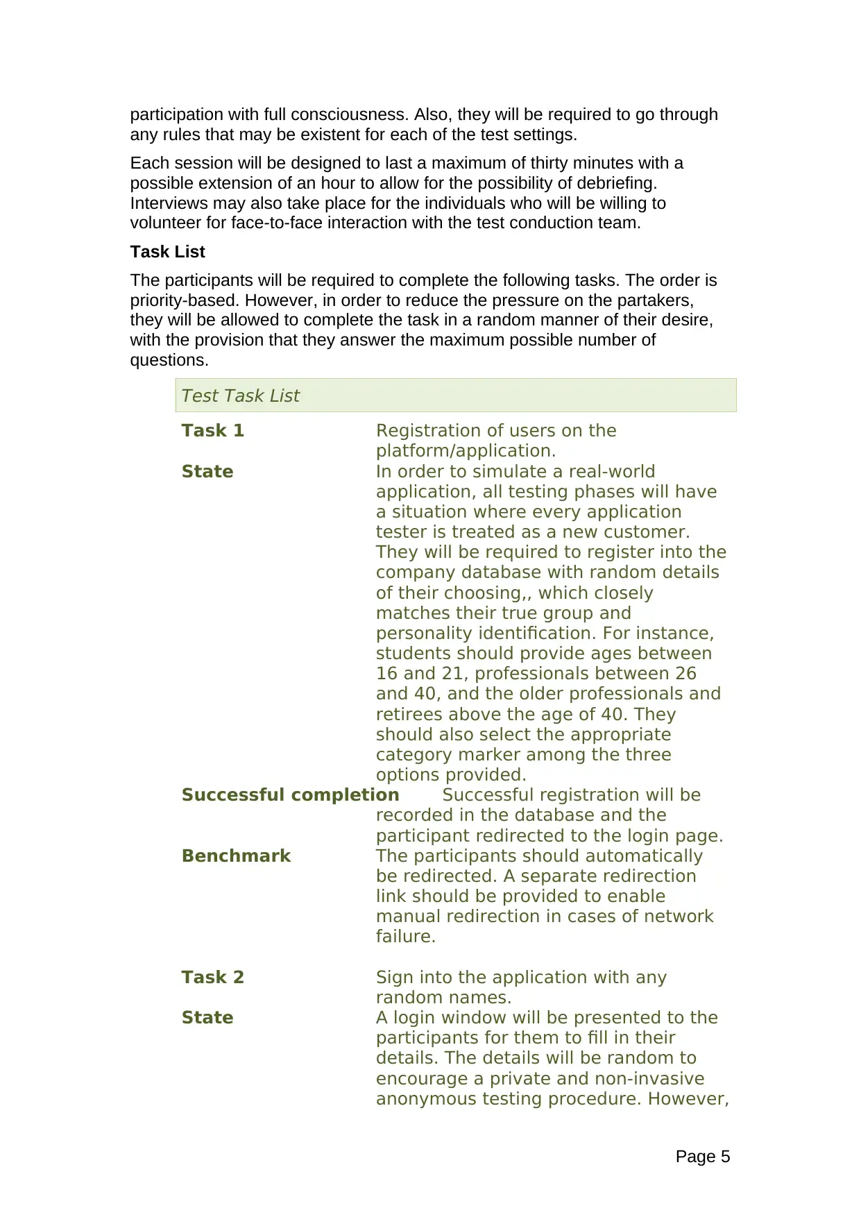
Task List
The participants will be required to complete the following tasks. The order is
priority-based. However, in order to reduce the pressure on the partakers,
they will be allowed to complete the task in a random manner of their desire,
with the provision that they answer the maximum possible number of
questions.
Test Task List
Task 1 Registration of users on the
platform/application.
State In order to simulate a real-world
application, all testing phases will have
a situation where every application
tester is treated as a new customer.
They will be required to register into the
company database with random details
of their choosing,, which closely
matches their true group and
personality identification. For instance,
students should provide ages between
16 and 21, professionals between 26
and 40, and the older professionals and
retirees above the age of 40. They
should also select the appropriate
category marker among the three
options provided.
Successful completion Successful registration will be
recorded in the database and the
participant redirected to the login page.
Benchmark The participants should automatically
be redirected. A separate redirection
link should be provided to enable
manual redirection in cases of network
failure.
Task 2 Sign into the application with any
random names.
State A login window will be presented to the
participants for them to fill in their
details. The details will be random to
encourage a private and non-invasive
anonymous testing procedure. However,
Page 5
Paraphrase This Document
Need a fresh take? Get an instant paraphrase of this document with our AI Paraphraser
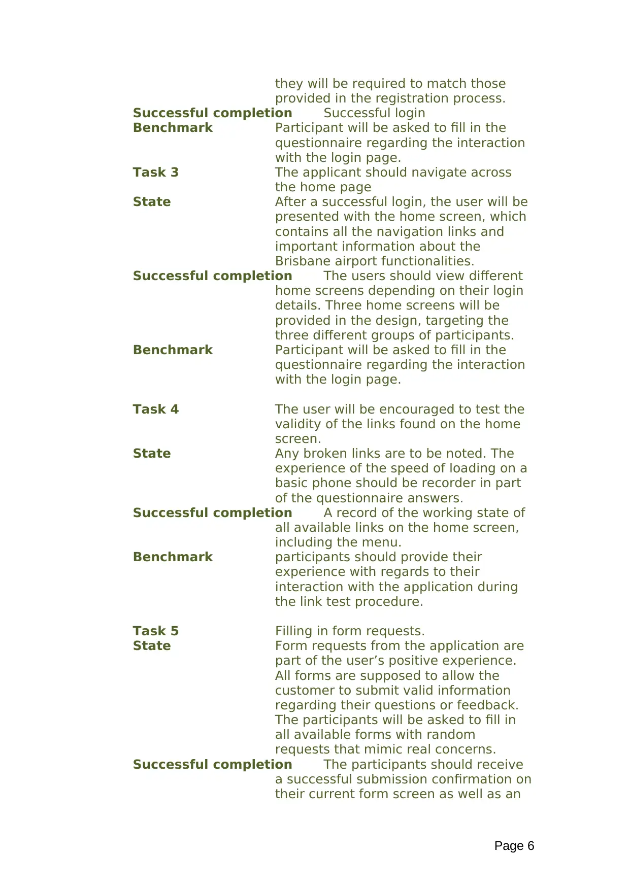
they will be required to match those
provided in the registration process.
Successful completion Successful login
Benchmark Participant will be asked to fill in the
questionnaire regarding the interaction
with the login page.
Task 3 The applicant should navigate across
the home page
State After a successful login, the user will be
presented with the home screen, which
contains all the navigation links and
important information about the
Brisbane airport functionalities.
Successful completion The users should view different
home screens depending on their login
details. Three home screens will be
provided in the design, targeting the
three different groups of participants.
Benchmark Participant will be asked to fill in the
questionnaire regarding the interaction
with the login page.
Task 4 The user will be encouraged to test the
validity of the links found on the home
screen.
State Any broken links are to be noted. The
experience of the speed of loading on a
basic phone should be recorder in part
of the questionnaire answers.
Successful completion A record of the working state of
all available links on the home screen,
including the menu.
Benchmark participants should provide their
experience with regards to their
interaction with the application during
the link test procedure.
Task 5 Filling in form requests.
State Form requests from the application are
part of the user’s positive experience.
All forms are supposed to allow the
customer to submit valid information
regarding their questions or feedback.
The participants will be asked to fill in
all available forms with random
requests that mimic real concerns.
Successful completion The participants should receive
a successful submission confirmation on
their current form screen as well as an
Page 6
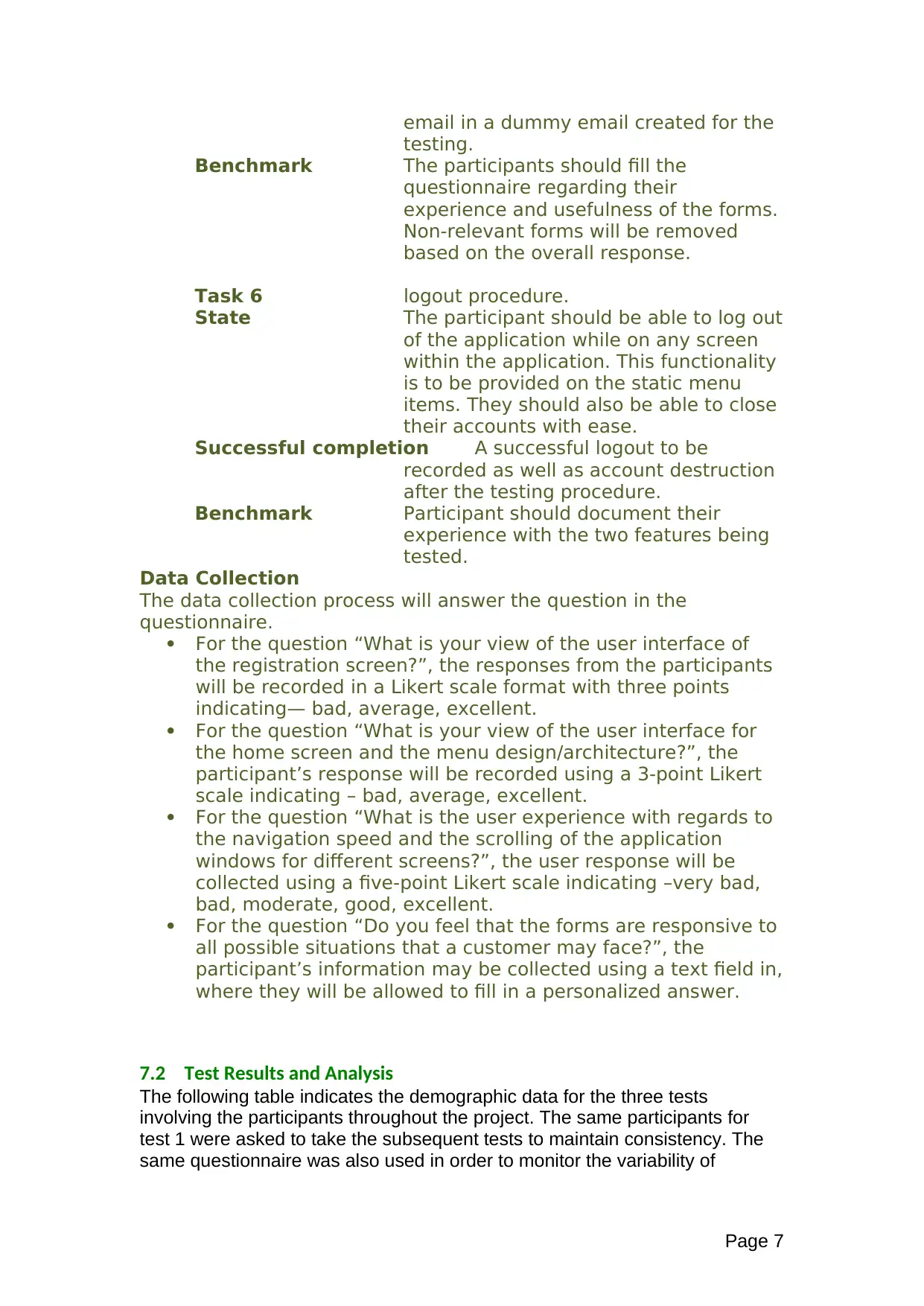
email in a dummy email created for the
testing.
Benchmark The participants should fill the
questionnaire regarding their
experience and usefulness of the forms.
Non-relevant forms will be removed
based on the overall response.
Task 6 logout procedure.
State The participant should be able to log out
of the application while on any screen
within the application. This functionality
is to be provided on the static menu
items. They should also be able to close
their accounts with ease.
Successful completion A successful logout to be
recorded as well as account destruction
after the testing procedure.
Benchmark Participant should document their
experience with the two features being
tested.
Data Collection
The data collection process will answer the question in the
questionnaire.
For the question “What is your view of the user interface of
the registration screen?”, the responses from the participants
will be recorded in a Likert scale format with three points
indicating— bad, average, excellent.
For the question “What is your view of the user interface for
the home screen and the menu design/architecture?”, the
participant’s response will be recorded using a 3-point Likert
scale indicating – bad, average, excellent.
For the question “What is the user experience with regards to
the navigation speed and the scrolling of the application
windows for different screens?”, the user response will be
collected using a five-point Likert scale indicating –very bad,
bad, moderate, good, excellent.
For the question “Do you feel that the forms are responsive to
all possible situations that a customer may face?”, the
participant’s information may be collected using a text field in,
where they will be allowed to fill in a personalized answer.
7.2 Test Results and Analysis
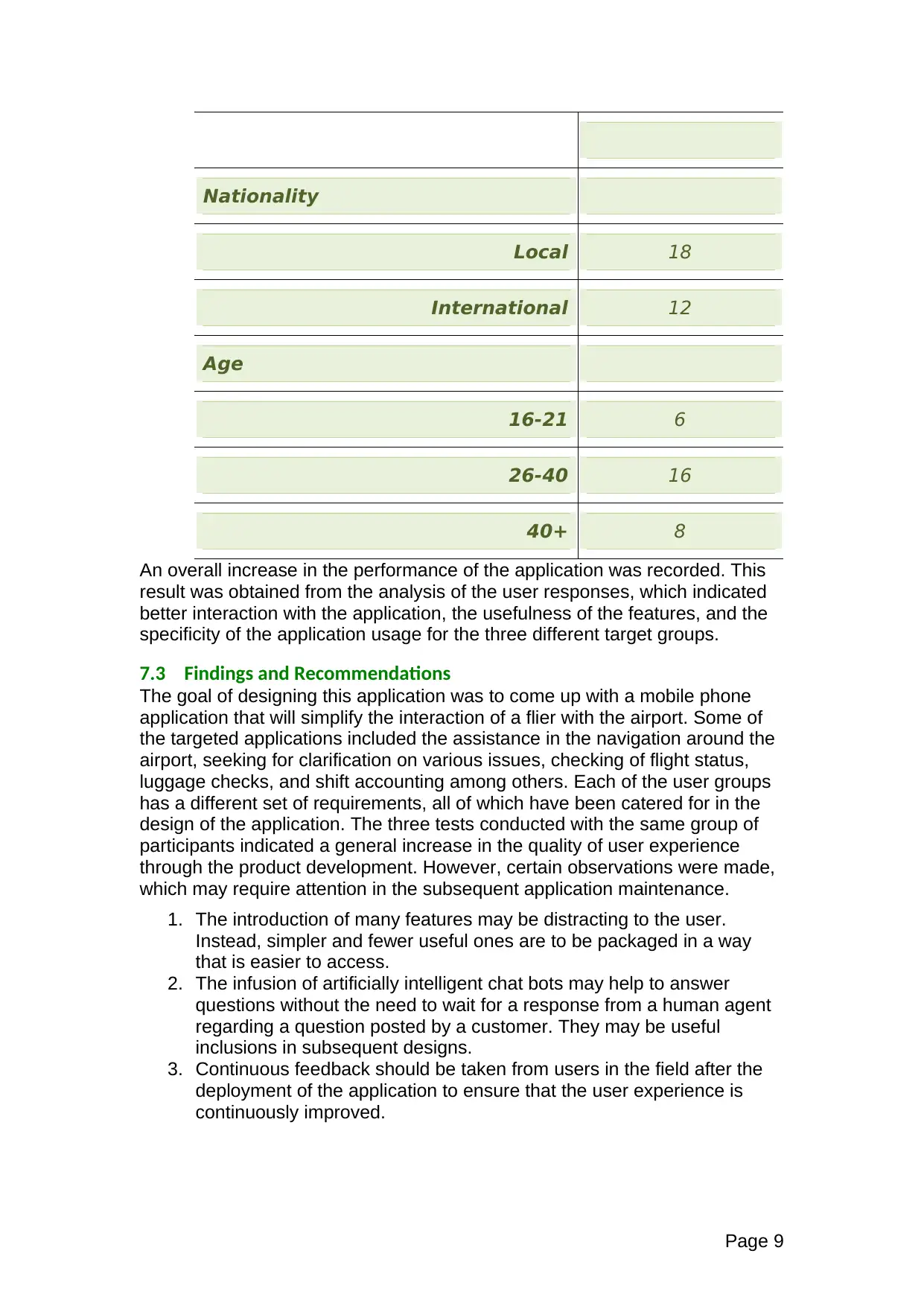
The following table indicates the demographic data for the three tests
involving the participants throughout the project. The same participants for
test 1 were asked to take the subsequent tests to maintain consistency. The
same questionnaire was also used in order to monitor the variability of
Page 7
⊘ This is a preview!⊘
Do you want full access?
Subscribe today to unlock all pages.

Trusted by 1+ million students worldwide
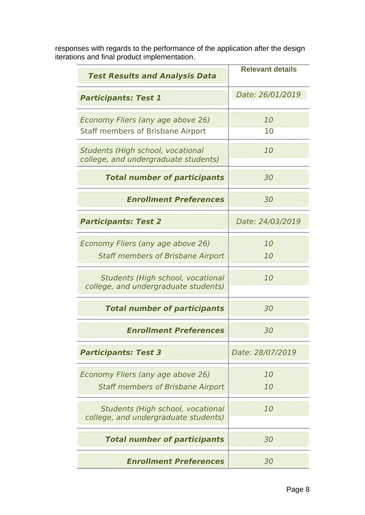
responses with regards to the performance of the application after the design
iterations and final product implementation.
Test Results and Analysis Data Relevant details
Participants: Test 1 Date: 26/01/2019
Economy Fliers (any age above 26)
Staff members of Brisbane Airport
10
10
Students (High school, vocational
college, and undergraduate students)
10
Total number of participants 30
Enrollment Preferences 30
Participants: Test 2 Date: 24/03/2019
Economy Fliers (any age above 26)
Staff members of Brisbane Airport
10
10
Students (High school, vocational
college, and undergraduate students)
10
Total number of participants 30
Enrollment Preferences 30
Participants: Test 3 Date: 28/07/2019
Economy Fliers (any age above 26)
Staff members of Brisbane Airport
10
10
Students (High school, vocational
college, and undergraduate students)
10
Total number of participants 30
Enrollment Preferences 30
Page 8
Paraphrase This Document
Need a fresh take? Get an instant paraphrase of this document with our AI Paraphraser
Nationality
Local 18
International 12
Age
16-21 6
26-40 16
40+ 8
An overall increase in the performance of the application was recorded. This
result was obtained from the analysis of the user responses, which indicated
better interaction with the application, the usefulness of the features, and the
specificity of the application usage for the three different target groups.
7.3 Findings and Recommendations
The goal of designing this application was to come up with a mobile phone
application that will simplify the interaction of a flier with the airport. Some of
the targeted applications included the assistance in the navigation around the
airport, seeking for clarification on various issues, checking of flight status,
luggage checks, and shift accounting among others. Each of the user groups
has a different set of requirements, all of which have been catered for in the
design of the application. The three tests conducted with the same group of
participants indicated a general increase in the quality of user experience
through the product development. However, certain observations were made,
which may require attention in the subsequent application maintenance.
1. The introduction of many features may be distracting to the user.
Instead, simpler and fewer useful ones are to be packaged in a way
that is easier to access.
2. The infusion of artificially intelligent chat bots may help to answer
questions without the need to wait for a response from a human agent
regarding a question posted by a customer. They may be useful
inclusions in subsequent designs.
3. Continuous feedback should be taken from users in the field after the
deployment of the application to ensure that the user experience is
continuously improved.
Page 9
8 Discussion – Accessibility
The application is primarily meant to be used on a smartphone. It is packaged with a
voice assistant, meaning that it may be used by people with eye problems in low light
capacities or other conditions [2]. It may be accessed both online and offline, making
it useful as a travel companion.
9 Discussion – Domains
This application is absolutely domain-specific. It is only meant to be used as a
smartphone application. The reason for the suitability of this domain is that it
is a mobile device, which provides flexibility in usage [3].
10 Discussion – Emerging Technology
The most disruptive technology today is artificial intelligence. Its application in
business and non-business situations improves the quality of operation and
efficiency. It may be applied in the continuous evaluation of user feedback to
provide insights on better design methodologies or in the chat bot to learn
from experience and give more useful feedbacks to customers over with more
data usage experience.
Page 10
⊘ This is a preview!⊘
Do you want full access?
Subscribe today to unlock all pages.

Trusted by 1+ million students worldwide
1 out of 15
Related Documents
Your All-in-One AI-Powered Toolkit for Academic Success.
+13062052269
info@desklib.com
Available 24*7 on WhatsApp / Email
![[object Object]](/_next/static/media/star-bottom.7253800d.svg)
Unlock your academic potential
Copyright © 2020–2025 A2Z Services. All Rights Reserved. Developed and managed by ZUCOL.


