Quantitative Analysis: Summary Statistics, Histograms, Scatterplots, and Correlations
Added on 2023-01-19
12 Pages2069 Words27 Views
Quantitative analysis
Student name:
Instructor:
1 | P a g e
Student name:
Instructor:
1 | P a g e
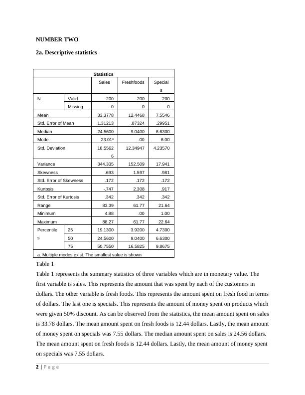
NUMBER TWO
2a. Descriptive statistics
Statistics
Sales Freshfoods Special
s
N Valid 200 200 200
Missing 0 0 0
Mean 33.3778 12.4468 7.5546
Std. Error of Mean 1.31213 .87324 .29951
Median 24.5600 9.0400 6.6300
Mode 23.01a .00 6.00
Std. Deviation 18.5562
6
12.34947 4.23570
Variance 344.335 152.509 17.941
Skewness .693 1.597 .981
Std. Error of Skewness .172 .172 .172
Kurtosis -.747 2.308 .917
Std. Error of Kurtosis .342 .342 .342
Range 83.39 61.77 21.64
Minimum 4.88 .00 1.00
Maximum 88.27 61.77 22.64
Percentile
s
25 19.1300 3.9200 4.7300
50 24.5600 9.0400 6.6300
75 50.7550 16.5825 9.8675
a. Multiple modes exist. The smallest value is shown
Table 1
Table 1 represents the summary statistics of three variables which are in monetary value. The
first variable is sales. This represents the amount that was spent by each of the customers in
dollars. The other variable is fresh foods. This represents the amount spent on fresh food in terms
of dollars. The last one is specials. This represents the amount of money spent on products which
were given 50% discount. As can be observed from the statistics, the mean amount spent on sales
is 33.78 dollars. The mean amount spent on fresh foods is 12.44 dollars. Lastly, the mean amount
of money spent on specials was 7.55 dollars. The median amount spent on sales is 24.56 dollars.
The mean amount spent on fresh foods is 12.44 dollars. Lastly, the mean amount of money spent
on specials was 7.55 dollars.
2 | P a g e
2b. Histogram and ogive curve
0-5
10-15
20-25
30-35
40-45
50-55
60-65
70-75
80-85
90-95
100-105
110-115
0
5
10
15
20
25
30
35
40
45
50
Histogram - store 2
Sales intervals
Frequency
Figure 1
The above figure is of a histogram representing the distribution of amount spent on sales in
dollars. It can be seen that the distribution depicts two peaks. The first high peak is between 10
and 25 dollars. This indicates that most customers spent between 10 to 25 dollars. The other peak
was between 50 dollars and 65 dollars. This indicates that most customers spent between 50 to
65 dollars. It can also be observed that very few people spent more than 65 dollars and less than
10 dollars on sales.
5
15
25
35
45
55
65
75
85
95
105
115
0.00%
10.00%
20.00%
30.00%
40.00%
50.00%
60.00%
70.00%
80.00%
90.00%
100.00%
Ogive curve-store 2
upper limits
Cummulative frequency
Figure 2
3 | P a g e
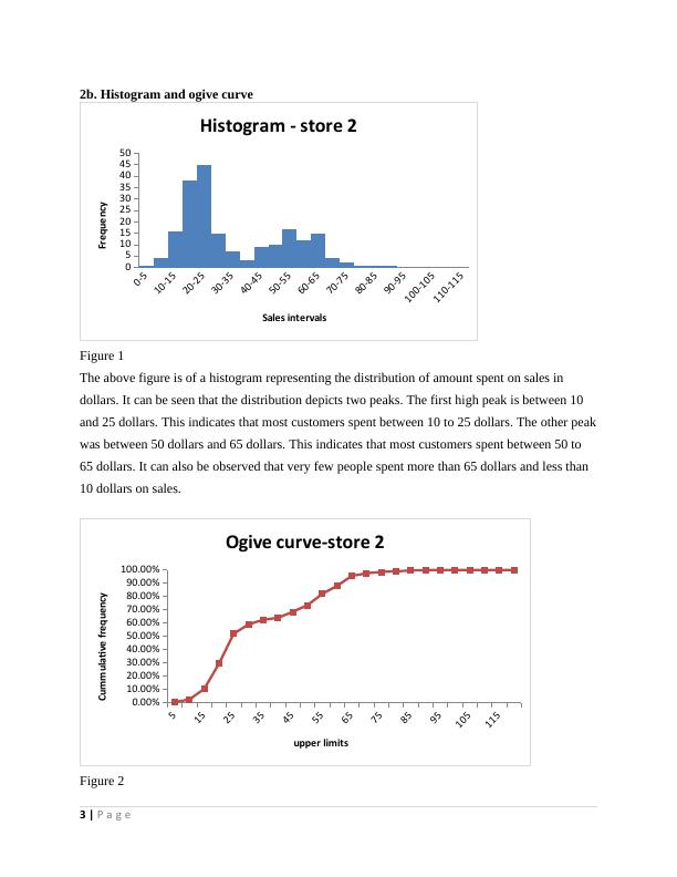
Figure 2 is of an ogive curve also known as the histogram curve. It gives the linear trend of the
cumulative frequency of the amount spent on sales. It is different from the histogram in that it
plots the cumulative data points and not the data points themselves. It can be observed that it
rises steadily from bottom left to right then stabilizes around 90% of the cumulative frequency.
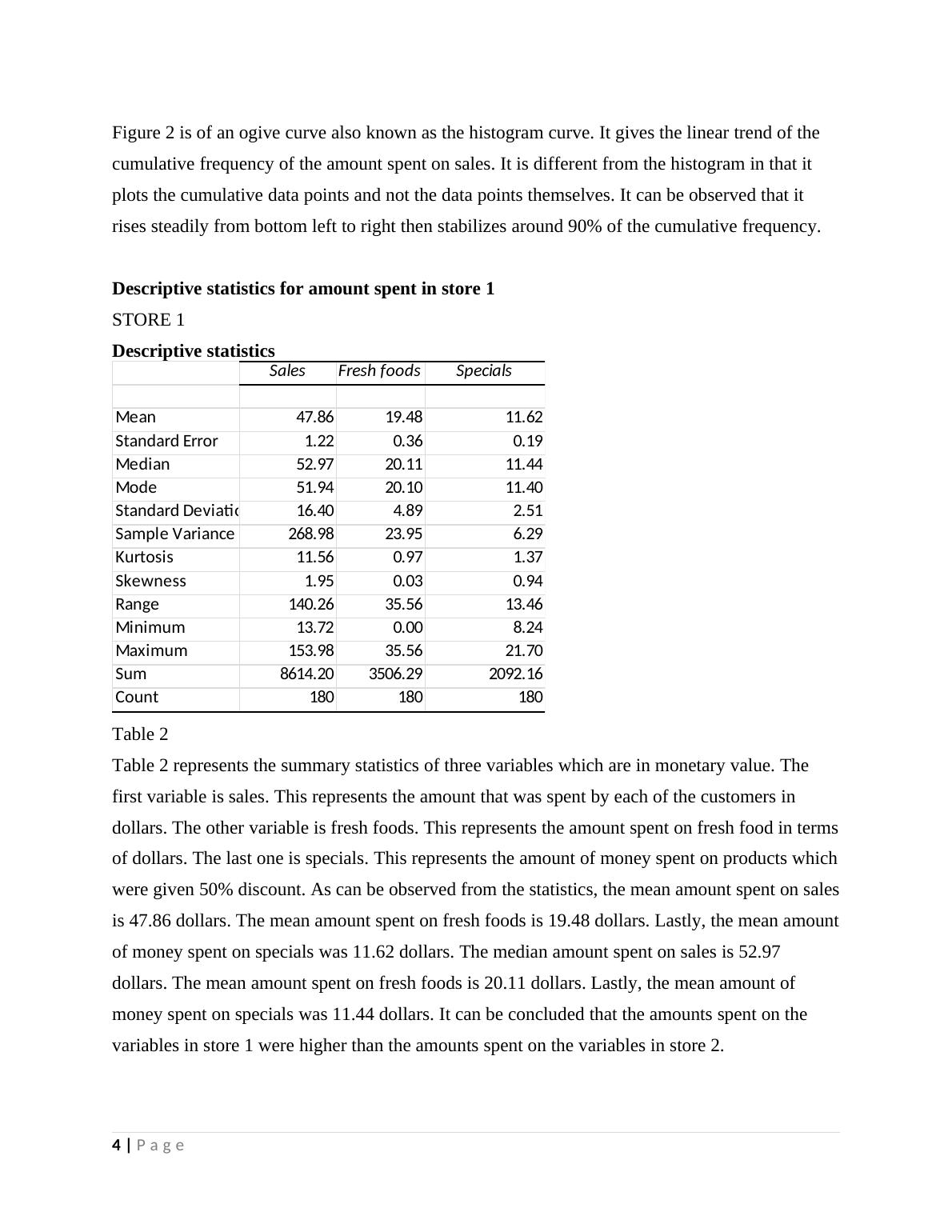
Descriptive statistics for amount spent in store 1
STORE 1
Descriptive statistics
Sales Fresh foods Specials
Mean 47.86 19.48 11.62
Standard Error 1.22 0.36 0.19
Median 52.97 20.11 11.44
Mode 51.94 20.10 11.40
Standard Deviation 16.40 4.89 2.51
Sample Variance 268.98 23.95 6.29
Kurtosis 11.56 0.97 1.37
Skewness 1.95 0.03 0.94
Range 140.26 35.56 13.46
Minimum 13.72 0.00 8.24
Maximum 153.98 35.56 21.70
Sum 8614.20 3506.29 2092.16
Count 180 180 180
Table 2
Table 2 represents the summary statistics of three variables which are in monetary value. The
first variable is sales. This represents the amount that was spent by each of the customers in
dollars. The other variable is fresh foods. This represents the amount spent on fresh food in terms
of dollars. The last one is specials. This represents the amount of money spent on products which
were given 50% discount. As can be observed from the statistics, the mean amount spent on sales
is 47.86 dollars. The mean amount spent on fresh foods is 19.48 dollars. Lastly, the mean amount
of money spent on specials was 11.62 dollars. The median amount spent on sales is 52.97
dollars. The mean amount spent on fresh foods is 20.11 dollars. Lastly, the mean amount of
money spent on specials was 11.44 dollars. It can be concluded that the amounts spent on the
variables in store 1 were higher than the amounts spent on the variables in store 2.
4 | P a g e
cumulative frequency of the amount spent on sales. It is different from the histogram in that it
plots the cumulative data points and not the data points themselves. It can be observed that it
rises steadily from bottom left to right then stabilizes around 90% of the cumulative frequency.
Descriptive statistics for amount spent in store 1
STORE 1
Descriptive statistics
Sales Fresh foods Specials
Mean 47.86 19.48 11.62
Standard Error 1.22 0.36 0.19
Median 52.97 20.11 11.44
Mode 51.94 20.10 11.40
Standard Deviation 16.40 4.89 2.51
Sample Variance 268.98 23.95 6.29
Kurtosis 11.56 0.97 1.37
Skewness 1.95 0.03 0.94
Range 140.26 35.56 13.46
Minimum 13.72 0.00 8.24
Maximum 153.98 35.56 21.70
Sum 8614.20 3506.29 2092.16
Count 180 180 180
Table 2
Table 2 represents the summary statistics of three variables which are in monetary value. The
first variable is sales. This represents the amount that was spent by each of the customers in
dollars. The other variable is fresh foods. This represents the amount spent on fresh food in terms
of dollars. The last one is specials. This represents the amount of money spent on products which
were given 50% discount. As can be observed from the statistics, the mean amount spent on sales
is 47.86 dollars. The mean amount spent on fresh foods is 19.48 dollars. Lastly, the mean amount
of money spent on specials was 11.62 dollars. The median amount spent on sales is 52.97
dollars. The mean amount spent on fresh foods is 20.11 dollars. Lastly, the mean amount of
money spent on specials was 11.44 dollars. It can be concluded that the amounts spent on the
variables in store 1 were higher than the amounts spent on the variables in store 2.
4 | P a g e
End of preview
Want to access all the pages? Upload your documents or become a member.
Related Documents
Descriptive Statistics Coursework with Tasks and Analysislg...
|11
|1466
|331
Statistics Assignment: Probabilitylg...
|10
|2040
|38
Descriptive Statistics - Analysis of Expenditure on Stand Mixers, Time Series Data, Critical Path Analysis, Break Even Analysislg...
|11
|1473
|52
Descriptive Statisticslg...
|11
|1540
|409
Using and Managing Data and Informationlg...
|11
|781
|448
Using and Managing Data and Informationlg...
|11
|668
|125