Data Analysis and Statistical Testing Assignment: Tovee Dataset
VerifiedAdded on 2023/04/23
|18
|3650
|163
Homework Assignment
AI Summary
This assignment analyzes the Tovee dataset, focusing on the statistical properties of variables such as VAS_choice, BMI, and WHR. It investigates normality and symmetry using box plots, density plots, and the Shapiro-Wilk test. The solution examines the impact of the Box-Cox transformation on BMI to achieve normality. The assignment further explores the relationship between ppt_sex and VAS_choice using t-tests, including the Welch two-sample t-test. Finally, the solution assesses the relationship between BMI and VAS_choice, employing scatterplots, resistant lines, and considering the presence of outliers. The analysis includes graphical representations and statistical tests to draw meaningful conclusions about the data and the relationships between variables.
STATISTICS
Question One
Part a
Normality can be defined as the property of a dataset or variables in a dataset to be
modelled by a normal distribution (Barbara & Susan, 2014). Symmetry is closely related to
normality and it refers to the property of the distribution of a dataset or variables in a dataset to
be balanced evenly (or almost evenly) on both sides about the mean (O'Neil & Schutt, 2013;
Vicenc, 2017).
Here we evaluate the symmetry and normality of three variables from the Tovee Data;
VAS_choice for the Visual Analogue Scale, BMI for the Body Mass Index and WHR for the
Weight-Hip Ratio. The visual analogue scale refers to a measurement scale applied in measuring
when the subject is thought to lie across a wide range of values (Reips & Frederik, 2008).
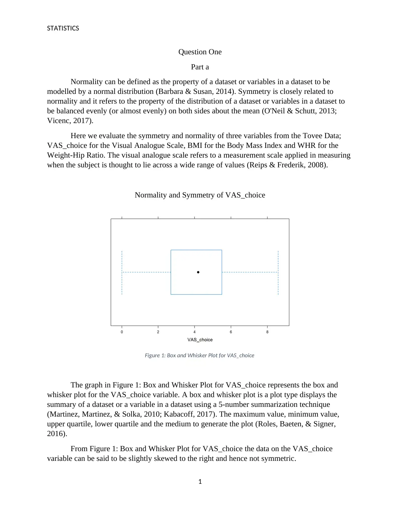
Normality and Symmetry of VAS_choice
Figure 1: Box and Whisker Plot for VAS_choice
The graph in Figure 1: Box and Whisker Plot for VAS_choice represents the box and
whisker plot for the VAS_choice variable. A box and whisker plot is a plot type displays the
summary of a dataset or a variable in a dataset using a 5-number summarization technique
(Martinez, Martinez, & Solka, 2010; Kabacoff, 2017). The maximum value, minimum value,
upper quartile, lower quartile and the medium to generate the plot (Roles, Baeten, & Signer,
2016).
From Figure 1: Box and Whisker Plot for VAS_choice the data on the VAS_choice
variable can be said to be slightly skewed to the right and hence not symmetric.
1
Paraphrase This Document
Need a fresh take? Get an instant paraphrase of this document with our AI Paraphraser
STATISTICS
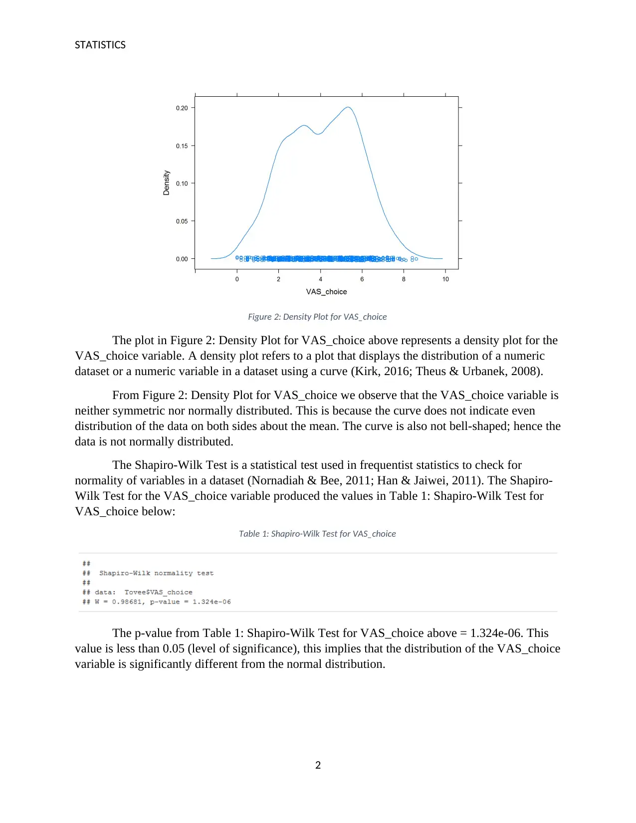
Figure 2: Density Plot for VAS_choice
The plot in Figure 2: Density Plot for VAS_choice above represents a density plot for the
VAS_choice variable. A density plot refers to a plot that displays the distribution of a numeric
dataset or a numeric variable in a dataset using a curve (Kirk, 2016; Theus & Urbanek, 2008).
From Figure 2: Density Plot for VAS_choice we observe that the VAS_choice variable is
neither symmetric nor normally distributed. This is because the curve does not indicate even
distribution of the data on both sides about the mean. The curve is also not bell-shaped; hence the
data is not normally distributed.
The Shapiro-Wilk Test is a statistical test used in frequentist statistics to check for
normality of variables in a dataset (Nornadiah & Bee, 2011; Han & Jaiwei, 2011). The Shapiro-
Wilk Test for the VAS_choice variable produced the values in Table 1: Shapiro-Wilk Test for
VAS_choice below:
Table 1: Shapiro-Wilk Test for VAS_choice
The p-value from Table 1: Shapiro-Wilk Test for VAS_choice above = 1.324e-06. This
value is less than 0.05 (level of significance), this implies that the distribution of the VAS_choice
variable is significantly different from the normal distribution.
2
STATISTICS
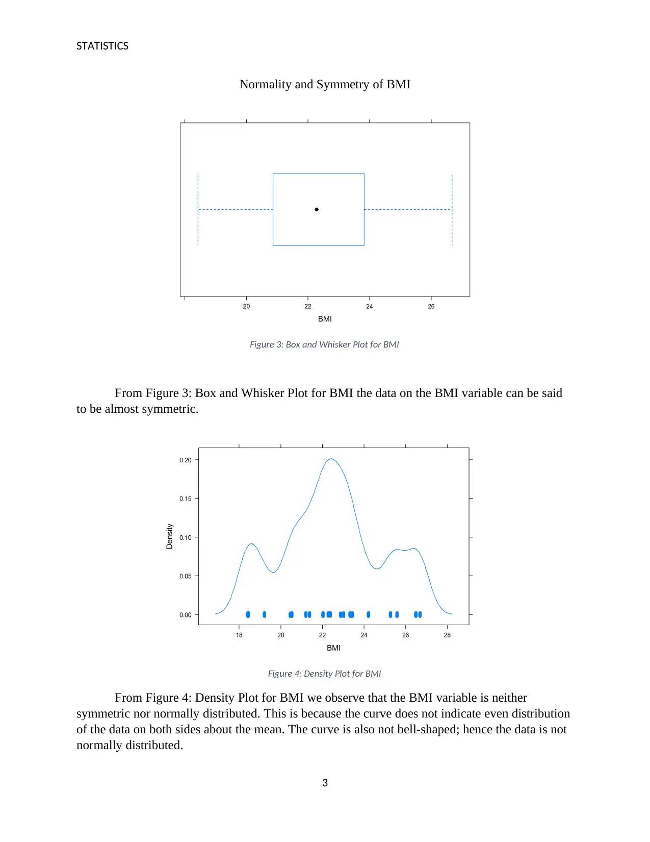
Normality and Symmetry of BMI
Figure 3: Box and Whisker Plot for BMI
From Figure 3: Box and Whisker Plot for BMI the data on the BMI variable can be said
to be almost symmetric.
Figure 4: Density Plot for BMI
From Figure 4: Density Plot for BMI we observe that the BMI variable is neither
symmetric nor normally distributed. This is because the curve does not indicate even distribution
of the data on both sides about the mean. The curve is also not bell-shaped; hence the data is not
normally distributed.
3
⊘ This is a preview!⊘
Do you want full access?
Subscribe today to unlock all pages.

Trusted by 1+ million students worldwide
STATISTICS
The Shapiro-Wilk Test for the BMI variable produced the values in Table 2: Shapiro-
Wilk Test for BMI below:
Table 2: Shapiro-Wilk Test for BMI
The p-value from Table 2: Shapiro-Wilk Test for BMI above = 7.334e-15. This value is
less than 0.05 (level of significance), this implies that the distribution of the BMI variable is
significantly different from the normal distribution.
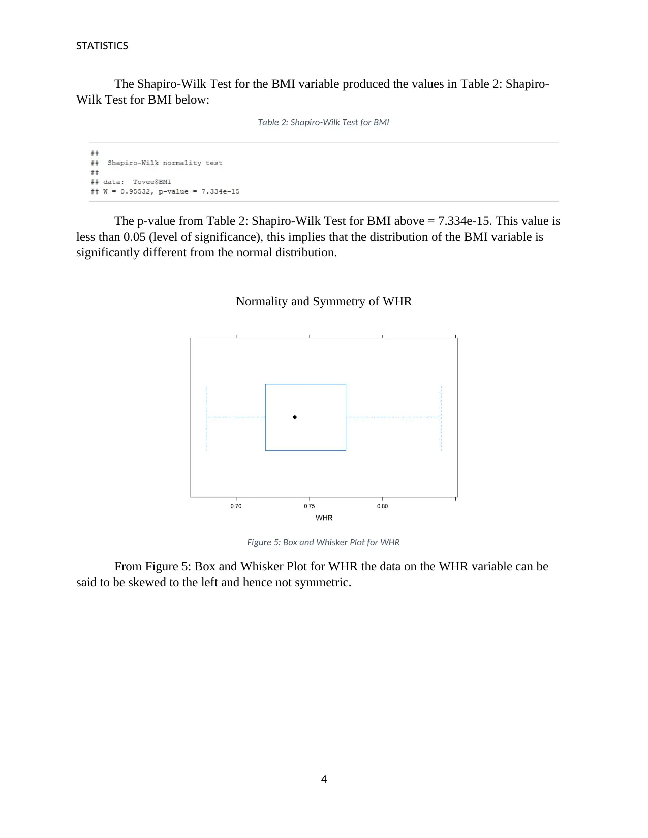
Normality and Symmetry of WHR
Figure 5: Box and Whisker Plot for WHR
From Figure 5: Box and Whisker Plot for WHR the data on the WHR variable can be
said to be skewed to the left and hence not symmetric.
4
Paraphrase This Document
Need a fresh take? Get an instant paraphrase of this document with our AI Paraphraser
STATISTICS
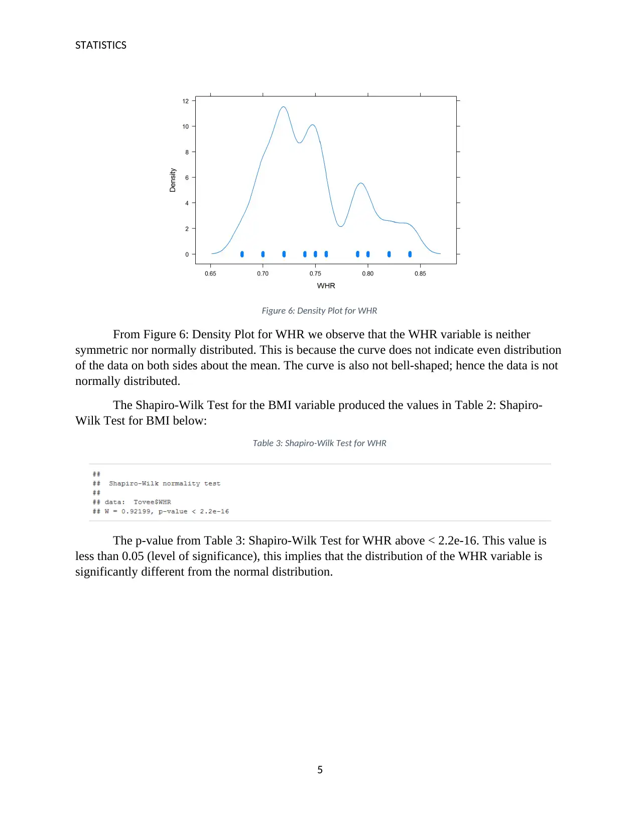
Figure 6: Density Plot for WHR
From Figure 6: Density Plot for WHR we observe that the WHR variable is neither
symmetric nor normally distributed. This is because the curve does not indicate even distribution
of the data on both sides about the mean. The curve is also not bell-shaped; hence the data is not
normally distributed.
The Shapiro-Wilk Test for the BMI variable produced the values in Table 2: Shapiro-
Wilk Test for BMI below:
Table 3: Shapiro-Wilk Test for WHR
The p-value from Table 3: Shapiro-Wilk Test for WHR above < 2.2e-16. This value is
less than 0.05 (level of significance), this implies that the distribution of the WHR variable is
significantly different from the normal distribution.
5
STATISTICS
Part b
The Box-Cox transformation is a transformation technique in statistics that transforms
data variables that have non-normal distributions into normally distributed variables (Ulf-
Dietrich & Uwe, 2014). The Box-Cox transformation is a power based transformation method
where the data points of the data variable that has non-normal distribution are raised to a given
power to achieve normality (Witten, 2011).
The Box-Cox transformation is suitable for the transformation of the BMI variables from
a non-normal variable to a normal variable.
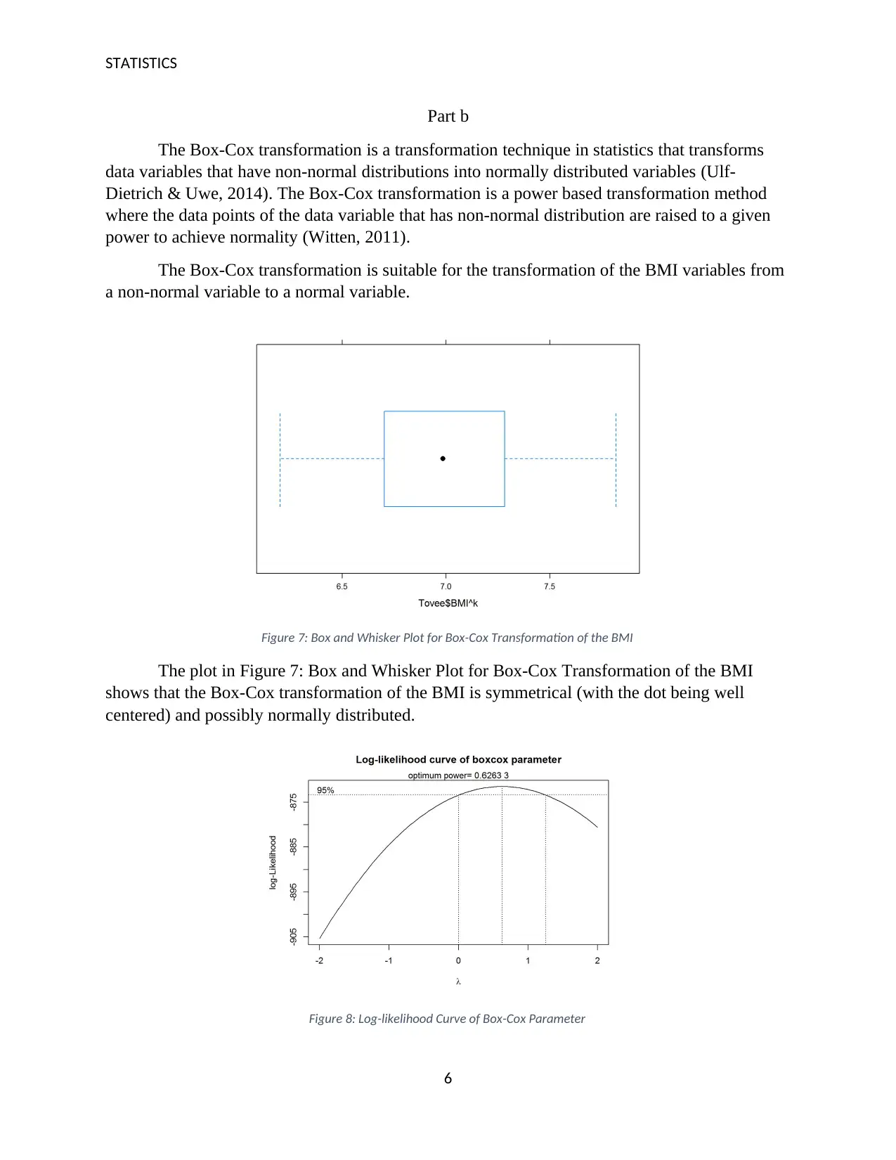
Figure 7: Box and Whisker Plot for Box-Cox Transformation of the BMI
The plot in Figure 7: Box and Whisker Plot for Box-Cox Transformation of the BMI
shows that the Box-Cox transformation of the BMI is symmetrical (with the dot being well
centered) and possibly normally distributed.
Figure 8: Log-likelihood Curve of Box-Cox Parameter
6
⊘ This is a preview!⊘
Do you want full access?
Subscribe today to unlock all pages.

Trusted by 1+ million students worldwide
STATISTICS
From the plot in Figure 8: Log-likelihood Curve of Box-Cox Parameter above, we
observe a bell-shaped curve for log-likelihood. This implies that the Box-Cox transformation of
the BMI variable has resulted in normally distributed data points. The optimum power for the
Box-Cox transformation of the BMI variable has also been given as 0.62633.
Part c
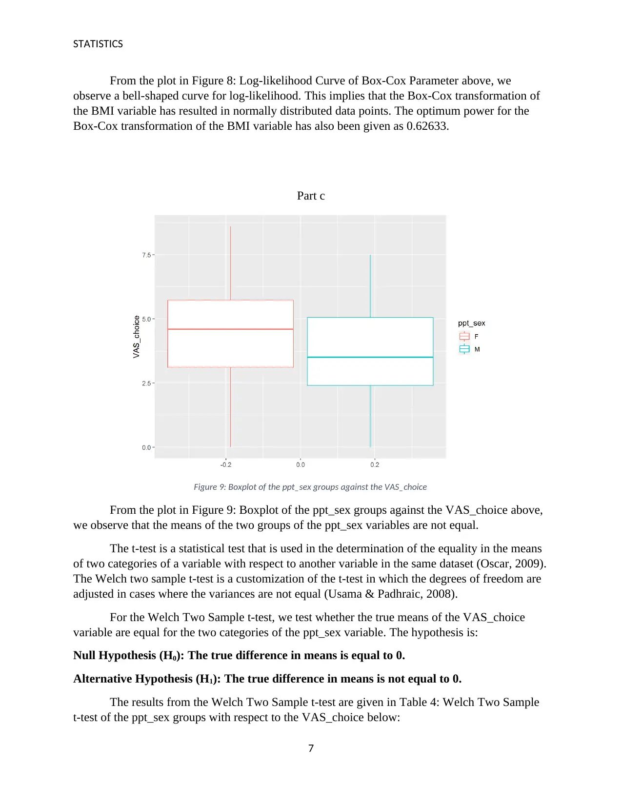
Figure 9: Boxplot of the ppt_sex groups against the VAS_choice
From the plot in Figure 9: Boxplot of the ppt_sex groups against the VAS_choice above,
we observe that the means of the two groups of the ppt_sex variables are not equal.
The t-test is a statistical test that is used in the determination of the equality in the means
of two categories of a variable with respect to another variable in the same dataset (Oscar, 2009).
The Welch two sample t-test is a customization of the t-test in which the degrees of freedom are
adjusted in cases where the variances are not equal (Usama & Padhraic, 2008).
For the Welch Two Sample t-test, we test whether the true means of the VAS_choice
variable are equal for the two categories of the ppt_sex variable. The hypothesis is:
Null Hypothesis (H0): The true difference in means is equal to 0.
Alternative Hypothesis (H1): The true difference in means is not equal to 0.
The results from the Welch Two Sample t-test are given in Table 4: Welch Two Sample
t-test of the ppt_sex groups with respect to the VAS_choice below:
7
Paraphrase This Document
Need a fresh take? Get an instant paraphrase of this document with our AI Paraphraser
STATISTICS
Table 4: Welch Two Sample t-test of the ppt_sex groups with respect to the VAS_choice
From Table 4: Welch Two Sample t-test of the ppt_sex groups with respect to the
VAS_choice above, we observe that at 95% confidence interval, the p-value is given as 2.666e-
10. This value is less than 0.05 (level of significance), hence we reject the null hypothesis and
conclude that the true difference in means is not equal to 0.
In the two sample t-test we assume that the dependent variable is normally distributed
(Galit, Peter, Inbal, Patel, & Kenneth, 2018). We also assume in the two sample t-test that the
variances are equal (Jaulin, 2010). This presents limitations in applying the two sample t-test for
this case. The VAS_choice variable is not normally distributed as seen from the Shapiro-Wilk
test in Table 1: Shapiro-Wilk Test for VAS_choice. We are also not certain as to whether the
variance in the two categories of the ppt_sex variable with respect to the VAS_choice variable is
equal. Application of the Welch Two Sample t-test however caters for the uncertainty in the
equality of the variance.
Part d
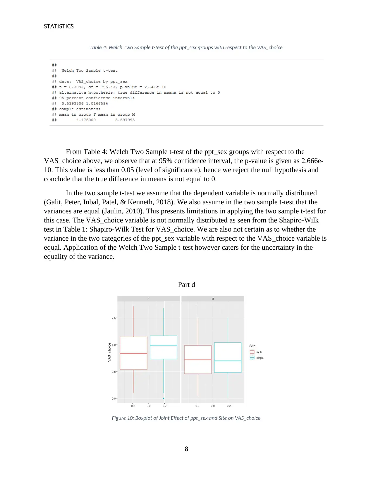
Figure 10: Boxplot of Joint Effect of ppt_sex and Site on VAS_choice
8
STATISTICS
From the plot in Figure 10: Boxplot of Joint Effect of ppt_sex and Site on VAS_choice
above we observe the boxplots for the four interactions between the categories of the ppt_sex
and Site variables. Under the F (Female) category of the ppt_sex variable, the two Site variable
categories (multiple and single) appear to have means that are not equal. Under the M (Male)
category of the ppt_sex variable, the two Site variable categories (multiple and single) appear to
have means that are almost equal.
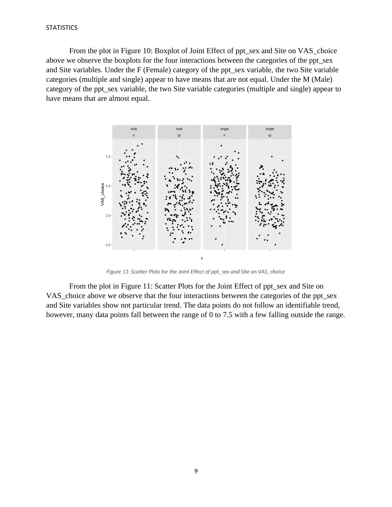
Figure 11: Scatter Plots for the Joint Effect of ppt_sex and Site on VAS_choice
From the plot in Figure 11: Scatter Plots for the Joint Effect of ppt_sex and Site on
VAS_choice above we observe that the four interactions between the categories of the ppt_sex
and Site variables show not particular trend. The data points do not follow an identifiable trend,
however, many data points fall between the range of 0 to 7.5 with a few falling outside the range.
9
⊘ This is a preview!⊘
Do you want full access?
Subscribe today to unlock all pages.

Trusted by 1+ million students worldwide
STATISTICS
Question Two
Part a
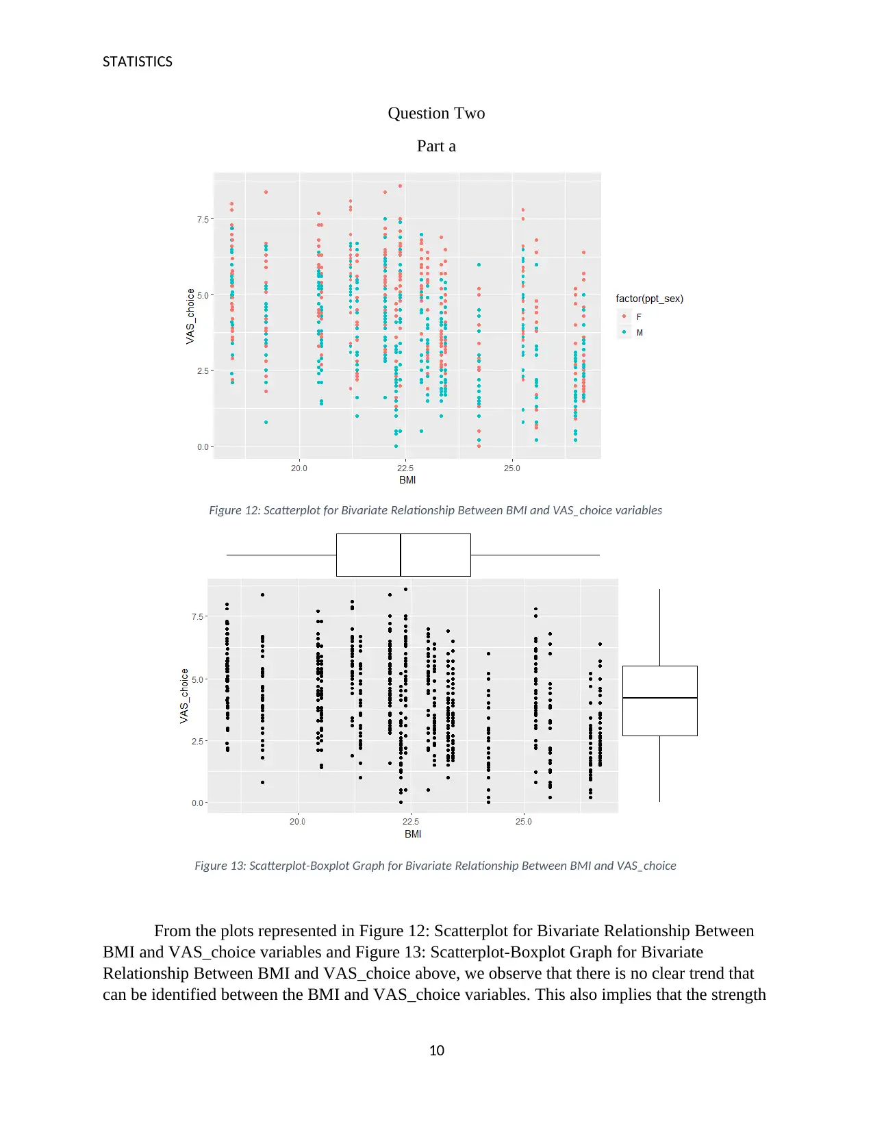
Figure 12: Scatterplot for Bivariate Relationship Between BMI and VAS_choice variables
Figure 13: Scatterplot-Boxplot Graph for Bivariate Relationship Between BMI and VAS_choice
From the plots represented in Figure 12: Scatterplot for Bivariate Relationship Between
BMI and VAS_choice variables and Figure 13: Scatterplot-Boxplot Graph for Bivariate
Relationship Between BMI and VAS_choice above, we observe that there is no clear trend that
can be identified between the BMI and VAS_choice variables. This also implies that the strength
10
Paraphrase This Document
Need a fresh take? Get an instant paraphrase of this document with our AI Paraphraser
STATISTICS
of any relationship that may exist between the BMI and VAS_choice variables is significantly
weak.
We also observe from the Figure 12: Scatterplot for Bivariate Relationship Between BMI
and VAS_choice variables that for the same value of the BMI, the values of the VAS_choice for
the male category is more likely be lower than that for the female category. This is evident from
the concentration of data points for the male category at the bottom of the graph while the
concentration of data points for the female category at the top of the graph. However, we can say
that for both categories of the ppt_sex variable, there is no indication of existence of a definable
relationship between the BMI and VAS_choice variables.
Outliers are data points or observations in a dataset that show significant difference in
measurement or magnitude in comparison to majority of other observations in the same dataset
(Schubert, Zimek, & Kriegel, 2012). Outliers can be observed on both plots and are present at the
0-point mark of the VAS_choice variable as well at and above the 7.5-point mark of the
VAS_choice variable. The presence of these outlier values may affect the results of statistical
analysis (Zimek, Schubert, & Kriegel, 2012). They may also result in test assumptions not being
met.
Part b
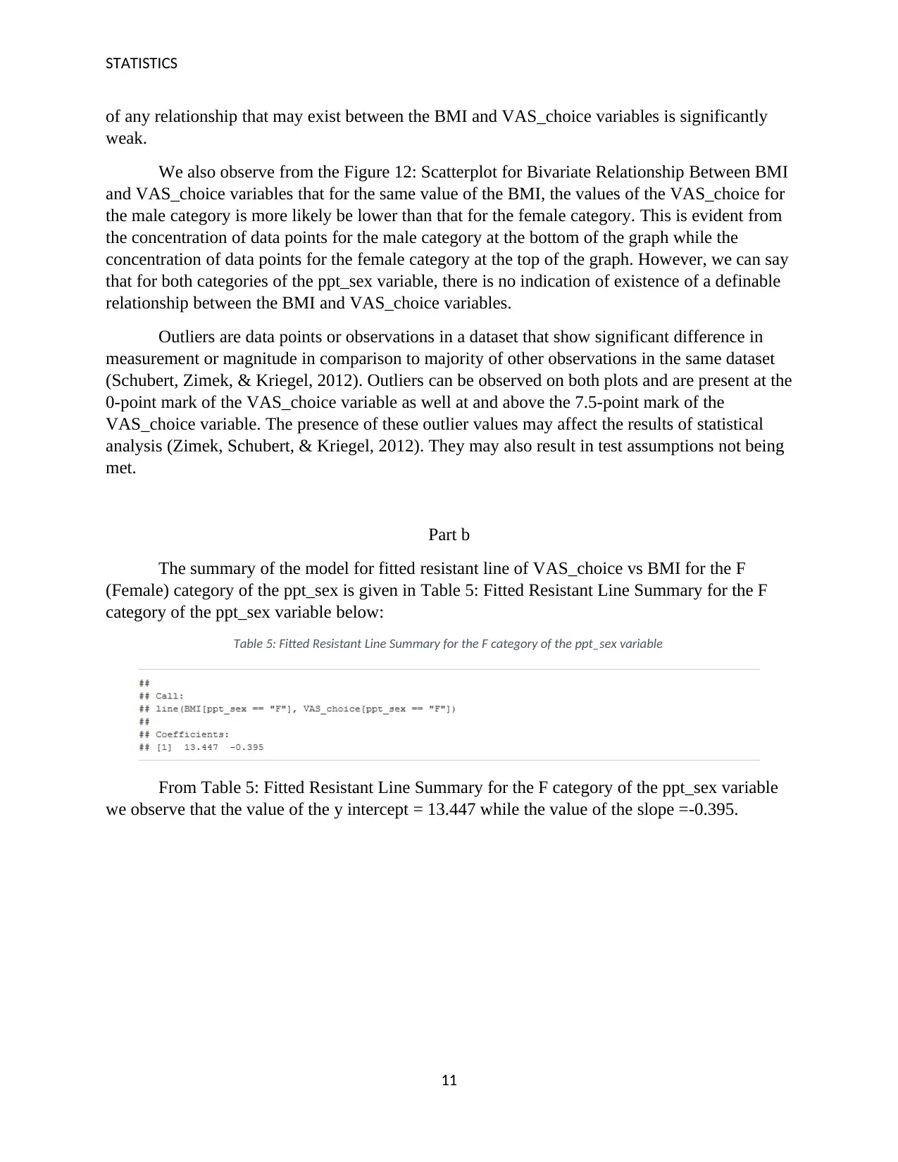
The summary of the model for fitted resistant line of VAS_choice vs BMI for the F
(Female) category of the ppt_sex is given in Table 5: Fitted Resistant Line Summary for the F
category of the ppt_sex variable below:
Table 5: Fitted Resistant Line Summary for the F category of the ppt_sex variable
From Table 5: Fitted Resistant Line Summary for the F category of the ppt_sex variable
we observe that the value of the y intercept = 13.447 while the value of the slope =-0.395.
11
STATISTICS
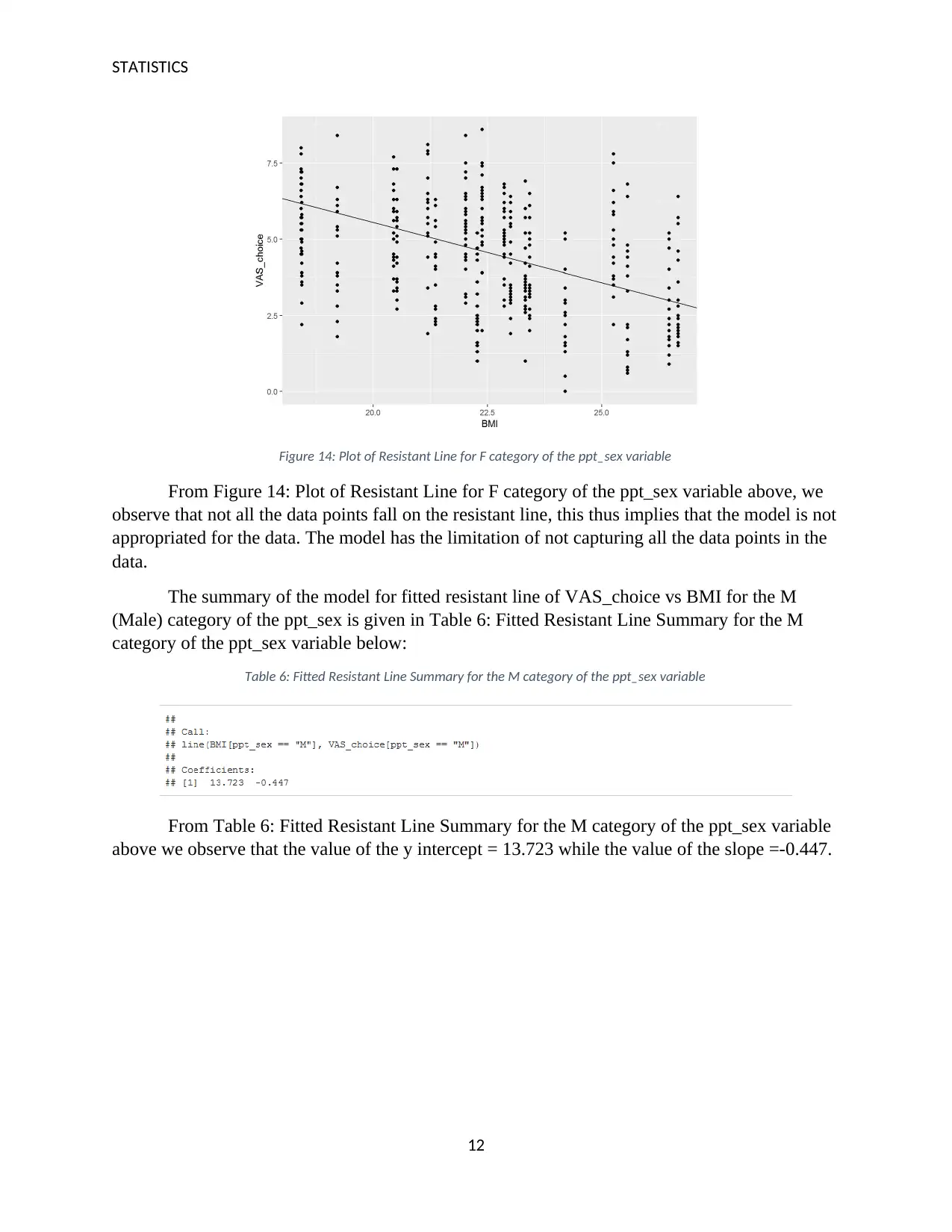
Figure 14: Plot of Resistant Line for F category of the ppt_sex variable
From Figure 14: Plot of Resistant Line for F category of the ppt_sex variable above, we
observe that not all the data points fall on the resistant line, this thus implies that the model is not
appropriated for the data. The model has the limitation of not capturing all the data points in the
data.
The summary of the model for fitted resistant line of VAS_choice vs BMI for the M
(Male) category of the ppt_sex is given in Table 6: Fitted Resistant Line Summary for the M
category of the ppt_sex variable below:
Table 6: Fitted Resistant Line Summary for the M category of the ppt_sex variable
From Table 6: Fitted Resistant Line Summary for the M category of the ppt_sex variable
above we observe that the value of the y intercept = 13.723 while the value of the slope =-0.447.
12
⊘ This is a preview!⊘
Do you want full access?
Subscribe today to unlock all pages.

Trusted by 1+ million students worldwide
1 out of 18
Related Documents
Your All-in-One AI-Powered Toolkit for Academic Success.
+13062052269
info@desklib.com
Available 24*7 on WhatsApp / Email
![[object Object]](/_next/static/media/star-bottom.7253800d.svg)
Unlock your academic potential
Copyright © 2020–2025 A2Z Services. All Rights Reserved. Developed and managed by ZUCOL.


