There are various tools used in data visualization
VerifiedAdded on 2022/09/17
|6
|645
|25
AI Summary
Contribute Materials
Your contribution can guide someone’s learning journey. Share your
documents today.
Data Visualization
Name:
Institution:
Name:
Institution:
Secure Best Marks with AI Grader
Need help grading? Try our AI Grader for instant feedback on your assignments.
There is no doubt one of essential concept in data exploration and analysis is
visualization of the data. Data visualization is the presentation of data in a pictorial or graphical
format, thus enabling the decision makers to visualize the data and make informed decision [1].
Notably, large data is generated regularly, which needs extensive analysis and interpretation. As
a result, there are various benefits associated with the data visualization to various sectors (data
analysts (decision makers) and organizations). For example, the concept aids in including
enhanced assimilation of business information, whereby many business intelligence reports
incorporate numerous visualization tools, such as statistics tables and charts [2]. Moreover,
business managers in organization that utilize visual data tools are 28% more likely to find
timely information than those who depend solely on managed reporting and dashboards.
Besides, data visualization aids in rapid identification of latest trends, whereby
companies are able to gather various business insights, such as revenue, expenses, and business
opportunities thus make informed decision [3]. For instance, the decision makers are bale to
identify shifts in the customer behavior and market conditions. Furthermore, data visualization
plays a critical part in predictive analysis of various sections, such as sales whereby decision
makers can forecast the increase or decrease of sales. Therefore, the following study will use of
data visualization to exhibit insights and characteristics of real GDP data in the United states
collected quarterly.
There are various tools used in data visualization, which include line graph, bar chart, pie
chart, scatter plots, and histogram [3]
Bar graphs: They are used to exhibit comparison among individual items; for instance,
the graph can be used it the study illustrate gender comparison, whereby the graph will show
between male and female which gender recorded higher sales.
Pie charts: They are used to illustrate the contribution of individual measurement value to
the grand total represented in a circle.
Histogram charts: They are charts used to show the frequency of an event. Thus, the
following chart exhibits the frequency distribution of services provided.
20 30 40 50 60 70 80 90 100 110 120
0
10
20
30
40
50
60
70
Histogram
Services
Frequency
Line charts: They are used to exhibit the trend of continuous data over time. The chart
below shows an increase in real GDP across years (1947 to 2018)
1947Q11954Q3 1962Q11969Q31977Q11984Q31992Q11999Q32007Q12014Q3
0.000
20.000
40.000
60.000
80.000
100.000
120.000
140.000
Line Graph
Quarters of the year
GDP
Scatter plots: they are used to show the relationship between two variables, which
exhibits either a positive or negative relationship. The following scatter plot show the
relationship between GDP and personal expenditure
0.000 20.000 40.000 60.000 80.000 100.000 120.000 140.000
0.000
20.000
40.000
60.000
80.000
100.000
120.000
140.000
Scatter Plot
Personal expenditure
GDP
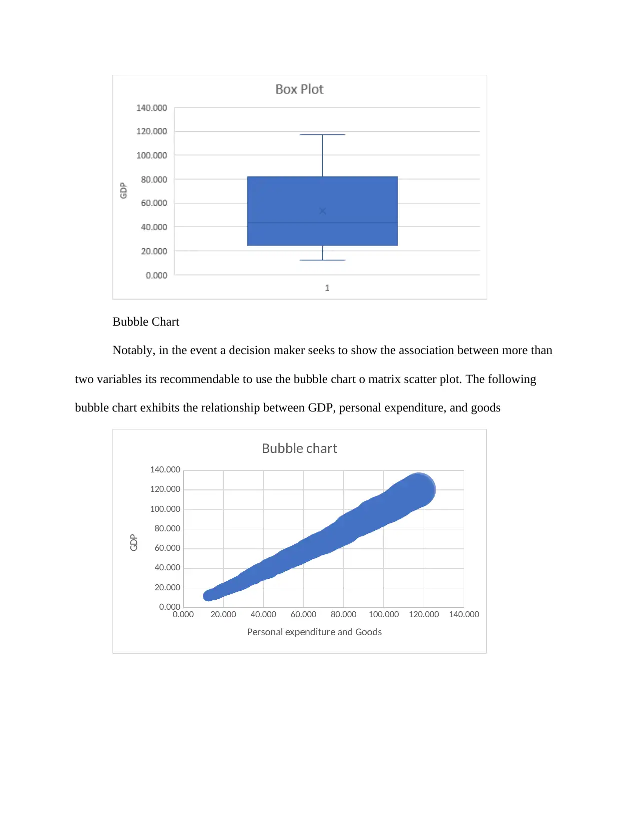
Box Plots
They are graphical representation of measures of dispersion, which include median,
interquartile range, 75- and 25-percentile value in a data set. Moreover, the graphical
representation exhibits any outlier in the data. Therefore, the following data box plot shows the
median, 75- and 25-percentile value.
Secure Best Marks with AI Grader
Need help grading? Try our AI Grader for instant feedback on your assignments.
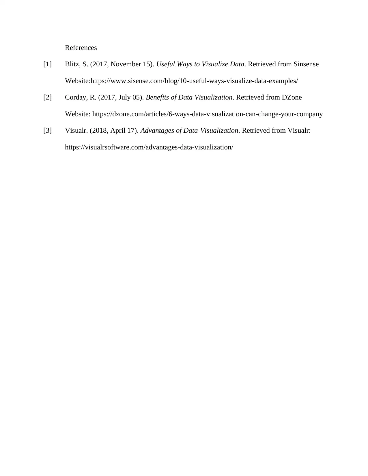
Bubble Chart
Notably, in the event a decision maker seeks to show the association between more than
two variables its recommendable to use the bubble chart o matrix scatter plot. The following
bubble chart exhibits the relationship between GDP, personal expenditure, and goods
0.000 20.000 40.000 60.000 80.000 100.000 120.000 140.000
0.000
20.000
40.000
60.000
80.000
100.000
120.000
140.000
Bubble chart
Personal expenditure and Goods
GDP
References
[1] Blitz, S. (2017, November 15). Useful Ways to Visualize Data. Retrieved from Sinsense
Website:https://www.sisense.com/blog/10-useful-ways-visualize-data-examples/
[2] Corday, R. (2017, July 05). Benefits of Data Visualization. Retrieved from DZone
Website: https://dzone.com/articles/6-ways-data-visualization-can-change-your-company
[3] Visualr. (2018, April 17). Advantages of Data-Visualization. Retrieved from Visualr:
https://visualrsoftware.com/advantages-data-visualization/
1 out of 6
Related Documents
Your All-in-One AI-Powered Toolkit for Academic Success.
+13062052269
info@desklib.com
Available 24*7 on WhatsApp / Email
![[object Object]](/_next/static/media/star-bottom.7253800d.svg)
Unlock your academic potential
© 2024 | Zucol Services PVT LTD | All rights reserved.


