Usability Analysis Report: Web Accessibility for Visually Impaired
VerifiedAdded on 2023/06/15
|13
|3017
|227
Report
AI Summary
This report provides a usability analysis of web systems designed for visually impaired users, focusing on accessibility standards, user interface structure, component arrangement, visual design, and language use. It examines interaction modes, including keyboard accessibility and assistive technologies like screen readers and braille displays, and emphasizes the importance of maps and clear labeling for content communication. The report offers recommendations for improving web interface design, such as using simple glyphs, optimized color contrast, appropriate font sizes, and non-overlapping features. It suggests allowing users to customize the map and switch between normal and black-and-white versions for enhanced accessibility. The analysis aims to reduce legal risks and increase website simplicity, ensuring visually impaired users can effectively access and navigate web content.
Running head: USABILITY ANALYSIS AND TESTING
Usability Analysis and Testing
Name of the Student
Name of the University
Author’s Note
Usability Analysis and Testing
Name of the Student
Name of the University
Author’s Note
Paraphrase This Document
Need a fresh take? Get an instant paraphrase of this document with our AI Paraphraser
1
USABILITY ANALYSIS AND TESTING
Table of Contents
1. Introduction......................................................................................................................2
2. Background......................................................................................................................2
2.1. Target groups............................................................................................................2
2.2. User interface structure and design...........................................................................2
2.3. Arrangement of the components...............................................................................3
2.4. Visual design of the Components.............................................................................4
2.5. Use of Language.......................................................................................................5
3. Interaction modes.............................................................................................................5
3.1. Keyboard accessibility..............................................................................................5
3.2. Assistive technology.................................................................................................6
4. MAP.................................................................................................................................6
5. Recommendations............................................................................................................7
6. Additional Considerations for increasing the accessibility.............................................9
7. Conclusion.....................................................................................................................10
References..........................................................................................................................11
2
USABILITY ANALYSIS AND TESTING
1. Introduction
The report is prepared for the selection of the topic Designing accessible web systems for
visually disabled users. There are different standards that should be applied in the development
process for reducing the risk of legal obligations and increase the simplicity of the website for
easier access. The disable personnel with visual impairment who are unable to read the text in
the web content should be able to hear it using the screen reading application software. The
options that can be implemented for handling the peoples with disability should be analyzed for
designing the website for visually disabled users.
2. Background
2.1. Target groups
The main target groups for the development of the website are the visually impaired and
the website is required to cover a wide range of disorders of the personnel’s. There are different
types of web application that can be used for the development of the website such as navigation
tools, help components and mapping components that can be embedded with the GUI for the
development of the web interface design of an organization.
2.2. User interface structure and design
The user interface should have different components that are applied for increasing the
flexibility of the websites such as navigation tools, pop-up windows, web maps, zooming maps,
base map selectors, etc (Taylor et al. 2015). Similar to the development of the graphical user
interface the different map components can be selected such that it can be accessed and
developed with the needs of the user using the website.
⊘ This is a preview!⊘
Do you want full access?
Subscribe today to unlock all pages.

Trusted by 1+ million students worldwide
3
USABILITY ANALYSIS AND TESTING
2.3. Arrangement of the components
It should be ensured that the components deployed for the development of the web
interface should be easy to use and the design of the interface should be kept simple and
consistent for increasing the usability of the website. A predictable layout should be used and the
components should be selected carefully for application in the website and a specific
functionality should be linked with it for the benefiting the targeted group of users using the
website (O’Modhrain et al. 2015). The following guidelines should be used for the development
of the graphical user interface:
- Checking the unnecessary elements and removal of the elements for keeping the web
interface simple.
- Removal of the unnecessary control elements and controlling the elements for focusing
on the group of users for reducing the complexity of the website
- Location the same type of control elements and grouping them according to their
similarity for the management of the codes
- Implementation of a horizontal and flat organized structure of interface with no nested or
dropdown element.
- Placing the critical element in the front page such it is visible to the users at a glance and
no scrolling is required to access them (Waddington et al. 2015).
- Avoiding the overlap of the elements placed in the web interface for increasing the
readability of the website.
The navigation tools and the base maps selectors if deployed in the component of the
map, the visually disables users may find difficulty to read the map and also it becomes
difficult to use and recognize the control elements. For increasing the efficiency of the
Paraphrase This Document
Need a fresh take? Get an instant paraphrase of this document with our AI Paraphraser
4
USABILITY ANALYSIS AND TESTING
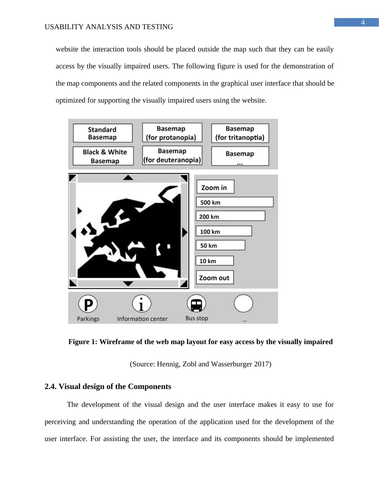
website the interaction tools should be placed outside the map such that they can be easily
access by the visually impaired users. The following figure is used for the demonstration of
the map components and the related components in the graphical user interface that should be
optimized for supporting the visually impaired users using the website.
Figure 1: Wireframe of the web map layout for easy access by the visually impaired
(Source: Hennig, Zobl and Wasserburger 2017)
2.4. Visual design of the Components
The development of the visual design and the user interface makes it easy to use for
perceiving and understanding the operation of the application used for the development of the
user interface. For assisting the user, the interface and its components should be implemented
5
USABILITY ANALYSIS AND TESTING
according to the size and the colors should be selected appropriately for contrasting the
background and the patterns (Williams and Hennig 2015). Symbols and images should also be
applied for the development of the user interface and reduce the use of text for reducing the
complexity of the website.
2.5. Use of Language
The information used of the development of the web interface should be accessible to all
the users and it should be carefully chosen because the language acts as the intermediation for
communicating with the users. The buttons used for designing the web interface should be
properly labeled such that the user using the website should know the use of the button (Petrie,
Savva and Power 2015). The terms used in the web interface should be familiar to the users and
the language should be consistent and kept should such the user can read the text at a glance to
understand the functionality of the website.
3. Interaction modes
Mostly all the interface of the websites are implemented as Graphical user interface and
the user interacts with the system using the menu bars, buttons and icons. The interaction are
handles using the keyboard, mouse and/or touchscreens. The graphical user interface relies on
the visual sense of the users but it are not suitable for the heavily visually impaired or blind
personnel’s (Gustafson 2015). The keyboard accessibility and other assistive technology can be
applied as a solution of the severely visually impaired peoples.
3.1. Keyboard accessibility
For the improvement of the operation of the web maps for the visually disable users
accessibility of the keyboard is an important factor. Many of the blind and the severely visually
⊘ This is a preview!⊘
Do you want full access?
Subscribe today to unlock all pages.

Trusted by 1+ million students worldwide
6
USABILITY ANALYSIS AND TESTING
impaired users depends on the keyboard for the navigation of the application. It also helps the
partially sighted users to easily access the contents of the websites (Schindler, de Vries and
Zacharias 2015). The map navigation tool used for the development of the website should have
the pre-defined discrete zoom features and some predefine keyboard shortcuts should be mapped
that helps the user to reduce the use of mouse and increase the usability of the website.
3.2. Assistive technology
The assistive technology can be referred to as the system or object that is directed for the
people having disability and help them to interact with the computing environment. There are
different assistive technology that can be embedded with the website such as voice output, screen
readers, magnification applications and braille displays (Sanchez-Gordon and Luján-Mora 2016).
For the analysis of the importance of the assistive technology a group of users must be involved
for testing the website with the assistive technology.
The screen magnification can be easily implemented in the website and existing tools of
the operating system or the browser can also be used for the magnification of the web page. The
implementation of the braille display, voice software and the screen readers requires specific
application that should be installed by the users (Cyr 2014). The braille displays needs to be
installed for supporting the alternatives and for the support of the options the alternative of the
text should be available for the non-text elements used for the development of the websites. The
website must be designed with short description such that it is easy for the users to understand
the content when delivered to the users via the screen reader.
Paraphrase This Document
Need a fresh take? Get an instant paraphrase of this document with our AI Paraphraser
7
USABILITY ANALYSIS AND TESTING
4. MAP
The map is an important tool that is applied for increasing the success of communication
of the contents of the websites to the users. It helps in improved readability of the web content
for the visually impaired and person affected by colour blindness. The shape, position,
arrangement and patterns of the symbols should be implemented such that it can create a
difference between the design components and should be easily distinguished for easy readability
of the contents (Petrie, Savva and Power 2015). A feedback of the design should be taken from
the users for changing the web interface design aligning the requirement of the users for
increasing the usability and enhancing the readability of the contents of the web page. A similar
design should be maintained throughout the web pages such that user does not feel they are
redirected. The labelling of the features is necessary for the identification of the features and help
the user to understand the content of the map (Waddington et al. 2015). The map should be
developed in such a manner that it should be used for communicating the contents with the users
using the web interface. The ability of the user to map the interface according to the needs helps
in increasing the satisfaction level reducing the errors in the design.
5. Recommendations
The following recommendations are provided for designing the web interface for the
visually disabled users:
Points
- Use of simple glyphs and symbols
- The use of icons should be increase and it should be well known to the users.
8
USABILITY ANALYSIS AND TESTING
- Bright and vibrant colours should be used for designing the web interface and the colour
contrast should be optimized between the surroundings and the symbols.
- The different features should have different colours and different icons.
- The size of the glyphs and the symbols should be adequate such that it can be viewed in
all conditions for the intended group of users using the web interface.
Lines
- The lines use for the development of the interface should not be thin and an appropriate
thickness should be maintained according to the colour used in the web interface design
- Bright colours should be used and an optimized colour contrast should be maintained
between the elements used for the development of the interface
- The lines should have different colours for representing different functionality and
separating the sections from each other
- Different patterns of the lines can be applied for the representation of the different types
lines used for the representation of the different functionality
Areas
- The outlines of the website interface should be kept dark such that the inter contents are
clearly visible
- The colour design should be appropriate and the colour contrast should be optimized
according to WCAG 2.0.
- For distinguishing the different areas in the webpage different combinations of patterns
and colours should be applied.
Text
⊘ This is a preview!⊘
Do you want full access?
Subscribe today to unlock all pages.

Trusted by 1+ million students worldwide
9
USABILITY ANALYSIS AND TESTING
- The colour contrast between the text and the background should be considered for
designing the user interface design. For example black letter and white background
should be an ideal example for designing the website interface.
- Use of san serif fonts as the typeface for the well establishment and simple text
- Avoiding the use of underline and italics of the text
- Capitalizing the first character of the text
- Using large font size and maintaining the font size throughout the webpages
- Using left aligned for the text
- The features in the webpages should not overlap with each other
There are different other methods that can be applied for meeting the needs of the
visually impaired and the colour blind users such as providing a set of baselines from which the
user can choose the best map suited for them. The website interface should allow the user to
switch between the normal version and the black and white version for using the visually
impaired friendly designs. The website can be made more flexible by allowing the users to
customize the webpage such as adjusting the contrast ratio, size of the symbols, increasing or
decreasing the width of the lines and controlling the brightness.
6. Additional Considerations for increasing the accessibility
The accessibility of the web page depends on the removal of the barriers that can cause a
problem for the people with disability during accessing the informations. The accessibility is not
enough for the success of the web design and there are different factors such as usability,
compatibility and the utility also acts as a factor that should be considered for the development of
the web interface.
Paraphrase This Document
Need a fresh take? Get an instant paraphrase of this document with our AI Paraphraser
10
USABILITY ANALYSIS AND TESTING
The usability and the accessibility are closely related to each other and each operates at
different angles because the accessibility of the website depends on the extent to which the
website is usable and the range of activities provided to them (Taylor et al. 2015). The usability
is dependent on the extent on which the targeted users can achieve the specified goals and
objectives for efficiency, effectiveness and satisfaction of the web content.
The utility and compatibility is also interdependent because the web applications and the
websites must be accessible to all levels of users and the access of the relevant devices should
also be provided to the users (Hennig, Zobl and Wasserburger 2017). Thus the targeted group of
users should have the functionality that can be used for utilizing the assistive technology.
7. Conclusion
From the above report it can be concluded that a good design is the main constraint for
the success of the web page and the web designer should look into the visual characteristics for
the development of the interface of a web page. The different factors related with the human
computer interaction and the usability of the interface are analyzed for the development of the
report. The website design should be evaluated according to the requirement of the users and the
disability of the users such as auditory disability, visual disability and mobility disability should
be understood for the development of the website. The people affected with the disability should
be included in the development process for reducing the errors in the final website and increase
the accessibility of the website. The standards should be maintained for the development of the
web interface and it should comply with the laws such that legal discrimination should be
avoided.
11
USABILITY ANALYSIS AND TESTING
References
Cyr, D., 2014. Return visits: a review of how Web site design can engender visitor
loyalty. Journal of Information Technology, 29(1), pp.1-26.
Gustafson, A., 2015. Adaptive web design: crafting rich experiences with progressive
enhancement. New Riders.
Hennig, S., Zobl, F. and Wasserburger, W. (2017). Accessible Web Maps for Visually Impaired
Users: Recommendations and Example Solutions. Cartographic Perspectives, [online] 0(88), p.
Available at: http://www.cartographicperspectives.org/index.php/journal/article/view/1391/1575
[Accessed 24 Feb. 2018].
O’Modhrain, S., Giudice, N.A., Gardner, J.A. and Legge, G.E., 2015. Designing media for
visually-impaired users of refreshable touch displays: Possibilities and pitfalls. IEEE
transactions on haptics, 8(3), pp.248-257.
Petrie, H., Savva, A. and Power, C., 2015, May. Towards a unified definition of web
accessibility. In Proceedings of the 12th Web for all Conference (p. 35). ACM.
Sanchez-Gordon, S. and Luján-Mora, S., 2016. Design, implementation and evaluation of
MOOCs to improve inclusion of diverse learners. User-centered design strategies for massive
open online courses (MOOCs), pp.115-141.
Schindler, C.E., de Vries, S.J. and Zacharias, M., 2015. Fully blind peptide-protein docking with
pepATTRACT. Structure, 23(8), pp.1507-1515.
⊘ This is a preview!⊘
Do you want full access?
Subscribe today to unlock all pages.

Trusted by 1+ million students worldwide
1 out of 13
Related Documents
Your All-in-One AI-Powered Toolkit for Academic Success.
+13062052269
info@desklib.com
Available 24*7 on WhatsApp / Email
![[object Object]](/_next/static/media/star-bottom.7253800d.svg)
Unlock your academic potential
Copyright © 2020–2026 A2Z Services. All Rights Reserved. Developed and managed by ZUCOL.


