Life Tables Analysis: Norway Population Dynamics (1950-2014)

Verified

Added on  2021/06/18

|8
|913
|276
Report
AI Summary
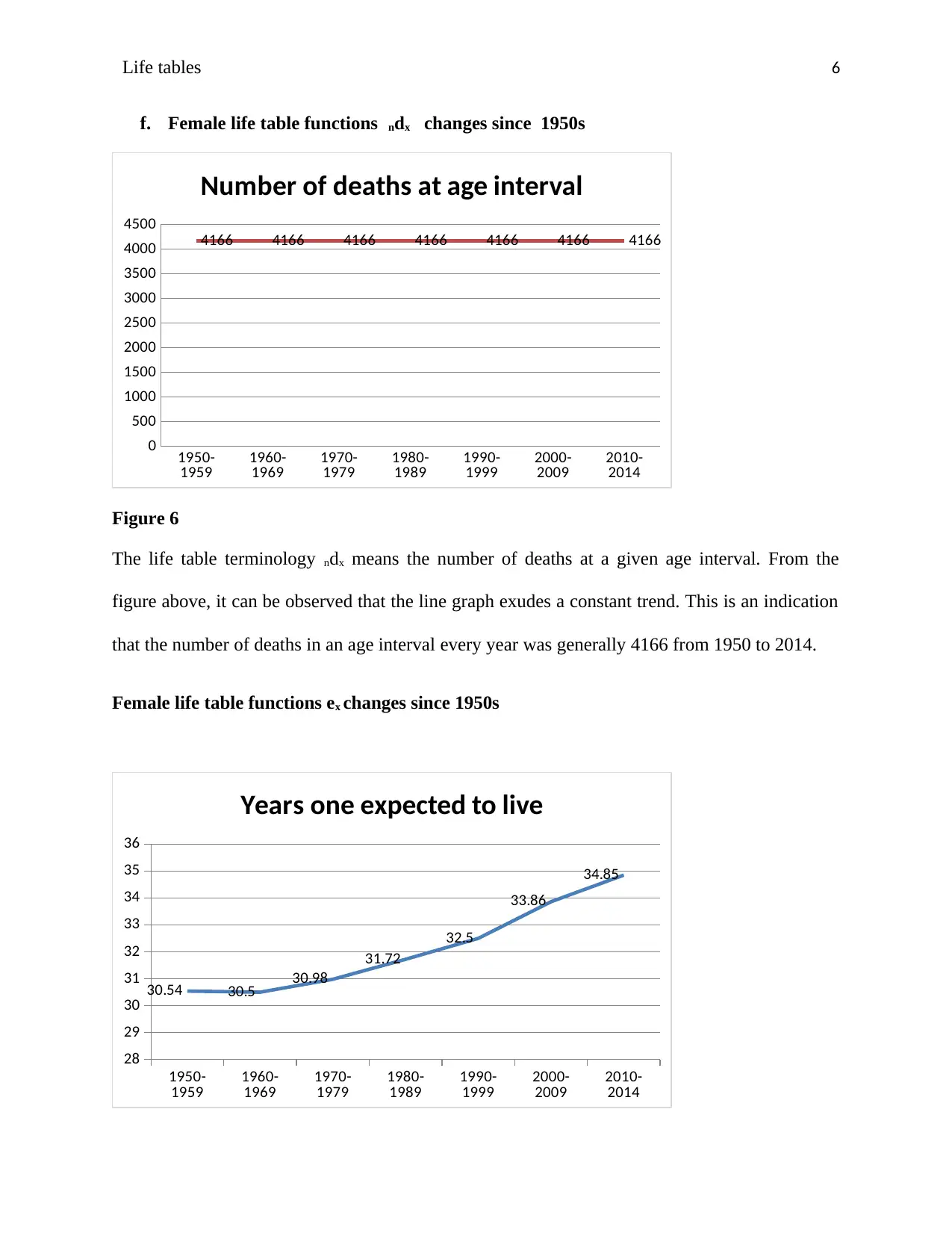
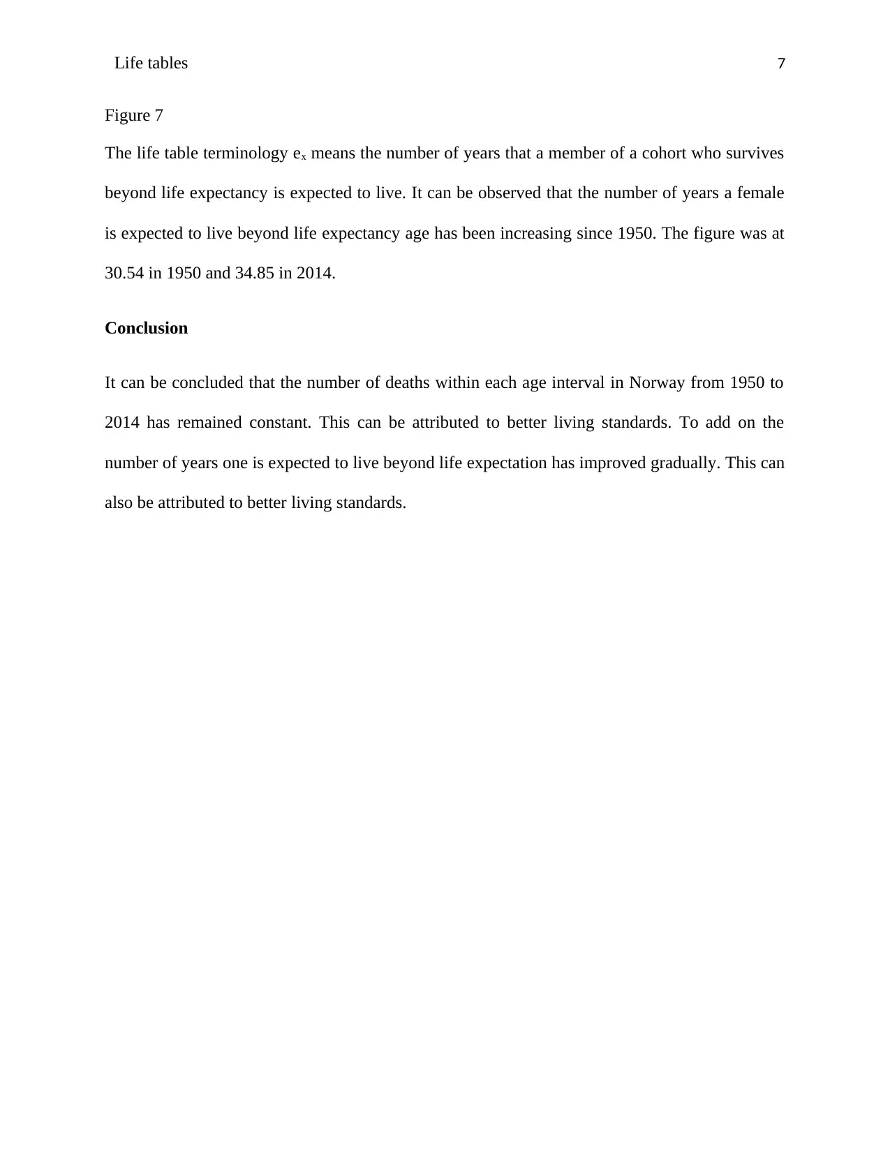
This report provides an analysis of life tables and mortality trends in Norway from 1950 to 2014. The study examines the age distribution of deaths, revealing a skew towards older age groups, and analyzes changes in mortality patterns over time. The report highlights the decreasing trend in both male and female infant mortality rates, with males initially exhibiting higher rates but converging with females by 2014. It further investigates the dynamics of female mortality at the lowest ages, showing a significant decrease from 1950 to 2014. The analysis includes changes in life table functions, such as population size (lx), number of deaths in a given age interval (ndx), and life expectancy (ex), indicating a constant trend in deaths per age interval and an increase in female life expectancy. The conclusion suggests improved living standards as a contributing factor to these trends.
Document Page
Life tables 1
Name:
Institution:
Date:
tabler-icon-diamond-filled.svg

Paraphrase This Document

Need a fresh take? Get an instant paraphrase of this document with our AI Paraphraser
Document Page
Life tables 2
Introduction
Population size is a characteristic that is very dynamic. It is never constant. It is either increasing
or decreasing every moment of the time (Kenneth, 2009). It is therefore imperative for
government to keep abreast of its population dynamics in order to be able to provide for its basic
needs such as health, infrastructure and education among others (Donna, 2011). Norway is one
of the countries that have taken keen interest in the dynamics of its population in order to provide
for it efficiently. The sections that follow entail data analysis, findings, discussion and
conclusion regarding life tables and deaths.
a. Changing age distribution of deaths since 1950 to 2014
0
.5- 9
15-19
25-29
35-39
45-49
55-59
65-69
75-79
85-89
95-99
105-109
0
50000
100000
150000
200000
250000
300000
350000
400000
450000
500000
Observed death by age
Figure 1
The figure 1 above shows number of deaths according to age distribution. It can be seen that the
distribution of deaths across the ages is not normal but skewed to the right. It has a long tail to
the left. From the distribution above, it is observed that most of the deaths occur between 55
years and 94 years. Fewer deaths can be seen in the age groups between 0 to 49 years and over
99 years.
Document Page
Life tables 3
b. Changing age pattern of mortality since 1950 to 2014
0
.5- 9
15-19
25-29
35-39
45-49
55-59
65-69
75-79
85-89
95-99
105-109
0
20000
40000
60000
80000
100000
120000
Age pattern of mortality
Figure 2
It can be observed from figure 2 above that the mortality rate across the ages is fairly constant up
to the age of 54 years after which it starts to fall till age 109 years.
Data analysis and findings
c. Male and female infant mortality rates changes since the 1950s?
1950-
1959 1960-
1969 1970-
1979 1980-
1989 1990-
1999 2000-
2009 2010-
2014
0
1000
2000
3000
4000
5000
6000
7000
8000
Infant mortality
Female
Male
Number of deaths
Document Page
Life tables 4
Figure 3
The line graph in figure 1 is a trend line of female and male mortality rate from 1950 to 2014. It
can be observed that the mortality rate for males was generally higher than that of females since
1950 to almost 2014. It can also be observed that the mortality rate for both male and females
has had a decreasing trend since 1950 to 2014. However the rate of the decrease has been high in
males as compared to the females. This can be explained by the fact that from 2009 going
backwards to 1950, there has been a difference in mortality rate between the two genders yet
between 2010 and 2014 the male mortality rate had fallen to match the female mortality rate.
d. Female lowest age-specific death rate dynamics from 1950 to 2014
1950-
1959 1960-
1969 1970-
1979 1980-
1989 1990-
1999 2000-
2009 2010-
2014
0
200
400
600
800
1000
1200
1400
1600
1800
2000
1776
1143
750
383 351 213 78
Female mortality rate (age 1-4 yrs)
Figure 4
From figure 2 above, it can be observed that the females’ mortality at the lowest age (1-4 years)
has decreased since 1950. Between 1950 and 1959, the mortality rate was 1776 while the
mortality rate between 2010 and 2014 was 78. This is a drop of about 1700 deaths. The mortality
drop rate can therefore be estimated to be 27 females per year since 1950 to 2014.
tabler-icon-diamond-filled.svg

Paraphrase This Document

Need a fresh take? Get an instant paraphrase of this document with our AI Paraphraser
Document Page
Life tables 5
e. Female life table functions lx changes since 1950s
1950-
1959 1960-
1969 1970-
1979 1980-
1989 1990-
1999 2000-
2009 2010-
2014
62000
64000
66000
68000
70000
72000
74000
76000
lx; 74164
Population at time x
Figure 5
The life table terminology lx means the size of the population at a particular time, x. It can be
observed from figure 3 that the line graph is ascending from left to right. This is an indication
that the population of Norway has been on an upward trend since 1950. At no one time has the
population been seen to go down. Between 1950 and 1959, the population was 67075 while the
population between 2010 and 2014 was 74164. This is an increase, however gradual.
Document Page
Life tables 6
f. Female life table functions ndx changes since 1950s
1950-
1959 1960-
1969 1970-
1979 1980-
1989 1990-
1999 2000-
2009 2010-
2014
0
500
1000
1500
2000
2500
3000
3500
4000
4500
4166 4166 4166 4166 4166 4166 4166
Number of deaths at age interval
Figure 6
The life table terminology ndx means the number of deaths at a given age interval. From the
figure above, it can be observed that the line graph exudes a constant trend. This is an indication
that the number of deaths in an age interval every year was generally 4166 from 1950 to 2014.
Female life table functions ex changes since 1950s
1950-
1959 1960-
1969 1970-
1979 1980-
1989 1990-
1999 2000-
2009 2010-
2014
28
29
30
31
32
33
34
35
36
30.54 30.5 30.98
31.72
32.5
33.86
34.85
Years one expected to live
Document Page
Life tables 7
Figure 7
The life table terminology ex means the number of years that a member of a cohort who survives
beyond life expectancy is expected to live. It can be observed that the number of years a female
is expected to live beyond life expectancy age has been increasing since 1950. The figure was at
30.54 in 1950 and 34.85 in 2014.
Conclusion
It can be concluded that the number of deaths within each age interval in Norway from 1950 to
2014 has remained constant. This can be attributed to better living standards. To add on the
number of years one is expected to live beyond life expectation has improved gradually. This can
also be attributed to better living standards.
tabler-icon-diamond-filled.svg

Paraphrase This Document

Need a fresh take? Get an instant paraphrase of this document with our AI Paraphraser
Document Page
Life tables 8
References
Donna L. Hoyert and Jiaquan Xu, “Deaths: Preliminary Data for 2011,” National Vital Statistics
Reports 61, no. 6 (2012): 1-64.
Kenneth D. Kochanek et al., “Deaths: Final Data for 2009,” National Vital Statistics Reports 60,
no. 3 (2011): 1-117.
National Center for Health Statistics, Health, United States, 2011: With Special Feature on
Socioeconomic Status and Health (2012): figure 32.
Statistics Canada. Age-standardized Rates 2017 [updated 2017-06-15. Available from:
http://www.statcan.gc.ca/eng/dai/btd/asr
chevron_up_icon
1 out of 8
circle_padding
hide_on_mobile
zoom_out_icon
[object Object]