1IT201 β HUMAN COMPUTER INTERACTION Table of Contents Background:.....................................................................................................................................2 Problems:.........................................................................................................................................2 Summary of Work:..........................................................................................................................4 Features:...........................................................................................................................................8 Reviewer Testing:............................................................................................................................8 Evolution:........................................................................................................................................9 Conclusion:......................................................................................................................................9 Bibliography:.................................................................................................................................10
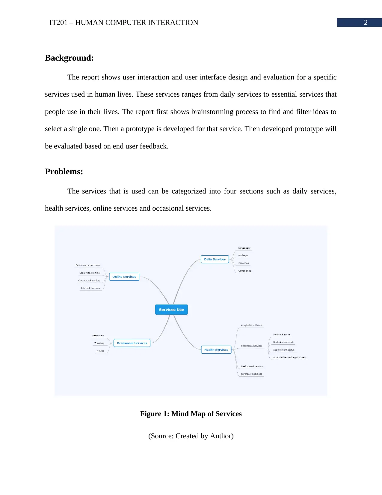
2IT201 β HUMAN COMPUTER INTERACTION Background: The report shows user interaction and user interface design and evaluation for a specific services used in human lives. These services ranges from daily services to essential services that people use in their lives. The report first shows brainstorming process to find and filter ideas to select a single one. Then a prototype is developed for that service. Then developed prototype will be evaluated based on end user feedback. Problems: The services that is used can be categorized into four sections such as daily services, health services, online services and occasional services. Figure 1: Mind Map of Services (Source: Created by Author)
3IT201 β HUMAN COMPUTER INTERACTION Most of the above mentioned services has a common backdrop and that is unavailability of information. None of the services are transparent. Taken as an example, customers do not have any idea when they are going to get the service or if the services are available. The customer have to waste their precious time get that information. In some cases, getting these information is much harder than expected because not all the service owners provide same quality of customer support. There are various services that are interesting such as online shopping, grocery shopping, health care services, exercise, newspaper, coffee shop, restaurants and more. Among all the services, healthcare services are most complex to manage. Most of the local healthcare centers do not provide any way to use online services. People have to visit healthcare center or call them to book an appointment. The phone lines are very rarely connects due to connection issue. Often scheduled appointment are cancelled and not all patients gets that updated information. There is not specific section to where all the health reports are illustrated. In order to understand health conditions, patients have to take precious time out of their schedules. Patients cannot track their upcoming and past appointment details. As health care centers often store wrong information of patient and his/her health, medical care gets hampered. Taking time out to visit healthcare center just to schedule an appointment is a very hard task. Patients have to visit the healthcare center several times for getting reports, showing that report to doctor and other stuffs. In case doctor is not available, they have to visit again on a specific date to check if doctor is available. This can be easily simplified using a centralized system. The system will collect all the data from patients and health care centers and generate information to serve everyone better. Taken as an example, if doctor is available then dates will
Paraphrase This Document
Need a fresh take? Get an instant paraphrase of this document with our AI Paraphraser
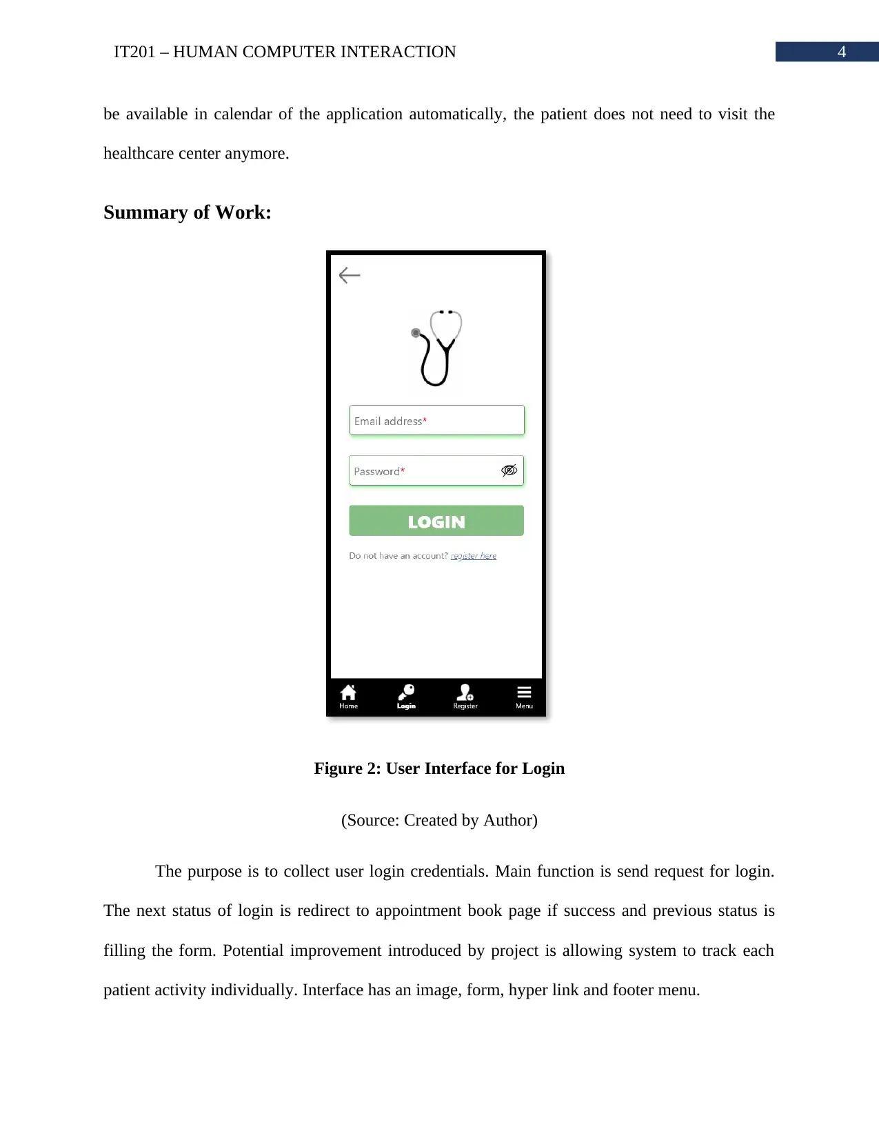
4IT201 β HUMAN COMPUTER INTERACTION be available in calendar of the application automatically, the patient does not need to visit the healthcare center anymore. Summary of Work: Figure 2: User Interface for Login (Source: Created by Author) The purpose is to collect user login credentials. Main function is send request for login. The next status of login is redirect to appointment book page if success and previous status is filling the form. Potential improvement introduced by project is allowing system to track each patient activity individually. Interface has an image, form, hyper link and footer menu.
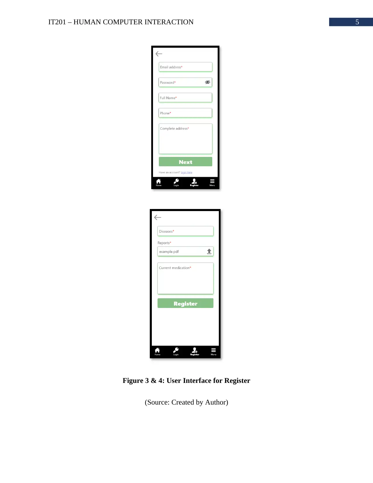
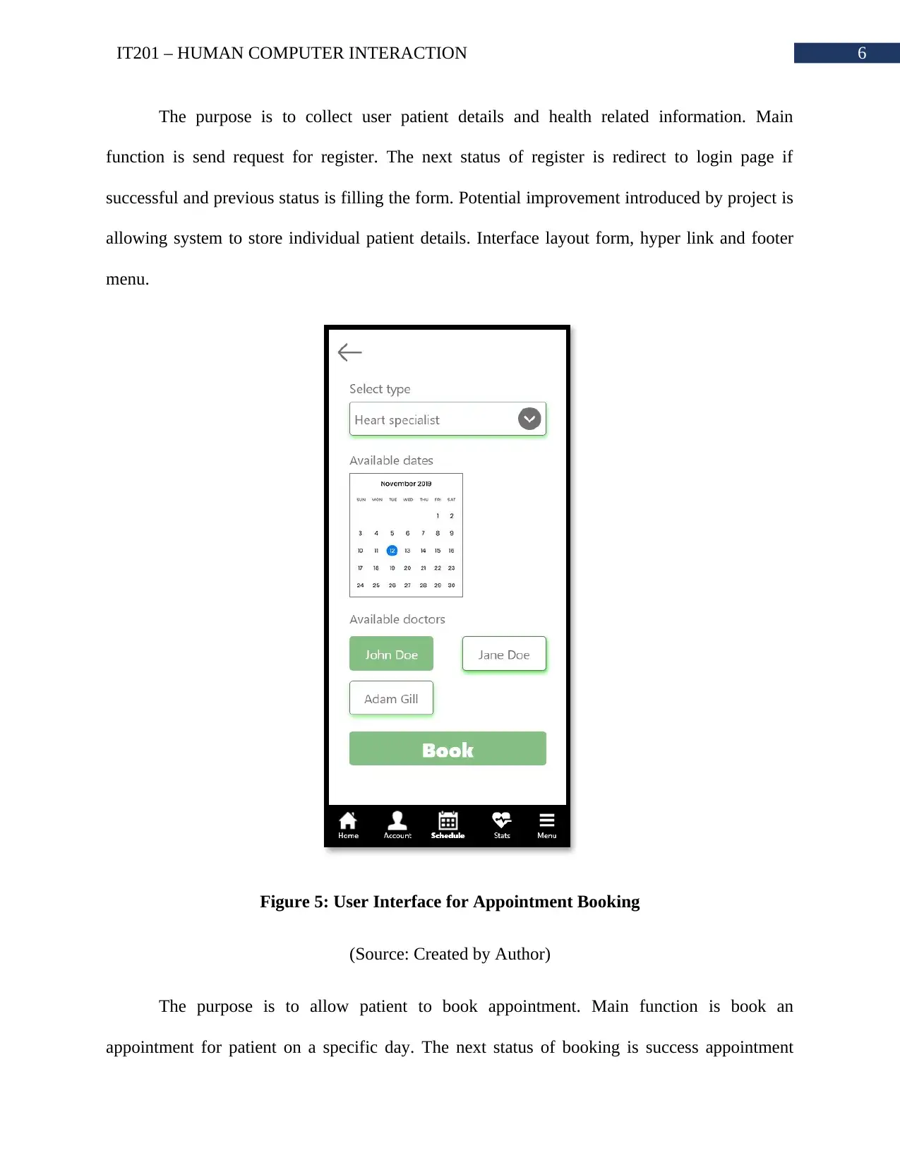
5IT201 β HUMAN COMPUTER INTERACTION Figure 3 & 4: User Interface for Register (Source: Created by Author)
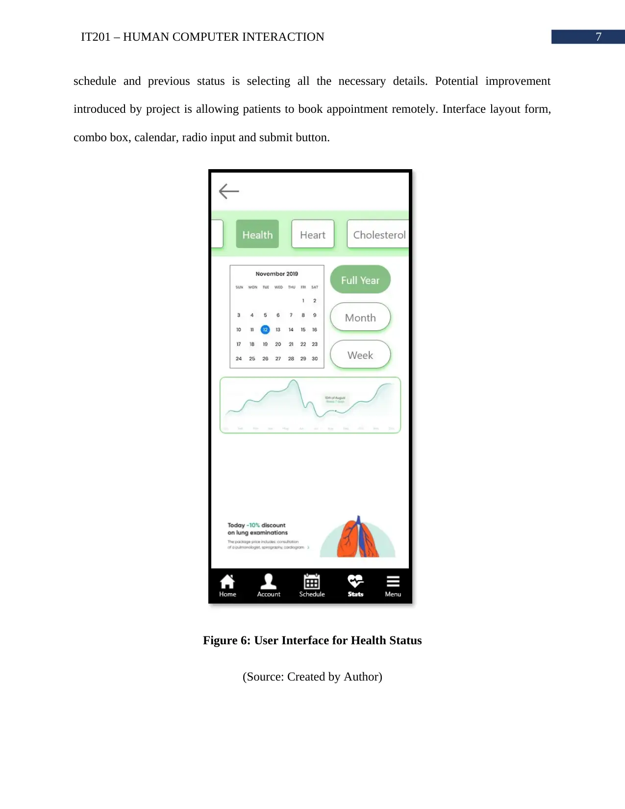
6IT201 β HUMAN COMPUTER INTERACTION The purpose is to collect user patient details and health related information. Main function is send request for register. The next status of register is redirect to login page if successful and previous status is filling the form. Potential improvement introduced by project is allowing system to store individual patient details. Interface layout form, hyper link and footer menu. Figure 5: User Interface for Appointment Booking (Source: Created by Author) The purpose istoallowpatientto book appointment.Main functionisbook an appointment for patient on a specific day. The next status of booking is success appointment
Secure Best Marks with AI Grader
Need help grading? Try our AI Grader for instant feedback on your assignments.
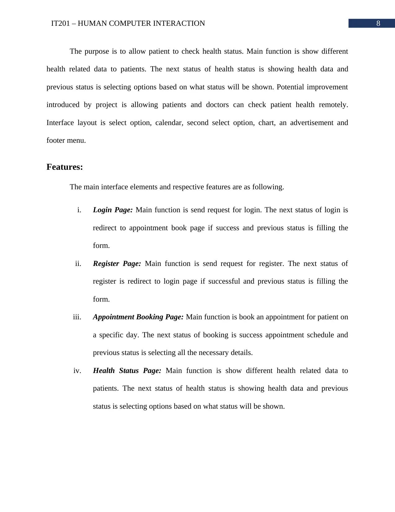
7IT201 β HUMAN COMPUTER INTERACTION schedule and previous status is selecting all the necessary details. Potential improvement introduced by project is allowing patients to book appointment remotely. Interface layout form, combo box, calendar, radio input and submit button. Figure 6: User Interface for Health Status (Source: Created by Author)
8IT201 β HUMAN COMPUTER INTERACTION The purpose is to allow patient to check health status. Main function is show different health related data to patients. The next status of health status is showing health data and previous status is selecting options based on what status will be shown. Potential improvement introduced by project is allowing patients and doctors can check patient health remotely. Interface layout is select option, calendar, second select option, chart, an advertisement and footer menu. Features: The main interface elements and respective features are as following. i.Login Page:Main function is send request for login. The next status of login is redirect to appointment book page if success and previous status is filling the form. ii.Register Page:Main function is send request for register. The next status of register is redirect to login page if successful and previous status is filling the form. iii.Appointment Booking Page:Main function is book an appointment for patient on a specific day. The next status of booking is success appointment schedule and previous status is selecting all the necessary details. iv.Health Status Page:Main function is show different health related data to patients. The next status of health status is showing health data and previous status is selecting options based on what status will be shown.
9IT201 β HUMAN COMPUTER INTERACTION Reviewer Testing: In terms of subjective satisfaction, reviewer one was very impressed with the interface design. He did not like how whole navigation was based on only footer menu. Second reviewer felt easy to use the footer menu as he uses his phone with one hand. Third reviewer was impressed with the error prevention because system does not allow user to input any information. All the information are based on what action user has taken. Taken as an example, third user did not have to input, specialist type, doctor name or date to book appointment, it was generated automatically based on inputs. As the second user is not very familiar with health related application, he had a hard time in understanding what exactly the application can do. However, due to high quality match between system and real world language, he eventually understood how to use it. According to all of them, the actions needed to be taken to complete a task, is very self- explanatory. Due to high degree of visibility of system status, no process was hard to complete. Reviewer one and two had problem with understanding the chart in the health status page. In the health status pages there was no help or document to guide the user understand the chart. Evolution: The proposed interface is very good and well crafted. The prototype will increase health care facilities much more. The improvements that can be implemented are as following. i.Link to associated pages in proper positions
Paraphrase This Document
Need a fresh take? Get an instant paraphrase of this document with our AI Paraphraser
10IT201 β HUMAN COMPUTER INTERACTION ii.More help buttons iii.Showing health record in numbers along with chart Conclusion: From the above study it can be concluded that proposed prototype is effective for the chosen service. The user interactions and user interface can be improved later but the core idea of the prototype is very effective and real.
11IT201 β HUMAN COMPUTER INTERACTION Bibliography: Billestrup, J., BornΓΈ, N., Bruun, A., & Stage, J. (2016, November). Usability problems found across public self-service applications and self-service providers. In Proceedings of the 28th Australian Conference on Computer-Human Interaction (pp. 623-625). Wei, Z., & Landay, J. A. (2018). Evaluating speech-based smart devices using new usability heuristics.IEEE Pervasive Computing,17(2), 84-96.