Amazon Online Selling Website 3 Use Cases. 4 Methodology of Evaluation
VerifiedAdded on 2021/05/31
|21
|4006
|355
AI Summary
17 Conclusion 17 References 19 Appendix A: Participant’s Questionnaire 21 List of Figures Figure 1 use case for Amazon Check in and check out 4 Figure 2 homepage for amazon website 8 Figure 3 navigation across the Amazon website 9 Figure 4 devices & electronics 10 Figure 5 Groceries & Gourmet Food 11 Figure 6 Toys & games 12 Figure 7movies & TV 12 Figure 8 star wars episode iv 13 Figure 9 Star Wars The Force Awakens 2016 Wall Calendar 13 Figure 10 Sort by 14 Figure 11sort by features
Contribute Materials
Your contribution can guide someone’s learning journey. Share your
documents today.
Table of Contents
Amazon Online Selling Website..................................................................................................................3
Use Cases....................................................................................................................................................4
Methodology of the Evaluation...................................................................................................................5
First Scenario...........................................................................................................................................5
Second Scenario......................................................................................................................................6
Third Scenario.........................................................................................................................................6
Fourth Scenario.......................................................................................................................................6
Five Scenario...........................................................................................................................................6
Results Evaluation...................................................................................................................................7
Results of First Scenario..........................................................................................................................7
Results of Second Scenario.....................................................................................................................9
Results for Third Scenario.....................................................................................................................12
Results for Fourth Scenario...................................................................................................................12
Sort By...............................................................................................................................................14
Results for Fifth Scenario......................................................................................................................15
Overall results........................................................................................................................................16
Findings and Recommendations................................................................................................................16
How Consistent?........................................................................................................................................16
How visible is the information?.................................................................................................................17
How easy it is to use and the Functionalities.............................................................................................17
Recommendations.....................................................................................................................................17
Conclusion.................................................................................................................................................17
References.................................................................................................................................................19
Appendix A: Participant’s Questionnaire..................................................................................................21
Secure Best Marks with AI Grader
Need help grading? Try our AI Grader for instant feedback on your assignments.
List of Figures
Figure 1 use case for Amazon Check in and check out................................................................................4
Figure 2 homepage for amazon website......................................................................................................8
Figure 3 navigation across the Amazon website..........................................................................................9
Figure 4 devices & electronics..................................................................................................................10
Figure 5 Groceries & Gourmet Food.........................................................................................................11
Figure 6 Toys & games.............................................................................................................................12
Figure 7movies & TV................................................................................................................................12
Figure 8 star wars episode iv-vi.................................................................................................................13
Figure 9 Star Wars The Force Awakens 2016 Wall Calendar...................................................................13
Figure 10 Sort by.......................................................................................................................................14
Figure 11sort by features in Amazon.........................................................................................................15
Figure 12 gift cards webpage.....................................................................................................................16
Figure 13 usability acceptance test............................................................................................................16
Amazon Online Selling Website
Nowadays many users have been engaging themselves in buying and ordering their products
online. This users may be in need of applications on the web which are interactives in all ways.
Users have been known to be as selective in all ways as they like interactive products that will be
very effective, much efficient, very safe and much more satisfying when in use and easy to learn.
This evaluation has led us in to asking ourselves what is an interactive system? The interactive
system in usability testing an evaluation is kind of an app may it be mobile or websites that will
allow users in performing their operations and functions in it such as the E-devices, electronic
Commerce sites, software’s such as games and many other more (meich, 2017). There are many
considerations that are always put ahead when we determining the capability of the usability
(NIELSEN, 2013). Some of these considerations may include things like as follows;
1. How consistency is your info and the design of the app (Sauro, 2013)?
2. What is the look and feel of the GUI?
3. Is the navigation easy while interacting with the webpages (Analysisa, 2018)?
4. Do we have clarity and visibility of the app or website?
5. Does the system match with the real World?
6. Are there the help and documentation for the user?
7. Does the application or website help users in recognizing, diagnosing and even recovering
from errors?
8. Can the system support the freedom and control of the users (Jakob, 1995)?
This report below aims at explaining the human interaction usability test that was performed on
Amazon Online selling website. Amazon online Selling Website will allow its clients in viewing
their products on their web app, they can place an order and required to pay online through
PayPal or credit cards among others online way of paying. This report will give an analysis of
the Amazon website is doing an investigation and observations of how the members or clients
who uses or have used the Amazon website where we will use some questionnaire so that we can
capture their ideas and much more evaluate their views (JannaDupree, 2014). The other area but
not least will be providing an evaluation of all the findings and recommending depending on
what we have collected so that the analysis will be meaningful and appealing in this study.
Use Cases.
Amazon is an international online and shipping company that sells goods or products on
wholesale and retail over their website globally. Amazon has been known for selling about over
50 million overall products daily which consists of different varieties such as the prime video
products, the Electronics and computers and office equipment’s, the toy kids and babies among
other more (Amazon, 2018). Amazon being online has its warehouses distributed all over the
world where if you place an order then the nearest warehouse will be searched and if the product
is found then they give you the price for shipping such and from there one can make the overall
payment. For better interactions with the customers Amazon have created a look and feel website
that is very easy to learn when searching hence making it easy when interacting with it and much
more very easy when navigating across it (Yitmen, 2013). All amazon products are stored in the
websites in their departments and categories (niloda, 2014). This website has been known for
allowing clients and customers in viewing their products from any place as far as they have some
internet (Dept, 2018). Just like any other website in amazon one can purchase by purchasing
their goods where they place an order by adding it to the shopping cart and waiting for delivery
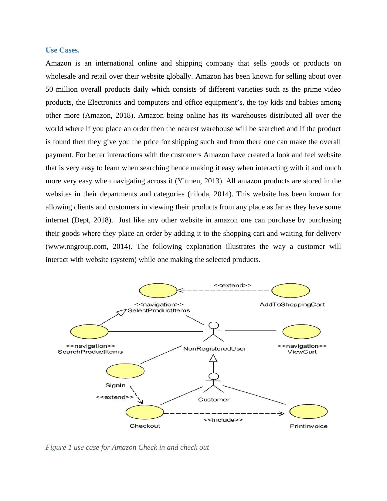
(www.nngroup.com, 2014). The following explanation illustrates the way a customer will
interact with website (system) while one making the selected products.
Figure 1 use case for Amazon Check in and check out
Secure Best Marks with AI Grader
Need help grading? Try our AI Grader for instant feedback on your assignments.
Using the concept as explained in the use case diagram below customers will interact with
Amazon online selling company in many ways before purchasing of a product can be termed to
be successful. In understanding the whole process that happens from the moment the customer
opens the webpage on the amazon and start navigating across the webpages we will need to do a
report that is based on the usability test, we evaluate it, and hence we look all the functional and
non-functional requirements of the website. The test is on the basis of how easy it is when
interacting with the website, the way the graphical user interface is consistent, the look and feel
of the website and the clarity and visibility of info etc.
Methodology of the Evaluation
The test for evaluation is on the basis of applying scenarios that will help in guiding the
customers or anyone participating in the usage of the Amazon website for do an analysis of all
functionalities and the features of the usability in the proposed system. In this case we used a
total of 10 people with no knowledge of Amazon in completing the usability tasks where every
user is given 20 minutes while the researcher is observing how they are performing the tasks
assigned to them. This task and the questions asked were all in relation what the Amazon offer to
its customers. Some of this tasks included thing like:
Creation of the account
Sign up
Login
Selecting the products of one’s choice
Adding to shopping cart
Making an order.
There are a number scenarios explained here below and this makes it to be a one task at a time as
explained from all the scenarios below.
First Scenario
In scenario one the user is needed to pay the Amazon website a visit for the first time that is
(https://www.amazon.com), selecting the location one is, the next step is navigation to the
departments for shopping where we are allowed to view various services and products offered by
Amazon and which are available and the price they are offering at.
Second Scenario
This is where the user will do a lot of navigation through the app which will include going
through the departments and categories such as the garden& outdoor, gift cards, handmade,
home & kitchen, industrial & scientific, movies & TV, pet supplies, office products, musical
instruments among others. The reason to why this scenario is performed is testing the usability of
the main navigation bar for transversing in to different parts of the website application or
website.
Third Scenario
In this scenario three the users were needed to do some item selection on the movies & TV and
the office products menu bars by viewing their details where they were needed to add at least
two items on from each department or category on the shopping cart.
Fourth Scenario
The scenario put more emphasis on the number of webpages that are visited by the customer in
the Amazon website. The user must have visited at least 6 webpages where we looked at design
consistency, clarity of the context as applied in the visited webpages. Ion this scenario four the
user was needed to write down all the webpages he or she visited and stating what all the visited
webpages entailed and reasoning out if the represented content was relevant in terms of functions
of the applications.
Five Scenario
In the fifth scenario the user was required to the category of gift cards and create a gift card for
any recipient for the selected product by choosing the design of the recipient gift card through
which we were to provide the info of the recipient and the gift card sing a credit card.
As seen from above all the ten users participated in going through all the five scenarios one by
one and with that knowledge and experience gained we were able to know how Amazon has
grown to be what it is entirely. All scenarios did put all their focuses on the analysis of the
usability of the whole website and the application, the GUI consistency, relevance of the content
that is on the webpages visited and how easy it is when navigating across all different parts of the
Amazon. These scenario discussed above are providing a step by step guideline explaining on
how the users interacts with the Amazon website which ensure how it is when conducting the
analysis and way that is effective in all manners.
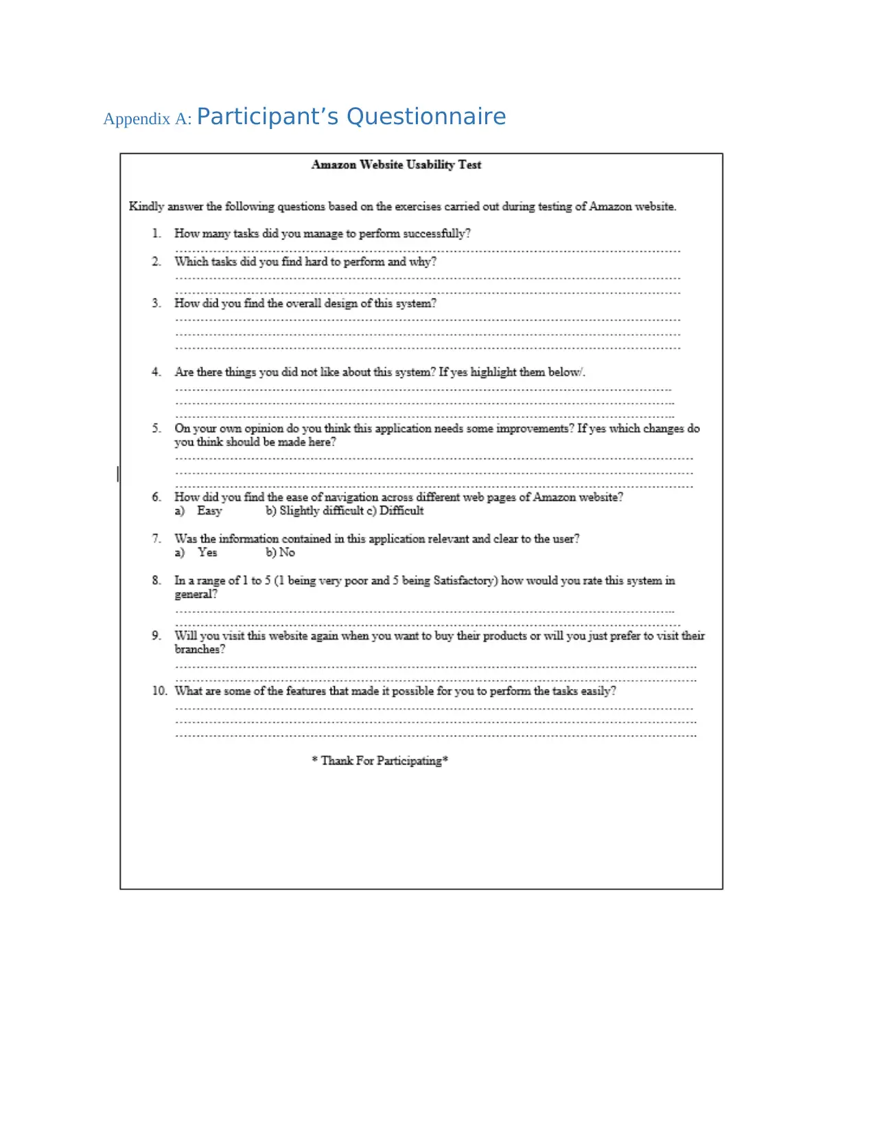
When all users were done performing all the five scenarios successfully; a well and simple
questionnaire with questions on the usability were supposed to be filled. The questionnaire
prepared aim on was getting an understanding of the general view of the users on Amazon
website and what they learnt during navigating across all the webpages visited in the website.
The users were required to do a rating out of the 5 points and say if a success or a failure was
really.
Methods that were used for evaluation really provided an interaction that is direct and make the
users to have the feel feature in them when observing and reading the gestures. With the
questionnaire it was easy knowing what the user felt about the Amazon website something that
was very easy but hard to perform when observing the executions of the scenarios above. The
methods were considered to be so effective in that they gave results that were appropriate for the
research.
Results Evaluation
On the basis on what we have done above there are number of concepts that need to be put in to
considerations as we realize them from the questionnaire (juben, 2013). In this cases all selected
particpants were performed alternatively to all people following the same procedure so that we
can achieve oure objectives (nizma, 2016).
Results of First Scenario
In this scenario the aim was testing how easy it is to navigate through the Amazon webpages
from indicating the location and lastly signing up and login in to the website and know what it
entails I all departments and categories. In this section it was not hard for them navigating across
the websites and it was easy for most of them as 7 out of 10 cited that part of the scenario to be
not necessary and time wastage and they requested to be taken directly to the website and start
doing their shopping, as most of them looked to have knowledge on such websites. The figure
below shows the home page of Amazon website.
Paraphrase This Document
Need a fresh take? Get an instant paraphrase of this document with our AI Paraphraser
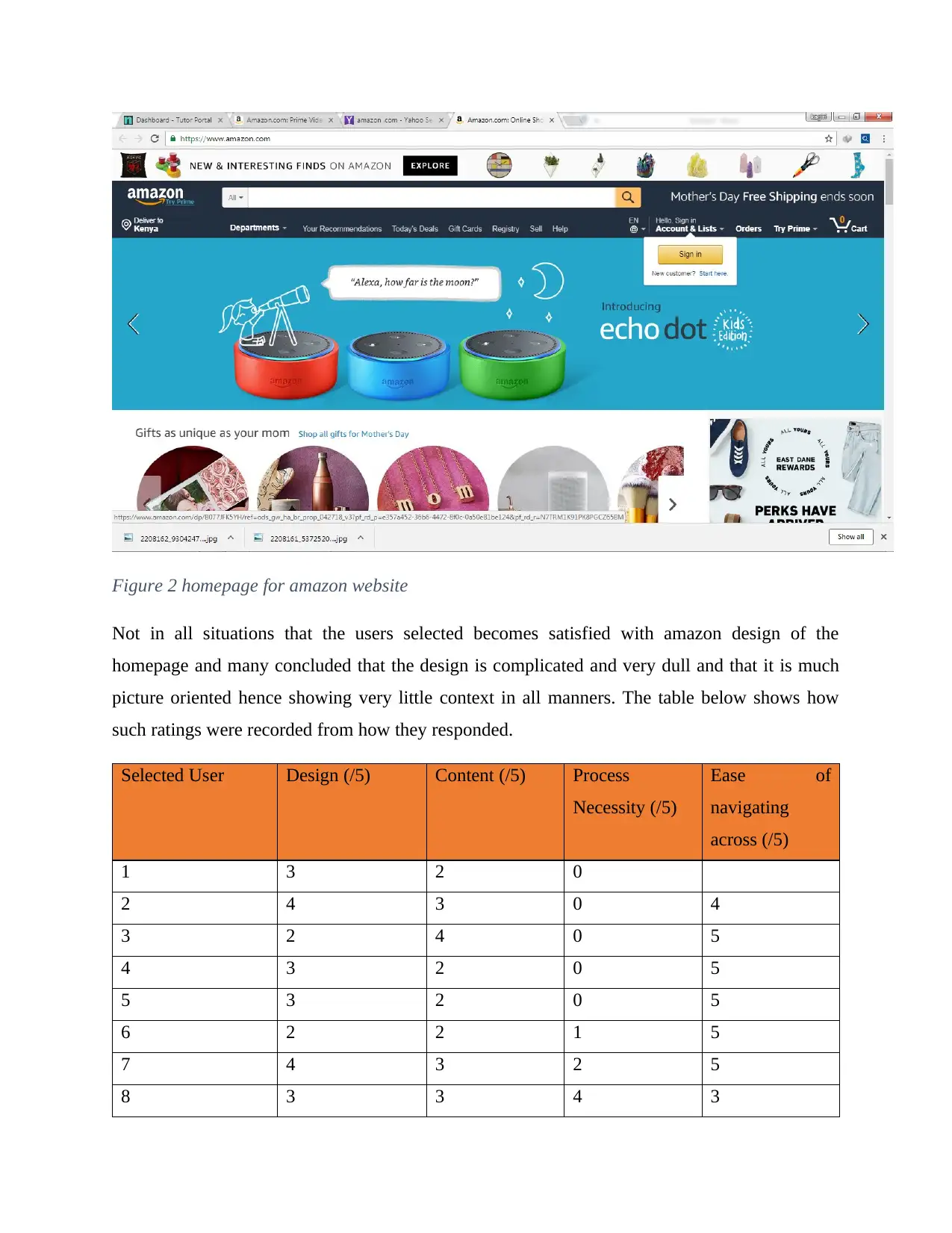
Figure 2 homepage for amazon website
Not in all situations that the users selected becomes satisfied with amazon design of the
homepage and many concluded that the design is complicated and very dull and that it is much
picture oriented hence showing very little context in all manners. The table below shows how
such ratings were recorded from how they responded.
Selected User Design (/5) Content (/5) Process
Necessity (/5)
Ease of
navigating
across (/5)
1 3 2 0
2 4 3 0 4
3 2 4 0 5
4 3 2 0 5
5 3 2 0 5
6 2 2 1 5
7 4 3 2 5
8 3 3 4 3
9 2 3 0 4
10 5 4 0 5
Results of Second Scenario
In this scenario aimed at checking at how easy it is easy while navigating across the amazon
website.
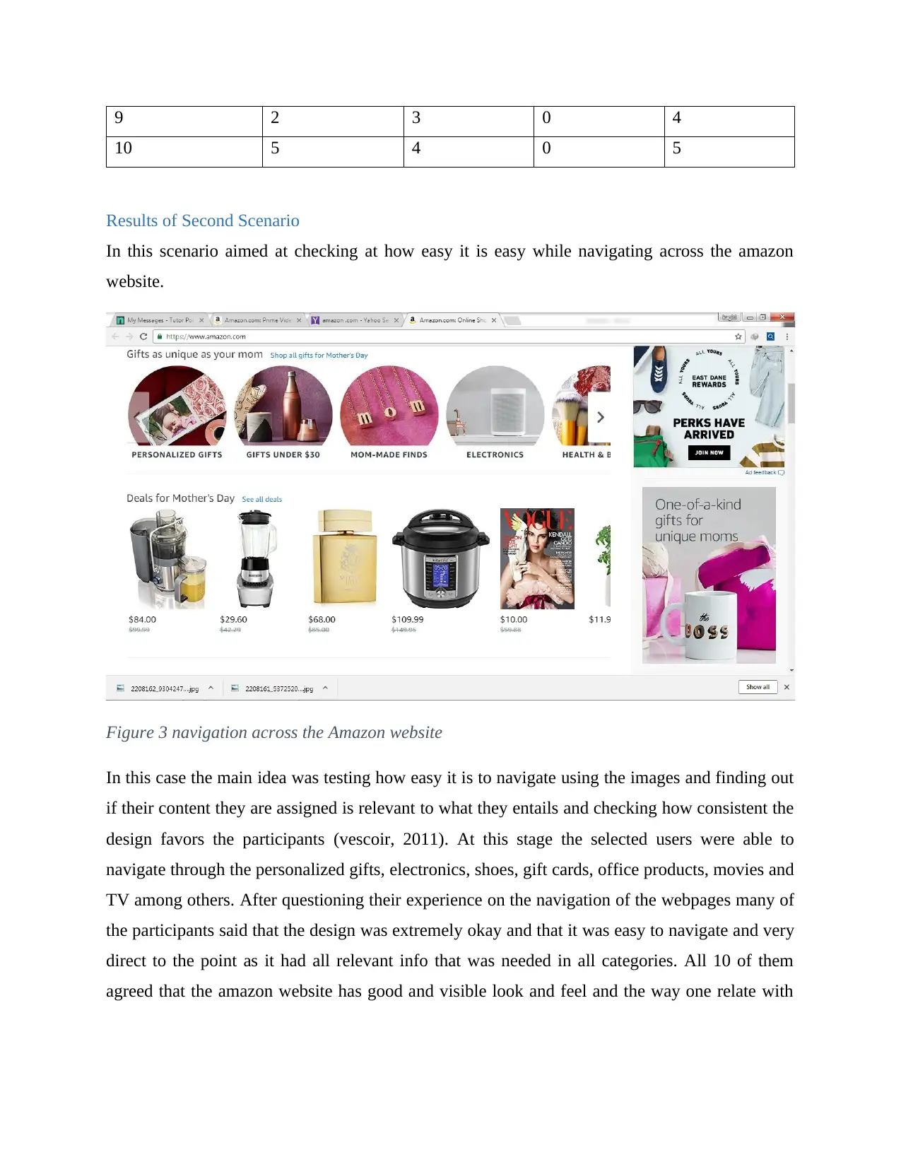
Figure 3 navigation across the Amazon website
In this case the main idea was testing how easy it is to navigate using the images and finding out
if their content they are assigned is relevant to what they entails and checking how consistent the
design favors the participants (vescoir, 2011). At this stage the selected users were able to
navigate through the personalized gifts, electronics, shoes, gift cards, office products, movies and
TV among others. After questioning their experience on the navigation of the webpages many of
the participants said that the design was extremely okay and that it was easy to navigate and very
direct to the point as it had all relevant info that was needed in all categories. All 10 of them
agreed that the amazon website has good and visible look and feel and the way one relate with
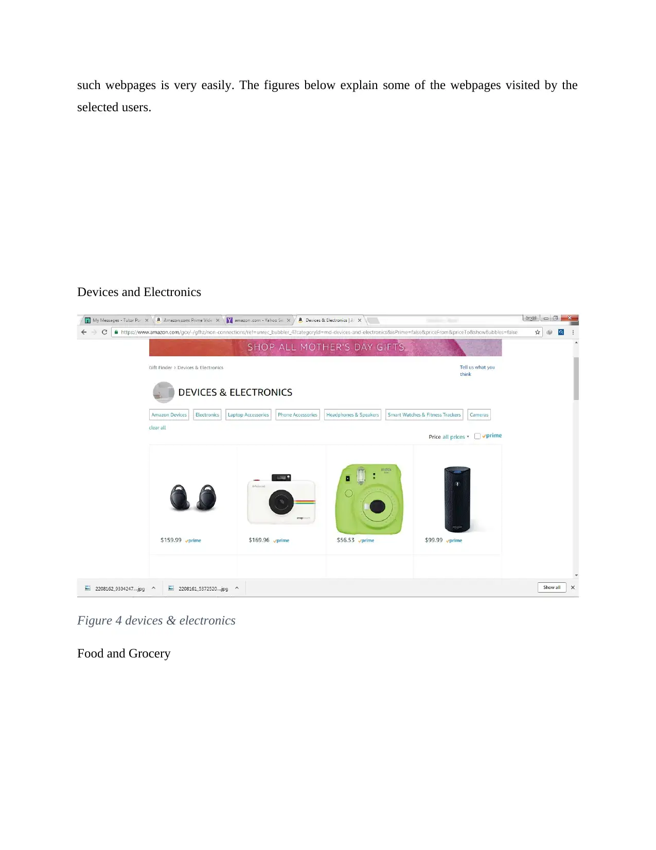
such webpages is very easily. The figures below explain some of the webpages visited by the
selected users.
Devices and Electronics
Figure 4 devices & electronics
Food and Grocery
selected users.
Devices and Electronics
Figure 4 devices & electronics
Food and Grocery
Secure Best Marks with AI Grader
Need help grading? Try our AI Grader for instant feedback on your assignments.
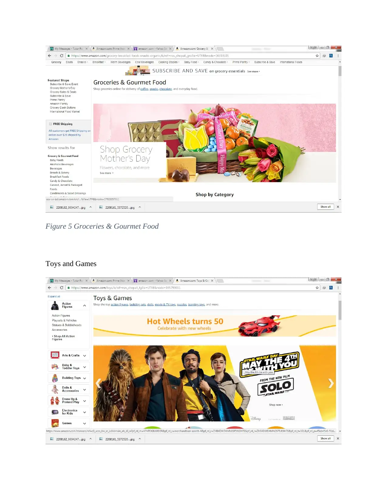
Figure 5 Groceries & Gourmet Food
Toys and Games
Toys and Games
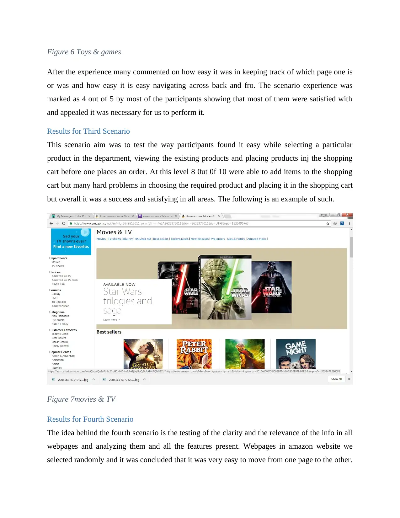
Figure 6 Toys & games
After the experience many commented on how easy it was in keeping track of which page one is
or was and how easy it is easy navigating across back and fro. The scenario experience was
marked as 4 out of 5 by most of the participants showing that most of them were satisfied with
and appealed it was necessary for us to perform it.
Results for Third Scenario
This scenario aim was to test the way participants found it easy while selecting a particular
product in the department, viewing the existing products and placing products inj the shopping
cart before one places an order. At this level 8 0ut 0f 10 were able to add items to the shopping
cart but many hard problems in choosing the required product and placing it in the shopping cart
but overall it was a success and satisfying in all areas. The following is an example of such.
Figure 7movies & TV
Results for Fourth Scenario
The idea behind the fourth scenario is the testing of the clarity and the relevance of the info in all
webpages and analyzing them and all the features present. Webpages in amazon website we
selected randomly and it was concluded that it was very easy to move from one page to the other.
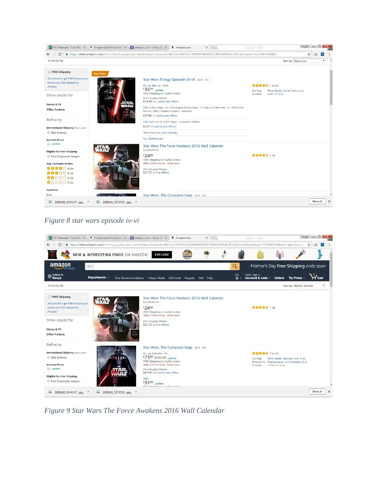
Figure 8 star wars episode iv-vi
Figure 9 Star Wars The Force Awakens 2016 Wall Calendar
Figure 9 Star Wars The Force Awakens 2016 Wall Calendar
Paraphrase This Document
Need a fresh take? Get an instant paraphrase of this document with our AI Paraphraser
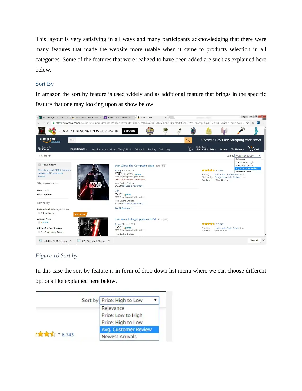
This layout is very satisfying in all ways and many participants acknowledging that there were
many features that made the website more usable when it came to products selection in all
categories. Some of the features that were realized to have been added are such as explained here
below.
Sort By
In amazon the sort by feature is used widely and as additional feature that brings in the specific
feature that one may looking upon as show below.
Figure 10 Sort by
In this case the sort by feature is in form of drop down list menu where we can choose different
options like explained here below.
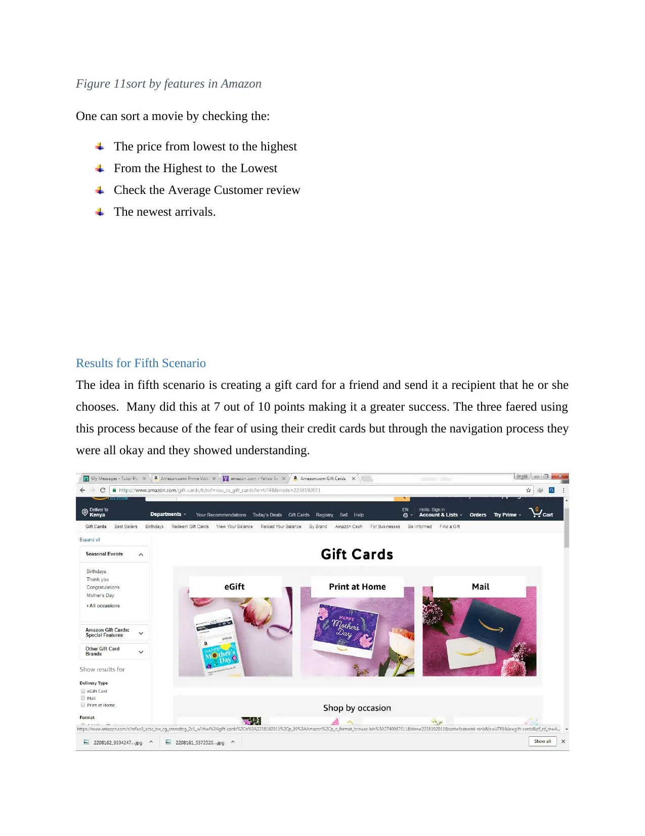
Figure 11sort by features in Amazon
One can sort a movie by checking the:
The price from lowest to the highest
From the Highest to the Lowest
Check the Average Customer review
The newest arrivals.
Results for Fifth Scenario
The idea in fifth scenario is creating a gift card for a friend and send it a recipient that he or she
chooses. Many did this at 7 out of 10 points making it a greater success. The three faered using
this process because of the fear of using their credit cards but through the navigation process they
were all okay and they showed understanding.
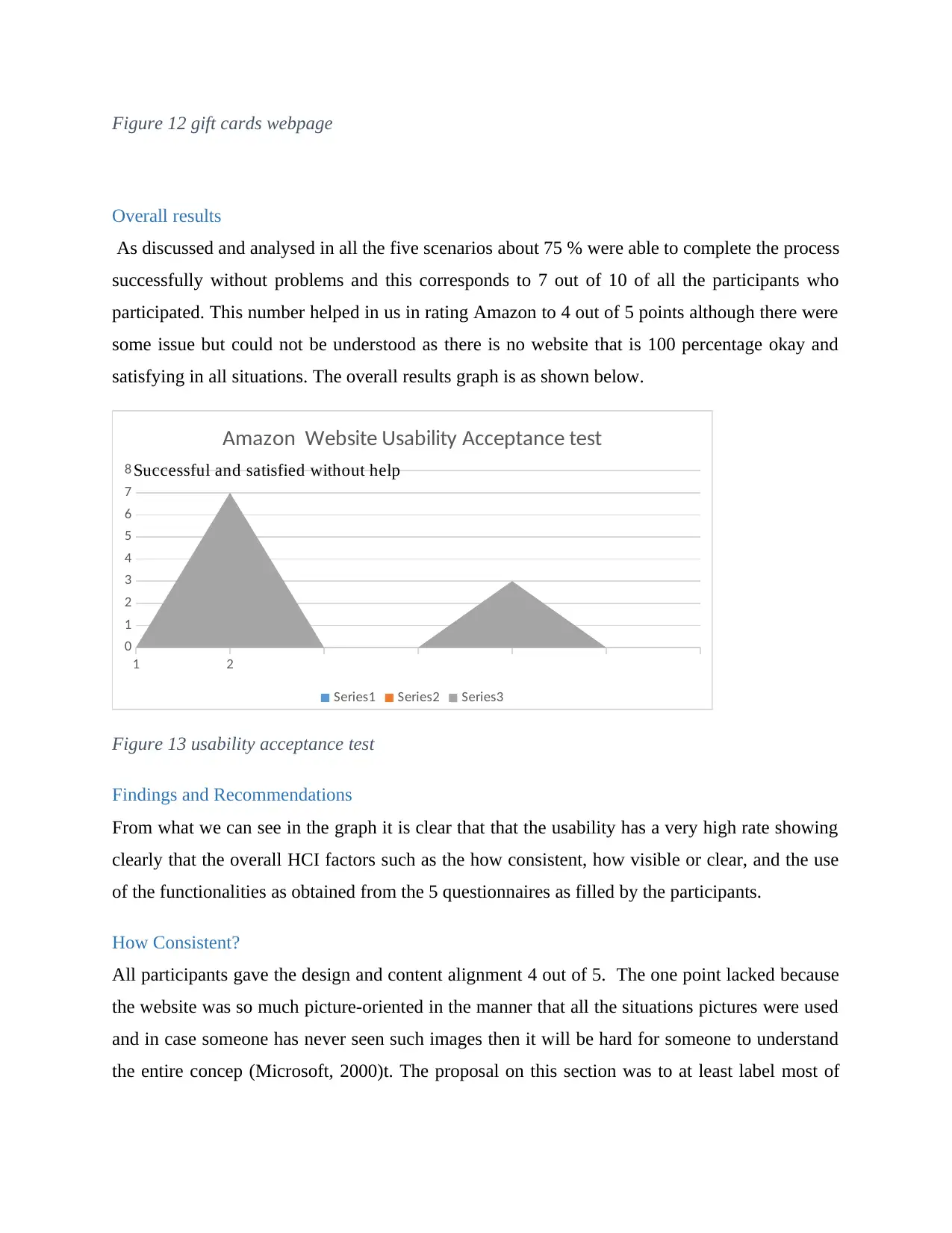
Figure 12 gift cards webpage
Overall results
As discussed and analysed in all the five scenarios about 75 % were able to complete the process
successfully without problems and this corresponds to 7 out of 10 of all the participants who
participated. This number helped in us in rating Amazon to 4 out of 5 points although there were
some issue but could not be understood as there is no website that is 100 percentage okay and
satisfying in all situations. The overall results graph is as shown below.
1 2
0
1
2
3
4
5
6
7
8
Amazon Website Usability Acceptance test
Series1 Series2 Series3
Successful and satisfied without help
Figure 13 usability acceptance test
Findings and Recommendations
From what we can see in the graph it is clear that that the usability has a very high rate showing
clearly that the overall HCI factors such as the how consistent, how visible or clear, and the use
of the functionalities as obtained from the 5 questionnaires as filled by the participants.
How Consistent?
All participants gave the design and content alignment 4 out of 5. The one point lacked because
the website was so much picture-oriented in the manner that all the situations pictures were used
and in case someone has never seen such images then it will be hard for someone to understand
the entire concep (Microsoft, 2000)t. The proposal on this section was to at least label most of
Secure Best Marks with AI Grader
Need help grading? Try our AI Grader for instant feedback on your assignments.
the images used with just a single name so that if one clicks on it then it will take him or her to
the detailed description of the image (nielsen, 2015).
How visible is the information?
The content was found to be relevant and very easy to understand. The way the additional
features such as the sort by, search among other were aligned in a satisfying way and there were
easy to locate and use (istqbexamcertification.com, 2012). All participants clearly stated that the
content is visible and very clear in all manners from webpage to ordering what they had selected.
How easy it is to use and the Functionalities
As seen from above info even from the graphs many participants were able to successfully
navigate across all the webpages and executing their tasks in an effective way. The recording
was that the website was easy to use and hence making interacting with it as very few and
minimal challenges were seen during the process. Many agreed and said that but about 70
percent said it is clear and visible but 30 percent did not strongly agree on that.
Recommendations.
The first recommendation will be on the improvement of the homepage design and add content
in terms of text and make it to be in dynamic by use of such features like sliders that will help in
seeking the attention of the visitors. The second recommendation that amazon will need to
reduce the searching process and categorize all similar products in one departments. Lastly but
not least is that the help section should be visible always and a live chart should be created hence
allowing good interaction between the Website and the visitor or purchaser.
Conclusion
In concluding this it was evident that for having a good and quality interactive system as seen
from above then the website or application will need to be visible to the users, it shows some
clarity, very easy when navigating through the entire website, and lastly how easy it is locating
what one is in need of. As we all know for a website to be told is a good quality interactive
system it should have the assistive features such as the search engines, filter and sort by contents
helping the users in locating their map location and much more navigating easily through the

webpages. If the above discussed from the first scenario to fifth scenario will be observed then it
will be easy for us to have a good and enhanced quality interactive systems.
will be easy for us to have a good and enhanced quality interactive systems.
References
Amazon, 2018. News and interesting finds on amazon. [Online]
Available at: https://www.amazon.com/gp/site-directory/ref=nav_shopall_btn
[Accessed 04 may 2018].
Analysisa, 2018. Test your mobile app Test Your Mobile application usability by real users. [Online]
Available at: http://www.analysia.com
[Accessed 05 may 2018].
Dept, U., 2018. improving the user experience, Newyork: usabilitygov.
istqbexamcertification.com, 2012. What is Usability testing in software and it’s benefits to end user?.
[Online]
Available at: http://istqbexamcertification.com/what-is-usability-testing-in-software-and-its-benifits-to-
end-user/
[Accessed 05 May 2018].
Jakob, N., 1995. 10 Usability Heuristics for User Interface Design, Newyork: Nielsen Norman group.
JannaDupree, 2014. Help us improve the experience: Looking for usability testing participants, LA:
communitica.
juben, m., 2013. heuruistic evaluation for the graphica user interfaces. usability huristics, 3(1), pp. 2-7.
meich, s., 2017. knowledge capitalization. Evaluation of the Website, 3(2), pp. 27-78.
Microsoft, 2000. UI Guidelines vs. Usability Testing. [Online]
Available at: https://msdn.microsoft.com/en-us/library/ms997578.aspx
[Accessed 05 may 2018].
NIELSEN, j., 2013. 10 Usability Heuristics for User Interface Design. The most comprehensive collection of
Design Principles on the Internet., 7(3), pp. 78-90.
nielsen, j., 2015. Usability 101: Introduction to Usability. [Online]
Available at: https://www.nngroup.com/articles/usability-101-introduction-to-usability/
[Accessed 05 May 2018].
niloda, 2014. step by step guide in doin evaluation in usability. heuristic evaluation, 6(7), pp. 56-82.
nizma, 2016. introduction to usabiility evaluation, 6(9), pp. 25-40.
Sauro, J., 2013. MeasuringU. 10 METRICS FOR TESTING WEBSITE NAVIGATION, 6(2), pp. 23-25.
vescoir, 2011. evaluation and manufacturing the usability cases.. usability and usability testing of
websites, 3(2), pp. 11-56.
www.nngroup.com, 2014. Turn User Goals into Task Scenarios for Usability Testing. [Online]
Available at: https://www.nngroup.com/articles/task-scenarios-usability-testing/
[Accessed 05 May 2018].
Paraphrase This Document
Need a fresh take? Get an instant paraphrase of this document with our AI Paraphraser

Yitmen, K., 2013. Usability Testing: Personas, Scenarios, Use Cases, and Test Cases. starcanada,
UXservices.
UXservices.
Appendix A: Participant’s Questionnaire
1 out of 21
Your All-in-One AI-Powered Toolkit for Academic Success.
+13062052269
info@desklib.com
Available 24*7 on WhatsApp / Email
![[object Object]](/_next/static/media/star-bottom.7253800d.svg)
Unlock your academic potential
© 2024 | Zucol Services PVT LTD | All rights reserved.


