Evaluation of Responsive Web Design Principles on AWM Website
16 Pages2763 Words67 Views
Added on 2023-03-20
About This Document
This report evaluates the conformity of the AWM website to Responsive Web Design principles, including fluid grid design, flexible media, and media queries. It also discusses the positive and negative aspects of the website's design and suggests improvements.
Evaluation of Responsive Web Design Principles on AWM Website
Added on 2023-03-20
ShareRelated Documents
Name of University
Responsive Web Design
Student Name
Course Name
Submission Date
Responsive Web Design
Student Name
Course Name
Submission Date
Table of Contents
Introduction......................................................................................................................................3
Discussion........................................................................................................................................3
Overview of the website..............................................................................................................3
Main Features in the website.......................................................................................................4
i. Clear navigation:...............................................................................................................4
ii. Social media integration:...............................................................................................4
iii. Security:.........................................................................................................................5
iv. Contact and business information:................................................................................6
v. Search Bar:....................................................................................................................6
vi. Login with Facebook:....................................................................................................7
Positive aspects of the website....................................................................................................8
Fluid grid design......................................................................................................................8
Flexible media.........................................................................................................................9
Media queries.........................................................................................................................10
Negatives aspects of the website...............................................................................................11
Comments..................................................................................................................................13
Advantages and disadvantages of simulation tool used................................................................14
Conclusion.....................................................................................................................................15
References......................................................................................................................................16
Introduction
The purpose of this report is to evaluate and analyse “https://www.awm.gov.au/” website
on its conformity with Responsive Web Design (RWD) principal. In addition, the report
evaluates the usability of the website in different user devices like desktop computers, mobile
phones of different screen sizes as well as tablet computers. Under RWD, the report tries the
examine the existence of fluid grid systems, fluid image use and dynamic media queries,
breakpoints, max and min values, nested objects, the idea of mobile or desktop first and fonts
versus images that drive a responsive website design. The evaluation is performed using Google
Chrome Developers tool.
Discussion
Designing a website with responsive web design principles allows visitors to have a
smooth, continuous and uninterrupted experience with every device they use to access it. These
devices include desktop browsers, tablets and mobile phones (Storey, 2013). There are three
fundamental ingredients that make the responsive web design recipe. These are fluid grid,
flexible media and media queries (Medina et al, 2013). Fluid grid design allows for the contents
to adjust to different environments. Most elements are measured in percentages, rem, em, vh, or
vm units rather than pixels, combined with a series of CSS breakpoints defined in CSS media
(Storey, 2013). Flexible media like images should adopt to grow and shrink to fit with a flexible
grid column. Higher resolution images should be set not to load on small screens meant for smart
phones but only on desktop browsers. On the other hand, media queries should be driven by
Cascading Style Sheet (CSS).
Overview of the website
“https://www.awm.gov.au/” is a corporate website for the Australian War Memorial. The
website showcases shrines and world-class museum and an extensive archive of war memorial in
Australia. This is to commemorate the sacrifice of those Australians who have died in war or on
operational service and those who have served the nation in times of conflict. Most importantly,
the website offers a way to remember and understand of Australia’s wartime experience. The
website’s audience is the general populous from Australian citizens to visitors from all over the
world. The website has a shopping cart where the visitors can purchase relics and souvenir.
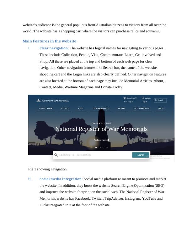
Main Features in the website
i. Clear navigation: The website has logical names for navigating to various pages.
These include Collection, People, Visit, Commemorate, Learn, Get involved and
Shop. All these are placed at the top and bottom of each web page for clear
navigation. Other navigation features like Search bar, the name of the website,
shopping cart and the Login links are also clearly defined. Other navigation features
are also located at the bottom of each page they include Memorial Articles, About,
Contact, Media, Wartime Magazine and Donate Today
Fig 1 showing navigation
ii. Social media integration: Social media platform re meant to promote and market
the website. In addition, they boost the website Search Engine Optimization (SEO)
and improve the website footprint on the social web. The National Register of War
Memorials website has Facebook, Twitter, TripAdvisor, Instagram, YouTube and
Flickr integrated in it at the foot of the website.
world. The website has a shopping cart where the visitors can purchase relics and souvenir.
Main Features in the website
i. Clear navigation: The website has logical names for navigating to various pages.
These include Collection, People, Visit, Commemorate, Learn, Get involved and
Shop. All these are placed at the top and bottom of each web page for clear
navigation. Other navigation features like Search bar, the name of the website,
shopping cart and the Login links are also clearly defined. Other navigation features
are also located at the bottom of each page they include Memorial Articles, About,
Contact, Media, Wartime Magazine and Donate Today
Fig 1 showing navigation
ii. Social media integration: Social media platform re meant to promote and market
the website. In addition, they boost the website Search Engine Optimization (SEO)
and improve the website footprint on the social web. The National Register of War
Memorials website has Facebook, Twitter, TripAdvisor, Instagram, YouTube and
Flickr integrated in it at the foot of the website.
End of preview
Want to access all the pages? Upload your documents or become a member.
Related Documents
Responsive Web Design Processlg...
|20
|3825
|112
Assignment on Responsive Web Design RWDlg...
|15
|3125
|28
Pirates Restaurant Websitelg...
|8
|1518
|35
A Guide to Responsive Web Designlg...
|13
|3591
|86
What is web design (and how to get it right)? - Deskliblg...
|4
|726
|12
Website Design and Responsive Web Design Tester Toolslg...
|14
|2768
|317