IMAT5209 Assignment: Usability Evaluation of Interactive System Report
VerifiedAdded on 2023/01/20
|21
|4457
|91
Report
AI Summary
This report presents a usability evaluation of the Missguided online retail website, assessing its user interface and overall user experience. The evaluation is conducted using a heuristic evaluation method, focusing on ten usability guidelines. The report details the interactive system's functionalities, including login, registration, and product management, and examines usability requirements such as learnability, performance, availability, and navigation. The evaluation methodology involves task-based assessments of user interactions with the system, with participants performing specific tasks to gauge the website's adherence to usability principles. The findings highlight strengths and weaknesses of the website's design, providing insights into areas for improvement to enhance user satisfaction and overall system effectiveness. The report includes use cases, a detailed analysis of usability requirements, and a description of the evaluation process. This report aims to provide practical recommendations for improving the website's usability, contributing to a better user experience.
Running head: USABILITY EVALUATION OF INTERACTIVE SYSTEM
Usability Evaluation of Interactive System
Name of the Student
Name of the University
Author’s note:
Usability Evaluation of Interactive System
Name of the Student
Name of the University
Author’s note:
Paraphrase This Document
Need a fresh take? Get an instant paraphrase of this document with our AI Paraphraser
1USABILITY EVALUATION OF INTERACTIVE SYSTEM
Table of Contents
Part ONE: The Interactive System and Its Users.............................................................................2
Part TWO: The Use Cases...............................................................................................................3
Part THREE: The Usability Requirements......................................................................................4
Part FOUR: The Evaluation Methodology......................................................................................5
Part FIVE: The Evaluation..............................................................................................................8
Part SIX: The Findings of the Evaluation......................................................................................15
Bibliography:.................................................................................................................................17
2USABILITY EVALUATION OF INTERACTIVE SYSTEM
Part ONE: The Interactive System and Its Users
The selected interactive system is an online web application that allows the customers to
buy clothing and fashion products. The name of the interactive system is Missguided (Women
Clothing Website). The interactive system is an online retail website. The system has
authorization and authentication functions. The system is developed on web 2.0 technologies. It
has a menu that allows the user to navigate through the system freely. The account is also
available for registered users. After registering into the system, the user can use the provided
login credentials to login to their account. The account holds all the purchasing and short listed
products. During the registration, the system stores the email address of the user. The system
uses this email address for promoting products and informing user about the availability of the
products. The system has an interface for the administrators so that they can adjust contents of
the system and make desired changes. The user can add products to wish list if not available
currently. The purchasing of product is also very easy because the system has a cart that manages
all the products in a single order.
The user of the system are customer, admin and service provider. The system will be
hugely by the customers. They have the biggest interest on the system. Every purchase they
make from the owner organization has to be made through this system. The admin are in the
middle of customer and service provider in terms of interest and power over the system. They
admin can make changes in the system appearance, working and many other things. The service
provider remains the most powerful user as they control the system. They can update, install
patch, change resources and do every other possible things mentioned in SLA that can affect the
system processing.
⊘ This is a preview!⊘
Do you want full access?
Subscribe today to unlock all pages.

Trusted by 1+ million students worldwide
3USABILITY EVALUATION OF INTERACTIVE SYSTEM
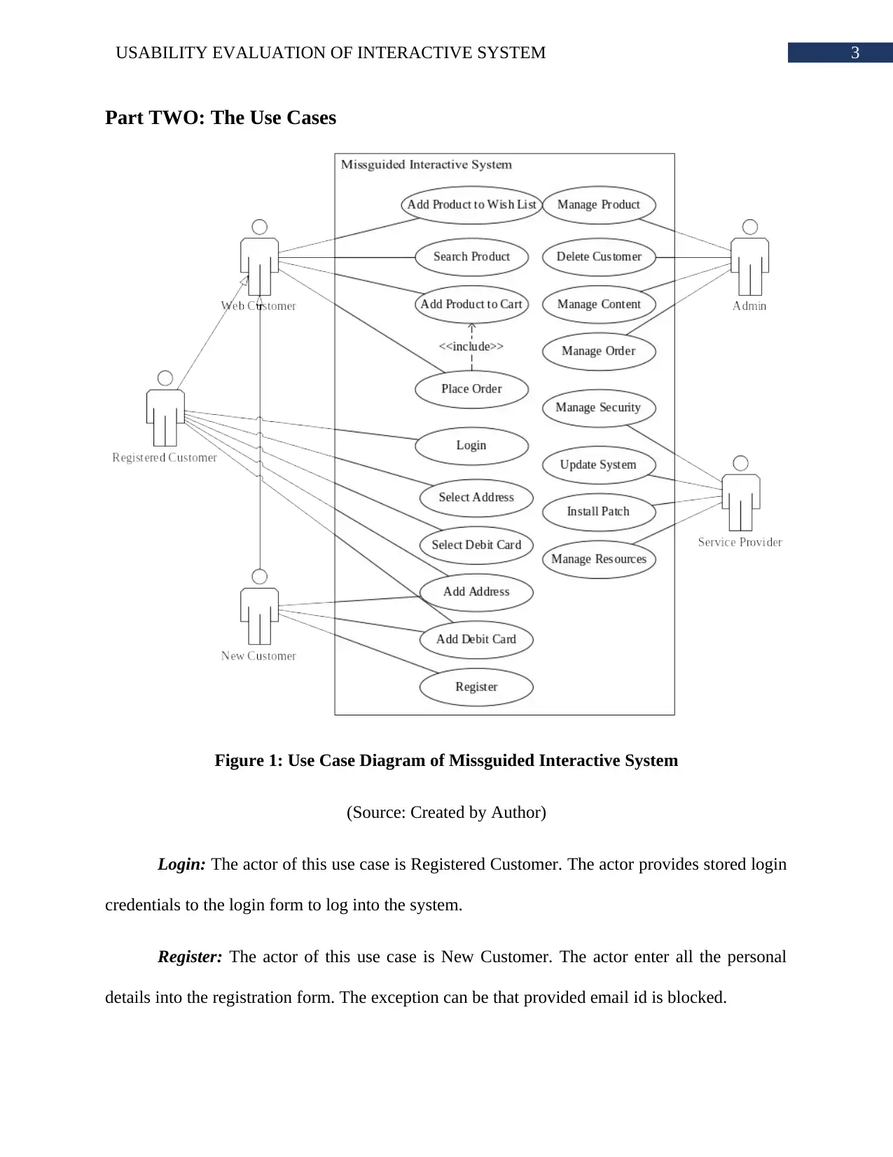
Part TWO: The Use Cases
Figure 1: Use Case Diagram of Missguided Interactive System
(Source: Created by Author)
Login: The actor of this use case is Registered Customer. The actor provides stored login
credentials to the login form to log into the system.
Register: The actor of this use case is New Customer. The actor enter all the personal
details into the registration form. The exception can be that provided email id is blocked.
Paraphrase This Document
Need a fresh take? Get an instant paraphrase of this document with our AI Paraphraser
4USABILITY EVALUATION OF INTERACTIVE SYSTEM
Place Order: Any of the web customers can place an order. This use case is related to
add product to cart use case. The exception can be that selected product cannot be delivered to
specified location.
Manage Product: The admin is the actor of this use case. The actor can add, delete and
update the product details. The actor can also manage stock related to a product.
Manage Content: The administrators can manage the contents like text, posts, images
and other elements present in the pages. They have the authority to update style and theme of the
system.
Update System: The service provider can update the system. This actor can add modules
to the system or update its working procedure.
Part THREE: The Usability Requirements
Learnability: This refers to the capacity of the system, how easily the functions can be
presented to the users. The users should be able to understand how to use the system very
efficiently. The system must provide hints about how to operate its functions or what button does
what job. The learnability can also be effectively used by showing the outcome of clicking
different buttons or links.
Performance: In terms of Web applications, the performance is a very crucial usability
requirement. In this era, the competition of online retail is extremely high and a system without
high performance capability cannot be a choice of the customers. The performance of the system
will affect the user experience. The performance also denotes that how easily the customer can
execute a specific task.
5USABILITY EVALUATION OF INTERACTIVE SYSTEM
Availability and Accessibility: These types of interactive systems must be available to the
users 24*7. The user can try to connect to the system anytime from anywhere. The designers also
has to be concern about the fact that persons with different disabilities will use the system. The
system should be loaded into the user device with medium internet connection. The online stores
are mostly used through the phones and mobile networks does not provide strong connection like
broadband.
Good Navigation: The users of the system should be able to freely navigate throughout
the system without being three clicks away from whatever they wish to access. The three clicks
technique is a very critical solution to complex and big website navigation. The main menu must
have links to product categories and sub categories.
Undo: It is common for the users to select products and execute a task that they do not
want. The system must provide them the opportunity to rollback to previous state. Taken as an
example, a customer may want to remove a product from the cart or admin wants to delete a
product that they have mistakenly added.
Part FOUR: The Evaluation Methodology
The usability evaluation will be done based on ten usability heuristics. These ten
heuristics will be examined by monitoring the user activities in the system. Few participants will
be employed in this evaluation process. Each user will be given specific tasks that they will carry
out. The user experience can be considered as the qualitative metric that can have impact on
many human interaction factors. The continuous improvement in the human computer interaction
is allowing organizations to provide great user experience. However, checking the impact of the
developed product is always a factor in system development. In order to check the usability of
⊘ This is a preview!⊘
Do you want full access?
Subscribe today to unlock all pages.

Trusted by 1+ million students worldwide
6USABILITY EVALUATION OF INTERACTIVE SYSTEM
the system interface the heuristic evaluation method has been selected. This method will be
carried out based on ten guidelines. Each guideline has to be carried out by the participants and
tasks for following the guidelines will be discussed with them.
Guideline Description User Task
Visibility of System
Status
This guideline refers to the response of the system
based on the user activity. That means, system
should react to user action within minimal time
through colour changing, animation, loader or any
other way.
Purchase
Product
Connection between
the real world and
the system
The system may have some contents of functions
that user may not be familiar with. This issue can be
overcome because, a user can get accustomed with
the system after a few days of interactions.
However, it is significant for the system to speak in
the language of the system user.
Newsletter
Registration
User Control and
Freedom
This guideline is all about providing the freedom to
the user to perform actions and navigate through the
system. The user will have complete control over the
actions they make.
Adding product
to cart and wish
list
Consistency and
Standards
Consistency is a significant factor in system design
to make the user learn about the system fast. The
buttons for same purpose must look and feel same in
every page in the system. Moreover, the system
Accessing the
content of the
system
Paraphrase This Document
Need a fresh take? Get an instant paraphrase of this document with our AI Paraphraser
7USABILITY EVALUATION OF INTERACTIVE SYSTEM
must show a particular type of data in the same
fashion in every page.
Error Prevention The error prevention informs the user when he/she is
about to make a mistake. This is very important for
increasing the user experience. It is because, the
users will be highly satisfied if the system informs
them what mistake they are making and prevent it
from doing.
Password
confirmation,
purchase
product
Recognition rather
than recall
This guideline is based on giving suggestions to the
users rather than asking him to remember the whole
thing. The aim of this guideline is minimizing the
usage of the user memory. The system remembers
the set of options user have picked and show
contents and products based on that.
Purchasing
same type of
product
Efficient and
Flexible usage of
system
The user interface of the user should always be
flexible so that it can convert itself according to the
experience of the user such as novice to expert user.
This allows the advance user to select more complex
and controlled procedure and novice expert select
more straight forward approach.
Shopping with
advanced
options and
shopping with
normal options.
Aesthetic and
minimalist design
A key role player of this guideline is the
prioritization. In this guideline only the necessary
and useful contents are displayed in the pages. This
Check page
texts, functions
and media
8USABILITY EVALUATION OF INTERACTIVE SYSTEM
guideline assigns priority to the contents of every
page. The top priority contents are only allowed to
be shown in the pages.
Assist users identify,
evaluate and recover
from errors
A user cannot prevent him/herself from making an
error while using a system. For this reason, the
system must implement a check option so that errors
can be properly explained to the user. The
explanation should be simple words so that every
user can understand it.
Entering wrong
password or
email in the
login page
Adding same
product twice in
the cart
Assist and
Documentation
Not all the users have experience of accessing
similar system. A very good user interface allows
the user to navigate through its pages and features
without any training or documentation. If a user is
not able to make it out then required assistance
should be provided.
Checking every
possible
navigation
pattern
Part FIVE: The Evaluation
Guideline Evaluation
Visibility of System
Status
The users are asked to add the products to the cart first. After the
participants have added the products to the cart, then the system update
the cart details. ‘view bag/pay securely’ option is available in the cart
⊘ This is a preview!⊘
Do you want full access?
Subscribe today to unlock all pages.

Trusted by 1+ million students worldwide
9USABILITY EVALUATION OF INTERACTIVE SYSTEM
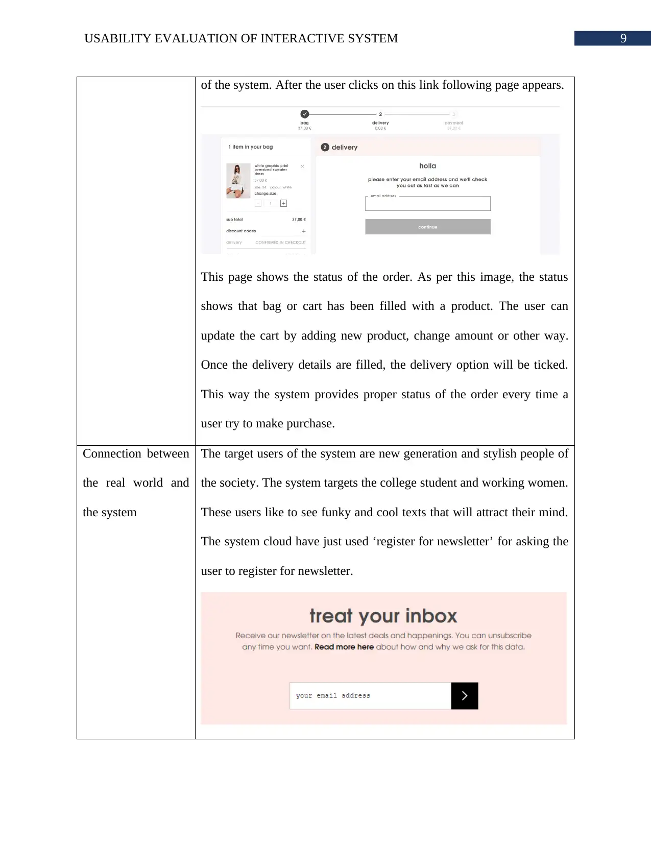
of the system. After the user clicks on this link following page appears.
This page shows the status of the order. As per this image, the status
shows that bag or cart has been filled with a product. The user can
update the cart by adding new product, change amount or other way.
Once the delivery details are filled, the delivery option will be ticked.
This way the system provides proper status of the order every time a
user try to make purchase.
Connection between
the real world and
the system
The target users of the system are new generation and stylish people of
the society. The system targets the college student and working women.
These users like to see funky and cool texts that will attract their mind.
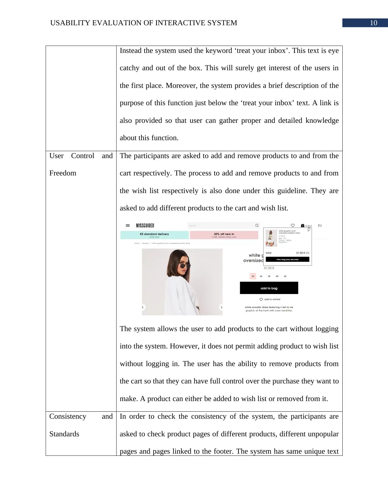
The system cloud have just used ‘register for newsletter’ for asking the
user to register for newsletter.
Paraphrase This Document
Need a fresh take? Get an instant paraphrase of this document with our AI Paraphraser
10USABILITY EVALUATION OF INTERACTIVE SYSTEM
Instead the system used the keyword ‘treat your inbox’. This text is eye
catchy and out of the box. This will surely get interest of the users in
the first place. Moreover, the system provides a brief description of the
purpose of this function just below the ‘treat your inbox’ text. A link is
also provided so that user can gather proper and detailed knowledge
about this function.
User Control and
Freedom
The participants are asked to add and remove products to and from the
cart respectively. The process to add and remove products to and from
the wish list respectively is also done under this guideline. They are
asked to add different products to the cart and wish list.
The system allows the user to add products to the cart without logging
into the system. However, it does not permit adding product to wish list
without logging in. The user has the ability to remove products from
the cart so that they can have full control over the purchase they want to
make. A product can either be added to wish list or removed from it.
Consistency and
Standards
In order to check the consistency of the system, the participants are
asked to check product pages of different products, different unpopular
pages and pages linked to the footer. The system has same unique text
11USABILITY EVALUATION OF INTERACTIVE SYSTEM
patterns throughout the website. The colours are limited to the white,
pink and blue. The text the presentation of the products is also similar.
Therefore, the system has followed consistency in terms of contents
and media.
Error Prevention The participants are asked to register into the system. Unlike the
conventional approach, the web application did not have any link to
login/register page in the header. The login/register option is available
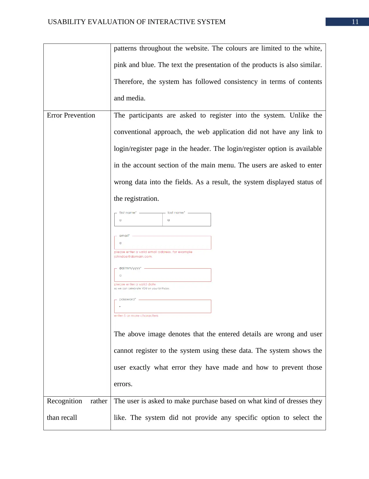
in the account section of the main menu. The users are asked to enter
wrong data into the fields. As a result, the system displayed status of
the registration.
The above image denotes that the entered details are wrong and user
cannot register to the system using these data. The system shows the
user exactly what error they have made and how to prevent those
errors.
Recognition rather
than recall
The user is asked to make purchase based on what kind of dresses they
like. The system did not provide any specific option to select the
⊘ This is a preview!⊘
Do you want full access?
Subscribe today to unlock all pages.

Trusted by 1+ million students worldwide
1 out of 21
Related Documents
Your All-in-One AI-Powered Toolkit for Academic Success.
+13062052269
info@desklib.com
Available 24*7 on WhatsApp / Email
![[object Object]](/_next/static/media/star-bottom.7253800d.svg)
Unlock your academic potential
Copyright © 2020–2025 A2Z Services. All Rights Reserved. Developed and managed by ZUCOL.


