COIS 12036 - Website Evaluation Report: HCI & Museum Analysis
VerifiedAdded on 2023/06/09
|10
|2216
|264
Report
AI Summary
This report presents a comprehensive evaluation of the Western Australian Museum website, analyzing its interactive aspects and user interface design through the lens of Human-Computer Interaction (HCI) principles. The evaluation identifies positive aspects such as search functionality, contact information, social media integration, and a site map, which enhance usability. However, it also points out negative aspects like excessive whitespace, responsiveness issues in portrait mode, and inconsistencies in the user interface across different resolutions. The report includes reviews from users with varying technical expertise, highlighting their experiences and challenges. Recommendations for improvement include adopting responsive web design principles, maintaining consistency across all web pages, enhancing visual aesthetics, and minimizing unnecessary scrolling, ultimately aiming to improve the overall user experience and human-computer interaction. This document is available on Desklib, a platform offering a range of study tools and resources for students.
qwertyuiopasdfghjklzxcvbnmqw
ertyuiopasdfghjklzxcvbnmqwert
yuiopasdfghjklzxcvbnmqwertyui
opasdfghjklzxcvbnmqwertyuiop
asdfghjklzxcvbnmqwertyuiopasd
fghjklzxcvbnmqwertyuiopasdfgh
jklzxcvbnmqwertyuiopasdfghjkl
zxcvbnmqwertyuiopasdfghjklzxc
vbnmqwertyuiopasdfghjklzxcvb
nmqwertyuiopasdfghjklzxcvbnm
qwertyuiopasdfghjklzxcvbnmqw
ertyuiopasdfghjklzxcvbnmqwert
yuiopasdfghjklzxcvbnmqwertyui
opasdfghjklzxcvbnmqwertyuiop
asdfghjklzxcvbnmqwertyuiopasd
fghjklzxcvbnmqwertyuiopasdfgh
jklzxcvbnmrtyuiopasdfghjklzxcv
Website Evaluation
Human Computer Interaction (HCI)
8/2/2018
ertyuiopasdfghjklzxcvbnmqwert
yuiopasdfghjklzxcvbnmqwertyui
opasdfghjklzxcvbnmqwertyuiop
asdfghjklzxcvbnmqwertyuiopasd
fghjklzxcvbnmqwertyuiopasdfgh
jklzxcvbnmqwertyuiopasdfghjkl
zxcvbnmqwertyuiopasdfghjklzxc
vbnmqwertyuiopasdfghjklzxcvb
nmqwertyuiopasdfghjklzxcvbnm
qwertyuiopasdfghjklzxcvbnmqw
ertyuiopasdfghjklzxcvbnmqwert
yuiopasdfghjklzxcvbnmqwertyui
opasdfghjklzxcvbnmqwertyuiop
asdfghjklzxcvbnmqwertyuiopasd
fghjklzxcvbnmqwertyuiopasdfgh
jklzxcvbnmrtyuiopasdfghjklzxcv
Website Evaluation
Human Computer Interaction (HCI)
8/2/2018
Paraphrase This Document
Need a fresh take? Get an instant paraphrase of this document with our AI Paraphraser
Website Evaluation
Table of Contents
Overview & Description of the Website................................................................................................2
Main Features of the Website................................................................................................................2
Positive Aspects of the Site...................................................................................................................2
Negative Aspects of the Site..................................................................................................................5
Review of Nominated Website..............................................................................................................7
Review 1............................................................................................................................................7
Review 2............................................................................................................................................7
Recommendations for Website Improvement........................................................................................8
References.............................................................................................................................................9
1
Website Evaluation
Overview & Description of the Website
The nominated website is http://museum.wa.gov.au/museums/ and it is designed for Western
Australian Museum. There are six museum sites located in Western Australia and the website
provides the information on the six sites. The Western Australian Museum was established in
the year 1891 and was referred as Geological Museum at that time. The website provides the
details and history of the museum along with the exhibitions and events, and research &
collections available in the museum.
Main Features of the Website
The main features of the website have been listed below.
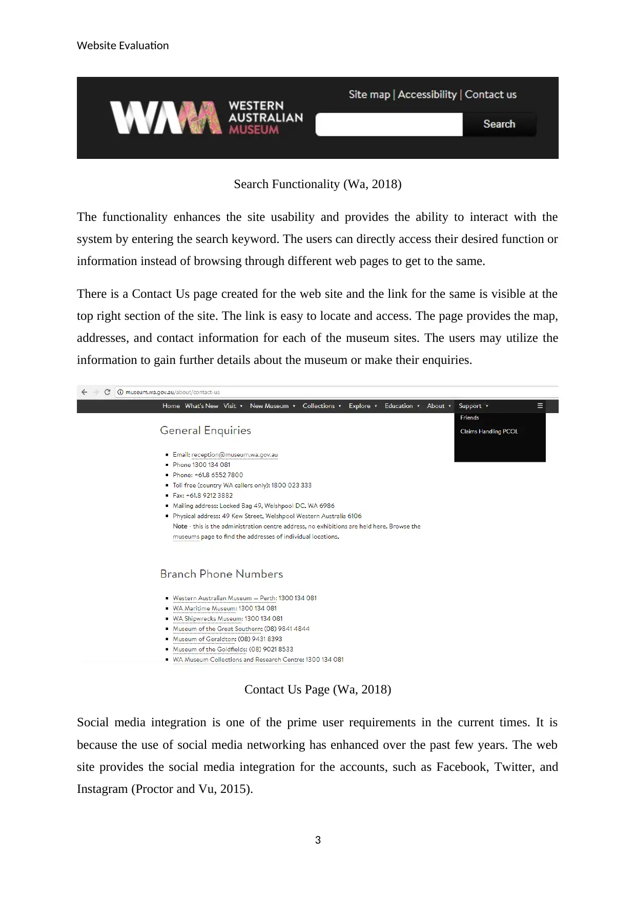
Search functionality at the top right corner of the header section that allows the users
to search for the required information on the basis of the keyword entered.
Information about the museums comprising of the museum details, virtual tour,
opening & admission details, address, and contact information (Wa, 2018).
Details about the exhibition and events organized in the museum are provided on the
web site.
Research & collectibles associated and available with each of the museum sites is
available on the website.
The site map is accessible from the website.
Privacy and Copyright details are available on the site
The connectivity and integration with the social media accounts is present on the
website.
Positive Aspects of the Site
There are a lot of positive aspects that are associated with the website. The primary aim of the
site is to provide the users with the information regarding Western Australian Museum and to
enhance the user experience and usability of the site. The users must have the ease of usage
and the web site elements shall be designed in such a manner that the users understand each
of the site elements on their own.
There is search functionality present at the top right of the site to allow the users to search for
their desired information (Issa and Isaias, 2014).
2
⊘ This is a preview!⊘
Do you want full access?
Subscribe today to unlock all pages.

Trusted by 1+ million students worldwide
Website Evaluation
Search Functionality (Wa, 2018)
The functionality enhances the site usability and provides the ability to interact with the
system by entering the search keyword. The users can directly access their desired function or
information instead of browsing through different web pages to get to the same.
There is a Contact Us page created for the web site and the link for the same is visible at the
top right section of the site. The link is easy to locate and access. The page provides the map,
addresses, and contact information for each of the museum sites. The users may utilize the
information to gain further details about the museum or make their enquiries.
Contact Us Page (Wa, 2018)
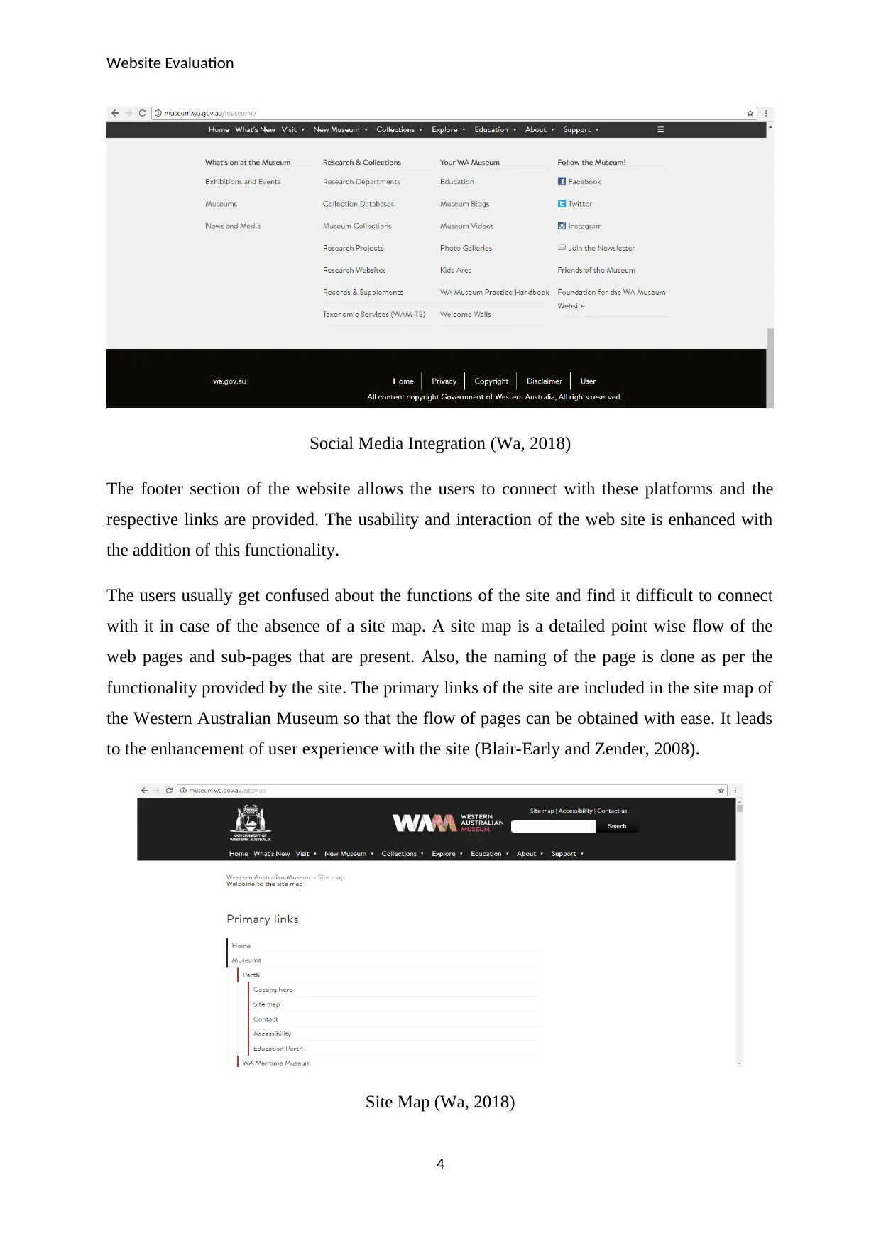
Social media integration is one of the prime user requirements in the current times. It is
because the use of social media networking has enhanced over the past few years. The web
site provides the social media integration for the accounts, such as Facebook, Twitter, and
Instagram (Proctor and Vu, 2015).
3
Paraphrase This Document
Need a fresh take? Get an instant paraphrase of this document with our AI Paraphraser
Website Evaluation
Social Media Integration (Wa, 2018)
The footer section of the website allows the users to connect with these platforms and the
respective links are provided. The usability and interaction of the web site is enhanced with
the addition of this functionality.
The users usually get confused about the functions of the site and find it difficult to connect
with it in case of the absence of a site map. A site map is a detailed point wise flow of the
web pages and sub-pages that are present. Also, the naming of the page is done as per the
functionality provided by the site. The primary links of the site are included in the site map of
the Western Australian Museum so that the flow of pages can be obtained with ease. It leads
to the enhancement of user experience with the site (Blair-Early and Zender, 2008).
Site Map (Wa, 2018)
4
Website Evaluation
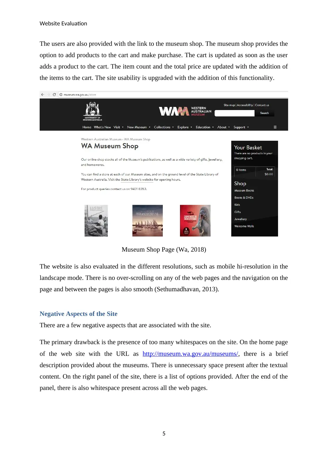
The users are also provided with the link to the museum shop. The museum shop provides the
option to add products to the cart and make purchase. The cart is updated as soon as the user
adds a product to the cart. The item count and the total price are updated with the addition of
the items to the cart. The site usability is upgraded with the addition of this functionality.
Museum Shop Page (Wa, 2018)
The website is also evaluated in the different resolutions, such as mobile hi-resolution in the
landscape mode. There is no over-scrolling on any of the web pages and the navigation on the
page and between the pages is also smooth (Sethumadhavan, 2013).
Negative Aspects of the Site
There are a few negative aspects that are associated with the site.
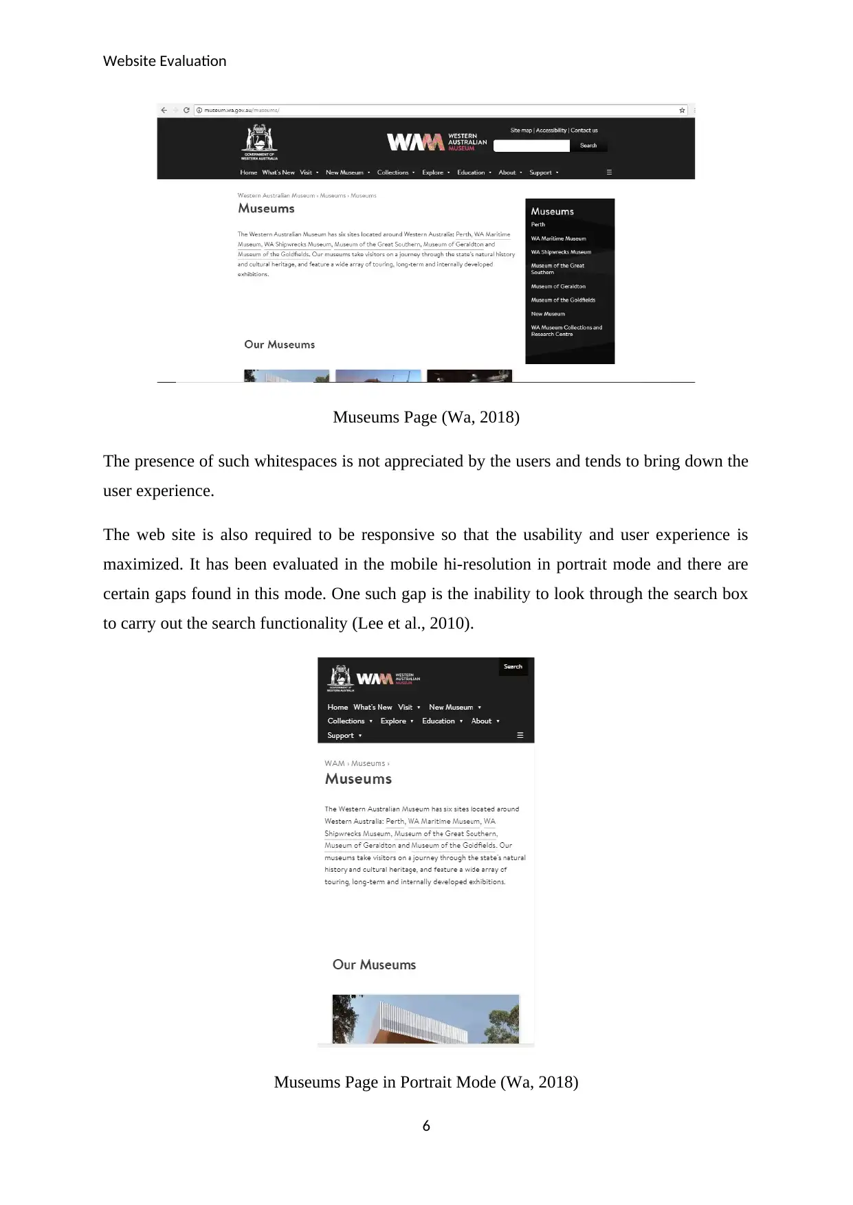
The primary drawback is the presence of too many whitespaces on the site. On the home page
of the web site with the URL as http://museum.wa.gov.au/museums/, there is a brief
description provided about the museums. There is unnecessary space present after the textual
content. On the right panel of the site, there is a list of options provided. After the end of the
panel, there is also whitespace present across all the web pages.
5
⊘ This is a preview!⊘
Do you want full access?
Subscribe today to unlock all pages.

Trusted by 1+ million students worldwide
Website Evaluation
Museums Page (Wa, 2018)
The presence of such whitespaces is not appreciated by the users and tends to bring down the
user experience.
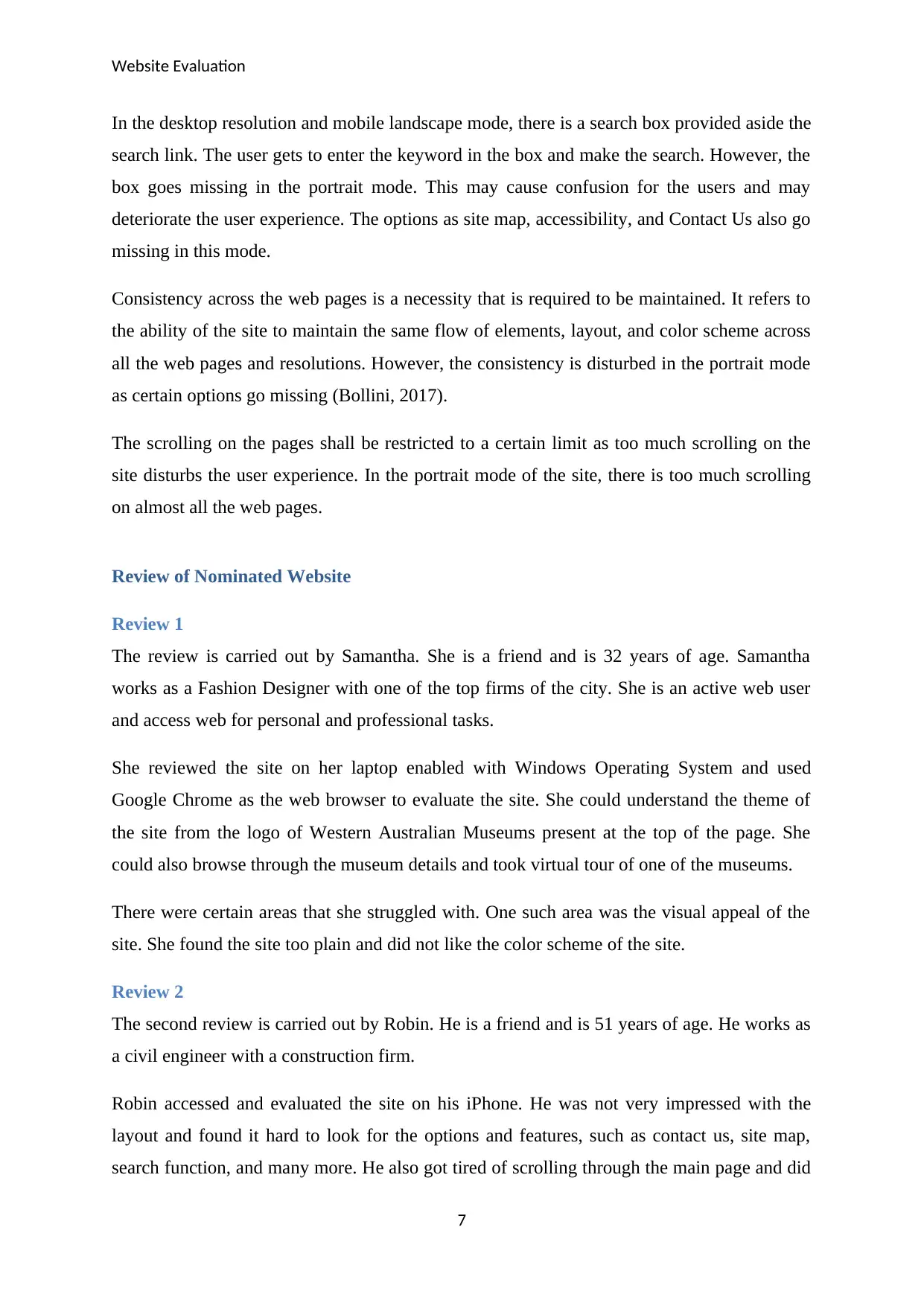
The web site is also required to be responsive so that the usability and user experience is
maximized. It has been evaluated in the mobile hi-resolution in portrait mode and there are
certain gaps found in this mode. One such gap is the inability to look through the search box
to carry out the search functionality (Lee et al., 2010).
Museums Page in Portrait Mode (Wa, 2018)
6
Paraphrase This Document
Need a fresh take? Get an instant paraphrase of this document with our AI Paraphraser
Website Evaluation
In the desktop resolution and mobile landscape mode, there is a search box provided aside the
search link. The user gets to enter the keyword in the box and make the search. However, the
box goes missing in the portrait mode. This may cause confusion for the users and may
deteriorate the user experience. The options as site map, accessibility, and Contact Us also go
missing in this mode.
Consistency across the web pages is a necessity that is required to be maintained. It refers to
the ability of the site to maintain the same flow of elements, layout, and color scheme across
all the web pages and resolutions. However, the consistency is disturbed in the portrait mode
as certain options go missing (Bollini, 2017).
The scrolling on the pages shall be restricted to a certain limit as too much scrolling on the
site disturbs the user experience. In the portrait mode of the site, there is too much scrolling
on almost all the web pages.
Review of Nominated Website
Review 1
The review is carried out by Samantha. She is a friend and is 32 years of age. Samantha
works as a Fashion Designer with one of the top firms of the city. She is an active web user
and access web for personal and professional tasks.
She reviewed the site on her laptop enabled with Windows Operating System and used
Google Chrome as the web browser to evaluate the site. She could understand the theme of
the site from the logo of Western Australian Museums present at the top of the page. She
could also browse through the museum details and took virtual tour of one of the museums.
There were certain areas that she struggled with. One such area was the visual appeal of the
site. She found the site too plain and did not like the color scheme of the site.
Review 2
The second review is carried out by Robin. He is a friend and is 51 years of age. He works as
a civil engineer with a construction firm.
Robin accessed and evaluated the site on his iPhone. He was not very impressed with the
layout and found it hard to look for the options and features, such as contact us, site map,
search function, and many more. He also got tired of scrolling through the main page and did
7
Website Evaluation
not appreciate the whitespaces present on the pages. He could get the theme and purpose of
the site from the contents included on the home page and the logo of the museum.
Recommendations for Website Improvement
There are certain recommendations for improving the web site to enhance the Human
Computer Interaction and user experience.
The placement of the UI elements shall be done to avoid the whitespaces.
Responsive web design principles shall be utilized so that the site behaves as per the
user actions. It shall adapt to the screen resolution and access mode selected by the
user (Majid, Kamaruddin and Mansor, 2015).
Consistency is one of the necessary principles that shall be maintained across all the
web pages. The layout of the web pages shall remain constant in the landscape as well
as the portrait mode irrespective of the resolution of the device (Shneiderman and
Plaisant, 1987).
Visual aesthetics of the site shall be improved by enhancing the responsiveness of the
site. For instance, text highlights, button shadows, etc. shall be included to enhance
the level of interaction of the site with the users (Punchoojit and Hongwarittorrn,
2017).
There is too much scrolling on a majority of the web pages in the portrait mode. The
screen elements in this mode shall be adjusted to minimize the unnecessary scrolling
on the site.
The use and incorporation of the above set of features will lead to enhanced human computer
interaction and improved user experience.
8
⊘ This is a preview!⊘
Do you want full access?
Subscribe today to unlock all pages.

Trusted by 1+ million students worldwide
Website Evaluation
References
Blair-Early, A. and Zender, M. (2008). User Interface Design Principles for Interaction
Design. Design Issues, 24(3), pp.85-107.
Bollini, L. (2017). Beautiful interfaces. From user experience to user interface design. The
Design Journal, 20(sup1), pp.S89-S101.
Issa, T. and Isaias, P. (2014). Promoting Human-Computer Interaction and Usability
Guidelines and Principles Through Reflective Journal Assessment. Emerging Research and
Trends in Interactivity and the Human-Computer Interface, pp.375-394.
Lee, G., Eastman, C., Taunk, T. and Ho, C. (2010). Usability principles and best practices for
the user interface design of complex 3D architectural design and engineering tools.
International Journal of Human-Computer Studies, 68(1-2), pp.90-104.
Majid, E., Kamaruddin, N. and Mansor, Z. (2015). Adaptation of usability principles in
responsive web design technique for e-commerce development. 2015 International
Conference on Electrical Engineering and Informatics (ICEEI).
Proctor, R. and Vu, K. (2015). Principles for Designing Interfaces Compatible With Human
Information Processing. International Journal of Human-Computer Interaction, 32(1), pp.2-
22.
Punchoojit, L. and Hongwarittorrn, N. (2017). Usability Studies on Mobile User Interface
Design Patterns: A Systematic Literature Review. Advances in Human-Computer Interaction,
2017, pp.1-22.
Sethumadhavan, A. (2013). Principles for Designing Good User Interfaces. Ergonomics in
Design: The Quarterly of Human Factors Applications, 21(1), pp.33-33.
Shneiderman, B. and Plaisant, C. (1987). Designing the user interface strategies for effective
human-computer interaction. ACM SIGBIO Newsletter, 9(1), p.6.
Wa (2018). Museums | Western Australian Museum. [online] Western Australian Museum.
Available at: http://museum.wa.gov.au/museums/ [Accessed 3 Aug. 2018].
9
1 out of 10
Related Documents
Your All-in-One AI-Powered Toolkit for Academic Success.
+13062052269
info@desklib.com
Available 24*7 on WhatsApp / Email
![[object Object]](/_next/static/media/star-bottom.7253800d.svg)
Unlock your academic potential
Copyright © 2020–2026 A2Z Services. All Rights Reserved. Developed and managed by ZUCOL.


