Analyzing Online Shopping Application
VerifiedAdded on 2023/01/23
|22
|6034
|24
AI Summary
This document analyzes the features and usability of an online shopping application. It discusses the interactive system, use cases, usability requirements, and evaluation methodology. The document provides insights into how users interact with the system and the importance of usability in enhancing the shopping experience.
Contribute Materials
Your contribution can guide someone’s learning journey. Share your
documents today.
Running head: ANALYSING ONLINE SHOPPING APPLICATION
ANALYSING ONLINE SHOPPING APPLICATION
Name of the Student
Name of the University
Author Note
ANALYSING ONLINE SHOPPING APPLICATION
Name of the Student
Name of the University
Author Note
Secure Best Marks with AI Grader
Need help grading? Try our AI Grader for instant feedback on your assignments.
1
ANALYSING ONLINE SHOPPING APPLICATION
Table of Contents
Part ONE: The interactive system and its users.........................................................................2
Part TWO: The use cases...........................................................................................................3
Part THREE: The usability requirements..................................................................................5
Part FOUR: The evaluation methodology..................................................................................7
Part FIVE: The evaluation.........................................................................................................9
Part SIX: The findings of the evaluation..................................................................................11
References................................................................................................................................13
Appendix..................................................................................................................................13
2
ANALYSING ONLINE SHOPPING APPLICATION
Part ONE: The interactive system and its users
Interactive system are characterized by interaction between the humans and the
computers that enables the work to be done more easily (Oinas-Kukkonen and Harjumaa
2018). The examples of graphical interactive system are the windows and the Macintosh. The
development of the interactive system help to understand that how the human perceive,
evaluate, analyse and interpret to the actions of the computers (Grønbæk et al. 2017). The
computers are innovated using the concept of innovation and interaction. The effectiveness
and the efficiency of the interactive system is increased with the help of the innovation in the
old system. An interactive shopping basket such as big basket can be helpful for the users
who shop in a large quantity. These allow the customer to ship from any ship and anytime.
These provides a large range of products and give the customer the chance to buy whatever
they want to by just sitting in the place (Korn 2016). They can choose the required items that
they want to buy such as groceries, household, fruits, vegetables, organic products, pet food,
beauty products and many more from their mobile, laptop and computer from any
supermarket or shop (Lu et al. 2015). The customers also enjoy the discount which they get
by shopping on the particular site. The able to do a hassle-free shopping with their mobile by
being at the place here they are. The online shopping application Big Basket is one of the
example of such application. Online shopping basket is a huge time saver as the customers do
not have to go anywhere. These allows the shops, stores and the supermarket to increase there
sales as these attract many customers from the distant places. These allow the users to get
more variety of products and at more better prices (Groß 2015). The users can send purchase
and send gifts to anyone. Online shopping basket help to avoid crowd and pressure. The
comparison between the prices of the products that are offered by the different shops can be
done by the users before purchasing the product. The customers who are engaged in shopping
with the interactive shopping basket can keep an electronic record of whatever they are
3
ANALYSING ONLINE SHOPPING APPLICATION
purchasing (Jannach, Lerche and Jugovac 2015). With the interactive shopping basket the
customers can enjoy more convenient shopping with more number of choices. There are two
interfaces in an interactive shopping basket, from one interfaces the selection of the items that
the customers want to buy are done and from the other interface the shopping stores receive
the orders. An interactive system allows human and computer interaction that can be used to
serve the people and making the work more straightforward and more accessible. The web
browser is an example of an interactive system That can be used to increase the effectiveness
of computer design and software.
Part TWO: The use cases
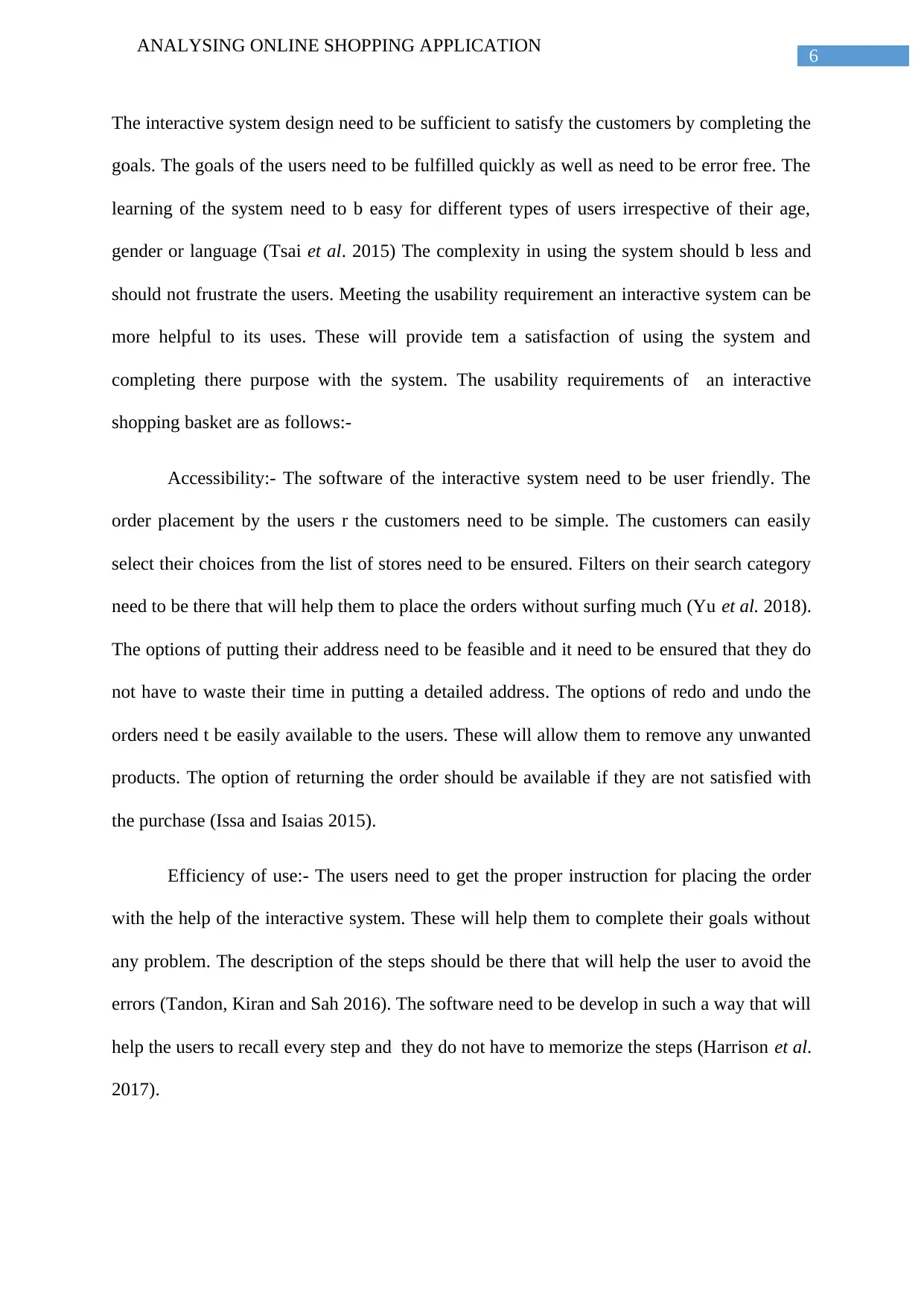
The use cases are how the users of an interactive shopping basket will perform the
task. They need to place the order on the website and will receive the order within a specific
time with certain steps that will fulfill the goal of the customers. The use cases of an
interactive system includes the users of the application. These also depicts what the users
want to achieve with the interactive system. These also help to understand that how the
interactive system software will behave. The use cases includes the actors, stakeholders,
clients and many more. The use cases of an interactive shopping basket are as follows:-
Customers:-They will place the order by using the shopping basket application. Placing the
order includes many steps that the customers have to follow. The users have to first choose
the shop or store from a wide range of options. Then they have to find the category of the
product they want to buy(Oinas-Kukkonen and Harjumaa 2018). There are several filters that
can be applied that will help in identifying the required product. After selecting the product
they can they can choose the payment mode that also have several options. After confirming
the order in the selected shop the shopping center will continue with the rest. The customers
also get an opportunity to order the list of the items that they are wishing. The can use the
Secure Best Marks with AI Grader
Need help grading? Try our AI Grader for instant feedback on your assignments.
4
ANALYSING ONLINE SHOPPING APPLICATION
interactive surface for placing the order. The system also allow them to back their steps with
the system. These will help them to avoid the wrong placement of the orders. They can also
see the inputs that they are placing within the system thus making the system real-time. These
interactive system also help the customers to see the output result within the screen of the
interactive system.
Shop owner:-The shopping centre who will be connected to an interactive shopping basket
can able to receive order from the peoples online. The shop will get the notification of the
order that will contain the list of the requirement from the customers and the address. The
shopping centre ensures that the items will be shipped to the nearest courier centre from
where it will be delivered to the customers. The shop ensure that the correct quantity, brand
and the product is delivered with a quality packaging.
Delivery service provider:-They are enrolled in the act of picking the products from the
stores and taking them to the customer destination. They ensures the delivery of the product
in proper address by making contact with the customers. They also take the reviews of their
services from the customers. They pick up the product from the customers if they want to
return their products. They also take the reviews of the service they are providing from the
customers
System developers:- The system developers look after that whether the system is running
properly. It repair the system if there is any defect within the interactive system software.
They ensure that the customers or the shop owners do not face any difficulty while placing
the order. The system developer also help in solving the issues that arises in the interactive
system. They also hep in developing the functioning of the interactive system that will to
develop the system in the lace which have installed it.
5
ANALYSING ONLINE SHOPPING APPLICATION
Figure 1: Use case diagram
(Source: Created by Author)
Part THREE: The usability requirements
The usability of an interactive system is the experience of the user. Usability is not
about using the interactive system but providing the a level of the satisfaction to the users of
the system (Earthy, Geis and Harker 2016). The interface hat is used for the interactive
system need to be easily accessible and can be easily used and use of the manual for using
the system should be minimal. From the primary users perspective the system need to be
efficient, effective, accessible, error free and provide real time and fast result to the users.
6
ANALYSING ONLINE SHOPPING APPLICATION
The interactive system design need to be sufficient to satisfy the customers by completing the
goals. The goals of the users need to be fulfilled quickly as well as need to be error free. The
learning of the system need to b easy for different types of users irrespective of their age,
gender or language (Tsai et al. 2015) The complexity in using the system should b less and
should not frustrate the users. Meeting the usability requirement an interactive system can be
more helpful to its uses. These will provide tem a satisfaction of using the system and
completing there purpose with the system. The usability requirements of an interactive
shopping basket are as follows:-
Accessibility:- The software of the interactive system need to be user friendly. The
order placement by the users r the customers need to be simple. The customers can easily
select their choices from the list of stores need to be ensured. Filters on their search category
need to be there that will help them to place the orders without surfing much (Yu et al. 2018).
The options of putting their address need to be feasible and it need to be ensured that they do
not have to waste their time in putting a detailed address. The options of redo and undo the
orders need t be easily available to the users. These will allow them to remove any unwanted
products. The option of returning the order should be available if they are not satisfied with
the purchase (Issa and Isaias 2015).
Efficiency of use:- The users need to get the proper instruction for placing the order
with the help of the interactive system. These will help them to complete their goals without
any problem. The description of the steps should be there that will help the user to avoid the
errors (Tandon, Kiran and Sah 2016). The software need to be develop in such a way that will
help the users to recall every step and they do not have to memorize the steps (Harrison et al.
2017).
Paraphrase This Document
Need a fresh take? Get an instant paraphrase of this document with our AI Paraphraser
7
ANALYSING ONLINE SHOPPING APPLICATION
Workload:- The interface need to less frustrating to the users. All the steps for placing
the order canceling the order returning the products should be less frustrating to the users.
The users should not have to gain much knowledge to use the system. The system design
should be easily handled by the users (Koli, Chowdhury and Dhar 2016).
Error free:- The system need to be error free. The users of the system should not face
any difficulty while using the system because this could give them a bad experience with the
interactive shopping basket. The users should not be troubled with doing the payment online.
The interactive system need to ensure that the online transaction while ordering the products
are hassle free. The errors in the system can dissatisfy the shopping experience of the users
(Springer et al. 2017).
Effectiveness:- The system need to be effective to the users. The purpose of
developing the interactive system need to be served. The instruction of using the software
need to be available in many languages that is easily understandable by all the users. The
users can easily explore all the required field in the software (Isohella 2018).
Intuitiveness:-The system need to appear in a easy way. The graphics and the fonts
that are used to give the instruction need to be of a good quality. The system have to ensure
that the users of the system get the visual satisfaction while using the system. The navigation
buttons that are available that are use to navigate from one page to the page need of unique.
The colors of the icons of the navigation button should be unique that will help to avow color
merging in the page. The graphics of the system need to be visually understandable y the
users.
Part FOUR: The evaluation methodology
There are different methods that can be used for evaluating an interactive system that
include heuristic evaluation, cognitive walkthrough, user trial and many more. The
8
ANALYSING ONLINE SHOPPING APPLICATION
methodology which is adapted for evaluating the interactive system is heuristic evaluation
method. This method is adapted for evaluating the problems related to the usability (Hussain
and Mkpojiogu 2016). These includes a small sets of evaluators are involved in examining
the interactive system. The compliance of the interface with the heuristics are assessed. The
heuristic evaluation help in avoiding the failure of the system after the product is released.
The other evaluation process are time consuming, long and expensive and hence heuristic
evaluation is adapted for evaluating the interactive system (González-Pérez et al. 2017).
Heuristic evaluation method is a cheap method and can bee done easily. The heuristic
evaluation method have several advantages and disadvantages. The heuristic evaluation
consists of several step that includes establishment of a list of list of heuristic, selecting the
evaluators, briefing the evaluators, the different evaluation phases, Recording the problems
and lastly debriefing the session (Rusu et al. 2015). There are rules of conducting the
heuristic evaluation. The status of the system need to be visible to the users that means the
users need to have the information about the operation and the status of the system need to be
displayed within a specific time. There need to be a match between the system and the real
time users. The development of the system be done after having the proper knowledge of the
target users. The presentation of the information should be done in a logical manner that will
meet the expectations of the users. The users need to enjoy the freedom of accessing the
system that means that the control of the system need o be in the hand of the users. A space
should be offered to the users so that can take backward steps to change their actions. There
need to be some standard and consistency in the system. The designers of the system need to
ensure that the graphic elements and the terminology that are available in the system are
unique for the different pages (Díaz, Rusu and Collazos 2017). Error prevention is a very
important concept of the heuristic evaluation. These help in the prevention of many potential
errors that can arise in the system. The users do not like to find the remedy of problems. They
9
ANALYSING ONLINE SHOPPING APPLICATION
manly expect a error free service that need to be ensured. Eliminating the steps that can
increase the probability of occurrence of an error is the best solution. Flagging the step is also
a good approach. The workload on the users need to be reduced. When the user will explore
the interface it need to be ensured that the particular page consists the information that is
required b the users. The attention that can be provided by the users is limited and is capable
o recall only few items aim their short time memory (Khajouei, Gohari and Mirzaee,2018).
The designer of the system need to ensure that the work the users by can be achieved by
recalling the information. Recalling will be more easy than remembering all the steps. The
system need to be efficient and flexible to the users. As the use of the system increases the it
is demanded that les interactions are there and that will also provide faster navigation
(Dhouib et al. 2016). These types of facilities can also be achieved by the use of
abbreviations, functional keys, command that will be hidden and many macro facilities. The
interface need to be customizable by the users so that they can customize the page according
to their relevance. The information that are present in the page that is explored need to be
minimal. The display need to consists the information about the current task. To many
irrelevant information can create confusion within the users. There should be means by which
the users can move from one content to the other. The diagnosing, recognizing and
recovering of the errors need to be easily available. The designers need to remember that the
users are normal people and they do not understand the technical terminology. The
instruction should be there in common language rather in technical terms. The design should
ensure the users do not miss any instruction due to the use of critical terms. The help and the
documentation part need to be incorporated in the system. There is a need that the users do
not have to provide any documentation for navigating to different pages within the system.
The help that is provide by the system need to be easily available to the users that can be
taken at the time of requirement. There should be step by step instructions of the solution of
Secure Best Marks with AI Grader
Need help grading? Try our AI Grader for instant feedback on your assignments.
10
ANALYSING ONLINE SHOPPING APPLICATION
the issue that arise. Thu the heuristic evaluation help to identify the problems that can arise
when a system s developed and detecting them so that the users of the system do not get
troubled while using the system (Georgsson and Staggers 2015). These evaluation process
help to identify the major problems and eliminating the minor problems. These help in
ignoring the problems that are least significant to the system.
Part FIVE: The evaluation
The online shopping basket is evaluated with the help of the heuristic evaluation. A
set of heuristic is developed and it is evaluated by the experts. When the users of the
shopping application search for any product or simply by click on some products the system
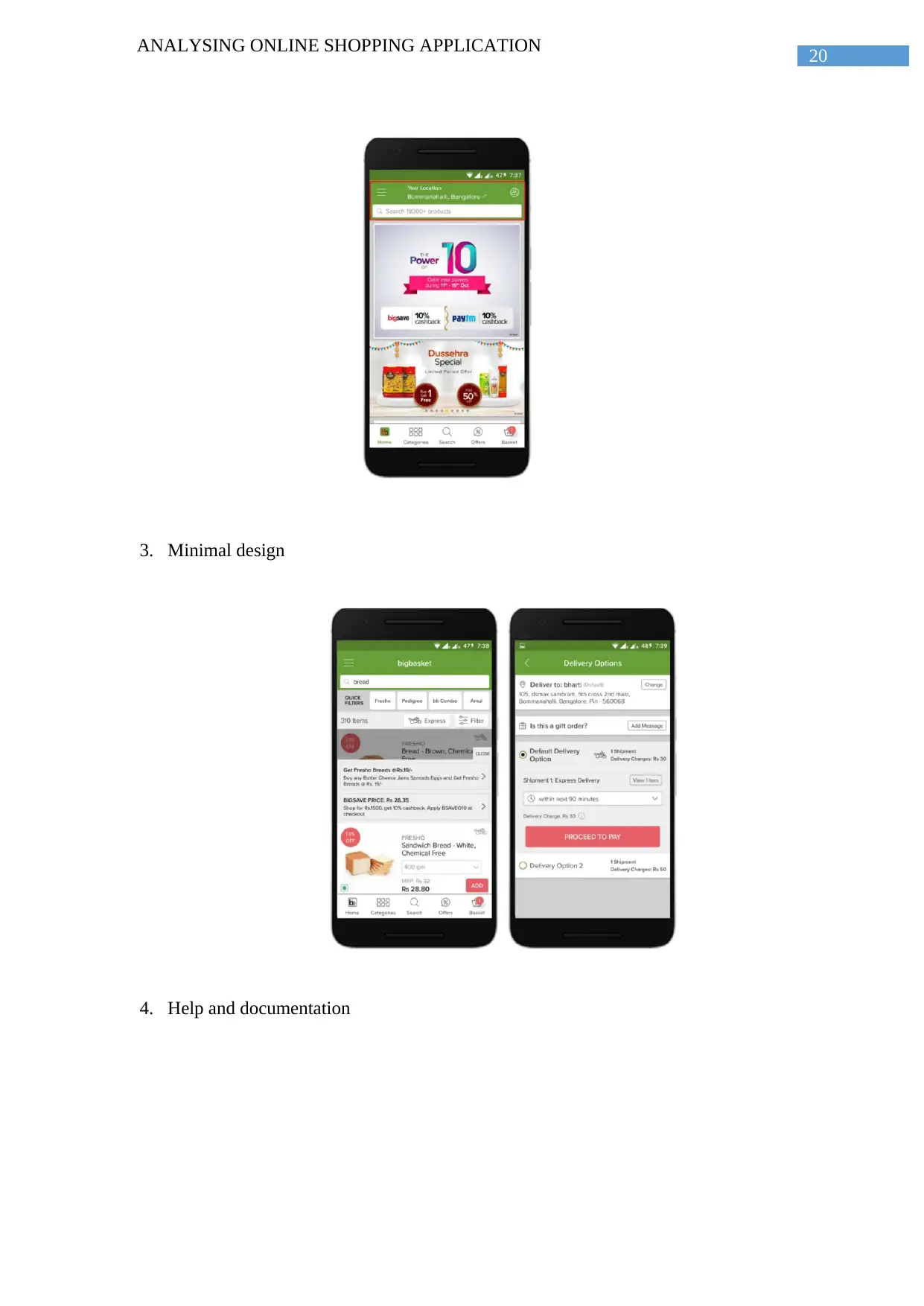
shows that the system is asking the users to wait for sometime while they are processing on
the request. These ensure that the customers are getting informed that there command is
being accepted and thus ensuring the visibility of the status of the work. Likewise the users
are get informed of any delay use to processing on there command. If the interactive
shopping app will contain technical terminology which are not very familiar to the users of
the real world will create problem. Example of such shopping application is Bigbasket which
use some technical terms like “smart basket” and “third party payment wallet” can create
confusion. In this case the heuristic is violated. In the various shopping application the users
are allowed to add and remove items from their shopping basket. These allow them to do the
steps according to do the steps according to their convenience. They are also allowed to
check out the items before they finally proceed to pay for the orders (Kölling and McKay
2016). Now the users can easily use the application without any hesitation. The heuristic is
not violated in these case. The consistency and the standard of the interactive system is
maintained. The search option in the website is always present in the top of the website. The
details of the profile of the individual is always found at the same place (Santana and Anido
2016). These allow the customers to get everything in the same place whenever they surf the
11
ANALYSING ONLINE SHOPPING APPLICATION
website. These allow the users to waste time in searching the options whenever they go to use
the system. The heuristic is not violated in these case. While using the interactive system the
system ask permission from the user for performing any application of the interface. For
example while searching anything using the option of voice search the application will ask
the permission for accessing the voice recoding application. These allow the users to the right
of giving the permission o use of any other application. In the search option of the interactive
system the history is available. From the history section the previous search can be repeated.
These help the users to keep a track on their previous searches. The users can also add some
of the products marked that they wish to buy in the future (Russo et al. 2015). This feature
help them to do a thorough search before buying the product. These software help to provide
a wide range of service to its users. The users can apply a wide range of filters in their search
these will help them to arrange their search according to the need of the users. The
availability of too much information in the display create mess and it do not allow the users
to concentrate on the required fields. There is an availability of so many delivery options and
the customers can select according to their convenience. Thee do not violate the heuristic of
flexibility. When an item is being selected by the user in the online shopping application they
get notified if the product is out of stock. The user will also get a notification if the product
stock is refreshed once again. The interactive system also allows it users to easily take the
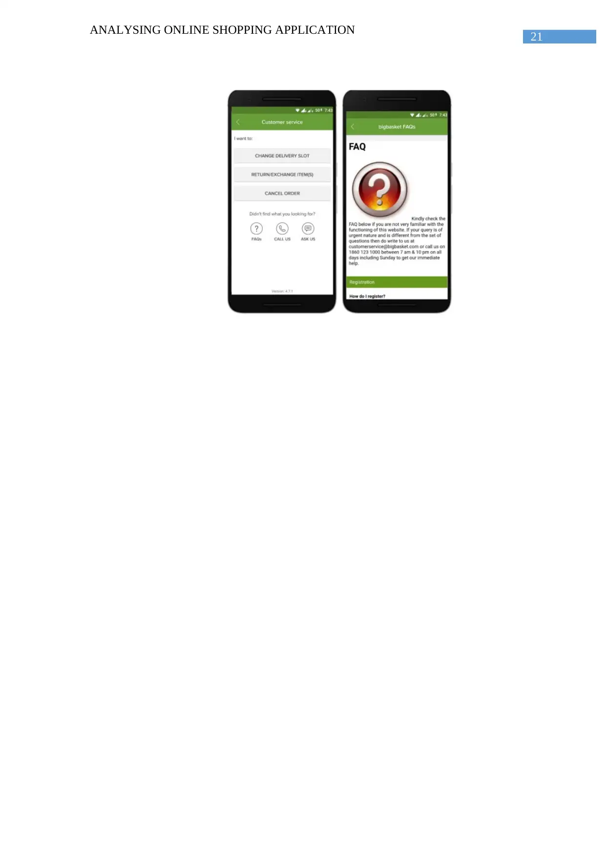
help of the customer service provider. These will help the users to use the system more easily.
There are several positive and negative sides of heuristic evaluation. These will allow the
evaluators to focus on the major issues that arises in the interactive system. These issues are
evaluated by the experts and they evaluate the problems that can arise in the system. They
can be predetermined and required steps can be taken to make the required changes. Heuristic
evaluation can be done by not violating the ethical issues. The methods that uses the real time
users and it do not violate their rights. The problems that can arise in the interactive system
12
ANALYSING ONLINE SHOPPING APPLICATION
can be detected and solved by performing the heuristic evaluation. The overall experience of
the users can be enhanced by modifying the potential and the existing problems. The
problems that can arise in the surfing the online shopping application can be determined and
solved. These can be done by determining the whether the software are violating the heuristic
or not. If the interactive system is violating the heuristic then proper steps will be taken to
rectify the same. There are many major and minor issues that arises in the system. The
heuristic evaluation allow to detect the major issues and eliminating the minor issues. Minor
issues are those which do not affect the workability of the system. There are several issues
that can arise if wrong sets of heuristic is evaluated. If the evaluation is not done properly
then certain usability problems can be overlooked. The heuristic evaluation can consume
more time than the other methods of evaluating the interactive system. In the heuristic
evaluation there are false alarm for the issues which are not that critical. These false alarm
sometime causes the loss of time and revenue. Detecting the correct issues that can affect the
interactive shopping basket is a big challenge. Correcting the problems to provide user
satisfaction is the main aim of the heuristic evaluation.
Part SIX: The findings of the evaluation.
There are several findings regarding the usability of an online shopping application.
These application provides a huge satisfaction to its users. The strength and weakness of such
system are follows:-
In the shopping application there are several terms that are hard to understand
by the common users that can create problems. The real world users do not
find these terms conventional for there use. They expect that the instruction
that are given to them for performing the actions in the interactive system will
Paraphrase This Document
Need a fresh take? Get an instant paraphrase of this document with our AI Paraphraser
13
ANALYSING ONLINE SHOPPING APPLICATION
be in simple language. They are not familiar with the technical terms and
hence the heuristic is evaluated (Roth et al. 2015).
The shopping application allow the users to add or remove the products
according to their convenience. These allow the users to perform any action in
the software and hence giving user satisfaction (Mohseni-Kabir et al. 2015).
This provide the users the opportunity to get informed if some of the product
are not available. They get notified once the product is available. These allow
the users to get knowledge of each product that are not available and getting
the knowledge of the availability of the product (Spagnolli, Chittaro and
Gamberini 2016).
There are too many information in the are displayed in the screen and the users
get confused and missed out the relevant information. The users need to get a
scope o stay focused on the primary information and in this case the heuristic
is violated (Amir et al. 2016).
When the users order something they get many delivery options that leave
them to a state of confusion. They need o understand the options available to
them before they are moving to a choice. The heuristic is violated (Ouadoud et
al. 2016).
If the users order something, which they want to cancel, they have to follow
several steps that can frustrate them. There are two many delivery options that
can confuse the users. The functions that are given by the users need to be
easy, simple and conventional (Paz, Paz and Pow-Sang 2015).
Then an interface design is evaluated it helped to identify the usability
problems that are faced by the users. These problems have an impact on the
individual and they also affect the overall experience of the users. Heuristic

14
ANALYSING ONLINE SHOPPING APPLICATION
evaluation is a very important method for inspecting the interactive system.
These evaluation can also improve the utility, usability and desirability item.
Thus the heuristic evaluation help to determine the advantages and
disadvantages of the interactive system.
15
ANALYSING ONLINE SHOPPING APPLICATION
References
Amir, O., Kamar, E., Kolobov, A. and Grosz, B., 2016. Interactive teaching strategies for
agent training.
Dhouib, A., Trabelsi, A., Kolski, C. and Neji, M., 2016, June. An approach for the selection
of evaluation methods for interactive adaptive systems using analytic hierarchy process.
In 2016 IEEE Tenth International Conference on Research Challenges in Information
Science (RCIS) (pp. 1-10). IEEE.
Díaz, J., Rusu, C. and Collazos, C.A., 2017. Experimental validation of a set of cultural-
oriented usability heuristics: e-commerce websites evaluation. Computer Standards &
Interfaces, 50, pp.160-178.
Earthy, J., Geis, T. and Harker, S., 2016, July. New ISO standards for usability, usability
reports and usability measures. In International Conference on Human-Computer
Interaction (pp. 268-278). Springer, Cham.
Georgsson, M. and Staggers, N., 2015. Quantifying usability: an evaluation of a diabetes
mHealth system on effectiveness, efficiency, and satisfaction metrics with associated user
characteristics. Journal of the American Medical Informatics Association, 23(1), pp.5-11.
González-Pérez, L.I., Ramírez-Montoya, M.S., García-Peñalvo, F.J. and Cruz, J.E.Q., 2017,
October. Usability evaluation focused on user experience of repositories related to energy
sustainability: A Literature Mapping. In Proceedings of the 5th International Conference on
Technological Ecosystems for Enhancing Multiculturality(p. 35). ACM.
Grønbæk, K., Grudin, J., Bødker, S. and Bannon, L., 2017. Achieving cooperative system
design: shifting from a product to a process focus. In Participatory Design (pp. 79-97). CRC
Press.
Secure Best Marks with AI Grader
Need help grading? Try our AI Grader for instant feedback on your assignments.
16
ANALYSING ONLINE SHOPPING APPLICATION
Groß, M., 2015. Mobile shopping: a classification framework and literature
review. International Journal of Retail & Distribution Management, 43(3), pp.221-241.
Harrison, M.D., Masci, P., Campos, J.C. and Curzon, P., 2017. Verification of user interface
software: the example of use-related safety requirements and programmable medical
devices. IEEE Transactions on Human-Machine Systems, 47(6), pp.834-846.
Hussain, A. and Mkpojiogu, E.O., 2016, August. Usability evaluation techniques in mobile
commerce applications: a systematic review. In AIP Conference Proceedings (Vol. 1761, No.
1, p. 020049). AIP Publishing.
Isohella, S., 2018. Incorporating International Collaboration and Usability Evaluation Into a
Technical Communication Course. In Multilingual Writing and Pedagogical Cooperation in
Virtual Learning Environments (pp. 344-363). IGI Global.
Issa, T. and Isaias, P., 2015. Usability and human computer interaction (HCI). In Sustainable
design (pp. 19-36). Springer, London.
Jannach, D., Lerche, L. and Jugovac, M., 2015, September. Adaptation and evaluation of
recommendations for short-term shopping goals. In Proceedings of the 9th ACM Conference
on Recommender Systems (pp. 211-218). ACM. Bevan, N., Carter, J.,
Khajouei, R., Gohari, S.H. and Mirzaee, M., 2018. Comparison of two heuristic evaluation
methods for evaluating the usability of health information systems. Journal of biomedical
informatics, 80, pp.37-42.
Khajouei, R., Zahiri Esfahani, M. and Jahani, Y., 2017. Comparison of heuristic and
cognitive walkthrough usability evaluation methods for evaluating health information
systems. Journal of the American Medical Informatics Association, 24(e1), pp.e55-e60.
17
ANALYSING ONLINE SHOPPING APPLICATION
Koli, A., Chowdhury, A. and Dhar, D., 2016. Requirement of New Media Features for
Enhancing Online Shopping Experience of Smartphone Users. In Intelligent Systems
Technologies and Applications (pp. 423-435).
Kölling, M. and McKay, F., 2016. Heuristic evaluation for novice programming
systems. ACM Transactions on Computing Education (TOCE), 16(3), p.12.
Korn, G.A., 2016. Interactive Dynamic-System Simulation. Crc Press.
Lu, J., Wu, D., Mao, M., Wang, W. and Zhang, G., 2015. Recommender system application
developments: a survey. Decision Support Systems, 74, pp.12-32.
Mohseni-Kabir, A., Rich, C., Chernova, S., Sidner, C.L. and Miller, D., 2015, March.
Interactive hierarchical task learning from a single demonstration. In Proceedings of the
Tenth Annual ACM/IEEE International Conference on Human-Robot Interaction (pp. 205-
212). ACM.
Oinas-Kukkonen, H. and Harjumaa, M., 2018. Persuasive systems design: key issues, process
model and system features. In Routledge Handbook of Policy Design (pp. 105-123).
Routledge.
Ouadoud, M., Chkouri, M.Y., Nejjari, A. and El Kadiri, K.E., 2016. Studying and analyzing
the evaluation dimensions of e-learning platforms relying on a software engineering
approach. International Journal of Emerging Technologies in Learning (iJET), 11(01), pp.11-
20.
Paz, F., Paz, F.A. and Pow-Sang, J.A., 2015, August. Experimental case study of new
usability heuristics. In International Conference of Design, User Experience, and
Usability (pp. 212-223). Springer, Cham.
18
ANALYSING ONLINE SHOPPING APPLICATION
Roth, R., Ross, K. and MacEachren, A., 2015. User-centered design for interactive maps: A
case study in crime analysis. ISPRS International Journal of Geo-Information, 4(1), pp.262-
301.
Russo, P., Costabile, M.F., Lanzilotti, R. and Pettit, C.J., 2015. Usability of planning support
systems: An evaluation framework. In Planning support systems and smart cities(pp. 337-
353). Springer, Cham. Russo, P., Costabile, M.F., Lanzilotti, R. and Pettit, C.J., 2015.
Usability of planning support systems: An evaluation framework. In Planning support
systems and smart cities(pp. 337-353). Springer, Cham.
Rusu, C., Rusu, V., Roncagliolo, S., Quiñones, D., Rusu, V.Z., Fardoun, H.M., Alghazzawi,
D.M. and Collazos, C.A., 2016, July. Usability Heuristics: Reinventing the Wheel?.
In International Conference on Social Computing and Social Media (pp. 59-70). Springer,
Cham.
Santana, P.C. and Anido, L.E., 2016. Heuristic evaluation of an interactive television system
to facilitate elders home care. IEEE Latin America Transactions, 14(7), pp.3455-3460.
Spagnolli, A., Chittaro, L. and Gamberini, L., 2016. Interactive persuasive systems: a
perspective on theory and evaluation. International Journal of Human-Computer
Interaction, 32(3), pp.177-189.
Springer, Cham. Pee, L.G., Jiang, J. and Klein, G., 2018. Signaling effect of website usability
on repurchase intention. International Journal of Information Management, 39, pp.228-241.
Tandon, U., Kiran, R. and Sah, A.N., 2016. Customer satisfaction using website
functionality, perceived usability and perceived usefulness towards online shopping in
India. Information development, 32(5), pp.1657-1673.
Paraphrase This Document
Need a fresh take? Get an instant paraphrase of this document with our AI Paraphraser
19
ANALYSING ONLINE SHOPPING APPLICATION
Tsai, T.H., Chang, H.T., Yu, M.C., Chen, H.T., Kuo, C.Y. and Wu, W.H., 2016, July. Design
of a Mobile Augmented Reality Application: An Example of Demonstrated Usability.
In International Conference on Universal Access in Human-Computer Interaction (pp. 198-
205). Springer, Cham.
Yu, X., Meng, L., Tian, X., Fauvel, S., Huang, B., Guan, Y., Shen, Z., Miao, C. and Leung,
C., 2018, July. Usability Analysis of the Novel Functions to Assist the Senior Customers in
Online Shopping. In International Conference on Social Computing and Social Media (pp.
173-185). Springer, Cham.
Appendix
1. Status of the system is visible
2. Maintaining the consistancy
20
ANALYSING ONLINE SHOPPING APPLICATION
3. Minimal design
4. Help and documentation
ANALYSING ONLINE SHOPPING APPLICATION
3. Minimal design
4. Help and documentation
21
ANALYSING ONLINE SHOPPING APPLICATION
ANALYSING ONLINE SHOPPING APPLICATION
1 out of 22
Related Documents
Your All-in-One AI-Powered Toolkit for Academic Success.
+13062052269
info@desklib.com
Available 24*7 on WhatsApp / Email
![[object Object]](/_next/static/media/star-bottom.7253800d.svg)
Unlock your academic potential
© 2024 | Zucol Services PVT LTD | All rights reserved.


