Usability Testing of Jumia Express Selling Website
VerifiedAdded on 2023/06/13
|22
|4488
|313
AI Summary
This report evaluates the usability of Jumia Express Selling Website through a questionnaire-based evaluation methodology. The report includes research questions, Jumia Express use cases, evaluation methodology, evaluation results, findings, and recommendations.
Contribute Materials
Your contribution can guide someone’s learning journey. Share your
documents today.
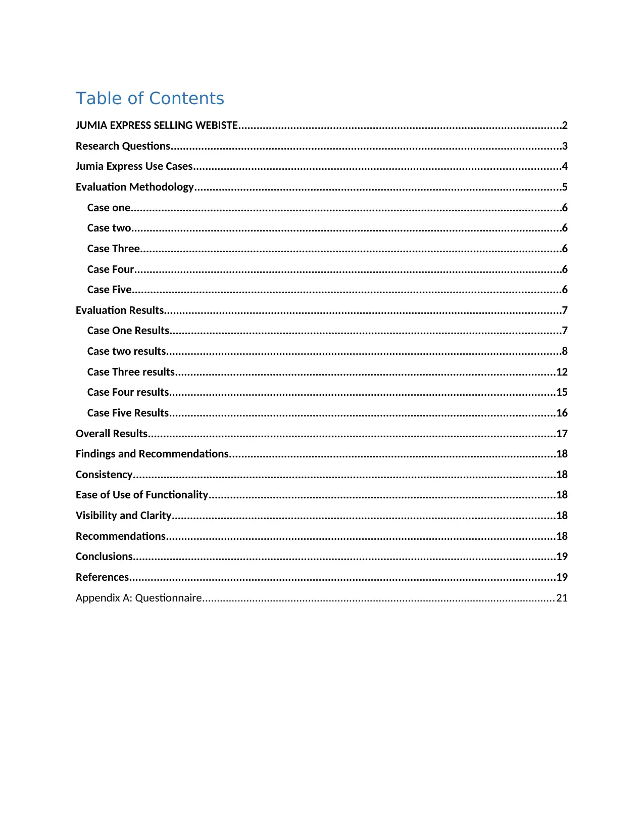
Table of Contents
JUMIA EXPRESS SELLING WEBISTE..........................................................................................................2
Research Questions................................................................................................................................3
Jumia Express Use Cases........................................................................................................................4
Evaluation Methodology........................................................................................................................5
Case one.............................................................................................................................................6
Case two.............................................................................................................................................6
Case Three..........................................................................................................................................6
Case Four............................................................................................................................................6
Case Five............................................................................................................................................6
Evaluation Results..................................................................................................................................7
Case One Results................................................................................................................................7
Case two results.................................................................................................................................8
Case Three results............................................................................................................................12
Case Four results..............................................................................................................................15
Case Five Results..............................................................................................................................16
Overall Results.....................................................................................................................................17
Findings and Recommendations...........................................................................................................18
Consistency..........................................................................................................................................18
Ease of Use of Functionality.................................................................................................................18
Visibility and Clarity.............................................................................................................................18
Recommendations...............................................................................................................................18
Conclusions..........................................................................................................................................19
References...........................................................................................................................................19
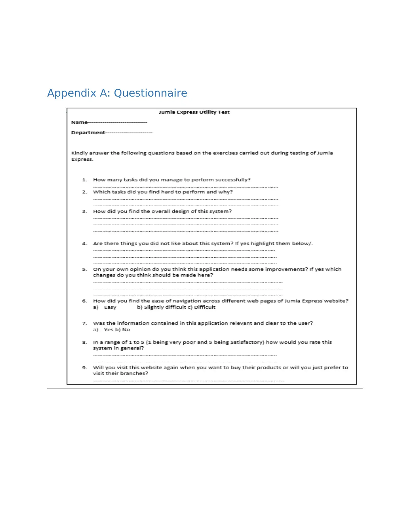
Appendix A: Questionnaire........................................................................................................................21
Secure Best Marks with AI Grader
Need help grading? Try our AI Grader for instant feedback on your assignments.
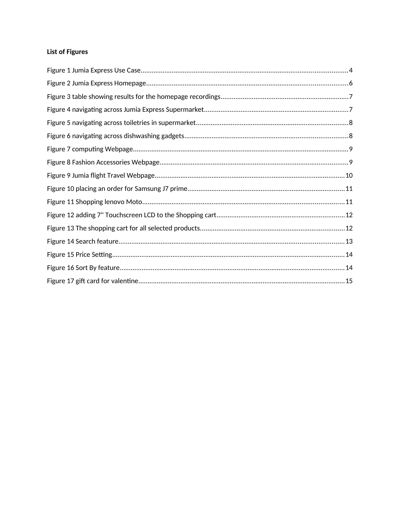
List of Figures
Figure 1 Jumia Express Use Case.................................................................................................................4
Figure 2 Jumia Express Homepage..............................................................................................................6
Figure 3 table showing results for the homepage recordings......................................................................7
Figure 4 navigating across Jumia Express Supermarket...............................................................................7
Figure 5 navigating across toiletries in supermarket...................................................................................8
Figure 6 navigating across dishwashing gadgets.........................................................................................8
Figure 7 computing Webpage......................................................................................................................9
Figure 8 Fashion Accessories Webpage.......................................................................................................9
Figure 9 Jumia flight Travel Webpage........................................................................................................10
Figure 10 placing an order for Samsung J7 prime......................................................................................11
Figure 11 Shopping lenovo Moto..............................................................................................................11
Figure 12 adding 7" Touchscreen LCD to the Shopping cart......................................................................12
Figure 13 The shopping cart for all selected products...............................................................................12
Figure 14 Search feature...........................................................................................................................13
Figure 15 Price Setting...............................................................................................................................14
Figure 16 Sort By feature...........................................................................................................................14
Figure 17 gift card for valentine.................................................................................................................15
JUMIA EXPRESS SELLING WEBISTE
In the present world due to rapid growth of technology people can order things or purchase home
supplies while they are still home seated. Many Companies which have adapted the online business
services have been on the verge of the market as they are now offering home delivery. For this urge and
need of products the users or consumers have found themselves downloading the mobile application
for a specific company selling online or browsing information regarding the online selling websites using
their browsers. Though there are so many companies adapting the online selling, thus this as made
many consumers to be so selective of the information provided in the application or in the website.
When consumers realize that the information they are seeking is not clear then the user will evade that
website and search for another selling site that meet his or her needs. This scenario of consumers being
selective has made many people to be eager when interacting with the already posted products by
checking if they are effective, how safe they are and if they satisfy their requirements with the duration
needed. We need to evaluate the Jumia express selling website (ExperienceUX, 2018). The first question
in this proposal is asking what is an interactive system? Interactive system can be defined in many ways
which depends on the discussion area but in this concept the topic of discussion is the usability testing
(point, 2018). The point of reference is the Information security in a applications used in smartphones or
a website that can be applied on browsers on machines or phones which may allow user to perform
functions and operations such as the E-commerce, selling games online, Electronic devices, E-book and
many others in all range of products existing in the world (meich, 2017). According to Nielsen Jacob
there are considerations and requirements that need to be analysed and designed when we are
determining how capable usability can if performed (Johnson, 2018). The following content below
explains all the considerations or principles to guide in doing an evaluation of the usability testing of
Jumia Express Selling Website (NIELSEN, 2013). Some of the questions to ask when doing
evaluation are us follows (Jakob, 1999).
Research Questions
1) What is the consistency of the information, content and the design of the Jumia Express Selling
Website?
2) Does Jumia Express Selling Website have a look and feel in its Graphical User Interface?
3) Is it easy while navigating the Jumia website webpages?
4) Does Jumia website show some clarity and visibility in the mobile application or in the website
(Nielsen, 2015)?
5) Is there in any way Jumia website interactive system matches with the real world?
6) Does Jumia website shows have support such as help and documentation assistance to the users
of Jumia?
7) Is it possible for Jumia Website to recognize, diagnose and recover errors if they occur when
dealing and interacting with the application?
8) Is the Jumia websites supportive in terms freedom and control of the user?
This report aims at giving a detailed explanation of the human interaction usability test of Jumia Express
Selling Website. Jumia Express is an online selling website that sells its good in most Africa countries and
doing very well in Kenya. Jumia has been known to deal with all types of goods where they can sell at
wholesales, retails and even specific products and doing home delivery to your home and you pay after
the good or service has been delivered to you. The concept is like that of Amazon just that in this one it
still has not yet gone international to other continents in Africa. In Jumia Express consumers of goods
can view goods on their websites, adding goods they want to shopping cart and placing an order where
they will follow up with immediately they receive an order. This report is aimed at giving a detailed
analysis where we use a questionnaire in investigation and evaluating the usability test of Jumia Express
(JannaDupree, 2014). Lastly after the evaluation is done we will have to explain all the findings
analysed from the investigations or the answers from the questionnaires and thus recommending on
what need to be done by Jumia Express depending on the result from findings (Garyperlman, 2018).
Jumia Express Use Cases
Jumia Express of late has been known to be dominating the sales of products online in Central, East and
West Africa where it has been engaging itself in selling goods at wholesale and retail prices which are
much convenient than buying from normal shops (Rouse, 2017). Jumia Express is a company that is
selling about 2 million products in a day which ranges from food, flight, travels, houses, party, men’s
fashion, women’s fashion, TVs audio and cameras, computing and beauty (Jumia, 2018). Jumia is termed
as one of the biggest online mall that has many warehouses in respective countries where it sells its
products to countries like Algeria, Cameroon, Ivory Coast, Egypt, Ghana, Morocco, Nigeria, Rwanda,
Senegal, Tanzania, Tunisia and Uganda. To interact closely with the customers Jumia Express has been
for a good website that a graphical user interface has a good look and feel making it easy when one
want to search for products as it is easy when interacting with the website or the mobile application and
lastly the navigation across all the webpages is very easy in Jumia Express (Yitmen, 2013). The
products at Jumia are classified depending on the category they belong just like the way products
Secure Best Marks with AI Grader
Need help grading? Try our AI Grader for instant feedback on your assignments.
in supermarkets are physically arranged (niloda, 2014). This website growth and update each and
every day as it allows one view products anywhere with regard that you have some internet
(Department, 2018). In Jumia Express one can view the good may it be a phone, place it in the
shopping cart if you are willing to buy and order where they will get back to you and asks the
location you discuss on the pay on delivery (www.nngroup.com, 2014). The explanation below
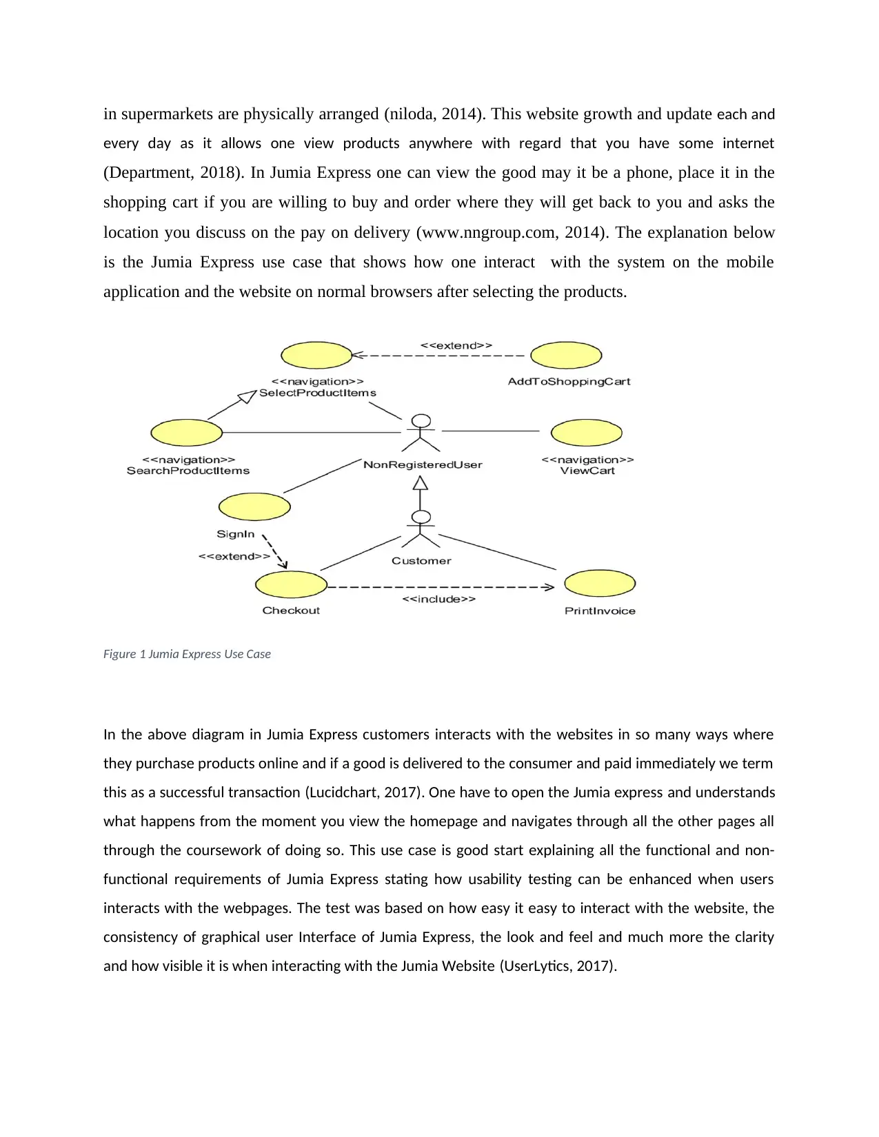
is the Jumia Express use case that shows how one interact with the system on the mobile
application and the website on normal browsers after selecting the products.
Figure 1 Jumia Express Use Case
In the above diagram in Jumia Express customers interacts with the websites in so many ways where
they purchase products online and if a good is delivered to the consumer and paid immediately we term
this as a successful transaction (Lucidchart, 2017). One have to open the Jumia express and understands
what happens from the moment you view the homepage and navigates through all the other pages all
through the coursework of doing so. This use case is good start explaining all the functional and non-
functional requirements of Jumia Express stating how usability testing can be enhanced when users
interacts with the webpages. The test was based on how easy it easy to interact with the website, the
consistency of graphical user Interface of Jumia Express, the look and feel and much more the clarity
and how visible it is when interacting with the Jumia Website (UserLytics, 2017).
Evaluation Methodology
The evaluation test is based on application of cases that helps to guide consumers to participate in the
usage of Jumia Express where we will analyse all the functionalities and additional features for proposed
system when doing usability testing (ATSDR, 2016). In this proposal of usability testing a total of 5
people who have never interacted with Jumia Express there before where each and every participant is
given 15 mins when being observed by the researcher while interacting with the Jumia Express website
or Mobile Application (ufl, 2018). The major areas that were targeted by the researcher were the way
the participants created their account by signing up then they login after being verified, starts viewing
the products by selecting their choice, adding it to the shopping cart and lastly making that specific
order. This methodology has been explained by use of cases that has explained all tasks to be completed
as per the specific case (APCRC, 2017).
Case one
In this case the user pays attention to what the homepage of Jumia Express entails where one checks all
what is available and start navigates through the products offered depending classified categories and
the content they portray in terms of description and price and how convenient it is in terms of delivery
and time (www.jumia.co.ke, 2018).
Case two
In this case the user is tested on how he can navigate across the Jumia Website where he have to
interact with concepts like phone & tablets, Supermarket, Women’s Fashion, Men’s Fashion, Beauty,
Jumia Global, Food, Travel, Flight, Computing, Fashion accessories among many other categories and
webpages. In this case it is performed for the issue of navigating through the website using all the
categories in all ways.
Case Three
In case three the participants are required to select three item on phones and tablets and computing
where they view the chosen products, adds them to the shopping cart and make an order
Case Four
In this case much of emphasis is placed on how many webpages the participant have visited on the
Jumia Express. All users had visited more than 10 webpages where we concentrated on how the
webpages were visible and clear to them, how consistent the context of the webpage is to the
participants. In this scenario the participants were required to record all the webpages they had visited
clearly indicating all the content they have and how they are represented in the website.
Case Five
The case five is known in that we will test the user requirement by asking them to create a gift card for
their friends (recipient). The participant had to choose a design of the gift card that they were to send
to the recipient giving all the information’s about the recipient and pay using Mpesa.
As explained from all the above cases from one to five the 5 participants navigated through the Jumia
Express website were able to learn a lot and the knowledge gained with a lot of experience for first time
interaction with Jumia Express. The focuses on all the cases from 1 to 5 was based on checking the
analysis of the usability of the Jumia express website and its mobile application checking how the
graphical user interface is consistent, how the content in the webpages is relevant to the participant and
the way or how easy it is when navigating through the Jumia Express Websites. As discussed above all
cases have explained all the steps from the moment the participant logins in the Jumia Website to
ordering the good.
After performing all the tasks in all five cases the users were required to answer the already prepared
questionnaire which entailed all of what they had experienced in the website. The aim for the
questionnaire was making the participant understand the general view of Jumia Express Website
explaining on what they learnt in the processes as they navigated across Jumia Express Website
(Explorable, 2017). The rating of the interaction was supposed to be given out of five and clearly
indicates it was good or bad experience.
The methods that were applied in evaluating were good and made the users to feel
the features even when observing. The questionnaire was used to help us to know
the way the user feels about Jumia express something that was very easy but it
was hard to perform when observing the executions of the scenarios above.
The methods were considered to be so effective in that they gave results
that were appropriate for the research.
Evaluation Results
Based on the already discussed cases then there are a number of concepts that will
need to looked upon as realized from the questionnaire (juben, 2013). All the
Paraphrase This Document
Need a fresh take? Get an instant paraphrase of this document with our AI Paraphraser
participants performed the given tasks alternatively following the indicated instructions in the
same way for all for the purpose of achieving the major objectives.
Case One Results
The aim of case one was testing the navigation through the Jumia Express webpages where we had to
sign up and login to the website all the app and start viewing all what the site entails in the classified and
categories as indicated in the site. The first case was performed easily as many did not experience any
problems when navigating where by about 4 out of the 5 stated that this case task was not necessary as
it was direct and straight to the point and termed it as time wastage and this resulted to them saying
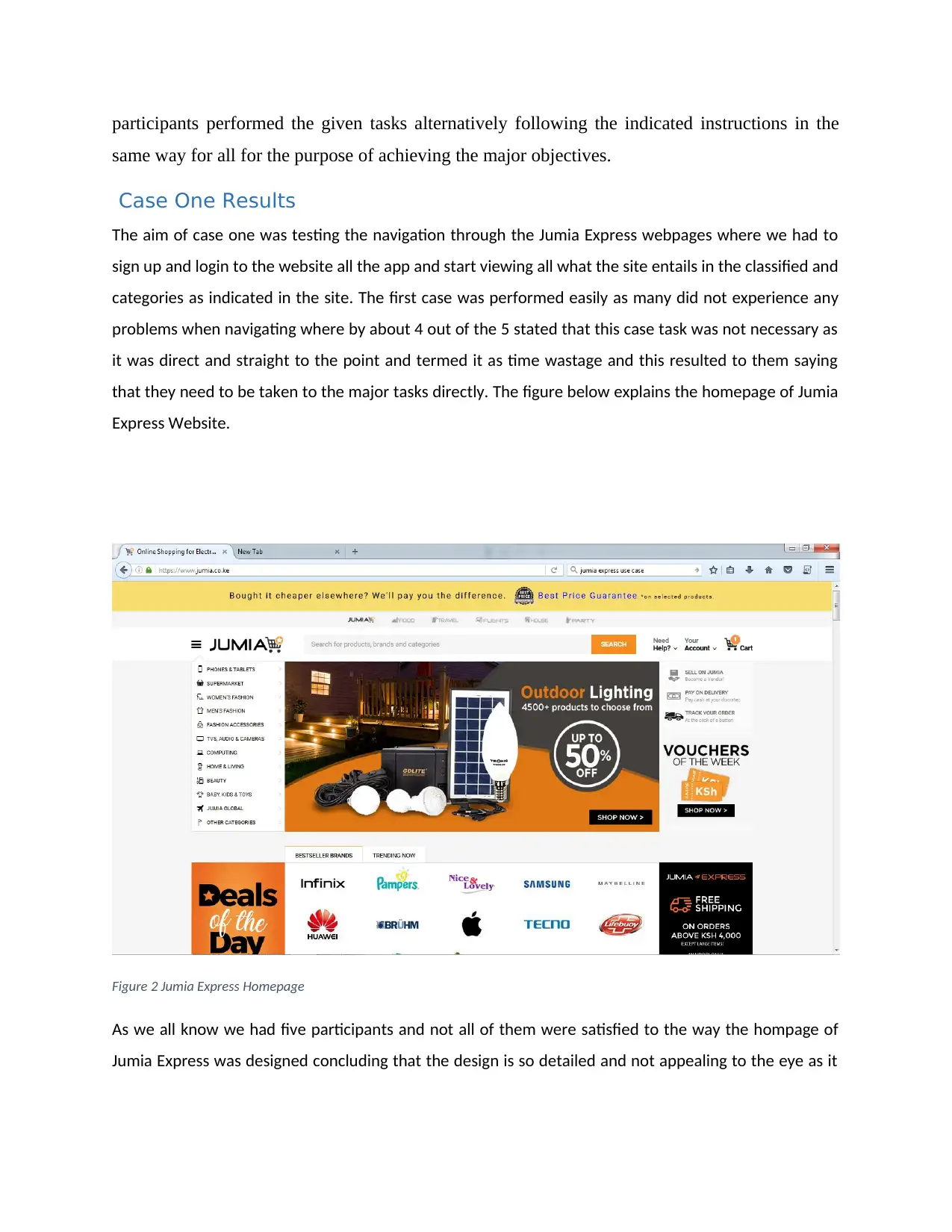
that they need to be taken to the major tasks directly. The figure below explains the homepage of Jumia
Express Website.
Figure 2 Jumia Express Homepage
As we all know we had five participants and not all of them were satisfied to the way the hompage of
Jumia Express was designed concluding that the design is so detailed and not appealing to the eye as it
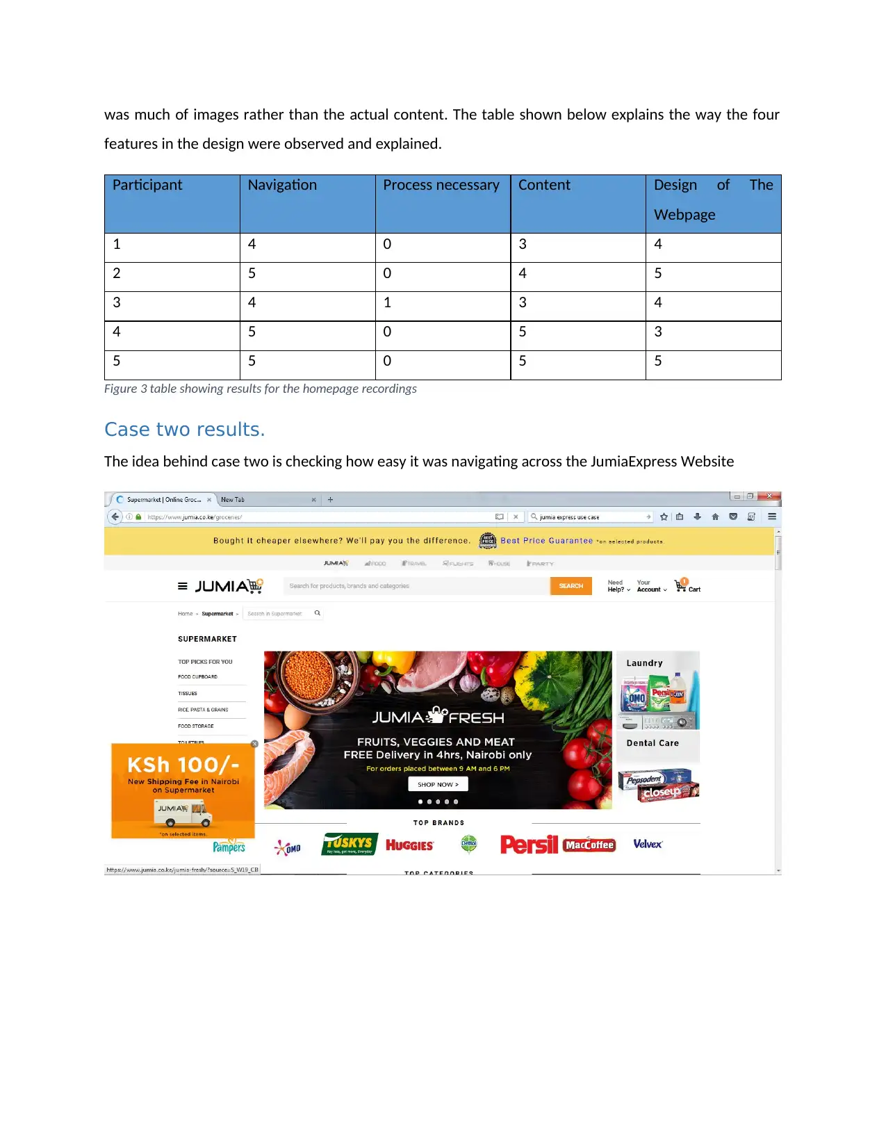
was much of images rather than the actual content. The table shown below explains the way the four
features in the design were observed and explained.
Participant Navigation Process necessary Content Design of The
Webpage
1 4 0 3 4
2 5 0 4 5
3 4 1 3 4
4 5 0 5 3
5 5 0 5 5
Figure 3 table showing results for the homepage recordings
Case two results.
The idea behind case two is checking how easy it was navigating across the JumiaExpress Website
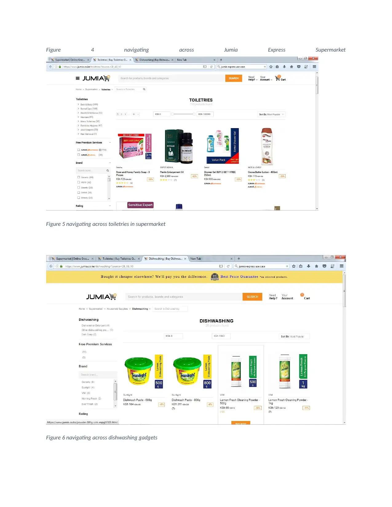
Figure 4 navigating across Jumia Express Supermarket
Figure 5 navigating across toiletries in supermarket
Figure 6 navigating across dishwashing gadgets
Figure 5 navigating across toiletries in supermarket
Figure 6 navigating across dishwashing gadgets
Secure Best Marks with AI Grader
Need help grading? Try our AI Grader for instant feedback on your assignments.
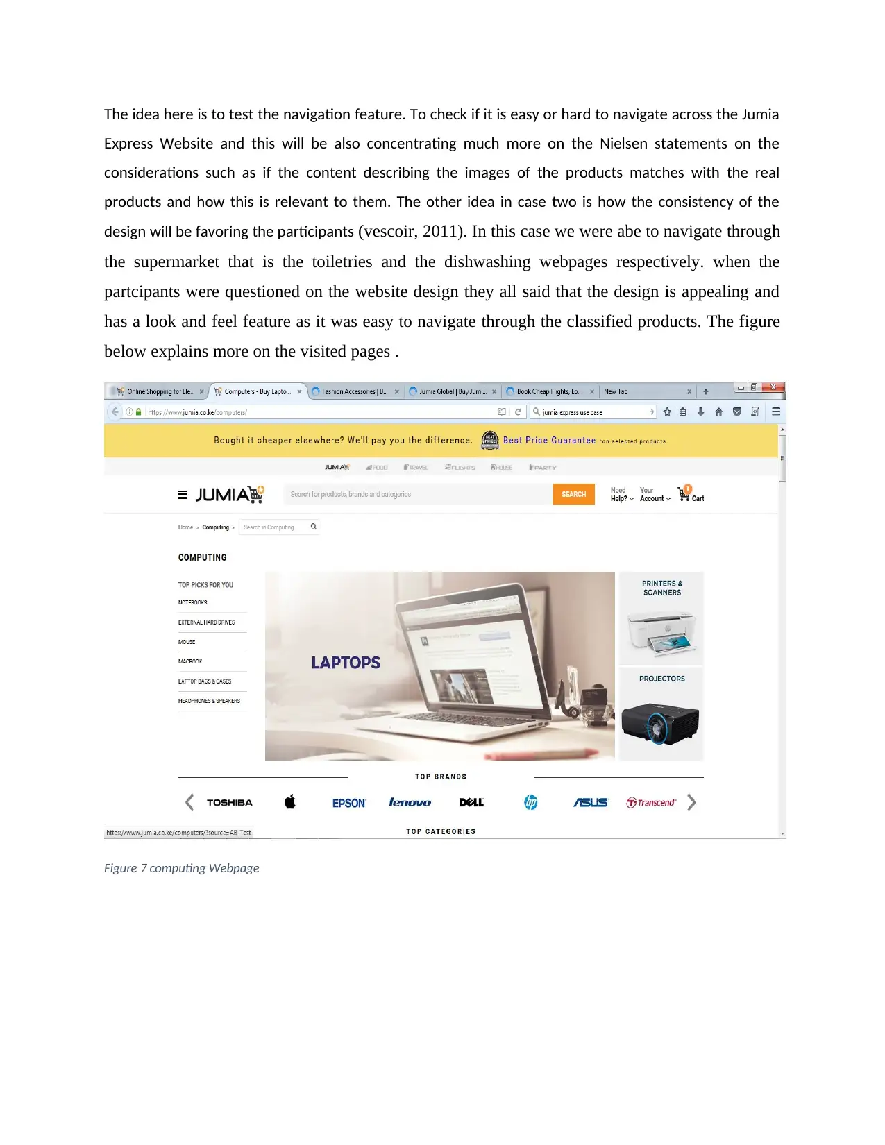
The idea here is to test the navigation feature. To check if it is easy or hard to navigate across the Jumia
Express Website and this will be also concentrating much more on the Nielsen statements on the
considerations such as if the content describing the images of the products matches with the real
products and how this is relevant to them. The other idea in case two is how the consistency of the
design will be favoring the participants (vescoir, 2011). In this case we were abe to navigate through
the supermarket that is the toiletries and the dishwashing webpages respectively. when the
partcipants were questioned on the website design they all said that the design is appealing and
has a look and feel feature as it was easy to navigate through the classified products. The figure
below explains more on the visited pages .
Figure 7 computing Webpage
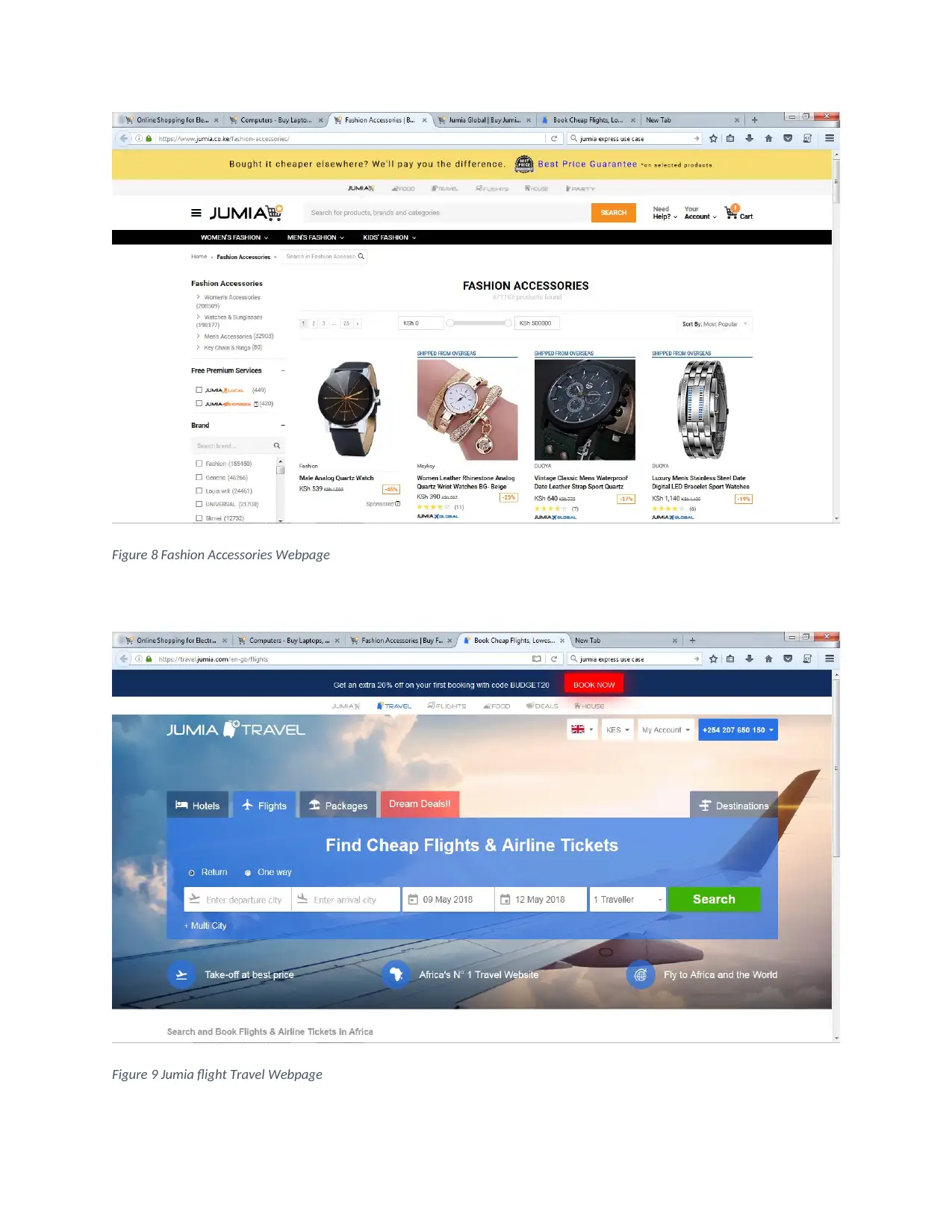
Figure 8 Fashion Accessories Webpage
Figure 9 Jumia flight Travel Webpage
Figure 9 Jumia flight Travel Webpage
Four out of the five participants said that the navigation from one page to the next was very easy,
appealing and much satisfying their expectations.
Case Three results
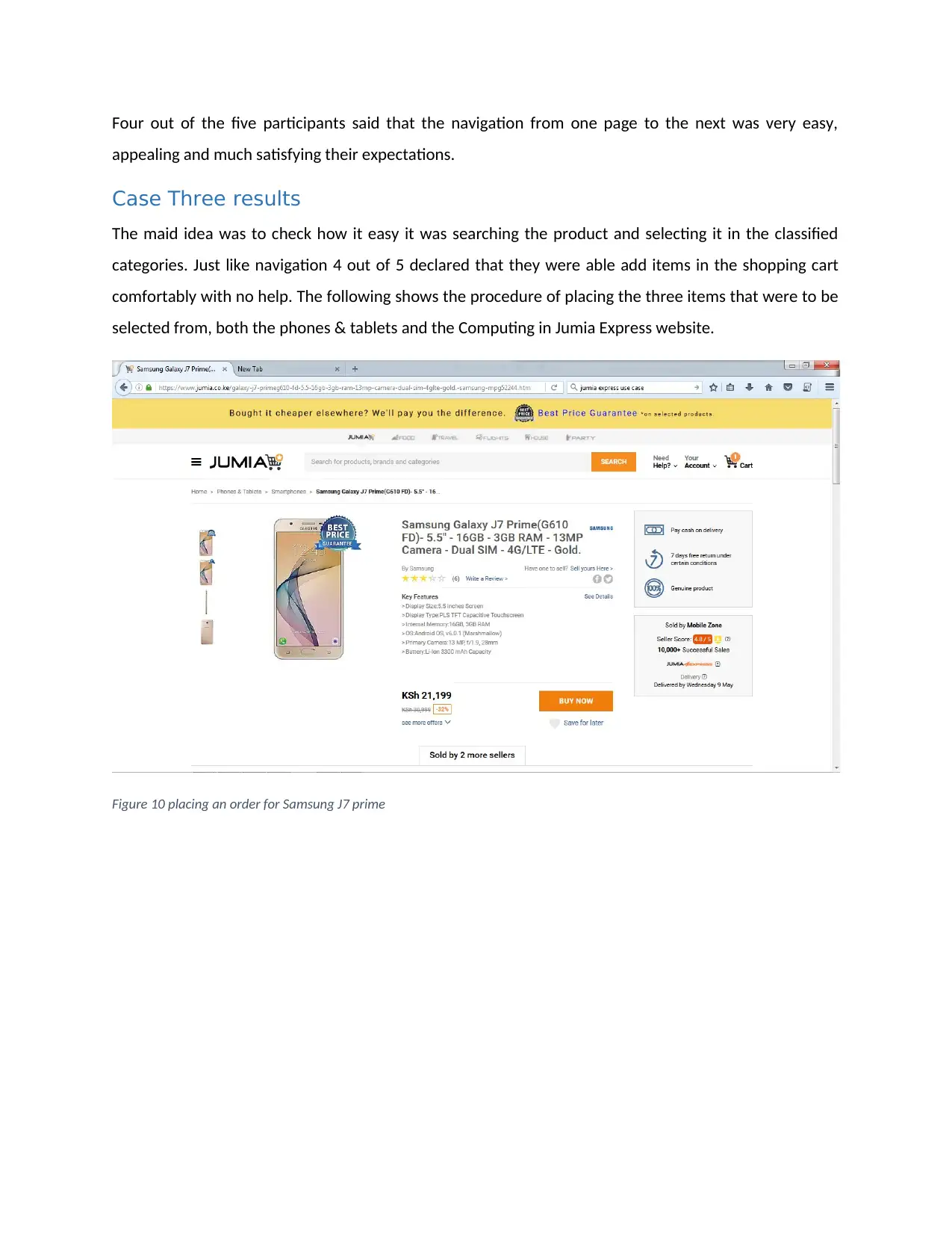
The maid idea was to check how it easy it was searching the product and selecting it in the classified
categories. Just like navigation 4 out of 5 declared that they were able add items in the shopping cart
comfortably with no help. The following shows the procedure of placing the three items that were to be
selected from, both the phones & tablets and the Computing in Jumia Express website.
Figure 10 placing an order for Samsung J7 prime
Paraphrase This Document
Need a fresh take? Get an instant paraphrase of this document with our AI Paraphraser
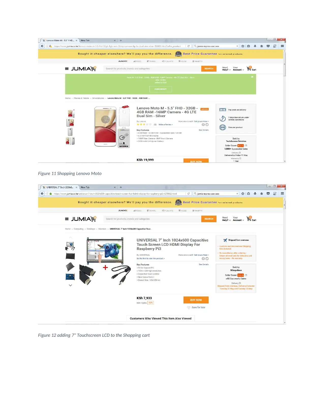
Figure 11 Shopping Lenovo Moto
Figure 12 adding 7" Touchscreen LCD to the Shopping cart
Figure 12 adding 7" Touchscreen LCD to the Shopping cart
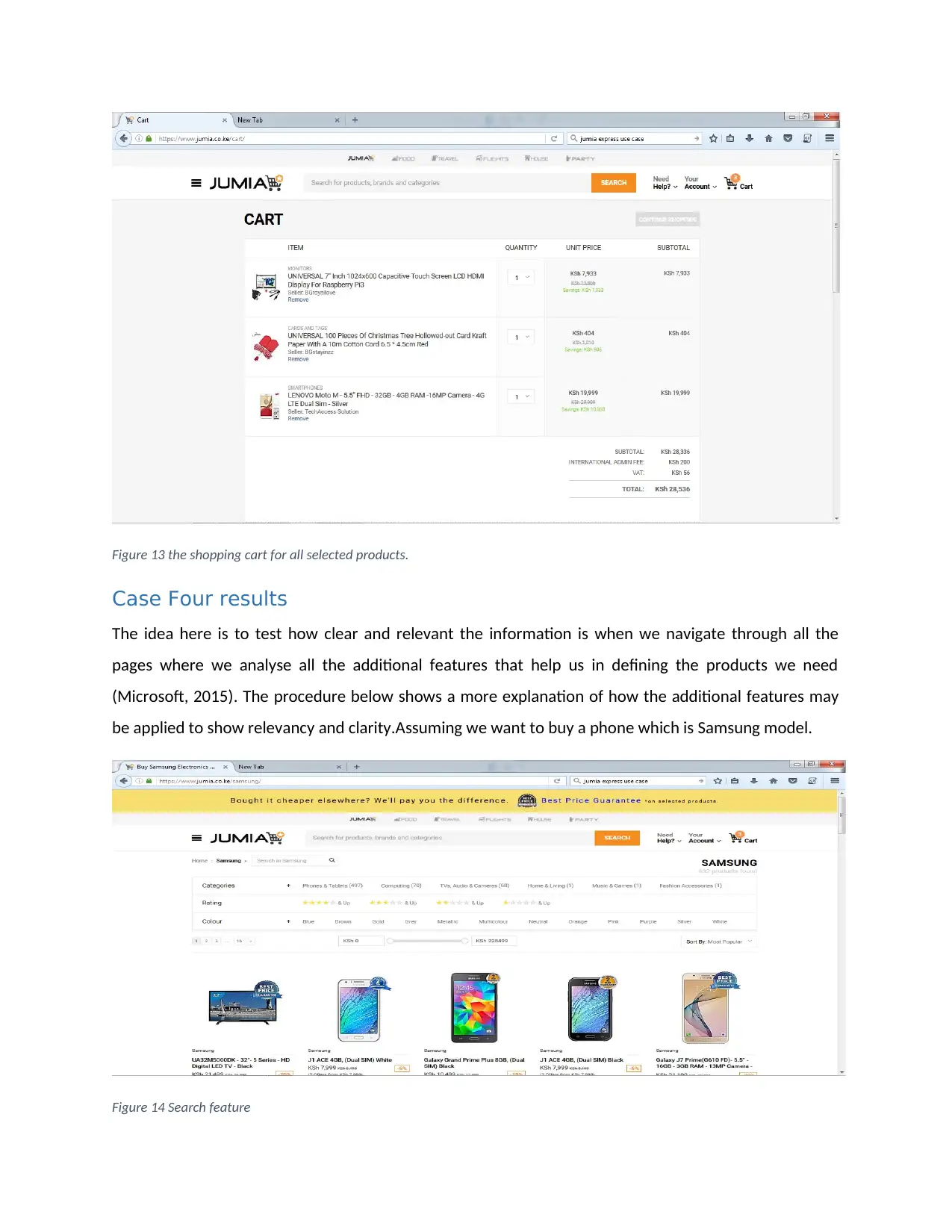
Figure 13 the shopping cart for all selected products.
Case Four results
The idea here is to test how clear and relevant the information is when we navigate through all the
pages where we analyse all the additional features that help us in defining the products we need
(Microsoft, 2015). The procedure below shows a more explanation of how the additional features may
be applied to show relevancy and clarity.Assuming we want to buy a phone which is Samsung model.
Figure 14 Search feature
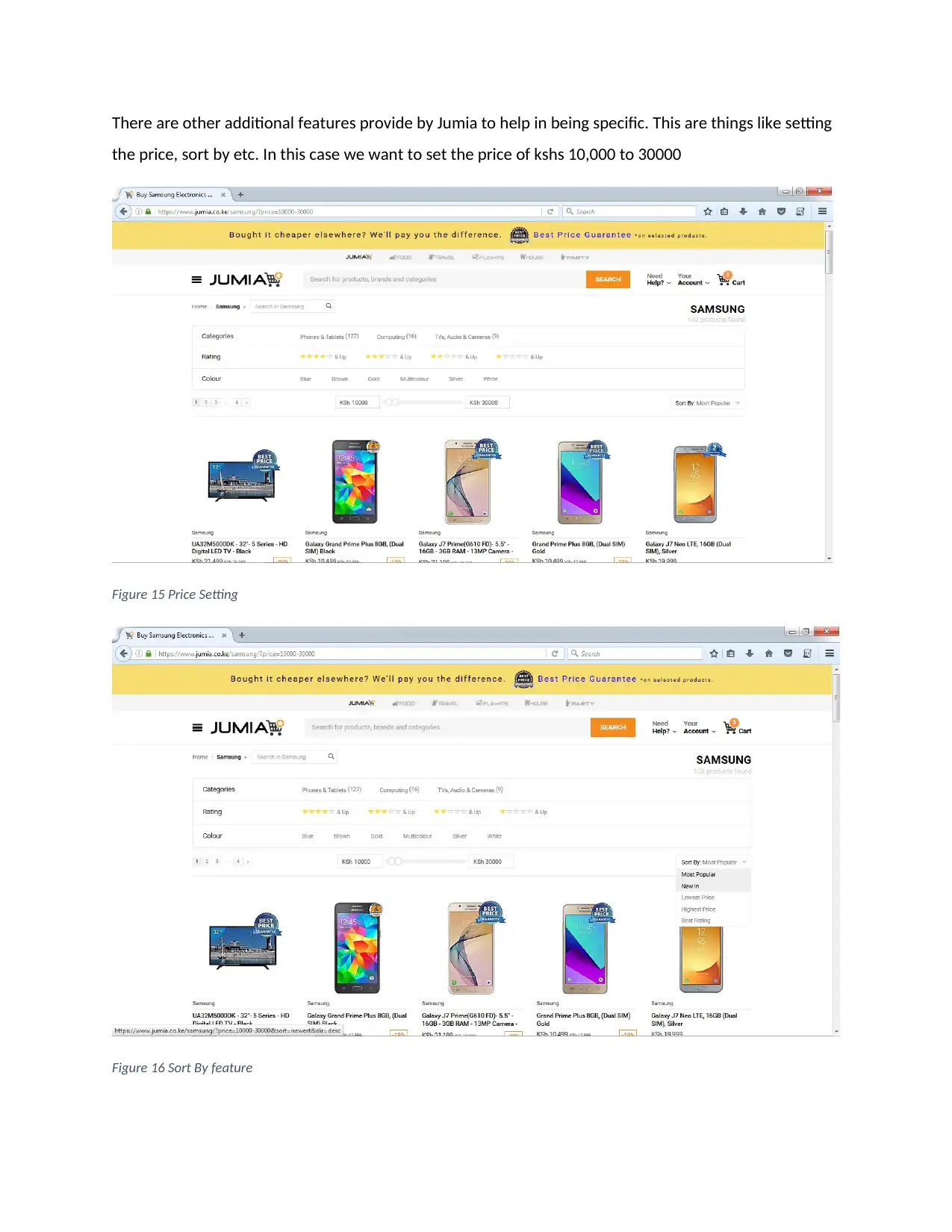
There are other additional features provide by Jumia to help in being specific. This are things like setting
the price, sort by etc. In this case we want to set the price of kshs 10,000 to 30000
Figure 15 Price Setting
Figure 16 Sort By feature
the price, sort by etc. In this case we want to set the price of kshs 10,000 to 30000
Figure 15 Price Setting
Figure 16 Sort By feature
Secure Best Marks with AI Grader
Need help grading? Try our AI Grader for instant feedback on your assignments.
This sort by feature is done by searching the below.
Most popular
New in
Lowest Price
Best rating
Highest price
Case Five Results
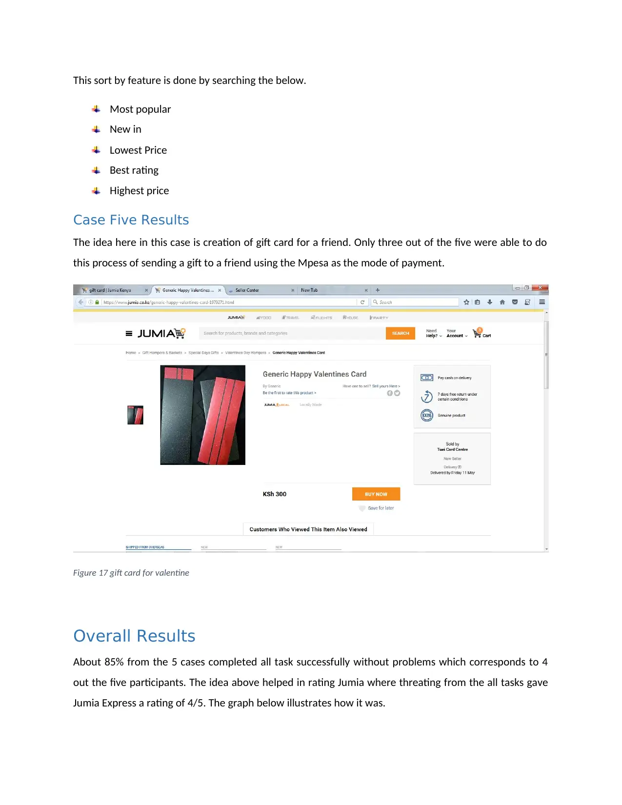
The idea here in this case is creation of gift card for a friend. Only three out of the five were able to do
this process of sending a gift to a friend using the Mpesa as the mode of payment.
Figure 17 gift card for valentine
Overall Results
About 85% from the 5 cases completed all task successfully without problems which corresponds to 4
out the five participants. The idea above helped in rating Jumia where threating from the all tasks gave
Jumia Express a rating of 4/5. The graph below illustrates how it was.
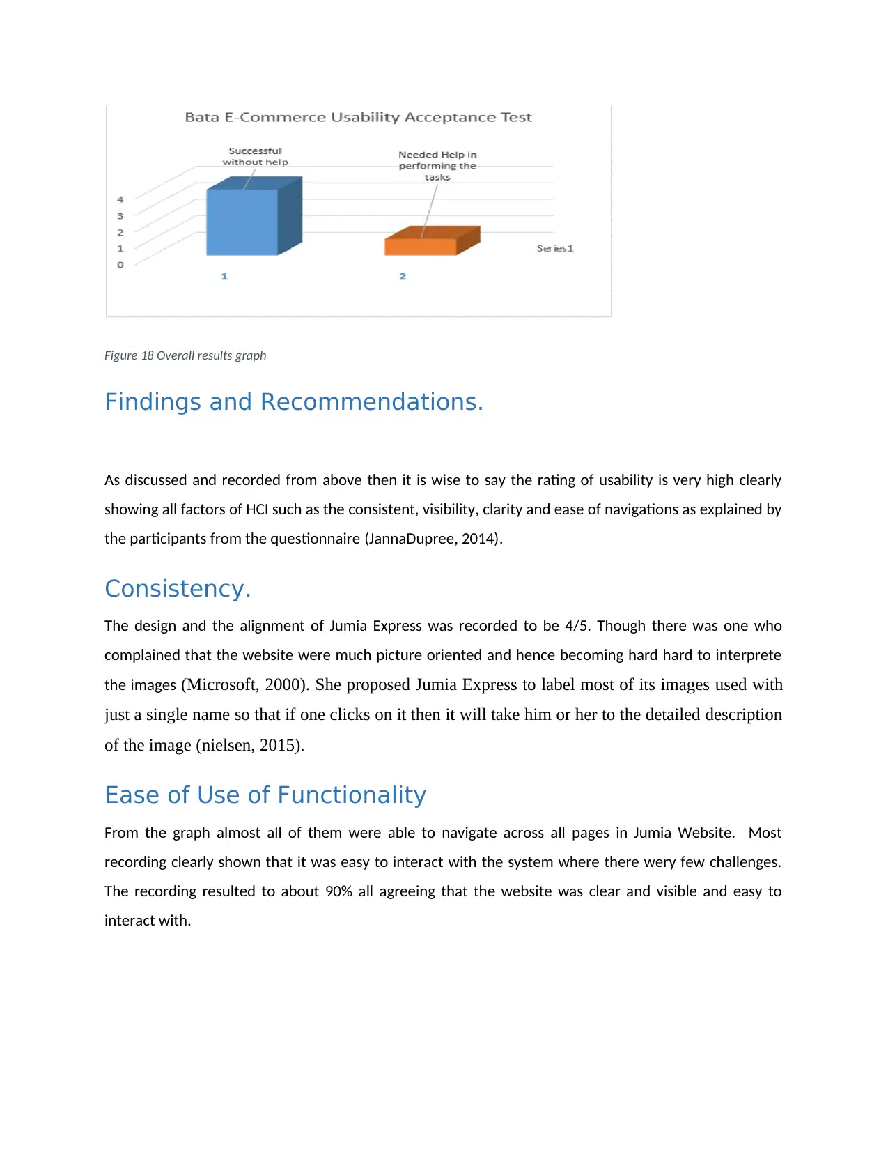
Figure 18 Overall results graph
Findings and Recommendations.
As discussed and recorded from above then it is wise to say the rating of usability is very high clearly
showing all factors of HCI such as the consistent, visibility, clarity and ease of navigations as explained by
the participants from the questionnaire (JannaDupree, 2014).
Consistency.
The design and the alignment of Jumia Express was recorded to be 4/5. Though there was one who
complained that the website were much picture oriented and hence becoming hard hard to interprete
the images (Microsoft, 2000). She proposed Jumia Express to label most of its images used with
just a single name so that if one clicks on it then it will take him or her to the detailed description
of the image (nielsen, 2015).
Ease of Use of Functionality
From the graph almost all of them were able to navigate across all pages in Jumia Website. Most
recording clearly shown that it was easy to interact with the system where there wery few challenges.
The recording resulted to about 90% all agreeing that the website was clear and visible and easy to
interact with.
Visibility and Clarity
The content was highly recommended to be very necessary and much more very straight to the point
when understanding. The other additional features like the setting the price range and sort by helped in
aligning and satisfying the user requirements as it made it easy locating the products
(istqbexamcertification.com, 2012).
Recommendations
I would recommend on the alignment of the homepage in that the pages are well aligned where we can
apply the use of features such as the slide sorters. The live chart should also be in a place where it can
be seen and the price currency of goods should be the international one like dollars.
Conclusions
As discussed from above, the test has been done in testing the quality of the website. For the website or
the system to be of good quality then there are some standards that will need to be visible to the
viewers or users that shows all the content clearly ,easy when navigating across the pages and much
easy to locate the selected products the best way possible in an efficient manner. We have also noted
the additional features like sort by, Filter, Price range set, search engine and many others have helped in
saving time to locate a product. The procedure followed from case one to case five have clearly
indicated that it is easy to understand a given site even if we are new from such websites (Microsoft,
2010).
Paraphrase This Document
Need a fresh take? Get an instant paraphrase of this document with our AI Paraphraser
References
APCRC, 2017. Evaluation methodology. [Online]
Available at: http://www.apcrc.nhs.uk/evaluation/methodology.htm
[Accessed 12 May 2018].
ATSDR, 2016. principles of community Engagement, 3(1), pp. 12-17.
Department, U., 2018. improving the user experience, Newyork: usabilitygov.
ExperienceUX, 2018. What is usability testing?. [Online]
Available at: https://www.experienceux.co.uk/faqs/what-is-usability-testing/
[Accessed 10 May 2018].
Explorable, 2017. Surveys and Questionnaires - Guide. [Online]
Available at: https://explorable.com/surveys-and-questionnaires
[Accessed 12 May 2018].
Garyperlman, 2018. USE Questionnaire: Usefulness, Satisfaction, and Ease of use. [Online]
Available at: http://garyperlman.com/quest/quest.cgi?form=USE
[Accessed 12 May 2018].
istqbexamcertification.com, 2012. What is Usability testing in software and it’s benefits to end user?.
[Online]
Available at: http://istqbexamcertification.com/what-is-usability-testing-in-software-and-its-benifits-to-
end-user/
[Accessed 05 May 2018].
Jakob, N., 1999. 10 Usability Heuristics for User Interface Design, Newyork: Nielsen Norman group.
JannaDupree, 2014. Help us improve the experience:. Looking for usability testing participants, 12(17),
pp. 47-62.
JannaDupree, 2014. Help us improve the experience: Looking for usability testing participants, LA:
communitica.
Johnson, C., 2018. HCI and Sofwares Life Cycle. Interactive Systems Design, 7(1), pp. 72-75.
juben, m., 2013. heuruistic evaluation for the graphica user interfaces. usability huristics, 3(1), pp. 2-7.
Jumia, 2018. Jumia. [Online]
Available at: https://www.jumia.co.ke/?creation=07-04-2014-
DL2&gclid=CjwKCAjwlcXXBRBhEiwApfHGTWOSLBzlRz_5-H6nak3N8FWNTpeNX_Np5DUI7jDRcdu-
0KBAUOeNHBoCtaEQAvD_BwE
[Accessed 08 may 2018].
Lucidchart, 2017. UML Use Case Diagram Tutorial , cadiff: LucidChart.
meich, s., 2017. knowledge capitalization. Evaluation of the Website, 3(2), pp. 27-78.
Microsoft, 2000. UI Guidelines vs. Usability Testing. [Online]
Available at: https://msdn.microsoft.com/en-us/library/ms997578.aspx
[Accessed 05 may 2018].
Microsoft, 2010. Configure additional features for the Search Core Results Web Part (. FAST Search
Server 2010 for SharePoint, 34(47), pp. 34-60.
Microsoft, 2015. Configure properties of the Search Results Web Part. Configure properties of the Search
Results Web Part in SharePoint Server, 34(17), pp. 12-18.
NIELSEN, j., 2013. 10 Usability Heuristics for User Interface Design. The most comprehensive collection of
Design Principles on the Internet., 7(3), pp. 78-90.
nielsen, j., 2015. Usability 101: Introduction to Usability. [Online]
Available at: https://www.nngroup.com/articles/usability-101-introduction-to-usability/
[Accessed 05 May 2018].
Nielsen, N., 2015. Website Usability. Creating User-Centric Designs, 09(12), pp. 54-63.
niloda, 2014. step by step guide in doin evaluation in usability. heuristic evaluation, 6(7), pp. 56-82.
point, t., 2018. Interactive System Design. [Online]
Available at:
https://www.tutorialspoint.com/human_computer_interface/interactive_system_design.htm
[Accessed 10 May 2018].
Rouse, M., 2017. use case , 4(1), pp. 12-17.
ufl, 2018. Degree in Research and Evaluation Methodology. [Online]
Available at: https://education.ufl.edu/research-evaluation-methods/
[Accessed 12 May 2018].
UserLytics, 2017. Remote Usability Testing Blog. Remote User Testing Insights, 4(17), pp. 12-14.
www.jumia.co.ke, 2018. Jumia Express. [Online]
Available at: https://www.jumia.co.ke/
[Accessed 08 May 2018].
www.nngroup.com, 2014. Turn User Goals into Task Scenarios for Usability Testing. [Online]
Available at: https://www.nngroup.com/articles/task-scenarios-usability-testing/
[Accessed 05 May 2018].
Yitmen, K., 2013. Usability Testing: Personas, Scenarios, Use Cases, and Test Cases. starcanada,
UXservices.
Appendix A: Questionnaire
1 out of 22
Related Documents
Your All-in-One AI-Powered Toolkit for Academic Success.
+13062052269
info@desklib.com
Available 24*7 on WhatsApp / Email
![[object Object]](/_next/static/media/star-bottom.7253800d.svg)
Unlock your academic potential
© 2024 | Zucol Services PVT LTD | All rights reserved.


